My Account
My Slides
Search by Category
Companies
Slide Type
Use Case
Industry
Pricing
Templates
View All Templates
Download Template Slides
✦ AI
AI Prompt Library
AI Search
Feedback
Login
Logout
Get Started
Browse all Slides
Browse all Slides
Create a FREE Account
Instant access to 1,000+ real slides from top companies like McKinsey, BCG, Goldman Sachs, Google and many more!
First Name
Last Name
Email
Password
I agree to all
Terms & Privacy Policy
Thank you! Your submission has been received!
Oops! Something went wrong while submitting the form.
Have an account?
Sign in
Saved Slides
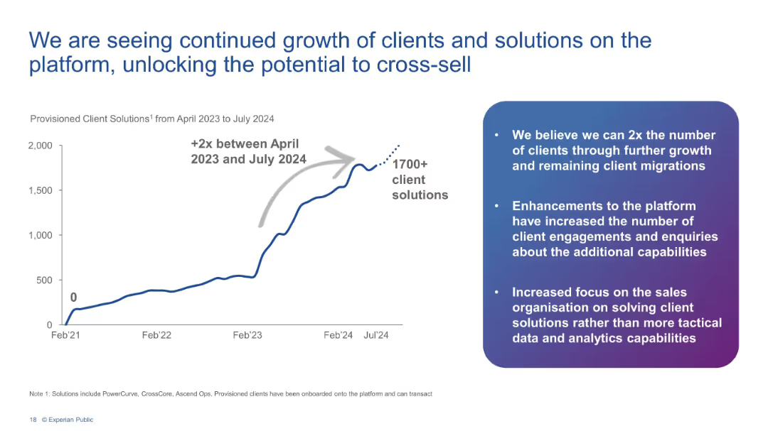
Line chart showing 2x growth in client solutions from Apr 2023 to Jul 2024 with bulleted insights.
Performance Metrics and KPIs
Financial Services
Depicts a sharp increase in provisioned client solutions to over 1700, doubling since April 2023. Accompanying text explains platform enhancements, client engagement growth, and cross-sell opportunities.
client growth, platform, Experian, KPIs, cross-sell, analytics, solutions, engagement
Mixed Chart
Barclays
Saved
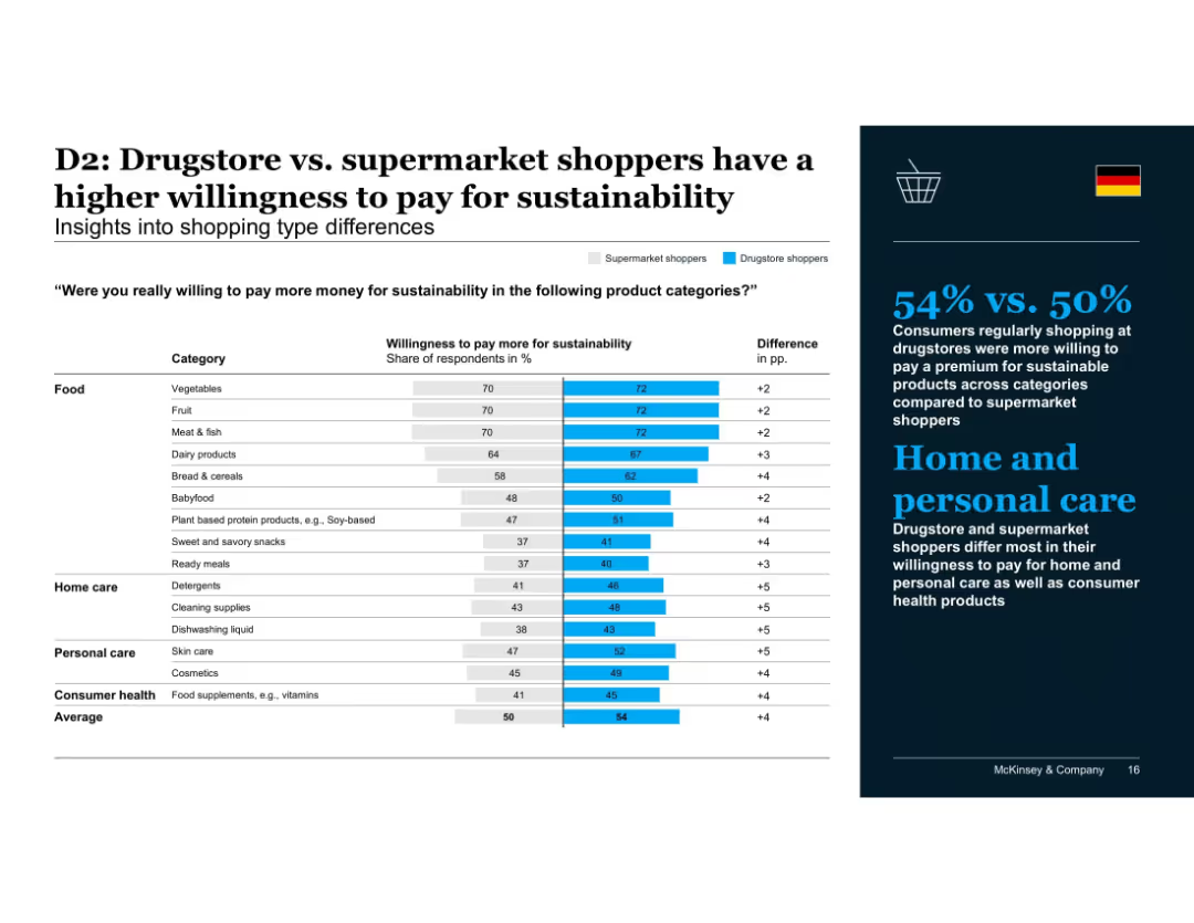
Comparison bar chart showing supermarket vs. drugstore shopper behavior; focuses on product categories
Customer and Market Segmentation
Consumer Goods
Drugstore shoppers exhibit greater willingness to pay for sustainable products, particularly in home and personal care. The trend suggests higher alignment of health-conscious shopping habits with sustainability values.
shopping type, drugstore, supermarket, personal care, home care, sustainability spending, consumer behavior, McKinsey, Germany
Mixed Chart
McKinsey
Saved
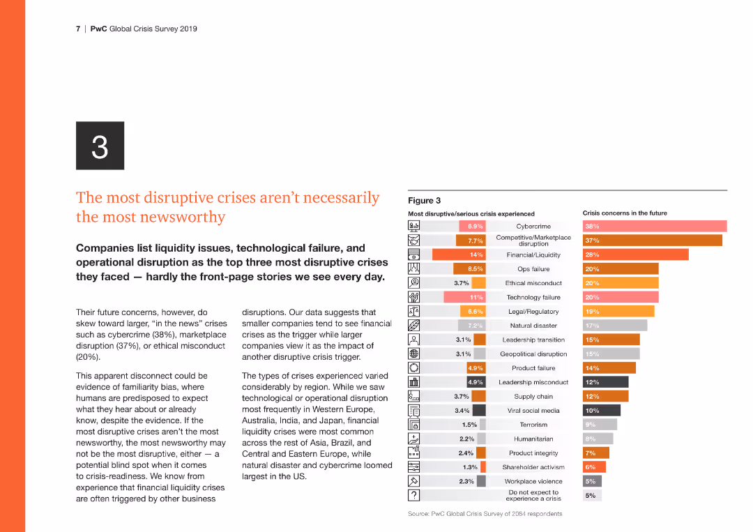
The slide features a column chart on the right comparing the most disruptive/serious crises experienced with future crisis concerns, highlighting cybercrime and financial issues.
Risk Assessment and Management
Financial Services
This slide discusses the disconnect between the most disruptive crises and those most reported, emphasizing the need for attention to operational and tech disruptions.
Disruptive crises, cybercrime, financial, operational, future concerns
Multiple Chart
PwC/Strategy&
Saved
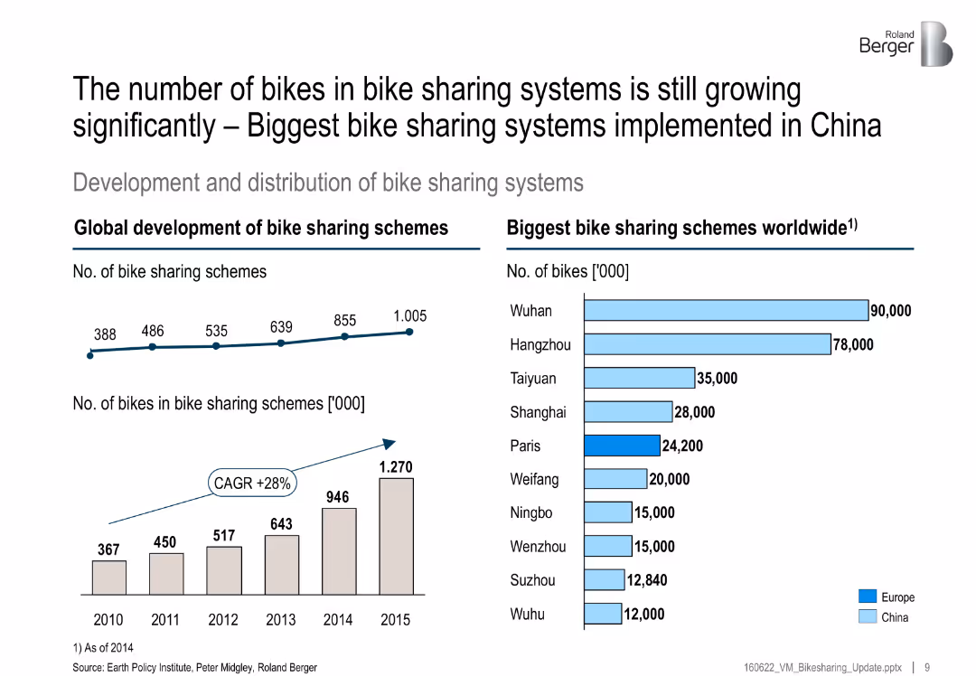
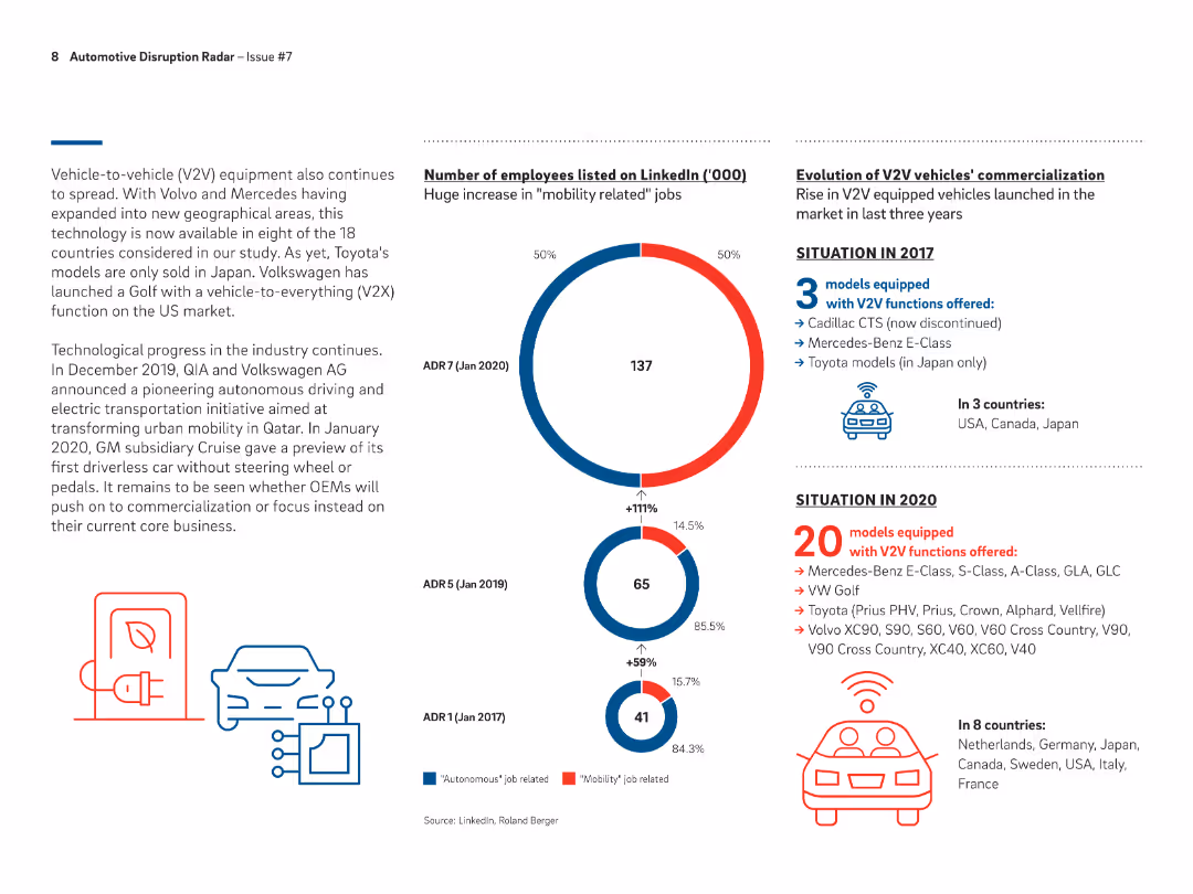
Left side has two growth charts (number of systems and bikes); right side bar chart lists largest global schemes by city
Market Analysis and Trends
Transportation & Logistics
This slide highlights significant global growth in bike-sharing schemes, especially in China. It includes a CAGR of 28% and lists top cities by number of bikes, with Wuhan and Hangzhou leading.
bike sharing, growth, China, CAGR, top cities, mobility, transportation, schemes
Multiple Chart
Roland Berger
Saved
Features flow charts and lists that compare traditional vs. holistic approaches to cost management.
Strategic Planning
Professional Services
Advocates for integrating cost management tools beyond conventional programs to improve decision making.
cost reduction, holistic, integration, decision making
Boxed
Deloitte
Saved
Two pie charts showing geographic distribution of net sales and breakdown by distribution channel for Essity. Each segment is color-coded and labeled with percentages.
Market Analysis and Trends
Consumer Goods
Analyzes geographic sales distribution and distribution channels for Essity, offering insights into market penetration and sales strategy.
Geographic Sales, Distribution Channels, Market Penetration, Sales Strategy
Multiple Chart
Barclays
Saved
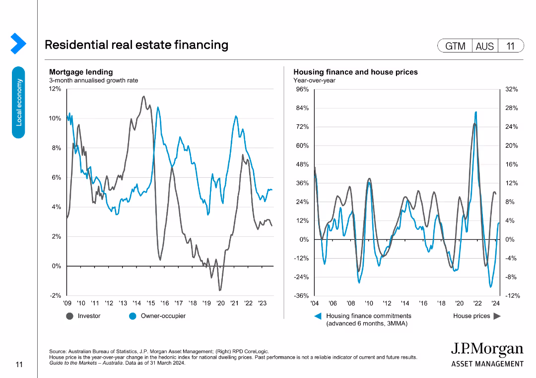
The slide presents two line charts: one on mortgage lending growth rates for investors and owner-occupiers, and the other on housing finance commitments and house prices.
Market Analysis and Trends
Real Estate & Construction
Analyzes trends in residential real estate financing, focusing on mortgage lending and housing finance metrics, useful for real estate market insights.
real estate, mortgage, housing finance, house prices, lending
Multiple Chart
JP Morgan
Saved
The slide contains line charts comparing changes in the Consumer Price Index by CO2 accounting methods for EU27+UK and China, both production-based and consumption-based. It includes text explanations above the charts and color-coded lines for domestic and import data.
Regulatory and Compliance
Energy & Utilities
Discusses the impact of adopting a consumption-based accounting method on price indices for domestic and imported goods, suggesting a smoother change for domestic products compared to the production-based approach.
CO2 accounting, price index, domestic, import, consumption-based
Multiple Chart
EY
Saved
The slide features a column chart showing the primary demand for renewable energies from 2000 to 2017, detailing the contributions of wind, solar, geothermal, hydro, advanced biofuels, and primary solid biofuels, with CAGR percentages.
Market Analysis and Trends
Energy & Utilities
This slide tracks the growth and changing composition of renewable energy demand from 2000 to 2017, emphasizing the shift towards wind and solar energies while noting the decreasing share of bioenergy.
renewable energies, primary demand, 2000-2017, wind, solar, geothermal, hydro, biofuels
Single Chart
Kearney
Saved
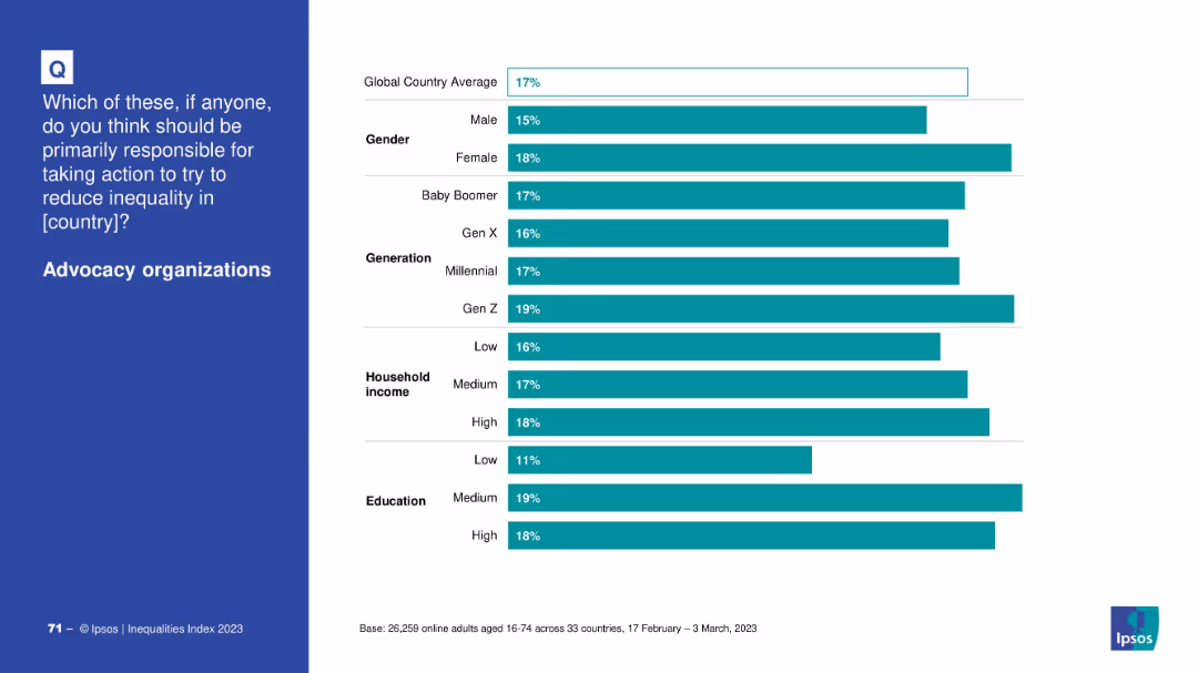
Bar chart by demographics (gender, generation, income, education); blue question box on left and bars on right.
Market Analysis and Trends
Government & Public Sector
The slide breaks down public support for advocacy organizations by demographic segments, showing slightly more support from younger generations and educated individuals.
advocacy, inequality, demographic trends, education, income, public opinion
Mixed Chart
IPSOS
Saved
The slide has a column chart comparing the number of companies by market capitalization ranges. The design is clear with well-defined data segments.
Market Analysis and Trends
Financial Services
This slide details the distribution of companies within the Global Top 100 based on market capitalization ranges, comparing data from March 2020 to March 2021.
market capitalization, company distribution, financial analysis, 2020-2021, comparative data
Mixed Chart
PwC/Strategy&
Saved
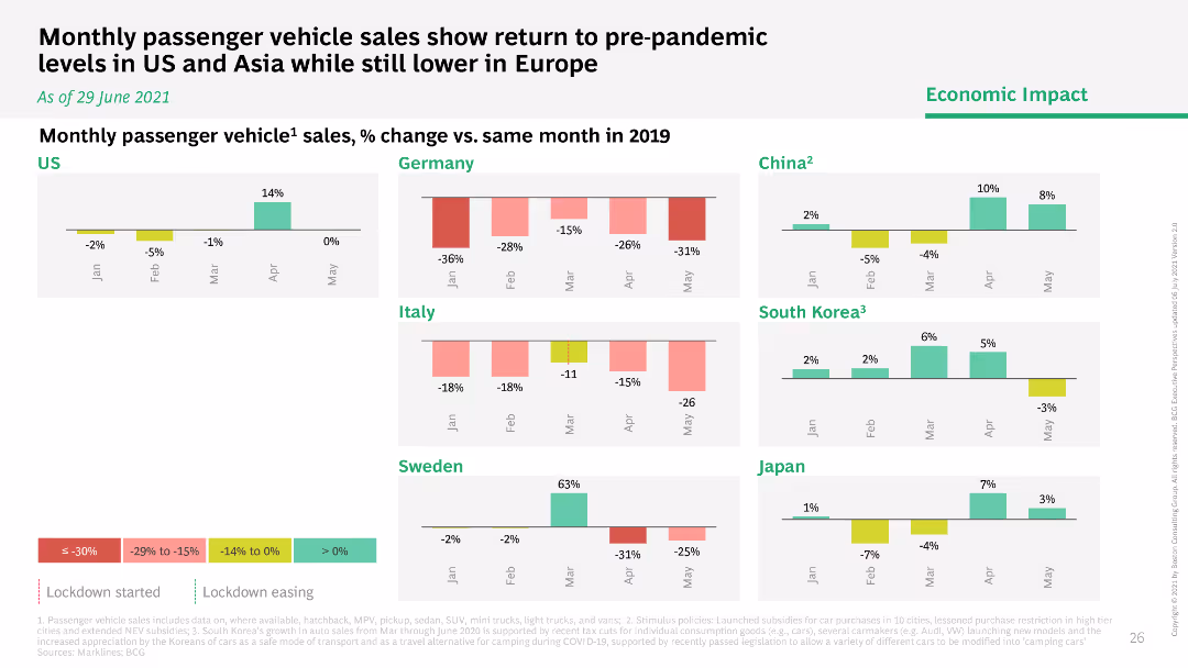
Column charts showing monthly passenger vehicle sales percentage change versus 2019 in different countries, with color-coded categories.
Market Analysis and Trends
Consumer Goods
Examines monthly passenger vehicle sales trends, indicating a return to pre-pandemic levels in the US and Asia, but slower recovery in Europe.
vehicle sales, pre-pandemic, US, Asia, Europe
Multiple Chart
BCG
Saved
Bubble chart showing venture capital investment trends in mobility platforms and transport technology from 2016 to 2019, with a comparison to AI investment.
Investment Analysis
Financial Services
Analyzes the trends in venture capital investments in mobility and transport technology, highlighting a decline in mobility investment and an increase in AI investment.
venture capital, mobility platforms, transport technology, AI
Mixed Chart
Roland Berger
Saved
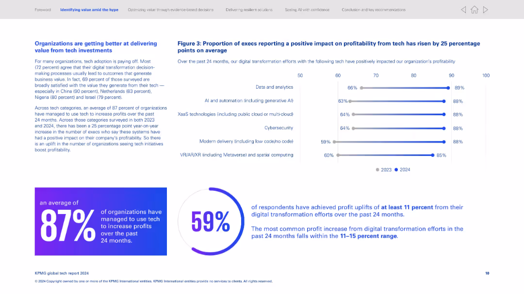
Split layout; left side has text-heavy content, right side has horizontal bar graph; bottom features two percentage callouts in circular design.
Strategic Planning
Technology & Software
Highlights how organizations are increasingly generating value from tech investments, especially digital transformation. Key statistics show 87% of organizations increased profits through tech, and 59% saw profit uplifts of at least 11%. The graph shows improved profitability across various tech domains from 2023 to 2024.
Digital transformation, profitability, AI adoption, data analytics, tech ROI, global survey, tech satisfaction, percentage uplift, cloud tech, VR/AR
Multiple Chart
KPMG
Saved
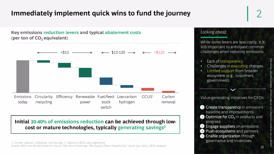
This slide contains a column chart showing key emission reduction levers and their abatement costs. It uses a gradient color scheme and detailed annotations to describe different abatement strategies and their potential impact.
Operational Efficiency
Energy & Utilities
The slide identifies key emissions reduction levers and typical abatement costs, suggesting that 30-40% of emissions reduction can be achieved through low-cost or mature technologies. It includes recommendations for CEOs on value-generating initiatives.
emissions reduction, abatement costs, strategies, low-cost technologies, CEO recommendations
Mixed Chart
BCG
Saved
Features a graph titled "Figure 7", a sidebar with additional text and headers, and a purple footer. The graph shows changes in skill importance over time.
Technology and Digital Transformation
Technology & Software
Highlights the evolving importance of various skills for science and engineering roles, implying a trend towards increasing value in creativity and social skills.
Skills Evolution, Science and Engineering, Data Analysis, Creativity, Social Skills
Single Chart
Accenture
Saved
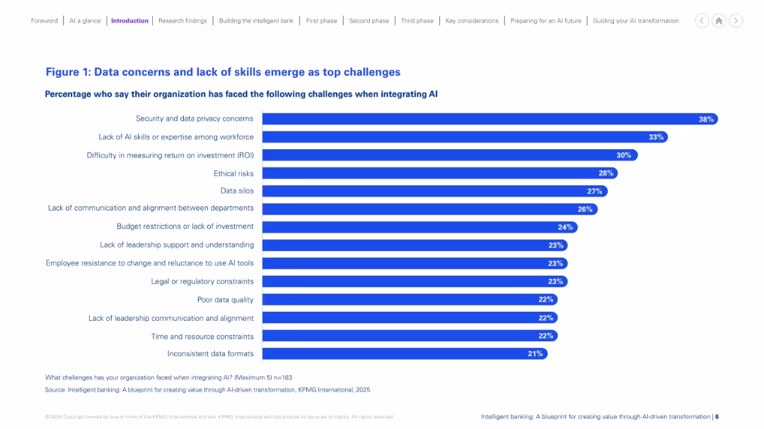
Horizontal bar chart layout on a white background, with bold blue bars and percentage values aligned to the right. Title and subtitle in blue, legend and source at bottom. Clean, structured, minimal visuals.
Risk Assessment and Management
Financial Services
The slide presents the top challenges organizations face when integrating AI. Security and data privacy concerns top the list, followed by lack of AI expertise, and difficulty measuring ROI. Additional barriers include ethical risks, data silos, and lack of leadership support. The data highlights common obstacles that hinder successful AI adoption in financial services.
AI challenges, data privacy, ROI, skills gap, risk, silos, investment, resistance
Single Chart
KPMG
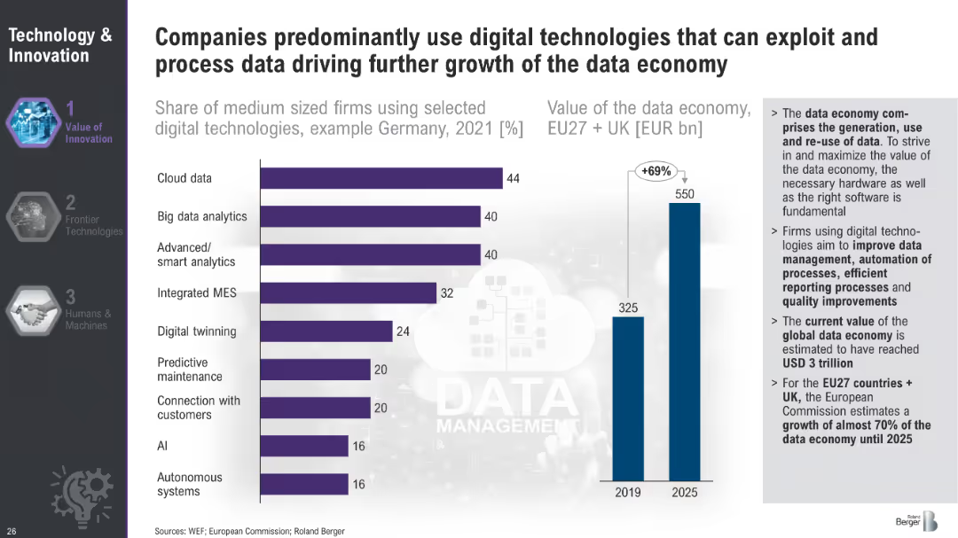
Saved
Bar chart showing the share of medium-sized firms using selected digital technologies in Germany in 2021 and a bar chart projecting the value of the data economy in the EU and UK from 2019 to 2025.
Technology and Digital Transformation
Technology & Software
This slide showcases the adoption of various digital technologies by medium-sized firms in Germany and projects the growth of the data economy in the EU and UK. It underscores the significance of digital technologies like cloud data and AI in driving economic value and efficiency.
Data Economy, Digital Technologies, Germany, EU
Multiple Chart
Roland Berger
Saved
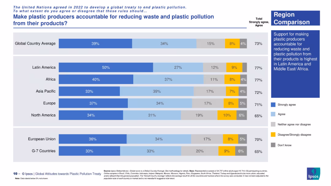
Regional horizontal stacked bar chart with consistent labeling and explanatory sidebar.
Regulatory and Compliance
Environmental Services & Sustainability
This slide aggregates regional support for producer accountability under a plastic treaty. Latin America and Africa show the highest support (77%), while North America and G7 countries lag behind.
global treaty, regional opinion, plastic regulation, corporate responsibility, Ipsos survey, accountability measures, environmental consensus
Mixed Chart
IPSOS
Saved
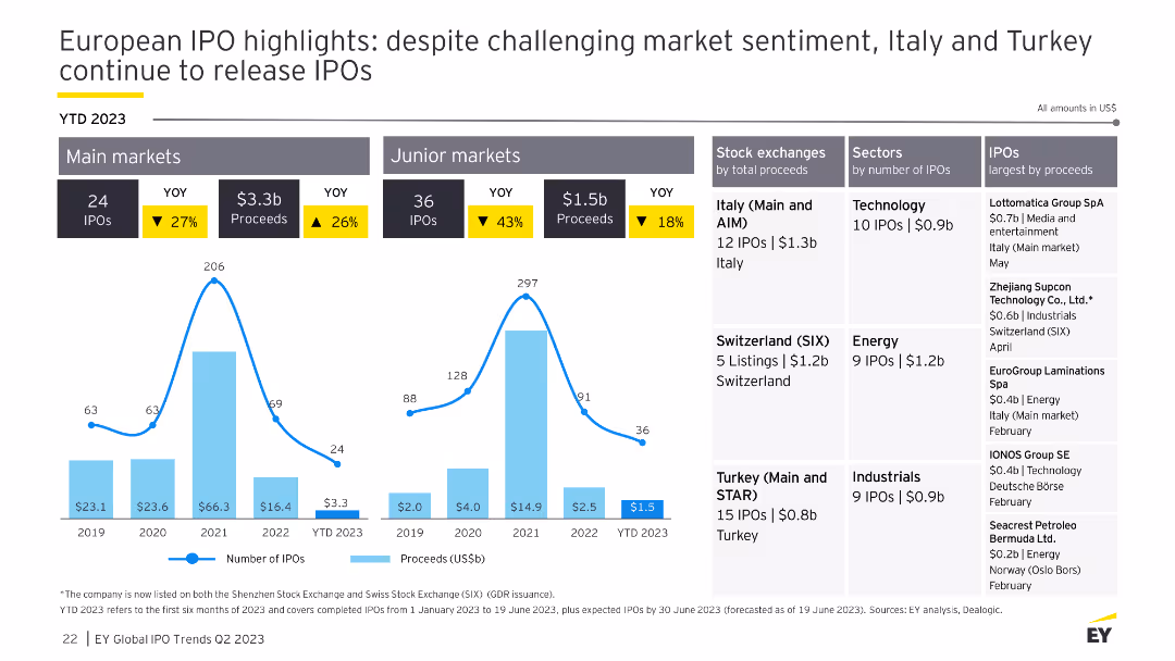
The slide includes column charts for IPO performance in main and junior markets, tables for stock exchanges and sectors, and highlights of the largest IPOs by proceeds.
Market Analysis and Trends
Financial Services
This slide examines the European IPO market, focusing on the challenging market sentiment and the performance of main and junior markets, with details on top exchanges, sectors, and notable IPOs.
IPO, Europe, market sentiment, financial
Multiple Chart
EY
Saved
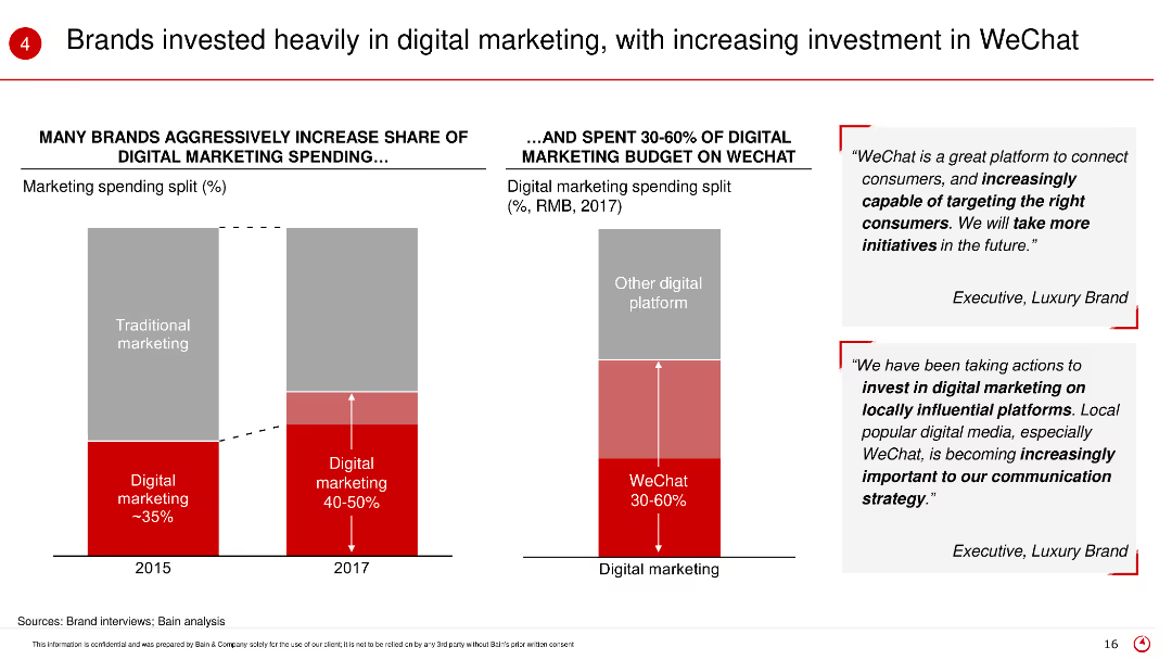
The slide shows bar charts comparing traditional and digital marketing spending in 2015 and 2017, and the proportion of digital marketing budget spent on WeChat. Text boxes include quotes from executives.
Market Analysis and Trends
Retail & E-commerce
This slide highlights the shift in marketing strategies among brands towards digital marketing, particularly emphasizing the significant investment in WeChat as a key platform for engagement.
Digital marketing, WeChat, marketing investment, traditional marketing, brand strategies
Multiple Chart
Bain
Saved
Contains a column chart comparing percentages of network budget spent on maintenance vs. modernization over four years.
Operational Efficiency
Telecommunications
Discusses changes in network spending focusing on the shift from maintenance to modernization, illustrating strategic network investments.
network modernization, budget allocation, operational efficiency, strategic investment, technology upgrades
Mixed Chart
Accenture
Saved
The slide features a detailed flowchart showing the possible routes for converting various feedstocks (animal waste, agricultural residues, MSW, forestry residues, algae, energy crops) into energy through conditioning, pretreatment, intermediates, conversion, and final product stages.
Technology and Digital Transformation
Energy & Utilities
This slide outlines the complex pathways for converting different types of biomass feedstocks into energy, illustrating the various conditioning, pretreatment, and conversion processes involved.
feedstocks, energy pathways, biomass, conversion, conditioning, pretreatment, intermediates, final product
Diagram
Kearney
Saved
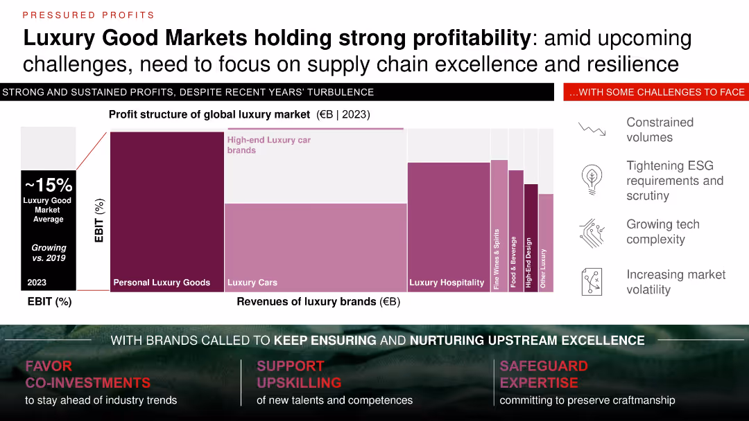
Waterfall bar chart and stacked segment comparison with icons outlining challenges; white background with dark red/maroon accent colors.
Industry Overview
Consumer Goods
Despite economic turbulence, luxury goods maintain ~15% EBIT, driven by high-end segments like cars and personal goods. Challenges include ESG regulations, tech complexity, and volatility. Emphasizes continued investment in supply chain resilience and upstream excellence to sustain performance.
luxury market, profitability, supply chain, ESG, resilience, EBIT, upstream, challenges
Mixed Chart
Bain
Saved
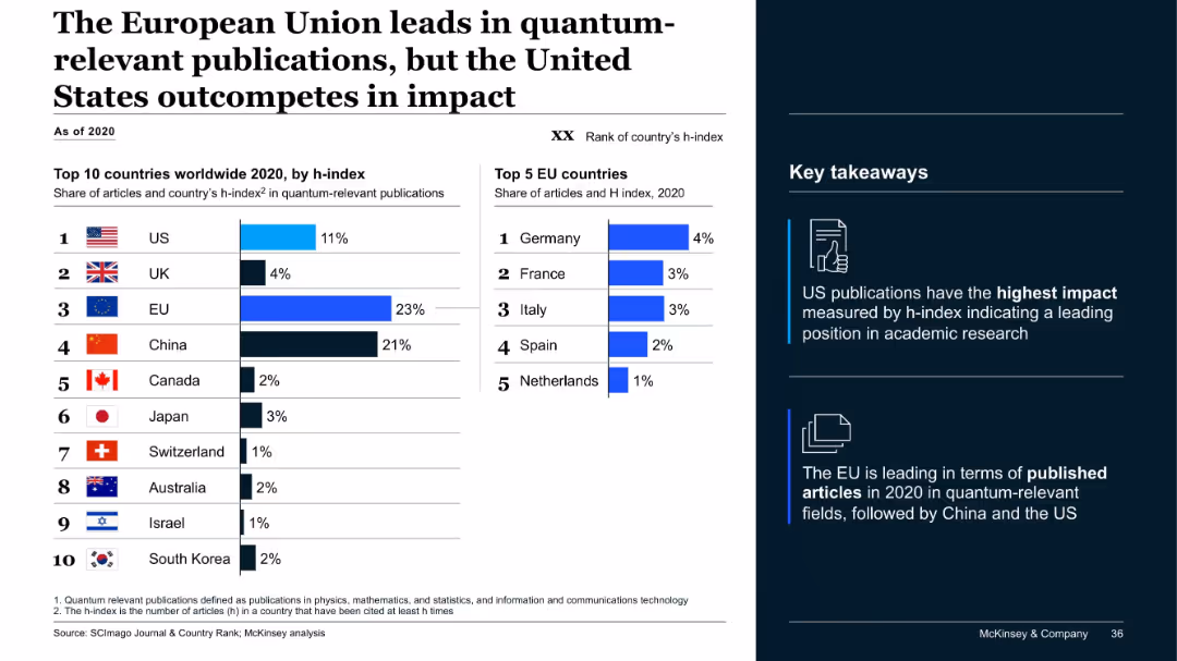
Dual-bar chart layout; left shows top 10 countries by h-index and share of articles, right shows top 5 EU countries; sidebar with icons and takeaways.
Industry Overview
Artificial Intelligence
The slide compares the global output of quantum-relevant academic publications. While the EU leads in publication volume, the US leads in impact, as measured by h-index. Key takeaways highlight regional strengths in both volume and quality.
quantum, h-index, publications, EU, US, research, impact, China, McKinsey, ranking
Mixed Chart
McKinsey
Saved
Previous
Next
If nothing, comes up, please save your slides first
Create a FREE account to continue browsing
Receive Instant Access to 1,000+ slides from companies like McKinsey, Google, and Goldman Sachs
First Name
Last Name
Email
Password
I agree to all
Terms & Privacy Policy
Thank you! Your submission has been received!
Oops! Something went wrong while submitting the form.
Have an account?
Sign in
Column Chart
Heatmap
Chevron
Org Chart
Infographic
Callouts
Timeline
List
Graphic
Picture
Process Flow
Diagram
Paragraph
Map
Table
Framework
Subtitle
Takeaway Box
Icon
Other Chart
Radar Chart
Waterfall Chart
Mekko Chart
Pie Chart
Scatter Plot
Line Chart
Bar chart
Bullet points