My Account
My Slides
Search by Category
Companies
Slide Type
Use Case
Industry
Pricing
Templates
View All Templates
Download Template Slides
✦ AI
AI Prompt Library
AI Search
Feedback
Login
Logout
Get Started
Browse all Slides
Browse all Slides
Create a FREE Account
Instant access to 1,000+ real slides from top companies like McKinsey, BCG, Goldman Sachs, Google and many more!
First Name
Last Name
Email
Password
I agree to all
Terms & Privacy Policy
Thank you! Your submission has been received!
Oops! Something went wrong while submitting the form.
Have an account?
Sign in
Saved Slides
Features a bar chart showing changes in podcast advertising investments by buy type (annual, quarterly, remnant) from 2019 to 2020.
Market Analysis and Trends
Media & Entertainment
Discusses a trend shift in podcast advertising investments moving from annual to more flexible remnant buys, reflecting market agility.
podcast advertising, investment trends, annual buys, remnant buys, 2019-2020
Single Chart
PwC/Strategy&
Saved
This slide presents two sets of bar graphs. On the left, bars represent the percentage of respondents planning to increase investments in technologies. On the right, bars show current monitoring of emerging technologies, such as "Next-gen computation" and "Metaverse and Web 3.0."
Investment Analysis
Technology & Software
The slide is designed to showcase investment trends in the digital core of businesses, highlighting areas like AI, automation, and cloud services. It also indicates the attention given to emerging technologies, useful for investors and businesses focusing on strategic technology advancements.
digital investment, AI, cloud services, emerging technology, business trends
Multiple Chart
Accenture
Saved
Features column charts comparing HR leaders' concerns over employees leaving due to weak benefits and the percentage of employees who would stay for the right financial package, emphasizing year-over-year increases.
Human Resources and Talent Management
Financial Services
Addresses the connection between financial benefits and employee retention, highlighting HR leaders' worries and employee preferences, valuable for retention strategy discussions.
Employee Retention, Financial Benefits, HR Concerns, Bar Graphs, Year-over-Year
Multiple Chart
Goldman Sachs
Saved
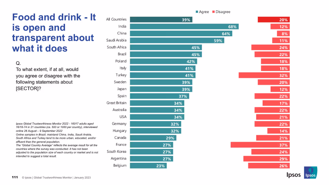
Same format as previous: horizontal bar chart; agree/disagree split by country, left-side question text.
Market Analysis and Trends
Consumer Goods
The slide presents survey results on whether people believe the food and drink sector is open and transparent. Countries are listed with corresponding agreement and disagreement levels. High transparency perception is concentrated in India and China.
transparency, openness, food industry, survey, global data, consumer trust, Ipsos, public opinion, chart, comparison
Mixed Chart
IPSOS
Saved
This slide features pie charts and bar graphs showcasing various investment assets within the firm. The color scheme differentiates between consumer & wealth management, with clear labeling for each section.
Financial Performance
Financial Services
The slide provides an overview of the firm's and clients' investment assets, detailing the division between institutional and wealth management, as well as the specific values in loans and deposits.
investment, assets, wealth management, loans, deposits
Multiple Chart
Goldman Sachs
Saved
Displays a column chart indicating the median CO2 capture capacities of projects (in Mtpa) by region and status (in development, operational, completed, cancelled).
Strategic Planning
Energy & Utilities
Projects significant growth in the size of CCUS projects globally. Provides insights into the future capacities and development of various regions' CCUS initiatives.
CCUS, project size, growth, future development, CO2 capture, regional analysis, strategic planning, trends
Mixed Chart
Kearney
Saved
Column charts showing foreign investment projects in pharmaceuticals and medical devices from 2018-2022.
Market Analysis and Trends
Healthcare & Pharmaceuticals
This slide discusses trends in foreign investments in the health sector, noting a slowdown but still above pre-COVID-19 levels.
pharmaceuticals, healthsciences, investment, Europe, trends
Mixed Chart
EY
Saved
This slide includes a text section on the left and a column chart on the right showing cumulative percentage timing for engaging with the metaverse by industry.
Market Analysis and Trends
Technology & Software
The content addresses the increasing interest of various industries in engaging with the metaverse, including challenges and concerns faced by brands in adopting metaverse technologies. A supporting column chart shows engagement timing by industry.
Metaverse, engagement, industries, technology, challenges
Mixed Chart
Deloitte
Saved
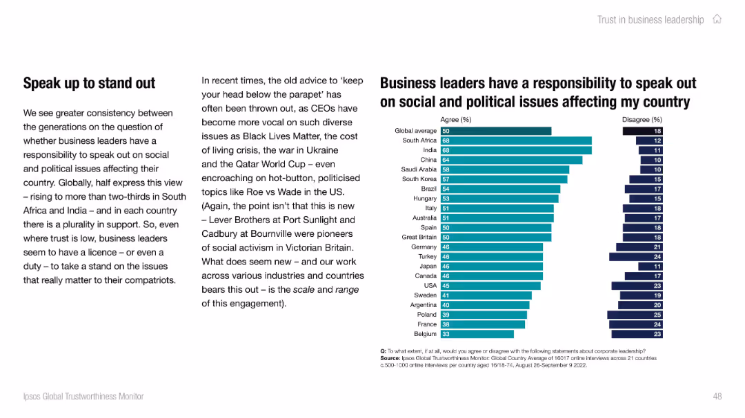
Left text explains trend toward corporate activism; right-side bar chart shows agreement levels across countries. Uses teal and navy for agree/disagree.
Strategic Planning
Professional Services
Illustrates global attitudes about business leaders’ responsibility to address social and political issues. Over two-thirds in South Africa and India agree with this role. Slide notes the growing visibility and expectation of activism among CEOs across regions.
corporate activism, leadership, Ipsos, social issues, responsibility, global sentiment
Mixed Chart
IPSOS
Saved
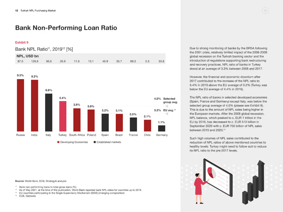
The slide features a column chart comparing the bank NPL ratios across various countries for 2019, with explanatory text on the significance and implications of these ratios.
Risk Assessment and Management
Financial Services
This slide presents a comparative analysis of bank non-performing loan ratios across different countries, emphasizing the significance and implications for the Turkish market.
NPL Ratio, Comparative Analysis, Turkey, International Comparison, Risk Assessment
Mixed Chart
PwC/Strategy&
Saved
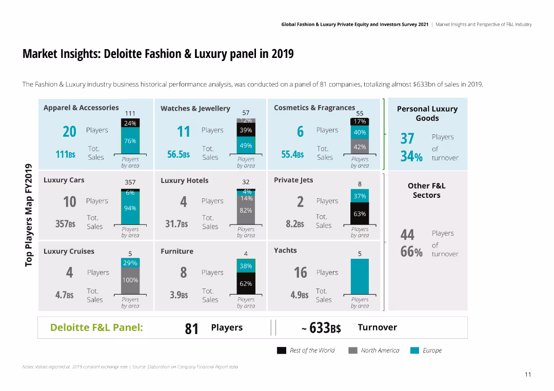
The slide is visually dense with multiple sections of bar charts, detailing the performance of various sectors within the fashion and luxury industry.
Market Analysis and Trends
Retail & E-commerce
Provides an analysis of the fashion and luxury market in 2019, including sales data across different sectors like apparel, watches, and personal luxury goods.
fashion, luxury, market analysis, retail, e-commerce, apparel, watches, sales data
Multiple Chart
Deloitte
Saved
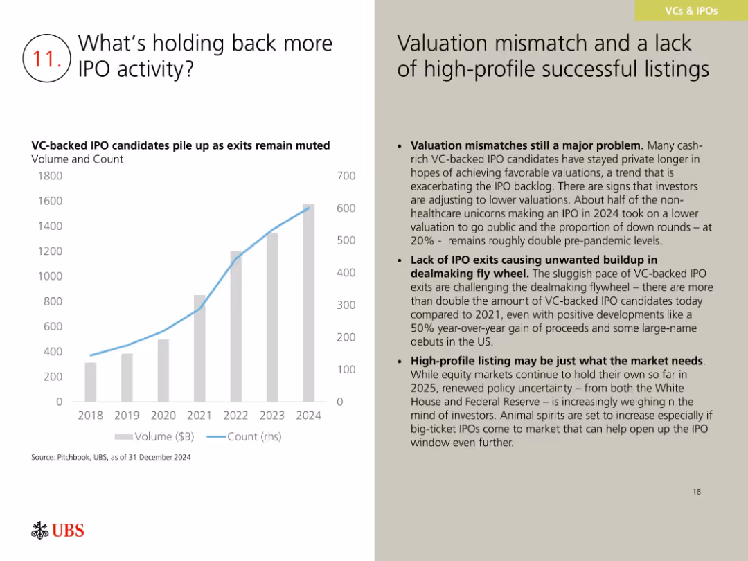
Bar and line chart showing VC-backed IPO candidate volume and count; right side has text on challenges and implications.
Market Analysis and Trends
Financial Services
This slide discusses reasons for a sluggish IPO market, citing valuation mismatches, lack of high-profile listings, and increased VC-backed company volume. While exits are slow, positive 2024 trends and investor anticipation may help re-open the IPO window in 2025.
IPO backlog, valuation mismatch, VC exits, dealmaking, 2024 outlook
Mixed Chart
UBS
Saved
Contains infographics detailing e-money statistics and competitive landscape. It includes graphical representation of active e-wallets and transaction volumes.
Technology and Digital Transformation
Financial Services
Details the growth and competitive landscape of the e-payments sector in the Philippines, highlighting significant investments and transactions.
e-payments, digital, Philippines, transactions, growth
Table
Deloitte
Saved
Includes a mix of text and tables detailing investment opportunities in wind energy, with icons for different types of capital investors.
Investment Analysis
Energy & Utilities
Discusses investment opportunities in wind energy project development in SEA, focusing on types of projects and stages of development.
wind energy, SEA, investment opportunities, project development, energy transition
Header Vertical
Bain
Saved
The slide features bar charts showing risks and opportunities percentages. Text boxes detail risks and opportunities, and a summary box highlights key takeaways.
Market Analysis and Trends
Industrial & Manufacturing
It shows survey results indicating a need for repositioning in industrial products functions due to digitalization, with focus on controlling, procurement, and logistics.
Digitalization, industrial products, risks, opportunities, controlling, procurement, logistics
Multiple Chart
Roland Berger
Saved
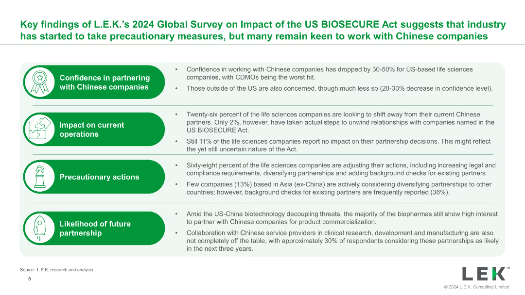
The slide uses bullet points and icons to present key findings from the 2024 Global Survey on the impact of the US BIOSECURE Act, with clear headings and supporting details.
Market Analysis and Trends
Healthcare & Pharmaceuticals
The slide summarizes key findings on the impact of the US BIOSECURE Act, highlighting changes in confidence, operational impacts, precautionary actions, and future partnership likelihoods.
BIOSECURE Act, survey, findings, impact, healthcare
Table
LEK
Saved
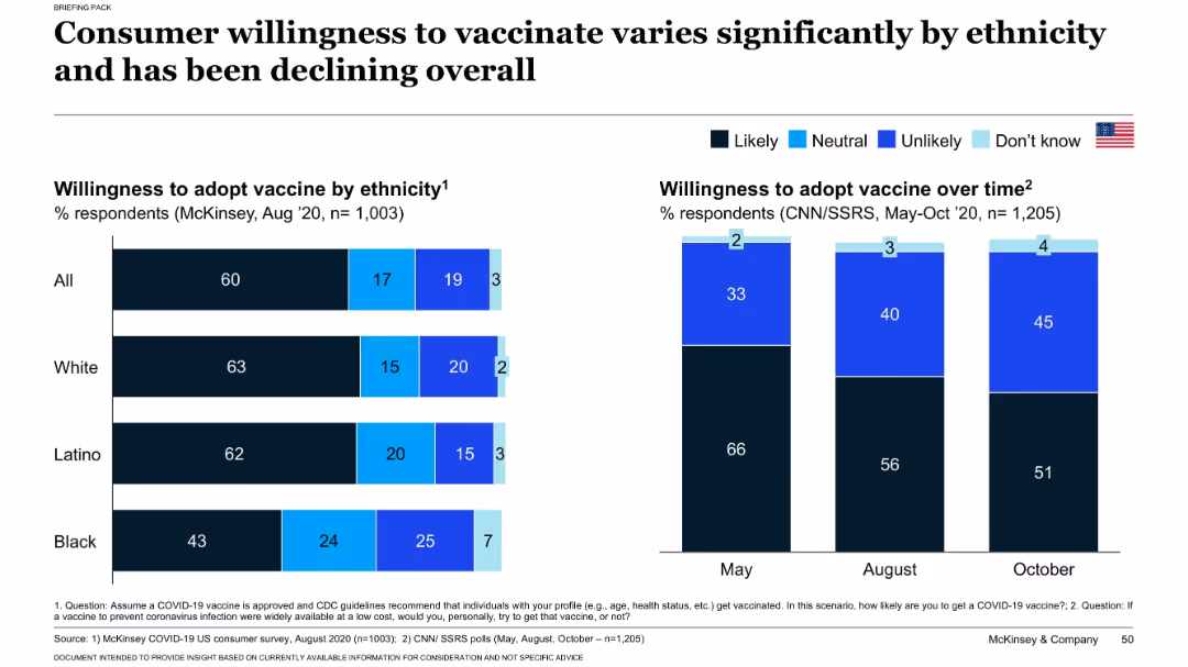
Split chart layout: left side shows willingness by ethnicity; right side shows willingness trend from May to Oct 2020.
Customer and Market Segmentation
Healthcare & Pharmaceuticals
This slide explores how willingness to receive a COVID-19 vaccine varies across ethnic groups and over time. It shows a decline in vaccine acceptance from May to October 2020 and highlights differences in likelihood to vaccinate among Black, Latino, and White populations. Insights support targeted communication strategies.
vaccine hesitancy, ethnicity, public opinion, COVID-19, trends, adoption
Multiple Chart
McKinsey
Saved
Graphical representation of deskless workers in various industries, icons for each sector, and a high-impact indicator.
Technology and Digital Transformation
Technology & Software
Overview of industries with a high proportion of non-desk workers potentially affected by AR/VR technologies, emphasizing immersive reality's scalability in these sectors.
Deskless workers, industries, AR, VR, immersive reality, scalability
Graphic
McKinsey
Saved
Contains column charts, textual information, and bullet points highlighting key metrics, with a dashed outline box.
Financial Performance
Financial Services
Slide shows strong performance and inflows in asset and wealth management, with a focus on alternatives fundraising surpassing targets. Likely used in investor relations or financial strategy meetings.
Fundraising, Asset Management, Performance, Inflows
Mixed Chart
Goldman Sachs
Saved
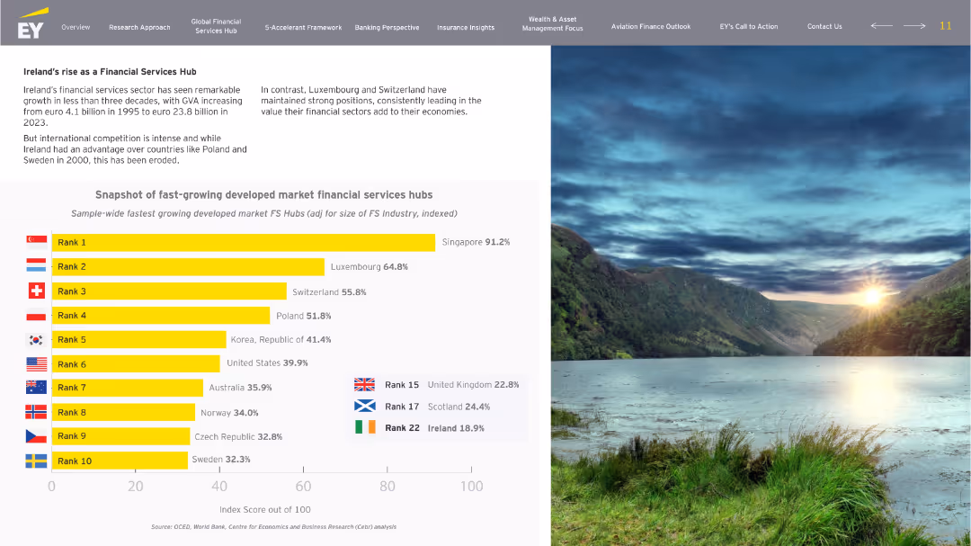
Left-aligned layout with title and narrative text at the top-left, a bar chart comparison occupying the center, and a full scenic image on the right side. Clear use of flags and rank indicators in the chart.
Industry Overview
Financial Services
This slide highlights the growth trajectory of Ireland’s financial services sector, comparing it to other developed market financial hubs. It notes Ireland’s early advantage and how other countries like Singapore, Luxembourg, and Switzerland have emerged as leaders. A chart ranks countries based on the indexed size-adjusted FS growth.
Ireland, financial services, growth, rankings, GVA, competition, hubs
Single Chart
EY
Saved
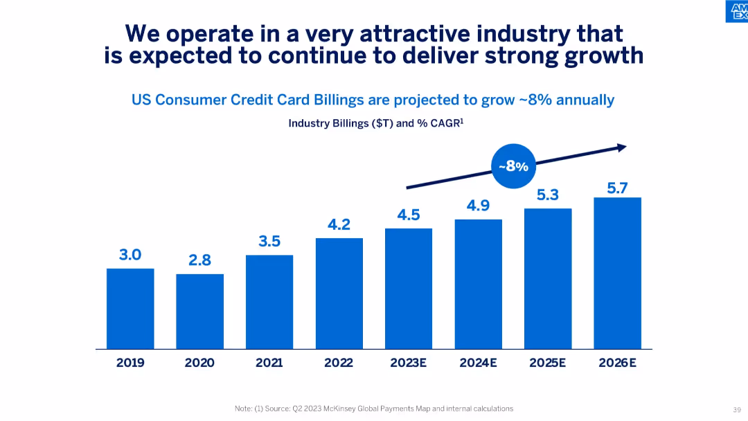
Single-column bar chart showing historical and projected US credit card billings with CAGR annotation.
Market Analysis and Trends
Financial Services
Projects strong 8% annual growth in US consumer credit card billings through 2026, indicating favorable industry trends and long-term opportunity for growth.
credit card industry, growth forecast, CAGR, billing volume, market trends, consumer credit
Single Chart
McKinsey
Saved
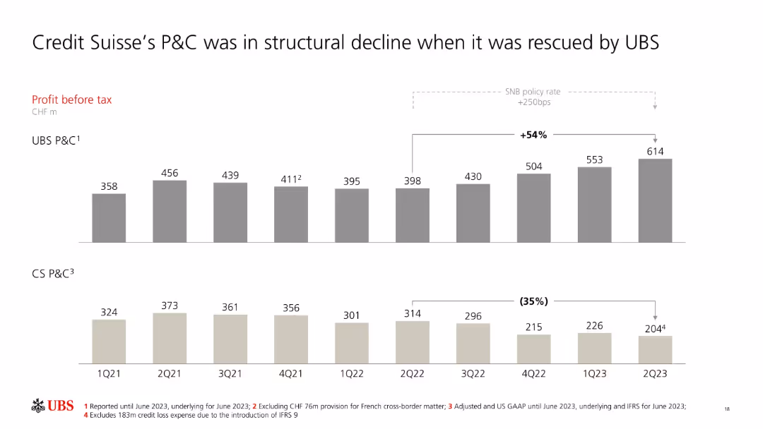
Dual bar chart comparing UBS and CS P&C profit before tax over 9 quarters.
Client Case Studies
Financial Services
The chart shows diverging performance trends between UBS and CS in their P&C segments. UBS’s profits rose steadily while CS experienced a 35% decline, emphasizing the rationale for UBS’s acquisition and integration efforts.
UBS, CS, profit before tax, P&C, structural decline, acquisition, integration, financial performance
Multiple Chart
UBS
Saved
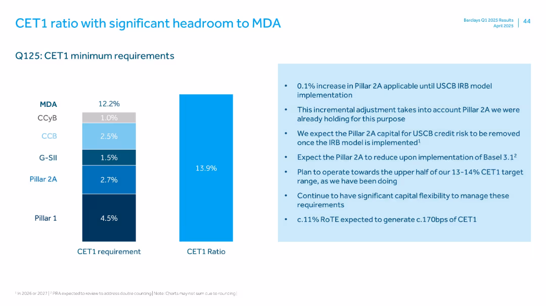
Two vertical bar charts side by side showing CET1 requirements vs. actual ratio; explanatory bullet points on the right in a light blue box.
Financial Performance
Financial Services
Shows Barclays’ CET1 ratio of 13.9% in Q1 2025, above the 12.2% minimum requirement. Provides context on Pillar 2A adjustment and flexibility under Basel 3.1. Emphasizes strong capital positioning and the bank’s ability to operate at the upper end of the target range.
CET1 ratio, capital buffer, Basel 3.1, Pillar 2A, financial strength, Barclays, Q1 2025
Mixed Chart
Barclays
Saved
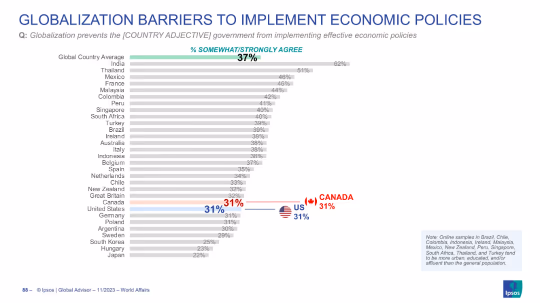
Horizontal bar chart showing agreement with globalization limiting policy implementation
Regulatory and Compliance
Government & Public Sector
The slide reveals that 37% globally believe globalization limits effective economic policy. Canada and the US are both at 31%, below the global average.
globalization, economic policy, governance, international influence, regulation
Single Chart
IPSOS
Saved
This slide features a line graph with six differently colored dashed lines representing various countries, plotted against time from February 2020 to October 2021. The graph is titled "Commute volume adjustment, indexed to January 2020". On the left side, there is a bullet-pointed section titled "Ride-hailing is the preferred transport option".
Market Analysis and Trends
Transportation & Logistics
The slide provides a comparative analysis of the adjustments in commute volumes in response to persistent lockdowns across different countries, highlighting the growing preference for ride-hailing services as a safer alternative during the pandemic, using indexed data from Google Mobility Report and Kantar SEA e-Conomy Research 2021.
pandemic, ride-hailing, transport, commute adjustment, lockdown, safety, Southeast Asia, trend analysis, mobility report
Mixed Chart
Bain
Saved
Previous
Next
If nothing, comes up, please save your slides first
Create a FREE account to continue browsing
Receive Instant Access to 1,000+ slides from companies like McKinsey, Google, and Goldman Sachs
First Name
Last Name
Email
Password
I agree to all
Terms & Privacy Policy
Thank you! Your submission has been received!
Oops! Something went wrong while submitting the form.
Have an account?
Sign in
Column Chart
Heatmap
Chevron
Org Chart
Infographic
Callouts
Timeline
List
Graphic
Picture
Process Flow
Diagram
Paragraph
Map
Table
Framework
Subtitle
Takeaway Box
Icon
Other Chart
Radar Chart
Waterfall Chart
Mekko Chart
Pie Chart
Scatter Plot
Line Chart
Bar chart
Bullet points