My Account
My Slides
Search by Category
Companies
Slide Type
Use Case
Industry
Pricing
Templates
View All Templates
Download Template Slides
✦ AI
AI Prompt Library
AI Search
Feedback
Login
Logout
Get Started
Browse all Slides
Browse all Slides
Create a FREE Account
Instant access to 1,000+ real slides from top companies like McKinsey, BCG, Goldman Sachs, Google and many more!
First Name
Last Name
Email
Password
I agree to all
Terms & Privacy Policy
Thank you! Your submission has been received!
Oops! Something went wrong while submitting the form.
Have an account?
Sign in
Saved Slides
Includes three line graphs for 'Historical Yields' and 'Correlation of S&P 500 Stocks', plus column chart for 'Current Yields' and a line graph for 'CBOE Market Volatility Index (VIX)'. The slide has a clear separation of sections, with color-coded elements and succinct axis labeling.
Investment Analysis
Financial Services
Targeting investors, this slide analyzes dividend yields and market volatility, contrasting historical and current data. It highlights yield trends and the correlation within the S&P 500, alongside the VIX trend, crucial for understanding market stability and potential investment risks.
Dividends, Yields, Volatility, S&P 500, VIX
Multiple Chart
Morgan Stanley
Saved
Shows a series of column charts detailing the year-to-date growth of mobile banking apps in different Southeast Asian countries, with a clear legend for reference.
Market Analysis and Trends
Financial Services
Examines the increase in app engagement among leading financial institutions across Southeast Asia, detailing user growth percentages by country.
Mobile Banking, User Growth, Financial Institutions, SEA
Single Chart
Bain
Saved
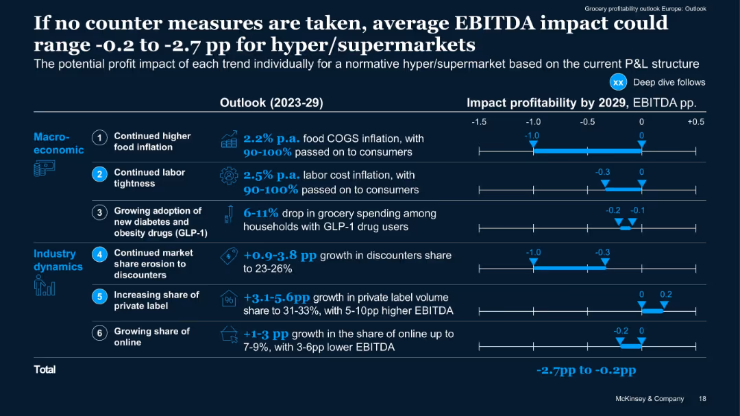
Horizontal bar impact chart quantifying EBITDA effect per trend from 2023–2029. Blue shaded bars show range.
Risk Assessment and Management
Retail & E-commerce
Quantifies potential downside to EBITDA if current trends continue without mitigation. Segments macroeconomic vs industry dynamics and provides projected ranges per trend. Total potential impact: -2.7pp to -0.2pp EBITDA.
EBITDA risk, impact forecast, industry dynamics, cost drivers, 2029
Mixed Chart
McKinsey
Saved
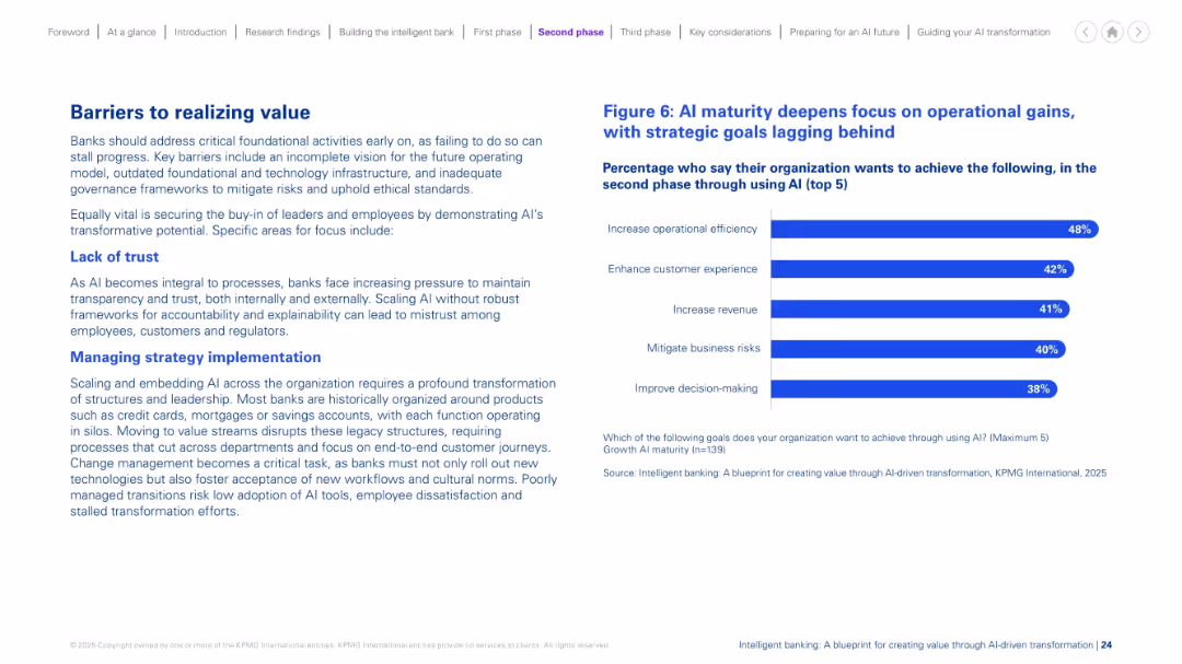
Left-aligned paragraphs describe challenges. Right side has a bar chart listing top AI goals. Balanced layout with headers in blue and clean structure.
Risk Assessment and Management
Financial Services
This slide discusses key obstacles banks face in AI scaling, such as lack of trust and difficulty managing strategic change. It emphasizes transparency, leadership alignment, and breaking down legacy silos. A chart shows the main goals during AI maturity, with a continued focus on efficiency, experience, and revenue.
AI barriers, strategy, trust, legacy systems, maturity, change management
Mixed Chart
KPMG
Saved
The slide compares the emission reduction targets and timelines for key automotive and construction industry companies, with data on their green steel demand shares.
Regulatory and Compliance
Environmental Services & Sustainability
This slide examines how emission reduction targets in the automotive and construction industries are driving demand for low-CO2 steel, with comparative data on target timelines and demand shares.
Emission reduction, low-CO2 steel, automotive, construction, targets, demand drivers, green steel, regulatory
Single Chart
BCG
Saved
Slide features a vertical bar chart showing percentages of anticipated workforce shortages in various operational areas such as retail, supply chain, and IT.
Human Resources and Talent Management
Retail & E-commerce
This slide predicts significant workforce shortages in retail operations and supply chain, highlighting urgent areas for strategic human resource planning in the industry.
workforce, shortage, retail, supply chain, operations, human resources, strategic planning, anticipates
Single Chart
Deloitte
Saved
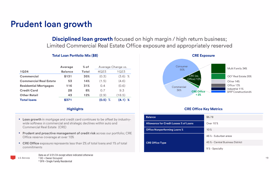
The slide features a table with loan portfolio mix and average changes, a pie chart of CRE exposure, and text highlights on loan growth and credit risk management.
Financial Performance
Financial Services
The slide discusses prudent loan growth, focusing on high-margin business, limited CRE office exposure, and proactive credit risk management, with detailed data on loan portfolio changes.
Loan, Growth, Portfolio, CRE, Risk, Management
Multiple Chart
Barclays
Saved
This slide contains column charts comparing the distribution of survey respondents across various industries from 2018 to 2020. It uses a color gradient to differentiate industries and provides percentage labels for clarity.
Market Analysis and Trends
Professional Services
Compares industry distribution of survey respondents in Europe from 2018 to 2020, showing shifts in participant demographics across sectors like technology, financial services, and consumer markets. Useful for understanding industry-specific trends in survey data.
survey data, industry distribution, Europe, 2018-2020
Multiple Chart
PwC/Strategy&
Saved
Depicts various types of sensors and input devices required for immersive-reality technologies, accompanied by descriptive text.
Technology and Digital Transformation
Technology & Software
Details the types of technologies and inputs that will enhance immersive-reality experiences, including on-body sensors and haptics.
sensors, haptics, immersive reality, technology peripherals, input devices
Header Vertical
McKinsey
Saved
This slide features two graphs. The left graph is a bar chart showing the NPV of expected losses in various industries over 10 years. The right graph, also a bar chart, displays the frequency of operational disruptions by duration.
Risk Assessment and Management
Financial Services
The slide provides an analysis of the financial impact of operational disruptions across various industries, highlighting the percentage of losses relative to annual EBITDA and the frequency of such disruptions.
disruptions, EBITDA, industry, financial impact, operation
Multiple Chart
McKinsey
Saved
Contains icons and statistics related to Fintech, Buy Now Pay Later, and the Rental industry, with projected market values and growth rates.
Market Analysis and Trends
Financial Services
Discusses Experian's growth opportunities in various emerging sectors like Fintech and Buy Now Pay Later, highlighting the potential for innovation and market expansion.
Fintech, Buy Now Pay Later, market growth, innovation, Experian
Header Vertical
Barclays
Saved
A clean layout with multiple text boxes summarizing key takeaways, including advertiser objectives, channel measurement, and data challenges. Each box contains a brief summary and a small icon representing the concept.
Strategic Planning
Media & Entertainment
This slide provides key takeaways on brand awareness, measurement, and data strategies. It emphasizes the importance of leveraging multiple channels and addressing data challenges to enhance marketing effectiveness.
Takeaways, Strategy, Brand, Measurement, Data
Multiple Chart
Nielsen
Saved
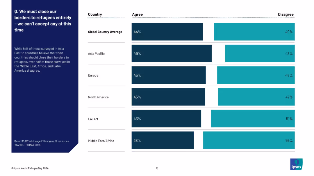
Similar layout to 19901; left text explanation with a regional breakdown bar chart on the right
Market Analysis and Trends
Government & Public Sector
The slide focuses on regional views of closing borders to refugees. Asia Pacific has the highest agreement rate, while Middle East/Africa and LATAM are more opposed. It complements slide 19902 by summarizing views at the regional rather than country level.
refugee policy, regional attitudes, border control, Ipsos, regional breakdown, public opinion, immigration
Mixed Chart
IPSOS
Saved
Uses a pie chart to display the composition of a loan book across different banking divisions and sectors.
Investment Analysis
Financial Services
Presenting a comprehensive view of the loan book composition, this slide is instrumental for investors and financial analysts. It breaks down the portfolio by sectors such as residential mortgages and corporate banking, providing insights into risk diversification, loan exposure, and strategic investment opportunities within the banking industry.
Loan Portfolio, Banking, Investment Analysis, Risk Diversification, Sector Breakdown
Mixed Chart
Deutsche Bank
Saved
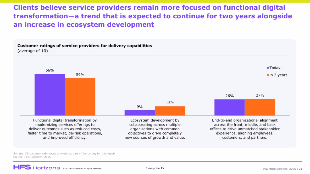
Bar graph comparing “Today” vs “In 2 Years” sentiment; three focus areas; explanatory text at bottom.
Customer and Market Segmentation
Financial Services
The slide presents survey data on clients’ current and expected focus areas for service providers. The data shows a shift from heavy focus on functional digital transformation to increased attention on ecosystem development and organizational alignment. It captures client sentiment on the delivery capabilities expected over the next two years.
Client ratings, delivery, transformation, ecosystem, efficiency, stakeholder alignment
Single Chart
EY
Saved
Contains a table comparing performance targets across several years with headers and rows for different banking services, such as 'Business Banking' and 'Card Services'.
Financial Performance
Financial Services
This slide showcases JP Morgan's performance targets for different sectors within consumer and community banking, reflecting past data and future outlooks. Useful in presenting measurable objectives to investors or stakeholders.
Performance Targets, Banking, Forecast, ROE, Net Charge-Off Rate
Table
JP Morgan
Saved
Contains check marks, text boxes, icons in a three-step outline. Green color scheme dominant.
Technology and Digital Transformation
Technology & Software
Explains the three-step approach to data-led customer engagement using the SHoP framework.
SHoP, framework, customer engagement, CMOs, maturity
Vertical Flow
BCG
Saved
The slide has a large word cloud in the background with key social issues and three key data points highlighted in red regarding brand preferences among luxury customers.
Market Analysis and Trends
Consumer Goods
Highlights the importance of social responsibility to younger luxury customers, emphasizing a preference for brands that demonstrate social engagement.
social responsibility, luxury brands, consumer preferences, millennials, brand loyalty
Mixed Chart
Bain
Saved
The slide shows a complex layout with multiple circular diagrams and infographics on business diversification and global presence.
Market Analysis and Trends
Financial Services
Designed to demonstrate the company's diversification across regions, staff distribution, and business mix over time. Suited for presenting to investors or during annual meetings.
Diversification, Global Presence, Annuity, Business Mix, Staff Distribution
Multiple Chart
Morgan Stanley
Saved
This slide shows a mix of bar charts, detailing financial revenues and global operation regions of companies.
Financial Performance
Financial Services
It details percentages of company revenues and the geographical distribution of operations, providing a financial overview and global footprint, useful for financial and regional market analysis.
revenues, global, companies, financial, market, analysis, distribution, operations
Multiple Chart
Deloitte
Saved
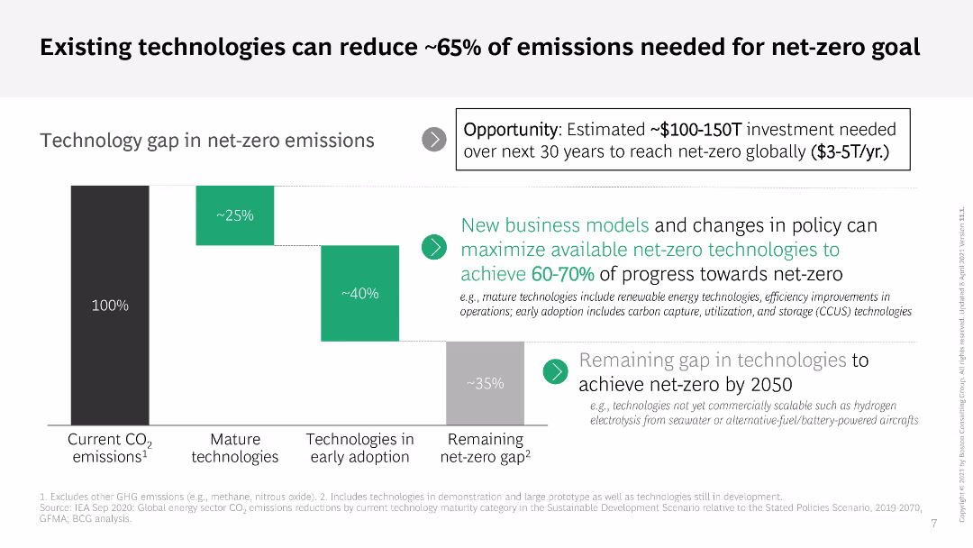
The slide includes a column chart and a text box detailing the technology gap in achieving net-zero emissions. It uses a gradient color scheme to show the progress and remaining gap, with additional explanatory text on the side.
Technology and Digital Transformation
Environmental Services & Sustainability
The slide presents the role of existing technologies in achieving about 65% of the emissions reduction required for the net-zero goal. It highlights investment opportunities and the need for new business models and policy changes.
net-zero, emissions reduction, technology, investment, policy
Mixed Chart
BCG
Saved
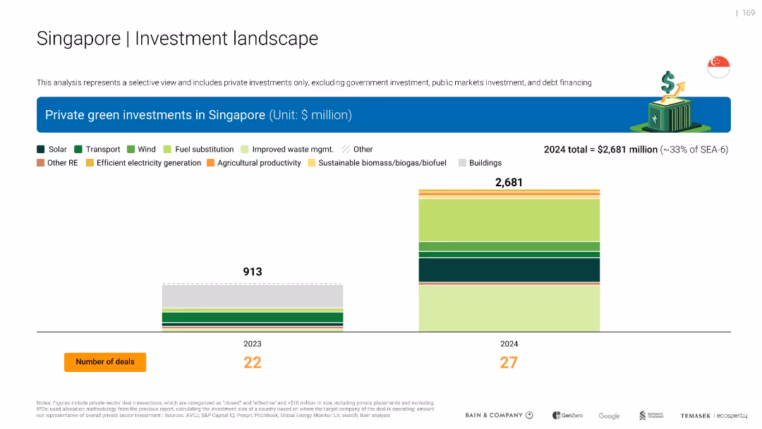
Two bar charts showing private green investments in Singapore for 2023 and 2024 by multiple categories including solar, transport, waste, biomass, etc.
Investment Analysis
Environmental Services & Sustainability
Illustrates a dramatic increase in Singapore’s private green investments from $913M in 2023 to $2.68B in 2024. Includes sector breakdowns and number of deals (22 in 2023, 27 in 2024).
Singapore, investments, biomass, transport, solar, 2024, deals, sectors
Single Chart
Bain
Saved
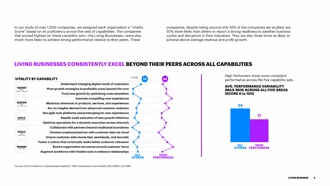
The slide features a line chart comparing 'Vitality by Capability' scores for all companies versus high performers. It includes detailed bullet points and a small column chart showing performance.
Financial Performance
Industrial & Manufacturing
The slide demonstrates how high-performing businesses excel in various capabilities compared to their peers, with visual data showing scores and performance variability.
vitality, capabilities, performance, high performers, comparison, data
Mixed Chart
Accenture
Saved
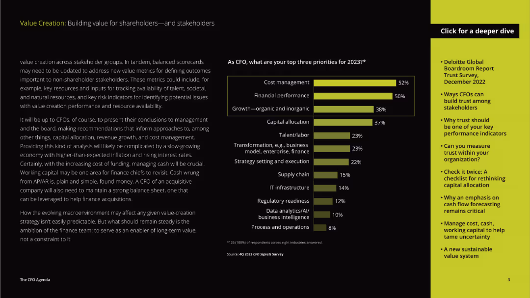
The layout includes a detailed paragraph on the left and a vertical column chart on the right. The text discusses priorities for CFOs in 2023, while the chart visualizes the top priorities.
Strategic Planning
Professional Services
The slide discusses the priorities of CFOs for the year 2023, focusing on cost management, financial performance, and growth, emphasizing the evolving role of CFOs in strategic decision-making.
priorities, CFOs, cost management, financial performance, growth, strategic planning, value creation, stakeholders, 2023
Mixed Chart
Deloitte
Saved
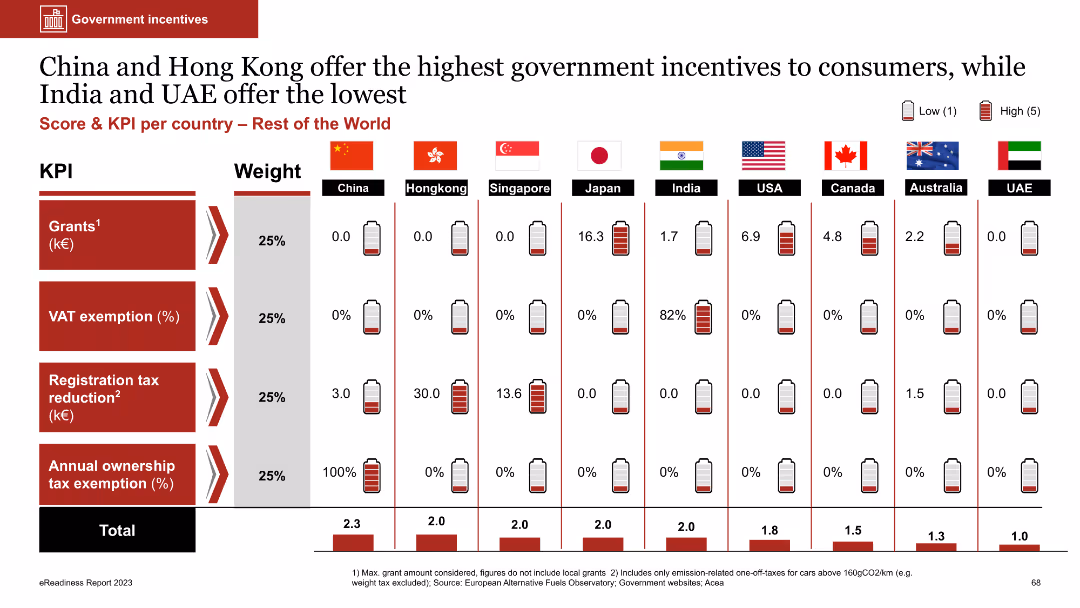
Column chart comparing government incentives across countries; dense with numerical data and battery icons
Market Analysis and Trends
Government & Public Sector
The slide compares government incentives for consumers across various countries using KPIs like grants, VAT exemptions, and tax reductions. China and Hong Kong offer the highest incentives, while India and UAE offer the lowest
government incentives, grants, VAT exemption, tax reduction, comparative analysis
Multiple Chart
PwC/Strategy&
Saved
Previous
Next
If nothing, comes up, please save your slides first
Create a FREE account to continue browsing
Receive Instant Access to 1,000+ slides from companies like McKinsey, Google, and Goldman Sachs
First Name
Last Name
Email
Password
I agree to all
Terms & Privacy Policy
Thank you! Your submission has been received!
Oops! Something went wrong while submitting the form.
Have an account?
Sign in
Column Chart
Heatmap
Chevron
Org Chart
Infographic
Callouts
Timeline
List
Graphic
Picture
Process Flow
Diagram
Paragraph
Map
Table
Framework
Subtitle
Takeaway Box
Icon
Other Chart
Radar Chart
Waterfall Chart
Mekko Chart
Pie Chart
Scatter Plot
Line Chart
Bar chart
Bullet points


![Companies of all sizes are well represented, with 44% of respondents having at least $5 billion in revenues and 16% having at least $25 billion in revenues [Figure 2]](https://cdn.prod.website-files.com/654e70fb59937215cac87b19/67036878374598b495385644_AqX5nzyZqdspxMeMSTfCTYwMbcTmkLrygIJ4YSzzGtc.avif)