My Account
My Slides
Search by Category
Companies
Slide Type
Use Case
Industry
Pricing
Templates
View All Templates
Download Template Slides
✦ AI
AI Prompt Library
AI Search
Feedback
Login
Logout
Get Started
Browse all Slides
Browse all Slides
Create a FREE Account
Instant access to 1,000+ real slides from top companies like McKinsey, BCG, Goldman Sachs, Google and many more!
First Name
Last Name
Email
Password
I agree to all
Terms & Privacy Policy
Thank you! Your submission has been received!
Oops! Something went wrong while submitting the form.
Have an account?
Sign in
Saved Slides
The slide has a text box with key recommendations, each accompanied by a relevant icon. The background is green with white text.
Strategic Planning
Professional Services
The slide offers strategic recommendations for marketers, emphasizing consumer trust, the power of influencers, and brand safety in their marketing strategies.
recommendations, marketers, strategy, influencers, brand safety
Header Vertical
Nielsen
Saved
Bar chart with horizontal country-by-country comparisons, color-coded by response category; historical comparison columns on right.
Risk Assessment and Management
Government & Public Sector
This slide reports on agreement with halting immigration, with 43% globally in favor. There is significant variation between countries—Türkiye and India show high support, while Japan and South Korea show low. The slide suggests immigration remains a polarizing issue globally, tied to national identity, economic concerns, and political narratives.
immigration, nationalism, identity, population, politics, Ipsos, opinion, integration
Mixed Chart
IPSOS
Saved
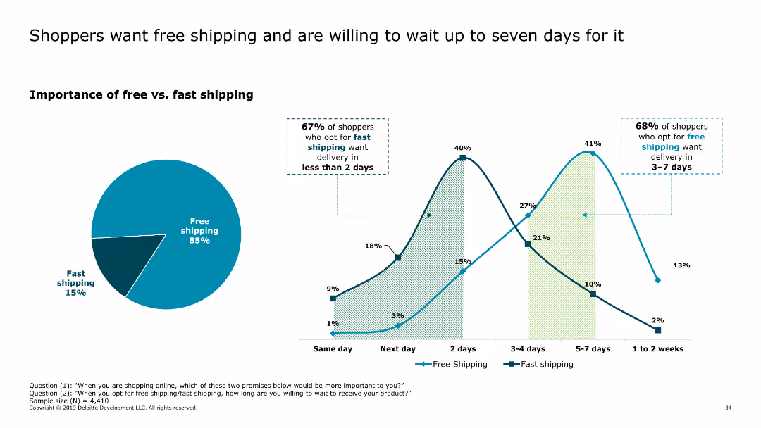
This slide includes a pie chart showing the importance of free versus fast shipping, along with a line chart illustrating delivery time preferences for free and fast shipping options.
Market Analysis and Trends
Retail & E-commerce
The slide highlights consumer preferences for free shipping over fast shipping, with many shoppers willing to wait up to seven days for free delivery. It provides insights into delivery expectations and preferences.
free shipping, delivery preferences, consumer behavior, online shopping, shipping options
Multiple Chart
Deloitte
Saved
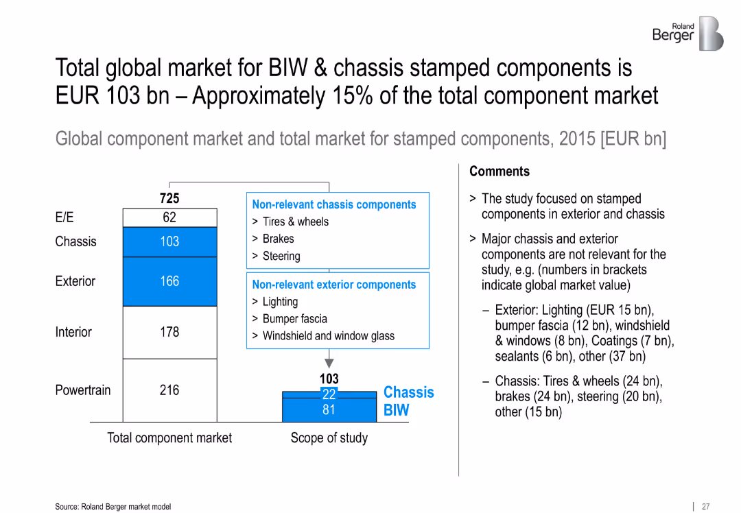
Bar chart showing breakdown of total component market and scope of BIW/chassis stamped components; comments explain exclusions
Investment Analysis
Industrial & Manufacturing
Defines the market scope for BIW and chassis stamped components, valued at EUR 103 bn in 2015. Excludes irrelevant chassis/exterior parts and focuses on relevant segments for detailed analysis.
BIW, chassis, stamped components, market size, EUR 103 bn, exterior, global component market
Mixed Chart
Roland Berger
Saved
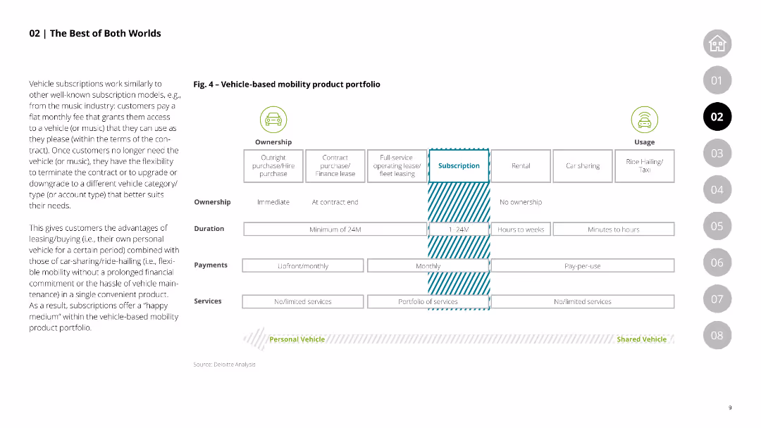
This slide features a comparative table showing the characteristics of vehicle-based mobility products, including ownership types, duration, payments, and services, comparing outright purchase, leasing, and subscription models.
Product and Service Analysis
Transportation & Logistics
Compares various vehicle-based mobility products, highlighting the flexibility and advantages of subscription models over traditional purchase and leasing options.
mobility products, vehicle ownership, leasing, subscription models, comparative analysis
Table
Deloitte
Saved
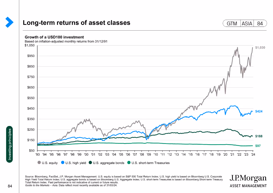
Line chart showing the growth of a USD100 investment in various asset classes, adjusted for inflation, from 1993 to 2024.
Investment Analysis
Financial Services
This slide presents the long-term returns of different asset classes, illustrating the growth of a USD100 investment over time across various asset categories.
asset classes, returns, investment, inflation, growth
Single Chart
JP Morgan
Saved
The slide features two column charts side by side. The left chart displays year-on-year house prices for Australia, Sydney, and Melbourne, while the right chart shows auction clearance rates and house prices as a 3-month moving average. It has a moderate level of visual complexity.
Market Analysis and Trends
Real Estate & Construction
The slide analyzes trends in residential real estate prices in Australia, comparing house prices in Australia, Sydney, and Melbourne over time. It also examines auction clearance rates.
Real estate, house prices, auction rates, Australia, Sydney, Melbourne, trends, data analysis
Multiple Chart
JP Morgan
Saved
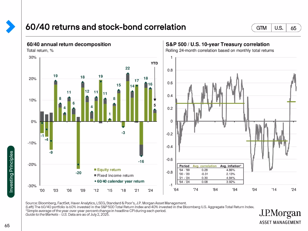
Two-panel chart with bar chart (return decomposition) and line chart (correlation over time)
Financial Performance
Financial Services
Shows yearly breakdown of 60/40 portfolio returns into equity and fixed income components, alongside historical correlation between stocks and bonds. Analyzes inflation periods as well.
60/40 returns, stock-bond correlation, equity return, fixed income, annual performance, inflation, diversification
Multiple Chart
JP Morgan
Saved
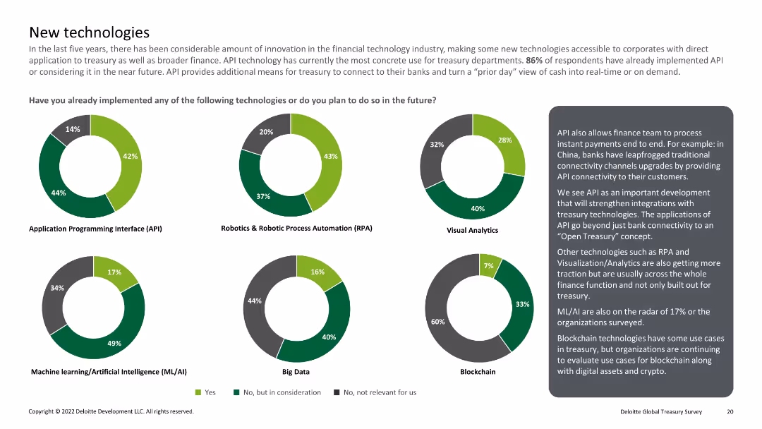
Multiple pie charts showing implementation of technologies like API, RPA, visual analytics, ML/AI, big data, and blockchain
Technology and Digital Transformation
Financial Services
Reviews the implementation of emerging technologies in treasury departments, including APIs, RPA, and blockchain.
New technology, API, RPA, ML/AI, blockchain
Multiple Chart
Deloitte
Saved
A slide with bullet points and a circular graphic, discussing the impact of e-commerce on related sub-sectors.
Market Analysis and Trends
Retail & E-commerce
Evaluates e-commerce's influence on its sub-sectors, essential for strategic planning and understanding market dynamics.
E-commerce, market segmentation, sub-sectors, strategic planning, market dynamics, social commerce, B2B commerce, specialized commerce
Header Horizontal
Kearney
Saved
This slide includes a central diagram depicting three interconnected cycles labeled as Inner Loop, Huddle, and Outer Loop, surrounded by various process steps and feedback loops.
Organizational Structure and Change
Professional Services
Describes the feedback and process improvement cycles within a business context. Useful for understanding organizational dynamics and improving customer service efficiency.
process improvement, customer service, feedback loops, organizational dynamics, business efficiency
Diagram
Bain
Saved
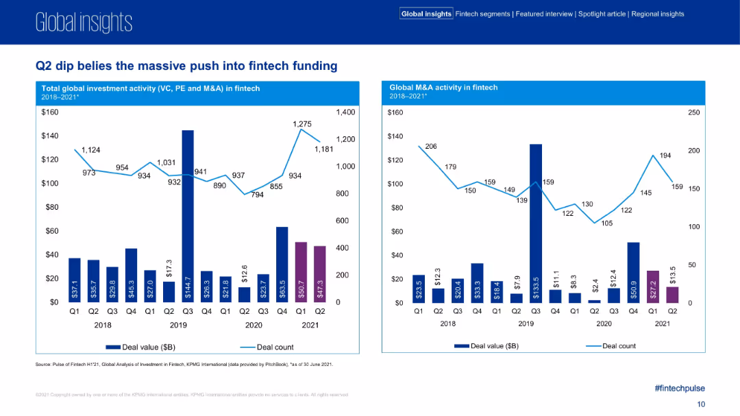
Two adjacent bar+line charts, Q1–Q2 comparisons across 2018–2021, showing total investment and M&A activity in fintech.
Market Analysis and Trends
Financial Services
This slide details quarterly fintech investment and M&A activity trends, showing that despite a Q2 2021 dip, deal value remained strong. It compares year-over-year and quarter-over-quarter metrics across deal value and count, reflecting sector momentum.
Q2 fintech, investment trend, deal count, deal value, M&A activity, quarterly comparison
Multiple Chart
KPMG
Saved
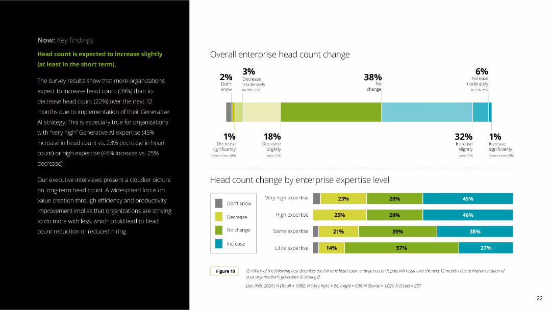
The slide includes a column chart showing enterprise head count changes segmented by expertise levels. The layout is clear with a mix of text and visual elements.
Human Resources and Talent Management
Professional Services
The slide explains anticipated changes in enterprise head count due to Generative AI, with survey results indicating slight increases. It breaks down the data by expertise level and provides detailed percentages.
Generative AI, head count, enterprise, survey results, expertise levels, workforce, HR, professional services, employee changes, AI impact
Multiple Chart
Deloitte
Saved
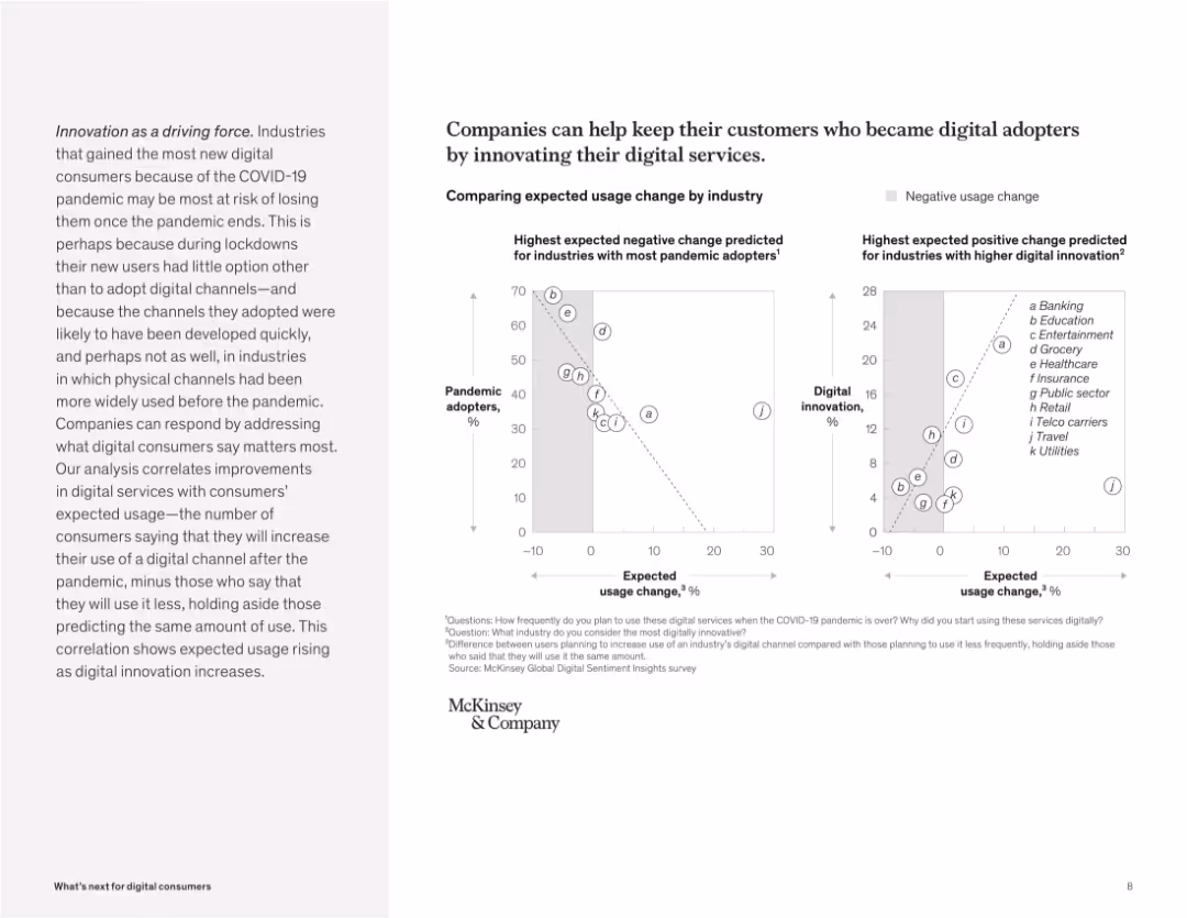
Dual scatter plots comparing pandemic adoption vs. usage change and innovation vs. usage change. Grayscale points labeled by industry.
Strategic Planning
Technology & Software
The slide uses two scatter plots to correlate digital innovation with future digital usage. It shows that industries with high pandemic adoption but low innovation risk losing users, while those with high innovation are expected to see sustained or increased usage.
innovation, pandemic adoption, usage change, digital services, correlation, scatter plot, strategy, industry risk
Multiple Chart
McKinsey
Saved
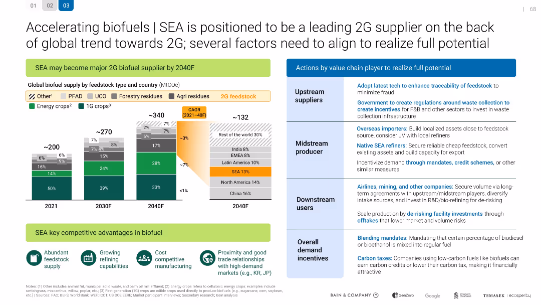
SEA is positioned to be a leading 2G supplier
Technology and Digital Transformation
Energy & Utilities
Technology and Digital Transformation
Describes how SEA can become a major 2G biofuel supplier by 2040. Details feedstock supply projections and value chain actions needed for success, including regulations, investment, and market development.
Mixed Chart
Bain
Saved
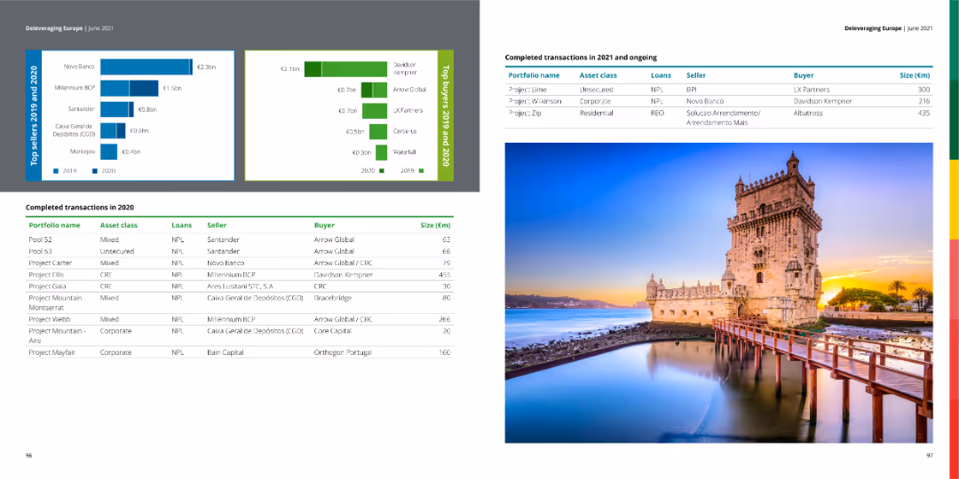
The slide features a table with completed transactions in 2020 and ongoing transactions in 2021, along with bar charts showing top sellers and buyers for 2019 and 2020. The right side contains an image of a historical building.
Market Analysis and Trends
Financial Services
The slide provides a summary of completed and ongoing financial transactions, detailing portfolio names, asset classes, loan types, sellers, buyers, and transaction sizes.
transactions, financial, market, buyers, sellers
Multiple Chart
Deloitte
Saved
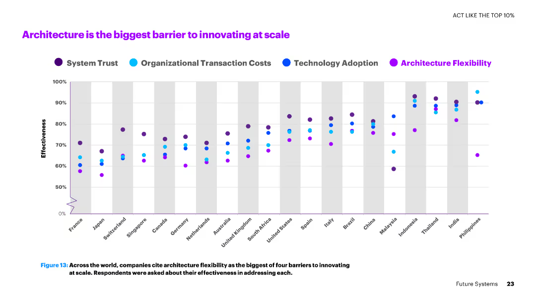
The slide shows a dot plot chart with multiple series representing various countries and their effectiveness in addressing barriers like architecture flexibility.
Operational Efficiency
Technology & Software
The slide discusses the major barriers to innovation at scale, with a focus on architecture flexibility as the biggest challenge faced by companies globally.
architecture, innovation, barriers, scale, countries, flexibility, effectiveness, technology
Single Chart
Accenture
Saved
A column chart displaying the share of minutes viewed by different platforms over various months, with different colored segments representing platforms like Netflix, YouTube, Hulu, etc. A legend on the right explains the color coding for each platform.
Market Analysis and Trends
Media & Entertainment
This slide shows the monthly breakdown of minutes viewed by different platforms from May 2021 to January 2022. The data highlights trends in viewership across linear TV and various streaming services.
minutes viewed, streaming platforms, viewership trends, linear TV, monthly breakdown
Single Chart
Nielsen
Saved
Line graph showing trends in technology investments over time, accompanied by a column chart comparing technology and business capabilities.
Technology and Digital Transformation
Technology & Software
Analyzes the impact of strong technology and business capabilities on long-term profitable growth, highlighting the importance of strategic investments.
technology investments, profitable growth, business capabilities, long-term, strategic investments, trends, line graph, bar chart
Multiple Chart
Accenture
Saved
Diagram of a central circle labeled 'Goldman Sachs' with connecting lines to various entities representing API connections.
Technology and Digital Transformation
Technology & Software
Outlines the central role of Goldman Sachs in connecting different sectors through APIs with a focus on technology development and service externalization.
platforms, technology, APIs, Goldman Sachs, development, externalization, developers, service
Framework
Goldman Sachs
Saved
The slide features a vertical bar chart comparing levels of concern about the climate over several years across different countries.
Market Analysis and Trends
Environmental Services & Sustainability
Analysis of changing levels of public concern about the climate in various countries over time, showing trends and possible waning interest in some areas.
Climate, concern, trends, survey, countries
Mixed Chart
IPSOS
Saved
The slide features text and icons representing different client segments and services offered. Sections provide details on corporate and personal banking.
Strategic Planning
Financial Services
This slide describes UBS's balanced mix of personal and corporate banking, highlighting the client base and services offered.
UBS, Banking, Client Segments, Services, Strategic Planning
Multiple Chart
UBS
Saved
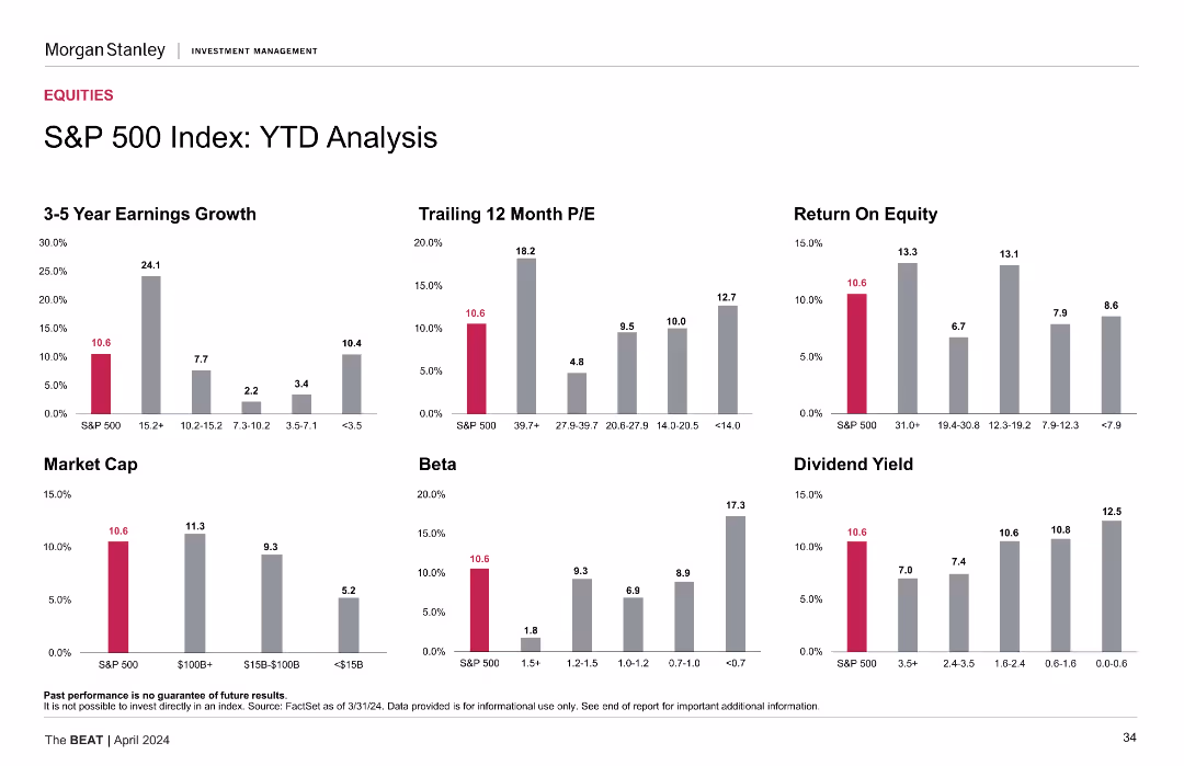
Similar to the previous slide, this one also has multiple column charts but focuses on year-to-date (YTD) performance for the same metrics.
Market Analysis and Trends
Financial Services
The slide provides a year-to-date performance analysis of the S&P 500 index, including earnings growth, P/E ratios, ROE, market cap, beta, and dividend yield metrics.
YTD analysis, financial metrics, S&P 500, performance
Multiple Chart
Morgan Stanley
Saved
The slide features a complex network illustration of partnerships and sector positioning, alongside two blocks describing business strengths.
Strategic Planning
Financial Services
Discusses the company's strategic position in the financial ecosystem, highlighting its partnerships, audience engagement, and a diversified business model that includes a mix of direct consumer relationships and data monetization.
distribution, partnerships, fintech, data monetization, engagement
Diagram
Barclays
Saved
Bar chart detailing adjusted costs by category such as compensation, IT, and professional services. Accompanied by bullet points of key highlights.
Operational Efficiency
Financial Services
Detailed analysis of quarterly changes in adjusted costs, focusing on the impacts of technology investments and operational efficiency.
Costs, adjustments, technology, efficiency
Mixed Chart
Deutsche Bank
Saved
Previous
Next
If nothing, comes up, please save your slides first
Create a FREE account to continue browsing
Receive Instant Access to 1,000+ slides from companies like McKinsey, Google, and Goldman Sachs
First Name
Last Name
Email
Password
I agree to all
Terms & Privacy Policy
Thank you! Your submission has been received!
Oops! Something went wrong while submitting the form.
Have an account?
Sign in
Column Chart
Heatmap
Chevron
Org Chart
Infographic
Callouts
Timeline
List
Graphic
Picture
Process Flow
Diagram
Paragraph
Map
Table
Framework
Subtitle
Takeaway Box
Icon
Other Chart
Radar Chart
Waterfall Chart
Mekko Chart
Pie Chart
Scatter Plot
Line Chart
Bar chart
Bullet points


![[Country] would be stronger if we stopped immigration](https://cdn.prod.website-files.com/654e70fb59937215cac87b19/6899bd5abc303b7d94f02f12_0Te_jmPYnbVvw-qHnHze3tKEeBz4_dT5PizkF-m_TSY.avif)