Create a FREE Account
Instant access to 1,000+ real slides from top companies like McKinsey, BCG, Goldman Sachs, Google and many more!
First Name
Last Name
Email
Password
I agree to all
Terms & Privacy Policy
Thank you! Your submission has been received!
Oops! Something went wrong while submitting the form.
Have an account?
Sign in
Library
Templates
Courses
Pricing
My Account
My Slides
My Templates
✦ AI
AI Prompt Library
AI Search
Sign in
Start Here
Logout
My Saved Slides
Contains a hierarchical diagram of the IAF department and a world map with connections, illustrating global coordination.
Organizational Structure and Change
Financial Services
The slide explains how the IAF department responds to changing client needs, emphasizing its global coordination and strategic direction under the Group CEO's leadership.
IAF, Client Needs, Organizational Change, Global Coordination, Strategy
Diagram
Credit Suisse
Saved
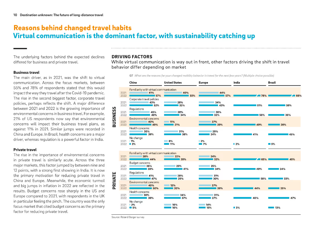
Grid of horizontal bar charts per country showing reasons for behavior change in business and private travel. Emphasis on communication, sustainability, cost.
Market Analysis and Trends
Transportation & Logistics
This slide details country-level breakdowns of reasons for changing travel behavior post-Covid. Virtual communication is the top factor for business travel changes, while environmental and cost concerns lead in private travel. Charts show shifts from 2021 to 2022.
Behavior change, virtual communication, environmental concern, business travel, private travel, travel reduction, cost impact
Multiple Chart
Roland Berger
Saved
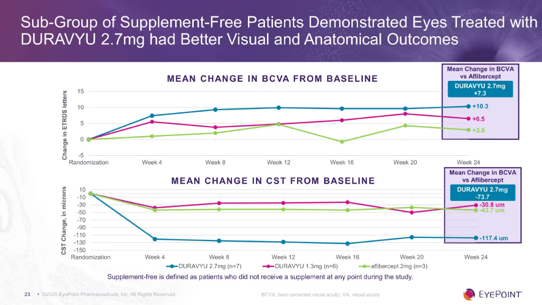
Two stacked line charts (BCVA and CST) tracking progress over 24 weeks for three treatment groups in supplement-free patients. Highlight box summarizes group differences.
Product and Service Analysis
Healthcare & Pharmaceuticals
Subgroup analysis reveals that supplement-free patients treated with DURAVYU 2.7mg had superior visual acuity gains (+10.3 letters) and CST reductions (-117.4 microns) compared to aflibercept and lower DURAVYU dosage. Suggests best results in supplement-free cohort.
supplement-free, subgroup, BCVA, CST, DURAVYU 2.7mg, clinical trial
Multiple Chart
Goldman Sachs
Saved
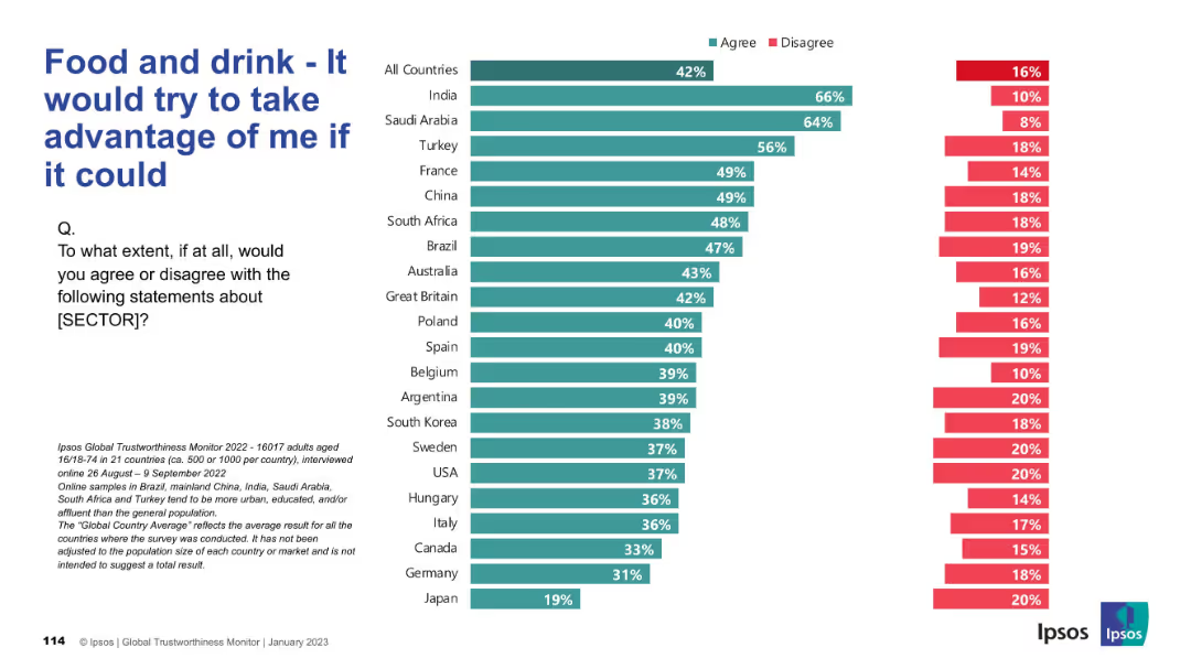
Horizontal bar chart indicating perceived exploitation potential of the food sector; disagreement on right side.
Risk Assessment and Management
Consumer Goods
The chart shows how much consumers across different countries believe the food and drink sector would exploit them if given the chance. A higher percentage in some countries indicates skepticism and perceived opportunism.
exploitation, trust, consumer risk, food industry, public perception, Ipsos, countries, bar chart, opinion, survey
Mixed Chart
IPSOS
Saved
This slide contains two visualizations: a column chart showing consensus forecasts for real GDP growth and a line chart illustrating Composite Purchasing Managers’ Index (PMI) for the UK, Eurozone, Japan, US, and China.
Market Analysis and Trends
Financial Services
The slide provides data on global GDP growth forecasts for 2023 and 2024, along with PMI trends for major economies, useful for understanding economic performance and future expectations.
GDP growth, PMI, global economy, economic performance, trends
Multiple Chart
JP Morgan
Saved
The slide shows a timeline with achievements for Q3 2023, key priorities for Q4 2023, and milestones for 2024.
Strategic Planning
Financial Services
This slide details the integration planning and execution process, highlighting achievements and future milestones.
integration planning, execution, key priorities, milestones, strategic plan
Header Horizontal
UBS
Saved
Column charts and tables are used to display IPO numbers and proceeds for Mainland China and Hong Kong stock exchanges.
Market Analysis and Trends
Financial Services
The slide highlights key IPO market data for Mainland China and Hong Kong, including sector breakdowns and changes from 2021 to 2022.
Mainland China, Hong Kong, IPOs, stock exchanges, sectors
Multiple Chart
EY
Saved
Similar dark background and white text with circular charts displaying percentages and yellow highlights.
Market Analysis and Trends
Healthcare & Pharmaceuticals
This slide demonstrates consumer openness to personalized medicine and technology-enhanced care, with 66% willing to take genetic tests, 66% open to non-urgent care at mini clinics, 64% willing to take medications made for their genetic profile, and 61% using wearables and mobile apps for health monitoring.
technology-enhanced care, personalized medicine, genetic testing, wearables, U.S. consumers
Mixed Chart
EY
Saved
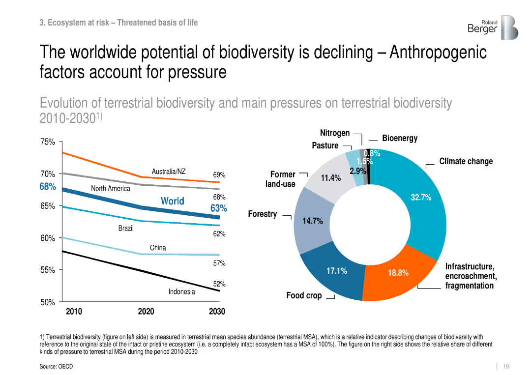
Line graph (2010–2030) with biodiversity trend by region and donut chart of pressure sources.
Risk Assessment and Management
Environmental Services & Sustainability
Shows decline in terrestrial biodiversity globally and identifies anthropogenic pressures—especially climate change and land use change—as the main causes.
biodiversity loss, climate pressure, habitat degradation, MSA, ecosystems
Multiple Chart
Roland Berger
Saved
The slide displays two line charts: the left chart shows monthly PMI trends for manufacturing and services, while the right chart shows stock market indexes for Shanghai SE and Shenzhen SE.
Market Analysis and Trends
Industrial & Manufacturing
The slide analyzes PMI data indicating slight increases in manufacturing and services in January. It also examines the performance of stock market indexes in February, providing insights into economic activities and market responses.
PMI, manufacturing, services, stock market indexes, economic activities
Multiple Chart
McKinsey
Saved
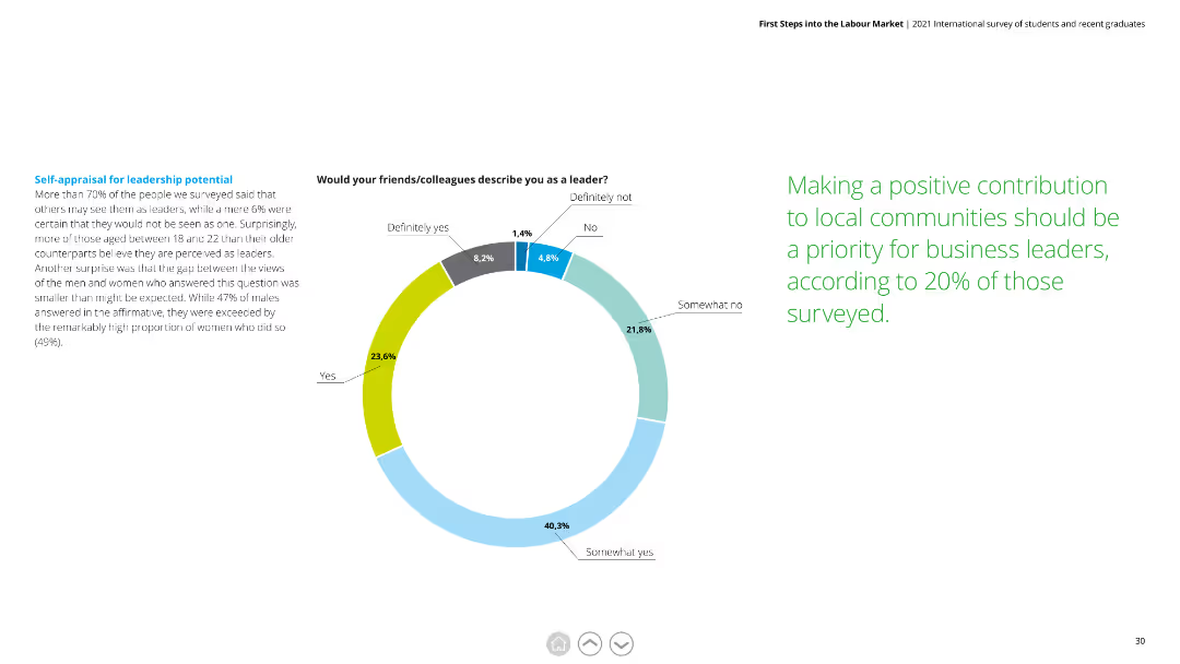
Donut chart showing how respondents perceive their leadership potential, with detailed text explaining the findings and gender differences in self-perception.
Human Resources and Talent Management
Education & Training
This slide reveals self-assessments of leadership potential among respondents, noting high levels of confidence, especially among younger and female participants.
self-appraisal, leadership potential, gender differences, confidence, young professionals
Mixed Chart
Deloitte
Saved
This slide consists of column charts showing assets under supervision over a five-year period, and long-term fee-based net inflows. The graphics are complemented by bullet points outlining key figures and statements.
Financial Performance
Financial Services
It shows the growth of assets under supervision and long-term fee-based net inflows, indicating a strategic focus on balancing growth through various investment management divisions.
Investment Management, Assets, Growth, Fee-Based, Net Inflows, GSAM, PWM, Ayco, Balanced Growth, Client Coverage
Multiple Chart
Goldman Sachs
Saved
Includes a line chart on the left showing macro hedge fund relative performance and volatility, and a column chart on the right comparing hedge fund style returns during bear markets.
Risk Assessment and Management
Financial Services
This slide analyzes volatility in alternative investments, focusing on macro hedge fund performance and comparing different hedge fund styles during bear markets.
volatility, hedge funds, performance, alternative investments, bear markets
Multiple Chart
JP Morgan
Saved
The slide uses a combination of icons and bullet points to explore the personal motivations behind investing, categorized into heart, mind, and wallet sections.
Strategic Planning
Financial Services
It encourages viewers to consider their personal motivations for investing, categorizing questions into heart (goals), mind (financial importance), and wallet (financial planning).
Investing, motivations, UBS, personal goals, financial planning
Header Vertical
UBS
Saved
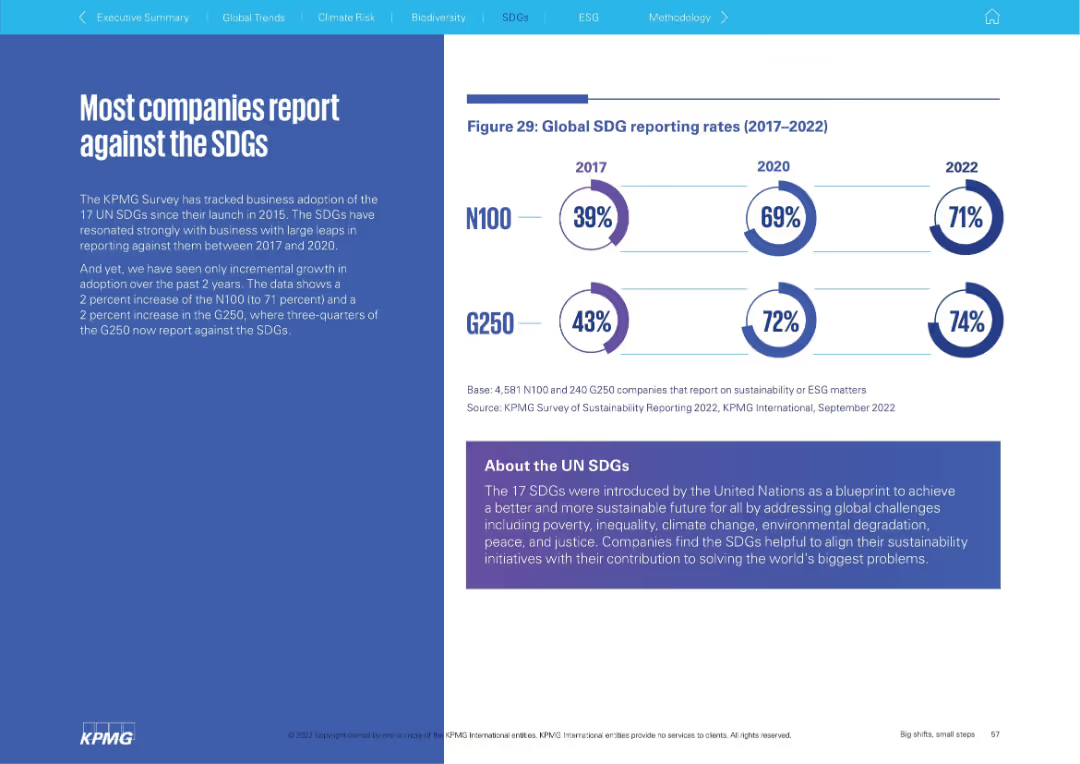
Left: narrative explanation; Right: circular infographic showing SDG reporting rates (2017–2022) for N100 and G250. Bottom panel explains SDGs.
Regulatory and Compliance
Environmental Services & Sustainability
The slide shows a high and gradually increasing rate of corporate reporting against the UN Sustainable Development Goals (SDGs). It explains the relevance of SDGs and highlights that three-quarters of G250 companies now report against them.
SDGs, sustainability goals, reporting, UN, ESG, corporate responsibility
Mixed Chart
KPMG
Saved
The slide features a balanced layout with a text section on the left and a column chart on the right. The text section explains strategic choices driven by technology. The column chart shows disruption levels increasing over time.
Strategic Planning
Technology & Software
The slide discusses how tech-forward companies accelerate strategy cycle times using real-time data. It highlights disruption forces with a chart showing disruption index growth.
strategy, disruption, technology, cycle times, real-time data
Mixed Chart
Accenture
Saved
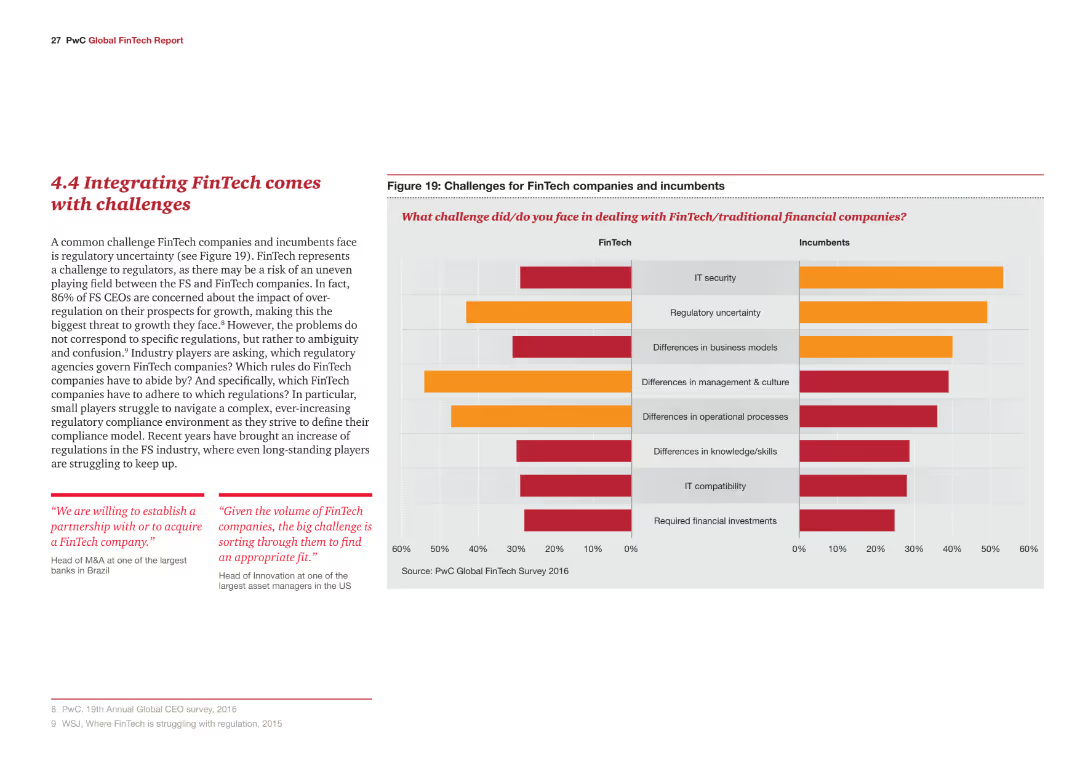
The slide contains a column chart comparing challenges faced by FinTech companies and incumbents, with challenges like IT security and regulatory uncertainty highlighted in different colors.
Risk Assessment and Management
Financial Services
The slide addresses challenges in integrating FinTech, such as regulatory uncertainty and differences in business models, and highlights the primary concerns of FS CEOs regarding over-regulation.
FinTech, challenges, regulatory, IT security, business models
Multiple Chart
PwC/Strategy&
Saved
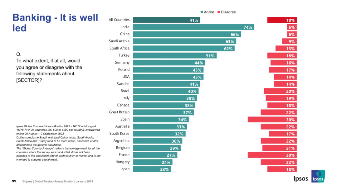
Horizontal bar chart ranking 21 countries by percentage of agreement/disagreement. Title on top-left, Ipsos branding on bottom-right, and survey description in small text at the bottom.
Performance Metrics and KPIs
Financial Services
This slide presents global survey data on perceptions of leadership quality within the banking sector. It compares agreement levels across countries, highlighting which populations view the sector as well-led.
banking, leadership, survey, Ipsos, global comparison, trust, country ranking, public opinion
Mixed Chart
IPSOS
Saved
This slide includes a box plot and a column chart showing the distribution of average daily time spent on search engines. Two tables provide detailed statistics about the time and proportion of online time spent on search engines.
Market Analysis and Trends
Technology & Software
The slide presents information on the average daily time spent on Search Engines, with detailed statistics including mean, median, and percentile distributions, based on data from Ipsos Iris Clickstream Data.
Search Engines, Daily Time, Statistics, Box Plot, Column Chart
Mixed Chart
IPSOS
Saved
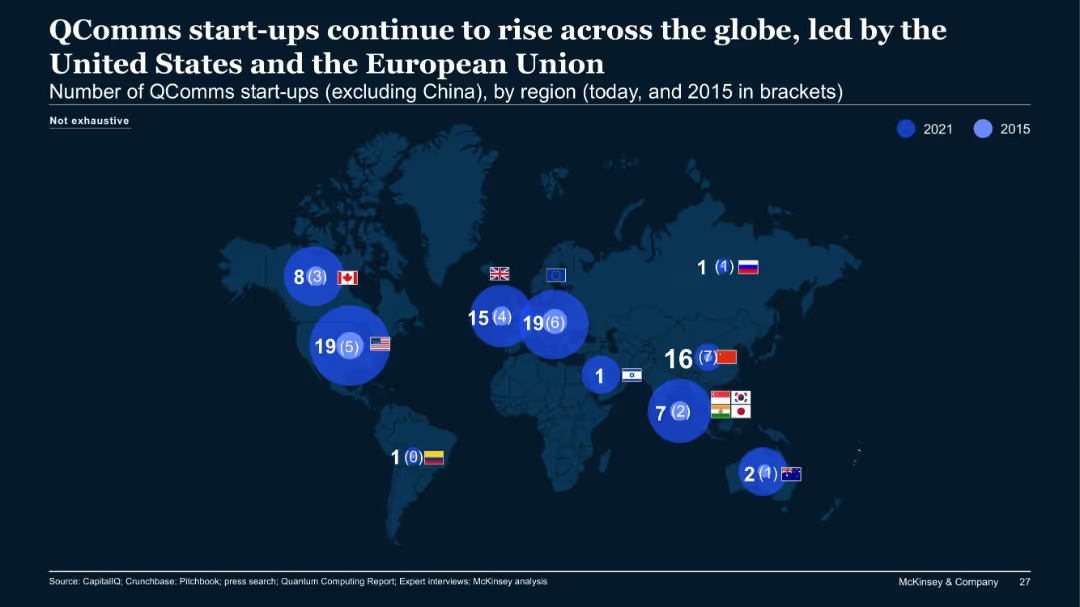
World map showing number of quantum communications (QComms) start-ups by region (2021 vs. 2015).
Market Analysis and Trends
Telecommunications
This slide displays regional growth in QComms start-ups, excluding China. Notably, the US and EU lead with 19 each in 2021, a substantial increase from 2015. Asia shows a moderate rise, while some regions remain stagnant.
QComms, start-ups, global, regional growth, map, telecommunications, EU, US
Single Chart
McKinsey
Saved
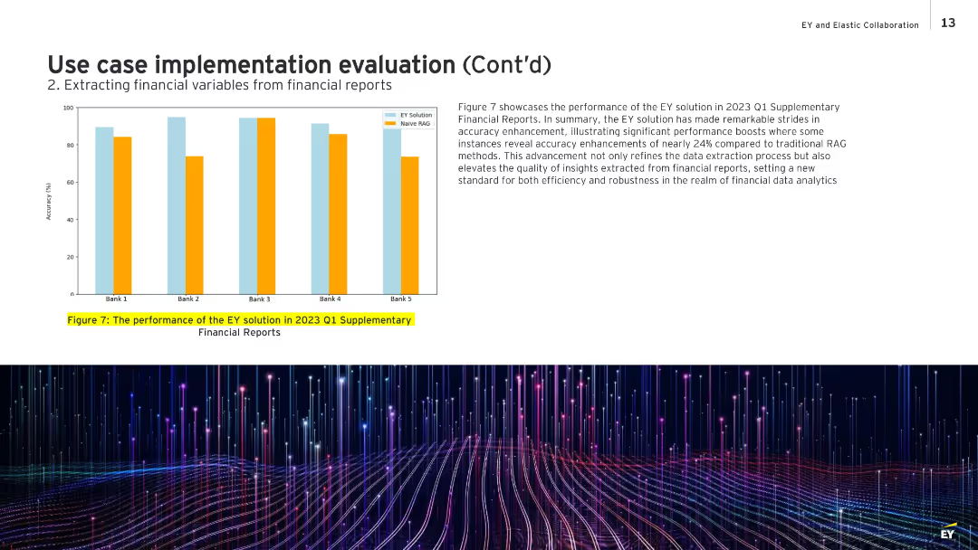
Bar chart on left showing comparative accuracy for five banks; text box on the right discusses the results.
Performance Metrics and KPIs
Financial Services
Highlights the performance improvement of EY’s data extraction system over traditional Naive RAG methods for Q1 2023 reports. The chart shows accuracy improvements of up to 24%, demonstrating robustness and quality in extracting actionable financial insights. It sets a benchmark for efficiency and reliability in financial data analysis.
financial accuracy, performance improvement, EY solution, Naive RAG, Q1 2023, analytics
Mixed Chart
EY
Saved
The slide features the title of a report on digital growth in a bold, large font. The left side of the slide contains text while the right side displays a background image of two children looking at a screen. The design is minimal, focusing attention on the report's title and the image that hints at inclusivity and future-oriented perspectives.
Industry Overview
Technology & Software
The slide serves as the title for a report on digital growth in Indonesia, setting the stage for a detailed discussion on expanding digitalization efforts beyond metropolitan areas. The visual and textual elements combined aim to evoke curiosity and engage stakeholders in exploring the strategies for harnessing digital growth opportunities in the broader Indonesian context.
Digital Growth, Indonesia, Metropolitan Areas, Technology Inclusion, Education, Future Trends, Digitalization, Market Expansion, Strategic Development, Report Title
Title
Kearney
Saved
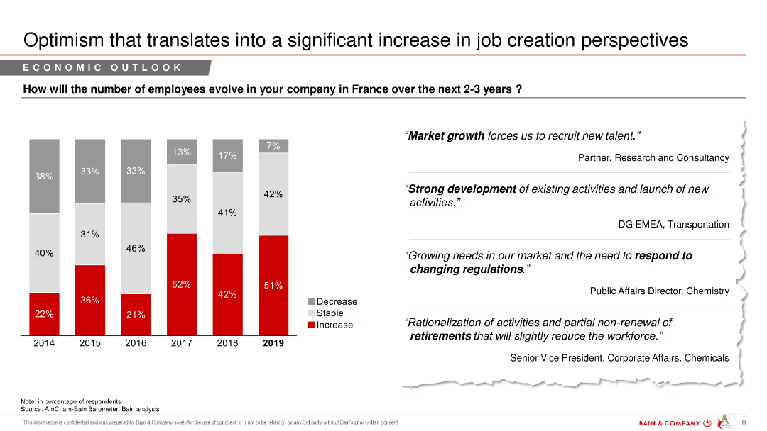
A column chart showing predicted changes in employee numbers over the next 2-3 years, with text quotes from industry experts.
Market Analysis and Trends
Financial Services
The slide discusses anticipated changes in employment levels in France over the next few years, reflecting optimism in job creation.
job creation, employee numbers, economic outlook, financial services, market analysis, predictions
Mixed Chart
Bain
Saved
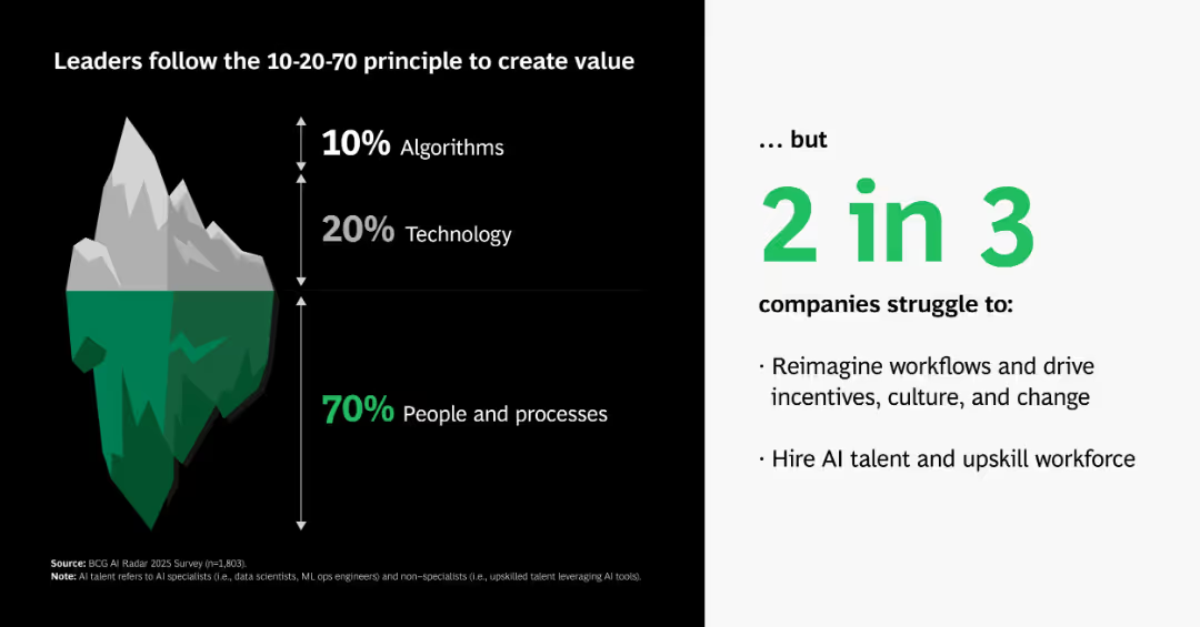
Iceberg visual metaphor breaking down AI value sources into algorithms, tech, and people/processes; supporting text on right.
Organizational Structure and Change
Artificial Intelligence
Explains that true AI value comes 70% from people and processes, 20% from technology, and only 10% from algorithms—contrasting perception with operational reality.
AI iceberg, 10-20-70, people, processes, tech, algorithms, value creation, organizational change
Boxed
BCG
Saved
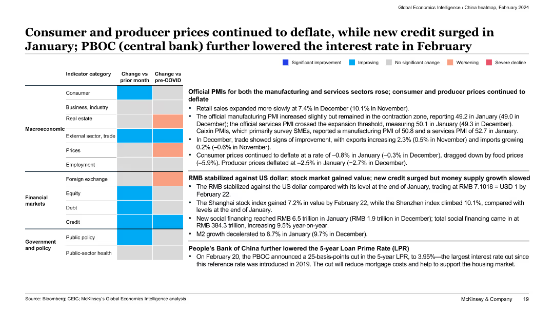
The slide presents a categorized summary of various economic indicators with text descriptions. Color-coded boxes indicate the direction and extent of changes for each category.
Market Analysis and Trends
Financial Services
This slide discusses the continued deflation of consumer and producer prices, the stabilization of RMB against the US dollar, and the People’s Bank of China’s interest rate cut, providing a comprehensive view of economic trends in China.
deflation, consumer prices, producer prices, RMB stabilization, interest rate cut
Table
McKinsey
Saved
Previous
Next
If nothing, comes up, please save your slides first
Create a FREE account to continue browsing
Receive Instant Access to 1,000+ slides from companies like McKinsey, Google, and Goldman Sachs
First Name
Last Name
Email
Password
I agree to all
Terms & Privacy Policy
Thank you! Your submission has been received!
Oops! Something went wrong while submitting the form.
Have an account?
Sign in
Column Chart
Heatmap
Chevron
Org Chart
Infographic
Callouts
Timeline
List
Graphic
Picture
Process Flow
Diagram
Paragraph
Map
Table
Framework
Subtitle
Takeaway Box
Icon
Other Chart
Radar Chart
Waterfall Chart
Mekko Chart
Pie Chart
Scatter Plot
Line Chart
Bar chart
Bullet points