Create a FREE Account
Instant access to 1,000+ real slides from top companies like McKinsey, BCG, Goldman Sachs, Google and many more!
First Name
Last Name
Email
Password
I agree to all
Terms & Privacy Policy
Thank you! Your submission has been received!
Oops! Something went wrong while submitting the form.
Have an account?
Sign in
Library
Templates
Courses
Pricing
My Account
My Slides
My Templates
✦ AI
AI Prompt Library
AI Search
Sign in
Start Here
Logout
My Saved Slides
This slide provides a line graph and two column charts, depicting unemployment rate forecasts and firmwide allowance for credit losses. The graphics are in shades of blue, and the line graph includes a forecast line with marked points. The column charts compare figures from different years with a pre-pandemic average, using clear color differentiation to enhance readability.
Risk Assessment and Management
Financial Services
Analyzing the unemployment rate forecast and allowance for credit losses, Slide 17 communicates JPMorgan's prudent financial reserves in anticipation of credit normalization and economic changes expected through the year.
Credit, Unemployment, Forecast, Allowance, Losses, Financial Reserves, Normalization, Pandemic Comparison
Multiple Chart
JP Morgan
Saved
A line chart showing the downward path for Fed fund futures from Mar-24 to Dec-26.
Market Analysis and Trends
Financial Services
This slide discusses the market's expectation of a downward path for Fed funds rates despite volatility, showing projections until December 2026.
Fed Rates, Market Analysis, Futures, Projections, Volatility
Mixed Chart
Morgan Stanley
Saved
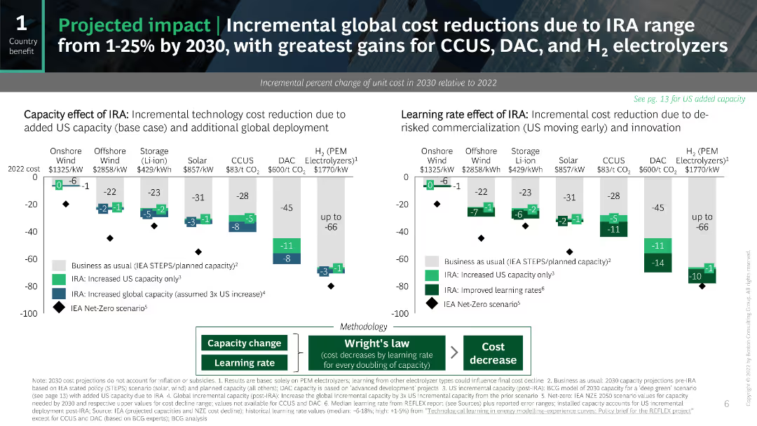
A bubble chart displaying power generation combined with CCUS projects over time.
Market Analysis and Trends
Energy & Utilities
Emphasizes the role of CCUS in retrofitting various power plants to reduce CO2 emissions.
CCUS, power generation, emissions, retrofit, biomass
Single Chart
Kearney
Saved
Standardized Ipsos layout; bar chart comparing regulation sentiment by country; dark and light green with red for too little.
Regulatory and Compliance
Technology & Software
The chart shows public sentiment around regulation of social media companies. A large portion of respondents across most countries believe that regulation is currently insufficient, with Belgium, France, and Argentina showing strong concern. Only a few countries feel regulation is excessive.
social media, tech regulation, public sentiment, compliance, Ipsos, bar chart, country comparison, technology sector, governance
Mixed Chart
IPSOS
Saved
Diagram integrates circular and connective elements to discuss the relevance of certified second-hand goods for luxury brands and retailers.
Strategic Planning
Retail & E-commerce
Explores the strategic relevance of certified second-hand goods in the luxury market, focusing on brand and retail perspectives.
certified second-hand, luxury market, brand strategy, retail innovation, market trends
Vertical Flow
BCG
Saved
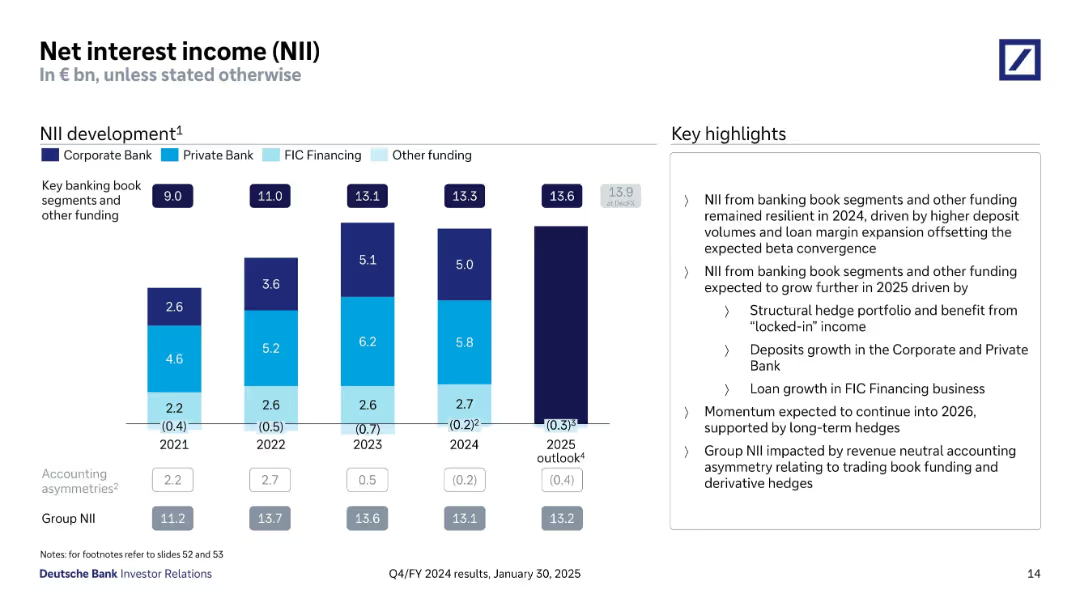
Combination of bar and line graphs projecting gross hedge income and yield rates.
Risk Assessment and Management
Financial Services
The slide projects gross hedge income beyond 2026 and shows historical and projected yield rates. It highlights growth in income and expectations around hedge maturities and market interest rates.
hedge income, swap rates, Barclays, risk management, hedge yield, Q125, interest rate, structural hedge, financial forecast
Multiple Chart
Barclays
Saved
The slide features a line chart plotting future expectations for central bank policy rates across the US, Eurozone, UK, and Japan. It has a white background with minimal distractions.
Investment Analysis
Financial Services
The slide offers a predictive analysis of central bank policy rates for key economies, likely aiding investors and financial planners in strategizing future investments and understanding the macroeconomic landscape influenced by central bank decisions.
Central Banks, Policy Rates, Predictive, US, Eurozone, UK, Japan, Finance
Single Chart
JP Morgan
Saved
The slide features a vertical column chart showing internet advertising revenue from 2018 to 2020, with colors representing each year. Annotations provide percentage growth rates.
Market Analysis and Trends
Media & Entertainment
Analyzes the growth trends in internet advertising revenues over three years, highlighting the sustained double-digit growth despite the pandemic's impact.
advertising, revenue, growth, internet, COVID-19, media, technology, trends
Single Chart
PwC/Strategy&
Saved
The slide features a column chart comparing organic growth (79%) and cost reduction (62%). It also has icons and small textual descriptions explaining the focus on innovation.
Strategic Planning
Professional Services
This slide compares the top two activities CEOs are planning to drive corporate growth or profitability: organic growth and cost reduction. It highlights that 79% of CEOs focus on organic growth while 62% prioritize cost reduction. The slide emphasizes the need for innovation.
Organic growth, cost reduction, CEOs, corporate growth, profitability, innovation, strategic planning
Multiple Chart
PwC/Strategy&
Saved
Two large column charts detailing population and spending, accompanied by a colored map of Indonesia showing school connectivity rates. Visual elements are clear and neatly organized, using blues and oranges to differentiate data points.
Strategic Planning
Education & Training
Explains the connectivity challenges faced by schools across various Indonesian islands, showing the correlation between population size, economic contributions, and school connectivity.
school connectivity, population data, economic analysis, Indonesia, mapping
Multiple Chart
BCG
Saved
Bar chart with vertical bars comparing April manufacturing performance against the previous 3-month average for 6 Southeast Asian countries.
Performance Metrics and KPIs
Industrial & Manufacturing
The slide compares April 2025 manufacturing output with the previous 3-month average across Southeast Asia, showing mixed performance with growth in Singapore and the Philippines, and declines in countries like Indonesia and Vietnam.
manufacturing, Southeast Asia, Singapore, Indonesia, PMI, output, April, comparison, trends, performance
Single Chart
Accenture
Saved
The slide contains bar graphs comparing gender and ethnic diversity at various levels within the organization against target goals for future years.
Regulatory and Compliance
Financial Services
Illustrates progress in diversity, equity, and inclusion within Barclays, focusing on gender and ethnic diversity at the management and board levels.
diversity, equity, inclusion, gender, management, board, targets, progress, financial services, DEI
Multiple Chart
Barclays
Saved
Dual-panel chart; left shows median deal size by stage; right shows deal outcome distribution (up/down).
Risk Assessment and Management
Financial Services
The slide shows a decline in median deal sizes across VC stages in the Americas from 2018–2024, with a concurrent increase in flat and down rounds. This reflects ongoing investor caution and reduced valuations amid persistent macroeconomic uncertainty.
deal size, VC stages, risk, down rounds, investor sentiment, flat rounds, caution, Americas, funding trends
Multiple Chart
KPMG
Saved
Vertical logic tree layout in grayscale and blue, progressing through 3 assessment steps. Boxes contain decision questions and flow to "Yes"/"No" outcomes. Blue highlights indicate enabling status.
Customer and Market Segmentation
Financial Services
Provides a decision framework to classify PortCos as Decarbonisation Enablers based on taxonomy alignment, climate contribution, and revenue thresholds. This structured logic is used to guide investment decisions or categorize assets according to their role in supporting the net-zero transition.
decarbonisation enabler, emissions, climate, taxonomy, classification, PortCo, investment criteria
Uncategorized
Bain
Saved
A donut chart showing 91% of respondents have disciplinary procedures in place.
Strategic Planning
Professional Services
Useful for HR management to evaluate the adoption and effectiveness of disciplinary procedures within organizations.
HR, disciplinary procedures, evaluation, adoption, effectiveness
Single Chart
PwC/Strategy&
Saved
This slide presents a dense layout with a multi-bar chart comparing global and country-specific data from 2010 and 2020. It has a clear title and captions, with significant use of orange and black to distinguish data points.
Market Analysis and Trends
Environmental Services & Sustainability
This slide provides an analysis of how climate change opportunities are perceived in different economies, with an emphasis on the growing acceptance in China. It offers insights into international views on environmental initiatives and is likely used in global sustainability strategy meetings or environmental impact assessments.
Climate Change, Economies, Global, China, Opportunities, Environment, Strategy, Acceptance, Assessment
Single Chart
PwC/Strategy&
Saved
A single column chart depicts the increase in mobile gaming revenue per gamer from 2015 to 2025, with key growth drivers listed.
Market Analysis and Trends
Media & Entertainment
The slide centers on the revenue per mobile gamer in SEA, highlighting a 3.6x increase and mobile gaming's share of total gaming revenue.
mobile gaming, revenue, SEA, growth
Multiple Chart
Bain
Saved
The slide includes column charts showing sales and EBITDA growth for Q2 2020. Bullet points provide details on growth drivers and margin expansion.
Financial Performance
Agriculture & Food Production
This slide reviews Crop Science's financial performance in Q2 2020, focusing on sales and EBITDA growth, driven by regional performance and volume growth, despite challenges in specific markets.
Crop Science, Sales Growth, EBITDA, Margin Expansion, Q2 2020
Multiple Chart
Credit Suisse
Saved
World map with vertical bar comparisons for CO₂ emissions by region (2013, 2030 2°C/6°C).
Risk Assessment and Management
Environmental Services & Sustainability
Highlights key countries driving future CO₂ emissions, stressing the role of the US, China, and India under different climate action pathways.
regional CO₂, emissions forecast, climate policy, Asia, North America
Mixed Chart
Roland Berger
Saved
This slide includes a column chart displaying purchase price multiples for leveraged buyouts from 2007 to 4Q2023, segmented by Senior Debt/EBITDA, Sub Debt/EBITDA, Equity/EBITDA, and Others.
Investment Analysis
Financial Services
Indicates that private equity valuations have improved, with entry multiples declining in response to higher interest rates, suggesting better entry opportunities in leveraged buyouts.
Private Equity, Entry Valuations, Leveraged Buyouts, Purchase Price Multiples, Investment, Interest Rates
Mixed Chart
Morgan Stanley
Saved
Four area plots comparing age-based consumption and labor income in Germany and China, 2015 vs. 2030.
Financial Performance
Government & Public Sector
This slide shows how aging will shift national consumption patterns, increasing demand from the elderly, which could reduce trade surpluses and boost imports in export-heavy nations like Germany and China.
aggregate consumption, aging society, Germany, China, trade balance, elderly spending, demographic shift
Multiple Chart
Roland Berger
Saved
Bar chart showing percentages of family offices not confident in various tax operations, with supporting text.
Regulatory and Compliance
Financial Services
Addresses the lack of confidence in tax operations among APAC family offices, detailing areas of concern.
tax operations, confidence, APAC, family offices, transparency
Mixed Chart
EY
Saved
It contains two column charts—one in blue shades, one in green—depicting the percentage agreement from HR leaders and employees over three years. A small pie chart indicating a 9% increase is also present. The layout is simple, with prominent headers and clear, legible text.
Market Analysis and Trends
Financial Services
The slide addresses how equity compensation is perceived as a motivational factor by both HR leaders and employees, with a trend over three years. It's useful for demonstrating shifts in HR strategies and employee satisfaction related to compensation benefits in the financial sector.
equity compensation, motivation, HR leaders, employees, trend
Multiple Chart
Goldman Sachs
Saved
This slide shows a title, two column charts displaying trial lengths for FCoA and FCC, and a pie chart depicting reserved judgments delivery time. It uses red and orange hues with clear labels and a note on trial length comparison.
Regulatory and Compliance
Government & Public Sector
It breaks down the trial lengths for matters heard in FCoA and FCC, the percentage of reserved judgments delivered within three months, and highlights the significant difference in trial lengths between the two courts.
FCoA, FCC, trial lengths, reserved judgments, case management, legal proceedings
Multiple Chart
PwC/Strategy&
Saved
Includes a pie chart showing fee income composition and three bar charts detailing fee and net interest income (NII) breakdowns across three segments: WCIB, CBB, and Payments.
Financial Performance
Financial Services
Emphasizes the strength of U.S. Bancorp's diversified fee income, showing the percentage of total net revenue derived from different business segments, and outlines key revenue differentiators.
earnings, power, fee income, revenue, WCIB, CBB, payments, net interest income
Multiple Chart
Barclays
Saved
Previous
Next
If nothing, comes up, please save your slides first
Create a FREE account to continue browsing
Receive Instant Access to 1,000+ slides from companies like McKinsey, Google, and Goldman Sachs
First Name
Last Name
Email
Password
I agree to all
Terms & Privacy Policy
Thank you! Your submission has been received!
Oops! Something went wrong while submitting the form.
Have an account?
Sign in
Column Chart
Heatmap
Chevron
Org Chart
Infographic
Callouts
Timeline
List
Graphic
Picture
Process Flow
Diagram
Paragraph
Map
Table
Framework
Subtitle
Takeaway Box
Icon
Other Chart
Radar Chart
Waterfall Chart
Mekko Chart
Pie Chart
Scatter Plot
Line Chart
Bar chart
Bullet points