Create a FREE Account
Instant access to 1,000+ real slides from top companies like McKinsey, BCG, Goldman Sachs, Google and many more!
First Name
Last Name
Email
Password
I agree to all
Terms & Privacy Policy
Thank you! Your submission has been received!
Oops! Something went wrong while submitting the form.
Have an account?
Sign in
Library
Templates
Courses
Pricing
My Account
My Slides
My Templates
✦ AI
AI Prompt Library
AI Search
Sign in
Start Here
Logout
My Saved Slides
Features maps and bar graphs depicting the distribution of mobile and fixed broadband access across Indonesia's districts and provinces.
Strategic Planning
Telecommunications
Addresses the uneven distribution of broadband connectivity in Indonesia, particularly the lack of mobile signal and low fixed broadband penetration in many areas.
broadband, Indonesia, mobile signal, fixed broadband, connectivity, provinces, districts
Graphic
BCG
Saved
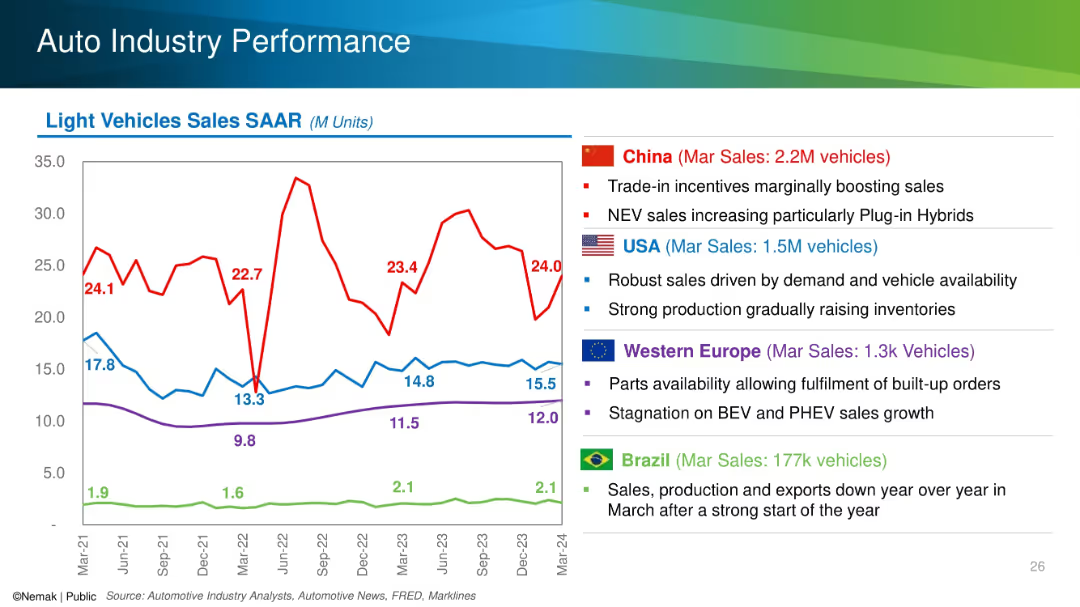
Line chart with SAAR trends for China, USA, Europe, and Brazil alongside country-specific bullet points.
Performance Metrics and KPIs
Industrial & Manufacturing
The slide tracks seasonally adjusted annual rates (SAAR) of light vehicle sales for major global markets and highlights key drivers and challenges in each region, such as incentives in China and stagnation in Europe. March 2024 sales figures are emphasized.
SAAR, auto sales, regional performance, NEV, incentives, inventory
Mixed Chart
Barclays
Saved
The slide features comparative data from 2021 to 2022 showcasing the shift in online activities with an emphasis on video consumption. A bar graph and a circular graph highlight the increase in screen time dedicated to video. There's an image of an individual using a smartphone, symbolizing content engagement. The design is modern with a clear, legible font and contrasting colors.
Market Analysis and Trends
Media & Entertainment
This slide highlights the growing importance of video in digital consumer engagement, emphasizing the shift towards video consumption over other online activities in Southeast Asia. It's a valuable tool for discussions about media trends, consumer behavior, and strategic planning for content delivery in the evolving digital landscape.
Video Consumption, Southeast Asia, Media Trends, Consumer Behavior, Digital Engagement, Online Activities, Screen Time, Strategic Planning, Content Delivery, Market Research
Boxed
Bain
Saved
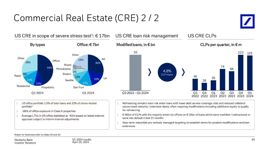
This slide features pie charts and bar charts detailing US CRE loans under severe stress test, segmented by types (Office, Retail, etc.) and risk management, including modified loans and CLPs per quarter from Q3 2022 to Q1 2024.
Market Analysis and Trends
Real Estate & Construction
The slide discusses Deutsche Bank's US commercial real estate loans under severe stress test, detailing loan types, risk management strategies, and CLPs per quarter from Q3 2022 to Q1 2024.
commercial real estate, CRE, stress test, US loans, risk management, modified loans, CLPs, Deutsche Bank, Q1 2024
Multiple Chart
Deutsche Bank
Saved
Features three line charts depicting India's y/y real GDP, y/y CPI, and repurchase rate from 2005 to 2025, alongside detailed explanatory text.
Market Analysis and Trends
Financial Services
Discusses India's economic resilience, GDP growth, inflation trends, and monetary policy expectations.
India, GDP, CPI, Resilience, Monetary Policy
Multiple Chart
EY
Saved
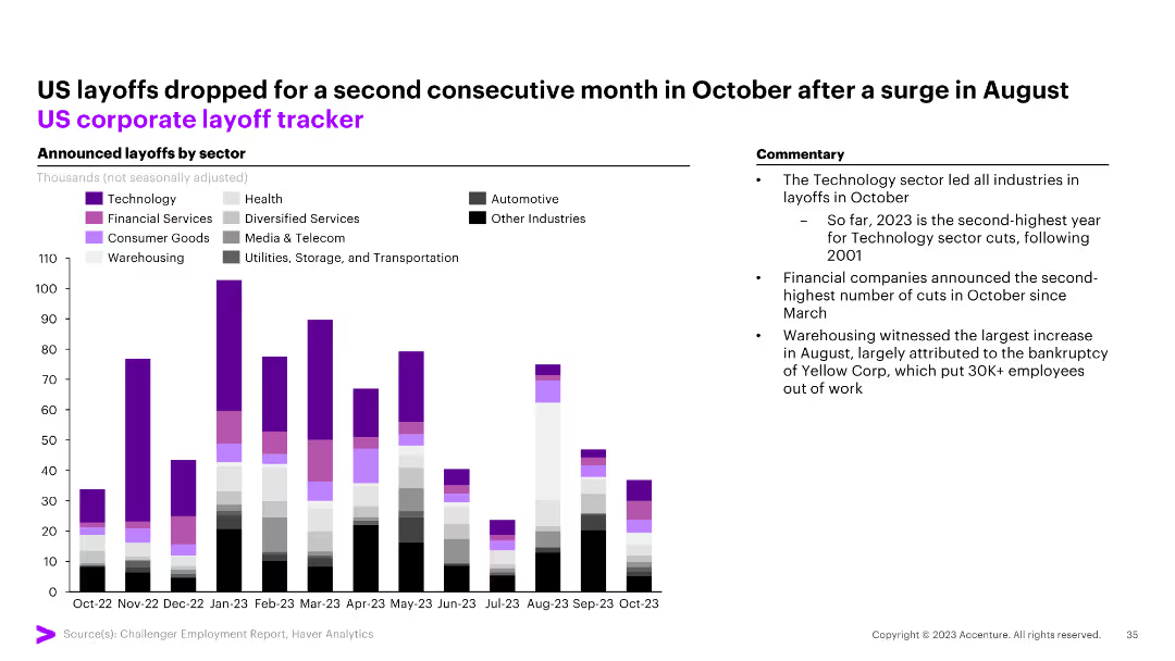
The slide features a column chart tracking announced layoffs by sector (Technology, Health, Financial Services, etc.) in the US from October 2022 to October 2023. Commentary on the right.
Market Analysis and Trends
Financial Services
The slide shows a drop in US layoffs for the second consecutive month in October, with technology leading the layoffs in October.
US, layoffs, corporate, tracker, technology, financial services, health, automotive, column chart
Mixed Chart
Accenture
Saved
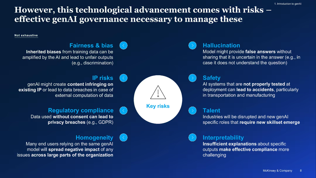
Dark blue slide with a central risk icon and radial layout of risk categories, labeled left and right
Risk Assessment and Management
Artificial Intelligence
This slide highlights key risks associated with generative AI adoption, including fairness, hallucinations, IP concerns, regulatory compliance, safety, and talent challenges. It underscores the importance of establishing governance to manage these risks effectively.
governance, AI risk, compliance, fairness, hallucination, safety, bias, talent, IP risk
Diagram
McKinsey
Saved
Includes a large pie chart that breaks down tax and non-tax revenue sources, illustrated with colors and labeled segments. A smaller triangle graph breaks down the components of non-tax revenue.
Regulatory and Compliance
Government & Public Sector
This slide provides a breakdown of tax versus non-tax revenue for the fiscal year, detailing the proportions and specific amounts from various sources such as fines, fees, and entrepreneurial activities. This aids in understanding the structure and diversity of government revenue sources.
Revenue, Tax, Non-tax, Fiscal policy, Government finance
Mixed Chart
PwC/Strategy&
Saved
The slide features a three-part comparative layout with check marks and bullet points. It is moderately dense with textual information across three distinct sections, comparing company priorities with achieved progress. The text is organized in blue and black, with green checks indicating progress.
Operational Efficiency
Financial Services
This slide outlines JPMorgan Chase & Co.'s significant progress against set priorities such as acquisition and deepening, engagement, and expenses and simplification. It uses bullet points and check marks to indicate achievements like increased deposit balances and improved digital activity rates. The slide is likely used in presentations to stakeholders to demonstrate company growth and operational achievements.
Progress, Priorities, Banking, Deposits, Engagement, Digital, Expenses, Simplification, Achievements, Growth
Table
JP Morgan
Saved
Circular chart showing the distribution of how employee engagement feedback is communicated within companies.
Strategic Planning
Professional Services
Discusses how effectively companies communicate employee engagement feedback, crucial for HR management improvement.
HR, communication, employee engagement, feedback, management
Single Chart
PwC/Strategy&
Saved
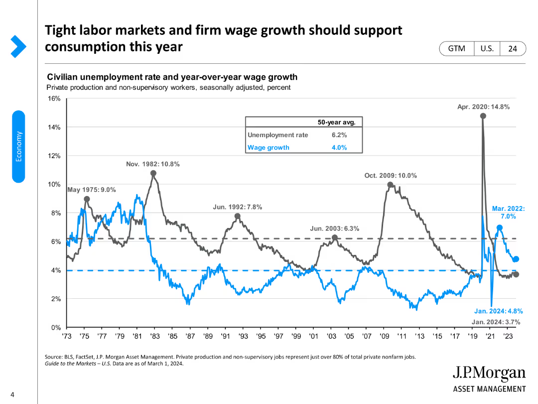
The slide displays a line chart comparing civilian unemployment rates with year-over-year wage growth, using different colors for clarity.
Market Analysis and Trends
Financial Services
It illustrates the relationship between tight labor markets, wage growth, and their impact on consumption trends in the current year.
labor market, wage growth, consumption, unemployment, economic trends
Single Chart
JP Morgan
Saved
Features bar and line charts comparing 60/40 portfolio returns and stock-bond correlations over time.
Investment Analysis
Financial Services
Explores the annual return decomposition of a 60/40 portfolio and the rolling 12-month correlation between S&P 500 and U.S. 10-year Treasuries.
returns, correlation, stock, bond, portfolio
Multiple Chart
JP Morgan
Saved
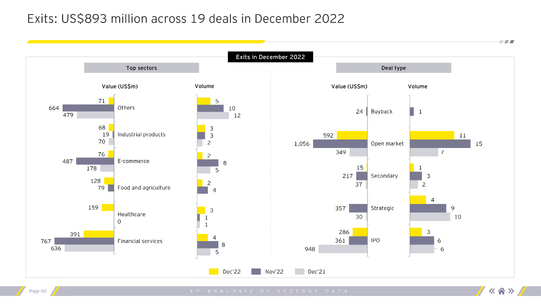
The slide features two bar charts. The left chart shows top sectors by value and volume. The right chart shows deal types by value and volume.
Market Analysis and Trends
Financial Services
This slide provides a detailed breakdown of exits in December 2022 by sector and deal type.
exits, December 2022, top sectors, deal types, value, volume, financial services
Multiple Chart
EY
Saved
This slide includes multiple triangular diagrams illustrating the impact of technology, process, data, and talent on operational maturity. The visuals are effectively used to compare the influence of each factor.
Strategic Planning
Professional Services
Highlights how different operational levers affect the maturity and efficiency of business operations. Essential for strategic decision-making and resource allocation in organizational development.
Operational Efficiency, Maturity Levels, Strategy
Mixed Chart
Accenture
Saved
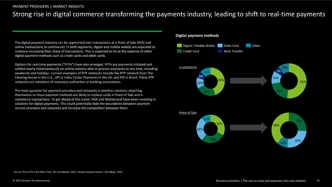
Contains two donut charts showing digital payment methods for e-commerce and Point of Sale (PoS). Includes text explaining the rise of digital wallets and real-time payments.
Market Analysis and Trends
Financial Services
Examination of the shift to digital and real-time payments in e-commerce and PoS, highlighting the increasing use of mobile wallets and instant payment methods.
digital commerce, payments industry, e-commerce, PoS, digital wallets, real-time payments, market analysis, financial services, trends, transformation
Multiple Chart
Deloitte
Saved
Pie chart showing the turnover distribution among Unilever’s top brands: Knorr and Hellmann’s. Gray and green colors, simple labels.
Competitive Landscape
Consumer Goods
Details the concentration of Unilever's turnover within its top brands, highlighting the significance of Knorr and Hellmann's in its global strategy. Offers insights into brand management and market penetration.
Brand Management, Turnover Distribution, Knorr, Hellmann’s, Market Penetration
Single Chart
Deutsche Bank
Saved
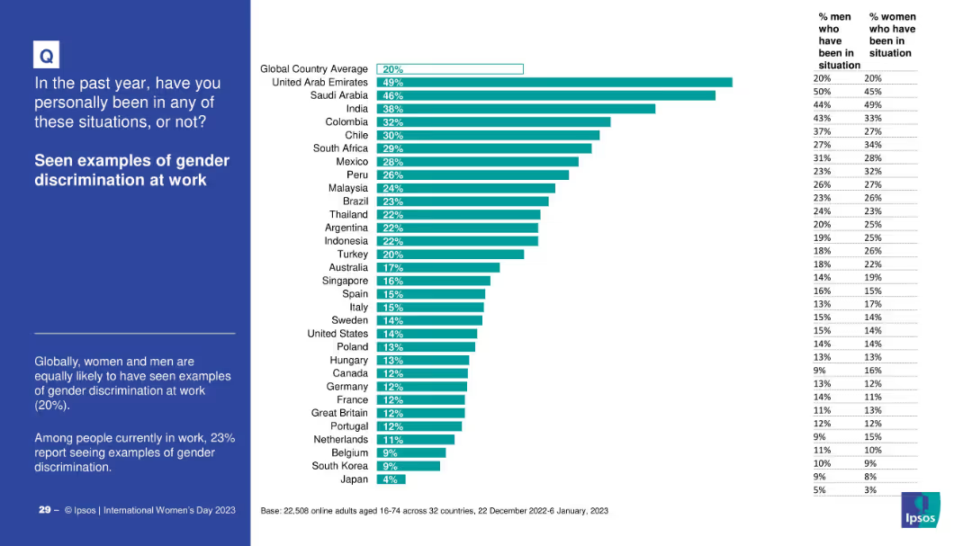
Bar chart showing reported workplace gender discrimination across countries. Gender-specific stats are included in tabular form.
Risk Assessment and Management
Government & Public Sector
This slide focuses on perceptions and experiences of gender discrimination in the workplace. The UAE and Saudi Arabia show the highest incidence, with men and women reporting equal likelihood globally.
workplace bias, gender discrimination, international comparison, employment issues, equal opportunity
Mixed Chart
IPSOS
Saved
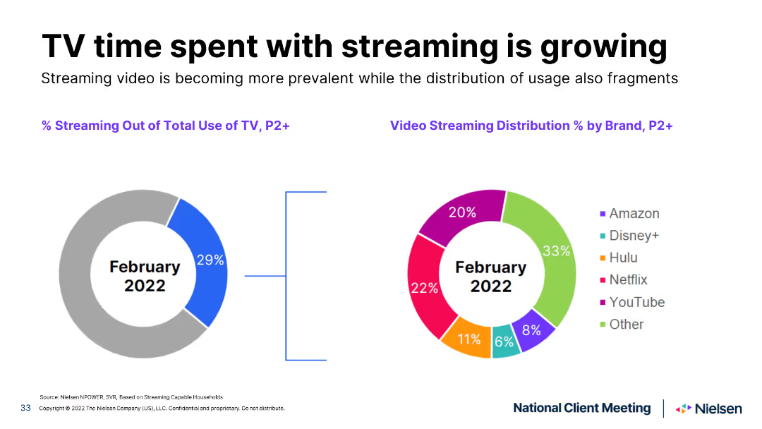
Pie chart slide showing the percentage of TV time spent streaming in February 2021 and February 2022, with distinct color segments for different streaming services.
Market Analysis and Trends
Media & Entertainment
Illustrates the increase in TV streaming time and the changing distribution among streaming services over a year, highlighting trends.
TV streaming, growth, comparison, streaming services, trends
Multiple Chart
Nielsen
Saved
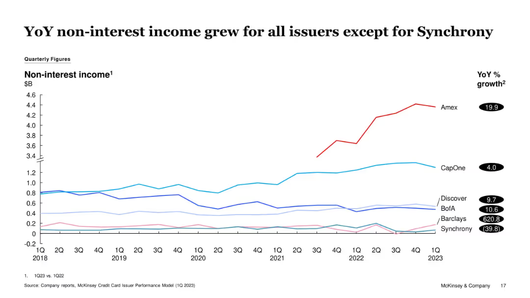
Multi-line graph of issuer-level non-interest income from 1Q18 to 1Q23. Amex stands out with significant growth. Synchrony declined. YoY % growth values listed on right.
Financial Performance
Financial Services
The slide shows YoY growth in non-interest income for most issuers, with Amex leading. Synchrony is the only issuer with a negative trend. The slide indicates strengthening of fee-based revenue for most firms, contributing to financial resilience.
Non-interest Income, Amex, Synchrony, Fee Revenue, Financial Trends, Credit Cards
Single Chart
McKinsey
Saved
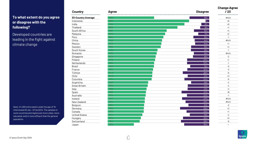
Horizontal bar chart comparing country-level agreement and disagreement on whether developed countries are leading the climate fight. Includes change from 2023.
Competitive Landscape
Environmental Services & Sustainability
This slide examines perceptions of leadership in the climate crisis. Developing countries (like Indonesia and India) show high agreement, while developed nations display skepticism. It highlights disparities in trust and accountability perceptions regarding global climate leadership.
climate leadership, developed countries, perception, public opinion, environment, global roles, Ipsos, Earth Day
Mixed Chart
IPSOS
Saved
Features a sequence of column chart illustrating changes in the leverage ratio over a period, complemented by a smaller bar chart depicting tier 1 capital data. Key highlights are noted on the right for quick reference.
Financial Performance
Financial Services
Focuses on the stability of the leverage ratio within a financial institution over time, emphasizing changes in regulatory treatment and capital adjustments. It provides insights into strategic financial planning and regulatory compliance.
leverage, capital, financial, compliance, stability
Mixed Chart
Deutsche Bank
Saved
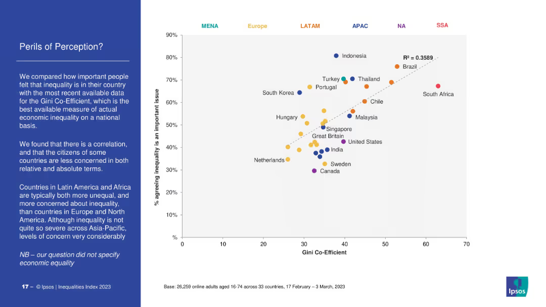
Scatter plot mapping Gini Coefficient (economic inequality) against percentage agreeing inequality is a major issue. Dotted trendline indicates correlation. Countries coded by region (color). Left-side text explains key takeaways.
Market Analysis and Trends
Government & Public Sector
The slide correlates perceived inequality with actual economic inequality (Gini coefficient). Countries in Latin America and Africa show high concern and inequality, while Europe and North America show lower concern. Highlights discrepancies in perception vs. data.
Gini coefficient, perception, inequality, economic data, Ipsos, regional comparison, Latin America, public opinion
Mixed Chart
IPSOS
Saved
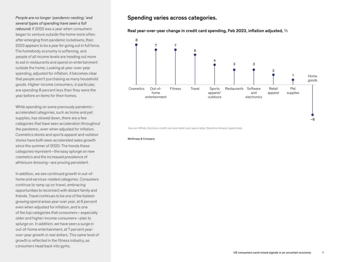
Split layout: left side contains narrative text in paragraph form; right side features a vertical dot plot chart showing % change in credit card spending across various categories. Clean, minimal layout with consistent typography.
Market Analysis and Trends
Consumer Goods
This slide highlights shifting consumer spending patterns in early 2023, showing increased spending in entertainment, travel, fitness, and cosmetics, while spending on home goods and pet supplies declined. The analysis focuses on how inflation-adjusted spending has changed year-over-year, particularly among higher-income consumers.
consumer spending, inflation, categories, travel, entertainment, retail
Mixed Chart
McKinsey
Saved
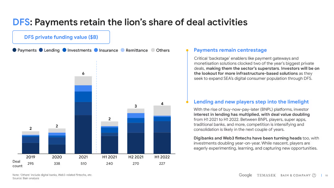
Column chart with detailed analysis in the sidebar, highlighting the distribution of deals across the DFS sector.
Market Analysis and Trends
Financial Services
Examines the distribution of deals within the DFS sector, emphasizing payments' dominance and spotlighting new players in lending.
DFS, deal activities, payments, lending, investment trends, SEA, column chart, market analysis
Mixed Chart
Bain
Saved
Composed of a series of performance metric tables, the slide compares targets with actual results for different financial indicators over three years, using checkmarks and crosses to show if targets were met.
Financial Performance
Financial Services
The slide evaluates JPMorgan Chase's achievement against its long-term financial targets, useful for performance assessment and management discussions.
financial targets, performance assessment, JPMorgan Chase, long-term growth, revenue, profit margin, return on equity.
Table
JP Morgan
Saved
Previous
Next
If nothing, comes up, please save your slides first
Create a FREE account to continue browsing
Receive Instant Access to 1,000+ slides from companies like McKinsey, Google, and Goldman Sachs
First Name
Last Name
Email
Password
I agree to all
Terms & Privacy Policy
Thank you! Your submission has been received!
Oops! Something went wrong while submitting the form.
Have an account?
Sign in
Column Chart
Heatmap
Chevron
Org Chart
Infographic
Callouts
Timeline
List
Graphic
Picture
Process Flow
Diagram
Paragraph
Map
Table
Framework
Subtitle
Takeaway Box
Icon
Other Chart
Radar Chart
Waterfall Chart
Mekko Chart
Pie Chart
Scatter Plot
Line Chart
Bar chart
Bullet points