Create a FREE Account
Instant access to 1,000+ real slides from top companies like McKinsey, BCG, Goldman Sachs, Google and many more!
First Name
Last Name
Email
Password
I agree to all
Terms & Privacy Policy
Thank you! Your submission has been received!
Oops! Something went wrong while submitting the form.
Have an account?
Sign in
Library
Templates
Courses
Pricing
My Account
My Slides
My Templates
✦ AI
AI Prompt Library
AI Search
Sign in
Start Here
Logout
My Saved Slides
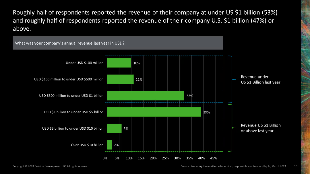
This slide presents a combination of a horizontal bar chart and stacked bar chart, depicting company revenue distributions. The green and black color scheme is used, with revenue ranges clearly labeled.
Financial Performance
Financial Services
It provides insights into the revenue distribution of companies, showing that about half reported revenues under $1 billion, while the other half reported revenues of $1 billion or more.
revenue, distribution, financial, chart, company
Single Chart
Deloitte
Saved
Features an individual making adjustments to machinery, symbolizing proactive engagement. Includes statistics about public DEI commitments and funding.
Regulatory and Compliance
Professional Services
Highlights recent trends in DEI commitments among multinational companies and the importance of integrating DEI into business practices.
DEI, commitments, funding, multinational companies, business practices, equity
Multiple Chart
Deloitte
Saved
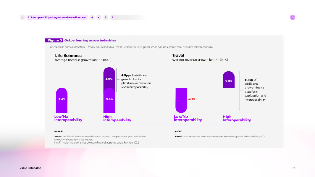
The slide features a column chart comparing average revenue growth across industries (Life Sciences, Travel) based on interoperability. High interoperability is shown in purple, while low/no interoperability is shown in a lighter shade.
Market Analysis and Trends
Technology & Software
Highlights how interoperability impacts revenue growth in different industries. The chart compares life sciences and travel sectors, showing significant growth advantages for companies with high interoperability.
interoperability, industry comparison, revenue, growth, life sciences
Multiple Chart
Accenture
Saved
Features a combination of column chart, scatter plot chart and a pie chart depicting the relationship between IPO sizes and bank fees in Germany, including individual data points and trends. Text explanations supplement the graphs.
Financial Performance
Financial Services
Analyzes the fee structures associated with German IPOs, providing insights into base fees, incentive fees, and variations based on IPO size, along with strategic implications for financial planning.
IPO fees, financial analysis, German IPOs, fee structure, bank fees, incentive fees, market analysis, regulatory compliance
Multiple Chart
PwC/Strategy&
Saved
Various pie charts illustrating Knorr's global sales, profitability, and market segments. Includes a pie chart for market distribution and column charts for financial metrics.
Product and Service Analysis
Consumer Goods
Provides an in-depth analysis of Knorr’s performance across different market segments, emphasizing its profitability and widespread market presence. Discusses strategic positioning and product diversity.
Knorr, Global Sales, Profitability, Market Segments, Product Diversity
Multiple Chart
Deutsche Bank
Saved
Features a column chart showing the rising costs of SOC advanced design at various technology nodes from 2006 to 2020, with the costs represented in millions and a significant upward trend as the technology node size decreases. The slide is visually straightforward with a focus on the trend line highlighted in green.
Market Analysis and Trends
Technology & Software
This slide outlines the escalating costs of semiconductor design with advancements in technology, from 65nm in 2006 to 5nm in 2020. It highlights the financial implications of technological progress in the semiconductor industry, suitable for financial analysis or strategic investment discussions in technology sectors.
semiconductor, design costs, technology nodes, financial analysis, trend
Single Chart
BCG
Saved
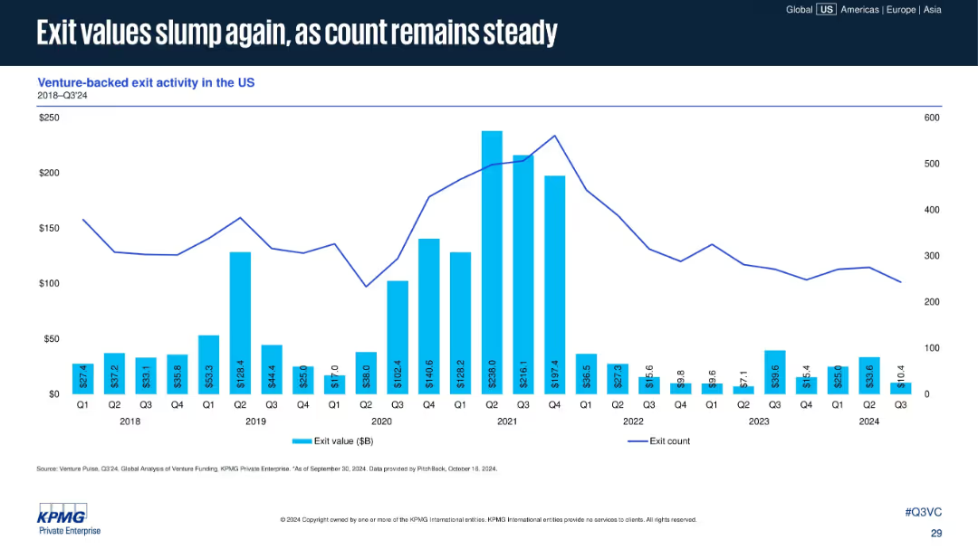
Bar-line combo chart of exit values and counts from 2018 to Q3 2024. Blue bars for value and a line for exit count.
Financial Performance
Financial Services
Exit values for venture-backed companies in the U.S. continue to decline into 2024, while the number of exits remains relatively steady. This signals reduced market valuations but persistent M&A or IPO activity.
exit value, venture-backed exits, IPO, M&A, exit count, market downturn, US exits, 2024 trends
Single Chart
KPMG
Saved
Column chart showing yearly capital expenditures as a percentage of net sales, projected to rise in the future.
Financial Performance
Consumer Goods
Details the financial planning for capital investments over several years, emphasizing shifts due to strategic decisions.
capital expenditures, financial planning, net sales, investments, column chart
Single Chart
Barclays
Saved
Divides concepts of purpose, strategy, and culture visually, accompanied by a supermarket case study responding to COVID-19. It uses clear lines and text separation for organizational topics.
Operational Efficiency
Retail & E-commerce
Emphasizes the alignment of purpose, strategy, and culture in driving organizational success, showcased through a supermarket case study during the COVID-19 crisis.
Organizational culture, Strategic alignment, COVID-19, Supermarket
Header Vertical
BCG
Saved
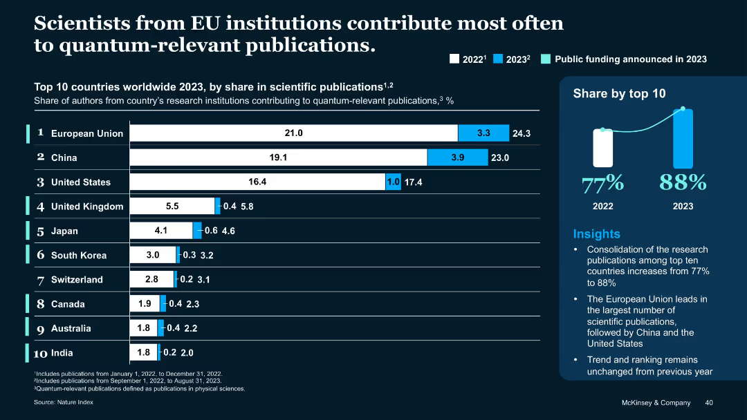
Bar chart showing % of QT scientific publications by country/region (2022–2023), with annotation on public funding.
Industry Overview
Education & Training
European Union leads in quantum-related research publications in 2023, followed by China and the U.S. The top 10 countries now contribute 88% of total publications. The slide highlights public research funding's impact on QT output.
quantum publications, EU, China, scientific research, 2023, public funding, institutions
Multiple Chart
McKinsey
Saved
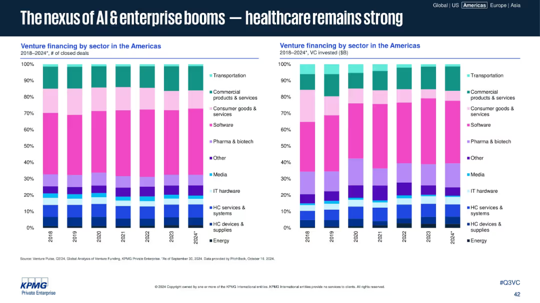
Side-by-side stacked bar charts showing venture financing by sector (deal count and value).
Industry Overview
Artificial Intelligence
Sector analysis from 2018–2024 shows growing investment in AI, enterprise software, and healthcare (especially pharma & biotech). Despite fluctuations, these sectors consistently attract high funding and deal activity across the Americas.
AI, healthcare, pharma, biotech, enterprise, VC sectors, funding trends, Americas, software, sector analysis
Multiple Chart
KPMG
Saved
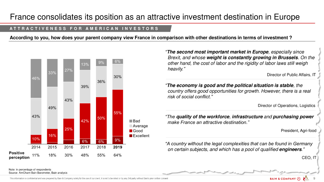
A column chart comparing perceptions of France's investment attractiveness over several years, with text quotes from industry leaders.
Market Analysis and Trends
Financial Services
The slide analyzes how France's attractiveness as an investment destination has evolved, particularly for American investors.
investment attractiveness, France, financial services, market analysis, yearly comparison, perceptions
Mixed Chart
Bain
Saved
The slide includes text boxes outlining key figures and commitments for future dates, and the 'Act4nature International' logo.
Strategic Planning
Environmental Services & Sustainability
Outlines Michelin's environmental performance in 2022 and its commitments for 2030 to reduce the impact of its operations on biodiversity and ecosystems, highlighting progress and future targets.
Biodiversity, Ecosystems, Environmental Impact, Michelin, Commitments, Sustainability, Life Cycle Analysis, Raw Materials, 2030 Targets, Act4nature
Table
Morgan Stanley
Saved
Column chart comparing the levelized cost of storage for various energy storage systems, both subsidized and unsubsidized, for different configurations and use cases.
Financial Performance
Energy & Utilities
The slide evaluates the energy-based levelized cost of storage across various configurations, highlighting cost differences with and without subsidies.
Energy storage, Cost analysis, Energy, Subsidies, Comparison
Single Chart
Roland Berger
Saved
Column charts showing group funding by year and quarter, with percentage breakdowns of shareholders equity, debt, and deposits.
Financial Performance
Financial Services
Overview of UBS group funding from 2020 to 3Q23, highlighting changes in shareholder equity, debt, and customer deposits.
Funding, equity, debt, deposits, trends
Multiple Chart
UBS
Saved
Tables and color-coded data blocks comparing various metrics.
Financial Performance
Financial Services
Provides a comparative analysis of the global economic impact due to the pandemic, including GDP forecasts, stock market performance, and consumer activity.
economic, impact, GDP, market, pandemic
Mixed Chart
BCG
Saved
Contains small text blocks and icons. There's a strategic pillar graphic at the bottom.
Industry Overview
Financial Services
Provides an overview of market leadership, strategic principles, and innovation within JPMorgan's Asset and Wealth Management, illustrating their market position and investment in research.
asset management, wealth, innovation, JPMorgan, market lead
Pillar
JP Morgan
Saved
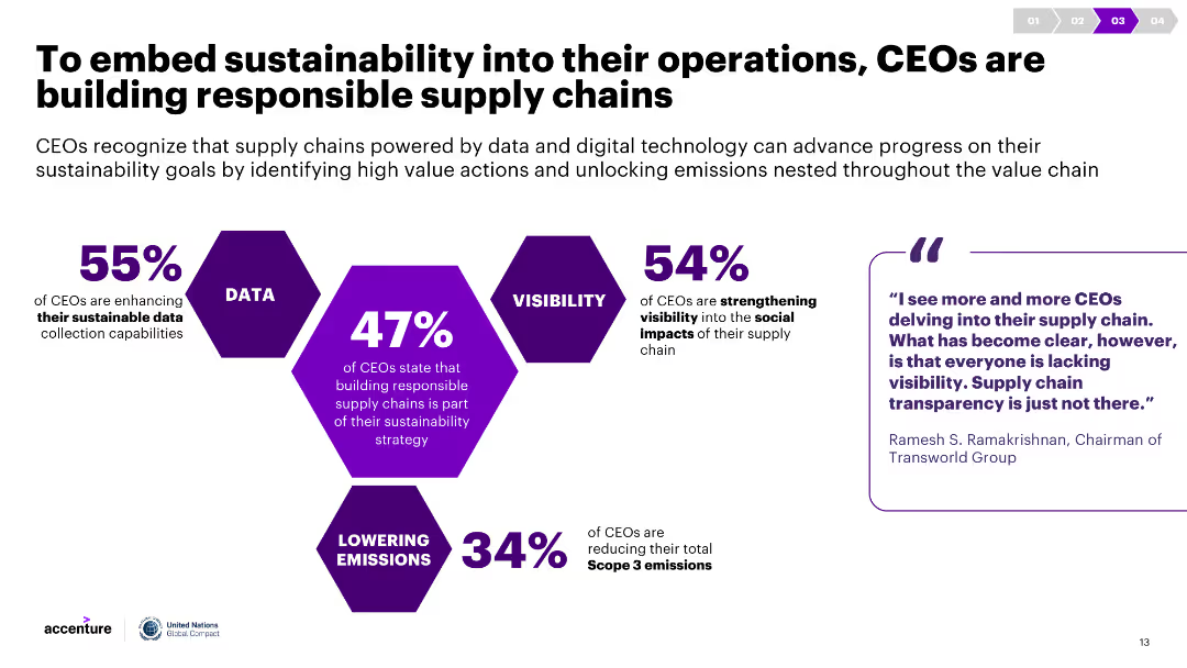
Infographics show percentages of CEOs taking various actions to build responsible supply chains. Commentary includes quotes and detailed descriptions of these actions.
Strategic Planning
Environmental Services & Sustainability
The slide highlights the steps CEOs are taking to incorporate sustainability into supply chains, such as enhancing data collection, visibility, and reducing emissions.
Responsible supply chains, sustainability, CEO actions, data collection, emissions reduction
Diagram
Accenture
Saved
It features a comparative column chart of year-over-year investments in various business areas for CCB.
Strategic Planning
Financial Services
Details the strategic investment plans for 2022-2023 to grow the Consumer and Community Banking franchise with expected ROI.
investments, franchise growth, CCB, ROI, strategic planning, JPMorgan Chase & Co, financial services
Mixed Chart
JP Morgan
Saved
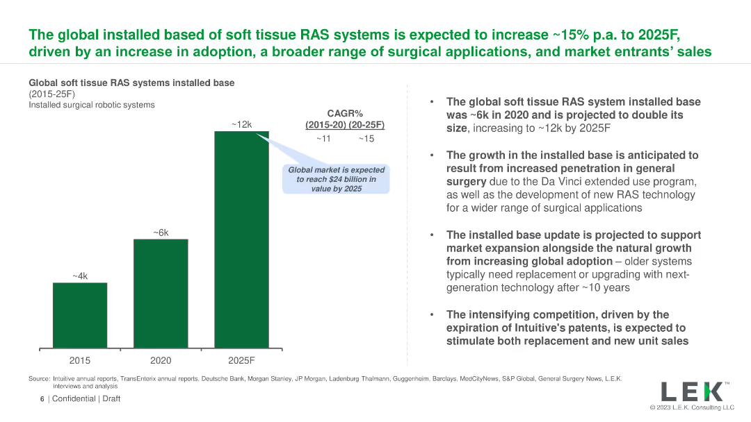
The slide uses a column chart to show the projected growth of the global installed base of soft tissue RAS systems from 2015 to 2025. Text on the right provides context and details about the projected growth, market expansion, and competitive landscape.
Market Analysis and Trends
Healthcare & Pharmaceuticals
The slide forecasts the growth of the installed base of soft tissue robotic-assisted surgery (RAS) systems globally, expecting an increase from ~6k in 2020 to ~12k by 2025. It outlines the drivers of this growth, including market expansion and technological advancements.
RAS, growth, global, installed base, soft tissue, projection, 2025, market expansion, technology, competition
Mixed Chart
LEK
Saved
This slide features a line chart depicting the Global economic policy uncertainty index from 1997 to 2022, and a column chart showing year-over-year percent change in real GDP from 2019 to 2024 for various regions and countries. It uses a blue and white color scheme with clear labels and legends.
Market Analysis and Trends
Financial Services
The slide analyzes persistent inflation and elevated interest rates, showcasing global economic policy uncertainty and projected real GDP changes for different regions and countries, suggesting these as continued characteristics of the economic slowdown.
inflation, interest rates, economic slowdown, GDP, policy uncertainty
Multiple Chart
EY
Saved
Column chart detailing the usage plans for different types of APIs, including Internal APIs, APIs by third parties, Private APIs, and Public APIs. The chart segments into categories: No plans, Plan to use, and Currently use.
Operational Efficiency
Technology & Software
The slide presents a survey result showing the adoption rates and future plans for various types of APIs, highlighting the predominance of internal APIs and public/external APIs.
APIs, survey, internal, external, adoption
Multiple Chart
Gartner
Saved
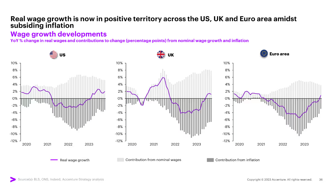
The slide contains three column charts comparing YoY % change in real wages and contributions from nominal wage growth and inflation for the US, UK, and Euro area from 2020 to 2023.
Market Analysis and Trends
Professional Services
The slide shows real wage growth is now positive across the US, UK, and Euro area amidst subsiding inflation.
wage growth, real wages, inflation, US, UK, Euro area, column chart
Multiple Chart
Accenture
Saved
Split layout: radar-style visual for capabilities (top), text sections for strengths and limitations (bottom); corporate and professional style.
Competitive Landscape
Technology & Software
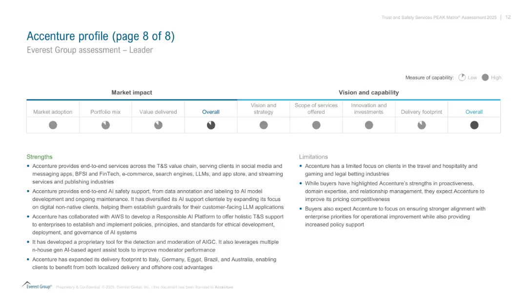
Final profile summary of Accenture in the PEAK Matrix assessment. Visualizes its performance across several dimensions (vision, services, investments). Text highlights Accenture’s strengths in AI safety and end-to-end solutions, with noted client and pricing focus limitations.
Accenture, PEAK Matrix, AI safety, capabilities, limitations, client focus, strengths
Mixed Chart
Accenture
Saved
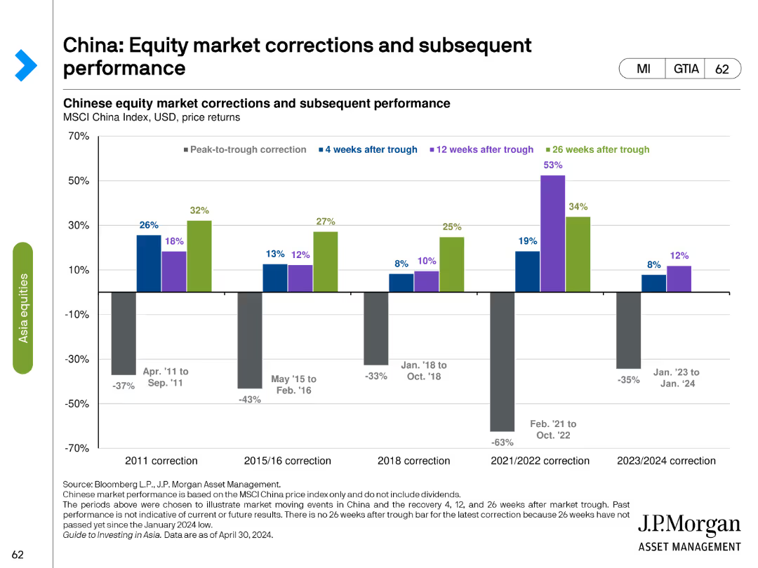
This slide includes a column chart showing peak-to-trough corrections and subsequent performance of the Chinese equity market. Different colors represent recovery periods of 4, 12, and 26 weeks after market trough.
Market Analysis and Trends
Financial Services
The slide shows the performance of Chinese equities during various correction periods, detailing the percentage drops and recovery patterns to analyze market resilience and investment opportunities post-correction.
China, equity market, corrections, performance, peak-to-trough, recovery, financial analysis, investment opportunities, market resilience, post-correction
Single Chart
JP Morgan
Saved
Previous
Next
If nothing, comes up, please save your slides first
Create a FREE account to continue browsing
Receive Instant Access to 1,000+ slides from companies like McKinsey, Google, and Goldman Sachs
First Name
Last Name
Email
Password
I agree to all
Terms & Privacy Policy
Thank you! Your submission has been received!
Oops! Something went wrong while submitting the form.
Have an account?
Sign in
Column Chart
Heatmap
Chevron
Org Chart
Infographic
Callouts
Timeline
List
Graphic
Picture
Process Flow
Diagram
Paragraph
Map
Table
Framework
Subtitle
Takeaway Box
Icon
Other Chart
Radar Chart
Waterfall Chart
Mekko Chart
Pie Chart
Scatter Plot
Line Chart
Bar chart
Bullet points