Create a FREE Account
Instant access to 1,000+ real slides from top companies like McKinsey, BCG, Goldman Sachs, Google and many more!
First Name
Last Name
Email
Password
I agree to all
Terms & Privacy Policy
Thank you! Your submission has been received!
Oops! Something went wrong while submitting the form.
Have an account?
Sign in
Library
Templates
Courses
Pricing
My Account
My Slides
My Templates
✦ AI
AI Prompt Library
AI Search
Sign in
Start Here
Logout
My Saved Slides
Bar charts compare the top countries for inbound and outbound student numbers in 2018, highlighting major destinations and sources of international students.
Market Analysis and Trends
Education & Training
Focuses on global student mobility in 2018, detailing the leading countries for inbound and outbound educational travel. It discusses trends and predicts future changes in international student flows by 2030.
student mobility, global, 2018, trends
Multiple Chart
Roland Berger
Saved
Bar graphs comparing the number of unicorns in the United States, Greater China, and the rest of the world, with boxing gloves.
Competitive Landscape
Media & Entertainment
Highlights the competitive growth of unicorns in China compared to the US and globally, suggesting a shift in the global power balance.
Unicorns, Global, Power Balance, China, United States, Competition
Multiple Chart
PwC/Strategy&
Saved
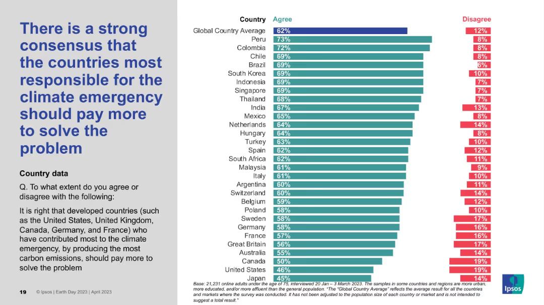
Two-column layout; left side contains large bold blue text; right side features a horizontal bar chart with country-wise agreement/disagreement percentages in teal and red.
Strategic Planning
Environmental Services & Sustainability
The slide presents survey data indicating that a majority of people globally agree that the countries most responsible for the climate emergency should bear greater financial responsibility. The chart shows percentage agreement levels across various countries.
climate responsibility, developed countries, emissions, accountability, survey, financial burden, global opinion, environmental justice, Ipsos, Earth Day
Mixed Chart
IPSOS
Saved
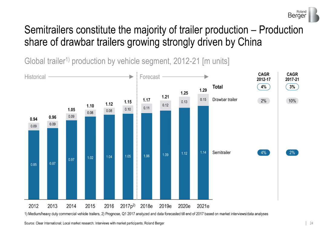
Stacked bar chart comparing semitrailers vs. drawbar trailers from 2012–2021
Product and Service Analysis
Industrial & Manufacturing
The chart shows that semitrailers dominate global production, but drawbar trailers are gaining share, especially due to demand in China. It also presents historical and forecasted production volumes with CAGR indicators.
semitrailers, drawbar trailers, trailer production, China, market shift, CAGR
Single Chart
Roland Berger
Saved
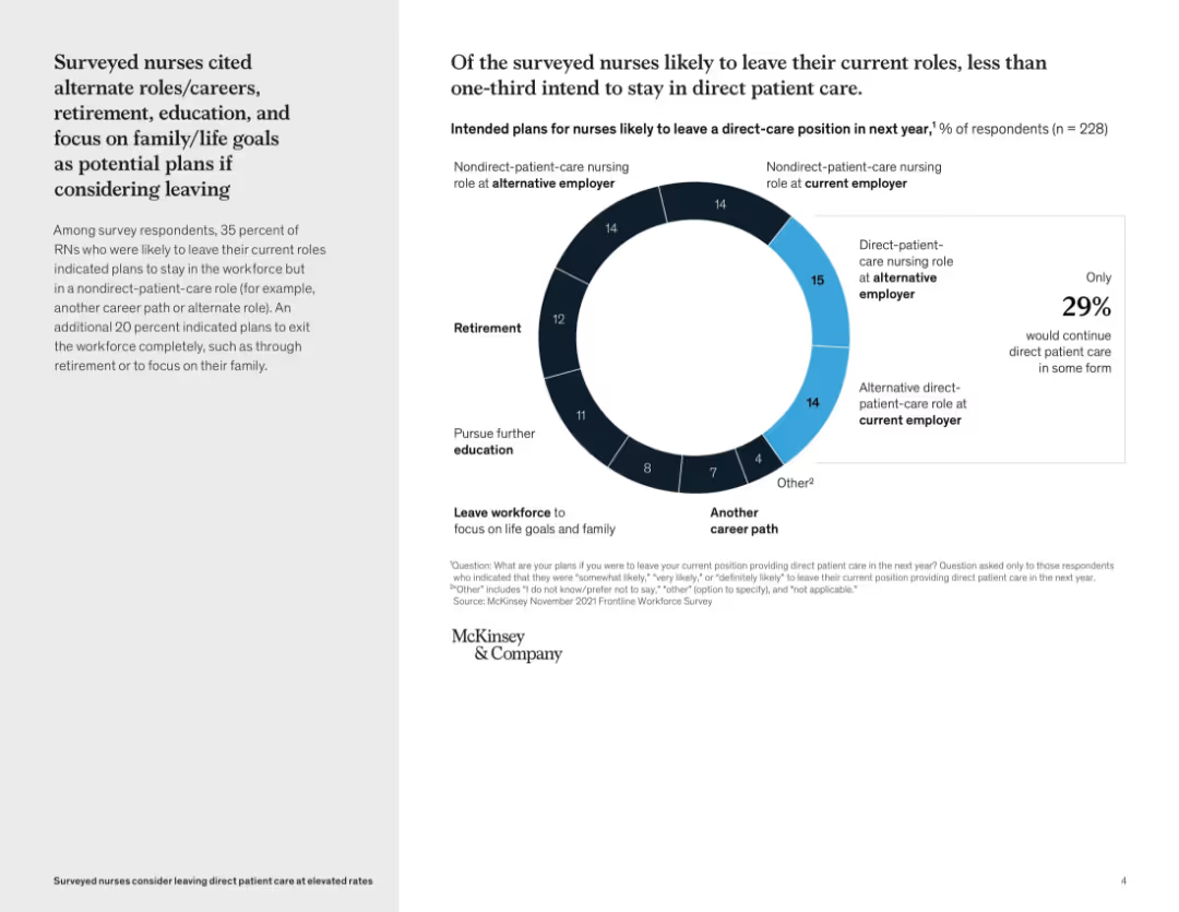
Split layout: left side contains text summary, right side features a donut chart with percentages and categories of career transitions; light background with blue accent
Human Resources and Talent Management
Healthcare & Pharmaceuticals
This slide explores nurses’ potential career moves if they leave direct patient care. It shows that only 29% intend to remain in direct patient care roles, with others planning retirement, education, alternate roles, or leaving the workforce. The visual emphasizes a workforce shift and highlights the need for retention strategies.
nurse retention, career transitions, patient care, workforce trends, survey data, McKinsey, alternate roles, retirement, education, family goals
Mixed Chart
McKinsey
Saved
The slide features a pie chart outlining leaders' expectations for a 2023 recession and colored blocks indicating strategies to mitigate economic downturns.
Risk Assessment and Management
Financial Services
Offers insights into the anticipated economic climate for 2023 with a focus on recession expectation and strategic responses, emphasizing risk management and financial planning.
Recession, Strategy, Risk Management, 2023
Mixed Chart
JP Morgan
Saved
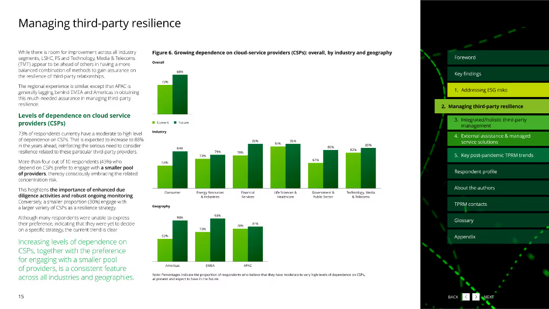
The slide features column charts about organizational priorities in widening the scope of TPRM into related areas.
Strategic Planning
Professional Services
This slide discusses the priorities of organizations in expanding third-party risk management to related functional areas.
TPRM, priorities, scope, functional areas, survey
Multiple Chart
Deloitte
Saved
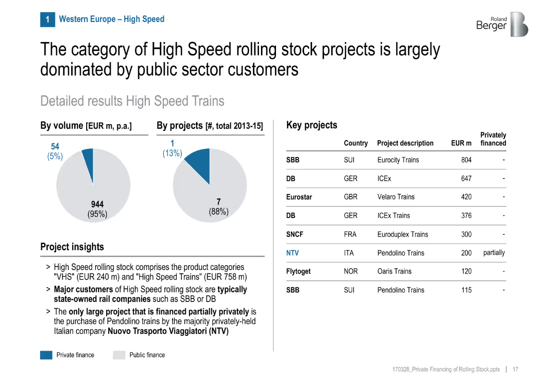
Pie charts, title, two data visuals (volume & projects), list of key projects with country/financing info
Product and Service Analysis
Transportation & Logistics
High-speed rail projects in Western Europe are mainly publicly funded, with only one partially private project (NTV in Italy). State-owned companies dominate.
high speed, rail, public sector, NTV, Italy, SNCF, SBB, DB, funding share, project breakdown
Mixed Chart
Roland Berger
Saved
The slide contains a bar chart showing fixed income yields to maturity for different bond categories, divided into developed market government bonds, investment-grade bonds, high yield bonds, and Asia & emerging market bonds.
Financial Performance
Financial Services
This slide provides an overview of global fixed income yields and duration, highlighting yields to maturity for various bond categories. It is used for financial performance evaluation and fixed income strategy planning.
Global fixed income, yields, duration, bonds, investment-grade, high yield, emerging markets
Multiple Chart
JP Morgan
Saved
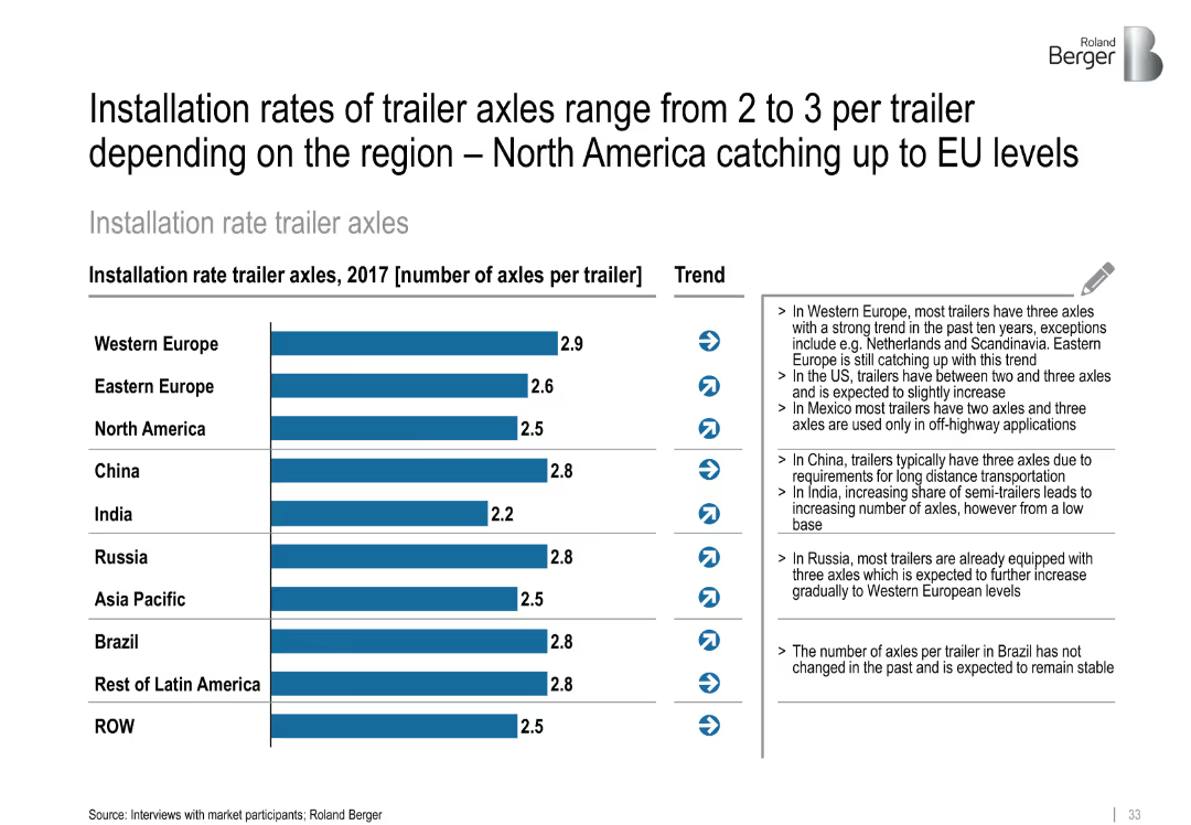
Bar chart layout with horizontal bars and region-wise comparison; trend arrows and side-aligned insights
Performance Metrics and KPIs
Transportation & Logistics
This slide compares the average number of trailer axles installed per trailer across global regions as of 2017. Western Europe leads with 2.9 axles per trailer, while India is lowest at 2.2. Trends show gradual increases across most regions, especially North America.
trailer axles, installation rates, regional trends, North America, Western Europe, China, performance metrics, transportation equipment
Mixed Chart
Roland Berger
Saved
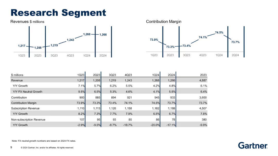
Charts showing revenue and contribution margins above a detailed table. Table includes growth metrics and breakdown into subscription categories.
Performance Metrics and KPIs
Technology & Software
Provides updated data for the Research segment through 2Q24. Tracks sustained subscription growth and contraction in non-subscription revenue, alongside steady contribution margins and FX-neutral growth.
Research, Revenue, Contribution Margin, Subscription, FX Growth
Multiple Chart
Gartner
Saved
The slide presents a structured layout with a hierarchical diagram of a bank's organizational structure. Key positions from CEO to various department heads are shown, with connecting lines indicating reporting and structural relationships. The slide uses a monochromatic blue color scheme, which is simple yet effective in highlighting the text and structure.
Organizational Structure and Change
Financial Services
Outlines the organizational structure of a customer-focused bank, emphasizing integration and centralization of services to enhance customer experience and operational efficiency. It identifies key leadership positions and their interconnections within the bank, reinforcing the strategic focus on customer-centricity in banking operations.
banking, organizational structure, customer-centric, efficiency
Diagram
Deutsche Bank
Saved
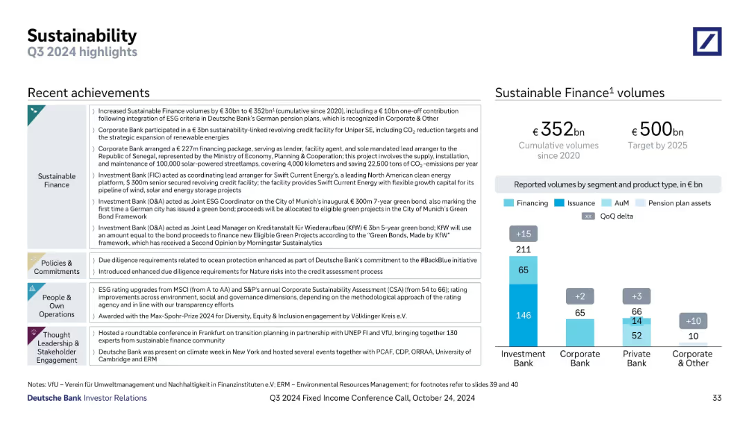
Left: bullet-based achievements by theme (Finance, Commitments, Operations, Thought Leadership); Right: vertical bar chart with segment breakdown
Strategic Planning
Financial Services
Highlights Deutsche Bank’s Q3 2024 sustainability efforts, with updates on green financing, ESG initiatives, and policy changes. Shows cumulative sustainable finance volumes and targets by 2025, segmented by business unit and type.
ESG, sustainability, green bonds, sustainable finance, corporate responsibility, Q3 2024, Deutsche Bank, investment banking
Mixed Chart
Deutsche Bank
Saved
A column chart showing the market cap of Brazil's top companies in 2010, 2015, and 2019 with significant downturns and recoveries noted.
Investment Analysis
Financial Services
Presents Brazil's top 10 companies' market cap fluctuations and recovery over the decade, providing insights into the economic conditions and recovery phases.
market cap, Brazil, top companies, economic recovery, investment
Mixed Chart
McKinsey
Saved
Features a series of column charts in varying shades of green, showing the utilization of first party data across maturity stages. The layout is effective in conveying comparative data.
Market Analysis and Trends
Media & Entertainment
Highlights the importance of leveraging first party data in marketing campaigns across different maturity stages. This slide is useful for analyzing data utilization trends and planning data-driven marketing strategies.
first party data, marketing campaigns, data utilization, maturity stages, data-driven marketing, column chart, comparative analysis, trend analysis
Single Chart
BCG
Saved
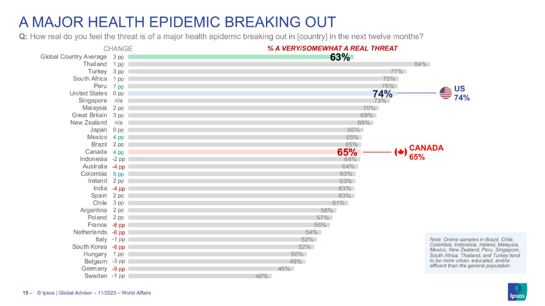
Horizontal bar chart showing how real people perceive the threat of a health epidemic in their country, with countries ranked by concern level.
Risk Assessment and Management
Healthcare & Pharmaceuticals
Country comparison of how real people think the risk of a major health epidemic is. U.S. (74%) ranks highly, with global average at 63%. Canada’s concern is at 65%. Includes % change from previous year, showing shifting perceptions of epidemic threat.
health epidemic, public threat, perception, global concern, pandemic, Ipsos, national comparison, risk
Single Chart
IPSOS
Saved
Slide includes icons and bullet points depicting funding sources and infrastructure projects under the Indonesian Universal Service Obligation (USO). Annotations explain funding mechanisms and geographic focus areas, with a sidebar detailing specific government-led projects.
Regulatory and Compliance
Telecommunications
Explains the role of the Indonesian USF in funding telecommunications infrastructure in remote and underdeveloped areas. Describes ongoing projects and financial strategies, emphasizing the government's commitment to enhancing nationwide connectivity.
USF, network coverage, remote areas, funding, infrastructure, government projects
Linear Flow
BCG
Saved
Includes column charts showing cancellation rates by engine and brand preference during COVID-19.
Market Analysis and Trends
Transportation & Logistics
Analyzes consumer loyalty to car brands and engine types during the pandemic, with a focus on premium brands.
brand loyalty, engine types, purchase intent, market stability
Multiple Chart
McKinsey
Saved
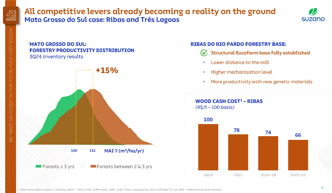
Histogram on forestry productivity, bullet points summarizing Ribas region benefits, and bar chart on wood cost.
Operational Efficiency
Agriculture & Food Production
Demonstrates forestry productivity improvements in Mato Grosso do Sul, highlighting the Ribas base’s structural advantages. Projects significant cost reduction in wood by 2029 through higher yields and mechanization.
forestry productivity, Ribas, genetic materials, cost reduction, MAI
Multiple Chart
Goldman Sachs
Saved
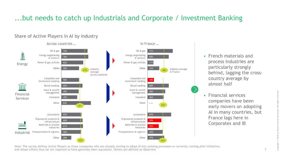
Bar charts showing the share of active AI players in energy, financial services, and industrial sectors between France and other countries.
Competitive Landscape
Financial Services
This slide highlights areas where France lags in AI adoption, particularly in industrial and corporate banking sectors, compared to other countries.
AI, France, financial services, industrial, investment banking, energy, comparison, active players, bar charts, industry average
Multiple Chart
BCG
Saved
Features three pie charts illustrating different metrics for chargebacks in GBS across stages: overall, startup, and mature.
Financial Performance
Professional Services
Discusses how chargeback metrics within global business services (GBS) vary across different stages of business maturity, focusing on various operational and financial metrics.
GBS, chargebacks, metrics, stages
Multiple Chart
Deloitte
Saved
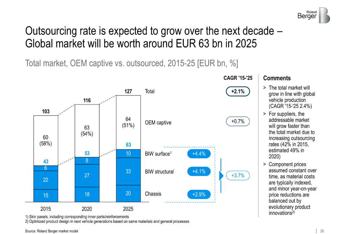
Vertical stacked bar chart with three grouped columns (2015, 2020, 2025) showing OEM captive vs. outsourced market components. Includes CAGR labels and comment section.
Market Analysis and Trends
Industrial & Manufacturing
The slide forecasts growth in outsourcing within the automotive body and chassis market. It predicts OEM captive shares will decline while outsourced market grows, driven by cost and efficiency pressures.
outsourcing, OEM, market growth, automotive, BIW, chassis, CAGR, supplier market, Roland Berger
Mixed Chart
Roland Berger
Saved
Features column charts comparing education funding levels and allocations within the Indonesian government budget over several years. Additional bar charts compare Indonesia's education spending to neighboring countries, with annotations highlighting key statistics and trends.
Financial Performance
Education & Training
Reviews the sustainability of government funding for education in Indonesia, comparing it to neighboring countries and discussing potential impacts of policy changes on funding levels. Offers insights into the challenges and opportunities within the education funding landscape.
demand, subsidy
Multiple Chart
BCG
Saved
The slide features a black background with a large orange header. It contains a text block and three bar charts displaying the percentage of employees discussing political and social issues at work, segmented by different groups.
Organizational Structure and Change
Government & Public Sector
Discusses the frequency and impact of political and social discussions at work. It examines the positive and negative outcomes of these discussions across various demographic groups, revealing that such interactions can have both beneficial and detrimental effects on workplace dynamics.
workplace discussions, political issues, social issues, demographics
Multiple Chart
PwC/Strategy&
Saved
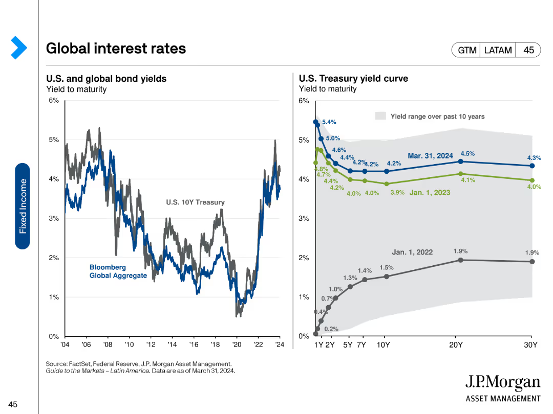
The slide includes two line charts: one showing U.S. and global bond yields over time, and the other displaying the U.S. Treasury yield curve at different points in time. The charts use distinct colors for different time periods and bond types.
Market Analysis and Trends
Financial Services
It compares the yield to maturity for U.S. and global bonds and shows changes in the U.S. Treasury yield curve over the past few years. This helps analyze trends in interest rates and predict future movements.
Bond yields, yield curve, U.S. Treasury, interest rates, global bonds
Multiple Chart
JP Morgan
Saved
Previous
Next
If nothing, comes up, please save your slides first
Create a FREE account to continue browsing
Receive Instant Access to 1,000+ slides from companies like McKinsey, Google, and Goldman Sachs
First Name
Last Name
Email
Password
I agree to all
Terms & Privacy Policy
Thank you! Your submission has been received!
Oops! Something went wrong while submitting the form.
Have an account?
Sign in
Column Chart
Heatmap
Chevron
Org Chart
Infographic
Callouts
Timeline
List
Graphic
Picture
Process Flow
Diagram
Paragraph
Map
Table
Framework
Subtitle
Takeaway Box
Icon
Other Chart
Radar Chart
Waterfall Chart
Mekko Chart
Pie Chart
Scatter Plot
Line Chart
Bar chart
Bullet points