Create a FREE Account
Instant access to 1,000+ real slides from top companies like McKinsey, BCG, Goldman Sachs, Google and many more!
First Name
Last Name
Email
Password
I agree to all
Terms & Privacy Policy
Thank you! Your submission has been received!
Oops! Something went wrong while submitting the form.
Have an account?
Sign in
Library
Templates
Courses
Pricing
My Account
My Slides
My Templates
✦ AI
AI Prompt Library
AI Search
Sign in
Start Here
Logout
My Saved Slides
Tabular and pie chart layout; heavy use of structured text data with supporting pie charts for debt and investment diversification.
Investment Analysis
Financial Services
This slide summarizes the investment portfolio of Goldman Sachs BDC as of Q3 2024, including total investment value, sector allocation, leverage ratios, and seniority mix. It presents a snapshot of portfolio structure and performance metrics, highlighting diversification across software, healthcare, and financial services.
portfolio, investment, diversification, seniority, software, healthcare, leverage, BDC, fixed/floating
Multiple Chart
Goldman Sachs
Saved
Map with plant and client locations, color-coded regions and bar graphs for market share/capacity by region.
Industry Overview
Industrial & Manufacturing
Visual overview of Befesa’s global footprint in steel dust and salt slags recycling, emphasizing its competitive positioning across Europe, Asia, and North America with 24 plants and high market share.
global footprint, plant map, recycling, Befesa, market share, steel dust
Mixed Chart
Goldman Sachs
Saved
Column chart shows liquidity coverage ratio changes from 3Q22 to 4Q22. Bullets highlight key actions taken to rebuild liquidity.
Risk Assessment and Management
Financial Services
Describes actions taken to improve the liquidity coverage ratio to 144%, supported by capital raises and deleveraging, improving financial stability.
liquidity coverage, financial stability, capital raises, deleveraging, risk management
Mixed Chart
Credit Suisse
Saved
Title and text left-aligned; multi-line chart on right showing median salary trends for tech skills (2019–2023)
Human Resources and Talent Management
Technology & Software
This slide assesses the skill gap in tech via median salary trends. It identifies AWS, DevOps, and Python as high-paying roles, indicating strong demand. From 2022 to 2023, many top-paying skills saw declining or stagnant salaries, implying more job offerings at lower wages or increased availability of these skills in the workforce.
skill gap, tech salaries, AWS, DevOps, Python, salary trends, hiring pressure, UK tech, talent supply
Mixed Chart
Barclays
Saved
Infographic-style boxes per pollution type (air, water, land, noise, light), each with origins, examples, and stats; green callout boxes and action items
Risk Assessment and Management
Environmental Services & Sustainability
This slide addresses five pollution categories beyond GHGs, such as air, water, and noise, emphasizing their environmental and health impacts. It presents alarming statistics and suggests targeted pollution mitigation strategies like banning harmful pollutants and improving infrastructure.
pollution types, air pollution, water pollution, health impacts, noise, mitigation, WHO data
Table
Roland Berger
Saved
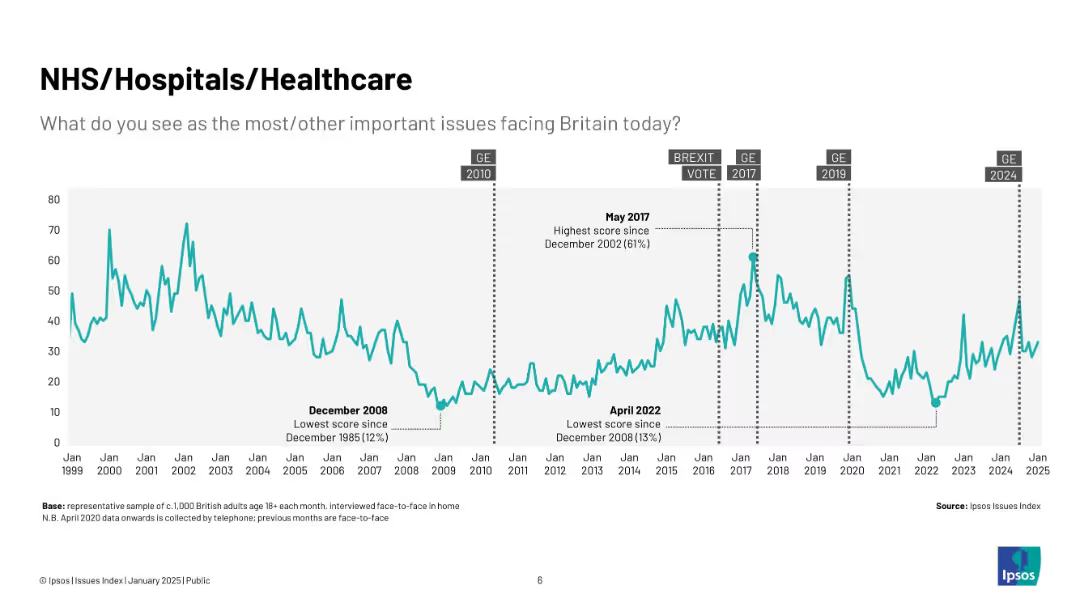
Country bar chart ranking concern about healthcare costs, with historical trend data (2018–2023).
Risk Assessment and Management
Healthcare & Pharmaceuticals
This slide ranks countries based on public concern over the cost of accessing treatment. The five-year trend highlights how financial barriers are a major healthcare issue in nations like Indonesia and the U.S., offering insights into affordability challenges.
healthcare cost, treatment affordability, financial access, Ipsos, survey, global trends, economic barriers, perception
Mixed Chart
IPSOS
Saved
Two column charts showing statistics on women's determination to succeed professionally and diversity as a career barrier. Text provides detailed insights into women's perspectives on career and family balance.
Human Resources and Talent Management
Professional Services
The slide highlights women's determination to succeed in their careers while balancing personal priorities and discusses perceived barriers like diversity and family impact on career progression.
women, career, diversity, priorities, balance
Multiple Chart
PwC/Strategy&
Saved
Includes emissions chart, bullet-pointed content blocks, and case study highlighting cross-border collaboration. Designed with a clean, organized layout using teal and white space.
Market Analysis and Trends
Energy & Utilities
Describes the role of virtual power purchase agreements (vPPAs) in facilitating renewable energy adoption through cross-border deals. Emissions reduction potential is estimated at 6%. Investment suggestions include regional electricity trade participation and public infrastructure development. The Singapore-Malaysia cross-border agreement is highlighted as a model for grid-linked expansion.
vPPA, interconnection, cross-border, RE, emissions, SEA, grid, Singapore, Malaysia
Multiple Chart
Bain
Saved
The slide combines text and graphics with a two-column layout. The left side features a segmented bar chart depicting company divisions and their contributions, while the right side shows a global presence map with data points.
Industry Overview
Financial Services
Providing an overview of Macquarie's business divisions, global presence, and key statistics, this slide is useful for investors, clients, or stakeholders needing a comprehensive introduction to the company's scope and scale.
Macquarie, Global Presence, Financial Services, Asset Management, Market Share
Mixed Chart
Goldman Sachs
Saved
This slide shows a combination of text and a column chart. The text explains the rationale for outsourcing, and the chart lists various capabilities being outsourced by percentage.
Operational Efficiency
Financial Services
The slide describes how APAC family offices are outsourcing capabilities like tax, risk, and technology to manage external demands and improve in-house capabilities.
outsourcing, capabilities, APAC, family offices, external expertise
Mixed Chart
EY
Saved
Slide features a line graph showing a downward trend in expense growth from 2023 to 2024, and a column chart detailing components such as Core, FDIC, Acquisitions, and Pension costs.
Financial Performance
Financial Services
Highlights the financial strategy for 2024 focusing on reducing expense growth with specific initiatives like cost savings from various corporate activities.
financial, expenses, 2024, savings, growth
Mixed Chart
Barclays
Saved
Line chart with multiple colored lines; long-term trend of asset classes' value growth
Strategic Planning
Financial Services
Compares inflation-adjusted growth of $10,000 in various asset classes (large cap stocks, small caps, bonds, cash) from 1995–2024. Highlights compounding benefits over time.
compounding, inflation, purchasing power, long-term investing, asset classes, small cap, large cap, bonds, cash, total return
Single Chart
JP Morgan
Saved
Bar chart showing the number of AI players by country and column charts comparing the revealed comparative advantage of leading geographic areas for various AI domains.
Technology and Digital Transformation
Technology & Software
This slide emphasizes the importance of data in optimizing artificial intelligence and presents data on the number of AI players by country. It compares the strengths of different regions in AI domains like natural language processing and machine learning, highlighting the global competition in AI development.
AI, Data Optimization, Geographic Advantage, AI Players
Multiple Chart
Roland Berger
Saved
Dark green background with white and green text, a comparative table with percentage values of different sustainability behaviors across age groups.
Regulatory and Compliance
Consumer Goods
The slide examines top behaviors for personal sustainability among different age groups, emphasizing the importance of recycling and the preference for refurbished or rental models.
Sustainability, recycling, consumer behavior, age groups, survey
Single Chart
Oliver Wyman
Saved
Column chart showing changes accelerated by COVID-19 on society. Includes two text quotes on the right in gray boxes. The slide is dominated by yellow and gray colors.
Strategic Planning
Real Estate & Construction
Discusses how the Future of Work puts pressure on urban development, necessitating better infrastructure and efficient local supply chains.
Cities, Communities, Infrastructure, Urban Development, COVID-19, Changes, Society, Future of Work, Pressures
Mixed Chart
EY
Saved
Textual content with minimal visuals and icons
Strategic Planning
Hospitality & Tourism
Outlines strategic priorities for developing high-end tourism in Europe, focusing on sustainability, nature tourism, and infrastructure improvements.
priorities, development, tourism, strategy, sustainability
Pillar
Bain
Saved
Horizontal bar chart showing perception of education system quality (good/neutral/poor) across 30 countries, ordered from most to least positive.
Market Analysis and Trends
Education & Training
This slide shows global variation in public perception of national education quality. Countries like Singapore and India rank highest in positive views, while Romania and Hungary rank lowest, reflecting regional trust gaps in education.
global, education quality, perception, countries, Ipsos, comparison, survey
Mixed Chart
IPSOS
Saved
Follows same format; focuses on summarization, risk synthesis, synthetic data, and workflow redesign. High-impact use cases appear in Wave 3 (e.g., full compliance automation).
Risk Assessment and Management
Financial Services
Continues analysis of compliance-related use cases, particularly focused on risk evaluation, fraud modeling, and automated workflows. Points to long-term impact of AI agents handling complex compliance processes with minimal human intervention, highlighting innovation potential.
risk management, workflow, fraud, synthetic data, compliance automation, GenAI
Single Chart
Oliver Wyman
Saved
Contains two columns with descriptions and methodologies for Sustainable Finance and Environmental and Social Due Diligence, along with supporting text.
Regulatory and Compliance
Financial Services
The slide compares sustainable finance practices with environmental and social due diligence, highlighting Deutsche Bank's commitment to these standards and regular updates.
Sustainability, finance, due diligence, standards, methodology, banking, ESG, framework, compliance, regulation
Table
Deutsche Bank
Saved
The slide includes a bar chart displaying eurozone economic indicators. The bars show percentile ranks relative to historic data across different economic conditions, consumer confidence, business expectations, manufacturing orders, and unemployment.
Market Analysis and Trends
Financial Services
This slide monitors eurozone economic health by presenting various economic indicators over time, aiding in the assessment of recession risks and economic stability.
eurozone, economic indicators, recession risk, consumer confidence, manufacturing orders
Single Chart
JP Morgan
Saved
This slide displays a column chart and a line graph. The column chart shows half-yearly rent reversion percentages, and the line graph tracks portfolio occupancy rates over time. The colors in the bar graph correlate with the periods shown on the x-axis. The line graph is superimposed to demonstrate the relationship between occupancy and rent reversion. There's also a note clarifying the occupancy calculation.
Financial Performance
Real Estate & Construction
Examines the portfolio's performance in terms of occupancy rates and rent reversion, suggesting high levels of retention and positive financial trends.
Portfolio Occupancy, Rent Reversion, Asset Management, Performance Analysis, Tenant Retention, Financial Indicators
Single Chart
Morgan Stanley
Saved
Bar chart compares the prevalence of CDO roles by digital maturity of the organization.
Organizational Structure and Change
Technology & Software
Examines the trend of appointing Chief Digital Officers in companies at different stages of digital maturity.
CDO, digital transformation, digital maturity, leadership roles, organizational change
Multiple Chart
BCG
Saved
Vertical bar chart categorizing company AI maturity levels: experimenting, progressing, fast-followers, and front-runners. Percentages listed next to each category.
Market Analysis and Trends
Artificial Intelligence
Highlights distribution of AI maturity across surveyed companies, showing that only 8% are front-runners. Notes distinctions between fast-followers and front-runners, with most companies still in early AI phases. Suggests significant room for growth in scaling strategic AI capabilities.
AI maturity, front-runners, adoption stages, market segmentation
Mixed Chart
Accenture
Saved
This slide contains multiple column charts and a net promoter score table. It uses a clean design with consistent colors and clear data presentation, making it easy to compare different metrics.
Customer and Market Segmentation
Professional Services
The slide presents client feedback results, including satisfaction ratings, areas for improvement, and net promoter scores across different service lines within the company.
Feedback, Survey, Satisfaction, NPS, Clients
Multiple Chart
PwC/Strategy&
Saved
Left: stacked bar charts of income by business line across quarters; Right: table on inorganic activity; blue-themed visuals
Strategic Planning
Financial Services
This slide summarizes Q424 income trends and inorganic activity. Income fell 61% YoY, with declines in several segments. The right panel outlines three major M&A activities, detailing their P&L impact, RWA, RoTE impact, and CET1 ratio effects. Completion dates are noted for each transaction.
Q4 income, head office, inorganic activity, acquisitions, P&L impact, RWA
Mixed Chart
Barclays
Saved
Previous
Next
If nothing, comes up, please save your slides first
Create a FREE account to continue browsing
Receive Instant Access to 1,000+ slides from companies like McKinsey, Google, and Goldman Sachs
First Name
Last Name
Email
Password
I agree to all
Terms & Privacy Policy
Thank you! Your submission has been received!
Oops! Something went wrong while submitting the form.
Have an account?
Sign in
Column Chart
Heatmap
Chevron
Org Chart
Infographic
Callouts
Timeline
List
Graphic
Picture
Process Flow
Diagram
Paragraph
Map
Table
Framework
Subtitle
Takeaway Box
Icon
Other Chart
Radar Chart
Waterfall Chart
Mekko Chart
Pie Chart
Scatter Plot
Line Chart
Bar chart
Bullet points