Create a FREE Account
Instant access to 1,000+ real slides from top companies like McKinsey, BCG, Goldman Sachs, Google and many more!
First Name
Last Name
Email
Password
I agree to all
Terms & Privacy Policy
Thank you! Your submission has been received!
Oops! Something went wrong while submitting the form.
Have an account?
Sign in
Library
Templates
Courses
Pricing
My Account
My Slides
My Templates
✦ AI
AI Prompt Library
AI Search
Sign in
Start Here
Logout
My Saved Slides
Complex graph showing COVID-19 case trajectories by country, color-coded lines, with detailed callouts for select countries.
Strategic Planning
Healthcare & Pharmaceuticals
This slide provides insight into how different responses affect the COVID-19 outbreak trajectory, targeting strategists and health policy planners.
trajectories, measures, COVID-19, country comparison, containment strategies, outbreak, health policy
Mixed Chart
McKinsey
Saved
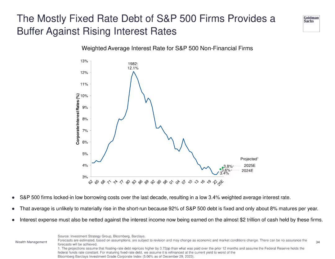
Line chart depicting the weighted average interest rate for S&P 500 non-financial firms from 1968 to projected rates in 2025.
Financial Performance
Financial Services
Discusses how the mostly fixed-rate debt of S&P 500 firms buffers against rising interest rates, with the weighted average interest rate expected to remain low in the short run.
fixed rate debt, interest rates, S&P 500, financial buffer
Mixed Chart
Goldman Sachs
Saved
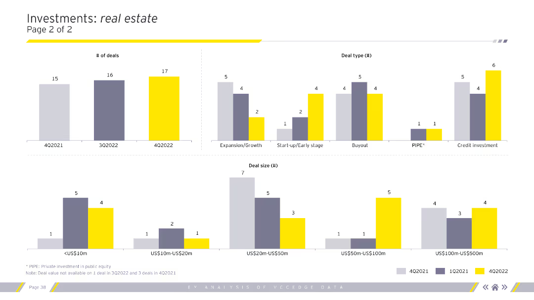
Contains several column charts displaying the number of deals, deal types, and deal sizes across different quarters. Uses grey, purple, and yellow for differentiation. Visual complexity is moderate.
Investment Analysis
Real Estate & Construction
Analyzes investment trends in real estate, including the number of deals, deal types (expansion/growth, buyout), and deal sizes over time. Useful for investors and analysts.
investments, deals, real estate, trends, analysis
Multiple Chart
EY
Saved
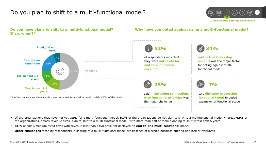
Pie chart showing the percentage of organizations planning to shift to a multi-functional model. Bar charts detailing reasons for not shifting. Summary points discuss findings and challenges faced by organizations.
Strategic Planning
Professional Services
The slide presents data on organizational plans to shift to a multi-functional model. A pie chart shows the percentage breakdown, while bar charts explain reasons for not shifting. Summary points highlight major challenges such as readiness for end-to-end execution and leadership support.
SSC, multi-functional model, planning, challenges, shift
Mixed Chart
Deloitte
Saved
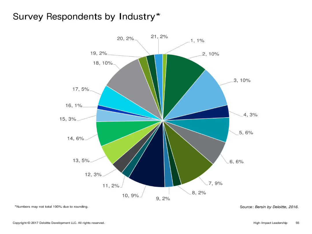
Pie chart detailing the percentage of survey respondents from various industries. The chart uses a variety of colors to differentiate between industry segments.
Market Analysis and Trends
Professional Services
Illustrates the distribution of survey respondents across different industries, highlighting the diversity of sectors represented in the survey.
Pie chart, survey, industry distribution, segments, variety
Single Chart
Deloitte
Saved
A circular diagram split in two, showing how capital is allocated between operations and strategic investments.
Investment Analysis
Financial Services
Discusses the balanced approach to capital management, focusing on equal distribution of resources for expenditures and dividends.
capital management, expenditures, dividends, strategic investments, diagram
Single Chart
Barclays
Saved
The slide contains a line chart on the left showing the global PMI for manufacturing and services from 2007 to 2023. On the right, there is a heatmap displaying the global PMI for manufacturing by country (U.S., Japan, Australia, Eurozone, China, etc.) from April 2023 to March 2024.
Market Analysis and Trends
Industrial & Manufacturing
The slide provides a detailed view of global manufacturing performance through PMI indices, offering insights into the health of the manufacturing sector across different countries.
PMI, Manufacturing, Global, Services, Heatmap
Mixed Chart
JP Morgan
Saved
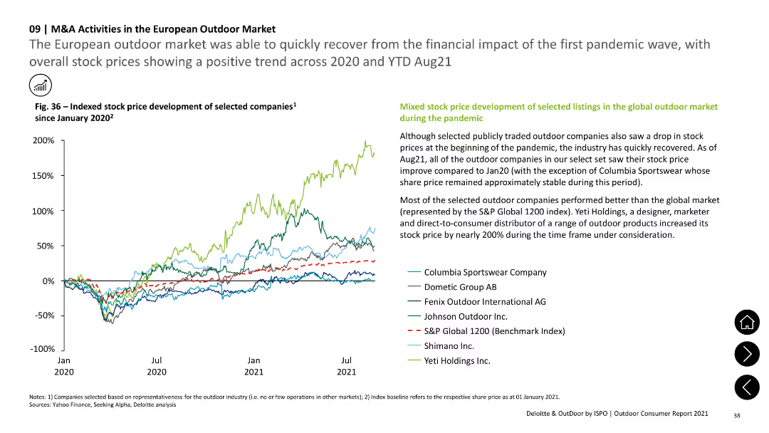
The slide includes a line chart showing indexed stock price development of selected companies from January 2020 to August 2021. Text sections provide explanations and context.
Market Analysis and Trends
Financial Services
The slide highlights the recovery of the European outdoor market from the pandemic, with a line chart showing positive trends in stock prices for selected companies, reflecting investor confidence and market recovery.
stock price, financial trends, market recovery, European market, pandemic impact
Mixed Chart
Deloitte
Saved
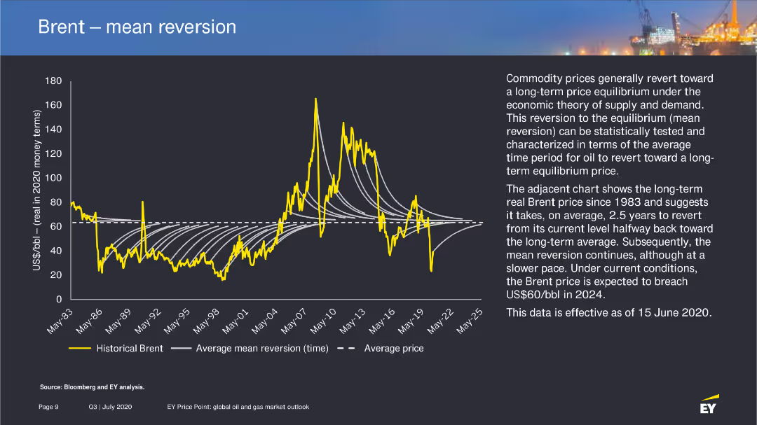
The slide includes a line chart showing historical Brent prices and the average mean reversion time, with a detailed explanation of the concept of mean reversion in commodity prices.
Market Analysis and Trends
Energy & Utilities
Explores the theory of mean reversion in oil prices, presenting historical data and future projections to explain the expected price adjustments over time.
mean reversion, Brent prices, oil market, 2020
Mixed Chart
EY
Saved
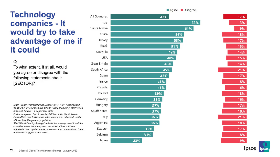
Agreement and disagreement stats across countries; negative sentiment focus; bar chart format.
Risk Assessment and Management
Technology & Software
The slide reflects public concern over the perceived exploitative potential of technology companies, with data showing who believes firms would act unethically if they could.
exploitation, distrust, tech sector, risk, ethics, Ipsos, negative sentiment, public opinion, global survey, corporate behavior
Mixed Chart
IPSOS
Saved
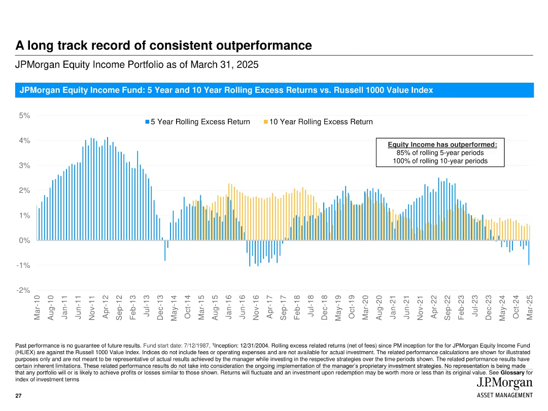
Vertical bar chart showing rolling 5- and 10-year excess returns over time; consistent visual style with blue and yellow colors and timeline from 2010 to 2025.
Financial Performance
Financial Services
Demonstrates JPMorgan Equity Income Fund’s consistent outperformance relative to the Russell 1000 Value Index across rolling 5- and 10-year periods, highlighting success in long-term strategies.
excess returns, rolling periods, outperformance, equity income, Russell 1000, performance history, consistency, fund analysis
Single Chart
JP Morgan
Saved
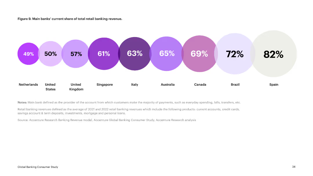
The slide presents a series of circular charts indicating the current share of total retail banking revenue for main banks in various countries. Each country is represented by a different colored circle.
Financial Performance
Financial Services
This slide displays the current market share of retail banking revenue by main banks in several countries, showing significant variation. It serves as a comparative analysis of market penetration.
retail banking, revenue share, market comparison, financial services, main banks
Single Chart
Accenture
Saved
Features a column chart displaying changes in planned premiums and exposure for 2019 versus 2018 across multiple insurance lines, highlighted with color differentiation.
Risk Assessment and Management
Financial Services
Outlines expected changes in insurance market exposures and premiums, especially highlighting significant reductions in Aviation. Gives insights into strategic adjustments for the year ahead.
market changes, insurance premiums, 2019 forecasts, aviation, exposure
Single Chart
PwC/Strategy&
Saved
The slide includes a visually appealing gradient background with an image of professionals working, along with text outlining practical actions for sustainability. The layout is clean, with a balance of images and text.
Strategic Planning
Environmental Services & Sustainability
The slide outlines practical actions to drive change for strengthening sustainability in organizations. It emphasizes a three-stage cycle: Diagnose, Define, and Develop, aiming for continuous improvement and adaptation to new stakeholder expectations.
Sustainability, Actions, Change, Strategy, Improvement
Linear Flow
Accenture
Saved
Line chart displaying Euro area wage growth from 1999 to 2019, with separate lines for Germany and Euro area excl. Germany. Colors are orange and blue with a source citation at the bottom left corner.
Market Analysis and Trends
Financial Services
This slide presents comparative wage growth data for Germany and the rest of the Euro area, indicating economic trends and providing insights for market analysis and financial forecasting.
Euro area, wage growth, Germany, economic data, line chart, comparison, financial trends, market analysis, ECB, J.P. Morgan.
Single Chart
JP Morgan
Saved
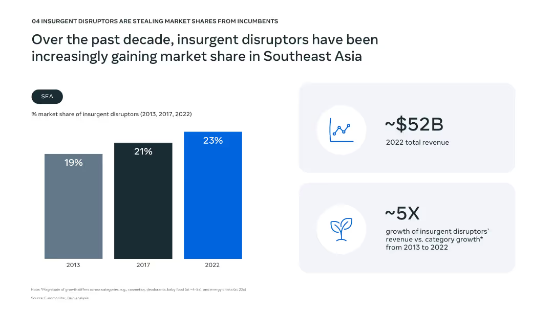
Vertical bar chart showing market share growth from 2013 to 2022; key financial metrics highlighted on right.
Competitive Landscape
Consumer Goods
The slide shows a steady increase in market share for insurgent disruptors over the past decade in SEA, reaching 23% in 2022. It emphasizes their revenue growth (5X compared to category average) and total 2022 revenue ($52B).
disruptors, market share, SEA, insurgent brands, revenue growth, competition, incumbents, consumer goods, innovation, market dynamics
Mixed Chart
Bain
Saved
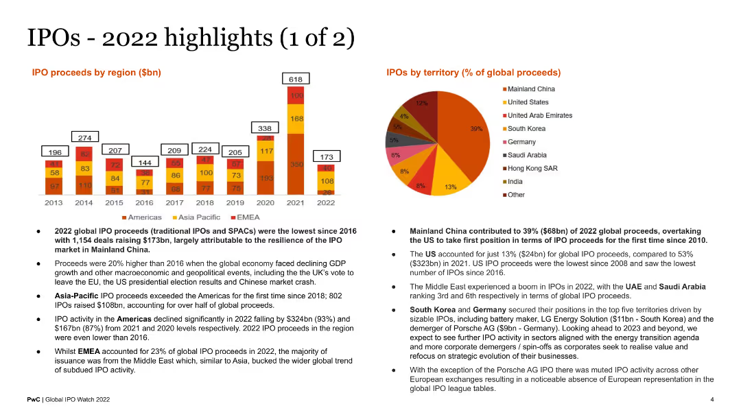
The slide showcases a column chart of IPO proceeds by region from 2013 to 2022 and a pie chart of IPO proceeds by territory for 2022. It is visually dense with a mix of charts and bullet points summarizing the highlights.
Market Analysis and Trends
Financial Services
This slide highlights key data points and trends in global IPO activity for 2022, breaking down proceeds by region and territory. It serves as an informative summary for investors and financial professionals.
IPO highlights, global proceeds, 2022, regional analysis, territory
Multiple Chart
PwC/Strategy&
Saved
This slide contrasts two pie charts, illustrating the percentage of consumers using video for product discovery and evaluation. A text box provides a relevant quote to emphasize the importance of video content in social media and OTT platforms. The visual elements are well-balanced, with clear labels and legible text, set against a neutral background to enhance readability.
Market Analysis and Trends
Media & Entertainment
The slide provides insights into how consumers use video in the product journey, particularly in product discovery and evaluation. It underscores the influence of video content on consumer decisions, making it suitable for presentations that analyze consumer engagement strategies and the role of video in marketing.
Consumer Engagement, Video Content, Product Discovery, Product Evaluation, Marketing Strategy, Social Media, OTT Platforms, Media Consumption, Audience Insights, Engagement Tactics
Multiple Chart
Bain
Saved
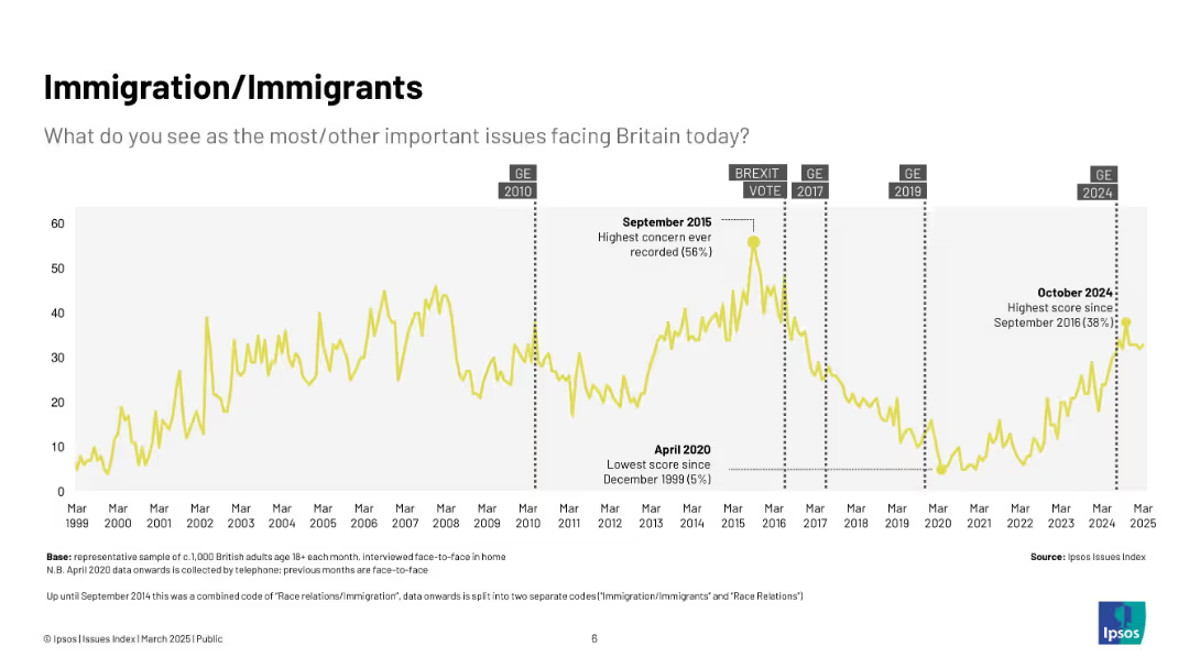
Yellow line chart (1999–2025) showing concern about immigration over time; highlights key dates like Brexit vote and 2015 peak.
Market Analysis and Trends
Government & Public Sector
Displays long-term trends in public concern around immigration in the UK, with major spikes during political debates and crises, notably Brexit and the 2015 refugee crisis.
immigration, Ipsos, Brexit, refugees, public concern, UK, politics, timeline
Single Chart
IPSOS
Saved
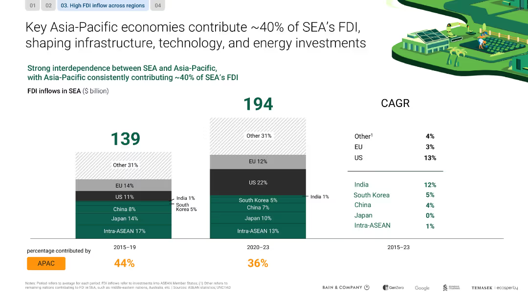
Dual bar charts comparing FDI inflows across time periods; color-coded by region; CAGR on the side
Investment Analysis
Financial Services
The slide shows how Asia-Pacific accounts for a steady 40% of FDI into SEA, highlighting the roles of China, Japan, and intra-ASEAN flows in shaping investments in infrastructure, energy, and technology.
FDI, infrastructure, SEA, China, Japan, ASEAN, investment, technology
Single Chart
Bain
Saved
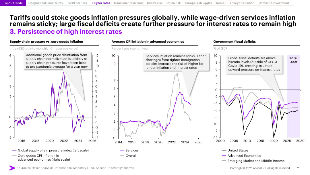
Three-panel layout with annotated line graphs on supply chain pressure vs. inflation, CPI inflation, and fiscal deficits. Purple accents highlight key data trends.
Market Analysis and Trends
Financial Services
This slide explores the persistence of high interest rates globally, driven by sticky services inflation, limited supply chain disinflation, and rising fiscal deficits. It emphasizes that structural factors like labor shortages and government debt are contributing to sustained inflationary pressure, preventing interest rates from dropping.
interest rates, inflation, fiscal deficits, supply chain, services CPI, global economy, sticky inflation, monetary policy, labor shortages, advanced economies
Multiple Chart
Accenture
Saved
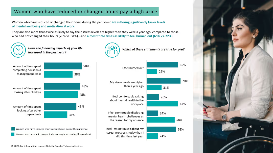
Light background with teal and black text. It features two column charts on stress levels and burnout, and increased time spent on household tasks, with a woman's photo.
Human Resources and Talent Management
Healthcare & Pharmaceuticals
Analyzes the impact of reduced or changed working hours on women's stress levels, burnout, and mental well-being, showing higher stress among those who changed hours.
burnout, stress, working hours, women, mental well-being
Multiple Chart
Deloitte
Saved
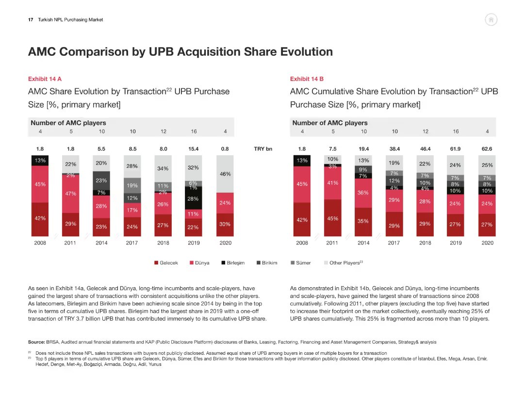
Two bar charts comparing AMC share evolution by transaction size and cumulative share from 2008-2020.
Competitive Landscape
Financial Services
This slide compares AMCs in terms of UPB acquisition share, illustrating market share changes and competitive positioning.
AMC, UPB acquisition, market share, competitive analysis, Turkey
Multiple Chart
PwC/Strategy&
Saved
A green and white slide detailing Ford's contribution to US GDP, including manufacturing and multiplier effects.
Financial Performance
Transportation & Logistics
Captures the overarching economic contribution of Ford to the US GDP, with a focus on manufacturing, sales, and associated multiplier effects from employee spending.
Ford, US GDP, economic contribution, manufacturing, multiplier effects, vehicle sales, after-sales service, community impact
Single Chart
BCG
Saved
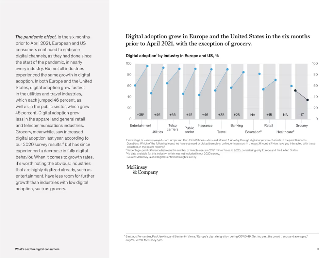
Bar chart comparing digital adoption by industry with growth metrics. Paragraph on the left gives context.
Market Analysis and Trends
Retail & E-commerce
This slide presents digital adoption rates by industry across Europe and the US. While most sectors saw growth in digital usage, the grocery sector notably declined, indicating a consumer shift back to physical channels.
digital growth, industry analysis, pandemic impact, retail trends, McKinsey, user behavior, grocery, Europe, US
Mixed Chart
McKinsey
Saved
Previous
Next
If nothing, comes up, please save your slides first
Create a FREE account to continue browsing
Receive Instant Access to 1,000+ slides from companies like McKinsey, Google, and Goldman Sachs
First Name
Last Name
Email
Password
I agree to all
Terms & Privacy Policy
Thank you! Your submission has been received!
Oops! Something went wrong while submitting the form.
Have an account?
Sign in
Column Chart
Heatmap
Chevron
Org Chart
Infographic
Callouts
Timeline
List
Graphic
Picture
Process Flow
Diagram
Paragraph
Map
Table
Framework
Subtitle
Takeaway Box
Icon
Other Chart
Radar Chart
Waterfall Chart
Mekko Chart
Pie Chart
Scatter Plot
Line Chart
Bar chart
Bullet points