Create a FREE Account
Instant access to 1,000+ real slides from top companies like McKinsey, BCG, Goldman Sachs, Google and many more!
First Name
Last Name
Email
Password
I agree to all
Terms & Privacy Policy
Thank you! Your submission has been received!
Oops! Something went wrong while submitting the form.
Have an account?
Sign in
Library
Templates
Courses
Pricing
My Account
My Slides
My Templates
✦ AI
AI Prompt Library
AI Search
Sign in
Start Here
Logout
My Saved Slides
Three-column layout with quantitative comparisons and a bar graph showing revenue mix between AXP and peers.
Financial Performance
Financial Services
Emphasizes AXP's unique revenue structure, showing significantly higher card fees and spending per card compared to peers, resulting in a greater share of revenue from spend and fees.
revenue mix, diversified income, card fees, spending behavior, subscription revenue, peer comparison, financial structure
Mixed Chart
McKinsey
Saved
A slide with three columns: "Choose your health insurance," "Protect your human capital," and "Make the most of your equity awards." Each column contains a checklist with brief explanations.
Human Resources and Talent Management
Financial Services
The slide provides a checklist for selecting health insurance, protecting human capital, and maximizing equity awards, aimed at helping employees understand and manage their workplace benefits.
health insurance, human capital, equity awards, checklist, benefits
Pillar
UBS
Saved
Diagram of a microservices ecosystem connected through an AI hub, featuring various procurement technology tools.
Technology and Digital Transformation
Technology & Software
Envisions the future of procurement technology as a decentralized ecosystem driven by AI, highlighting integration of various tech platforms.
procurement, AI, technology, future, ecosystem
Diagram
Kearney
Saved
Features four rounded rectangles, each with a heading and a short text blurb beneath it. The slide is divided into quadrants representing different aspects of work structure and delivery.
Organizational Structure and Change
Professional Services
Encourages thinking about work delivery, organization, employee experience, and enabling work. Useful for initiating discussions on organizational changes needed for the future of work.
Organizational Change, Work, Structure, Planning
Pillar
Deloitte
Saved
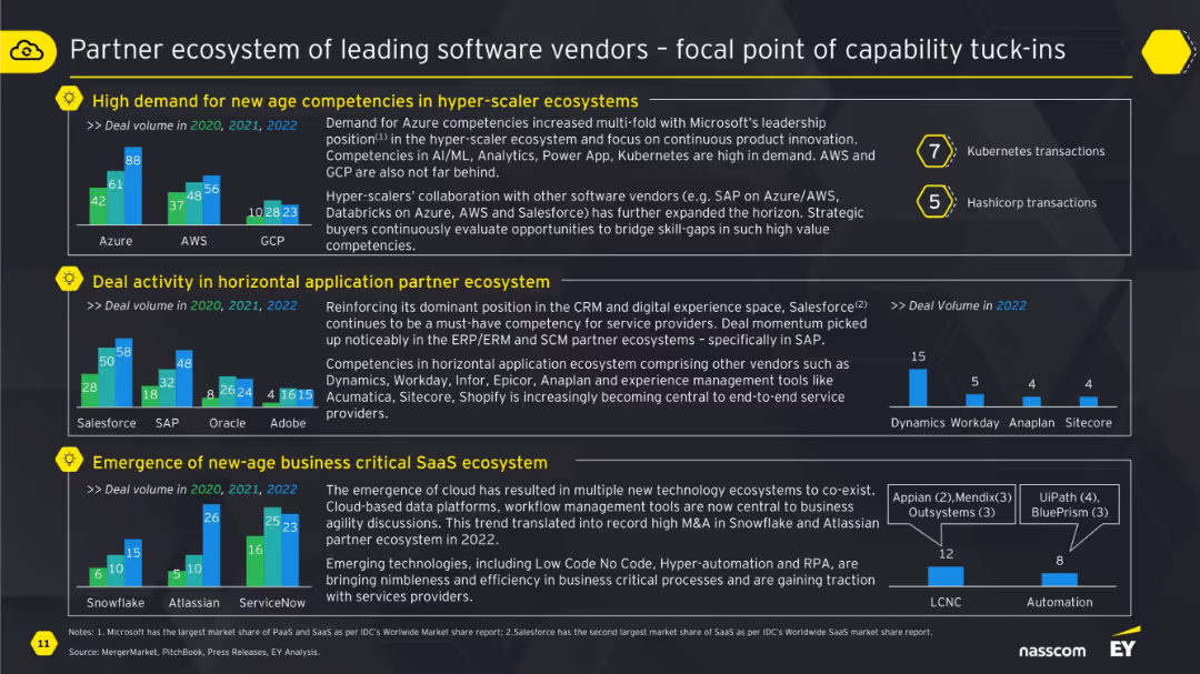
Column chart showing the demand projection for various API-related roles over the next 12 months, including Software Developer, DevOps Engineer, and API Engineer, with a breakdown of current roles and future plans.
Human Resources and Talent Management
Technology & Software
The slide analyzes the demand for different API-related roles in software development, indicating which roles are likely to see increased hiring and which ones will remain stable or decrease.
API roles, demand, software development, projections
Single Chart
Gartner
Saved
The slide displays a diagram outlining data collection methods for operations and maintenance, linking past surveys to updated methods and areas of focus like energy use.
Operational Efficiency
Environmental Services & Sustainability
Highlights the methodology for collecting data on operations and maintenance, updating from past practices to improve accuracy in resource use and environmental impact assessments.
Data collection, operations, maintenance, environmental impact, resource use, methodology update, energy consumption, sustainability practices
Diagram
Deloitte
Saved
Contains two comparative bar charts and a textual analysis section. The color scheme is consistent, using shades of red and blue to differentiate data year-over-year. It visually compares token offering metrics between countries from 2018 to 2019.
Market Analysis and Trends
Financial Services
Analyzes the leading countries in global token offerings for 2019, comparing them to previous years. It discusses the role of regulatory environments and market dynamics in influencing the token offering landscape, with specific mentions of the US, Singapore, and Hong Kong.
token offerings, countries, 2019, 2018, comparison, regulatory, market dynamics
Multiple Chart
PwC/Strategy&
Saved
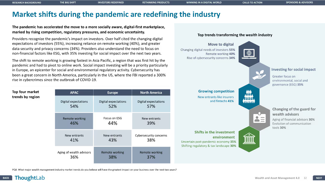
Two-column layout with text on the left and a heatmap chart on the right, indicating AI impact across industries and business functions. Blue gradient indicates impact intensity.
Strategic Planning
Artificial Intelligence
This slide illustrates the projected productivity impact of generative AI across various industries and business functions. It shows that marketing and sales are likely to benefit most, with tech and banking poised for even greater gains due to software acceleration.
productivity, generative AI, business functions, industry impact, marketing, sales, software, high tech, banking, heatmap
Table
McKinsey
Saved
Triangular diagram depicting 30 elements of value that elevate products and services beyond commodity status, categorized into social, emotional, and functional.
Product and Service Analysis
Professional Services
Outlines a framework for understanding the various elements that add value to products and services, useful in developing marketing and product development strategies.
Value, Product Analysis, Services
Framework
Bain
Saved
Two column charts depict the luxury goods market consumption by generation for 2017 and 2018, highlighting Gen Y and Gen Z's contributions.
Market Analysis and Trends
Retail & E-commerce
Focuses on the 2018 market growth driven by younger generations, emphasizing the shift in consumer demographics within the luxury sector.
generational marketing, consumer analysis, luxury goods, market growth, Gen Y, Gen Z
Multiple Chart
Bain
Saved
The slide includes tables and pie charts displaying the number and proceeds of IPOs and FOs by sector in the EMEA region for 2019, 2020, and 2021, along with sector breakdowns.
Market Analysis and Trends
Financial Services
It provides a comprehensive overview of IPO and FO activities in EMEA by sector, useful for understanding market trends and sector-specific performance.
IPOs, FOs, sector analysis, EMEA, financial data
Multiple Chart
PwC/Strategy&
Saved
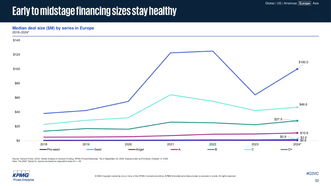
Features two line charts comparing EU and US export trends to China, using a clear color distinction between the two.
Market Analysis and Trends
Transportation & Logistics
Analyzes the impact of trade tensions on export volumes between the EU, US, and China, highlighting recent trends and changes.
exports, trade tensions, EU, US, China
Multiple Chart
Deutsche Bank
Saved
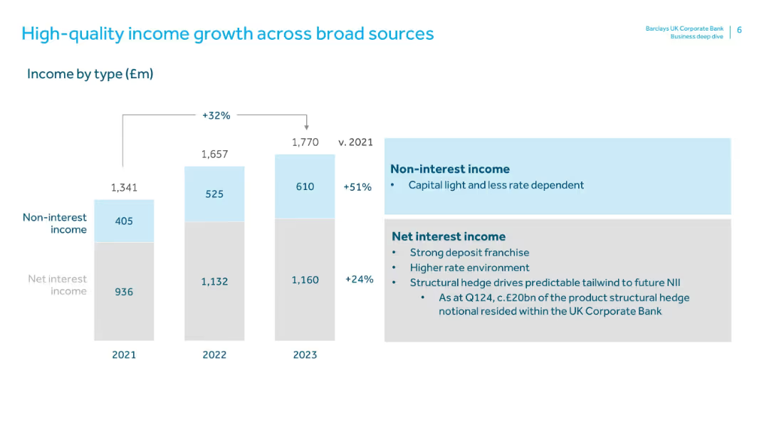
Left panel lists strategic delivery metrics; right chart visualizes bridge to >10% RoTE target by 2025, showing contributions from revenues, costs, and provisions.
Financial Performance
Financial Services
Shows Deutsche Bank’s strategic path to exceed 10% Return on Tangible Equity by 2025. Key drivers include 5.8% revenue CAGR, €2.5bn in cost efficiencies, and ~€24bn RWA reductions. Breakdown of RoTE improvement elements is provided.
RoTE, Deutsche Bank, return on equity, strategy, revenue, costs, FY25 target
Mixed Chart
Deutsche Bank
Saved
A line chart showing changes over time in the percentage of people who find online shopping more difficult than traditional shopping, with a significant rise post-COVID-19.
Market Analysis and Trends
Retail & E-commerce
The slide illustrates the increase in online shopping difficulties post-COVID-19, comparing 2016 to 2021 data for different countries, highlighting the impact of the pandemic.
online shopping, difficulties, COVID-19, trends, survey
Single Chart
IPSOS
Saved
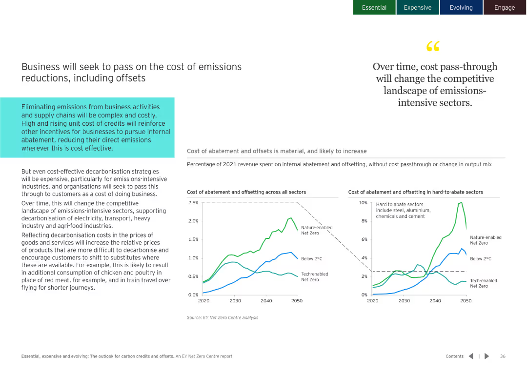
Dark background with column charts showing the distribution of credits by type over different years. Detailed and colorful visualization.
Market Analysis and Trends
Environmental Services & Sustainability
Examines the role of nature-based and technological removals in different scenarios and their increasing importance.
nature-based sequestration, technological removals
Multiple Chart
EY
Saved
Two-panel financial bar chart layout; includes visual trend indicators with dotted arrows; red and grey palette
Financial Performance
Financial Services
Despite a 70bps increase in the cost of debt from 3.9% to 4.6%, BOC Aviation maintained a stable lease rate factor and net operating lease yield at 9.8% and 7.0% respectively between 1H 2023 and 1H 2024.
lease yield, debt cost, operating lease, financial stability, aviation, finance expense, lease rate, 1H 2024
Single Chart
Goldman Sachs
Saved
Pie chart detailing loan distribution by sector and column chart depicting provisions for credit losses.
Risk Assessment and Management
Financial Services
Provides an overview of the loan book's composition and associated risk management practices, emphasizing diversified loans.
loans, risk management, credit losses, banking, pie chart, bar graph, distribution, provisions, diversified, sectors
Multiple Chart
Deutsche Bank
Saved
Horizontal waterfall bar chart showing breakdown from gross adjusted costs (€5,276m) to ex-items total (€4,976m); explanation panel at right.
Financial Performance
Financial Services
Dissects Q4 2024 adjusted costs and reconciles exceptional items like FX impacts, UK bank levy, and real estate measures. Ex-item total shows a 6% YoY reduction, aligning with prior guidance.
adjusted costs, FX, UK levy, real estate, Q4 2024, expenses, guidance
Mixed Chart
Deutsche Bank
Saved
Left side features percentage boxes, right side has a column chart
Market Analysis and Trends
Media & Entertainment
Adoption and expectations of generative AI in marketing, highlighting its integration into MarTech stacks
marketing, MarTech, generative AI, adoption, trends
Multiple Chart
Gartner
Saved
The slide includes a header, a background image, and two sections: a text block on the left and a bar chart on the right. The bar chart compares survey responses on the desire for control over personal health data versus the desire for personalized advice, using different colors for levels of agreement and disagreement.
Technology and Digital Transformation
Technology & Software
Explores the tension between privacy and personalization in health data management. The bar chart displays survey data on people's preferences for controlling personal health data versus receiving personalized health advice, showing varying levels of agreement and disagreement.
Privacy, personalization, health data, survey, preferences
Mixed Chart
IPSOS
Saved
The slide contains two column charts showing total market capitalization data over the years, with text explanations on the side. The design is clear and data-centric.
Market Analysis and Trends
Financial Services
This slide highlights the market capitalization growth of the top 100 companies from 2010 to 2021, emphasizing the significant increase observed in the recent years.
market capitalization, growth, top companies, data analysis, 2010-2021, financial trends
Multiple Chart
PwC/Strategy&
Saved
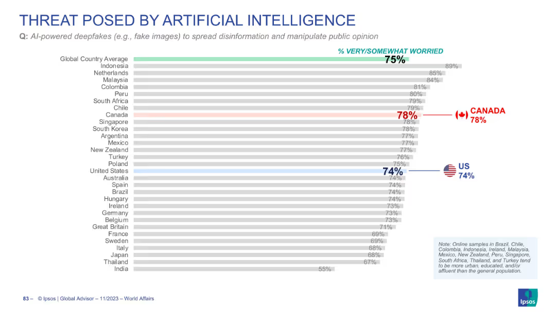
The slide features a donut chart displaying the percentage of people who have seen DeFi advertisements from crypto trading platforms. It includes a breakdown of responses on the left. The layout is moderate in complexity.
Technology and Digital Transformation
Financial Services
This slide shows the percentage of people who recall seeing advertisements from crypto trading platforms about DeFi, with a significant portion not remembering any such ads. It aims to gauge the reach of these advertisements.
DeFi, crypto, advertising, platforms, recall
Mixed Chart
IPSOS
Saved
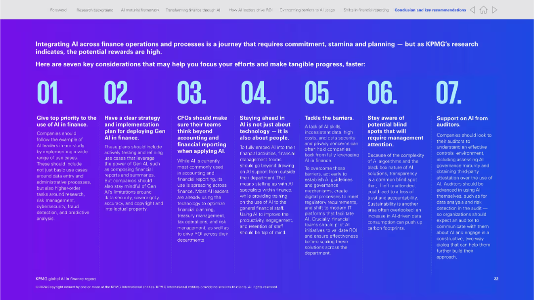
The slide contains bold headers, bullet points, and infographics, illustrating macro and micro levels of sustainability impact.
Investment Analysis
Environmental Services & Sustainability
Urges the importance of sustainability for market potential and regulatory compliance. Suitable for leadership briefings.
sustainability, market size, regulations, corporate strategy, leadership
Header Horizontal
McKinsey
Saved
The visual complexity is moderate, presenting a bar chart and growth drivers in an informative and visually accessible manner. The layout is balanced between graphical data representation and explanatory text.
Technology and Digital Transformation
Industrial & Manufacturing
This slide illustrates the projected market growth of the global process automation industry and its concentration in key sectors. It highlights the structural growth drivers, providing a strategic outlook on the market for the audience.
Market growth, Process automation, Sector analysis, Growth drivers
Multiple Chart
LEK
Saved
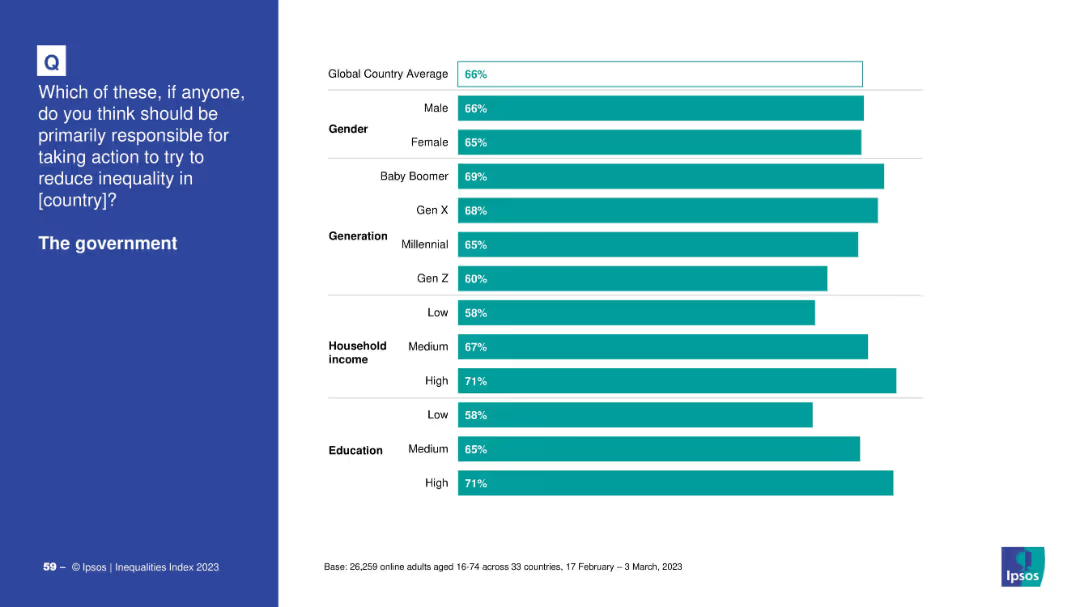
Bar chart with countries listed vertically and segmented horizontal bars for four happiness levels; left-aligned question text on dark blue background.
Market Analysis and Trends
Professional Services
This slide presents the percentage of people in 30 countries reporting different levels of happiness. It shows variation by country in responses to whether individuals feel "very happy," "rather happy," "not very happy," or "not happy at all." The chart reveals that India has the highest "very happy" rate, while Hungary ranks lowest.
happiness index, country comparison, survey, emotions, well-being, global trends, Ipsos, sentiment, 2025, ranking
Mixed Chart
IPSOS
Saved
Previous
Next
If nothing, comes up, please save your slides first
Create a FREE account to continue browsing
Receive Instant Access to 1,000+ slides from companies like McKinsey, Google, and Goldman Sachs
First Name
Last Name
Email
Password
I agree to all
Terms & Privacy Policy
Thank you! Your submission has been received!
Oops! Something went wrong while submitting the form.
Have an account?
Sign in
Column Chart
Heatmap
Chevron
Org Chart
Infographic
Callouts
Timeline
List
Graphic
Picture
Process Flow
Diagram
Paragraph
Map
Table
Framework
Subtitle
Takeaway Box
Icon
Other Chart
Radar Chart
Waterfall Chart
Mekko Chart
Pie Chart
Scatter Plot
Line Chart
Bar chart
Bullet points