Create a FREE Account
Instant access to 1,000+ real slides from top companies like McKinsey, BCG, Goldman Sachs, Google and many more!
First Name
Last Name
Email
Password
I agree to all
Terms & Privacy Policy
Thank you! Your submission has been received!
Oops! Something went wrong while submitting the form.
Have an account?
Sign in
Library
Templates
Courses
Pricing
My Account
My Slides
My Templates
✦ AI
AI Prompt Library
AI Search
Sign in
Start Here
Logout
My Saved Slides
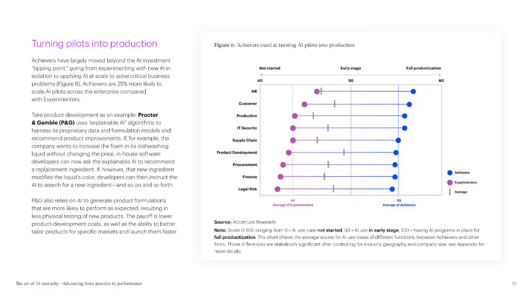
A two-column slide with text on the left and a matrix chart on the right. The matrix shows how AI Achievers outperform in various capabilities compared to other groups.
Strategic Planning
Technology & Software
The slide highlights the superior performance of AI Achievers in traditional performance metrics, emphasizing their ability to multitask and outperform competitors in nearly all key capabilities.
AI, performance, metrics, capabilities, multitasking, Achievers, comparison, traditional, superior, groups
Boxed
Accenture
Saved
Features a multi-colored line chart tracking the total shareholder return over ten years, comparing company performance against peers and the S&P 500.
Investment Analysis
Consumer Goods
Highlights the exceptional shareholder returns generated by the company over a decade, comparing favorably against industry peers and market averages.
shareholder return, long-term performance, S&P 500, peers, market comparison
Single Chart
Barclays
Saved
3-column layout: definition and rationale on left, case study in center, challenges/success factors on right; structured with icons and color accents.
Technology and Digital Transformation
Energy & Utilities
Explains offtake-based financing, where long-term contracts back high-risk clean energy projects. Describes SEA challenges like weak offtake structures and success factors such as standardization and supply aggregation. Features a real case study.
offtake, financing, ADB, SAFCO, Shell, energy, SEA
Table
Bain
Saved
A time-series chart with 1-day VaR, 10-day sVaR, and trading P&L, spanning from Q4 2023 to Q3 2024.
Risk Assessment and Management
Financial Services
Tracks group trading book VaR and sVaR against trading profit and loss from Q4 2023 to Q3 2024. Shows average values for VaR, sVaR, and highlights volatility spikes. Useful for evaluating risk control effectiveness in trading operations.
VaR, sVaR, Trading P&L, Risk Metrics, Volatility, Q3 2024
Single Chart
Deutsche Bank
Saved
Diagram illustrating various touch points in the human-machine relationship, including technological inequality, social media, future of work, biotechnology, and AI.
Technology and Digital Transformation
Technology & Software
The slide explores the complex interactions between humans and machines, emphasizing the need for society to adapt and shape technological advancements. It covers topics such as technological inequality, social media impact, future work scenarios, biotechnology, and AI integration.
Human-Machine Interaction, Technological Inequality, AI
Diagram
Roland Berger
Saved
The slide includes several line charts showing GDP and unemployment projections, along with a bar chart on balance sheet provisions.
Risk Assessment and Management
Financial Services
The slide covers the balance sheet provisions for expected credit losses, with accompanying projections for GDP and unemployment rates in the UK and US.
balance sheet, GDP, unemployment, credit losses, provisions, financial, risk, line chart, bar chart, projection
Multiple Chart
Barclays
Saved
Features comparative bar charts and graphical representations analyzing societal impact and motivations for corporate initiatives. The design is structured to highlight differences between German and global perspectives.
Strategic Planning
Professional Services
Analyzes how organizations measure success through societal impact, comparing motivations and approaches between German and global companies. This slide is useful for discussions on corporate social responsibility and strategic planning.
Societal impact, corporate strategy, German vs. global, CSR, strategic planning
Multiple Chart
Deloitte
Saved
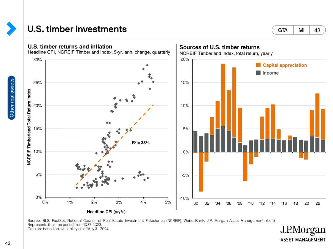
The slide features a bubble chart showing correlations, returns, and yields of alternative assets from 2013 to 2022. The x-axis represents the trailing 10-year correlation to a 60/40 portfolio, and the y-axis shows the 10-year annualized return.
Investment Analysis
Financial Services
This slide provides insights into the performance of various alternative assets, highlighting their correlations, returns, and yields for investment analysis and portfolio management.
Alternative assets, correlations, returns, yields, investment analysis, portfolio management, bubble chart
Single Chart
JP Morgan
Saved
Scatter plot comparing the Global Innovation Index with GDP per capita PPP for 2019, with emerging markets and advanced countries highlighted. Text discusses the relationship between innovation and prosperity.
Technology and Digital Transformation
Technology & Software
The slide illustrates the correlation between innovation capabilities and economic prosperity, showing how countries with higher Global Innovation Index scores tend to have higher GDP per capita. It highlights the importance of innovation for economic growth and development.
Innovation, GDP, Global Index, Prosperity
Mixed Chart
Roland Berger
Saved
This slide features a stacked bar chart comparing the market share of luxury spending by consumer nationality between 2016 and 2017. The chart is accompanied by text highlighting the key insights and the factors contributing to the growth in Chinese luxury spending.
Market Analysis and Trends
Retail & E-commerce
The slide discusses the global luxury market in 2017, focusing on the significant contribution of Chinese consumers who represented 32% of the market. It highlights the increase in spending among Chinese Millennials and the factors driving this trend, such as the wealth effect and increased consumer confidence.
Luxury spending, Chinese consumers, global market, 2017, Millennials, market share, spending trends, consumer confidence, wealth effect
Mixed Chart
Bain
Saved
A bar chart showing the economic risks impacting investment plans in Europe, with highlighted percentages and a detailed explanatory text box.
Risk Assessment and Management
Financial Services
The slide highlights the ongoing economic challenges and risks that will impact investment plans in Europe in 2023, such as rising interest rates and inflation.
economic risks, investment, Europe, 2023
Single Chart
EY
Saved
This slide shows two column charts comparing gross debt from 2016 to 2021 and the cost of funding over the same period, annotated with percentage changes, and includes bullet-pointed text.
Financial Performance
Financial Services
The slide presents a comparison of Leonardo's debt reduction and funding cost from 2016 to 2021, highlighting financial improvements and targets for the coming years.
debt reduction, cost of funding, financial improvement, interest rates, investment, deleveraging
Multiple Chart
Goldman Sachs
Saved
Contains lists and icons to depict workforce trends on the left and their implications on the right, with emphasis on career length, generational shifts, and skill relevancy.
Technology and Digital Transformation
Professional Services
Explores future workforce trends, including the predominance of millennials and changing skill requirements, and the subsequent implications for organizations.
workforce trends, millennials, skill requirements, organizational implications, future planning
Framework
Deloitte
Saved
Split layout: left has a scatter plot mapping trust vs perception of under-regulation; right side contains analysis of distinctions between social media and tech regulation.
Risk Assessment and Management
Professional Services
This slide presents a scatter plot analyzing the relationship between sector trust and perceived need for regulation. It reveals that low-trust sectors (e.g., social media, oil & gas) are also viewed as under-regulated. Narrative explains growing concerns over governance and transparency.
trust vs regulation, risk analysis, public governance, sector perception, social media, oil & gas, scatter chart
Mixed Chart
IPSOS
Saved
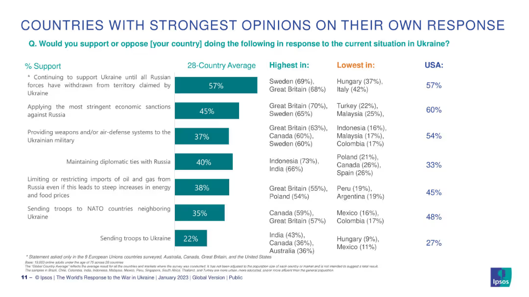
Horizontal bar chart showing alignment of social media companies with personal values by country; design is consistent with earlier slides.
Market Analysis and Trends
Technology & Software
This slide assesses whether individuals feel that social media companies share their personal values. Strong alignment is seen in India, China, and Saudi Arabia, while countries like France, Belgium, and Hungary report the lowest agreement, reflecting cultural and ideological disconnects.
values alignment, cultural trust, user perception, social media, Ipsos, agree, disagree
Mixed Chart
IPSOS
Saved
The slide contains a series of pie charts depicting the top skills required in risk management over the next three years, categorized by overall, G-SIB, and non-G-SIB responses.
Risk Assessment and Management
Financial Services
This slide identifies the top skills needed in the risk management function, such as data science, cybersecurity, and AI-based model risk management, crucial for future preparedness.
risk management, skills, pie charts, G-SIB, non-G-SIB
Multiple Chart
EY
Saved
The slide includes multiple vertical column charts showing underlying profit/loss before tax across various business units in Q3 2023.
Financial Performance
Financial Services
This slide presents the financial performance of different business units, emphasizing progress despite market challenges.
market conditions, profit, loss, business units, financial performance
Mixed Chart
UBS
Saved
Features text with a line chart showing projected temperature anomalies under different emissions pathways from 2020 to 2100.
Strategic Planning
Environmental Services & Sustainability
Emphasizes the necessity of committing to net zero emissions to prevent climate damage, highlighting the significant impacts of inaction on future temperatures.
Net zero, climate change, emissions, temperature, projection, pathway, 2100, sustainability
Mixed Chart
EY
Saved
A line chart comparing the distribution yield of Swiss real estate funds to the 10-year Swiss government benchmark bond yield, with a highlighted yield gap.
Financial Performance
Financial Services
This slide analyzes the distribution yield of Swiss real estate funds in comparison to the 10-year Swiss government benchmark bond, highlighting the yield gap over time.
Distribution Yield, Government Bond, Yield Gap, Comparison
Single Chart
Credit Suisse
Saved
The slide features a horizontal bar chart with multiple categories representing different values. Each bar indicates the importance percentage of the respective value among the respondents. The chart has blue bars with yellow percentage markers.
Market Analysis and Trends
Education & Training
The slide displays the most important values for all respondents, highlighting factors like family, health, and professional work. It helps understand what young graduates prioritize in life, useful for tailoring educational and training programs.
values, bar chart, priorities, respondents, family, health, education, importance, graduates
Mixed Chart
Deloitte
Saved
The slide features a column chart displaying various uses of crypto assets in 2022 and 2023, including conversion to cash and payment for services.
Market Analysis and Trends
Financial Services
It explores how crypto owners use their assets, from cash conversion to payments and unsuccessful sale attempts, noting demographic variations in usage patterns.
Crypto usage, 2023, 2022, cash conversion, payments, sale attempts, demographic variations
Mixed Chart
IPSOS
Saved
The slide includes line graphs comparing CAC vs CO2 emissions from electricity generation for FCEV and BEV under different scenarios.
Regulatory and Compliance
Energy & Utilities
The slide analyzes the carbon abatement cost and CO2 emissions for fuel cell electric vehicles and battery electric vehicles, considering the impact of grid emissions on savings.
CAC, CO2, FCEV, BEV, emissions, savings
Mixed Chart
Kearney
Saved
Four-section vertical layout with icons on the left and bullet text on the right. Each stage of the process is boxed and separated with visual lines. Clean white background with black text and blue highlight elements.
Investment Analysis
Financial Services
This slide explains J.P. Morgan’s structured approach to investment using a bottom-up method. It outlines four key stages: idea generation, fundamental analysis, portfolio construction, and sell discipline. Each stage lists specific tasks or considerations. The aim is to show the rigor behind identifying and managing investment opportunities.
bottom-up, investment process, fundamental analysis, portfolio construction, sell discipline, J.P. Morgan, idea generation, valuation, diversification
Vertical Flow
JP Morgan
Saved
This slide is designed with a circular diagram at the center, surrounded by text blocks, icons, and a title, all unified by a consistent blue color palette.
Human Resources and Talent Management
Technology & Software
It stresses the importance of investing in employees’ career growth, suitable for discussions on HR development strategies and managerial training.
career growth, HR, investment, training, enablement, employees, performance management
Diagram
Kearney
Saved
Large doughnut charts split PE direct vs roll-up and subsegment distribution; supported by summary of drivers and illustrative deals/exits.
Investment Analysis
Financial Services
This slide illustrates how private equity continues to drive deal activity, especially in CX and BPM verticals. It differentiates between direct investments and roll-ups, details illustrative transactions, and highlights the strong interest in scalable, digital, and automated capabilities across industries.
PE, investment, CX, BPM, roll-up, digital, deal momentum, exits, RCM
Multiple Chart
EY
Saved
Previous
Next
If nothing, comes up, please save your slides first
Create a FREE account to continue browsing
Receive Instant Access to 1,000+ slides from companies like McKinsey, Google, and Goldman Sachs
First Name
Last Name
Email
Password
I agree to all
Terms & Privacy Policy
Thank you! Your submission has been received!
Oops! Something went wrong while submitting the form.
Have an account?
Sign in
Column Chart
Heatmap
Chevron
Org Chart
Infographic
Callouts
Timeline
List
Graphic
Picture
Process Flow
Diagram
Paragraph
Map
Table
Framework
Subtitle
Takeaway Box
Icon
Other Chart
Radar Chart
Waterfall Chart
Mekko Chart
Pie Chart
Scatter Plot
Line Chart
Bar chart
Bullet points