Create a FREE Account
Instant access to 1,000+ real slides from top companies like McKinsey, BCG, Goldman Sachs, Google and many more!
First Name
Last Name
Email
Password
I agree to all
Terms & Privacy Policy
Thank you! Your submission has been received!
Oops! Something went wrong while submitting the form.
Have an account?
Sign in
Library
Templates
Courses
Pricing
My Account
My Slides
My Templates
✦ AI
AI Prompt Library
AI Search
Sign in
Start Here
Logout
My Saved Slides
The slide features a column chart showing percentages of investments bought during the pandemic, with text describing the data. Clean white background.
Market Analysis and Trends
Financial Services
This slide presents data on the percentage of investments bought by Canadian investors during the pandemic, showing that a significant number of investors were buying rather than selling.
investments bought, pandemic, Canadian investors, data analysis, COVID-19
Mixed Chart
IPSOS
Saved
Line chart showing the growth of a USD100 investment in various asset classes, adjusted for inflation, from 1993 to 2024.
Investment Analysis
Financial Services
This slide presents the long-term returns of different asset classes, illustrating the growth of a USD100 investment over time across various asset categories.
asset classes, returns, investment, inflation, growth
Single Chart
JP Morgan
Saved
The slide features text on the left and a line graph on the right. The graph shows annual revenue growth over five years for companies with high vs. low interoperability, with a purple line indicating high interoperability advantages.
Market Analysis and Trends
Technology & Software
Describes the long-term value of interoperability. The line graph illustrates how companies with high interoperability can unlock significant revenue growth over five years, making a compelling case for investing in interoperable solutions.
interoperability, long-term value, revenue, growth, trends
Mixed Chart
Accenture
Saved
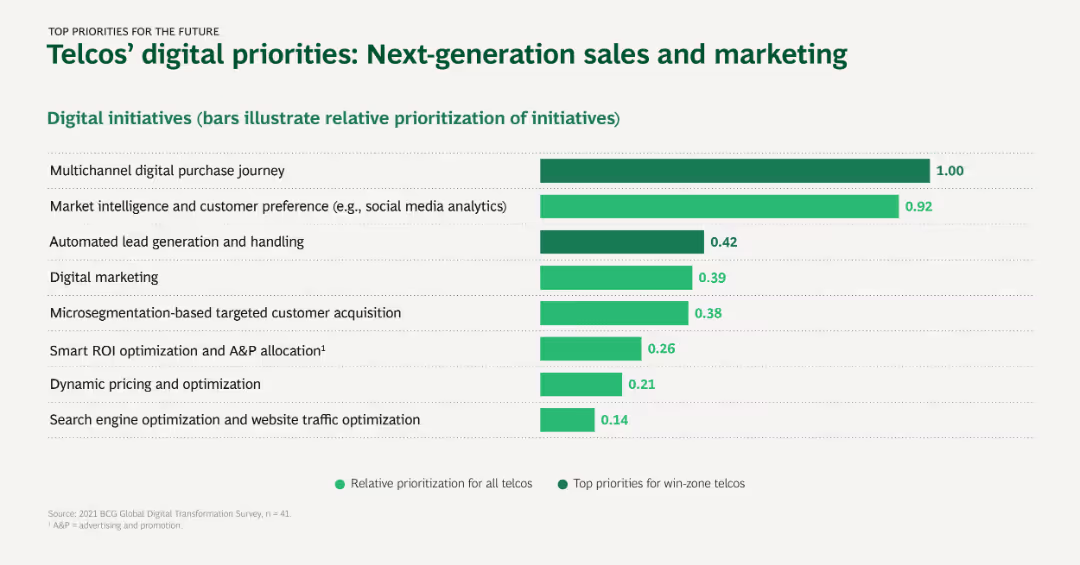
Horizontal bar chart representing the prioritization of digital initiatives for new business ventures in telcos, with a focus on top and relative priorities.
Market Analysis and Trends
Telecommunications
This slide details the digital initiatives telcos are prioritizing for new business ventures, including digital services, mobile banking, and IoT networks.
Digital services, Mobile banking, Network data, IoT, Business ventures
Single Chart
BCG
Saved
The slide contains a bar chart showing various methods of making investments, such as in person, online through a bank, and online trading platforms.
Strategic Planning
Financial Services
This slide presents data on the methods used by respondents to make investments, highlighting differences in preferred channels across age groups.
investment, methods, channels, age, preferences
Mixed Chart
IPSOS
Saved
The slide features a column chart showing the growth trajectory of "extro values" in luxury markets, comparing China with Western countries from 2014 to 2020.
Market Analysis and Trends
Consumer Goods
It highlights the differences in luxury value trends between China and Western countries, showing a faster progression in China.
luxury values, extro values, growth trajectory, China, Western world, market trends, COVID-19
Multiple Chart
BCG
Saved
Stacked area chart showing percentage of daily new COVID-19 cases by US region, timeline from March to November, colored by region.
Market Analysis and Trends
Healthcare & Pharmaceuticals
Tracks how the proportion of new COVID-19 cases in the US changed geographically over time. Shows a shift from the Northeast to the South and Midwest. Highlights relative shares and total daily new case counts.
COVID-19, US regions, case distribution, timeline, South, Northeast, McKinsey
Single Chart
McKinsey
Saved
Three-column layout for action pillars: demand, supply, infrastructure; bulleted strategies under each pillar; icons and color blocks guide focus.
Strategic Planning
Environmental Services & Sustainability
Proposes actions to scale SEA’s carbon market: raise demand via policy incentives, expand credible supply through offtake contracts, and develop infrastructure like carbon exchanges. Links strategy to regional harmonization and market mechanisms.
carbon markets, SEA, supply, demand, infrastructure, strategy
Pillar
Bain
Saved
Combination of horizontal bar chart showing how organizations govern RPA and a pie chart of tools used (e.g., Blueprism, UiPath). Also includes a text box detailing the comprehensive governance frameworks in life insurers.
Operational Efficiency
Financial Services
This slide details the governance of RPA implementations in insurance, noting that life insurers often have dedicated RPA centers of excellence, and highlights popular RPA tools and their adoption rates among organizations.
RPA, Governance, Tools, Insurance, Blueprism
Multiple Chart
PwC/Strategy&
Saved
The slide shows a line chart depicting EM EPS Revisions in USD from 2015 to 2024, with projected values highlighted for 2023 and 2024. The chart includes several lines for different years.
Financial Performance
Financial Services
This slide details the revisions in earnings expectations for emerging markets, showing how projections have been adjusted downward in recent years.
Earnings Expectations, EM EPS, Financial Performance, Market Projections, Economic Forecast, Earnings Revision, Market Trends, EPS Analysis
Single Chart
Morgan Stanley
Saved
The slide includes a main title, several paragraphs of text, and a bar chart showing the principal reasons for implementing an SCF program. A pie chart illustrates the number of suppliers involved in the program. A three-color scheme of yellow, orange, and brown is used consistently throughout the slide.
Operational Efficiency
Financial Services
This slide discusses the benefits of supply chain finance (SCF) for SMEs, highlighting improved cash flow and supplier relationships. It also presents data on the number of suppliers participating in SCF programs and the impact on working capital. The bar and pie charts provide a clear visual representation of the data.
Supply chain finance, SMEs, cash flow, supplier relationships, SCF program, bar chart, pie chart
Multiple Chart
PwC/Strategy&
Saved
Three-part layout: bar charts for pre-provision profit, net revenue by division, and adjusted costs. Color-coded by segment with highlights below.
Performance Metrics and KPIs
Financial Services
Shows year-on-year improvement in pre-provision profit (+11%), stable revenue (+1%), and decreased costs (-6%). Emphasizes operating leverage, cost/income ratio, and revenue growth from balanced business model.
revenue, costs, profit, KPIs, business units, growth
Multiple Chart
Deutsche Bank
Saved
Displays a line chart showing trends in prioritization of innovation, core business, and other aspects during and post-COVID-19 crisis.
Strategic Planning
Professional Services
Analyzes shifts in business focus on innovation during the COVID-19 crisis, highlighting how priorities changed over time and the implications for business strategy post-crisis.
COVID-19, innovation, trends, crisis management, business strategy, core business
Single Chart
McKinsey
Saved
Slide with text descriptions and symbolic icons
Market Analysis and Trends
Retail & E-commerce
Discusses key influences on the 2018 holiday season, highlighting the role of Chinese consumers and the impact of economic factors on global retail.
holiday season, retail, Chinese market, economic factors
Header Vertical
Bain
Saved
This slide contains text-heavy content divided into sections with subheadings and bullet points. A circular infographic on the right highlights key statistics.
Market Analysis and Trends
Financial Services
The executive summary provides an overview of foreign direct investment in Greece, including performance metrics, investment trends, and economic risks.
FDI, Greece, investment, summary, economic risks
Multiple Chart
EY
Saved
Split into explanatory sections; left defines systems-level thinking, center outlines approach steps, right shows impact benefits
Strategic Planning
Environmental Services & Sustainability
Introduces systems-level thinking as a superior method to overcome systemic barriers, enhance ROI, and prevent negative spillovers in SEA’s green transition. Emphasizes cross-system integration.
systems approach, SEA, energy security, ROI, decarbonization strategy
Vertical Flow
Bain
Saved
The slide includes column charts depicting the number of deals, deal types, and deal sizes for different quarters. Different colors represent distinct quarters, enhancing comparative analysis.
Market Analysis and Trends
Financial Services
This slide continues the analysis of investments excluding infrastructure and real estate, emphasizing the number of deals and their distribution across deal types and sizes.
Deal types, number of deals, deal sizes, investments
Multiple Chart
EY
Saved
Multiple tables and a column chart showing divisional revenues and key financial metrics such as net interest margin and CET1 ratio. Lists key highlights in bullet points.
Financial Performance
Financial Services
Overview of financial highlights for Q1 2023, focusing on revenue growth, cost management, and risk, providing a snapshot of the bank's financial health.
Revenue, costs, provisions, financial health
Mixed Chart
Deutsche Bank
Saved
Similar format as previous slide; charts for revenues and margins; data table includes attendees and events.
Performance Metrics and KPIs
Technology & Software
This slide presents detailed performance metrics for Gartner’s Conferences segment, highlighting revenue trends, growth in events and attendance, and contribution margins. It reflects recovery and growth from past volatility.
conferences, revenue, attendees, events, contribution margin, growth, FX neutral, KPIs, Gartner
Multiple Chart
Gartner
Saved
Circular indicators tracking U.S. public perception on four threats from 2015–2023, using consistent layout.
Risk Assessment and Management
Government & Public Sector
U.S. data showing high levels of concern for natural disasters (84%) and hacking (79%) in 2023. Epidemic concern remains steady. Long-term perception trends are visualized year-over-year, indicating overall concern has remained consistently high across most categories.
USA, cybersecurity, epidemic, natural disaster, risk perception, national survey, Ipsos
Single Chart
IPSOS
Saved
A bar chart on the left shows typical indirect spend per category, with pie charts on the right indicating Commercial and Demand management focus.
Operational Efficiency
Professional Services
This slide depicts typical indirect spend by category (Professional Services, Human Resource, etc.) and their focus on Commercial and Demand management.
Indirect spend, categories, commercial, demand management, bar chart, pie chart
Single Chart
EY
Saved
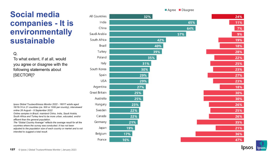
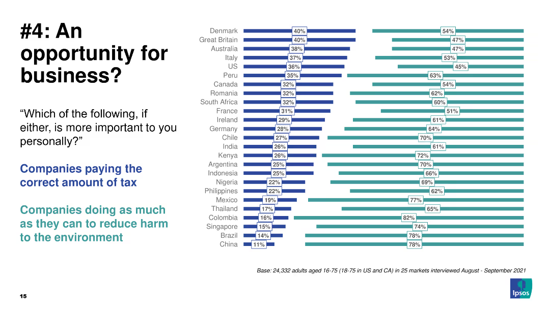
Split bar chart with clean format, agreement vs disagreement across countries
Regulatory and Compliance
Financial Services
The chart gauges public opinion on transparency in financial services. China, India, and Saudi Arabia again show strong trust, while countries like France, Belgium, and Argentina have high disagreement, highlighting trust issues.
transparency, openness, trust, perception, Ipsos, countries, financial services, public opinion
Mixed Chart
IPSOS
Saved
The slide has a title and a textual description on the left side, with a bar chart on the right side. The bar chart lists the top five post-Covid concerns with different colored bars representing different regions (EMEA, APAC, Americas).
Market Analysis and Trends
Financial Services
This slide discusses the impact of global pressures on innovation in the financial sector, highlighting the top concerns for FinTechs post-Covid. The slide is used to emphasize the importance of resilience and innovation in addressing growth and market uncertainties.
growth, uncertainty, innovation, FinTech, global pressures, market analysis, trends, post-Covid
Mixed Chart
Barclays
Saved
The slide contains a bar chart comparing the likelihood of cost reduction across industries over the next 24 months and a chart on annual cost reduction targets.
Risk Assessment and Management
Professional Services
The slide discusses the prevalence of cost reduction initiatives across different industries, highlighting survey data on likelihood and targets. It emphasizes the high failure rates in meeting cost reduction targets across industries.
cost reduction, industry analysis, failure rates, survey data, cost targets
Multiple Chart
Deloitte
Saved
The slide includes a horizontal bar chart showing the stages of AI use in different functions. It features clear distinctions between Achievers and Experimenters, making the data easy to interpret.
Technology and Digital Transformation
Technology & Software
It discusses the transition of AI projects from pilot phases to full production, using Procter & Gamble as a case study. The slide highlights the effectiveness of scaling AI solutions across enterprises.
AI production, case study, scalability, implementation, pilot projects
Boxed
Accenture
Saved
Previous
Next
If nothing, comes up, please save your slides first
Create a FREE account to continue browsing
Receive Instant Access to 1,000+ slides from companies like McKinsey, Google, and Goldman Sachs
First Name
Last Name
Email
Password
I agree to all
Terms & Privacy Policy
Thank you! Your submission has been received!
Oops! Something went wrong while submitting the form.
Have an account?
Sign in
Column Chart
Heatmap
Chevron
Org Chart
Infographic
Callouts
Timeline
List
Graphic
Picture
Process Flow
Diagram
Paragraph
Map
Table
Framework
Subtitle
Takeaway Box
Icon
Other Chart
Radar Chart
Waterfall Chart
Mekko Chart
Pie Chart
Scatter Plot
Line Chart
Bar chart
Bullet points