Create a FREE Account
Instant access to 1,000+ real slides from top companies like McKinsey, BCG, Goldman Sachs, Google and many more!
First Name
Last Name
Email
Password
I agree to all
Terms & Privacy Policy
Thank you! Your submission has been received!
Oops! Something went wrong while submitting the form.
Have an account?
Sign in
Library
Templates
Courses
Pricing
My Account
My Slides
My Templates
✦ AI
AI Prompt Library
AI Search
Sign in
Start Here
Logout
My Saved Slides
Features a line chart tracking the usage of channel partners by companies over a decade. Each point is annotated for clarity, and different sectors are highlighted with distinct colors. The layout includes a text box that provides additional insights and context to the trend depicted.
Operational Efficiency
Retail & E-commerce
The slide analyzes the long-term trend of companies moving towards direct marketing, reducing reliance on channel partners. This is relevant for discussions on operational strategies in marketing and sales, highlighting sector-specific behaviors and strategic shifts.
disintermediation, channel partners, marketing trends, operational strategy, direct marketing
Mixed Chart
Deloitte
Saved
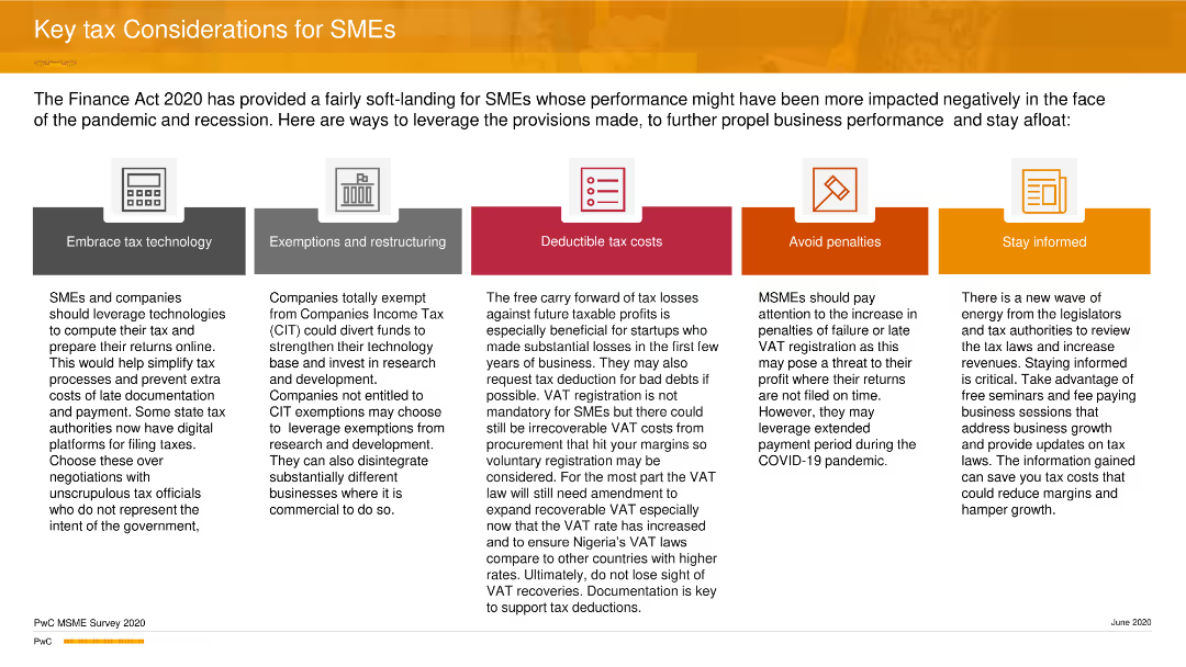
The slide features five icons representing key tax considerations: technology, exemptions, deductible costs, penalties, and staying informed.
Strategic Planning
Financial Services
The slide offers strategic tax considerations for SMEs, focusing on leveraging technology, understanding exemptions, managing deductible costs, avoiding penalties, and staying informed about tax laws to improve business performance during the pandemic and recession.
Tax, SMEs, Strategy, Planning, Business, PwC
Pillar
PwC/Strategy&
Saved
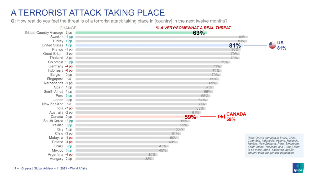
Horizontal bar chart ranking perceived risk of terrorist attacks in various countries. U.S. and Canada results are highlighted.
Risk Assessment and Management
Government & Public Sector
Global comparison of terrorism threat perception. U.S. ranks high (81%) while Canada shows moderate concern (59%). Slide includes changes from previous year and ranks countries accordingly. Designed to show comparative anxiety about terrorism among populations.
terrorism, threat perception, national security, global opinion, public risk, Ipsos, survey results
Single Chart
IPSOS
Saved
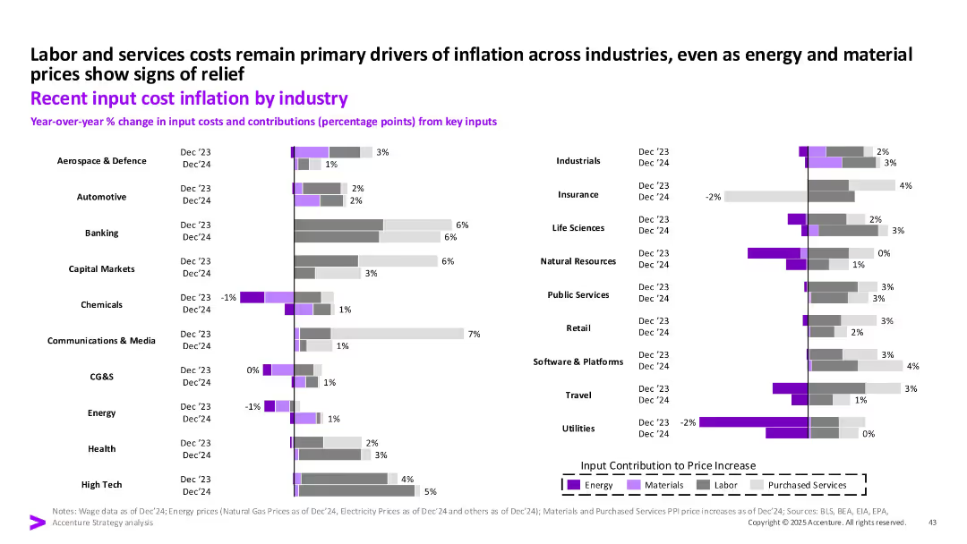
Horizontal bar chart split by industry and color-coded to show input cost components (labor, energy, materials, purchased services) for Dec '23 and Dec '24.
Operational Efficiency
Industrial & Manufacturing
This slide shows year-over-year input cost inflation across multiple industries, indicating labor and services costs as the primary inflation drivers. Energy and materials show mixed trends. Retail, Banking, and Communications show notable increases in purchased services and labor cost components.
input cost, labor, energy, inflation, industry, materials, purchased services, 2024
Single Chart
Accenture
Saved
Line chart comparing daily COVID-19 cases per million among the world's largest economies, annotated with key statistics on recent tests and case trends.
Regulatory and Compliance
Healthcare & Pharmaceuticals
Provides a comparative analysis of COVID-19 impact in major economies, focusing on daily cases per million and testing rates.
COVID-19, epidemiology, economies, cases
Single Chart
BCG
Saved
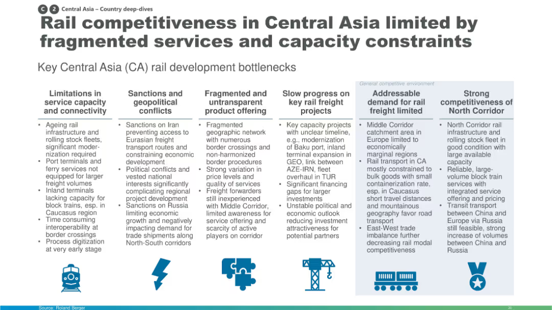
Column-based layout with icons and text boxes summarizing development bottlenecks like infrastructure limits, geopolitics, and fragmented offerings.
Market Analysis and Trends
Transportation & Logistics
The slide identifies major bottlenecks in Central Asia's rail freight development including outdated infrastructure, sanctions, non-transparent services, and weak demand. It also contrasts strong performance in the North Corridor. The insights are segmented under key thematic headers for clarity.
Central Asia, rail, infrastructure, connectivity, bottlenecks, sanctions, corridors
Pillar
Roland Berger
Saved
Clean layout with tiered blocks diagramming the layers of Web3 technology—Blockchain, Smart Contracts, Digital Assets, and their applications in areas like DeFi and Gaming. Colored in blue shades with icons.
Technology and Digital Transformation
Technology & Software
Explains the structure of Web3 technologies starting from basic blockchain through to various applications like gaming and insurance. Useful for explaining foundational technology and its potential applications.
Web3, blockchain, smart contracts, digital assets, applications
Table
McKinsey
Saved
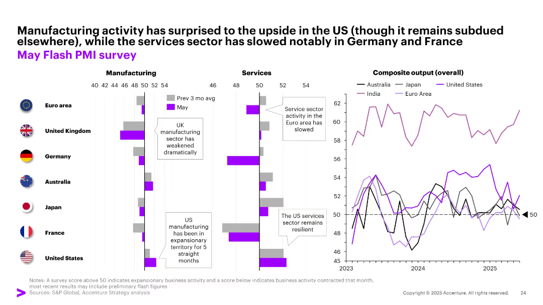
Three-section layout showing PMI data for manufacturing, services, and overall output across regions; bar and line charts used with color-coded country legends.
Performance Metrics and KPIs
Industrial & Manufacturing
This slide presents May PMI data across major economies. While US manufacturing shows resilience, services sectors in Europe have slowed. Composite output highlights divergent momentum. Corporates are encouraged to monitor sector-specific trends for better forecasting and strategy.
PMI, manufacturing, services, composite output, regional trends, US, Europe, Asia
Multiple Chart
Accenture
Saved
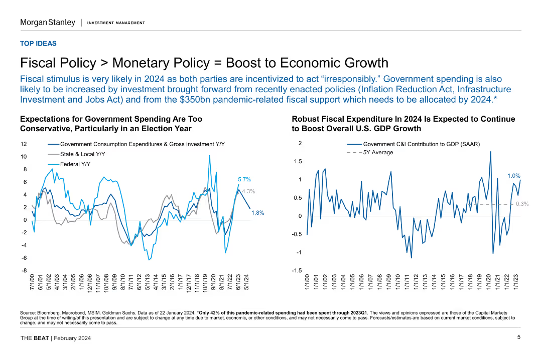
Two line charts displaying government spending expectations and fiscal expenditure projections for 2024, highlighting conservative estimates and robust growth.
Strategic Planning
Financial Services
The slide discusses how fiscal policy is expected to boost economic growth in 2024, comparing it with monetary policy and projecting government spending and its impact on GDP growth.
fiscal policy, monetary policy, economic growth, government spending, GDP
Multiple Chart
Morgan Stanley
Saved
A line chart displaying the integration cost as a percentage of cost synergies, with marked percentiles and a clear delineation of the median.
Financial Performance
Professional Services
Analyzes integration costs relative to annual synergies, providing a financial perspective on the cost-effectiveness of integration strategies.
integration, costs, synergies, financial analysis, cost-effectiveness
Single Chart
Deloitte
Saved
Features a detailed network diagram depicting cybersecurity infrastructure and risk management with labeled nodes for various organizational elements.
Risk Assessment and Management
Technology & Software
This slide emphasizes the importance of cybersecurity and risk management in financial systems, presenting a three-tier defense model. It could be used in risk management training or to explain an organization's security protocols.
Cybersecurity, Risk Management, Financial Services, Compliance
Framework
JP Morgan
Saved
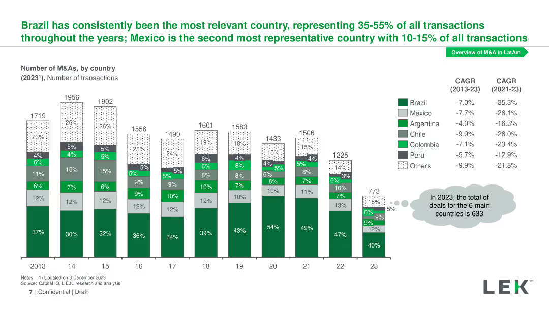
Column chart representing the number of M&As by country from 2013 to 2023, with percentages indicating each country's share of total transactions.
Market Analysis and Trends
Financial Services
Illustrates the distribution of M&A transactions by country, highlighting Brazil and Mexico as leading countries, with CAGR values for 2013-2023 and 2021-2023.
M&As, country distribution, Brazil, Mexico, CAGR
Mixed Chart
LEK
Saved
This slide presents two sets of bar graphs. On the left, bars represent the percentage of respondents planning to increase investments in technologies. On the right, bars show current monitoring of emerging technologies, such as "Next-gen computation" and "Metaverse and Web 3.0."
Investment Analysis
Technology & Software
The slide is designed to showcase investment trends in the digital core of businesses, highlighting areas like AI, automation, and cloud services. It also indicates the attention given to emerging technologies, useful for investors and businesses focusing on strategic technology advancements.
digital investment, AI, cloud services, emerging technology, business trends
Multiple Chart
Accenture
Saved
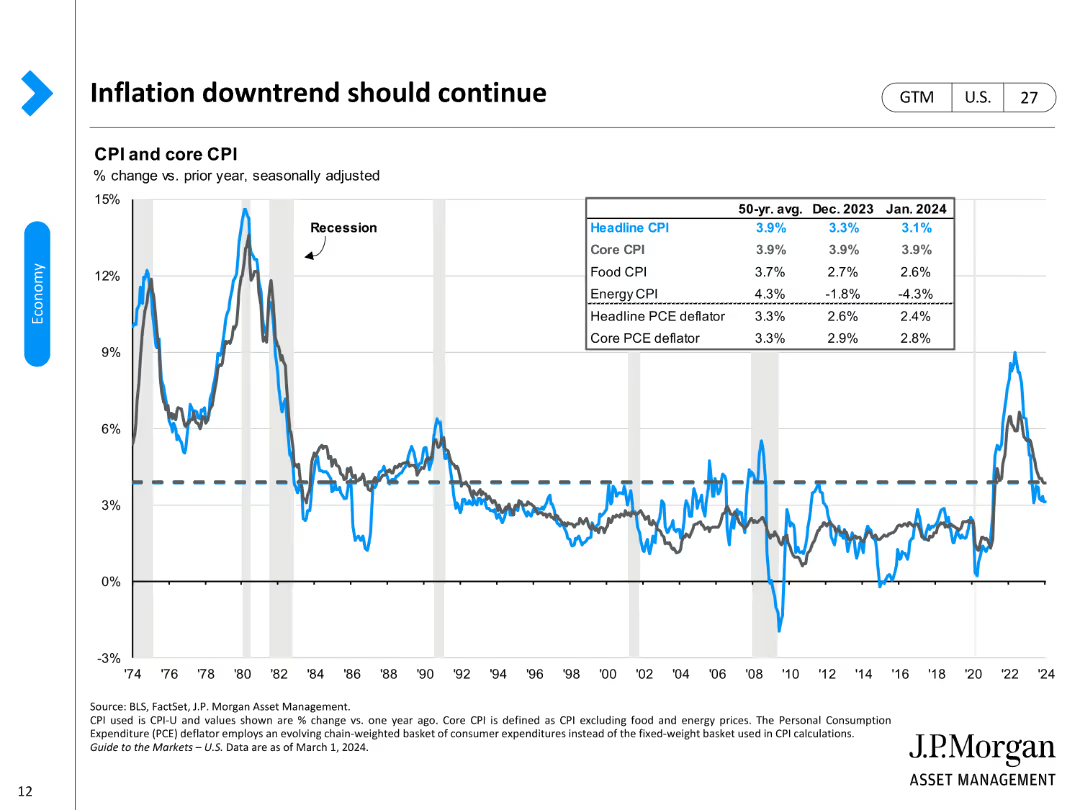
The slide features line charts for CPI and core CPI changes, with data points highlighted for different time periods.
Market Analysis and Trends
Financial Services
It predicts the continuation of the inflation downtrend, using historical and recent CPI data to support this forecast.
inflation, CPI, core CPI, economic trends, price changes
Single Chart
JP Morgan
Saved
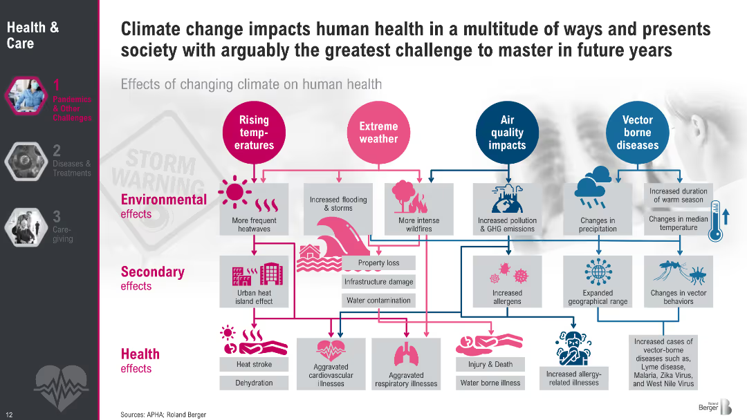
Visual flow diagram with icons, color-coded pathways and categorized effects (environmental, secondary, health). Uses pink and blue color themes to map rising temperatures, extreme weather, air quality, and vector-borne diseases.
Risk Assessment and Management
Healthcare & Pharmaceuticals
This slide explains how climate change influences human health via rising temperatures, extreme weather, air quality degradation, and changes in vector-borne diseases. It outlines environmental, secondary, and health effects, from heatwaves and floods to cardiovascular issues, allergies, and infectious diseases. The diagram emphasizes cascading impacts across multiple domains.
Climate change, health effects, temperature, pollution, vector diseases, flooding, allergies, infrastructure, dehydration, cardiovascular
Diagram
Roland Berger
Saved
The slide shows a series of line and area charts illustrating various CO2 emission pathways and the required carbon dioxide removal capacities to meet the 1.5°C target. Each pathway is color-coded for clarity.
Technology and Digital Transformation
Energy & Utilities
The slide explains the need for Carbon Capture, Utilization, and Storage (CCUS) technologies to achieve the 1.5°C climate target, showing different emission reduction pathways and their potential impacts.
CCUS, carbon capture, climate target, CO2 removal, emission pathways
Multiple Chart
Kearney
Saved
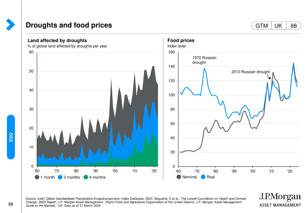
Includes a line chart on the left showing the percentage of global land affected by droughts and a line chart on the right showing the real and nominal food prices over time.
Market Analysis and Trends
Agriculture & Food Production
It examines the relationship between drought conditions and food prices, providing data on how climate impacts agriculture and the resultant economic effects on food markets.
drought, food prices, agriculture, climate impact, global land, real vs nominal prices, J.P. Morgan, environmental analysis, food market, economic effects
Multiple Chart
JP Morgan
Saved
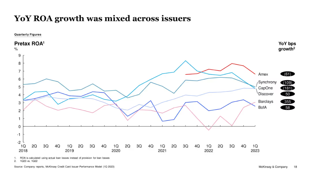
Line graph showing pretax ROA for several issuers over time. Barclays shows the strongest YoY gain, while CapOne, Synchrony, and Amex show declines.
Financial Performance
Financial Services
This slide analyzes changes in pre-tax ROA across major issuers. While some issuers like Barclays improved significantly, others like CapOne and Synchrony saw performance deterioration, indicating diverging profitability trends.
ROA, Issuer Profitability, CapOne, Barclays, Synchrony, Credit Card Industry
Single Chart
McKinsey
Saved
Three panels with economic indicators, energy sector data, and doing business metrics. Each panel uses simple arrows and text to convey changes.
Market Analysis and Trends
Financial Services
This slide highlights the post-pandemic economic recovery trends, focusing on inflation, energy sector performance, and doing business metrics.
Economic recovery, inflation, energy sector, doing business, indicators, post-pandemic, trends, metrics, analysis, performance
Pillar
EY
Saved
Horizontal bar chart showing various perceptions of societal change across different countries with percentages.
Market Analysis and Trends
Government & Public Sector
The slide analyzes global perceptions of societal changes, highlighting variations in attitudes and values across countries.
societal change, global trends, perceptions, attitudes, values
Mixed Chart
IPSOS
Saved
Presents detailed financial results and revenue trends through multiple graphs and comparative metrics.
Financial Performance
Financial Services
Highlights Q1 2023 financial and operational performance of a private bank, with focus on revenue and asset management, essential for financial strategy discussions.
private bank, financial performance, Q1 2023, revenue, asset management
Multiple Chart
Deutsche Bank
Saved
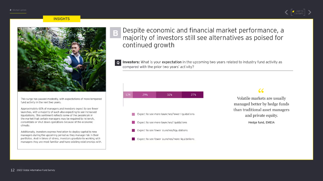
The slide features a large image of a man in a garden on the left, with a column chart on the right showing investor expectations for industry fund activity over the next two years.
Market Analysis and Trends
Financial Services
This slide presents data on investor expectations for industry fund activity in the next two years, comparing anticipated increases or decreases in fund launches and liquidations.
investors, fund activity, expectations, launches, liquidations
Mixed Chart
EY
Saved
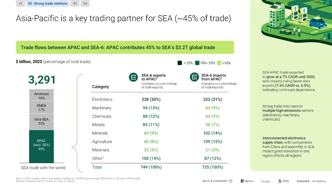
Split layout with left-side chart and right-side analysis; includes data table, bar graph, and callout highlights
Market Analysis and Trends
Transportation & Logistics
This slide emphasizes APAC’s dominant share (45%) in SEA’s global trade, highlighting electronics, machinery, and chemicals. It notes strong trade growth (7% CAGR) and interdependence in electronics supply chains between regions.
SEA, APAC, trade, electronics, CAGR, interdependence, supply chain
Mixed Chart
Bain
Saved
This slide includes two comparative charts depicting the expected changes in staffing levels and skill set requirements in risk management over the next five years.
Human Resources and Talent Management
Financial Services
It highlights the challenges and strategies related to staffing and talent management in risk management, detailing how companies plan to adapt their talent pools and resource allocation in response to market demands and operational needs.
staffing, talent management, risk management, skill sets, market demands
Multiple Chart
EY
Saved
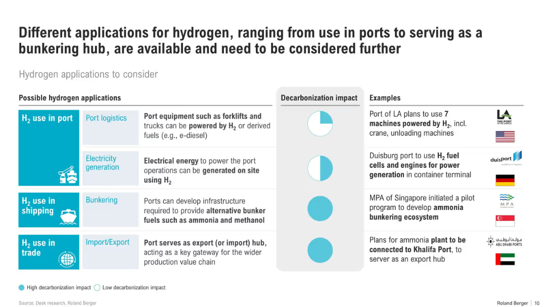
Table layout with rows for different hydrogen use cases, including icons, decarbonization impact ratings, and real-world examples.
Technology and Digital Transformation
Energy & Utilities
The slide categorizes hydrogen applications in port logistics, shipping, and trade, assessing their decarbonization potential. It features case studies from ports worldwide, such as LA, Duisburg, and Abu Dhabi.
hydrogen, ports, shipping, bunkering, H2 applications, decarbonization, logistics, fuel cell, global ports
Mixed Chart
Roland Berger
Saved
Previous
Next
If nothing, comes up, please save your slides first
Create a FREE account to continue browsing
Receive Instant Access to 1,000+ slides from companies like McKinsey, Google, and Goldman Sachs
First Name
Last Name
Email
Password
I agree to all
Terms & Privacy Policy
Thank you! Your submission has been received!
Oops! Something went wrong while submitting the form.
Have an account?
Sign in
Column Chart
Heatmap
Chevron
Org Chart
Infographic
Callouts
Timeline
List
Graphic
Picture
Process Flow
Diagram
Paragraph
Map
Table
Framework
Subtitle
Takeaway Box
Icon
Other Chart
Radar Chart
Waterfall Chart
Mekko Chart
Pie Chart
Scatter Plot
Line Chart
Bar chart
Bullet points