Create a FREE Account
Instant access to 1,000+ real slides from top companies like McKinsey, BCG, Goldman Sachs, Google and many more!
First Name
Last Name
Email
Password
I agree to all
Terms & Privacy Policy
Thank you! Your submission has been received!
Oops! Something went wrong while submitting the form.
Have an account?
Sign in
Library
Templates
Courses
Pricing
My Account
My Slides
My Templates
✦ AI
AI Prompt Library
AI Search
Sign in
Start Here
Logout
My Saved Slides
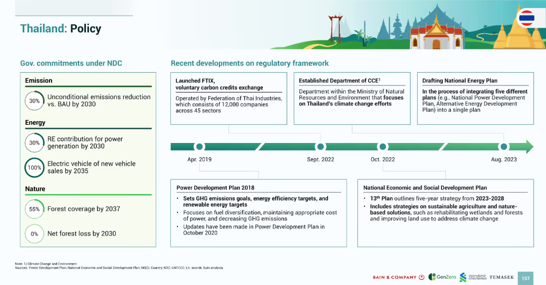
Two-part layout: government commitments on the left, regulatory developments on the right with timeline (2018–2023); clean, infographic design.
Regulatory and Compliance
Government & Public Sector
Summarizes Thailand’s climate-related policy framework. It outlines commitments under the NDC in emissions, energy, and forest conservation, and highlights key regulatory milestones including carbon credit exchange and integrated energy planning efforts.
Thailand, policy, carbon credits, renewable energy, electric vehicles, forest conservation, emissions, regulation
Mixed Chart
Bain
Saved
A content-rich slide with a bar graph and detailed text analysis. The graph on the right side displays percentages of brand-switching consumers from different Southeast Asian countries. The left side contains a descriptive analysis of brand-switching behavior.
Customer and Market Segmentation
Retail & E-commerce
Slide examines consumer openness to switching brands, with statistical data on Southeast Asian countries' brand loyalty. It discusses the implications for businesses in terms of innovation and customer retention, and variations in behavior by country.
brand switching, consumer behavior, Southeast Asia, market research, brand loyalty, business innovation, customer retention
Single Chart
Bain
Saved
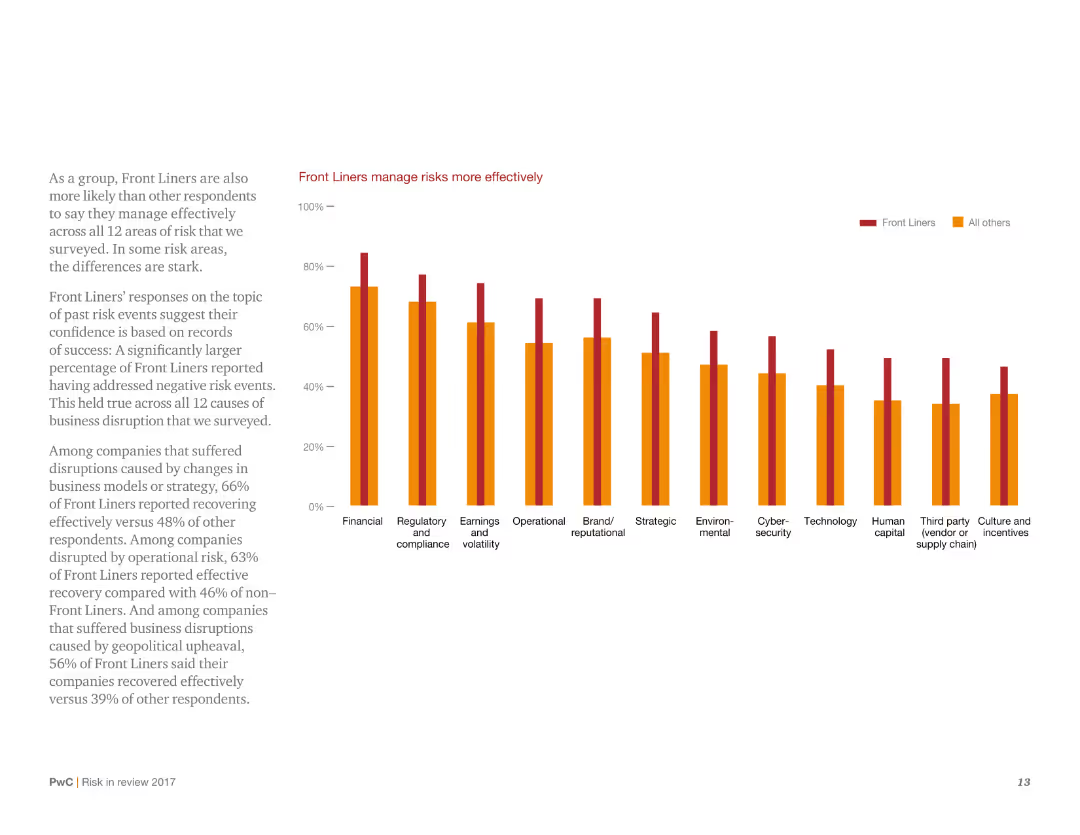
This slide presents a column chart showing the effectiveness of Front Liners in managing risks across multiple categories. It uses a simple design with minimal text, focusing on the comparison of Front Liners versus other respondents.
Risk Assessment and Management
Consumer Goods
It highlights that Front Liners are more effective in managing risks compared to other respondents, with higher percentages across various risk categories. The slide underscores the success rate of Front Liners in addressing negative risk events.
Risk management, effectiveness, Front Liners, survey, comparison
Mixed Chart
PwC/Strategy&
Saved
The slide is a content slide featuring a combination of text and a large pie chart illustrating the share of global GHG emissions by ETSs in 2022. The background is dark, with highlighted sections for emphasis on key points.
Regulatory and Compliance
Government & Public Sector
It explains the principles of carbon pricing, comparing ETS and carbon taxes, and discusses their implementation challenges and benefits. The slide includes data on the global GHG emissions covered by ETSs and insights into various countries' carbon pricing strategies to foster sustainability and emissions reduction.
Carbon Pricing, ETS, GHG Emissions, Regulatory, Compliance
Mixed Chart
EY
Saved
The slide illustrates a stacked column chart detailing the composition of the Indian advertising market from 2019 to 2024, showing resilience in digital advertising despite economic downturns. Each segment (Internet, TV, OOH, etc.) is color-coded, with annotations providing context on growth rates and market shifts.
Market Analysis and Trends
Media & Entertainment
Discusses the resilience of the Indian advertising market, particularly the robust performance of digital advertising amidst economic challenges. This slide is instrumental for media planners and advertisers in strategizing for market conditions, emphasizing the growth opportunities in digital advertising and the need for adaptation in traditional formats.
advertising resilience, digital media, market analysis
Multiple Chart
PwC/Strategy&
Saved
Provides detailed statistics and icons for specific luxury market trends, highlighting the impact of collaborations and environmental considerations among consumers.
Market Analysis and Trends
Retail & E-commerce
Delivers an in-depth analysis of prevailing trends in the luxury market, with a focus on the growing importance of sustainability and collaborative business models.
luxury market, detailed trends, collaborations, sustainability, consumer behavior, statistical analysis
Table
BCG
Saved
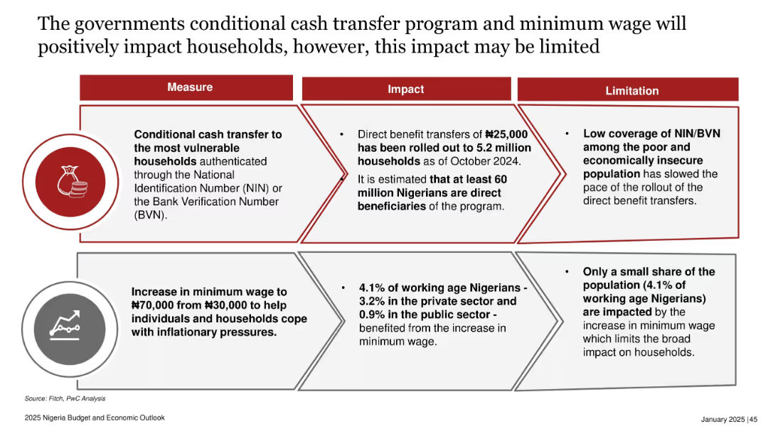
Two stacked horizontal sections, each with a three-column layout: Measure, Impact, and Limitation. Icons included to represent each initiative.
Strategic Planning
Government & Public Sector
The slide explains two government initiatives—conditional cash transfers and minimum wage increases—intended to help households cope with inflation. While impactful, the measures have limitations due to low ID coverage and limited reach, affecting their broad efficacy.
minimum wage, conditional cash transfer, NIN, BVN, household income, inflation mitigation, Nigeria policy, social intervention
Table
PwC/Strategy&
Saved
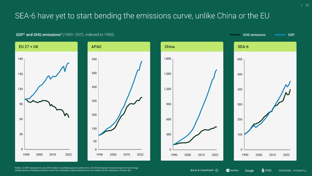
Four-panel line chart showing GDP vs. GHG emissions indexed to 1990 for EU+UK, APAC, China, and SEA-6
Performance Metrics and KPIs
Environmental Services & Sustainability
Compares emissions and economic growth over time, revealing that unlike the EU, SEA-6 and others (like APAC, China) have not decoupled emissions from GDP growth, highlighting a challenge for sustainable development.
emissions curve, GDP, SEA-6, APAC, EU, China
Multiple Chart
Bain
Saved
Contains a column chart showing percentages for three years under categories such as 'significantly more attention' to 'significantly less attention' regarding employee focus on financial benefits, with an emphasis on the increase since 2022.
Performance Metrics and KPIs
Financial Services
Analyzes the trends of employee attention to financial benefits over the years, with a focus on the increased attention in the recent year, useful for gauging employee priorities.
Financial Benefits, Employee Attention, Trend Analysis, Year-over-Year, Bar Graph
Single Chart
Goldman Sachs
Saved
A simple slide with a central graphic of four interconnected diamonds, each labeled with a business division, and a textual statement below emphasizing client-centricity.
Strategic Planning
Financial Services
Demonstrates the unified approach of the firm, highlighting the integration of different business divisions to ensure client-centric service and strategic talent deployment.
Organizational Structure, Client-Centricity, Integration, Talent Deployment
Framework
Goldman Sachs
Saved
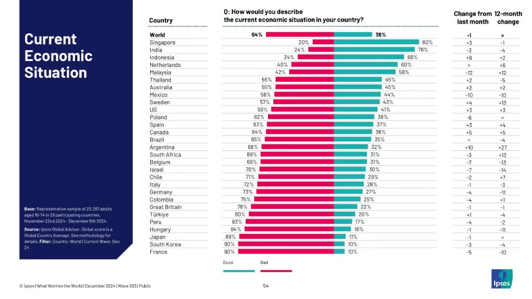
Horizontal bar chart comparing perceptions of economic situation across countries; sidebar left-aligned with bold text.
Market Analysis and Trends
Financial Services
This slide displays a global comparison of how people view their country’s economic situation (good vs. bad) with change metrics over one month and one year.
global survey, economy perception, bar chart, Ipsos, trend analysis, public opinion, global average, change metrics, economic outlook, 2024 data
Single Chart
IPSOS
Saved
This slide features a pie chart and a column chart detailing the segmentation of EO optical high-resolution market by industry. The layout is structured, containing explanatory texts and data labels.
Market Analysis and Trends
Environmental Services & Sustainability
The slide presents a detailed analysis of the EO downstream market shift towards higher resolution data and its implications on various industries. It’s useful for understanding market segmentation and potential data service opportunities.
high-resolution data, market shift, industry segmentation, data services, open data
Multiple Chart
PwC/Strategy&
Saved
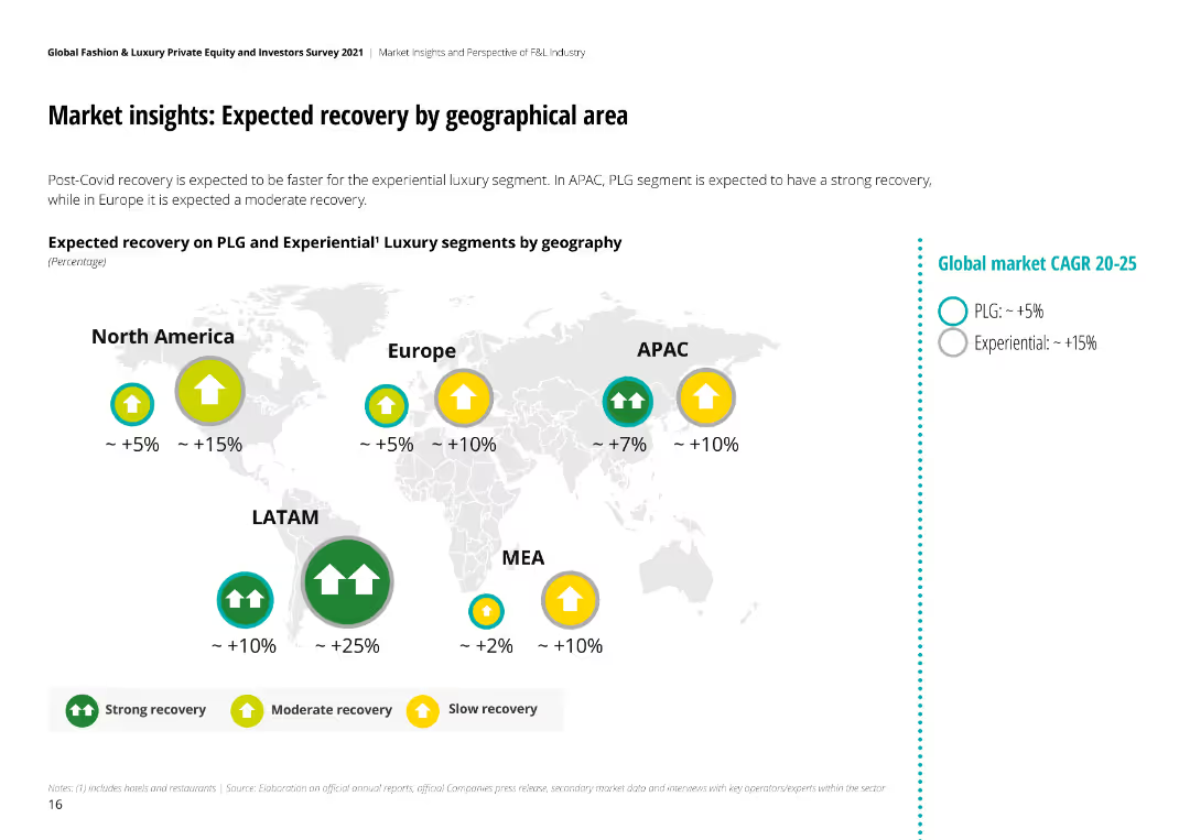
The slide includes a radar chart and textual insights from C-Level executives, detailing strategies for overcoming the COVID-19 crisis in the luxury goods market.
Strategic Planning
Retail & E-commerce
Outlines the major drivers and strategies for recovery in the personal luxury goods market, emphasizing supply chain control, AI, and digital marketing post-COVID.
luxury goods, recovery, strategies, COVID-19, supply chain, AI, digital marketing, planning, executives
Graphic
Deloitte
Saved
Donut chart and infographics on left and right; red-highlighted headers for key stats.
Strategic Planning
Financial Services
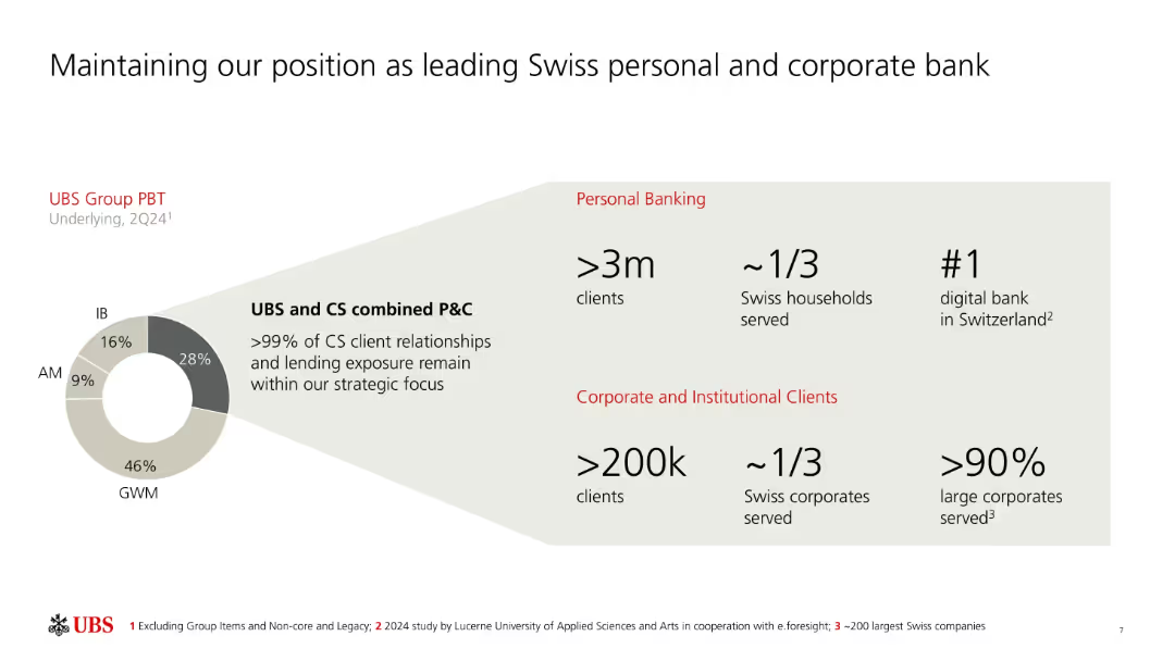
UBS emphasizes its dominant role in Swiss banking, serving over 3 million personal clients and 200k corporates. It shows client distribution and a donut chart of UBS Group PBT by division, highlighting its continued strategic alignment post-Credit Suisse acquisition.
Swiss banking, market share, PBT, UBS, personal banking, corporate banking, digital bank, CS integration
Mixed Chart
UBS
Saved
Column chart showing potential topline benefits from advancing maturity levels.
Technology and Digital Transformation
Financial Services
Discusses the potential incremental topline benefits for companies at different maturity levels in the SHoP framework.
topline, growth, customer conversion, NPS, engagement
Mixed Chart
BCG
Saved
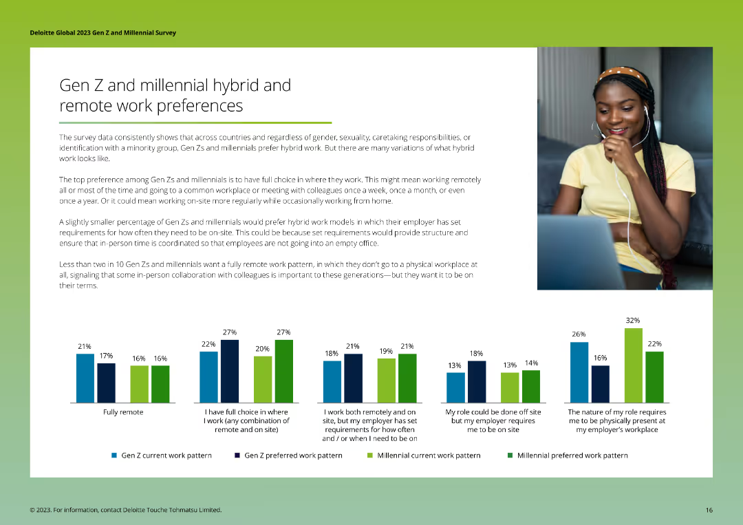
The slide features a series of column charts comparing current and preferred work patterns of Gen Zs and Millennials, highlighting preferences for hybrid and remote work models. The layout is clean and informative.
Technology and Digital Transformation
Telecommunications
The slide presents data on the hybrid and remote work preferences of Gen Zs and Millennials, showing current work patterns versus preferred arrangements, and emphasizing the desire for flexible work options and in-person collaboration under certain conditions.
Hybrid work, remote work, preferences, Gen Z, Millennials
Multiple Chart
Deloitte
Saved
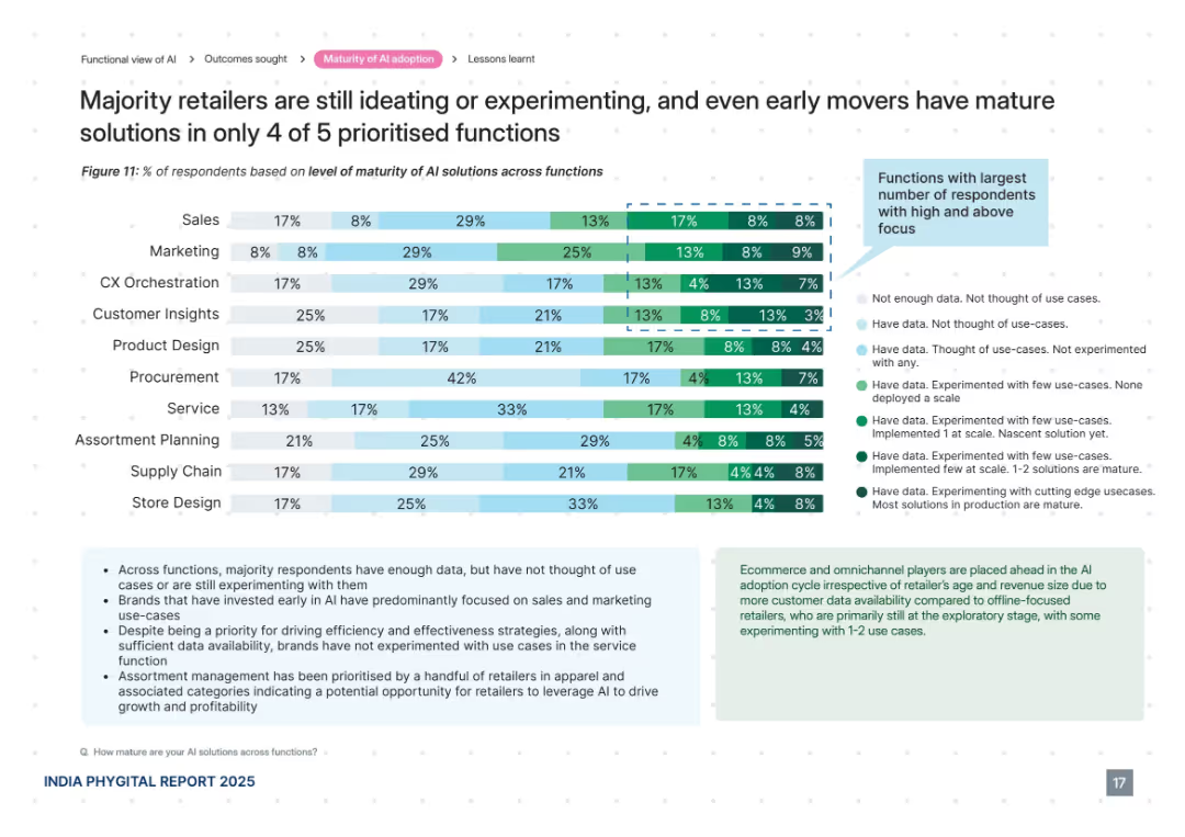
Horizontal bar chart with 10 AI functions, color-coded by level of maturity. Informational text boxes explain insights and patterns. Clean, data-heavy design with a right-aligned legend.
Technology and Digital Transformation
Retail & E-commerce
This slide analyzes the maturity levels of AI adoption across various retail functions, revealing that most brands are still experimenting or ideating. Only a few functions such as sales and marketing show mature solutions. The visual compares ten functions and explains trends in AI data usage and implementation, highlighting areas of opportunity and early adoption.
AI maturity, retail functions, experimentation, early adoption, customer insights, data use, sales, marketing, CX, assortment planning
Mixed Chart
PwC/Strategy&
Saved
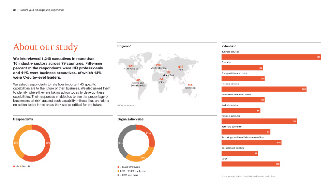
The slide presents an overview of the study, including a world map showing respondent distribution, pie charts of respondent roles and organization sizes, and a list of industries surveyed.
Strategic Planning
Professional Services
This slide provides a summary of the study's scope, detailing the demographics of respondents, the regions and industries covered, and the roles of the participants.
Study overview, respondent demographics, regions, industries, roles
Multiple Chart
PwC/Strategy&
Saved
Features multiple stacked column charts showing the breakdown of GHG emissions by sector in Nigeria, with detailed legends and annotations for clarity.
Regulatory and Compliance
Environmental Services & Sustainability
Analyzes the distribution of greenhouse gas emissions across different sectors within Nigeria, emphasizing the significant impact of the energy sector.
GHG emissions, energy sector, Nigeria, environmental analysis, emission breakdown
Multiple Chart
BCG
Saved
Slide with moderate visual complexity containing a blue color theme and icons for power storage, distribution, and an electric vehicle, alongside categorized text sections.
Operational Efficiency
Energy & Utilities
Covers aspects of power storage and distribution, including smart grids and electric vehicle charging infrastructure, crucial for the future of clean energy.
power storage, power distribution, smart grid, electric vehicle, clean energy, infrastructure, energy optimization, future
Header Horizontal
McKinsey
Saved
A column chart representing the count of shows in the Nielsen Top 10 by platform over several weeks. The chart uses different colors to represent platforms like Apple TV+, Hulu, Amazon, and Disney+, with a legend on the right for reference.
Competitive Landscape
Media & Entertainment
This slide shows the weekly count of shows in the Nielsen Top 10 by platform from October to February. It highlights the presence and performance of various streaming services in producing top-rated shows.
top 10 shows, platform performance, weekly count, Nielsen ratings, streaming services
Single Chart
Nielsen
Saved
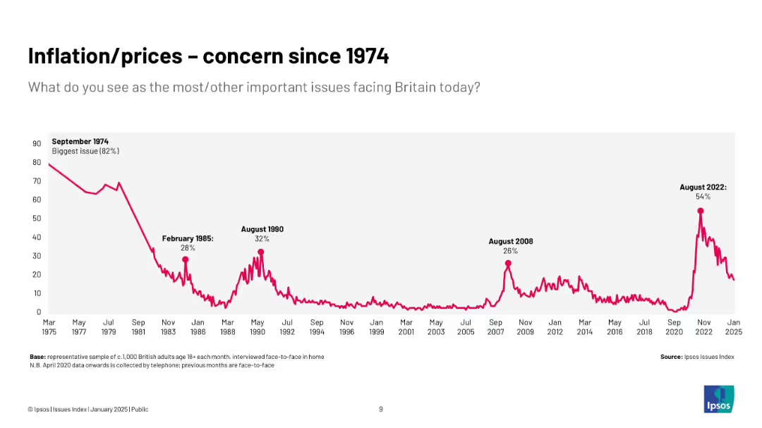
Extended timeline chart (1974–2025) of inflation concerns; major peaks and drops annotated
Market Analysis and Trends
Government & Public Sector
This slide provides a historical view of inflation concerns from 1974 to 2025. Major events include record-high concern in 1974 and resurgence during 2022. It contextualizes current sentiment historically.
inflation, history, UK, concern, Ipsos, economy, prices, public opinion, long-term trends
Single Chart
IPSOS
Saved
Comprising pie charts and column charts showing movements in asset and liability balances, this slide is organized to facilitate easy comprehension of complex financial data.
Financial Performance
Financial Services
Provides insights into Level 3 assets and liabilities, indicating the valuation and risk associated with unobservable assets, crucial for financial risk assessment and investment decision-making.
financial assets, liabilities, risk assessment, valuation
Multiple Chart
Deutsche Bank
Saved
The slide presents column charts and donut charts breaking down sales and EBITDA pre percentages. Red and grey colors are used to show contrasts.
Financial Performance
Industrial & Manufacturing
Analyzing Q1 results, the slide breaks down sales and EBITDA pre percentages by sector, supported by LANXESS’s Consumer Protection and Engineering Materials divisions.
Q1 results, sales breakdown, EBITDA, Consumer Protection, Engineering Materials, LANXESS, financial data, sector analysis
Multiple Chart
Morgan Stanley
Saved
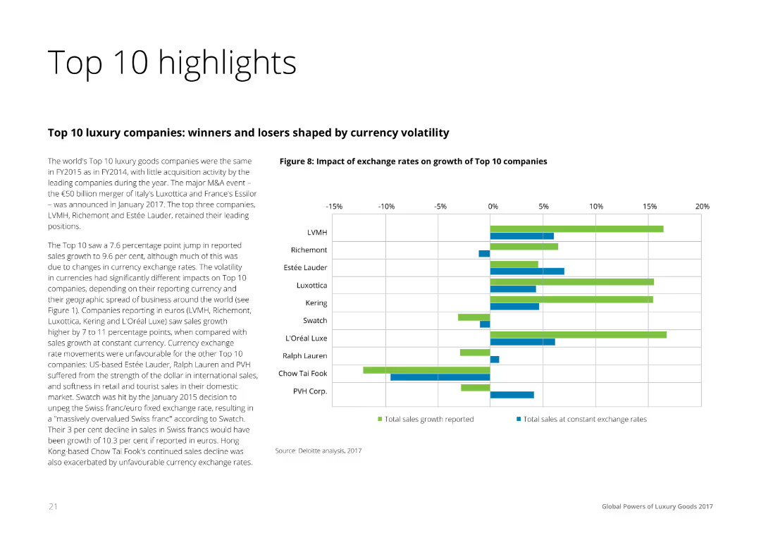
Text on the left summarizing the financial performance of the top 10 luxury companies, accompanied by a horizontal bar chart on the right comparing the impact of exchange rates on sales growth across these companies.
Financial Performance
Consumer Goods
The slide highlights the financial performance and currency exchange impact on the top 10 luxury companies, showing reported sales growth and the effects of exchange rate fluctuations. It is useful for understanding financial dynamics in the luxury sector.
Highlights, Financial, Performance, Luxury, Companies
Mixed Chart
Deloitte
Saved
Previous
Next
If nothing, comes up, please save your slides first
Create a FREE account to continue browsing
Receive Instant Access to 1,000+ slides from companies like McKinsey, Google, and Goldman Sachs
First Name
Last Name
Email
Password
I agree to all
Terms & Privacy Policy
Thank you! Your submission has been received!
Oops! Something went wrong while submitting the form.
Have an account?
Sign in
Column Chart
Heatmap
Chevron
Org Chart
Infographic
Callouts
Timeline
List
Graphic
Picture
Process Flow
Diagram
Paragraph
Map
Table
Framework
Subtitle
Takeaway Box
Icon
Other Chart
Radar Chart
Waterfall Chart
Mekko Chart
Pie Chart
Scatter Plot
Line Chart
Bar chart
Bullet points