Create a FREE Account
Instant access to 1,000+ real slides from top companies like McKinsey, BCG, Goldman Sachs, Google and many more!
First Name
Last Name
Email
Password
I agree to all
Terms & Privacy Policy
Thank you! Your submission has been received!
Oops! Something went wrong while submitting the form.
Have an account?
Sign in
Library
Templates
Courses
Pricing
My Account
My Slides
My Templates
✦ AI
AI Prompt Library
AI Search
Sign in
Start Here
Logout
My Saved Slides
Column chart and line chart showing average private credit cashflow/interest expense and distressed debt & special situations dry powder over time.
Investment Analysis
Financial Services
The slide highlights the attractiveness of special situations private credit, with increasing borrower challenges and available capital for flexible solutions.
private credit, special situations, distressed debt, cashflow, interest expense, investment opportunity
Multiple Chart
Morgan Stanley
Saved
This slide presents a column chart showing the storage methods for crypto assets in 2023 and 2022. Methods include exchanges, online wallets, and hardware wallets.
Technology and Digital Transformation
Financial Services
The slide compares how crypto asset owners stored their assets in 2023 and 2022, highlighting preferences for storage methods. It is useful for understanding storage security trends.
Crypto, Storage, Methods, Security, Comparison
Pillar
IPSOS
Saved
Column charts representing portfolio loans with quarterly changes, alongside a bar chart for FICO score distribution at origination. Clear and easy to understand layout.
Client Case Studies
Financial Services
Provides a snapshot of the credit card loan portfolio, emphasizing financial trends and borrower credit score distribution. It can serve as a case study in financial presentations to discuss credit risk management and customer profile analysis.
Credit Card, Financials, Risk, Portfolio, Scores
Multiple Chart
Morgan Stanley
Saved
Column chart illustrating the number of companies entering and exiting the Global Top 100 from 2009 to 2018, with sections for mergers and new entries.
Market Analysis and Trends
Financial Services
Overview of the new entrants to the Global Top 100 between 2009 and 2018, showing significant changes and the impact of mergers and acquisitions.
new entrants, global top 100, 2009, 2018, analysis
Single Chart
PwC/Strategy&
Saved
A world map marked with various investment locations, accompanied by logos representing different sectors such as private equity and real estate.
Investment Analysis
Financial Services
Elucidates on the diversity and scope of the company's alternative investment platform, indicating different sectors and regions involved in the investment strategy.
Alternative investments, private equity, real estate, global
Graphic
Goldman Sachs
Saved
An advanced layout featuring a large pie chart illustrating the investment portfolio composition, with detailed textual information to the right. The slide utilizes shades of blue and gray for the chart, with distinct sections indicating types of investments, such as Agency CMBS and Non-agency CMBS.
Financial Performance
Financial Services
The slide showcases the company's investment portfolio composition, highlighting the robustness and ratings of its CMBS portfolio. It is geared toward investors or stakeholders interested in understanding the company's investment strategies and risk management approaches.
Investment Portfolio, CMBS, AAA-Rated, Asset Management, Risk Management, Financial Assets, Agency, Non-Agency
Mixed Chart
Morgan Stanley
Saved
Side-by-side bar charts comparing the number of tech-savvy leaders in top-decile vs. bottom-decile companies. Accompanied by text on the left.
Organizational Structure and Change
Technology & Software
This slide shows that companies with more tech-savvy leaders (across leadership roles) are far more likely to develop strong tech capabilities. Top performers show greater representation of such leadership compared to bottom performers.
tech endowment, leadership, digital strategy, executive roles, McKinsey, performance, C-suite, technology engagement
Mixed Chart
McKinsey
Saved
Line chart comparing UK core goods versus services prices from 1988 to the present. Two lines, one for services (orange) and one for core goods (blue), show different growth trajectories with a clear upward trend for services.
Market Analysis and Trends
Financial Services
Demonstrates the differential inflation trends for goods and services in the UK, suggesting globalization's influence on price levels. This may inform investment strategies and economic policies.
UK, inflation, core goods, services prices, globalization, economic trends, market analysis, line chart, index level, J.P. Morgan.
Single Chart
JP Morgan
Saved
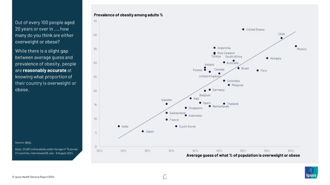
Donut chart on the left and bullet points on the right; clear blue/grey segmentation with percentages labeled.
Market Analysis and Trends
Hospitality & Tourism
The slide highlights that 31% of international attendees visited Texas for the first time, while 49% had visited 2–5 times. It analyzes attendee familiarity with the host city, based on data from a follow-up survey.
first-time visitors, Texas, international attendees, tourism analysis, event impact, familiarity, repeat visits, attendee survey
Mixed Chart
Nielsen
Saved
Features multiple horizontal column chart and a table to represent asset mix, with a clear, professional layout in blue, purple, and gray tones, for various financial metrics in the asset management sector.
Financial Performance
Financial Services
Summarizes the asset management division's performance, detailing net revenues, asset mix, and financial results compared to previous years.
asset management, financial results, asset mix, equity investments, net revenues
Mixed Chart
Goldman Sachs
Saved
Waterfall chart illustrating price vs. volume effects on growth; callout boxes summarize drivers and impacts; right panel shows supply chain effects and visual icons.
Strategic Planning
Consumer Goods
Volume contraction is impacting luxury markets despite sustained price/mix elevation. Factors include limited price hikes, shifts in assortment and geographic pricing, and supply chain adjustments, with volume drops projected at 20–25% through 2024.
volume drop, pricing strategy, mix effect, supply chain, market growth, COGS savings
Mixed Chart
Bain
Saved
A column chart showing invested assets from 2022 to 2028 with annotations on strategy and growth ambitions.
Strategic Planning
Financial Services
It details the goal to exceed 5 trillion in invested assets by 2028, highlighting strategic initiatives and expected growth.
invested assets, growth, strategic planning, GWM, ambitions
Mixed Chart
UBS
Saved
Bar and line combination chart tracking revenue, expenditure, and fiscal deficit as a % of GDP from 2016 to H1 2024.
Corporate Finance and Valuation
Government & Public Sector
Despite a reduction in the fiscal deficit from 6.2% to 4.4% of GDP in H1 2024, fiscal pressures are expected to continue in 2025 due to rising debt service, high spending, and limited revenue generation. Reforms are needed to stabilize public finances.
fiscal deficit, revenue, expenditure, GDP, Nigeria, debt service, fiscal reform
Mixed Chart
PwC/Strategy&
Saved
Standard layout and colors; bar chart showing global and country-specific sentiment on banking regulation.
Regulatory and Compliance
Financial Services
This slide presents public opinion on the regulation of the banking sector. Overall, most respondents believe the level of regulation is about right, but Argentina, France, and Belgium reflect greater concern over insufficient regulation. Japan and Canada exhibit the highest levels of perceived regulatory adequacy.
banking, finance, regulation, compliance, public sentiment, Ipsos, governance, financial sector, oversight, global survey
Mixed Chart
IPSOS
Saved
Bar chart showing three-tier access (full, limited, none) across countries, with a paragraph of insights on the left in a dark-blue sidebar. Clean, data-driven layout with emphasis on comparative support for refugee rights.
Regulatory and Compliance
Government & Public Sector
This slide compares global public opinion on whether refugees should have access to permanent residency or citizenship, showing preferences for full, limited, or no access. It highlights countries with the strongest support or resistance to full access.
refugees, citizenship, residency, public opinion, access rights, countries, Ipsos, global survey, support levels, immigration policy
Mixed Chart
IPSOS
Saved
The slide features a column chart showing the Group RoTE over the past years with a future target marked and bullet points outlining the strategic focus.
Financial Performance
Financial Services
This slide discusses the historical and target Return on Tangible Equity (RoTE) for the Group, highlighting past performance and future strategic goals to stabilize and improve financial returns.
RoTE, group returns, financial performance, strategy
Mixed Chart
Barclays
Saved
This slide has moderate visual complexity with two pie charts showing employee relocation resistance to specific regions. The design incorporates a clear layout for the text and charts, using color coding to differentiate responses by gender.
Human Resources and Talent Management
Professional Services
This slide discusses how global mobility leaders often face challenges aligning company growth destinations with employee preferences. It emphasizes the need for targeted action plans to address location barriers, particularly in areas less favored by employees, and to support female mobility to these locations.
Relocation challenges, Employee preferences, Geographical barriers, Action plans
Multiple Chart
PwC/Strategy&
Saved
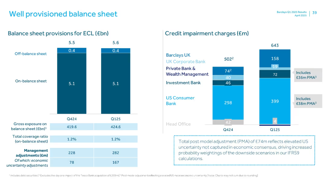
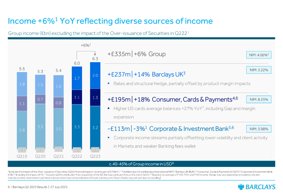
The slide features a column chart showing profit before tax, with key financial metrics listed alongside. The design is straightforward with blue tones.
Financial Performance
Financial Services
The slide provides an overview of Barclays' FY22 financial performance, highlighting a 10.4% RoTE and a 9% increase in profit before impairment.
RoTE, profit, financial performance, Barclays, FY22
Mixed Chart
Barclays
Saved
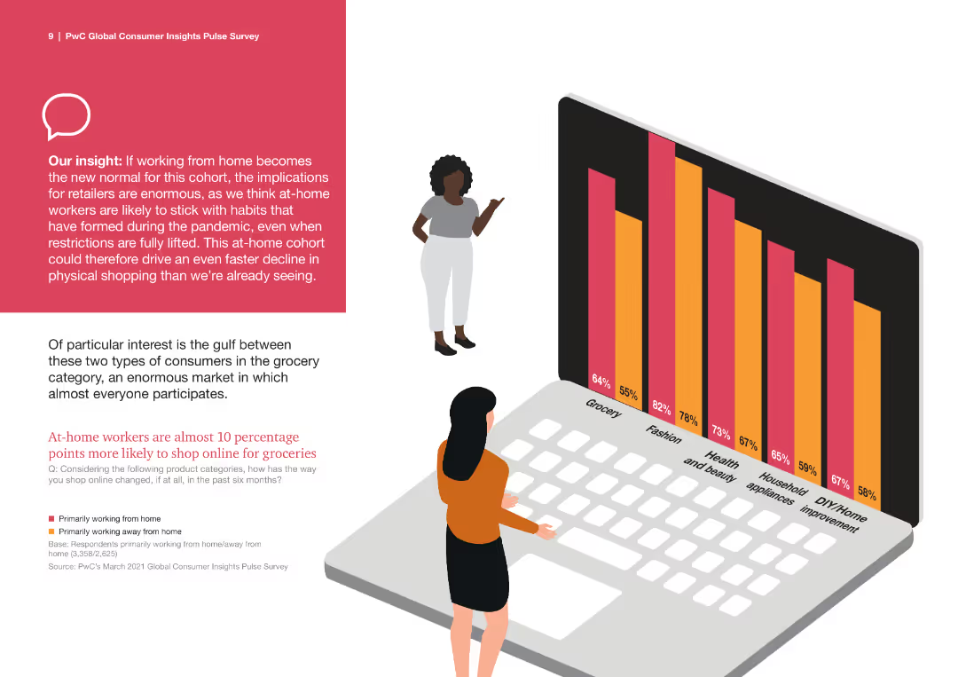
This slide contains text blocks, a large percentage bar chart, and icons representing different generations. The layout is colorful with a clear division of sections.
Market Analysis and Trends
Retail & E-commerce
It provides insights into shopping habits of different generations, particularly focusing on mobile shopping and future spending expectations, segmented by generations.
Generational Analysis, Mobile Shopping, Spending Habits, Market Segmentation, Consumer Insights
Multiple Chart
PwC/Strategy&
Saved
A split comparative slide, with top 5 factors for customer satisfaction listed on the left under green and red icons for promoters and detractors respectively, with simple icons and short texts.
Market Analysis and Trends
Retail & E-commerce
This slide compares customer satisfaction factors, with "Variety", "Price", and "Availability" being top drivers, and "Promotions" and "Quality" noted as well.
satisfaction, customer, variety, price, availability, promotions, quality, factors, comparison, e-commerce
Boxed
Bain
Saved
Column chart detailing the proportion of fiscal variance attributed to different factors like disasters and engineering, with a deep dive expected on these issues. The layout is clean with a distinct color coding.
Regulatory and Compliance
Government & Public Sector
Examines the causes of fiscal variance in NCDOT's budget, focusing on disasters and management issues. Useful for detailed fiscal analysis and strategy discussions in government finance.
fiscal analysis, disasters, engineering, management, government
Mixed Chart
McKinsey
Saved
Contains bar graphs, and detailed text analysis comparing China, the US, and EU in terms of battery production capabilities. The slide uses a combination of purple, blue, and grey colors.
Competitive Landscape
Energy & Utilities
This slide details the strategic industrial policies of the world's largest economies in the battery sector, focusing on manufacturing capacities and government incentives.
battery industry, China, US, EU, industrial policy, manufacturing capacity, government incentives
Mixed Chart
Accenture
Saved
Matrix chart similar to slide 17431, displaying October survey results of ~2,000 executives across nine virus/economic scenarios. Percentages indicate perceived likelihood. Delta from July shown in blue on the right.
Strategic Planning
Professional Services
Presents October sentiment from executives on the most likely virus and economic response scenarios. Scenario A1 (recurring virus, partial economic intervention) is seen as most likely (34%). Compares shifts in opinion from July to October.
executive opinion, survey results, scenario analysis, virus impact, economic intervention, business outlook, trend shift, October update, strategic expectations
Single Chart
McKinsey
Saved
This slide contains a multi-line graph showing office portfolio occupancy trends across several countries, alongside a bar chart representing portfolio weighting by country. It uses a white background with lines in various shades of blue and a yellow highlight for one country’s trend.
Performance Metrics and KPIs
Real Estate & Construction
The slide provides an analysis of office portfolio occupancy rates, close to 90%, across different countries, and shows the portfolio weighting by country. It is crucial for real estate managers tracking occupancy trends or investors evaluating market performance and investment distribution across a global portfolio.
office occupancy, portfolio management, country trends, real estate investment
Multiple Chart
Morgan Stanley
Saved
A map highlighting customer satisfaction ratings in Europe with associated pie charts displaying average satisfaction ratings by region. The slide is visually organized with distinct color coding for different European regions.
Market Analysis and Trends
Professional Services
Provides a geographic breakdown of customer service satisfaction within Europe, showcasing where companies excel or underperform in customer relations. Essential for businesses operating across Europe to identify regional strengths and weaknesses in customer service.
customer service, Europe, satisfaction ratings, geographic analysis, regional differences
Multiple Chart
Deloitte
Saved
Previous
Next
If nothing, comes up, please save your slides first
Create a FREE account to continue browsing
Receive Instant Access to 1,000+ slides from companies like McKinsey, Google, and Goldman Sachs
First Name
Last Name
Email
Password
I agree to all
Terms & Privacy Policy
Thank you! Your submission has been received!
Oops! Something went wrong while submitting the form.
Have an account?
Sign in
Column Chart
Heatmap
Chevron
Org Chart
Infographic
Callouts
Timeline
List
Graphic
Picture
Process Flow
Diagram
Paragraph
Map
Table
Framework
Subtitle
Takeaway Box
Icon
Other Chart
Radar Chart
Waterfall Chart
Mekko Chart
Pie Chart
Scatter Plot
Line Chart
Bar chart
Bullet points