Create a FREE Account
Instant access to 1,000+ real slides from top companies like McKinsey, BCG, Goldman Sachs, Google and many more!
First Name
Last Name
Email
Password
I agree to all
Terms & Privacy Policy
Thank you! Your submission has been received!
Oops! Something went wrong while submitting the form.
Have an account?
Sign in
Library
Templates
Courses
Pricing
My Account
My Slides
My Templates
✦ AI
AI Prompt Library
AI Search
Sign in
Start Here
Logout
My Saved Slides
Vertical bar graph showing self-perceived skill gaps by skill type; left-side text summary
Organizational Structure and Change
Healthcare & Pharmaceuticals
This slide reveals that many nurses feel underprepared in behavioral-health skills compared to other domains like technological or clinical capabilities. Only 37% of nurses feel confident in their behavioral health skills, pointing to a critical development area for future readiness.
skills gap, behavioral health, workforce training, nursing education, competency assessment, professional development
Mixed Chart
McKinsey
Saved
The slide features comparative visuals of traditional and edge cloud computing models. Graphical elements and color coding effectively delineate different computational approaches against a dark theme.
Technology and Digital Transformation
Technology & Software
The slide provides a clear and concise comparison between traditional cloud and edge computing. It highlights the benefits of edge computing in reducing data transmission delays and costs while offering a more relevant set of data for businesses to comply with data residency laws.
Cloud Computing, Edge Computing, Data Transmission
Diagram
McKinsey
Saved
The slide features a pie chart with three sections: 45% won’t impact plans, 33% have tenants rent, and 20% no longer purchase.
Regulatory and Compliance
Real Estate & Construction
This slide shows how regulations on short-term rentals impact investors' decisions to buy properties. It indicates the percentage of investors affected in different ways.
regulations, short-term rentals, investment, property, decision making, pie chart, investor impact
Single Chart
IPSOS
Saved
The slide contains a column chart showing the development of funding volumes per year from 2013 to 2022.
Market Analysis and Trends
Financial Services
The slide depicts the growth of funding volumes for ESG FinTech from 2013 to 2022, highlighting key findings such as the rise of equity investments, the potential for 2022 to surpass 2021's funding high, the concentration of large ticket transactions, and the increase in average ticket size per funding round.
Funding, ESG FinTech, Investment, Growth, Trends
Mixed Chart
EY
Saved
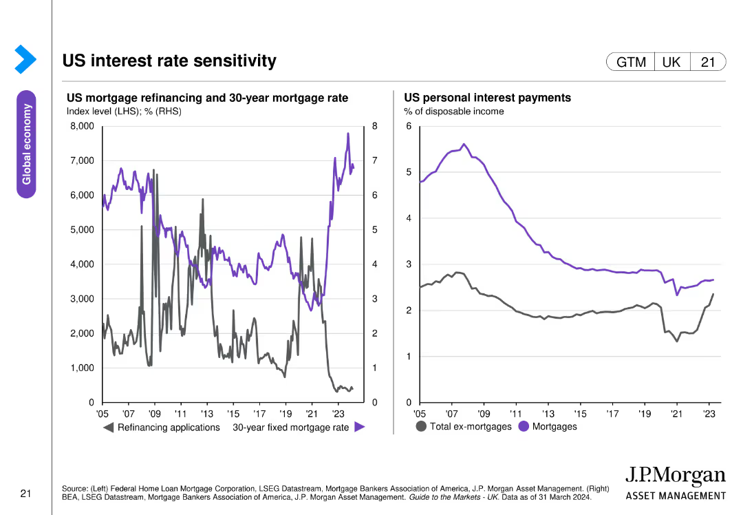
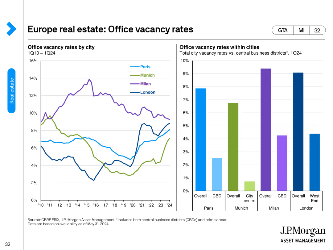
The slide presents two line charts: one on mortgage lending growth rates for investors and owner-occupiers, and the other on housing finance commitments and house prices.
Market Analysis and Trends
Real Estate & Construction
Analyzes trends in residential real estate financing, focusing on mortgage lending and housing finance metrics, useful for real estate market insights.
real estate, mortgage, housing finance, house prices, lending
Multiple Chart
JP Morgan
Saved
The slide uses column charts to show the types of cars and body types preferred by EV prospects. It presents data on preferences for various segments like C-segment and SUVs, with regional comparisons indicated by different colors.
Customer and Market Segmentation
Transportation & Logistics
This slide details the car and body type preferences of EV prospects, showing a significant interest in C-segment vehicles and SUVs. It includes regional data to illustrate the distribution of these preferences across different areas.
EV preferences, column chart, C-segment, SUV, regional comparison
Multiple Chart
PwC/Strategy&
Saved
Left: vertical RoTE bar chart; Center: stacked bars for income by product; Right: cost bars; bottom: NII breakdown waterfall
Financial Performance
Financial Services
Reports Barclays UK’s return on tangible equity for Q424, dissecting revenue by product and costs, with insights into Tesco Bank's financial integration. Structural hedge and product margin effects on NII are also highlighted.
RoTE, Barclays UK, NII, Tesco, income breakdown, cost analysis, structural hedge, Q424
Multiple Chart
Barclays
Saved
The slide features two charts: a bar chart on the left showing the average age of commercial aircraft in the U.S. from 1993 to 2022, and a column chart on the right depicting the U.S. airline passenger miles flown annually from 1970 to 2022. The charts use vertical bars to represent data points and include a clear legend.
Market Analysis and Trends
Transportation & Logistics
This slide analyzes trends in the global airline industry, focusing on the aging fleet of commercial aircraft in the U.S. and the increase in passenger miles flown. It provides insights into the operational dynamics and growth of the airline sector.
Airline industry, aircraft age, passenger miles, aviation trends, fleet management, industry analysis, air travel
Multiple Chart
JP Morgan
Saved
Charts and data table displaying consulting revenues, contribution margin, labor revenues, backlog, etc.
Performance Metrics and KPIs
Professional Services
Provides a breakdown of the Consulting segment’s performance with revenue streams (labor and contract optimization), headcount, backlog, utilization, and YoY trends. Shows growth and fluctuating contribution margins.
consulting, revenue, labor, contract optimization, utilization, backlog, growth, segment analysis, Gartner
Multiple Chart
Gartner
Saved
Horizontal bar chart listing reasons with percentages; includes gender-specific columns
Risk Assessment and Management
Government & Public Sector
The slide outlines reasons why people did not take action toward gender equality, with top responses including “nothing I can do” and lack of knowledge. It shows relative importance and gender differences in each reason.
barriers, gender equality, inaction, awareness, psychological barriers, Ipsos, public opinion
Mixed Chart
IPSOS
Saved
Bar chart comparing returns of different asset classes. Includes icons, dotted lines, and callout text boxes.
Investment Analysis
Financial Services
Compares average, best, and worst returns for stocks, bonds, cash, and diversified portfolios over 18-year rolling periods. Emphasizes that diversification and long-term investing can outperform tuition inflation.
diversification, investment returns, asset classes, inflation, 529 plan
Mixed Chart
JP Morgan
Saved
Bubble chart mapping investor attraction in F&L sectors, showing change in attractiveness from 2020-21. Sectors like Apparel & Accessories and Furniture highlighted.
Competitive Landscape
Financial Services
Apparel & Accessories and Cosmetics & Fragrances are highly attractive to investors. Furniture has shown notable increase in investment propensity for 2021.
sector attractiveness, F&L sectors, investor perspective, investment propensity, market trends
Mixed Chart
Deloitte
Saved
The slide features a column chart displaying the total market capitalization of the Global Top 100 companies from 2012 to 2022. The chart highlights significant growth over the period, with key CAGR figures noted.
Market Analysis and Trends
Financial Services
This slide illustrates the substantial increase in the total market capitalization of the Global Top 100 companies over a decade, emphasizing a 10-year CAGR of 10% and a 5-year CAGR of 15%. It provides a clear historical growth perspective.
Market Capitalization, Global Top 100, Growth, Historical Data, CAGR, Financial Analysis, Column Chart, Trends, Decade, Performance
Single Chart
PwC/Strategy&
Saved
Long-term line chart for Italy; relatively flat trend with minor variation; sidebar text emphasizes stability.
Market Analysis and Trends
Financial Services
Italy's perception of its economic situation has remained among the most stable, fluctuating only six percentage points over the past 12 months, now at 28%.
Italy, economic sentiment, stability, 2024 data, long-term chart, Ipsos, survey results, consistent perception
Mixed Chart
IPSOS
Saved
Scatter plot quadrant graph showing direct vs. indirect exposure to US market; color-coded quadrants with callouts; right-side text explaining quadrant meanings
Risk Assessment and Management
Government & Public Sector
This slide categorizes UK manufacturing sectors based on their exposure to the US market, using a matrix of direct and indirect reliance. Sectors such as chemical goods and transport equipment fall in the “Broad US Exposure” quadrant. It aids in identifying vulnerable sectors for targeted negotiations in future trade talks.
US exposure, UK manufacturing, export risk, sector analysis, trade dependency, quadrant matrix, policy planning
Mixed Chart
PwC/Strategy&
Saved
This slide features a column chart showing global fintech revenue growth from 2017 to 2024, segmented by region (Americas, EMEA, APAC), with green, yellow, and blue colors.
Market Analysis and Trends
Financial Services
Discusses the global fintech market size and growth projections, highlighting the dominance of the APAC and Americas regions and the impact of COVID-19 on fintech growth opportunities.
Fintech, market share, APAC, Americas, EMEA, growth, COVID-19, projections, digital payments, innovation
Mixed Chart
Deloitte
Saved
Horizontal bar chart; ranked by country; teal and navy represent likelihood and unlikelihood respectively
Market Analysis and Trends
Government & Public Sector
This slide reflects public belief in extraterrestrial visitation. India and Thailand rank highest in likelihood belief, while European countries are largely skeptical.
aliens, UFO, belief, outer space, public opinion, Ipsos survey, predictions, 2025, extraterrestrial life
Mixed Chart
IPSOS
Saved
Left-aligned text with a city-view silhouette; right side includes a bar chart comparing 2025–2026 data
Technology and Digital Transformation
Technology & Software
Explains RevOps as a strategic model for optimizing the revenue journey. Notes the expected jump in adoption by high-growth companies (from 30% in 2025 to 75% in 2026). Focus is on aligning internal teams to improve customer success and revenue generation.
customer awareness, interest rates, banking satisfaction, pricing, savings, financial behavior
Mixed Chart
Accenture
Saved
The slide features two line charts, one showing public sector investment as a percentage of GDP and another depicting public sector budget balance for the US, Eurozone, and UK.
Strategic Planning
Government & Public Sector
This slide provides an overview of public sector investment and budget balance trends, essential for analyzing fiscal policy and its economic impacts.
Fiscal policy, public investment, budget balance, GDP, government finance
Multiple Chart
JP Morgan
Saved
Country comparison via horizontal stacked bars with clear response categories.
Regulatory and Compliance
Environmental Services & Sustainability
The slide explores support across nations for ensuring equitable access to resources for treaty compliance. Highest support comes from Nigeria, Uganda, and South Africa. The global average for agreement is 72%.
global equity, treaty implementation, resource access, plastic rules, funding support, Ipsos survey, environmental policy, country views
Mixed Chart
IPSOS
Saved
Four-tile layout with icons and captions outlining urgent reasons for SEA to act on green transition; soft green gradient background.
Strategic Planning
Environmental Services & Sustainability
Lays out four reasons why Southeast Asia must act now on decarbonization: short timelines, actionable steps, economic growth synergy, and geopolitical support. Emphasizes urgency and achievability.
SEA, decarbonization, urgency, opportunity, strategic timing, green transition
Pillar
Bain
Saved
The slide displays a column chart showing agreement levels on trust in the internet across various countries.
Customer and Market Segmentation
Telecommunications
The slide shows the decline in internet trust over time, with a detailed breakdown by country.
trust, internet, agreement levels, countries, decline, 2020 findings, Ipsos
Single Chart
IPSOS
Saved
This slide features multiple line charts illustrating the year-over-year change in ridership for various NY transportation authorities. Annotations and a clear color-coded legend are included.
Operational Efficiency
Transportation & Logistics
Focuses on the drastic reduction in ridership across different public transportation modes in New York during the COVID-19 pandemic, highlighting significant drops and a comparative analysis with previous months.
Transportation, NY, COVID-19, Ridership, Decline
Multiple Chart
BCG
Saved
The slide uses a stark background image of a tree under a starry sky with a circular diagram overlaid, illustrating fiscal challenges faced by the government. The design is simple yet impactful, with contrasting blue and white colors.
Risk Assessment and Management
Government & Public Sector
Provides an overview of the fiscal challenges faced by the government, such as budget deficit, public debt, and fiscal weakness, arranged in a circular flow diagram. It is useful for understanding the complexities and risks associated with government financial management.
fiscal challenges, government, budget deficit, public debt, risk management
Diagram
PwC/Strategy&
Saved
The slide contains an area chart showing the projected economic impact of COVID-19 on New York's GDP, compared to the pre-COVID baseline. It visually represents data points through shading and text annotations to highlight key figures like total economic loss.
Financial Performance
Government & Public Sector
Provides detailed projections of the economic impact of COVID-19 on New York, including total loss and timeline to recovery. Valuable for discussions on fiscal planning and economic strategies in response to pandemics.
COVID-19, economic impact, GDP, New York, projections, recovery, fiscal planning
Mixed Chart
BCG
Saved
Previous
Next
If nothing, comes up, please save your slides first
Create a FREE account to continue browsing
Receive Instant Access to 1,000+ slides from companies like McKinsey, Google, and Goldman Sachs
First Name
Last Name
Email
Password
I agree to all
Terms & Privacy Policy
Thank you! Your submission has been received!
Oops! Something went wrong while submitting the form.
Have an account?
Sign in
Column Chart
Heatmap
Chevron
Org Chart
Infographic
Callouts
Timeline
List
Graphic
Picture
Process Flow
Diagram
Paragraph
Map
Table
Framework
Subtitle
Takeaway Box
Icon
Other Chart
Radar Chart
Waterfall Chart
Mekko Chart
Pie Chart
Scatter Plot
Line Chart
Bar chart
Bullet points