Create a FREE Account
Instant access to 1,000+ real slides from top companies like McKinsey, BCG, Goldman Sachs, Google and many more!
First Name
Last Name
Email
Password
I agree to all
Terms & Privacy Policy
Thank you! Your submission has been received!
Oops! Something went wrong while submitting the form.
Have an account?
Sign in
Library
Templates
Courses
Pricing
My Account
My Slides
My Templates
✦ AI
AI Prompt Library
AI Search
Sign in
Start Here
Logout
My Saved Slides
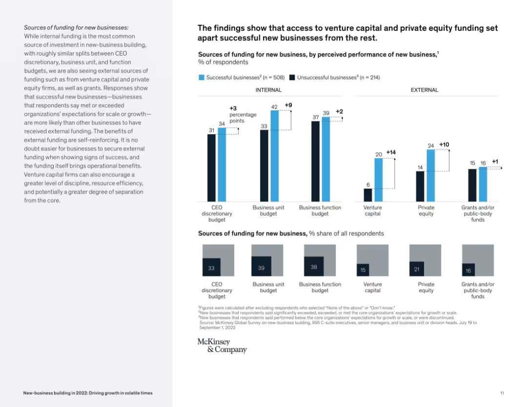
Bar graph layout comparing successful vs. unsuccessful businesses on internal/external funding sources.
Corporate Finance and Valuation
Financial Services
The slide compares sources of funding (CEO, business unit, venture capital, etc.) for successful vs. unsuccessful new businesses. It reveals external sources like VC and private equity correlate with higher business success rates.
funding, venture capital, private equity, startup success, internal vs external, McKinsey, new business
Mixed Chart
McKinsey
Saved
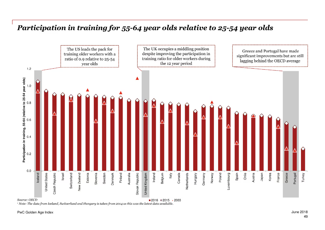
Column chart showing the ratio of participation in training for 55-64 year olds relative to 25-54 year olds across various countries.
Human Resources and Talent Management
Professional Services
The slide compares the training participation rates of older and younger adults in different countries over 2003, 2015, and 2016.
training participation, age comparison, education, OECD, trend
Single Chart
PwC/Strategy&
Saved
The slide has a pie chart showcasing fee revenue mix, bar graphs representing assets under management, and a variety of textual content. The layout is clean, with clear segmentation of sections, and uses blue and grey hues for the graphs, accented by bold colors to highlight key data points.
Financial Performance
Financial Services
It details Fifth Third's diverse fee revenue sources and the strength of its Wealth & Asset Management business, highlighting consistent growth and key priorities. The slide's comprehensive data presentation would be ideal for investor relations or strategic financial planning sessions, discussing revenue diversification and business scale in comparison to peers.
Fee Revenue, Diversification, Wealth Management, Growth, Pie Chart, Bar Graphs, Financial Services, Strategy, Comparison
Multiple Chart
Goldman Sachs
Saved
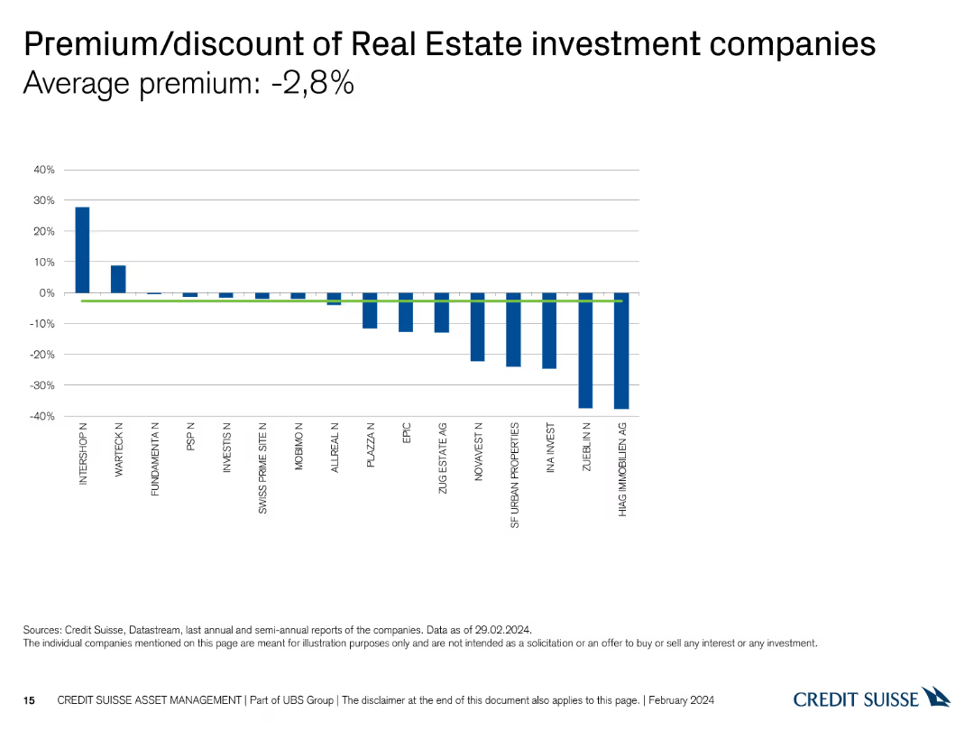
The slide shows a column chart comparing the premium/discount rates of various Real Estate investment companies.
Market Analysis and Trends
Real Estate & Construction
It highlights the average premium and discount rates, allowing for the analysis of investment values in Real Estate companies.
premium, discount, Real Estate, investment, companies
Single Chart
Credit Suisse
Saved
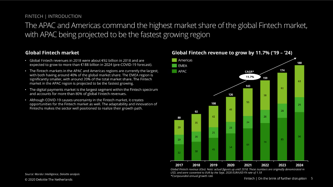
This slide features a column chart showing global fintech revenue growth from 2017 to 2024, segmented by region (Americas, EMEA, APAC), with green, yellow, and blue colors.
Market Analysis and Trends
Financial Services
Discusses the global fintech market size and growth projections, highlighting the dominance of the APAC and Americas regions and the impact of COVID-19 on fintech growth opportunities.
Fintech, market share, APAC, Americas, EMEA, growth, COVID-19, projections, digital payments, innovation
Mixed Chart
Deloitte
Saved
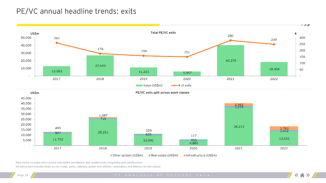
Column charts showing PE/VC exits split across asset classes, with total exits by value and number of exits for 2017-2022.
Investment Analysis
Financial Services
Analyzes annual trends in private equity and venture capital exits, focusing on value and number of exits.
PE/VC, exits, trends, asset classes, analysis
Multiple Chart
EY
Saved
Column chart showing the percentage of respondents agreeing or disagreeing with statements about privacy concerns, highlighting the inevitability of privacy loss due to new technology.
Risk Assessment and Management
Technology & Software
Addresses the global concern about loss of privacy due to technology, with significant agreement that privacy loss is inevitable and concerns about government and corporate data collection.
privacy, technology, concern, survey, inevitability
Mixed Chart
IPSOS
Saved
Displays column charts detailing assets under management by business unit and product group, with clear textual annotations.
Financial Performance
Financial Services
Details the growth and distribution of assets under management within the private banking sector, highlighting net flows and product distribution.
assets, management, banking, financial, growth, distribution, private, investment
Multiple Chart
Deutsche Bank
Saved
Horizontal bar chart showing agreement with increased respect for global institutions if democratic nations have more influence.
Strategic Planning
Government & Public Sector
This slide displays public sentiment in 30 countries regarding trust in global institutions. A majority agree that democratic control increases respect, but trust has declined from 2023, especially in the U.S. and Canada.
institutions, democracy, global governance, influence, trust
Mixed Chart
IPSOS
Saved
Features a comparison of different battery technologies, including lithium-ion, flow batteries, and sodium-ion. The slide uses bar graphs to depict expected global demand and Australia's relative strength in these technologies. Color coding and icons are used to visually differentiate each technology type, with additional textual descriptions providing context on their applications and advantages.
Competitive Landscape
Energy & Utilities
Analyzes the market potential and advantages of various battery technologies, focusing on Australia's strengths and opportunities in sectors like lithium-ion and flow batteries.
battery technologies, Australia, global market, lithium-ion, flow batteries, sodium-ion, market analysis, technology strengths, future potential, energy storage
Mixed Chart
Accenture
Saved
Vertical bar chart comparing views on the importance of inequality across demographic subgroups.
Market Analysis and Trends
Government & Public Sector
This slide shows how different demographic segments (gender, generation, income, education) rate the importance of inequality in their country relative to other issues, with a majority rating it as important.
demographics, inequality, importance, perception, global average, survey analysis
Mixed Chart
IPSOS
Saved
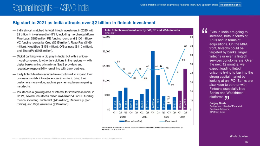
Content-rich slide with bullet points and a vertical bar graph of India's deal activity (2018–2021).
Investment Analysis
Financial Services
India attracted over $2 billion in H1’21 fintech investment, nearly matching 2020’s total. The slide details major deals, trends in digital banking and insurtech, and shows a deal volume chart by quarter.
India, Fintech, VC, PE, Insurtech, Investment, Digital Banking
Mixed Chart
KPMG
Saved
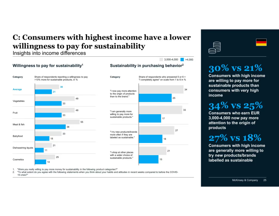
Income-based comparison using two bar charts: one for % willing to pay >10% more and one for agreement with sustainability-related statements; summary on the right.
Customer and Market Segmentation
Consumer Goods
Consumers with the highest income levels show less willingness to pay premiums for sustainability than those earning slightly less. However, middle-high income groups show higher engagement in paying attention to product origin and trying new sustainable products.
income levels, sustainability, willingness to pay, consumer behavior, purchasing patterns, high-income consumers
Mixed Chart
McKinsey
Saved
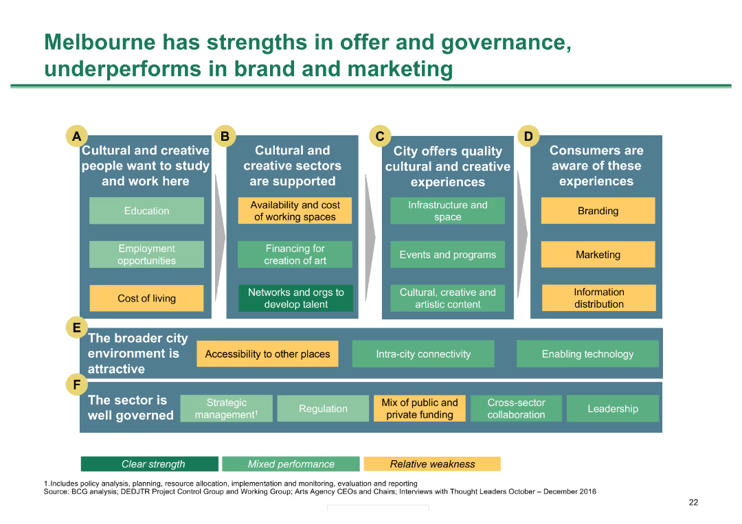
Grid with six categories of metrics; color-coded for strengths, mixed performance, and weaknesses
Market Analysis and Trends
Hospitality & Tourism
Analyzes Melbourne's strengths and weaknesses in various aspects of cultural and creative sector performance
Melbourne strengths, governance, cultural sectors, performance analysis, city metrics
Diagram
BCG
Saved
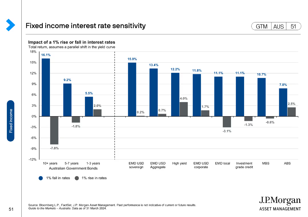
Column chart showing the impact of a 1% rise or fall in interest rates on total returns across various fixed income categories.
Market Analysis and Trends
Financial Services
Examines sensitivity of different fixed income categories to interest rate changes, showing potential returns and losses.
interest rates, sensitivity, fixed income, returns, impact
Single Chart
JP Morgan
Saved
The slide shows a world map overlaid with bar charts and textual annotations representing the year-over-year change in the PC/LT tire market by region. The design uses color-coded columns and icons to differentiate between OE and RT markets. The Michelin logo is subtly included, and the design makes use of brand colors and a clear, straightforward layout.
Market Analysis and Trends
Transportation & Logistics
Offering a global overview of the PC/LT tire market for the first 9 months of 2023, the slide depicts regional trends and market shifts. It is suitable for presentations to stakeholders in business strategy meetings or industry analysis seminars to inform decisions based on regional market performance.
tire market, global, analysis, trends, OE, RT, Michelin, regional, performance, strategy
Mixed Chart
Morgan Stanley
Saved
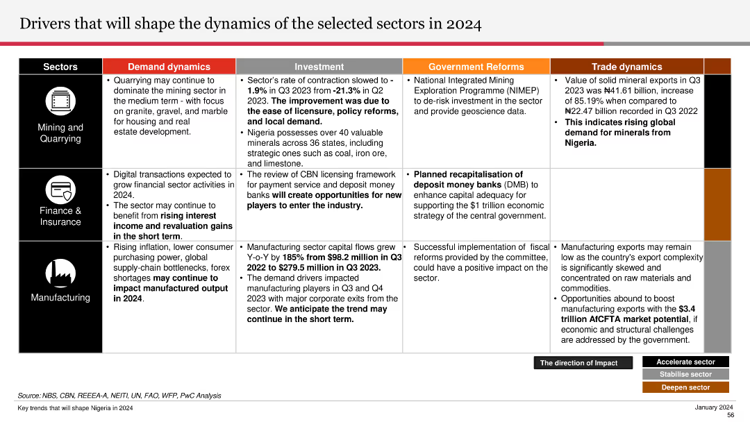
The slide is divided into sections for Mining and Quarrying, Finance & Insurance, and Manufacturing, detailing demand dynamics, investment, and reforms.
Strategic Planning
Industrial & Manufacturing
Outlines factors influencing sector dynamics in 2024, including demand, investment, and government reforms across mining, finance, and manufacturing.
sector dynamics, 2024, mining, quarrying, finance, insurance, manufacturing, investment, reforms
Table
PwC/Strategy&
Saved
The slide includes a title, a column chart with net revenues, a table detailing financial results, and bullet points summarizing the highlights. The slide is well-organized with moderate visual complexity.
Financial Performance
Financial Services
Aimed at displaying detailed financial results for the global banking and markets sector of a company. It includes revenue from various services like investment banking and equities. The data is probably used to analyze market positions and inform strategy meetings or investor updates.
Investment Banking, Equities, Net Revenues, Financial Results
Mixed Chart
Goldman Sachs
Saved
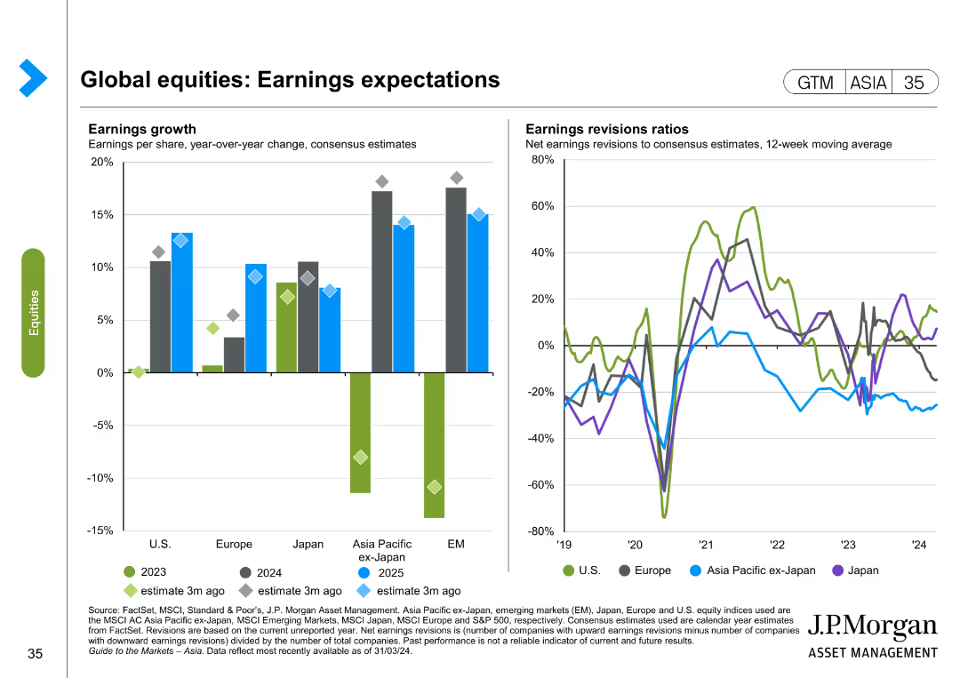
The slide includes two charts: a column chart for earnings growth and a line chart for earnings revisions ratios. The layout is detailed and moderately complex.
Investment Analysis
Financial Services
This slide presents expectations for global equity earnings, showing both growth projections and revisions ratios over recent periods.
earnings expectations, equity earnings, growth projections, earnings revisions, investment analysis
Multiple Chart
JP Morgan
Saved
The slide contains two primary visual elements: a column chart on the left showing the Commonwealth budget surplus/deficit as a percentage of GDP from 1971 to 2026, and a line chart on the right depicting the Commonwealth gross debt in AUD billions from 1971 to 2026.
Financial Performance
Government & Public Sector
The slide provides historical and forecasted data on Australia's budget surplus/deficit and gross debt, illustrating fiscal performance and debt levels over time. It can be used to analyze government financial health and economic policies.
Budget, Debt, Forecast, Economy, Australia
Multiple Chart
JP Morgan
Saved
Features a column chart showing responses about the future role of crypto assets, divided into several ratings.
Market Analysis and Trends
Financial Services
The slide discusses Canadians' opinions on the future role of crypto assets, showing a split view but with a significant portion believing in their importance. It also highlights the correlation between demographics and their views on crypto.
Crypto assets, future, financial ecosystem
Mixed Chart
IPSOS
Saved
Includes a heatmap chart depicting the interconnectedness of various risks including financial, operational, disruptive technology, and compliance risks, among others, based on industry data.
Risk Assessment and Management
Financial Services
Details how different risk types impact each other across sectors, providing a comprehensive view of potential vulnerabilities in the financial industry. Useful for strategic planning and risk assessment workshops.
risk assessment, heatmap, financial industry, strategic planning
Table
Accenture
Saved
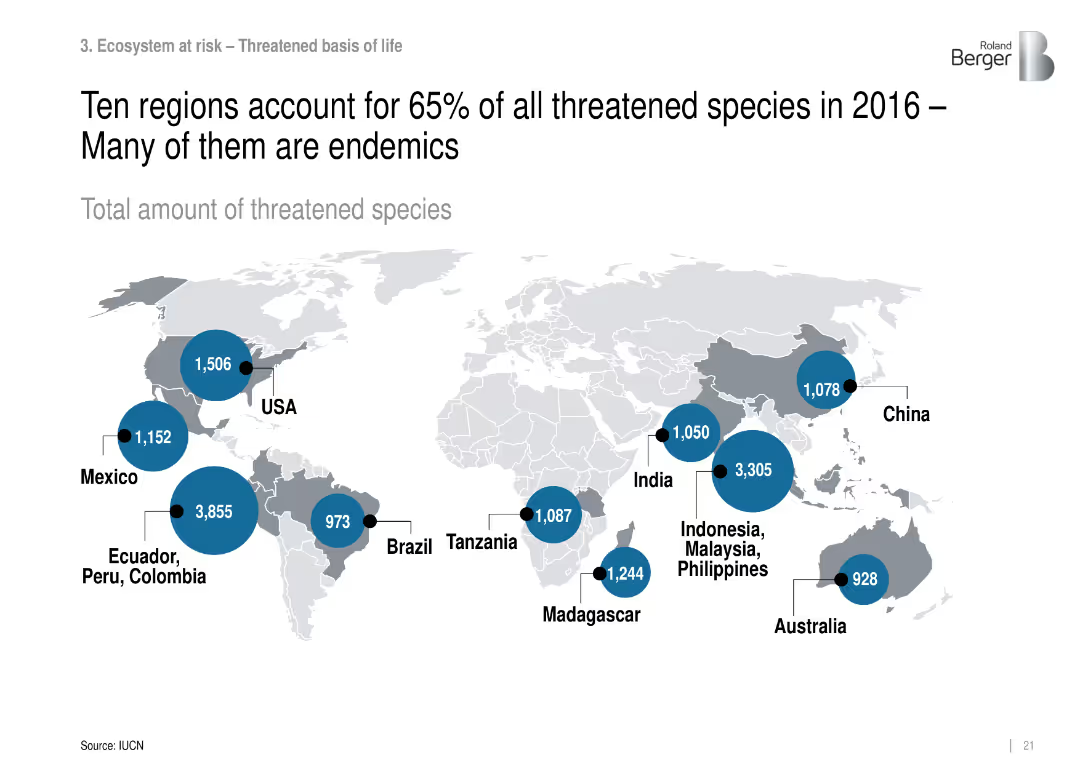
World map with data bubbles showing number of threatened species by region.
Strategic Planning
Environmental Services & Sustainability
Identifies biodiversity hotspots with high numbers of threatened species, focusing on endemic-rich regions like Ecuador, Indonesia, and Madagascar.
threatened species, biodiversity hotspots, endemic, conservation regions
Mixed Chart
Roland Berger
Saved
Contains a column chart and a line graph depicting the amount of investment in USD million and number of deals across various sectors including FinTech, Real Estate, etc
Market Analysis and Trends
Financial Services
Analyzes sector-wise venture capital investment and deals in 2019, emphasizing FinTech's significant share of the market
FinTech, investment, VC, sectors, 2019
Single Chart
McKinsey
Saved
This slide features two sets of column charts, one showing the dramatic decrease in the price of solar PV modules from 2010 to 2020, and another displaying the levelized cost of electricity (LCOE) for solar, diesel, and petrol in 2021. The layout is clean, with annotations providing clarity on the data trends.
Market Analysis and Trends
Energy & Utilities
The slide presents data on the declining cost of solar power compared to other energy sources, highlighting the increased affordability and cost-effectiveness of solar energy, which is significant for market competitiveness in the energy sector.
solar, LCOE, price reduction, cost effectiveness, energy comparison
Multiple Chart
BCG
Saved
Previous
Next
If nothing, comes up, please save your slides first
Create a FREE account to continue browsing
Receive Instant Access to 1,000+ slides from companies like McKinsey, Google, and Goldman Sachs
First Name
Last Name
Email
Password
I agree to all
Terms & Privacy Policy
Thank you! Your submission has been received!
Oops! Something went wrong while submitting the form.
Have an account?
Sign in
Column Chart
Heatmap
Chevron
Org Chart
Infographic
Callouts
Timeline
List
Graphic
Picture
Process Flow
Diagram
Paragraph
Map
Table
Framework
Subtitle
Takeaway Box
Icon
Other Chart
Radar Chart
Waterfall Chart
Mekko Chart
Pie Chart
Scatter Plot
Line Chart
Bar chart
Bullet points