Create a FREE Account
Instant access to 1,000+ real slides from top companies like McKinsey, BCG, Goldman Sachs, Google and many more!
First Name
Last Name
Email
Password
I agree to all
Terms & Privacy Policy
Thank you! Your submission has been received!
Oops! Something went wrong while submitting the form.
Have an account?
Sign in
Library
Templates
Courses
Pricing
My Account
My Slides
My Templates
✦ AI
AI Prompt Library
AI Search
Sign in
Start Here
Logout
My Saved Slides
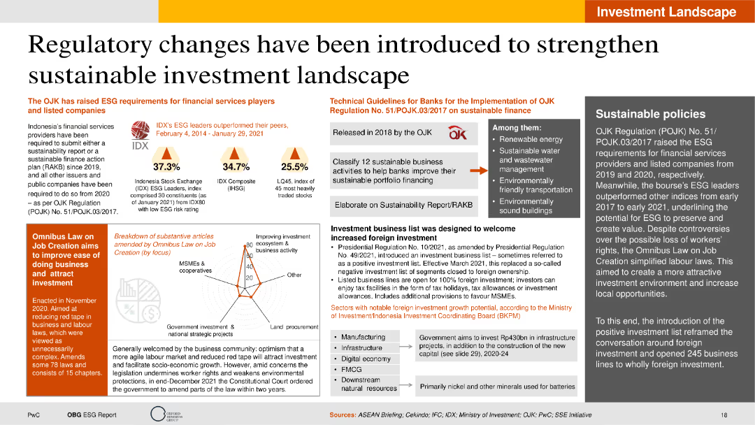
The slide is moderately dense with a combination of text, column charts, icons, and infographics. It has a clear layout featuring sections with distinct background colors for easy distinction. Key metrics are highlighted using column charts.
Regulatory and Compliance
Financial Services
The slide discusses recent regulatory changes in Indonesia aimed at strengthening the sustainable investment landscape. It covers the introduction of ESG requirements, technical guidelines for banks, and the impact of the Omnibus Law on job creation. The slide includes statistical performance data of IDX ESG leaders and highlights key areas for sustainable business activities.
Regulatory changes, ESG requirements, sustainable finance, Omnibus Law, IDX performance
Mixed Chart
PwC/Strategy&
Saved
The slide features a hexagon-shaped diagram with six colored segments, each representing a foundational aspect to address in digital policy-making, like 'Data and Privacy' and 'Work and Wage effects'.
Strategic Planning
Technology & Software
It stresses the importance of certain foundational aspects in digital transformations, such as cybersecurity and skill gaps. This slide is apt for presentations on digital strategy, policy-making, or discussing the broad implications of digitization on society.
digital foundations, policy-making, cybersecurity, data privacy, skill gaps, diagram
Diagram
McKinsey
Saved
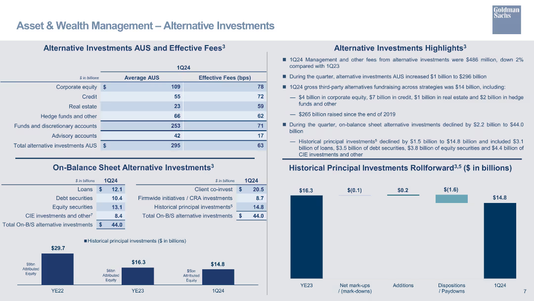
A table outlining alternative investments AUS and effective fees, with bar charts for historical principal investments rollforward.
Investment Analysis
Financial Services
Highlights alternative investments in AUS, detailing effective fees and changes in principal investments over time.
alternative investments, AUS, effective fees, principal investments, bar chart, financial overview
Multiple Chart
Goldman Sachs
Saved
This slide features multiple vertical bar (column) charts showing the S&P 500 sectors' current P/E ratios against 10-year highs, lows, and averages, with annotations for specific dates and a descriptive legend below. The layout is information-dense with a mix of vibrant colors for differentiation.
Financial Performance
Financial Services
The slide presents a comparative valuation analysis of S&P 500 sectors using current and historical P/E ratios, useful for financial analysts and investors.
S&P 500, valuation, P/E ratio, financial analysis, equity markets, historical comparison, investment, sector analysis
Single Chart
Morgan Stanley
Saved
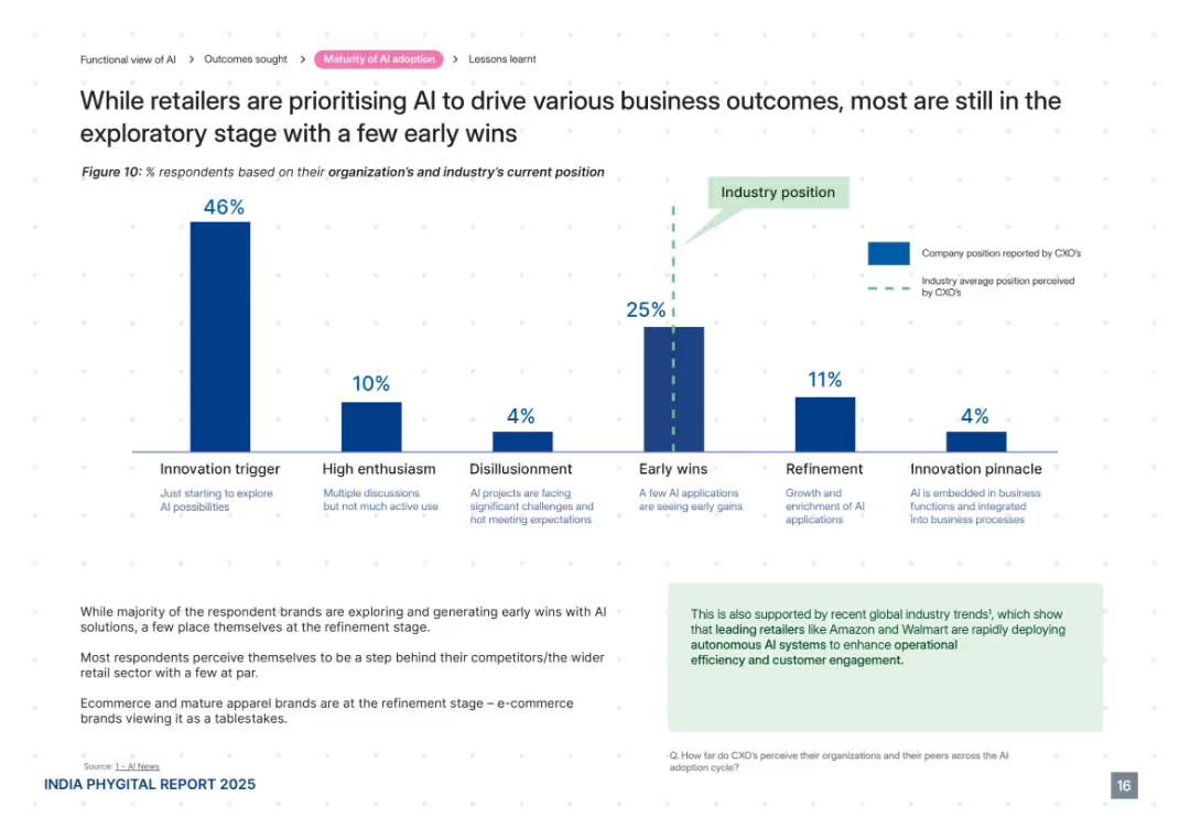
Centered vertical bar chart showing AI adoption stages, supported by paragraph analysis and green-highlighted insights box.
Technology and Digital Transformation
Retail & E-commerce
This slide maps AI maturity levels in retail, indicating most brands are in the exploratory or early-win stages. Very few are in the refinement or pinnacle phases. Commentary highlights perceived lag in progress relative to competitors and industry norms. E-commerce brands are further ahead.
AI maturity, innovation trigger, retail adoption, early wins, refinement, digital transformation, Amazon, Walmart
Mixed Chart
PwC/Strategy&
Saved
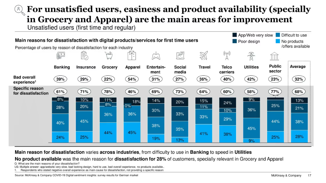
Stacked bar chart by industry; shows specific dissatisfaction reasons (slow, hard to use, poor design, product availability)
Performance Metrics and KPIs
Technology & Software
This slide identifies why users are dissatisfied with digital services. Top issues include difficulty of use and lack of available products or offers, especially in Grocery and Apparel. Each industry’s chart shows what aspects need improvement, providing guidance for digital product optimization.
user dissatisfaction, product availability, UX issues, service improvement, digital challenges, KPIs, grocery, apparel
Single Chart
McKinsey
Saved
Features a column chart comparing actual eCommerce sales against goals for FY16 to FY18, with future aspirations for FY20. The chart uses blue and green colors to distinguish between actual results and goals.
Sales and Business Development
Retail & E-commerce
Analyzes the growth of Clorox's eCommerce sales, highlighting the success against set goals and future targets. Useful for discussions on eCommerce strategies and sales performance reviews.
eCommerce, sales growth, Clorox, strategic planning
Single Chart
Barclays
Saved
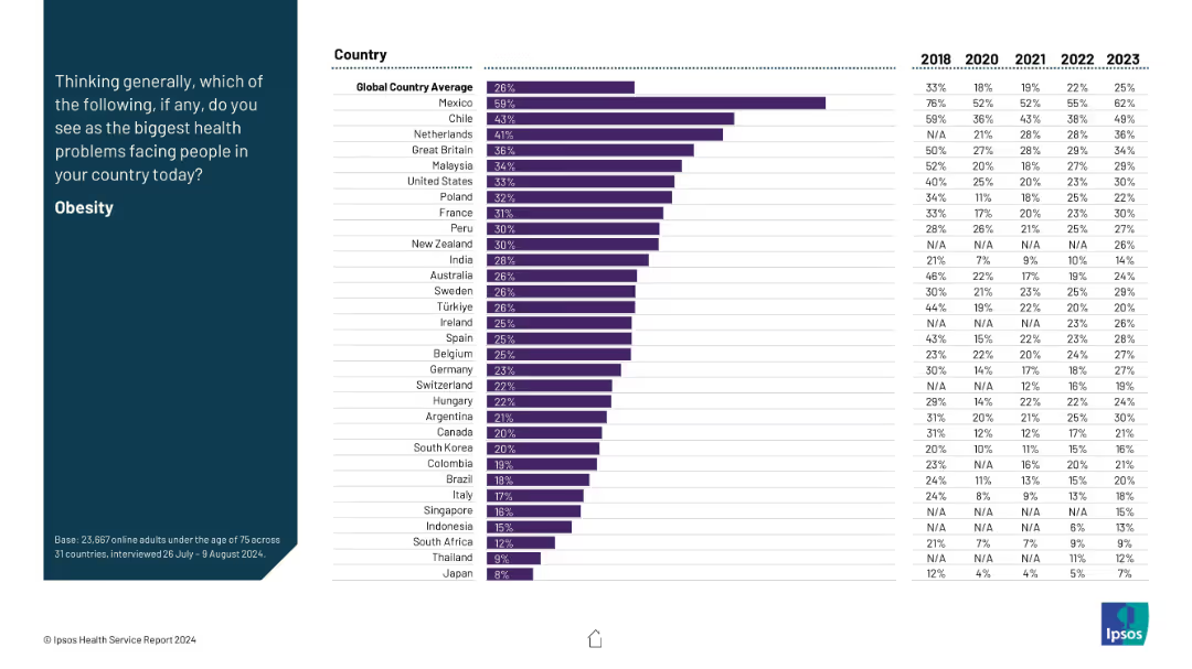
Same format as others: left-side question and right-side horizontal bar chart with six-year data trend.
Market Analysis and Trends
Healthcare & Pharmaceuticals
Obesity is presented as a major health concern, with Mexico leading by a wide margin. The data show historical shifts (2018–2023) with consistent rises in many countries. The global average sits at 26%, reflecting growing awareness of obesity as a health crisis.
obesity, lifestyle diseases, health trends, global health, survey
Mixed Chart
IPSOS
Saved
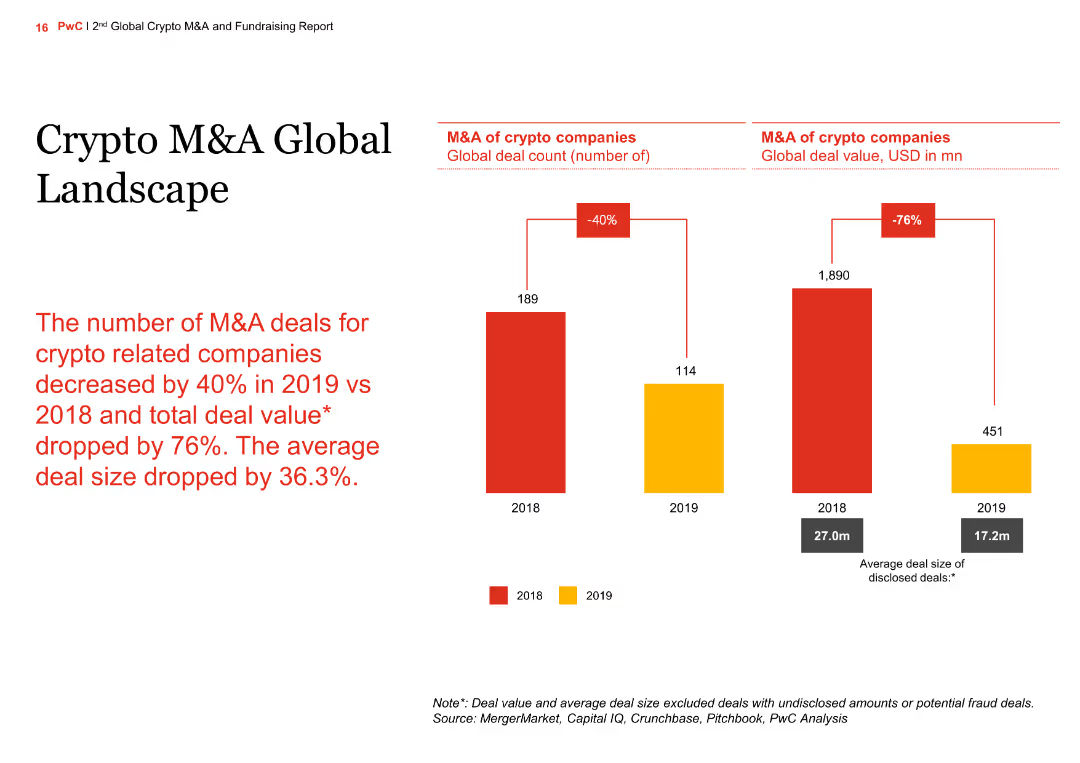
The slide presents a comparison of global M&A deal count and deal value for crypto companies between 2018 and 2019. It includes a column chart showing a significant drop in deal numbers and value in 2019.
Market Analysis and Trends
Financial Services
The slide highlights the decline in the number and value of M&A deals for crypto companies in 2019 compared to 2018, showing a 40% decrease in deal count and a 76% drop in total deal value.
crypto, M&A, global, column chart, comparison
Multiple Chart
PwC/Strategy&
Saved
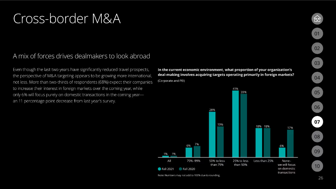
The slide features a black background with white text discussing the trend of cross-border M&A. A column chart compares the proportion of organizations focusing on foreign markets in 2020 and 2021.
Mergers and Acquisitions
Financial Services
Analyzes the shift in focus towards international markets for M&A activities, driven by survey data comparing the focus on foreign markets over two consecutive years.
cross-border M&A, international markets, foreign focus, survey comparison
Mixed Chart
Deloitte
Saved
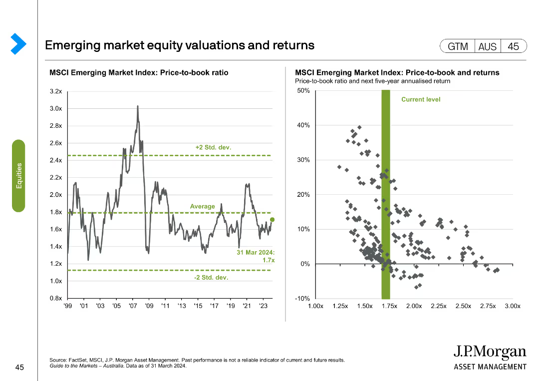
Line chart showing MSCI Emerging Market Index price-to-book ratio from 1999 to 2024. Scatter plot correlates price-to-book ratio with 5-year returns.
Investment Analysis
Financial Services
Displays historical and current valuations of emerging market equities, analyzing potential returns based on price-to-book ratio and historical data.
emerging markets, equity, valuations, returns, MSCI
Multiple Chart
JP Morgan
Saved
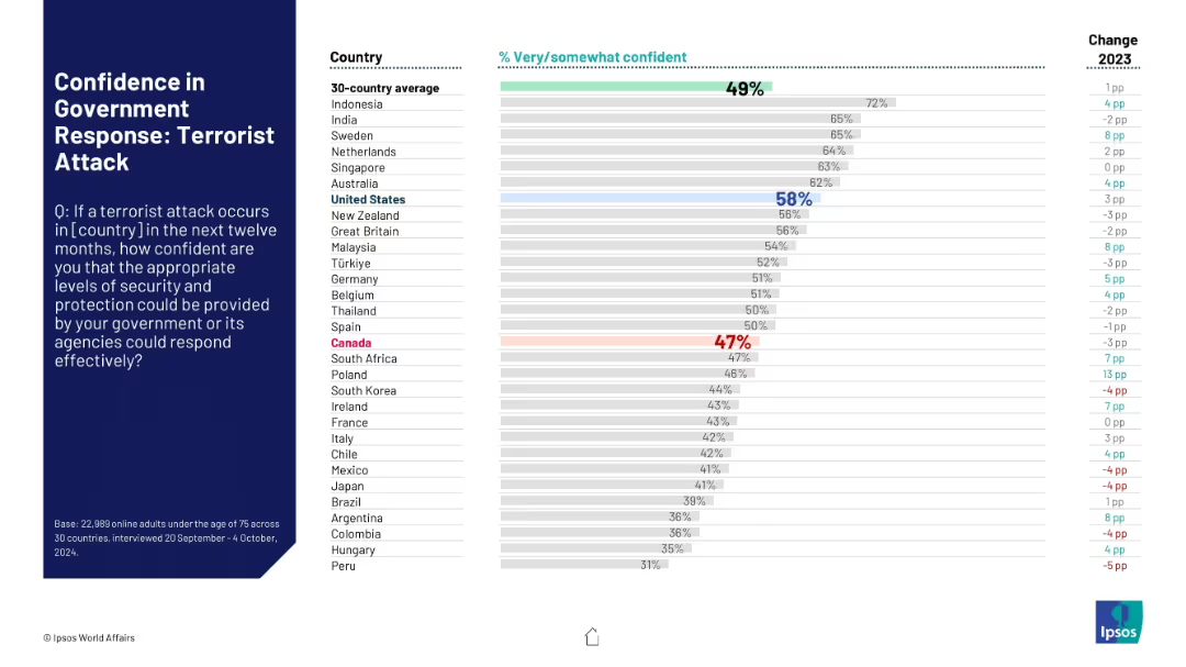
Horizontal bar graph; Canada and U.S. color-coded; terrorism response confidence analyzed.
Risk Assessment and Management
Government & Public Sector
Survey results showing public trust in government response to potential terrorist attacks. U.S. respondents show higher confidence (58%) than Canada (47%), with the global average at 49%.
terrorism, government response, security, Ipsos, 2024, Canada, U.S., emergency management, perception
Mixed Chart
IPSOS
Saved
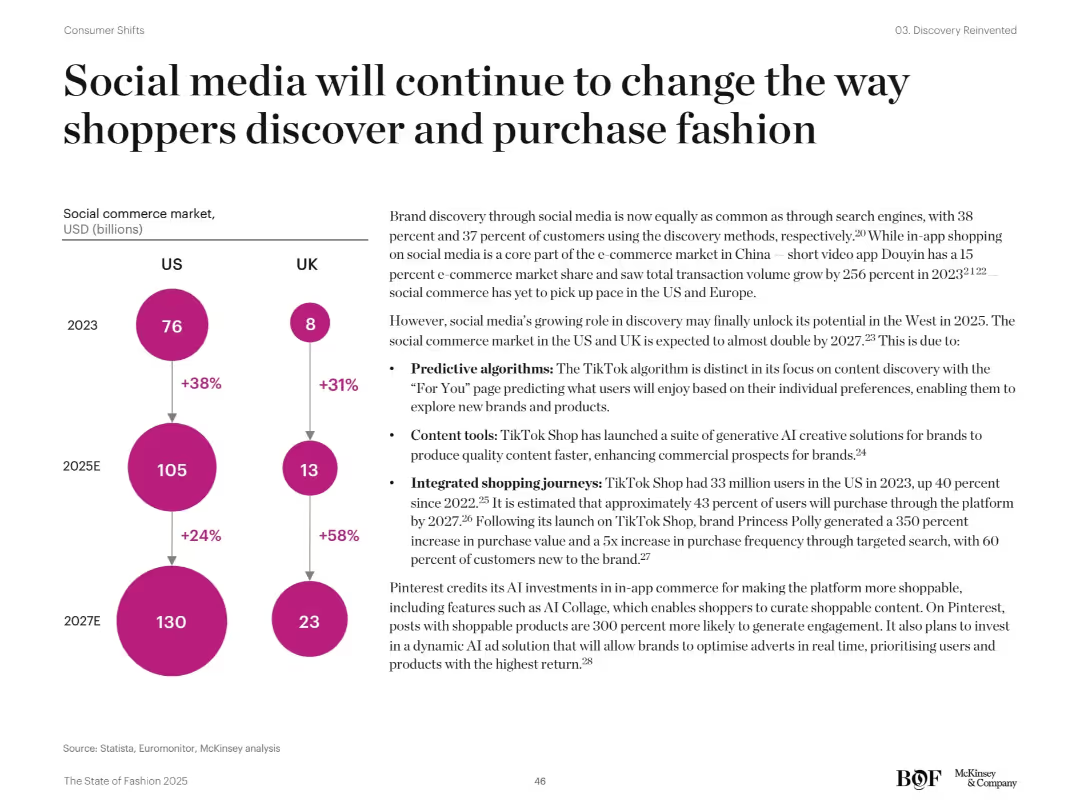
Split-page layout with left infographic (bubble chart) showing projected social commerce market growth in US/UK and right text explanation. Bright magenta circles and clean layout.
Customer and Market Segmentation
Retail & E-commerce
Projects strong growth in the US/UK social commerce market by 2027. Emphasizes TikTok’s role with predictive algorithms, content tools, and integrated shopping. Pinterest and other platforms’ strategies for engaging consumers are discussed.
social commerce, TikTok, Pinterest, predictive algorithms, e-commerce, market growth
Mixed Chart
McKinsey
Saved
The slide contains a line chart tracking IPO activity and volatility from July 2021 to June 2022, with annotations highlighting key trends.
Market Analysis and Trends
Financial Services
This slide analyzes the impact of rising volatility on IPO activity, showing a correlation between increased market volatility and a decline in the number of IPOs over the specified period.
IPO, Volatility, Market trends, Financial services, Analysis
Single Chart
EY
Saved
The slide features a flow chart illustrating the energy efficiency example from fossil fuel extraction to mechanical energy conversion for hydrogen, electric motor, and ICE.
Technology and Digital Transformation
Energy & Utilities
The slide compares the efficiency of converting fossil fuels to hydrogen via SMR with ICE and BEV, demonstrating that the process does not lead to extra fossil fuel consumption. It visually represents energy conversion steps and efficiencies.
fossil fuels, hydrogen, efficiency, SMR, BEV
Linear Flow
Kearney
Saved
This slide contains a pie chart detailing portfolio by industry and a line graph illustrating net charge-off performance, accompanied by text boxes.
Risk Assessment and Management
Financial Services
The slide presents a portfolio summary, market commentary, and performance metrics for commercial and industrial (C&I) lending, discussing risk management and credit performance.
Risk Discipline, C&I Lending, Portfolio, Market Commentary, Performance, Credit Quality
Multiple Chart
JP Morgan
Saved
With a deep purple backdrop, the slide includes vertical bar graphs illustrating pre and post-COVID-19 online activity changes.
Market Analysis and Trends
Technology & Software
Highlights the amplified use of telehealth, online learning, shopping, and government services on the nbn network as a result of COVID-19.
COVID-19, digital alternatives, nbn network, online activities, telehealth, online learning, government services
Multiple Chart
Accenture
Saved
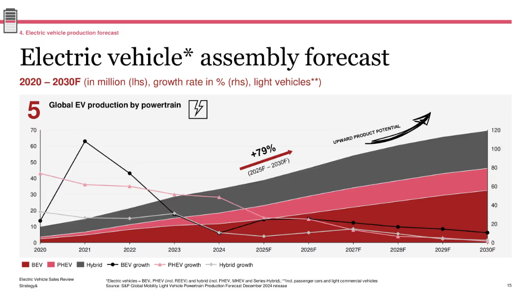
Line and area chart tracking EV production and growth rate by powertrain; annotation for “upward product potential”; uses five powertrain types and shows historical data (2020–2024) with projections to 2030
Technology and Digital Transformation
Industrial & Manufacturing
The slide presents global EV production trends by powertrain from 2020 to 2030. It includes BEV, PHEV, and hybrid vehicles, with associated growth rates. A 79% increase is forecasted between 2025 and 2030. The graphic highlights the industry’s long-term growth potential, especially for BEVs, and contextualizes recent slowdowns with projected acceleration.
EV production, global forecast, BEV, hybrid, powertrain growth, 2025–2030, automotive outlook
Single Chart
PwC/Strategy&
Saved
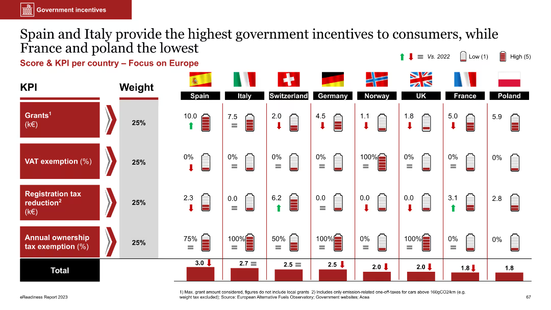
The slide includes a table with bar charts showing government incentives for EVs in various European countries. Metrics include grants, VAT exemption, and tax reductions, each weighted differently.
Regulatory and Compliance
Transportation & Logistics
The slide compares government incentives for EVs across European countries, highlighting Spain and Italy as offering the most incentives. It aims to illustrate the impact of government policies on EV adoption.
government incentives, EVs, Europe, grants, tax exemptions
Multiple Chart
PwC/Strategy&
Saved
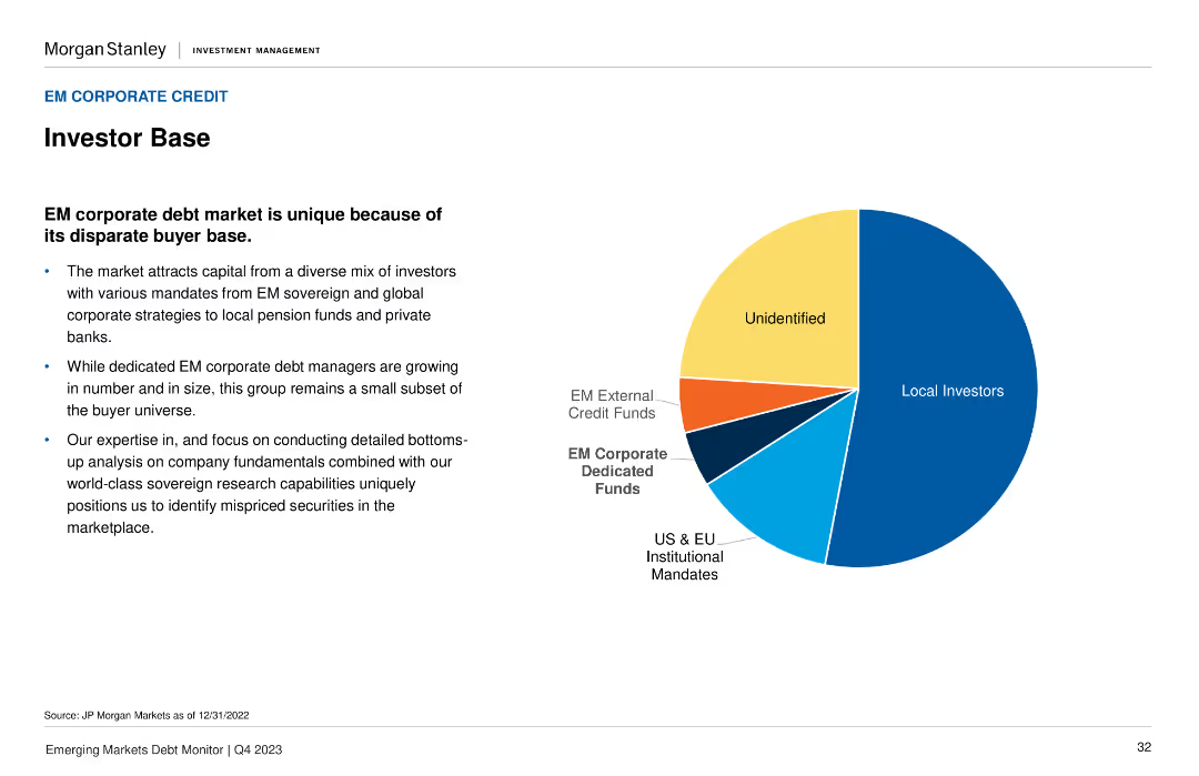
The slide features a pie chart displaying the composition of the EM corporate debt market investor base, with segments for Local Investors, US & EU Institutional, and others.
Market Analysis and Trends
Financial Services
It describes the diverse mix of investors in the EM corporate debt market and emphasizes the unique buyer base. Useful for understanding the investor landscape in emerging markets.
investor base, corporate debt, EM, market composition, analysis
Mixed Chart
Morgan Stanley
Saved
The slide contains a column chart illustrating concentration levels across different access modes. Bars are vertically oriented and labeled as Direct, Search, Apple News, Google News, Facebook, Twitter, and All.
Market Analysis and Trends
Media & Entertainment
This slide analyzes concentration levels across various access modes excluding subsequent visits. It helps understand how different sources contribute to concentration levels.
concentration, access modes, column chart, media, analysis
Single Chart
IPSOS
Saved
The slide contains several rectangular callout boxes with icons, a column chart, and text descriptions. It uses a blue and white color palette and has a balanced distribution of visuals and text.
Strategic Planning
Financial Services
Outlines a strategic plan for a wealth franchise, detailing service offerings like full-service, remote advice, and self-directed investing. It serves to illustrate the comprehensive approach to client service across multiple channels, aimed at capturing a larger share of the investment wallet.
Wealth franchise, Strategic plan, Service offerings, Investment, Channels
Mixed Chart
JP Morgan
Saved
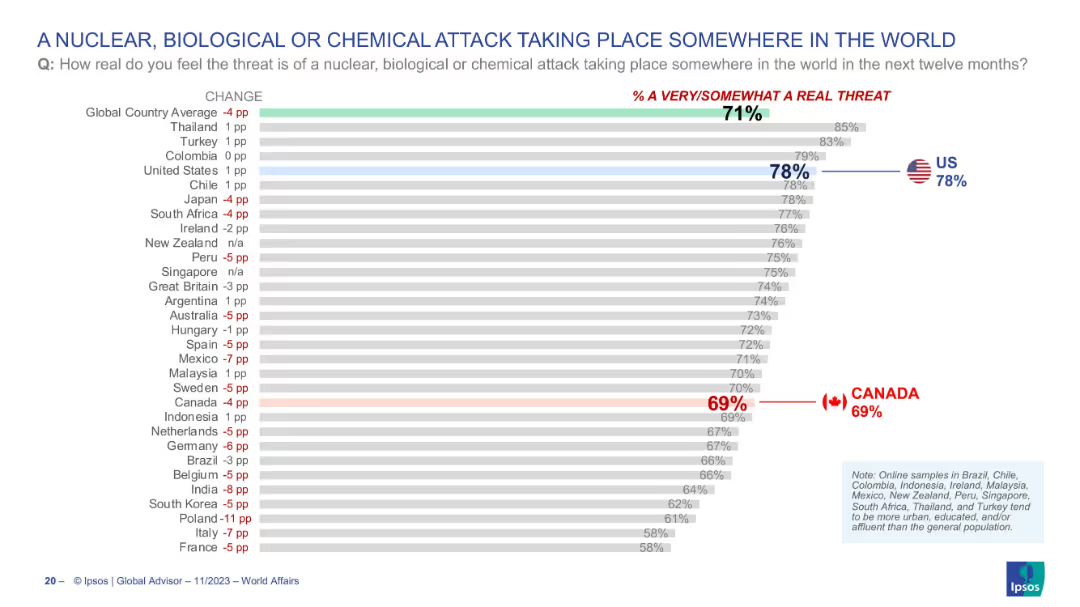
Bar chart ranking countries by concern over such attacks occurring globally; threat perception shown on the right; Canada and US again highlighted.
Risk Assessment and Management
Government & Public Sector
This slide illustrates the public’s view on the likelihood of a nuclear, biological, or chemical (NBC) attack somewhere in the world over the next year. The global average perceived threat is 71%, with 78% of Americans and 69% of Canadians regarding it as a real threat. The slide visualizes concern levels on global catastrophic risks.
NBC attack, public concern, global threats, terrorism, weapons, survey, perception, USA, Canada, Ipsos
Single Chart
IPSOS
Saved
The slide has four content boxes each with a heading, a ranking, and three bullet points summarizing strategy aspects. Two larger blue boxes highlight the market leadership position, while two smaller gray boxes detail engagement metrics.
Strategic Planning
Financial Services
This slide focuses on the strides made in Consumer Banking, Branch Network, and Business Banking, juxtaposing the current achievements with future strategic goals. It serves to communicate progress and set a determined outlook for extending market leadership.
Strategy progress, Consumer banking, Market leadership, Business strategy, Future outlook, Banking network
Table
JP Morgan
Saved
This slide displays a column chart with six sets of bars representing different digital service sectors. It contrasts the incremental adoption in H1 2022 with adoption as of 2021. Annotations provide insights on e-commerce and digital media consumption. Colors vary in shades of blue.
Market Analysis and Trends
Technology & Software
The slide analyzes the normalization of digital adoption growth post-acceleration phase, showing the saturation in various sectors such as e-commerce and digital media. It is a market analysis tool that can be used to gauge the digital service sector's plateau in growth and the potential for market consolidation or diversification.
digital adoption, urban users, SEA, e-commerce, normalization, growth, sector saturation, column chart
Single Chart
Bain
Saved
Previous
Next
If nothing, comes up, please save your slides first
Create a FREE account to continue browsing
Receive Instant Access to 1,000+ slides from companies like McKinsey, Google, and Goldman Sachs
First Name
Last Name
Email
Password
I agree to all
Terms & Privacy Policy
Thank you! Your submission has been received!
Oops! Something went wrong while submitting the form.
Have an account?
Sign in
Column Chart
Heatmap
Chevron
Org Chart
Infographic
Callouts
Timeline
List
Graphic
Picture
Process Flow
Diagram
Paragraph
Map
Table
Framework
Subtitle
Takeaway Box
Icon
Other Chart
Radar Chart
Waterfall Chart
Mekko Chart
Pie Chart
Scatter Plot
Line Chart
Bar chart
Bullet points