Create a FREE Account
Instant access to 1,000+ real slides from top companies like McKinsey, BCG, Goldman Sachs, Google and many more!
First Name
Last Name
Email
Password
I agree to all
Terms & Privacy Policy
Thank you! Your submission has been received!
Oops! Something went wrong while submitting the form.
Have an account?
Sign in
Library
Templates
Courses
Pricing
My Account
My Slides
My Templates
✦ AI
AI Prompt Library
AI Search
Sign in
Start Here
Logout
My Saved Slides
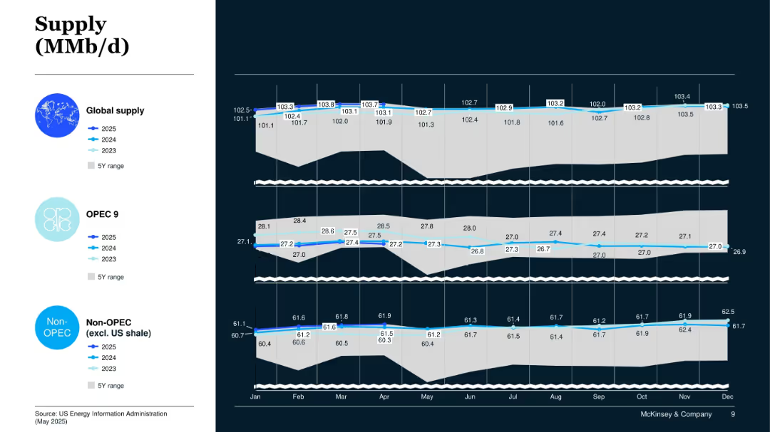
Three-panel line chart showing 2023–2025 global oil supply by global total, OPEC 9, and Non-OPEC; includes 5Y range.
Operational Efficiency
Energy & Utilities
This slide tracks supply trends from 2023 to 2025, focusing on global, OPEC 9, and Non-OPEC sources. It shows moderate growth in global output driven mainly by Non-OPEC sources.
Global Oil Supply, OPEC, Non-OPEC, Supply Trends, Production Forecast
Mixed Chart
McKinsey
Saved
Horizontal bar charts comparing agreement and disagreement on statements about societal change, conflict, immigration, and leadership, with a focus on specific concerns.
Market Analysis and Trends
Government & Public Sector
This slide addresses concerns related to rapid societal changes, such as values conflict, immigration issues, and weak leadership, highlighting agreement and disagreement levels.
societal change, conflict, immigration, leadership, concerns, bar chart, agreement, disagreement
Mixed Chart
IPSOS
Saved
Uses column bars to display different levers in procurement, emphasizing their activities and trends.
Sales and Business Development
Industrial & Manufacturing
Discusses key procurement levers, such as commercial procurement applications, supplier management, and category strategies.
Procurement, Commercial, Supplier Management, Trends
Single Chart
Roland Berger
Saved
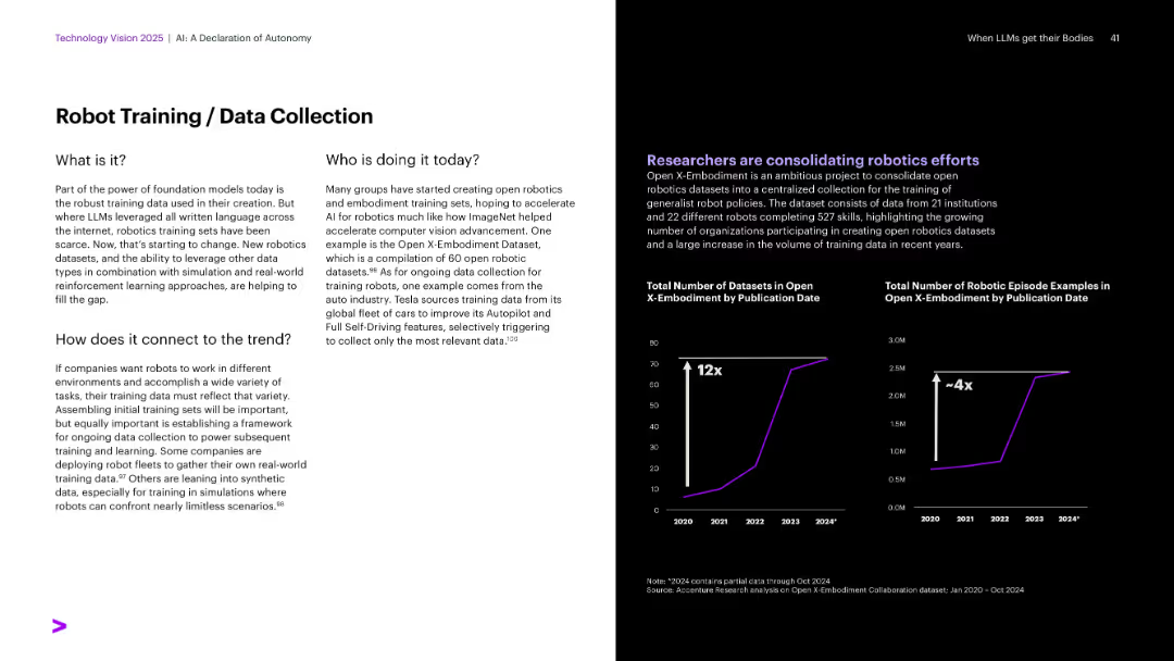
Layout similar to others: text left, black background right with dual line charts (datasets and examples growth).
Operational Efficiency
Artificial Intelligence
The slide discusses the importance of robust training datasets for foundation models in robotics. It features Open X-Embodiment, a dataset consolidating robotic data. Growth in dataset volume and episode examples is visualized, showing major recent scaling of data collection and robotics research efforts.
Robotics training, datasets, Open X-Embodiment, simulation, Tesla
Multiple Chart
Accenture
Saved
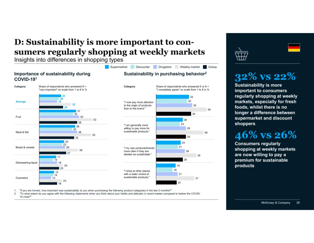
Multi-category comparison chart with different shopper types (supermarket, discounter, drugstore, weekly market, online) shown via color-coded bars across product categories; insights panel on the right.
Customer and Market Segmentation
Retail & E-commerce
Consumers who regularly shop at weekly markets value sustainability more, especially for fresh food categories. They also exhibit higher willingness to pay premiums, unlike discount and supermarket shoppers where differentiation has diminished.
shopping types, weekly markets, sustainability, fresh produce, consumer segmentation, willingness to pay
Mixed Chart
McKinsey
Saved
This slide presents a column chart comparing the current P/E ratios to 10-year highs, lows, and averages for various regions and styles. The color coding distinguishes between the metrics, and the layout is clear with labeled axes and an accompanying legend.
Investment Analysis
Financial Services
Focused on investors and financial analysts, this slide offers a valuation analysis using price-to-earnings ratios. It contrasts current figures with historical data across different regions and styles, serving as a basis for assessing market valuation and aiding in the development of investment strategies.
Valuation, P/E Ratio, Regions, Investment Analysis, Stocks
Single Chart
Morgan Stanley
Saved
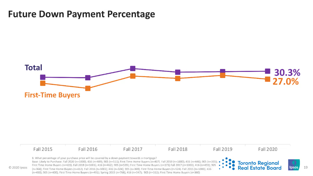
Line chart showing the percentage of down payments for total and first-time buyers from Fall 2015 to Fall 2020. Two lines represent each group.
Market Analysis and Trends
Real Estate & Construction
This slide tracks the expected down payment percentages for future purchases, highlighting trends among all buyers and first-time buyers specifically.
down payment, future trends, first-time buyers, total buyers, Fall 2015-2020
Single Chart
IPSOS
Saved
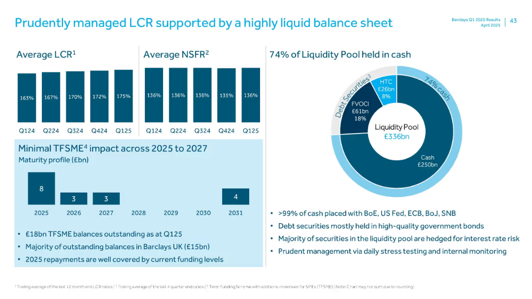
Split into four sections: two bar charts (LCR and NSFR), one pie chart (liquidity pool), and one maturity profile bar chart with bullet points below. Uses consistent blue branding and typography.
Financial Performance
Financial Services
Highlights Barclays’ liquidity coverage and funding stability in Q1 2025, including strong LCR and NSFR ratios, liquidity pool composition (74% in cash), and low TFSME refinancing risk through 2027. Emphasizes prudent liquidity management and high-quality asset backing.
LCR, NSFR, liquidity pool, TFSME, funding profile, Q1 2025, Barclays, cash reserves, financial stability
Multiple Chart
Barclays
Saved
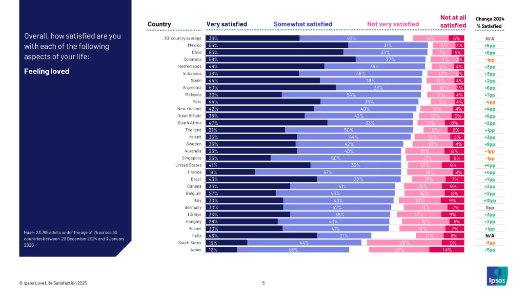
Dark blue left header; right side bar chart shows satisfaction levels by country in four response bands and change from 2024.
Human Resources and Talent Management
Professional Services
This slide visualizes how satisfied people are with feeling loved across 30 countries. It categorizes satisfaction levels and shows year-over-year change. Mexico and Colombia rank highest, while Japan and South Korea rank lowest. The chart includes detailed breakdowns per country.
feeling loved, satisfaction, emotional health, cross-country comparison, Ipsos, personal well-being, survey, 2025
Mixed Chart
IPSOS
Saved
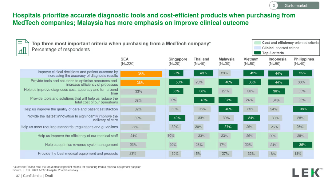
Vertical column chart comparing criteria for purchasing from MedTech companies across SEA countries. Color-coded bars for different criteria.
Market Analysis and Trends
Healthcare & Pharmaceuticals
Highlights the top three most important criteria when purchasing from MedTech companies in SEA, focusing on diagnostic accuracy, resource optimization, and process efficiency.
MedTech, purchasing criteria, diagnostic accuracy, resource optimization, process efficiency, SEA
Multiple Chart
LEK
Saved
This slide presents a column chart comparing economic capital assessments versus exposure over several years, with clear annotations and color highlights.
Financial Performance
Financial Services
Discusses the significant increase in capital requirements for insurance syndicates, reflecting on market conditions and the implications for risk management strategies.
capital requirements, insurance syndicates, risk management, market conditions, 2019
Mixed Chart
PwC/Strategy&
Saved
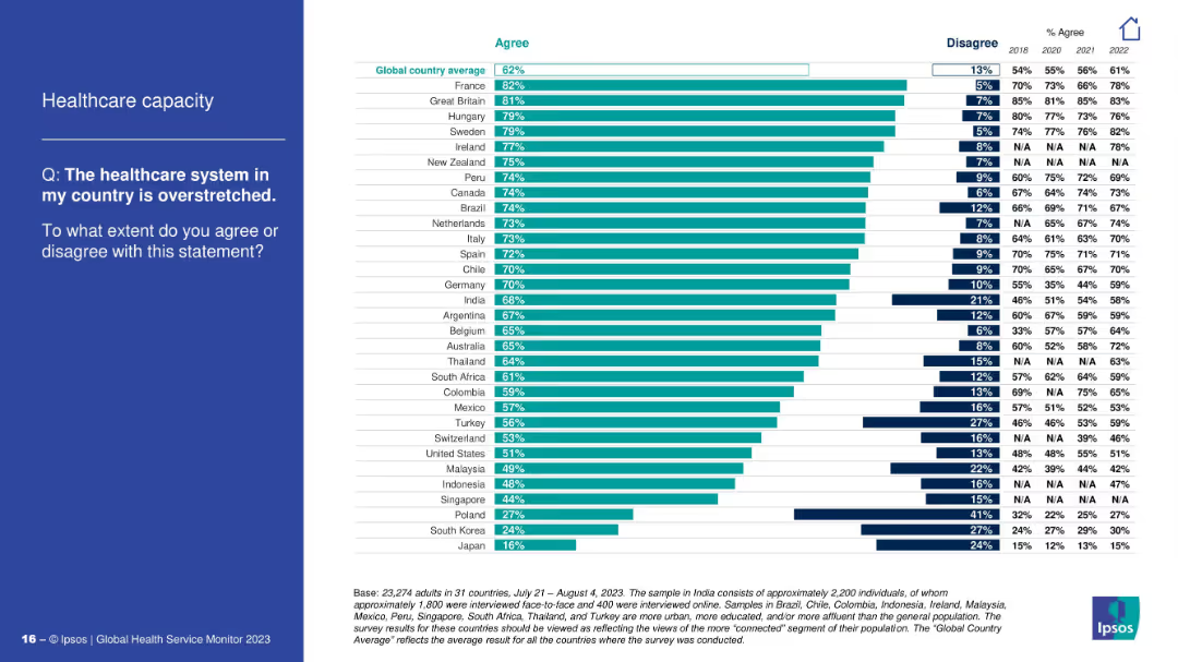
Similar design: left-aligned question, right side with bar chart and agree/disagree stats.
Operational Efficiency
Healthcare & Pharmaceuticals
This slide explores how overstretched people perceive their national healthcare systems to be. France and Great Britain have the highest agreement. It tracks opinion shifts since 2018 and identifies which populations feel most strain.
healthcare system, overstretched, survey, operational pressure, Ipsos, public sentiment, capacity, country stats
Mixed Chart
IPSOS
Saved
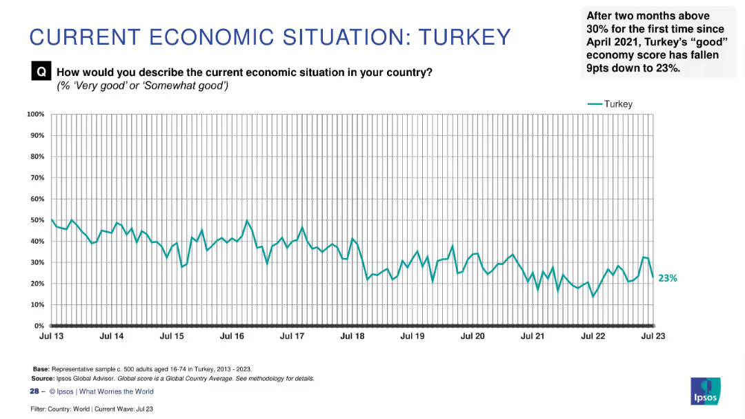
Line graph showing a declining trend from 2013 to 2023 with a recent 9-point drop to 23% marked in the annotation.
Market Analysis and Trends
Financial Services
Turkey's economic sentiment saw a sharp 9-point drop in July 2023, falling to 23% after briefly surpassing 30%. The slide captures fluctuating public confidence over time, reflecting recent instability.
Turkey, sentiment decline, economic outlook, 2023 drop, public perception, Ipsos, confidence fluctuation, barometer, historical data
Single Chart
IPSOS
Saved
The slide features bar charts displaying sources and uses of funds from 2022 to 2025, including projected free cash flow and additional financial debt.
Strategic Planning
Financial Services
It outlines Ipsos's cash allocation plan from 2022 to 2025, detailing funding sources and financial strategies, including debt and investment allocations.
cash allocation, financial planning, Ipsos, funding
Multiple Chart
IPSOS
Saved
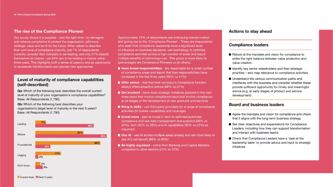
Bold color scheme, with chart on maturity level of compliance and bullet points describing pioneer traits.
Organizational Structure and Change
Professional Services
Encourages redefining compliance roles to become strategic. Few consider their company “leading,” but many aspire to be within three years. Lists traits of “Compliance Pioneers” who lead transformation through broad responsibilities, early involvement, and technology integration.
compliance maturity, transformation, pioneer, leadership, vision
Mixed Chart
PwC/Strategy&
Saved
The slide includes detailed financial data presented as table and a list. Blue highlights draw attention to positive figures, and gray to negative ones. A side panel adds context with bullet points summarizing base fees, performance fees, and other financial insights.
Financial Performance
Financial Services
Summarizes the financial results of Macquarie Asset Management, including base and performance fees, and provides an analysis of net operating income and equity under management, pertinent for financial review and strategy planning.
asset management, financial results, base fees, performance fees, operating income, equity management
Table
Goldman Sachs
Saved
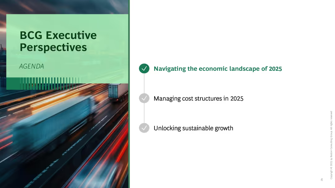
Split layout with blurred motion background photo on the left and agenda list on the right. Three bullet points listed vertically with one highlighted.
Industry Overview
Professional Services
This is an agenda slide introducing three focus areas for the presentation: economic landscape, cost structure, and sustainable growth in 2025. A motion-blurred image of trucks on a highway implies urgency or transformation.
agenda, executive perspective, 2025, growth, economy, transformation, BCG
Agenda
BCG
Saved
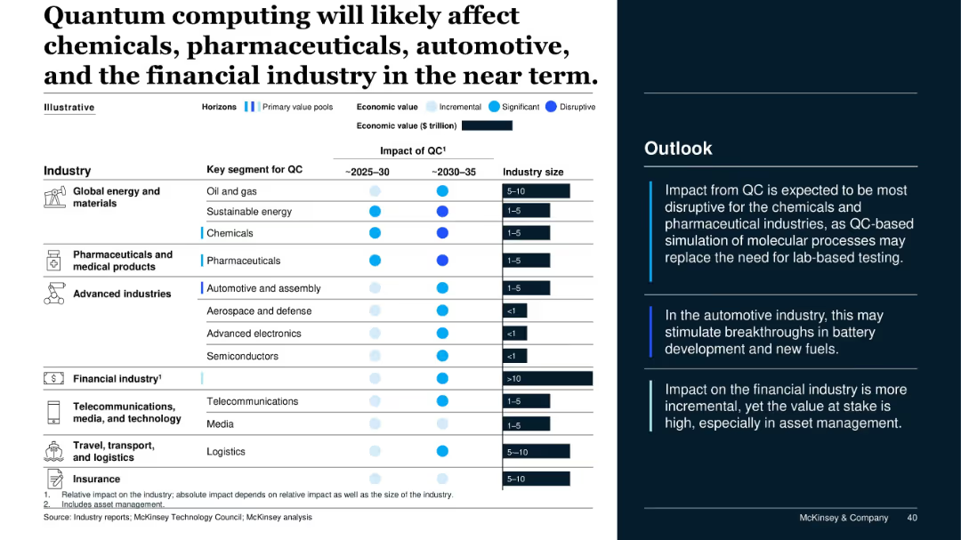
Industry-impact matrix with dot indicators showing timeline (~2025–2035), economic value (color gradient), and industry size; summary text box at right.
Market Analysis and Trends
Artificial Intelligence
This slide forecasts the industries most impacted by quantum computing, with chemicals, pharma, automotive, and financial services expecting significant to disruptive effects. The analysis includes impact timing and industry size, emphasizing QC's potential value.
quantum computing, industry impact, pharmaceuticals, chemicals, financial services, automotive, economic value
Mixed Chart
McKinsey
Saved
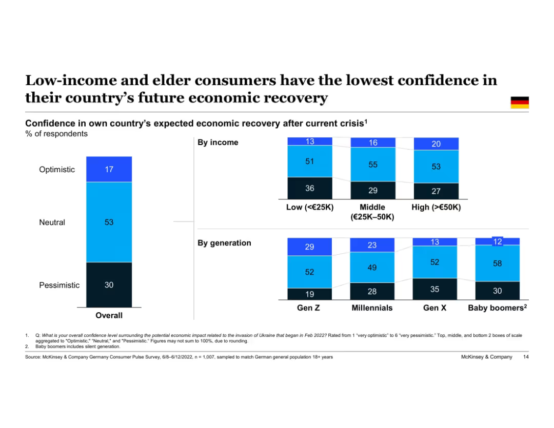
Vertical stacked bar chart showing Germany’s overall optimism by income and generation. Three confidence levels visualized for each group. Left column shows national average, followed by columns split by income level and age cohort.
Customer and Market Segmentation
Financial Services
This slide highlights disparities in economic recovery confidence among different German demographic groups. Low-income and Baby Boomer respondents are most pessimistic, whereas higher-income and younger generations express relatively greater optimism about future recovery.
consumer confidence, demographics, Germany, income groups, generations, Gen Z, Baby Boomers, pessimism, optimism
Single Chart
McKinsey
Saved
A column chart showing Namibia's total revenue versus expenditure over three fiscal years, depicting a budget deficit in each year as represented by different shades of red in the lower section of the bars.
Financial Performance
Government & Public Sector
Examines Namibia's fiscal performance over three years, highlighting the ongoing budget deficits. This visual comparison is crucial for discussions on governmental budget management and fiscal policy.
fiscal, budget, Namibia, government finance
Multiple Chart
PwC/Strategy&
Saved
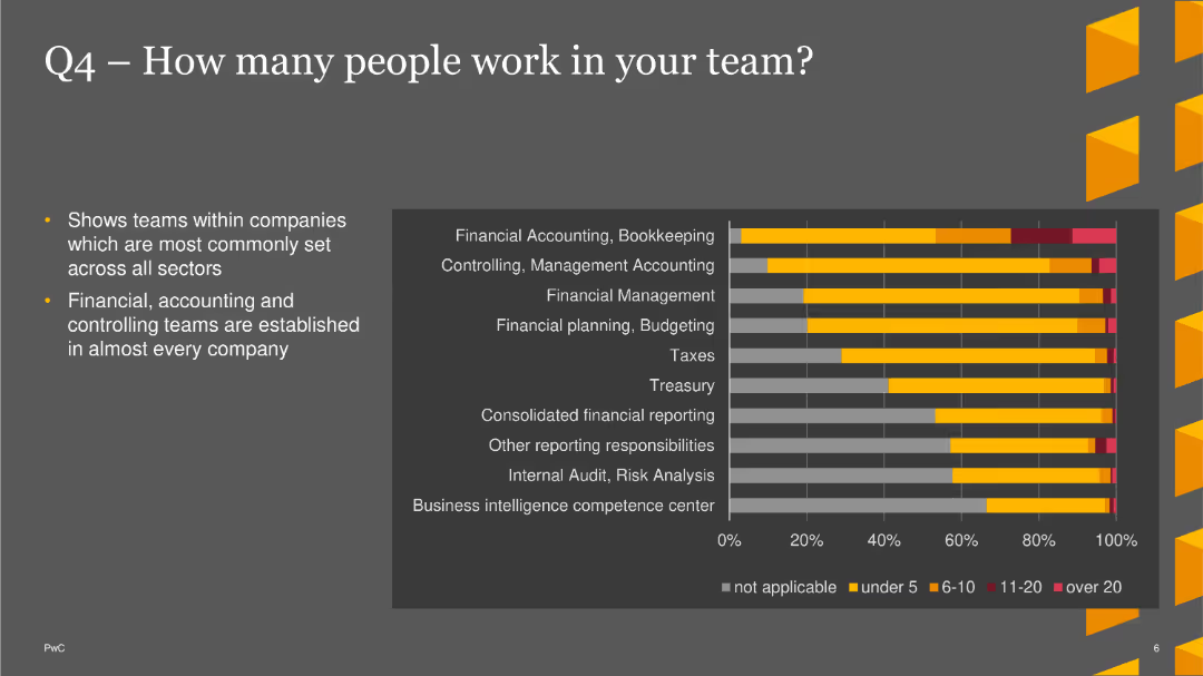
The slide features a bar chart showing the number of people in different teams across various sectors, highlighting common team sizes.
Market Analysis and Trends
Financial Services
This slide shows that financial, accounting, and controlling teams are common across companies, with detailed distribution of team sizes.
Team Size, Financial, Accounting, Bar Chart, PwC, Survey, 2022
Mixed Chart
PwC/Strategy&
Saved
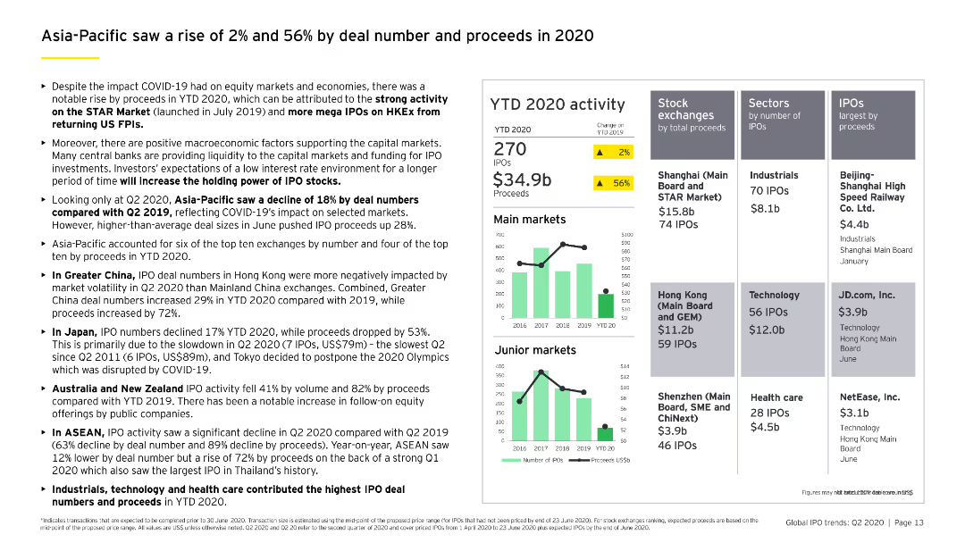
The slide features column charts comparing main and junior market IPO activities, highlighting the performance in Greater China, Japan, Australia, New Zealand, and ASEAN.
Market Analysis and Trends
Financial Services
Analyzes the Asia-Pacific IPO market's performance in 2020, noting increases in both deal numbers and proceeds, with detailed regional breakdowns.
Asia-Pacific, IPO growth, regional analysis, main market, junior market
Multiple Chart
EY
Saved
The slide features a column chart comparing feelings of being cut off from family and friends between May and December. It uses different colored bars to represent data from two time periods.
Customer and Market Segmentation
Government & Public Sector
This slide compares the feelings of being cut off from family and friends between two time periods, showing a decrease in such feelings in December compared to May, based on survey data.
feelings, family, friends, comparison, survey, cut off, column chart, time periods, public opinion
Single Chart
IPSOS
Saved
The slide serves as a cover for a report, with a dual-tone image overlaying a forest and a clear title text. It's the introductory slide with additional details like the report's date and affiliating companies' logos.
Investment Analysis
Technology & Software
As a title slide, this introduces the theme of the presentation, which is an assessment of the influence of major technology firms on venture capital investment. It establishes the collaborative nature of the report between Oliver Wyman and Facebook.
venture investment, big tech, title slide, Oliver Wyman, Facebook, report cover
Title
Oliver Wyman
Saved
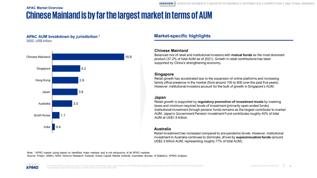
Bar chart with jurisdictional AUM and a column of highlights. Structured and minimalistic with strong blue tones.
Market Analysis and Trends
Financial Services
Breaks down APAC AUM by country, highlighting China’s dominance. The sidebar notes market-specific factors like regulatory frameworks, pension fund dominance, and online platform growth in Singapore and Japan.
AUM, China, Japan, Singapore, investment, retail growth, pensions
Mixed Chart
KPMG
Saved
Previous
Next
If nothing, comes up, please save your slides first
Create a FREE account to continue browsing
Receive Instant Access to 1,000+ slides from companies like McKinsey, Google, and Goldman Sachs
First Name
Last Name
Email
Password
I agree to all
Terms & Privacy Policy
Thank you! Your submission has been received!
Oops! Something went wrong while submitting the form.
Have an account?
Sign in
Column Chart
Heatmap
Chevron
Org Chart
Infographic
Callouts
Timeline
List
Graphic
Picture
Process Flow
Diagram
Paragraph
Map
Table
Framework
Subtitle
Takeaway Box
Icon
Other Chart
Radar Chart
Waterfall Chart
Mekko Chart
Pie Chart
Scatter Plot
Line Chart
Bar chart
Bullet points