Create a FREE Account
Instant access to 1,000+ real slides from top companies like McKinsey, BCG, Goldman Sachs, Google and many more!
First Name
Last Name
Email
Password
I agree to all
Terms & Privacy Policy
Thank you! Your submission has been received!
Oops! Something went wrong while submitting the form.
Have an account?
Sign in
Library
Templates
Courses
Pricing
My Account
My Slides
My Templates
✦ AI
AI Prompt Library
AI Search
Sign in
Start Here
Logout
My Saved Slides
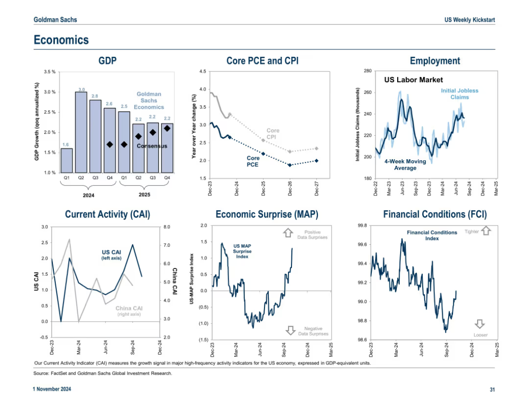
6-panel layout including GDP, inflation (CPI/PCE), employment, current activity, economic surprises, and financial conditions. Consistent blue-white aesthetic and small-multiple layout.
Market Analysis and Trends
Government & Public Sector
A macroeconomic snapshot featuring GDP growth, inflation trends, jobless claims, and sentiment indicators like CAI, MAP, and FCI. These visuals provide insight into the broader economic backdrop for market expectations.
GDP, inflation, CPI, employment, economic surprise, CAI, FCI, macroeconomic trends
Multiple Chart
Goldman Sachs
Saved
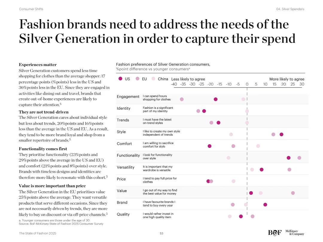
Left-aligned text with key insights and right scatter plot showing fashion preference differences by region. Pink dots compare older and younger consumers.
Customer and Market Segmentation
Retail & E-commerce
Analyzes shopping preferences of the Silver Generation vs younger consumers across categories like comfort, quality, trends, and brand loyalty. Emphasizes need for brands to focus on functionality, value, and independence in style rather than trends.
fashion preferences, older consumers, value, comfort, brand loyalty, style independence
Mixed Chart
McKinsey
Saved
The slide features a column chart displaying council members' responses regarding the impact of communication during acquisitions. There is an image of a high-rise building on the right.
Mergers and Acquisitions
Professional Services
Discusses the role of communication in various phases of acquisition: pre-acquisition scoping, execution, and integration.
Communication, Acquisition, Integration, Strategy, Professional Services
Mixed Chart
IPSOS
Saved
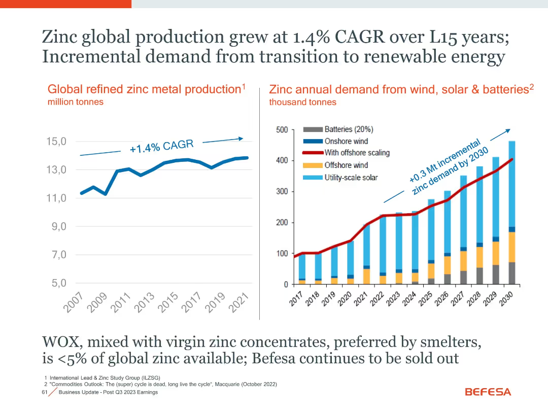
Two-panel layout with line and stacked bar charts, annotated CAGR and projections
Market Analysis and Trends
Industrial & Manufacturing
The slide presents historical and projected data on zinc production and its growing demand, especially from renewable energy sectors like wind, solar, and batteries.
Zinc, Renewable Energy, CAGR, Demand Growth, Batteries, Solar, Wind
Multiple Chart
Goldman Sachs
Saved
This slide displays a line chart of CPI inflation in developed markets over a period spanning from the 1970s to the 2020s. The x-axis marks the years while the y-axis shows the percentage change. The chart shows significant fluctuations, with notable peaks and troughs.
Market Analysis and Trends
Financial Services
The slide presents historical data of CPI inflation in developed markets, with an emphasis on the trends over the past five decades. This could be used to analyze economic patterns, predict future inflation trends, and inform investment strategies.
Inflation, CPI, Developed Markets, Economic History, Trends, Data Analysis, Fluctuations
Single Chart
JP Morgan
Saved
The slide consists of several sections, including icons and charts. It features rankings and a pie chart for client distribution. The color palette is blue, gray, and white, maintaining brand consistency.
Market Analysis and Trends
Financial Services
The slide discusses continued growth through comprehensive services and client excellence at JPMorgan Chase. With statistics on market share, revenue, and client distribution, it's useful for presentations that aim to highlight market leadership, growth trends, and commitment to client service across various business sectors.
Markets, Revenue, Growth, Excellence, Client Distribution, Global Expertise, Service Provider, Omnichannel, Trading
Mixed Chart
JP Morgan
Saved
Column charts comparing YTD financial results with previous years, highlighted with key financial metrics.
Financial Performance
Financial Services
Summarizes Deutsche Bank's YTD financial performance for 2023, including pre-provision profit and risk management statistics.
financial performance, YTD results, banking, revenue growth, risk management
Mixed Chart
Deutsche Bank
Saved
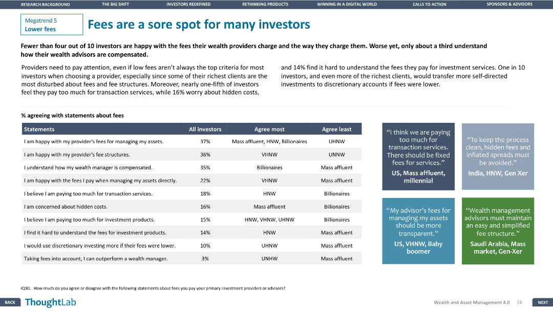
A table comparing investor agreement with fee statements. Three text boxes provide qualitative insights from different regions. Design is clear and focused.
Customer and Market Segmentation
Financial Services
Highlights investor dissatisfaction with fees and transparency issues, with specific agreement percentages and regional insights from investors.
fees, investors, satisfaction, transparency, regions
Header Vertical
Deloitte
Saved
Contains a timeline and bar graphs showing investment amounts for top FoodTech deals in Europe over three years, with flag icons for company countries.
Investment Analysis
Agriculture & Food Production
Provides details on significant 2020 FoodTech deals in Europe, such as investments in Karma and Oatly. Highlights a shift from food delivery to upstream value chains like AgTech and Food Science, with a focus on sector investment trends.
FoodTech, Europe, 2020, Investment Trends, Top Deals, AgTech, Food Science
Multiple Chart
Accenture
Saved
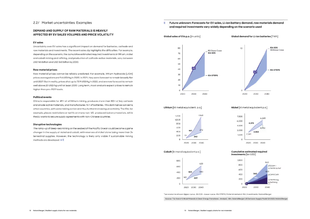
Left column provides narrative on EV sales, price volatility, and geopolitical issues. Right includes projected sales and demand curves under various scenarios.
Market Analysis and Trends
Energy & Utilities
This slide presents detailed scenarios of uncertainty affecting EV-related raw material markets. It compares forecast models for EV sales, Li-ion battery demand, and investment needs, reflecting varied assumptions and outcomes.
EV forecasts, battery demand, lithium, nickel, cobalt, scenario analysis, investment needs
Multiple Chart
Roland Berger
Saved
A central black board with sections radiating outwards details client priorities and sustainable finance offerings, alongside a narrative of client solutions on the right.
Client Case Studies
Financial Services
Highlights a case study on sustainable finance, showing client priorities and the firm’s sustainable offerings in various business sectors.
Sustainable, Finance, Investment, Asset, Wealth, Management, Solutions, Client
Table
Goldman Sachs
Saved
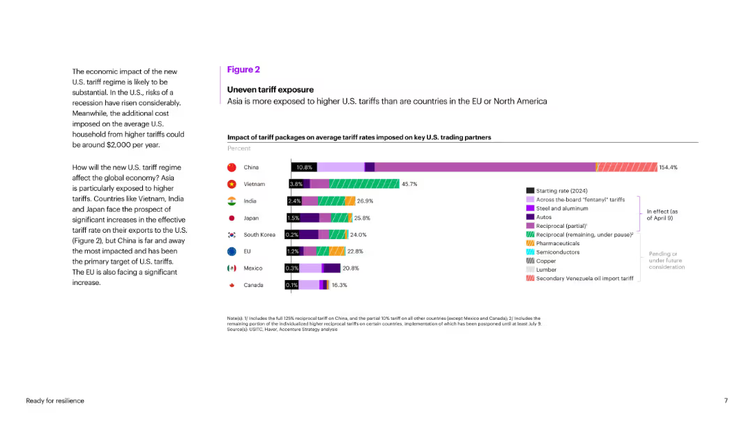
Bar chart comparing average tariff rate increases for key U.S. trading partners, color-coded by tariff category.
Risk Assessment and Management
Government & Public Sector
Illustrates asymmetric exposure of countries to U.S. tariffs, showing Asia is more affected than EU/North America. China faces the highest increase (154.4%), with Vietnam and India also highly impacted. Shows segmentation of tariffs across industries.
tariffs, China, trade exposure, Vietnam, India, trade war, U.S. partners, risk, import duties, policy impact
Mixed Chart
Accenture
Saved
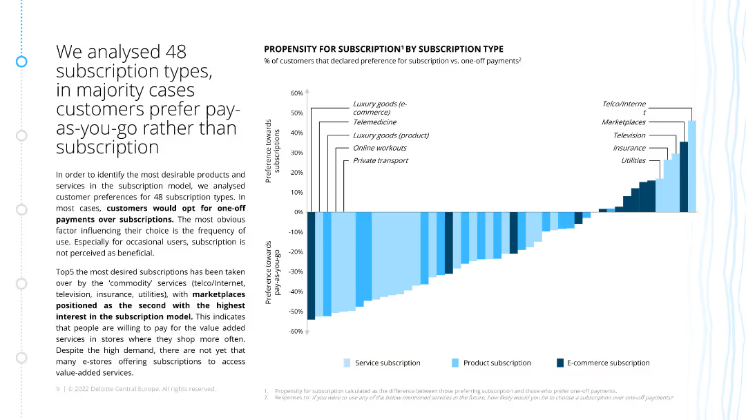
The slide has a bar chart displaying the propensity for subscription versus one-off payments for different product and service types, with bars indicating preferences across categories.
Market Analysis and Trends
Consumer Goods
The slide analyzes customer preferences for subscriptions over one-off payments, showing that luxury goods and telemedicine have the highest propensity for subscriptions.
propensity, subscription, one-off payments, customer preferences, survey
Mixed Chart
Deloitte
Saved
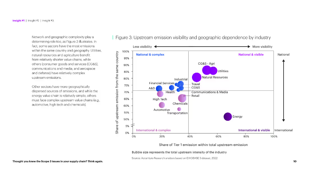
The slide uses a scatter plot to show the geographic dependency of upstream emissions and a textual analysis on the left. It has a clear and informative layout.
Market Analysis and Trends
Environmental Services & Sustainability
This slide explores the relationship between upstream emission visibility and geographic dependence across industries, identifying complex and simple sectors.
Emission visibility, geographic dependence, industry, complexity, analysis, environmental impact, sustainability, data visualization, scatter plot, insights
Mixed Chart
Accenture
Saved
Column chart showing the role of AI as an enabler or inhibitor under various sustainable development goals (SDGs) to 2030.
Technology and Digital Transformation
Technology & Software
The slide evaluates the impact of AI on achieving global sustainable development goals by 2030, suggesting that AI is more often seen as an enabler rather than an inhibitor. It presents data on AI's potential to contribute positively to various societal categories, such as no poverty, quality education, and clean water and sanitation.
AI, Sustainable Development Goals, Enabler
Mixed Chart
Roland Berger
Saved
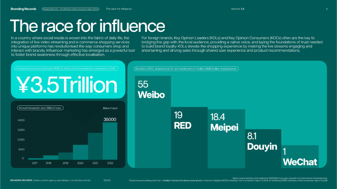
Teal-green layout with bar and stacked charts; large figure in center with visual emphasis.
Strategic Planning
Media & Entertainment
Illustrates the rise of influencer marketing and live-streaming commerce in China, with ¥3.5 trillion spent in 2022. Charts include annual transaction volume growth and KOL impressions by platform.
influencer marketing, KOLs, live-streaming, Weibo, RED, Meipei, Douyin, social commerce
Multiple Chart
McKinsey
Saved
Slide with text blocks and a central circular graphic illustrating integration of sustainability, technology, and market shifts. Uses a blue and white color scheme with icons.
Strategic Planning
Financial Services
Discusses the strategic focus of the bank on sustainability, technological integration, and adapting to market shifts to ensure growth and stability, aiming to enhance shareholder value and customer relationships.
strategic planning, sustainability, technology, market adaptation, growth strategies
Framework
Deutsche Bank
Saved
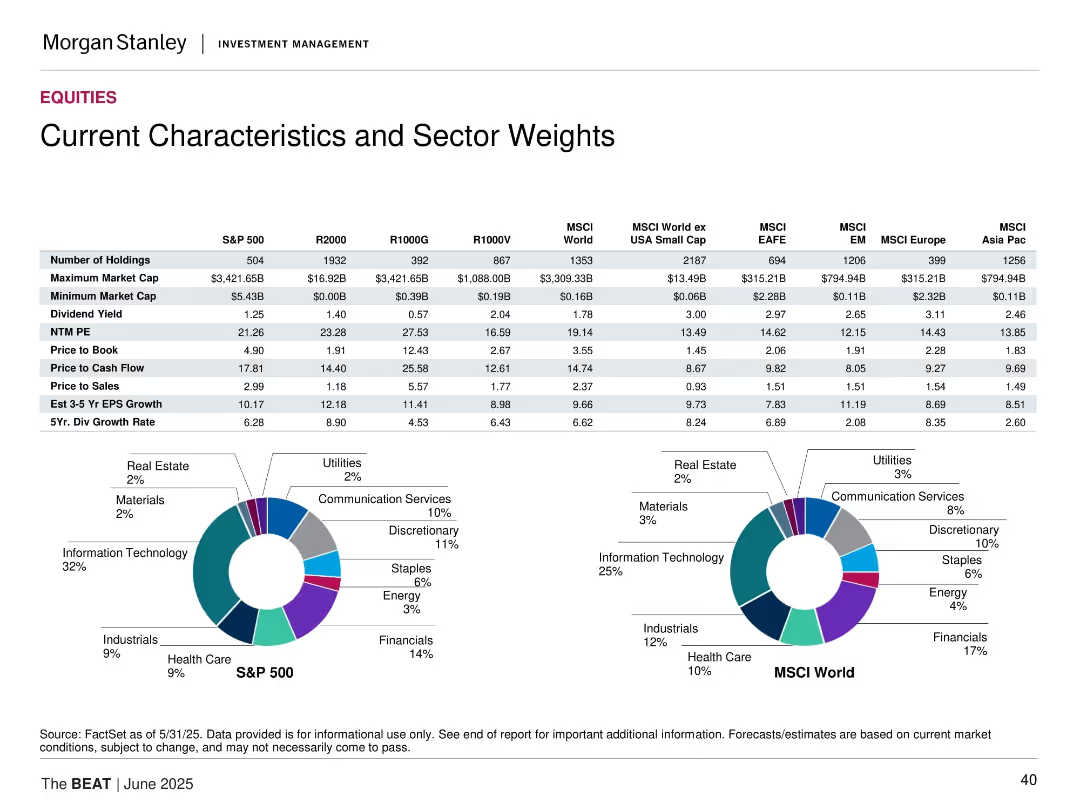
Tabular comparison of key metrics across indices plus pie charts for S&P 500 and MSCI World sector weights.
Market Analysis and Trends
Financial Services
The slide compares valuation and performance metrics like P/E, dividend yield, and EPS growth across major indices. It also visualizes sector weights for S&P 500 and MSCI World using pie charts, highlighting the concentration in Technology and Financials.
sector weights, index comparison, valuation metrics, S&P 500, MSCI World, dividend yield, earnings growth
Multiple Chart
Morgan Stanley
Saved
A stacked bar chart showing the percentage of total merchandise exports by type for various countries, and a column chart showing commodity exports by type in USD billions.
Market Analysis and Trends
Financial Services
The slide categorizes merchandise exports by type across different countries and details the value of commodity exports by type.
merchandise exports, export types, commodities, countries, economic analysis, trade, financial insights, export values, financial trends, development
Multiple Chart
JP Morgan
Saved
This slide has multiple column charts displaying revenue, income, and assets, with key financial metrics highlighted on the right.
Financial Performance
Financial Services
Demonstrates consistent growth in Asset Wealth Management, represented by yearly performance data and growth trends in bar graphs, intending to convey JPMorgan's financial stability and success over a decade.
AWM, financial performance, growth, JPMorgan, bar graphs
Multiple Chart
JP Morgan
Saved
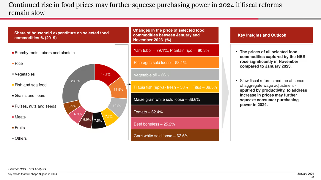
Features a pie chart of household expenditure on food commodities and a bar chart showing price changes of selected food commodities from Jan to Nov 2023.
Financial Performance
Agriculture & Food Production
Discusses the significant rise in food prices and the potential impact on purchasing power if fiscal reforms are not implemented swiftly.
food prices, purchasing power, fiscal reforms, commodities, household expenditure, 2024, food price changes
Mixed Chart
PwC/Strategy&
Saved
Slide includes column charts of revenue and balance sheet metrics across periods, and a line graph illustrating profitability trends.
Financial Performance
Financial Services
Provides a financial overview showcasing growth in revenue and assets, aimed at stakeholders interested in corporate financial health and performance metrics.
financial, performance, revenue, growth, assets
Multiple Chart
Barclays
Saved
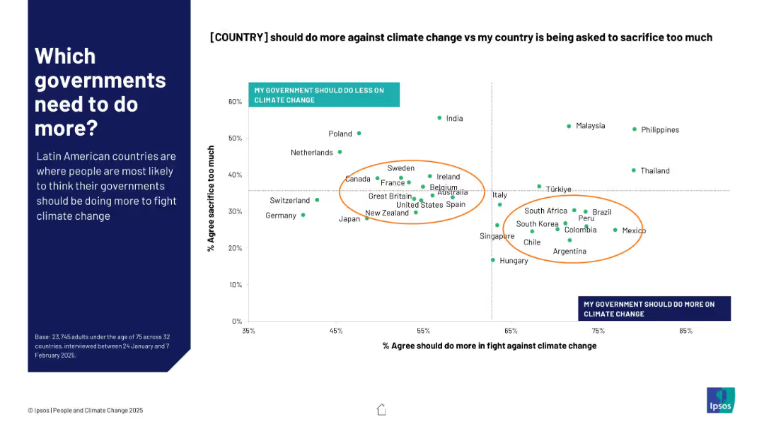
Scatterplot chart on right side shows correlation between views on government action and public sacrifice; annotated orange ellipses highlight country clusters
Regulatory and Compliance
Government & Public Sector
This slide examines the balance between public sentiment on whether their governments should do more on climate change vs. perceptions of national sacrifice. Latin American nations cluster around high dissatisfaction with government efforts.
government action, climate policy, perception, Latin America, scatterplot, Ipsos, responsibility, climate sacrifice, public opinion
Mixed Chart
IPSOS
Saved
This slide includes line charts showing regional EMD spreads for sovereigns and corporates, displaying data points over time for different regions including Asia, Europe, and LATAM.
Market Analysis and Trends
Financial Services
The slide analyzes emerging market debt spreads for sovereign and corporate bonds across different regions, providing insights into market conditions and investment risks in emerging economies.
emerging markets, debt spreads, sovereign bonds, corporate bonds, Asia, Europe, LATAM, market conditions, investment risks
Multiple Chart
JP Morgan
Saved
The slide shows a column chart representing 'CCB Adjusted Expense' in billions from 2021 to 2022, with projections for 2023. Factors contributing to changes in expenses are highlighted with arrows and brief descriptions. There are also several small icons, such as a car and a computer, which serve as visual aids to accompany the explanations of the various contributing factors.
Operational Efficiency
Financial Services
Aimed at showcasing a financial institution's expense management over the years with future outlook, the slide presents how investments, structural changes, and other factors influence overall expenses. It's meant to convey fiscal discipline and strategic investment with a goal of sustainable growth, possibly for investor reassurance or internal review.
Expenses, Financial Discipline, Investment, Forecast, Growth, Management, Strategic Planning
Single Chart
JP Morgan
Saved
Previous
Next
If nothing, comes up, please save your slides first
Create a FREE account to continue browsing
Receive Instant Access to 1,000+ slides from companies like McKinsey, Google, and Goldman Sachs
First Name
Last Name
Email
Password
I agree to all
Terms & Privacy Policy
Thank you! Your submission has been received!
Oops! Something went wrong while submitting the form.
Have an account?
Sign in
Column Chart
Heatmap
Chevron
Org Chart
Infographic
Callouts
Timeline
List
Graphic
Picture
Process Flow
Diagram
Paragraph
Map
Table
Framework
Subtitle
Takeaway Box
Icon
Other Chart
Radar Chart
Waterfall Chart
Mekko Chart
Pie Chart
Scatter Plot
Line Chart
Bar chart
Bullet points