Create a FREE Account
Instant access to 1,000+ real slides from top companies like McKinsey, BCG, Goldman Sachs, Google and many more!
First Name
Last Name
Email
Password
I agree to all
Terms & Privacy Policy
Thank you! Your submission has been received!
Oops! Something went wrong while submitting the form.
Have an account?
Sign in
Library
Templates
Courses
Pricing
My Account
My Slides
My Templates
✦ AI
AI Prompt Library
AI Search
Sign in
Start Here
Logout
My Saved Slides
A column chart for Great Britain showing actions believed to reduce greenhouse gas emissions, ranked by perceived impact and CO2 saved. Bars are in varying shades of green.
Market Analysis and Trends
Environmental Services & Sustainability
This slide shows the ranking and perceived effectiveness of actions to reduce greenhouse gas emissions in Great Britain, emphasizing the gap between public perception and the actual CO2 savings potential.
greenhouse gas, emissions, public perception, Great Britain, impactful actions, CO2 savings, environmental impact
Mixed Chart
IPSOS
Saved
A diagram showing a model of siloed private networks and a bar chart displaying the participation in private blockchain networks. It contrasts the traditional isolated networks with emerging trends of openness to public blockchains.
Market Analysis and Trends
Technology & Software
Highlights the shift from isolated private networks to a growing interest in public blockchains among enterprises, driven by the limitations of current siloed models.
Public blockchains, enterprise, trends, private networks, isolation, openness, participation, 2019, accelerated interest
Mixed Chart
EY
Saved
Grid layout listing eight key plays of an orchestrator of ecosystems.
Operational Efficiency
Financial Services
Overview of eight key strategies for financial services to enhance their ecosystem orchestration, focusing on experiential needs and financial services.
Ecosystem orchestration, financial services, key strategies, experiential needs, value-added services, fintech, APIs, platform development, space monetization
Table
Accenture
Saved
Slide features column charts depicting adjustments in operating profits across several business units. It includes green, red, and blue bars, some with growth indicators, and integrates real-world imagery of a building's balcony.
Financial Performance
Real Estate & Construction
Analyzes adjusted operating profit by business segment for Q1 2020 compared to Q1 2021, highlighting changes and trends in the real estate and construction industry.
Business premises, operating profit, real estate, financial analysis, construction
Single Chart
Goldman Sachs
Saved
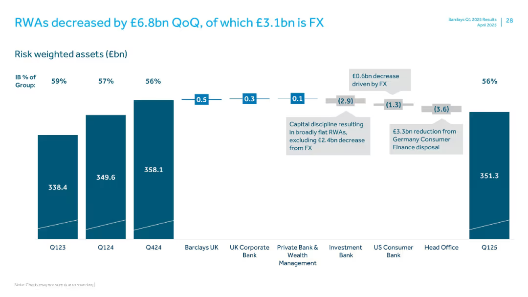
Column charts depict the evolution of the CET1 ratio with additional insights provided through callouts, against a backdrop of regulatory requirements.
Strategic Planning
Financial Services
Communicates the firm's strong capital position and its preparedness for future volatility and regulatory changes.
capital generation, CET1 ratio, resilience, strategic planning, column charts, JPMorgan
Mixed Chart
JP Morgan
Saved
Line chart segmented by phases (Pre-COVID to Correction) with a performance comparison, side metric table, and bullet points on the left. Background is dark-themed.
Financial Performance
Financial Services
This slide compares the performance of Indian and Global large caps, digital assets, and mid & small caps across different market phases. It highlights how MSCs and Digital outperformed other segments post-COVID, even amid corrections. It also explains valuation trends, profitability focus, and shifts in investor sentiment.
midcap, smallcap, valuation, EV/EBITDA, digital, profitability, correction, return, public markets
Mixed Chart
EY
Saved
The slide features a bar chart showing adjusted pre-tax income progression in USD mn from 9M16 to 2019, with detailed segments for loss components.
Risk Assessment and Management
Financial Services
It projects the pre-tax loss reduction to around USD 800 mn by year-end 2019, comparing with prior targets and breaking down the components of loss reduction.
pre-tax loss, income progression, loss reduction, risk management, financial targets
Single Chart
Credit Suisse
Saved
A timeline highlighting key milestones in sustainability, with bullet points on either side summarizing major initiatives and achievements.
Strategic Planning
Financial Services
This slide traces the company's history of sustainability leadership, featuring milestones such as environmental policy framework and clean energy investments, underlining the firm's long-term commitment to environmental and social governance.
Sustainability, Environmental Policy, Clean Energy, Social Governance, Corporate Responsibility
Linear Flow
Goldman Sachs
Saved
A slide with two large area graphs, overlaid with line graphs, displaying global credit creation data. The visual elements are significant, indicating the data's impact and importance.
Investment Analysis
Financial Services
Explains the impact of quantitative tightening on global credit, important for investors and analysts monitoring the financial sector's health. This slide likely informs discussions on macroeconomic policy effects on investment environments.
Credit Creation, Quantitative Tightening, Global, Finance
Multiple Chart
Morgan Stanley
Saved
Includes small images and infographics highlighting sustainability initiatives and their impacts on health and the environment.
Regulatory and Compliance
Agriculture & Food Production
Reviews the company's leading initiatives in sustainability, focusing on plant-based products and reduction of food waste.
sustainability, plant-based, food waste, environmental impact, health initiatives
Header Horizontal
Deutsche Bank
Saved
Column charts showing provisions for credit losses over several quarters with an additional line graph overlay for average loans. Includes key highlights.
Risk Assessment and Management
Financial Services
Discusses credit loss provisions, showcasing trends and risk management strategies in response to economic conditions.
Credit losses, risk management, trends
Mixed Chart
Deutsche Bank
Saved
Complex systems map with interlinked categories (power, transport, agriculture) surrounding central “green economy”
Operational Efficiency
Environmental Services & Sustainability
A systems diagram illustrates how power, transport, and agriculture interact to shape SEA’s green economy. It identifies bottlenecks, demand pressures, and feedback loops that hinder decarbonization and sustainability progress.
systems thinking, SEA, emissions, green economy, agriculture, transport
Uncategorized
Bain
Saved
Ranked country list in bar chart format; includes world average and change from last month/year.
Market Analysis and Trends
Professional Services
The slide presents a country-level breakdown of the percentage of respondents selecting crime and violence as a top concern. Peru, Chile, and Sweden lead globally. Change indicators highlight recent shifts, revealing regions experiencing increasing concern.
crime, violence, global concern, regional analysis, monthly change, survey, Ipsos, public safety
Single Chart
IPSOS
Saved
Features a line chart detailing the shift in advertising spend among digital, TV, and other platforms. Text blocks explain the trends and future predictions for advertising revenues.
Strategic Planning
Media & Entertainment
Details the redistribution of advertising revenues across digital, TV, and other media platforms from 2019 to 2024, analyzing the shift towards digital and its implications for media strategies.
Advertising, Revenue Trends, Digital Shift, Media Platforms, Future Predictions, TV, Market Analysis
Mixed Chart
Accenture
Saved
Bubble chart organized by sector activities like 'Manage' and 'Expertise' with color-coded bubbles representing different sectors and their automation potential.
Strategic Planning
Industrial & Manufacturing
Evaluates the automation potential across various sectors, identifying sectors like manufacturing and agriculture with high potential for automation based on current technology capabilities.
Sectors, Automation Potential, Technology, Manufacturing, Agriculture
Multiple Chart
McKinsey
Saved
The slide features a bar chart and text. The chart shows the extent to which various industries have put FinTech at the heart of their strategy.
Strategic Planning
Financial Services
The slide highlights the importance of FinTech across different industries and how it is integrated into their strategies.
FinTech, strategy, financial services, industry comparison, technology
Mixed Chart
PwC/Strategy&
Saved
Displays a line chart projecting global liquids supply and demand outlooks under various scenarios, including the 1.5°C Pathway and Accelerated Energy Transition.
Risk Assessment and Management
Energy & Utilities
The slide examines the projected global supply and demand for oil and gas, stressing the need for new projects under the Accelerated Energy Transition scenario to meet future demands.
O&G projects, energy transition, demand, supply outlook, new projects
Single Chart
McKinsey
Saved
Column chart showing energy capacity additions from 2017 to 2022 with categories for different energy sources.
Market Analysis and Trends
Energy & Utilities
Details the increase in power generation capacity over the past 5 years, driven by renewable sources.
Renewable, Energy, Capacity, Growth, Sources
Mixed Chart
Kearney
Saved
The slide features pie charts showing improvements in self-confidence, presentation skills, and business networking skills for participants in the program.
Regulatory and Compliance
Environmental Services & Sustainability
The slide highlights the Sustainable Futures program, which supports young people in achieving DEI goals and understanding business sustainability practices.
Sustainable Futures, DEI, business sustainability, skills development
Multiple Chart
EY
Saved
The slide presents a table comparing consumer spending trends in goods and services categories across the US, UK, Germany, and France as of December 6.
Market Analysis and Trends
Consumer Goods
The slide details recent moderation in consumer spending in the US and Europe, highlighting changes in various goods and services.
consumer spending, goods, services, trends, US, UK, Germany, France, table
Multiple Chart
Accenture
Saved
Features a line chart tracking the usage of channel partners by companies over a decade. Each point is annotated for clarity, and different sectors are highlighted with distinct colors. The layout includes a text box that provides additional insights and context to the trend depicted.
Operational Efficiency
Retail & E-commerce
The slide analyzes the long-term trend of companies moving towards direct marketing, reducing reliance on channel partners. This is relevant for discussions on operational strategies in marketing and sales, highlighting sector-specific behaviors and strategic shifts.
disintermediation, channel partners, marketing trends, operational strategy, direct marketing
Mixed Chart
Deloitte
Saved
Contains a column chart showing regional differences in CEOs' views on the permanence of low-density workplaces post-COVID-19, with different colors for the type of shift.
Market Analysis and Trends
Professional Services
This slide presents survey results on CEOs' perspectives across different regions regarding the permanence of low-density workplaces, highlighting enduring versus temporary shifts.
low-density, workplaces, CEOs, regional differences
Mixed Chart
PwC/Strategy&
Saved
Contains bar charts reflecting managers' views on upcoming industry changes.
Market Analysis and Trends
Professional Services
Reviews how managers view potential industry shifts as opportunities or threats.
industry trends, managerial insights, digital transformation, generational impact, opportunity vs threat
Multiple Chart
BCG
Saved
Donut chart on captive structures with accompanying definitions; 3-column layout for captive types.
Product and Service Analysis
Financial Services
The slide details the different types of captive structures (e.g., pure, third-party, group), noting that 65% are pure captives. It also describes the strategic benefits of each structure, from capital efficiency to group risk pooling, emphasizing their flexibility in modern insurance strategies.
captive types, insurance, structure, pure captive, group, rent-a-captive
Mixed Chart
KPMG
Saved
Purple-toned chart; similar demographic breakdown with map and bar visuals. Focuses on NHS concern levels by group.
Market Analysis and Trends
Healthcare & Pharmaceuticals
Explores NHS concern by age, gender, party, region, and social grade. Women, older adults, Labour supporters, and South England show higher concern. Least concern from young adults and DE social grade.
NHS, healthcare concern, regional views, Ipsos, demographics, UK healthcare
Multiple Chart
IPSOS
Saved
Previous
Next
If nothing, comes up, please save your slides first
Create a FREE account to continue browsing
Receive Instant Access to 1,000+ slides from companies like McKinsey, Google, and Goldman Sachs
First Name
Last Name
Email
Password
I agree to all
Terms & Privacy Policy
Thank you! Your submission has been received!
Oops! Something went wrong while submitting the form.
Have an account?
Sign in
Column Chart
Heatmap
Chevron
Org Chart
Infographic
Callouts
Timeline
List
Graphic
Picture
Process Flow
Diagram
Paragraph
Map
Table
Framework
Subtitle
Takeaway Box
Icon
Other Chart
Radar Chart
Waterfall Chart
Mekko Chart
Pie Chart
Scatter Plot
Line Chart
Bar chart
Bullet points