Create a FREE Account
Instant access to 1,000+ real slides from top companies like McKinsey, BCG, Goldman Sachs, Google and many more!
First Name
Last Name
Email
Password
I agree to all
Terms & Privacy Policy
Thank you! Your submission has been received!
Oops! Something went wrong while submitting the form.
Have an account?
Sign in
Library
Templates
Courses
Pricing
My Account
My Slides
My Templates
✦ AI
AI Prompt Library
AI Search
Sign in
Start Here
Logout
My Saved Slides
Contains a world map color-coded to show levels of water scarcity by country, ranging from abundant water resources to severe scarcity.
Regulatory and Compliance
Environmental Services & Sustainability
Provides a global view of water scarcity, helping in understanding geographical disparities in water availability. This slide is essential for discussions on water management policies and international aid allocation.
water scarcity, global, resources, policy, management
Graphic
Roland Berger
Saved
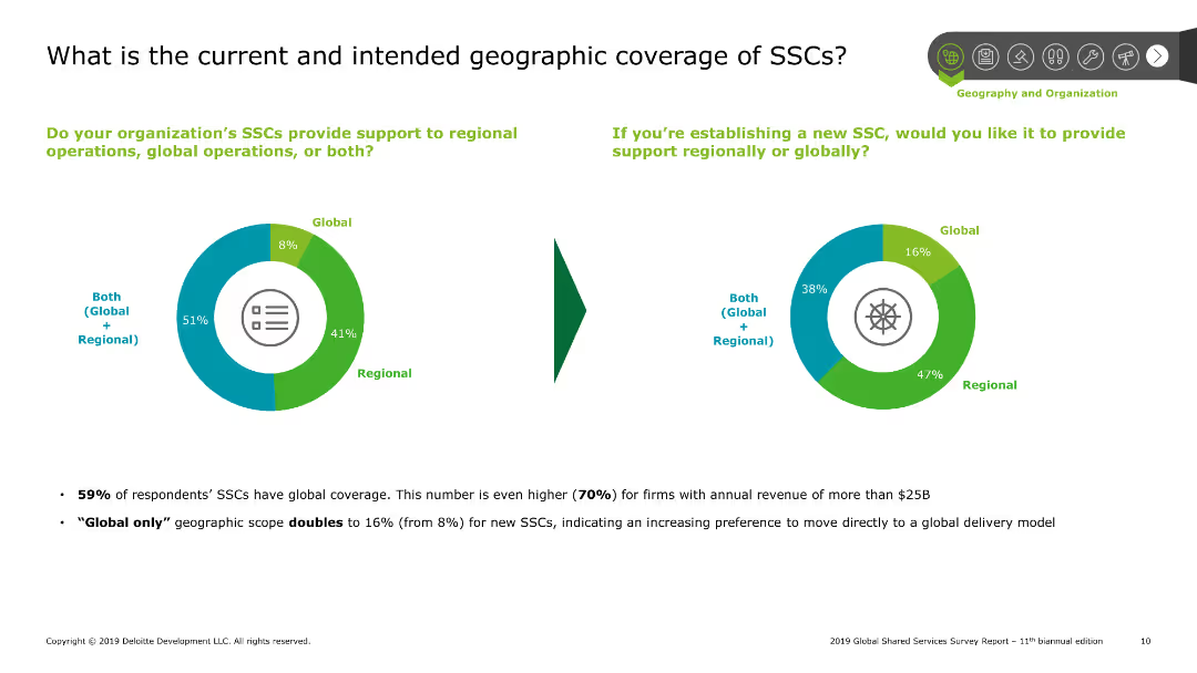
Pie charts showing current and intended geographic coverage of shared services centers (SSCs), with text explaining survey results on global and regional support.
Market Analysis and Trends
Professional Services
Explores the geographic scope of shared services centers, indicating a preference for both regional and global support among survey respondents, along with future intentions.
SSCs, geographic, coverage, global, regional
Multiple Chart
Deloitte
Saved
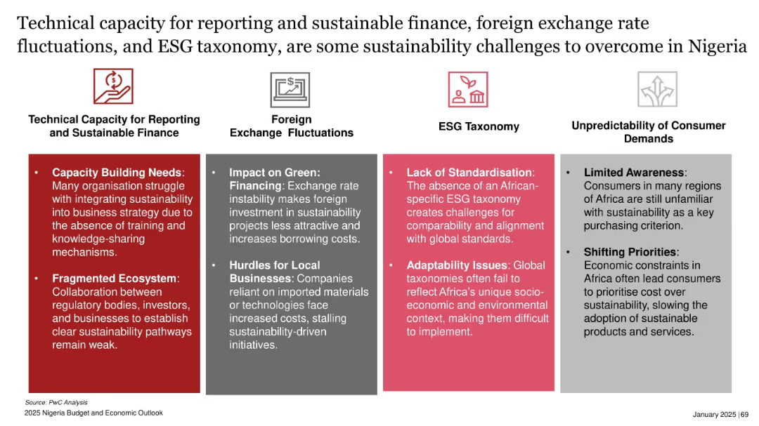
Multi-column layout with four categories, each with color-coded headers and bullet point issues
Regulatory and Compliance
Environmental Services & Sustainability
The slide outlines four main challenges to sustainability in Nigeria: weak technical capacity, exchange rate instability, lack of ESG standardization, and unpredictable consumer demand. Each category lists specific issues impacting green financing, reporting, and adoption of sustainable practices.
ESG, finance, sustainability, Nigeria, green financing, reporting, taxonomy, exchange rate
Pillar
PwC/Strategy&
Saved
Moderate visual complexity, the slide displays a matrix linking key industry sectors with specific automation applications that address the megatrends discussed earlier. It includes icons and a clear layout to illustrate these connections.
Technology and Digital Transformation
Industrial & Manufacturing
The slide delves into how new process automation applications are being deployed across various industry sectors in response to overarching megatrends. It explores specific examples within sectors, providing insights into the operational applications of these technologies.
Industry applications, Process automation, Sector-specific, Deployment
Table
LEK
Saved
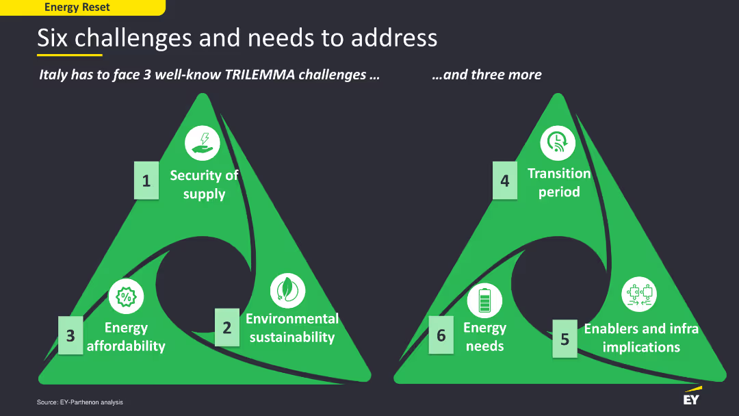
The slide has a content layout with two green triangular diagrams representing six challenges and needs in the energy sector. The diagrams are labeled with icons and text, using green and white colors for contrast. The layout is simple yet effective in conveying key points and challenges visually.
Strategic Planning
Energy & Utilities
The slide outlines six major challenges and needs that Italy must address in its energy sector, including security of supply, environmental sustainability, energy affordability, and others. It uses a trilemma framework to categorize these challenges, providing a strategic overview of the energy sector's critical issues.
energy challenges, Italy, trilemma, sustainability
Diagram
EY
Saved
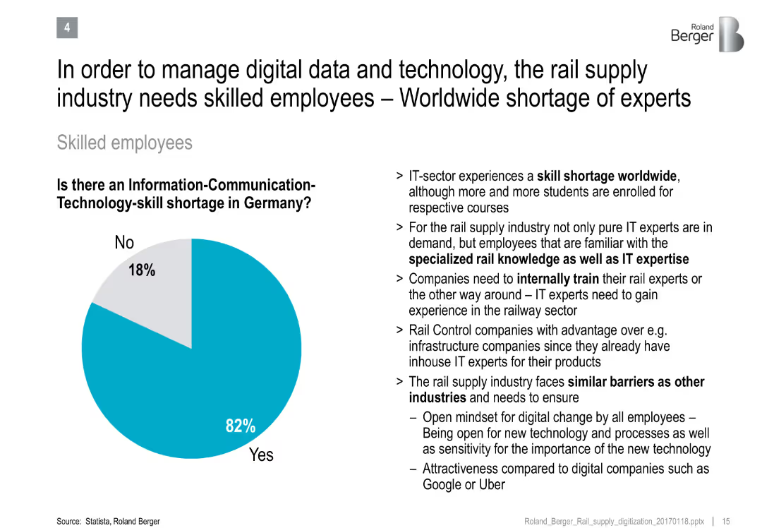
Pie chart on ICT-skill shortage and bullet points discussing talent challenges in rail and IT sectors
Human Resources and Talent Management
Transportation & Logistics
Emphasizes the critical shortage of ICT-skilled workers in Germany's rail industry, citing the need for specialized training and sector-specific expertise.
skill shortage, ICT, workforce development, rail supply, digital transformation, employee training
Mixed Chart
Roland Berger
Saved
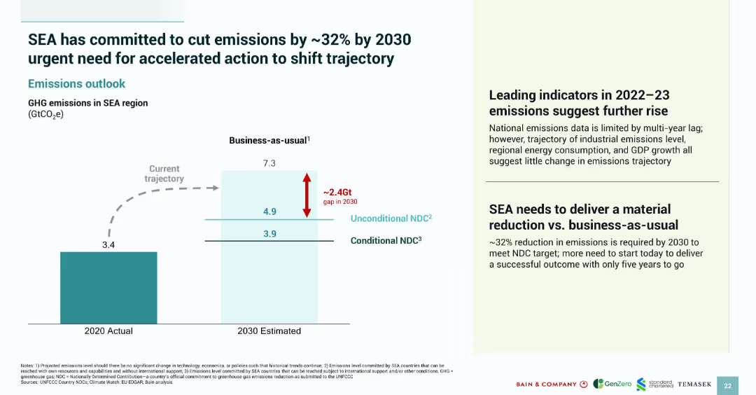
Split-panel layout with a left-side bar chart and right-side text; simple, corporate design with color coding
Strategic Planning
Environmental Services & Sustainability
This slide highlights Southeast Asia's emissions trajectory, indicating a business-as-usual scenario versus targets for 2030. It quantifies the emissions gap (~2.4Gt) and emphasizes the urgent need to meet Nationally Determined Contributions (NDCs) through accelerated action.
emissions, SEA, 2030 target, GHG, NDC, business-as-usual, reduction, sustainability, carbon gap
Mixed Chart
Bain
Saved
Contains a column chart showing CMO's top priorities for the next 12 months, with accompanying text explaining the priorities.
Market Analysis and Trends
Professional Services
This slide highlights the top priorities for Chief Marketing Officers in the coming year, focusing on digital technologies, market expansion, and customer personalization.
CMO, priorities, professional services, market trends, digital technologies
Mixed Chart
Deloitte
Saved
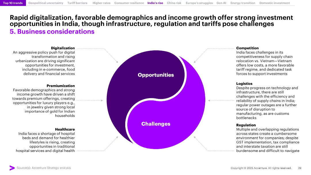
Yin-yang diagram showing “Opportunities” vs “Challenges” in India, surrounded by six labeled segments; minimalistic design with bold purple contrast.
Strategic Planning
Professional Services
This slide outlines the business landscape in India, balancing opportunities like digitalization, income growth, and healthcare demand against challenges in logistics, regulation, and competitiveness. It positions India as an attractive but complex market requiring strategic navigation of both growth drivers and structural hurdles.
India business, digitalization, demographics, regulation, competition, logistics, healthcare, premiumization, investment, challenges
Uncategorized
Accenture
Saved
This slide utilizes a combination of horizontal bar charts to show confidence levels in the ability to buy and sell various assets, including crypto assets, in the future, with detailed percentages.
Market Analysis and Trends
Financial Services
It explores the confidence of Canadians in their ability to buy and sell different types of assets, such as the US dollar, Canadian dollar, mutual funds, and crypto assets, with detailed confidence levels.
confidence, buy/sell, future, assets, percentages
Mixed Chart
IPSOS
Saved
High-contrast slide with infographics highlighting key fiscal year highlights, flanked by selected awards and certifications, exhibiting data and recognition.
Operational Efficiency
Professional Services
It showcases fiscal year accomplishments, like diversity in leadership and reductions in emissions, aligned with awards that affirm the company's values.
FY22, Highlights, Awards, Sustainability, Diversity
Agenda
Booz Allen Hamilton
Saved
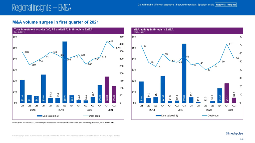
Two-panel bar and line chart layout; left chart covers total investment activity (VC, PE, M&A); right chart focuses on M&A activity; consistent blue and purple color scheme; simple data visuals.
Strategic Planning
Financial Services
The slide showcases the surge in fintech M&A activity in the EMEA region during Q1 2021, with strong increases in both deal value and count. It provides quarterly trend data from 2018–2021 for total investment and M&A-specific metrics, highlighting Q1 2021 as a peak period.
M&A, Fintech, EMEA, Investment, Deal Value, Deal Count, Q1 2021, Trends, PE, VC
Multiple Chart
KPMG
Saved
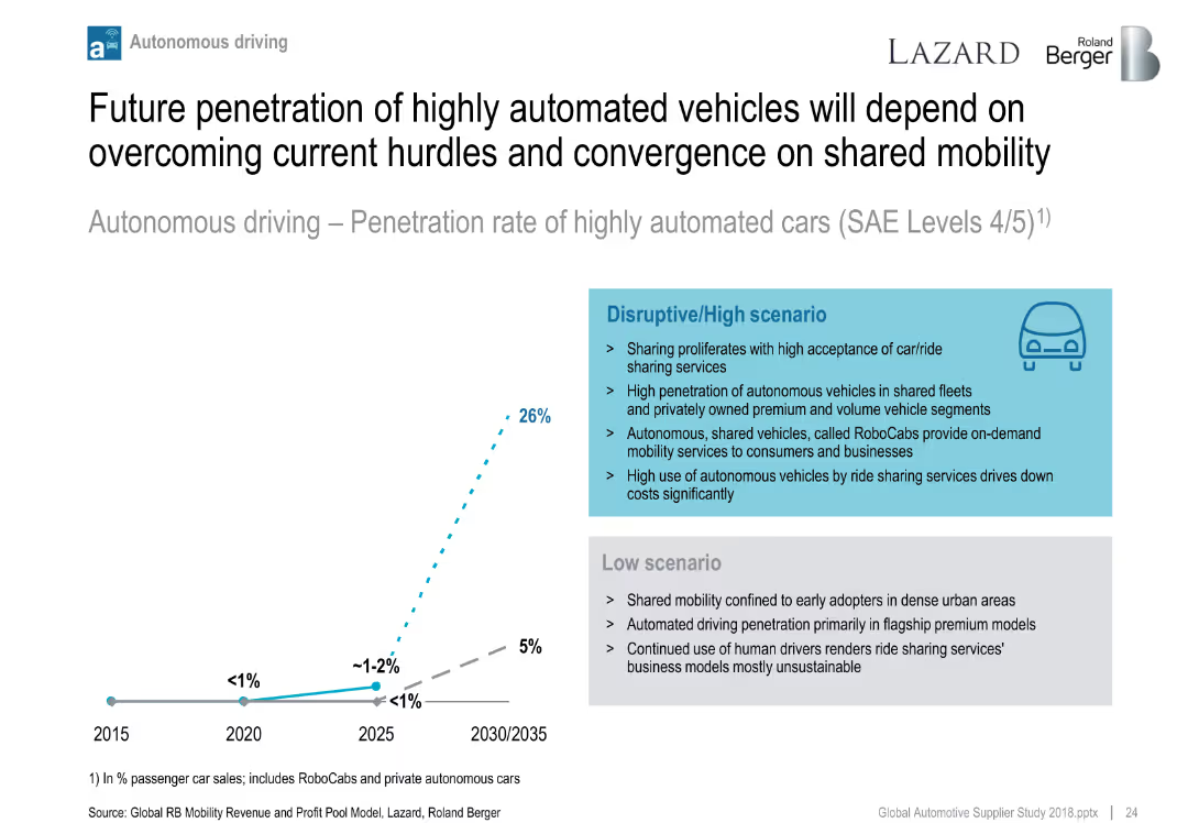
Line chart showing two scenarios for autonomous vehicle penetration (low vs. high); side text compares scenario assumptions.
Technology and Digital Transformation
Industrial & Manufacturing
Projects adoption of highly automated vehicles (SAE Level 4/5) under different market scenarios. Highlights role of shared mobility, ride-hailing, and RoboCabs in accelerating adoption under a disruptive path.
autonomous driving, RoboCabs, mobility, adoption forecast, automation scenarios
Mixed Chart
Roland Berger
Saved
A column chart comparing the provision for credit losses ratio between Credit Suisse and peers from 2010 to 2021.
Risk Assessment and Management
Financial Services
The slide discusses the weaknesses in risk management revealed by the Archegos incident, highlighting the deviations from historical performance and peer comparison in terms of provision for credit losses.
risk management, credit losses, peers, historical performance, Archegos
Single Chart
Credit Suisse
Saved
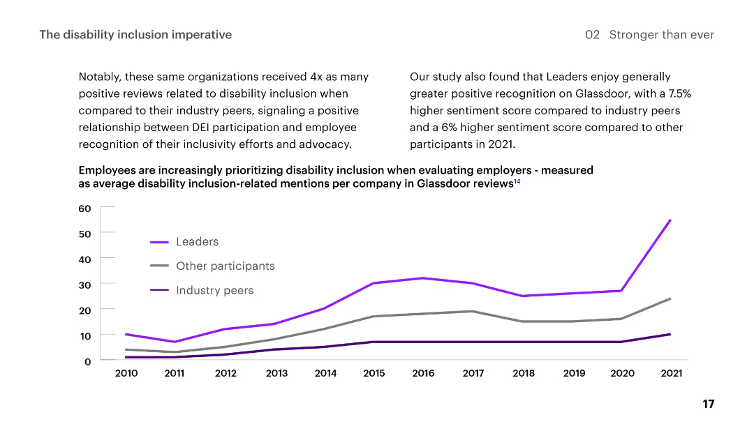
Line chart showing trends in disability inclusion-related mentions on Glassdoor from 2010 to 2021, comparing leaders, other participants, and industry peers.
Regulatory and Compliance
Professional Services
Describes positive recognition for organizations' disability inclusion efforts, showing a relationship between DEI participation and employee sentiment.
disability, inclusion, DEI, employee, recognition, trends, Glassdoor, positive reviews, leaders, participants
Mixed Chart
Accenture
Saved
Features descriptive text and proportional bar graphics illustrating perspectives on learning new work capabilities and solidarity during the pandemic.
Client Case Studies
Healthcare & Pharmaceuticals
Highlights the responses of millennials and Gen Z to the pandemic, focusing on new work capabilities, sense of community, and solidarity.
Pandemic, Millennials, Gen Z, Work Capabilities, Solidarity
Mixed Chart
Deloitte
Saved
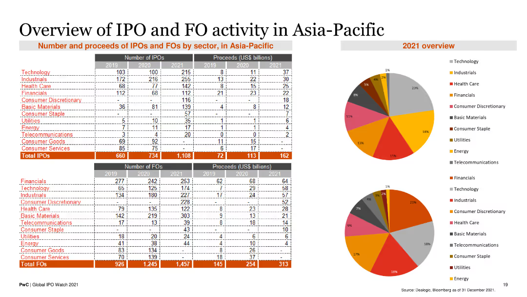
The slide contains two tables displaying the number and proceeds of IPOs and FOs by sector from 2019 to 2021. Two pie charts illustrate the sector distribution for 2021.
Market Analysis and Trends
Financial Services
This slide provides an overview of IPO and FO activities in the Asia-Pacific region, detailing the number and proceeds by sector, and highlighting key trends for 2021.
IPO, FO, Asia-Pacific, Financial Services, Market Trends
Multiple Chart
PwC/Strategy&
Saved
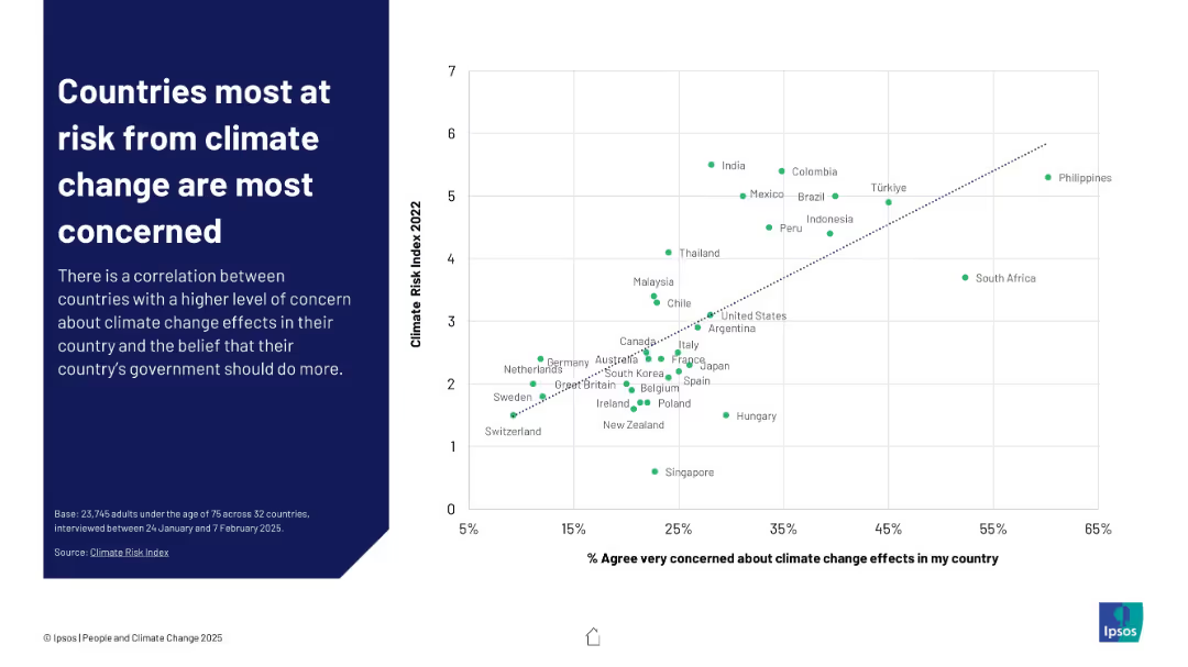
Scatterplot graph comparing % of people "very concerned" with each country's climate risk index ranking
Risk Assessment and Management
Environmental Services & Sustainability
This slide illustrates a positive correlation between climate vulnerability and public concern. Nations with higher Climate Risk Index scores like the Philippines and India show greater levels of worry, suggesting perception aligns with actual threat levels.
climate risk, concern, correlation, perception, Ipsos, vulnerability, risk index, government responsibility, public sentiment
Mixed Chart
IPSOS
Saved
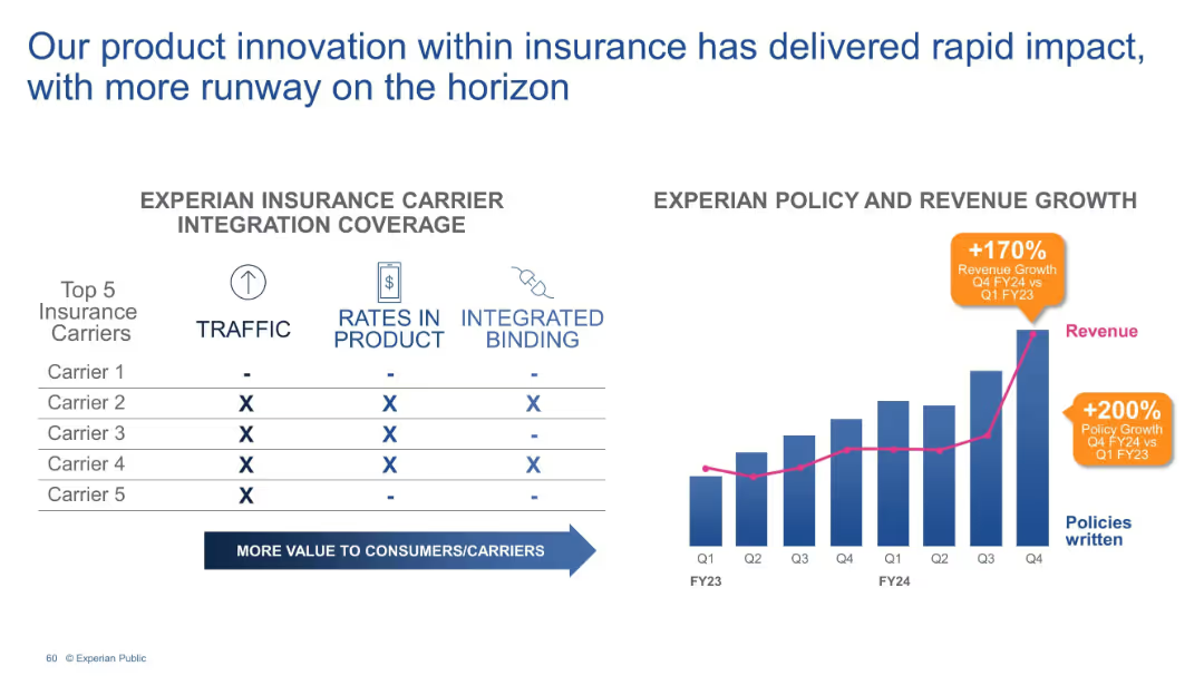
Split layout: Left side shows a table comparing integration across 5 carriers (columns: traffic, rates, binding); right side shows a bar & line chart.
Performance Metrics and KPIs
Financial Services
The slide highlights integration progress with top insurance carriers and correlates it with policy and revenue growth. It reports a 170% increase in revenue and 200% policy growth from Q1 FY23 to Q4 FY24, underscoring product innovation impact.
insurance, integration, carriers, policy growth, revenue, FY24, traffic
Mixed Chart
Barclays
Saved
The slide features a clear, professional layout with three columns of icons and text, describing key organizational requirements for transformation. Icons such as a human figure, group, and running person are used to symbolize the concepts.
Organizational Structure and Change
Professional Services
This slide outlines prerequisites for organizational transformation including leadership commitment, board support, and a strong desire for change, using both text and symbolic icons.
transformation, leadership, organizational change, board support, commitment
Table
McKinsey
Saved
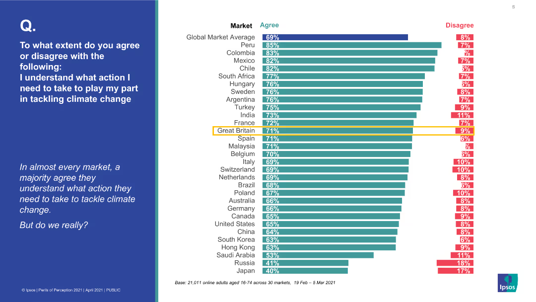
A bar chart with horizontal bars indicating the percentage of agreement and disagreement on understanding actions to tackle climate change across various countries. The left side features a blue background with a question.
Market Analysis and Trends
Environmental Services & Sustainability
The slide presents a global survey on the perception of understanding actions to tackle climate change, showing high agreement in most markets, but questioning if this understanding is real.
climate change, global survey, perception, actions, agreement, disagreement, countries, environmental understanding
Multiple Chart
IPSOS
Saved
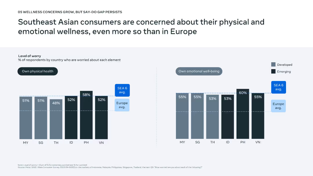
Two side-by-side bar charts comparing worry levels across countries; light vs. dark shades represent developed vs. emerging markets.
Market Analysis and Trends
Healthcare & Pharmaceuticals
The slide presents consumer concern levels for physical and emotional wellness across Southeast Asian countries and contrasts them with Europe. It highlights greater concern in SEA, particularly in emerging markets like the Philippines and Indonesia, revealing strong consumer interest in wellness despite economic limitations.
wellness, mental health, physical health, SEA, consumer concern
Multiple Chart
Bain
Saved
Slide with a pie chart and an image of people working on computers. The chart indicates percentages of changes to talent strategies due to generative AI. The image and chart are balanced with descriptive text.
Human Resources and Talent Management
Technology & Software
This slide examines the anticipated impact of generative AI on the workforce and talent strategies. It includes predictions on the timeline for these changes and highlights the need for education on AI capabilities, signaling potential shifts in skill requirements and employment landscapes.
AI, talent, workforce, strategy, education, impact, change, skills
Mixed Chart
Deloitte
Saved
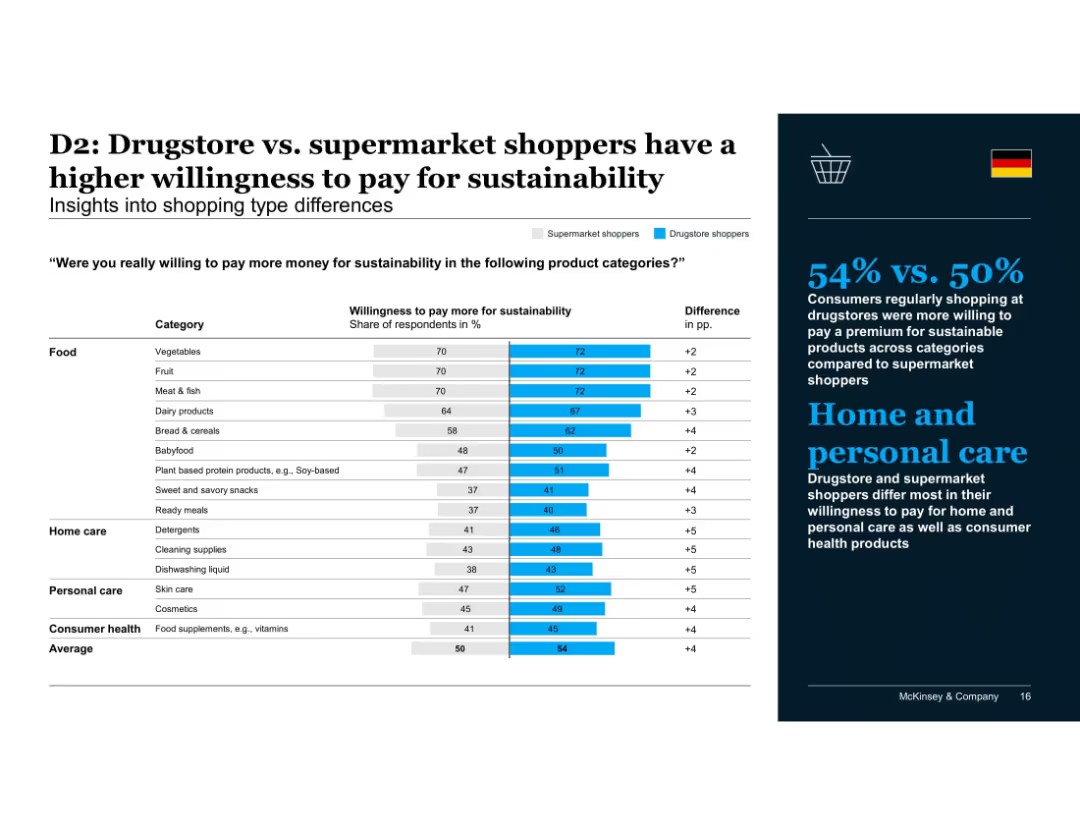
Comparison bar chart showing supermarket vs. drugstore shopper behavior; focuses on product categories
Customer and Market Segmentation
Consumer Goods
Drugstore shoppers exhibit greater willingness to pay for sustainable products, particularly in home and personal care. The trend suggests higher alignment of health-conscious shopping habits with sustainability values.
shopping type, drugstore, supermarket, personal care, home care, sustainability spending, consumer behavior, McKinsey, Germany
Mixed Chart
McKinsey
Saved
The slide contains two bar charts: one showing investments in infrastructure and real estate sectors by value, and the other by the number of deals. The charts use different colors for each month to make comparisons easier and highlight trends clearly.
Market Analysis and Trends
Real Estate & Construction
This slide focuses on PE/VC investments in the infrastructure and real estate sectors, detailing the investment values and number of deals. It helps in analyzing the investment patterns and trends within these specific sectors, providing insights for strategic planning.
PE/VC, infrastructure, real estate, investment value, number of deals
Multiple Chart
EY
Saved
Previous
Next
If nothing, comes up, please save your slides first
Create a FREE account to continue browsing
Receive Instant Access to 1,000+ slides from companies like McKinsey, Google, and Goldman Sachs
First Name
Last Name
Email
Password
I agree to all
Terms & Privacy Policy
Thank you! Your submission has been received!
Oops! Something went wrong while submitting the form.
Have an account?
Sign in
Column Chart
Heatmap
Chevron
Org Chart
Infographic
Callouts
Timeline
List
Graphic
Picture
Process Flow
Diagram
Paragraph
Map
Table
Framework
Subtitle
Takeaway Box
Icon
Other Chart
Radar Chart
Waterfall Chart
Mekko Chart
Pie Chart
Scatter Plot
Line Chart
Bar chart
Bullet points