Create a FREE Account
Instant access to 1,000+ real slides from top companies like McKinsey, BCG, Goldman Sachs, Google and many more!
First Name
Last Name
Email
Password
I agree to all
Terms & Privacy Policy
Thank you! Your submission has been received!
Oops! Something went wrong while submitting the form.
Have an account?
Sign in
Library
Templates
Courses
Pricing
My Account
My Slides
My Templates
✦ AI
AI Prompt Library
AI Search
Sign in
Start Here
Logout
My Saved Slides
Contains bullet points and column chart comparing different capital requirement metrics with annotations explaining surplus and deficits.
Regulatory and Compliance
Financial Services
Analyzes compliance with MREL/TLAC financial regulations, displaying the bank's capital against required thresholds, highlighting surpluses and shortages.
financial regulation, compliance, capital requirements, banking
Multiple Chart
Deutsche Bank
Saved
The slide uses a green and white color scheme with a table showing the percentages of respondents who repaired various items in Germany, France, and the UK. It includes icons for items like washing machines and mobile phones, with the highest and lowest repair rates indicated in different colors.
Market Analysis and Trends
Environmental Services & Sustainability
This slide indicates that the percentage of repaired goods is low across different products, with a focus on comparisons among Germany, France, and the UK, suggesting the impact of initiatives like the Green Deal in France.
repair, e-waste, products, survey, international
Multiple Chart
Oliver Wyman
Saved
Text and a column chart comparing the average number of cyber attacks per company between 2020 and 2021. The chart uses purple for data representation.
Risk Assessment and Management
Technology & Software
The slide discusses the increase in cyber attacks during the pandemic, highlighting that the average attacks per company rose by 31%. It also mentions the impact of these attacks on various sectors.
cyber attacks, increase, pandemic, comparison, impact
Mixed Chart
Accenture
Saved
Features table and column charts on net interest income by segment and detailed tables on loan types and amounts.
Financial Performance
Financial Services
Focuses on net interest income across different business segments and provides a detailed breakdown of loans. It is suitable for financial review meetings to discuss income trends and loan allocations in various sectors.
Net Interest, Loans, Segments, Income Trends, Corporate, Wealth Management, Real Estate, Consumer, Credit, Asset Management, Investment Banking
Multiple Chart
Goldman Sachs
Saved
The slide includes a donut chart showing the frequency of social contact among the public. Net more than once a week and net less than once a week statistics are highlighted in text boxes.
Market Analysis and Trends
Healthcare & Pharmaceuticals
This slide highlights the frequency of social contact among the public, showing the percentage of people socialising more than once a week versus less than once a week, based on survey data.
social contact, frequency, survey, public opinion, interaction, donut chart, healthcare, trends, socializing
Mixed Chart
IPSOS
Saved
A split slide with textual information on the left about job impact and an image of a worker on the right.
Human Resources and Talent Management
Transportation & Logistics
Analyzes the job creation impact of the F-Series across various sectors, with a focus on multiplier effects.
Ford, F-Series, job impact
Single Chart
BCG
Saved
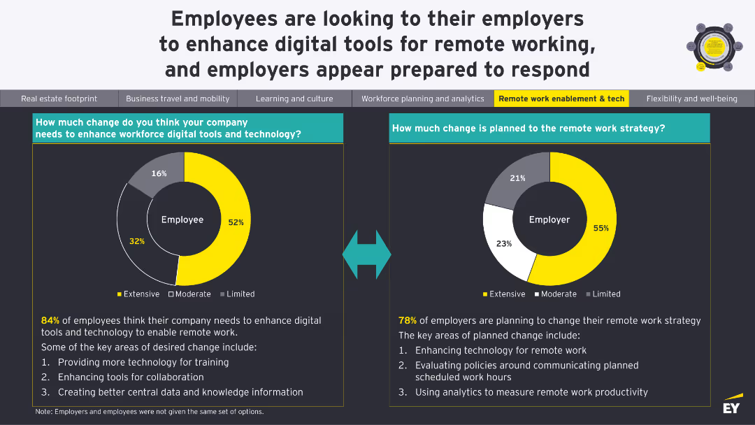
This slide features a dark background with a yellow highlight. It includes a header, body text, and a column chart displaying percentages. Four circular percentage indicators show key insights.
Market Analysis and Trends
Healthcare & Pharmaceuticals
The slide discusses the cautious optimism surrounding emerging technologies like AI and virtual presence in healthcare among German consumers. It highlights expected trends in digital technologies, precision medicine, and virtual hospitals.
healthcare, technology, AI, virtual presence, Germany
Mixed Chart
EY
Saved
Split layout: text explanation on left, segmented bar charts on right showing age, income, and location comparisons. Minimalist with McKinsey branding.
Customer and Market Segmentation
Technology & Software
The slide outlines demographic traits of new digital users, who are younger and wealthier than traditional users. It uses charts to show differences in age brackets, earnings, and urban vs. rural distribution, highlighting increased digital usage among these newer segments.
digital users, demographics, income, urban, rural, age groups, segmentation, McKinsey, adoption, technology
Mixed Chart
McKinsey
Saved
The slide presents a map of the Americas with logos and brief details of education companies likely to raise capital, accompanied by icons indicating educational sectors.
Market Analysis and Trends
Education & Training
This slide maps out education companies in the Americas that had transactions before 2021 and may raise capital again, providing company names, locations, and details.
capital raising, education assets, Americas, market analysis, transaction history, education companies, investment opportunities
Graphic
LEK
Saved
The slide shows a line graph comparing the productivity index of the mining industry with other sectors, accompanied by column charts showing equipment OEE percentages.
Operational Efficiency
Industrial & Manufacturing
Analyzes mining productivity trends over time compared to other industries, discussing factors influencing these trends and suggesting areas for operational improvements.
mining productivity, industry comparison, line graph, bar charts, operational efficiency, trend analysis, equipment OEE
Multiple Chart
McKinsey
Saved
The slide presents a column chart showing Europe HICP y/y inflation (2023-24F) for various countries. The data is displayed clearly, highlighting differences in inflation rates across EU Member States with supporting textual explanations.
Market Analysis and Trends
Financial Services
This slide forecasts diminishing cross-country inflation differentials in the EU for 2024, with most member states seeing inflation in the 1%-3% range. It provides a detailed comparison of inflation rates, discussing the factors contributing to these trends.
inflation, EU, HICP, cross-country, forecast
Mixed Chart
EY
Saved
Left: pie chart on plans to establish GenAI teams. Right: list of barriers to establishing GenAI teams.
Human Resources and Talent Management
Financial Services
Majority of banks plan to establish a GenAI team within 1-2 years, facing barriers such as expertise and regulatory ambiguity.
GenAI team, establishment, barriers, expertise, regulation
Mixed Chart
EY
Saved
The slide contains a bar graph showing monthly activity by revenue source, categorized into cash receipts, credit card receipts, checks, and regular JVs, with a color key.
Regulatory and Compliance
Financial Services
This slide explains the different sources of journal entries for revenue accounts, highlighting the significance of credit card receipts which account for 97% of total sources.
journal entries, revenue sources, credit card receipts, financial transactions, data analysis
Mixed Chart
EY
Saved
Features a comparative column chart of revenue and expenditure for Namibia from 2022/23 to 2024/25. Each year is represented with dual bars for revenue and expenses, colored distinctly in red and grey, alongside deficit annotations. The design is straightforward with clear labels.
Financial Performance
Government & Public Sector
Analyzes the balance between revenue and expenditures in Namibia's budget, highlighting fiscal challenges and planning for deficit management. Useful for governmental financial strategy and public administration.
Fiscal Balance, Revenue, Expenditure, Namibia, Government Finance
Single Chart
PwC/Strategy&
Saved
A U.S. map with states color-coded to show the likelihood of party control in the Senate, with red for Republicans, blue for Democrats, and green for toss-ups.
Market Analysis and Trends
Government & Public Sector
Analyzes the Senate races for 2024, highlighting which states are toss-ups and the potential risks for Democrats losing control of the Senate.
Senate, Toss-ups, Election, Control, 2024
Graphic
JP Morgan
Saved
The slide includes a combination of column charts, bar charts, and pie charts to display survey data. The charts categorize respondents by country, type of hospital, hospital size, and respondent role.
Market Analysis and Trends
Healthcare & Pharmaceuticals
This slide presents survey data on hospital priorities in APAC, categorizing responses by country, hospital type, size, and roles. It provides insights into the current focus areas for hospital executives.
healthcare, survey, priorities, APAC, hospitals
Single Chart
LEK
Saved
The slide contains text with bullet points outlining the investment case, recent updates, and catalysts for MercadoLibre, along with a table and line chart.
Client Case Studies
Retail & E-commerce
This slide presents a detailed investment case for MercadoLibre, including long-term thesis, recent performance updates, and growth catalysts.
Investment, MercadoLibre, E-commerce, Client Case, Performance, Updates, Catalysts, Financials, Market, Growth
Mixed Chart
Morgan Stanley
Saved
Text and data tables showing past and projected financials.
Strategic Planning
Financial Services
Provides a comprehensive view of financial performance and targets for 2026.
Financials, Targets, Forecasting, 2026, Performance Metrics
Multiple Chart
Barclays
Saved
Graphs and stats display current customer relationships and future improvement plans.
Customer and Market Segmentation
Financial Services
Details current state and strategic plans for enhancing customer relationships in banking.
customer relationships, banking, strategic plans, improvement
Multiple Chart
Barclays
Saved
The slide presents column charts breaking down expense growth by category from 2019 to 2022 and details on investment spending for technology and business sectors.
Operational Efficiency
Financial Services
This slide analyzes the drivers behind JP Morgan's expense growth, categorized by investments, revenue growth, and structural changes over four years. It highlights significant financial allocations in technology and operational areas, showcasing their approach to scaling business operations efficiently.
expenses, investments, growth, technology
Mixed Chart
JP Morgan
Saved
Bar chart of SBTi commitments over years and pie chart of validation loss. Right side provides insights into corporate struggles and requirements for target credibility.
Performance Metrics and KPIs
Industrial & Manufacturing
Reviews the increase in SEA companies committing to SBTi targets, with commitments doubling annually. Notes 18% failure rate in maintaining validation. Points to challenges such as plan credibility, funding gaps, and target scope issues. Underscores the need for continuous efforts to meet stringent validation frameworks and credibility in climate goal setting.
SBTi, SEA corporates, decarbonization, validation, climate targets, science-based targets, KPI, commitment, emissions
Multiple Chart
Bain
Saved
A column chart showing the number of international air passengers for various Australian cities, highlighting Melbourne's lower connectivity compared to Sydney.
Risk Assessment and Management
Transportation & Logistics
Compares international air passenger numbers among Australian cities, noting Melbourne's lower figures and the implications for global connectivity.
air passengers, connectivity, Melbourne, Sydney, international travel
Single Chart
BCG
Saved
The slide displays three bar graphs comparing the importance of ESG considerations in VC investments across environmental, social, and governance aspects. Commentary text is placed to the right. The graphs use a grey-blue palette, maintaining a professional appearance.
Investment Analysis
Financial Services
The slide examines how venture capital investors rate the importance of ESG dimensions in their investment processes, with additional insights provided on the slide. This can be used in discussions about investment strategies and sustainability practices in the VC industry.
ESG, VC investment, importance rating, environmental, social, governance
Mixed Chart
Bain
Saved
Two stacked bar graphs: Top section shows NII sensitivity for 2024–2026 under +/-25bps yield shifts; bottom section breaks down +25bps impact by currency (EUR, USD, Other).
Financial Performance
Financial Services
The slide models Deutsche Bank's net interest income sensitivity to a hypothetical ±25bps shift in the yield curve across 2024 to 2026, showing increasing sensitivity over time. The second chart segments the +25bps impact by currency, revealing EUR as the dominant contributor.
net interest income, yield curve, interest rate sensitivity, EUR, USD, projections, 2024–2026, Deutsche Bank
Multiple Chart
Deutsche Bank
Saved
Three-column layout with bullet points and delivery outlook charts (narrow and wide-body aircraft)
Performance Metrics and KPIs
Industrial & Manufacturing
The slide focuses on improving aircraft delivery confidence for 2025, with 83–93% of executives expecting growth. It highlights OEM production plans and supply chain adjustments following a turbulent 2024, and features delivery outlook visuals segmented by aircraft type and year comparison.
aircraft delivery, OEMs, production, supply chain, Boeing, Airbus, KPIs
Mixed Chart
Accenture
Saved
Previous
Next
If nothing, comes up, please save your slides first
Create a FREE account to continue browsing
Receive Instant Access to 1,000+ slides from companies like McKinsey, Google, and Goldman Sachs
First Name
Last Name
Email
Password
I agree to all
Terms & Privacy Policy
Thank you! Your submission has been received!
Oops! Something went wrong while submitting the form.
Have an account?
Sign in
Column Chart
Heatmap
Chevron
Org Chart
Infographic
Callouts
Timeline
List
Graphic
Picture
Process Flow
Diagram
Paragraph
Map
Table
Framework
Subtitle
Takeaway Box
Icon
Other Chart
Radar Chart
Waterfall Chart
Mekko Chart
Pie Chart
Scatter Plot
Line Chart
Bar chart
Bullet points