My Account
My Slides
Search by Category
Companies
Slide Type
Use Case
Industry
Pricing
Templates
View All Templates
Download Template Slides
✦ AI
AI Prompt Library
AI Search
Feedback
Login
Logout
Get Started
Browse all Slides
Browse all Slides
Create a FREE Account
Instant access to 1,000+ real slides from top companies like McKinsey, BCG, Goldman Sachs, Google and many more!
First Name
Last Name
Email
Password
I agree to all
Terms & Privacy Policy
Thank you! Your submission has been received!
Oops! Something went wrong while submitting the form.
Have an account?
Sign in
Saved Slides
The slide features a line chart tracking central bank policy rates over time and a line chart predicting future market expectations for these rates.
Regulatory and Compliance
Financial Services
This slide analyzes monetary policy through historical and projected central bank policy rates, with visual aids to compare different regions. It's crucial for understanding the impact of central bank decisions on financial markets.
Monetary Policy, Central Banks, Market Expectations, Rates, Policy, Trends, Forecast
Multiple Chart
Morgan Stanley
Saved
The slide combines a paragraph of text on the left and a stylized image of a person on a bike next to trees on the right. The graphics are simple and the layout balances text and image well.
Industry Overview
Environmental Services & Sustainability
Discusses the importance of environmental issues among Millennials and Gen Z, their view on businesses' environmental focus, and the potential for a greener future.
Environment, Millennials, Gen Z, Climate Change, Survey, Business, Optimism, Future
Mixed Chart
Deloitte
Saved
This slide features a world map showing the geographic distribution of survey respondents. Different sizes of green and blue dots indicate the number of Millennials and Gen Z participants from various regions.
Market Analysis and Trends
Media & Entertainment
The slide visualizes the geographic distribution of respondents from the primary survey conducted between November 2019 and January 2020. It provides a clear view of the global reach of the survey, highlighting regions with the highest participation, which is useful for understanding the demographic spread and diversity of opinions.
Geographic Distribution, Survey, Millennials, Gen Z, Map
Graphic
Deloitte
Saved
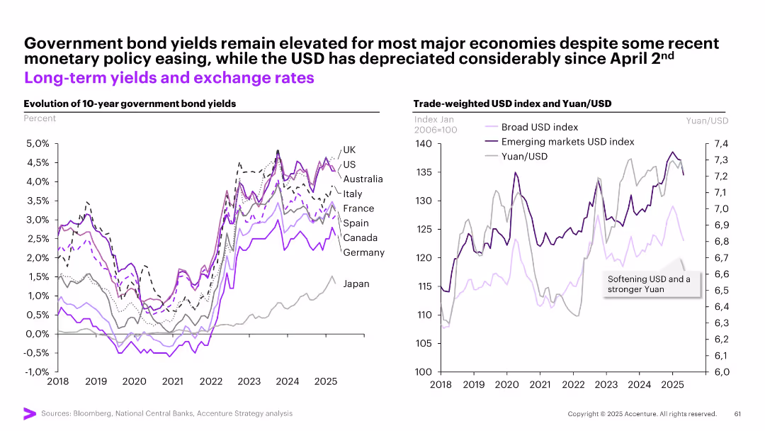
Two graphs: one for 10-year bond yields across countries, another for trade-weighted USD and Yuan/USD.
Investment Analysis
Financial Services
Examines bond yields and currency movements post-policy easing. Yields remain high despite easing, while the USD has weakened notably since April 2. A stronger Yuan and emerging markets USD index are emphasized.
bond yields, USD, Yuan, exchange rates, inflation, interest rates, investment, sovereign debt, currency trends
Multiple Chart
Accenture
Saved
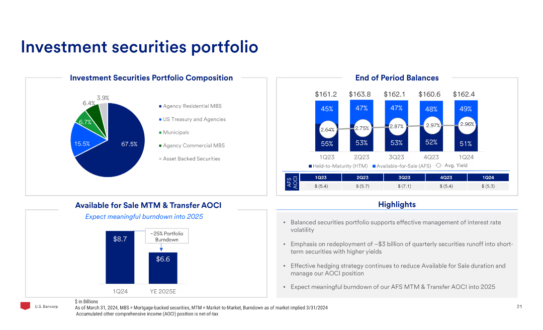
The slide contains a pie chart of the investment securities portfolio composition, column charts of end of period balances, and highlights on the portfolio management and market volatility.
Investment Analysis
Financial Services
The slide reviews the investment securities portfolio, focusing on composition, end-of-period balances, and strategies for managing interest rate volatility and portfolio runoff.
Investment, Securities, Portfolio, Composition, Management, Volatility
Multiple Chart
Barclays
Saved
This slide includes a flow chart showing the evolution of AI-influenced revenue share from 2018 to 2024. The colors represent different revenue thresholds, making the data visually engaging.
Market Analysis and Trends
Technology & Software
It illustrates the increasing influence of AI on companies' revenue, providing a visual comparison of revenue shares from 2018 to 2024, with projections highlighting significant growth areas.
AI revenue, market share, projections, data visualization, revenue growth
Mixed Chart
Accenture
Saved
The slide features a column chart showing changes in assets under management over time, with callout boxes indicating specific factors contributing to the increases or decreases, and an annotation explaining equity movements. The chart uses shades of blue and gray for visual differentiation.
Financial Performance
Financial Services
This slide presents the movements in Macquarie Infrastructure and Real Assets (MIRA) Equity Under Management (EUM), highlighting the impact of new equity raised, listed security price movements, and foreign exchange movements, suitable for financial analysis and investor presentations.
MIRA, EUM, equity, investment, financial analysis, Macquarie, bar graph, performance, capital, foreign exchange
Single Chart
Goldman Sachs
Saved
Text with map highlighting key luxury growth markets like Middle East, China, India, and Southeast Asia.
Market Analysis and Trends
Consumer Goods
Discusses the critical role of growth markets in the development of the luxury sector, highlighting key regions.
Luxury, Growth, Markets, Regions, Development
Graphic
Kearney
Saved
This slide features a vertical column chart illustrating the drawn SNB liquidity facilities over various dates. On the left, there is text highlighting key liquidity ratios (LCR and NSFR) and repayment details.
Financial Performance
Financial Services
The slide presents UBS's management of liquidity and funding, highlighting key ratios like LCR and NSFR, and showing the repayment of SNB facilities over time. It is used to show financial stability and management effectiveness.
Liquidity, funding, SNB facilities, LCR, NSFR
Mixed Chart
UBS
Saved
Features a diagram "FIGURE 6" depicting the importance of new skill sets across roles and two large text blocks discussing the relevance of these skills.
Market Analysis and Trends
Technology & Software
Analyzes the rising importance of complex reasoning, creativity, and socio-emotional intelligence in the workplace, arguing that such skills are acquired through practice and experience.
Skills, Importance, Analysis, Creativity, Market
Table
Accenture
Saved
The slide has a dark backdrop with a split layout showing a large blue bar graph on the left and a segmented bar on the right. It employs contrasting colors to highlight different categories of data, with the main focus on customer rewards for data access.
Customer and Market Segmentation
Retail & E-commerce
It showcases strategies for consumer incentivization for data access, highlighting the predominance of traditional rewards. It is useful for discussing customer engagement tactics and market segmentation strategies in retail and consumer goods industries.
Incentives, Data Access, Consumer Engagement, Rewards, Market Segmentation, Retail, Consumer Goods
Multiple Chart
Kearney
Saved
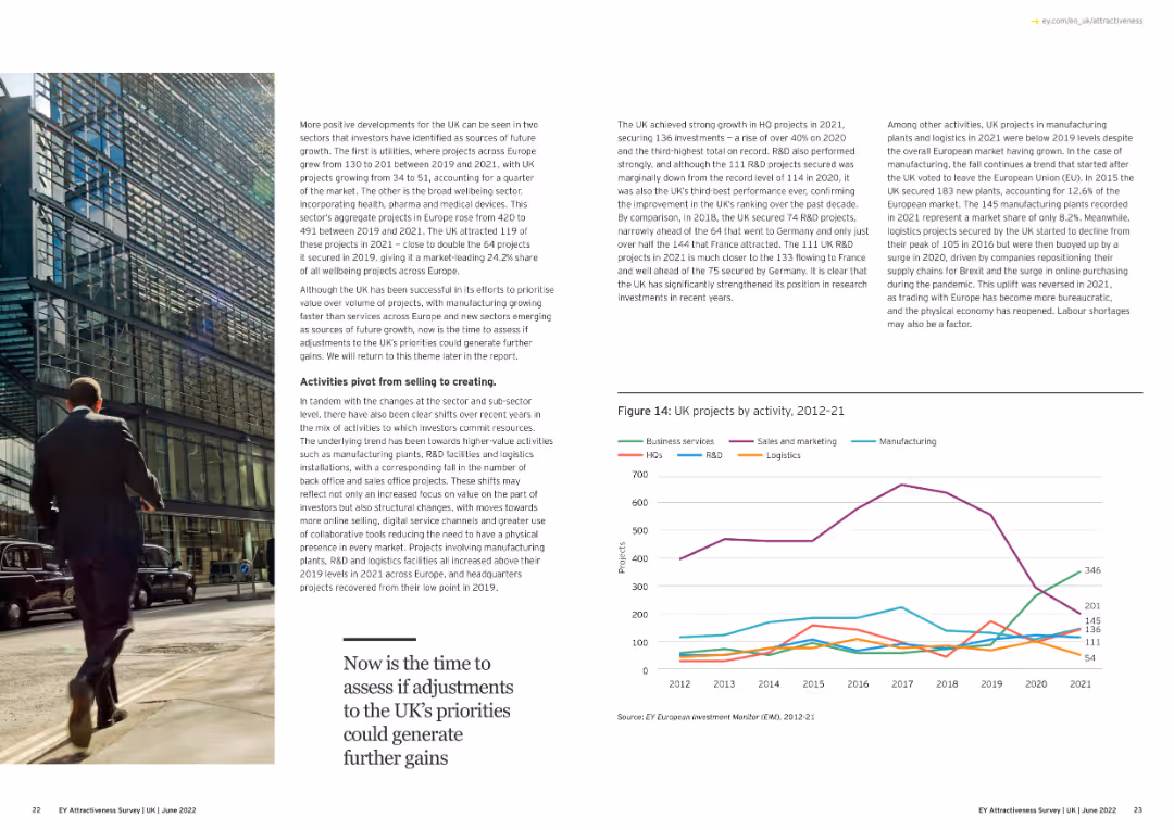
The slide features a line chart showing the leading sectors for investment in the UK from 2012 to 2021, with lines representing different sectors.
Market Analysis and Trends
Financial Services
This slide highlights the top sectors attracting investment in the UK over the years, providing insight into economic focus areas.
investment, sectors, UK, trends, 2012-21
Mixed Chart
EY
Saved
Slide presents a series of blue column charts tracking EBIT Margin Benefit from Cost Savings over several years.
Financial Performance
Consumer Goods
This slide demonstrates the company’s financial efficiency over time, highlighting consistent cost savings as reflected in EBIT margin improvements.
cost savings, EBIT margin, financial, yearly, analysis
Single Chart
Barclays
Saved
This slide presents a column chart detailing expenditure trends over a decade and a dotted line illustrating expenditure as a percentage of GDP, along with a sidebar on wage containment measures.
Regulatory and Compliance
Government & Public Sector
Discusses strategic measures to manage and consolidate government expenditure, including wage bill controls.
Fiscal consolidation, expenditure trends, wage control, budget
Mixed Chart
PwC/Strategy&
Saved
Bar graphs displaying user reliance levels on nbn™ network during COVID-19, visual markers for household upgrades, and supportive text on the side.
Strategic Planning
Technology & Software
Details the critical role of the nbn™ network in keeping users connected for entertainment and support during the pandemic, leading to many upgrading their plans.
COVID-19, nbn network, family connectivity, entertainment reliance, plan upgrades, pandemic response, user reliance, household data
Multiple Chart
Accenture
Saved
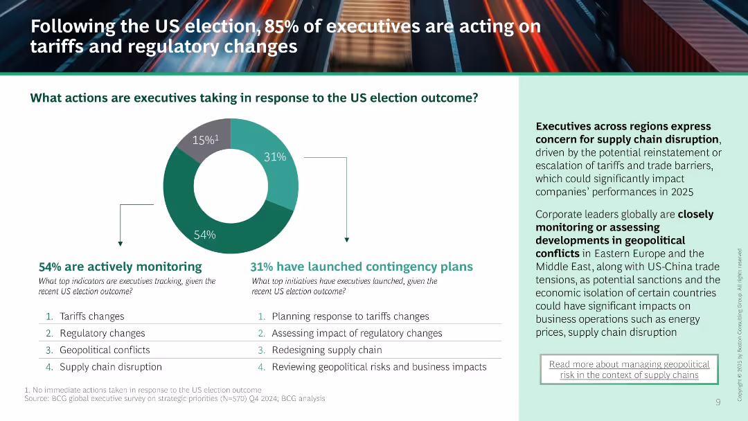
Donut chart shows 54% monitoring and 31% launching contingency plans. Supporting list of tracked and planned actions. Right text panel outlines concerns about supply chain and geopolitical instability.
Risk Assessment and Management
Professional Services
Majority of executives are reacting to the US election by monitoring and planning responses to tariffs, regulations, and geopolitical conflict. Highlights increased concern over supply chain risks and regional instability.
US election, contingency planning, tariffs, regulatory change, supply chain, monitoring, risk management
Mixed Chart
BCG
Saved
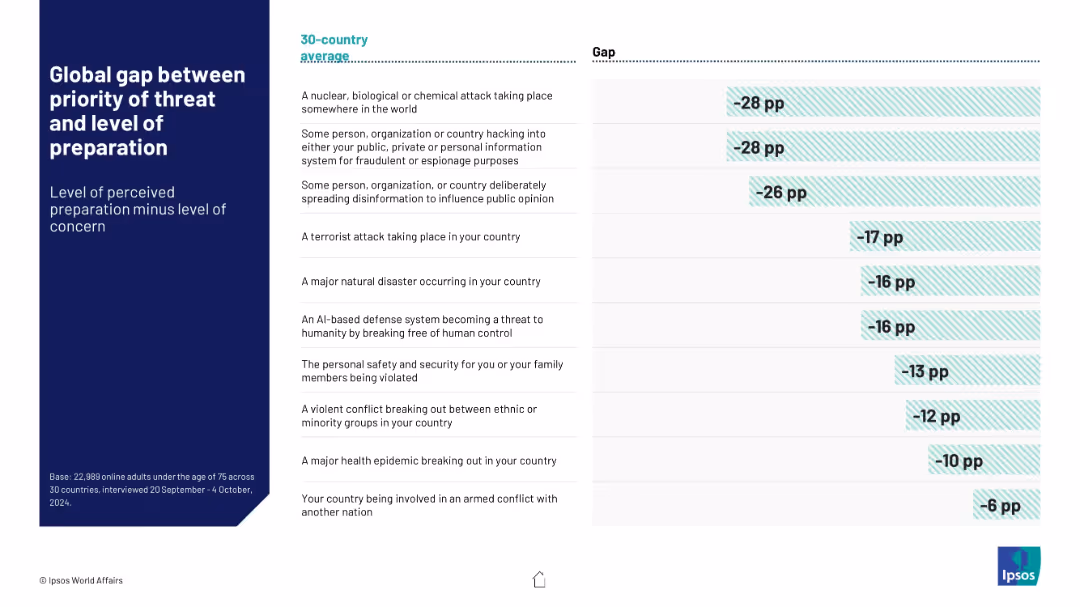
Table with two columns: threat types and corresponding global preparedness gap (concern minus confidence). Horizontal bars visualize the negative gaps.
Risk Assessment and Management
Government & Public Sector
Visualizes the global discrepancy between concern about various threats and perceived governmental preparedness. Highlights largest concern-preparedness gaps in NBC attacks and hacking across a 30-country average.
preparedness gap, risk perception, global concern, NBC threats, cyber attacks, Ipsos data
Mixed Chart
IPSOS
Saved
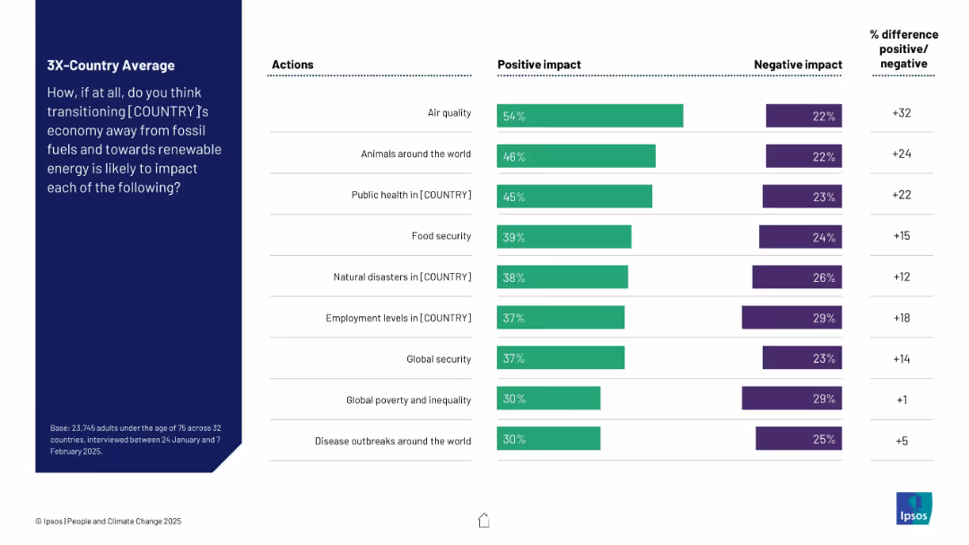
Tabular bar chart layout showing positive vs. negative impacts of transitioning away from fossil fuels across 9 domains. Right column quantifies net positivity.
Technology and Digital Transformation
Environmental Services & Sustainability
This slide presents average perceptions across 32 countries regarding the impact of moving from fossil fuels to renewables. Key areas assessed include air quality, health, employment, and disasters. Most respondents expect positive outcomes, especially for air quality.
renewable energy, transition, perception, fossil fuels, air quality, employment, public health, Ipsos, survey
Mixed Chart
IPSOS
Saved
This slide features multiple column charts comparing the percentage of Seadrill's fleet dedicated to specific market segments against its competitors. Each chart focuses on a different segment, such as 6th & 7th generation floaters and harsh environment floaters, with colors distinguishing Seadrill from others. The charts are simple yet effectively designed to highlight differences and competitive advantages. Annotations provide additional context for the data presented.
Strategic Planning
Energy & Utilities
The slide strategically showcases Seadrill's focused investment in high-value market segments, comparing it to competitors. It is likely used in strategic planning sessions or investor meetings to illustrate how Seadrill targets its resources to capitalize on lucrative market opportunities. The charts are designed to communicate the strategic alignment of Seadrill's fleet with market demand, aiding decision-makers in understanding the company's market focus and potential for growth in specific sectors.
strategic planning, market focus, Seadrill, column charts, competitive advantage, fleet utilization, investment, high-value markets, growth sectors, decision-making
Multiple Chart
Barclays
Saved
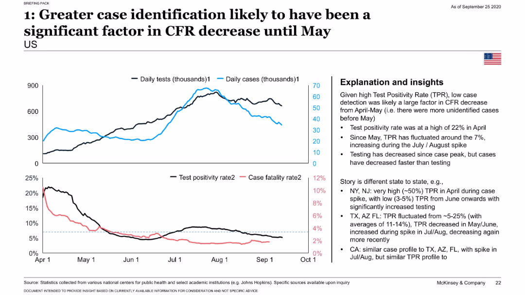
Dual-line graph comparing daily tests and cases; lower chart compares test positivity and CFR; insights presented in a right-side box.
Risk Assessment and Management
Healthcare & Pharmaceuticals
Highlights how the sharp decline in CFR through May 2020 was likely due to expanded testing identifying more mild or asymptomatic COVID-19 cases. Test positivity data from various U.S. states supports this conclusion.
testing, test positivity, CFR, COVID-19, case detection, states
Mixed Chart
McKinsey
Saved
The slide features tables, regional maps, and icons. It visually separates information by countries and key international alliances.
Market Analysis and Trends
Government & Public Sector
Analyzes the strengthening of Australia's international alliances in the Indo-Pacific, influencing Australia's battery industries.
Indo-Pacific, alliances, Australia, trade agreements
Table
Accenture
Saved
The slide is divided into two sections: text on the left and a bar chart on the right. The chart compares the percentage of millennials and Gen Zs valuing certain employee characteristics, with separate bars for each group. The slide has a white background with green accent bars.
Industry Overview
Technology & Software
The slide discusses the importance of flexibility and adaptability in the workplace, especially for millennials and Gen Z. It presents findings from the Deloitte Global Resilience Report, showing that these groups value flexibility/adaptability, creativity, and being technologically savvy the most in the success of businesses. A column chart visualizes these values, differentiating the perceptions between millennials and Gen Z.
Flexibility, Adaptability, Millennials, Gen Z, Deloitte, Resilience Report, Employee Characteristics, Business Success, Column Chart
Mixed Chart
Deloitte
Saved
The slide compares the emission reduction targets and timelines for key automotive and construction industry companies, with data on their green steel demand shares.
Regulatory and Compliance
Environmental Services & Sustainability
This slide examines how emission reduction targets in the automotive and construction industries are driving demand for low-CO2 steel, with comparative data on target timelines and demand shares.
Emission reduction, low-CO2 steel, automotive, construction, targets, demand drivers, green steel, regulatory
Single Chart
BCG
Saved
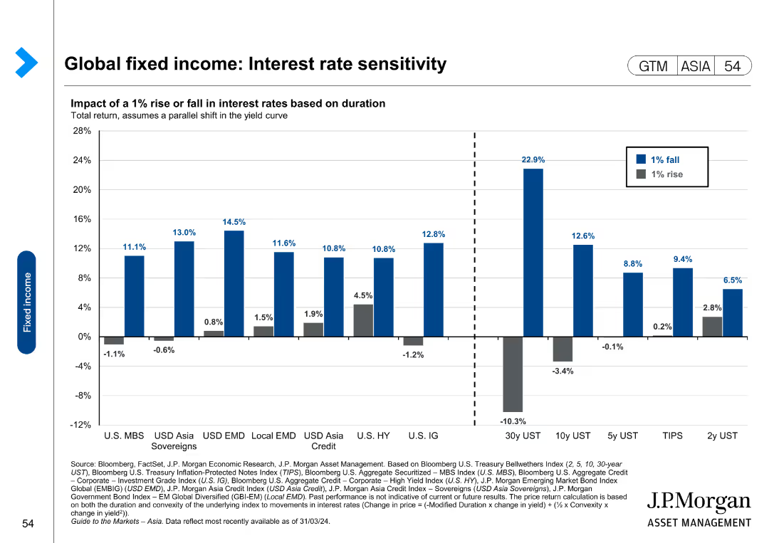
The slide features a bar chart showing the impact of a 1% rise or fall in interest rates on total return across various fixed income categories.
Risk Assessment and Management
Financial Services
This slide analyzes interest rate sensitivity for global fixed income investments, illustrating the impact of interest rate changes on total returns. It is used for risk assessment and management.
Global fixed income, interest rate sensitivity, total return, risk assessment, management
Single Chart
JP Morgan
Saved
The slide has a list format with color-coded sections, each providing key points about the investment thesis, and a company logo in the top right corner.
Strategic Planning
Financial Services
The slide articulates a financial institution's investment thesis, highlighting the pillars of earnings, risk management, and capital allocation. It's useful for communicating the company's strategic positioning and investment potential to stakeholders or potential investors.
Investment Thesis, Earnings, Risk Management, Capital Allocation, Strategic Position, Financial Institution
Table
Morgan Stanley
Saved
Previous
Next
If nothing, comes up, please save your slides first
Create a FREE account to continue browsing
Receive Instant Access to 1,000+ slides from companies like McKinsey, Google, and Goldman Sachs
First Name
Last Name
Email
Password
I agree to all
Terms & Privacy Policy
Thank you! Your submission has been received!
Oops! Something went wrong while submitting the form.
Have an account?
Sign in
Column Chart
Heatmap
Chevron
Org Chart
Infographic
Callouts
Timeline
List
Graphic
Picture
Process Flow
Diagram
Paragraph
Map
Table
Framework
Subtitle
Takeaway Box
Icon
Other Chart
Radar Chart
Waterfall Chart
Mekko Chart
Pie Chart
Scatter Plot
Line Chart
Bar chart
Bullet points