My Account
My Slides
Search by Category
Companies
Slide Type
Use Case
Industry
Pricing
Templates
View All Templates
Download Template Slides
✦ AI
AI Prompt Library
AI Search
Feedback
Login
Logout
Get Started
Browse all Slides
Browse all Slides
Create a FREE Account
Instant access to 1,000+ real slides from top companies like McKinsey, BCG, Goldman Sachs, Google and many more!
First Name
Last Name
Email
Password
I agree to all
Terms & Privacy Policy
Thank you! Your submission has been received!
Oops! Something went wrong while submitting the form.
Have an account?
Sign in
Saved Slides
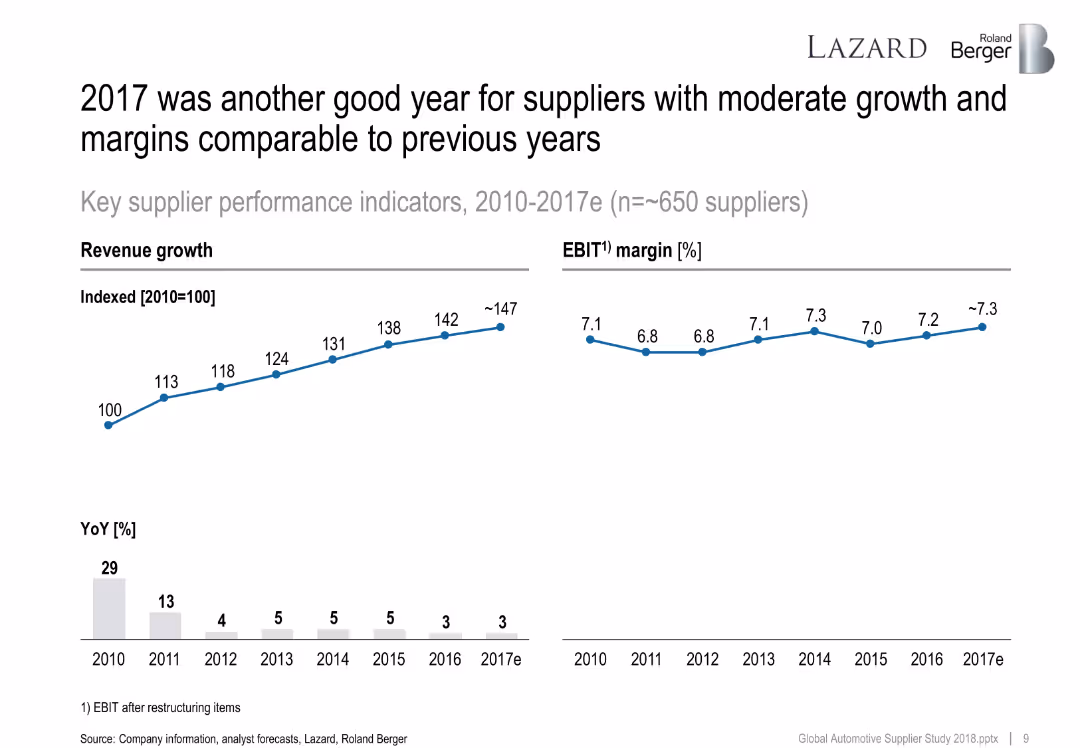
Line chart showing revenue growth index (2010–2017e) and EBIT margin. Below, a bar chart tracks year-over-year revenue growth percentages.
Financial Performance
Industrial & Manufacturing
The slide presents consistent revenue and margin performance for suppliers from 2010 to 2017e. EBIT margins remain stable while revenue index shows progressive growth, despite slight YoY slowdown.
revenue growth, EBIT, automotive suppliers, KPI, YoY, 2017, Roland Berger
Multiple Chart
Roland Berger
Saved
Slide features a diagram illustrating the overlap of Financial, Operational, and Commercial aspects within a common data platform, using a simple, clear design.
Investment Analysis
Professional Services
Describes A&M's integrated diligence process, illustrating how different aspects such as Financial, Operational, and Commercial are combined to guide investment and underwriting processes.
Integrated, Diligence, Financial, Operational, Commercial
Diagram
Alvarez & Marsal
Saved
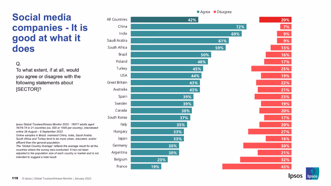
Similar chart format showing agreement/disagreement on performance of social media companies globally.
Product and Service Analysis
Technology & Software
This slide shows public agreement with the competence of social media companies. While emerging markets show strong belief in performance, Western nations like France and Belgium express more skepticism.
social media, performance, public perception, global opinion, Ipsos survey, competence, tech industry, country comparison
Mixed Chart
IPSOS
Saved
A slide with three columns: "Choose your health insurance," "Protect your human capital," and "Make the most of your equity awards." Each column contains a checklist with brief explanations.
Human Resources and Talent Management
Financial Services
The slide provides a checklist for selecting health insurance, protecting human capital, and maximizing equity awards, aimed at helping employees understand and manage their workplace benefits.
health insurance, human capital, equity awards, checklist, benefits
Pillar
UBS
Saved
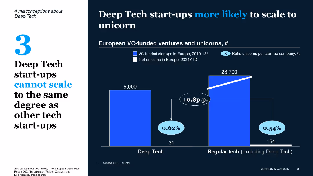
Dual-panel bar chart with bold contrast layout, white-on-dark theme, left-side callout with misconception number
Market Analysis and Trends
Technology & Software
The slide debunks the myth that Deep Tech start-ups can't scale, showing they have a slightly higher chance (0.62%) of becoming unicorns compared to regular tech (0.54%) based on VC-funded ventures and unicorn counts in Europe.
Deep Tech, unicorn, scalability, VC funding, Europe, start-ups, market analysis
Single Chart
McKinsey
Saved
The slide uses a combination of text and pie charts, with a focus on survey results. It is moderately dense, featuring textual analysis on the left and charts on the right.
Human Resources and Talent Management
Government & Public Sector
Discusses how governing workforce strategies apply to public services, emphasizing the need for new questions to leverage predictive analytics for decision-making.
workforce, analytics, public sector, strategy, decision-making, survey results, internal changes, external changes
Multiple Chart
Deloitte
Saved
The slide shows a column chart with features like detailed product descriptions, size calculators, and 360° views that shoppers find helpful for avoiding returns.
Customer and Market Segmentation
Retail & E-commerce
Identifies features that online shoppers consider helpful to prevent returns, such as detailed product descriptions, size calculators, and various product viewing options.
Helpful features, Online shopping, Product selection, Size calculator, 360° view
Mixed Chart
Roland Berger
Saved
Slide features image-focused layout discussing the importance of personalization in consumer interactions, with a timeline of increasing trend relevance.
Product and Service Analysis
Retail & E-commerce
Analyzes how personalization in digital spaces is shaping consumer experiences, appealing strongly to Gen X and Millennials.
personalization, consumer experiences, Gen X, Millennials, digital
Multiple Chart
Bain
Saved
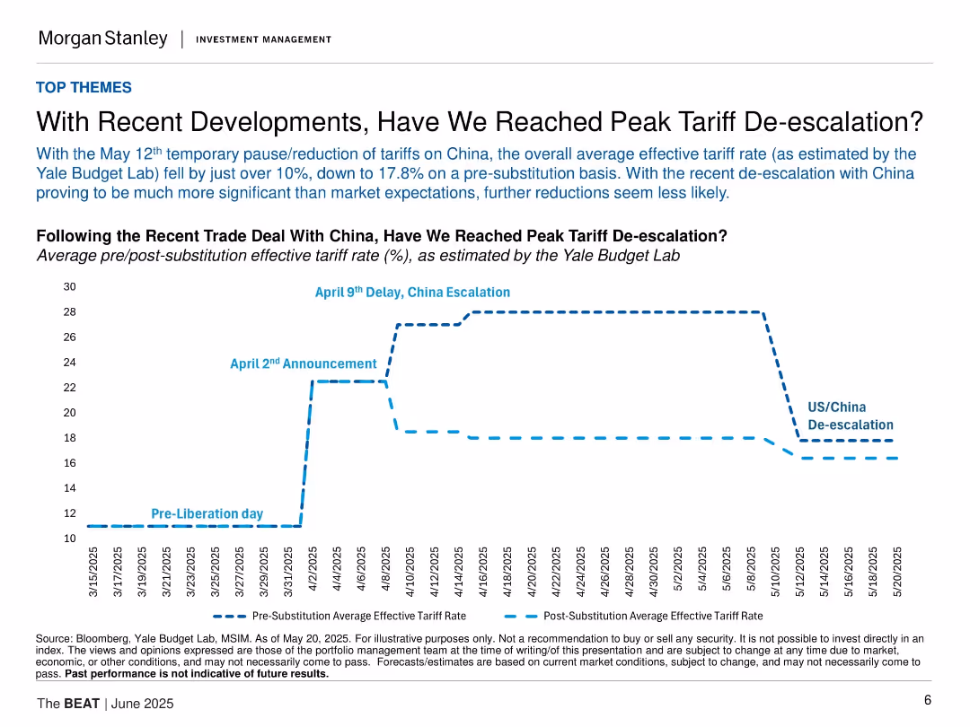
Time-series line chart tracking average tariff rates before and after recent US/China trade developments; vertical event markers show major dates; clear progression of data.
Regulatory and Compliance
Government & Public Sector
Analyzes effective tariff rate changes due to recent U.S.-China trade developments. With de-escalation events in May 2025, tariffs dropped to 17.8%, possibly marking peak de-escalation. The chart provides a timeline of trade-related announcements and their impacts.
tariffs, trade policy, China, de-escalation, economic impact
Single Chart
Morgan Stanley
Saved
Features texts and percentages in a borderless table comparing global and Ukrainian responses to skill-based management initiatives. The slide uses contrasting colors to distinguish between geographical responses and effectively presents comparative data.
Technology and Digital Transformation
Technology & Software
Analyzes the adoption of skill-based management practices globally and in Ukraine, emphasizing the transition in job structure and the barriers to implementing these changes.
skill-based management, global trends, Ukraine, job structure, organizational change
Table
Deloitte
Saved
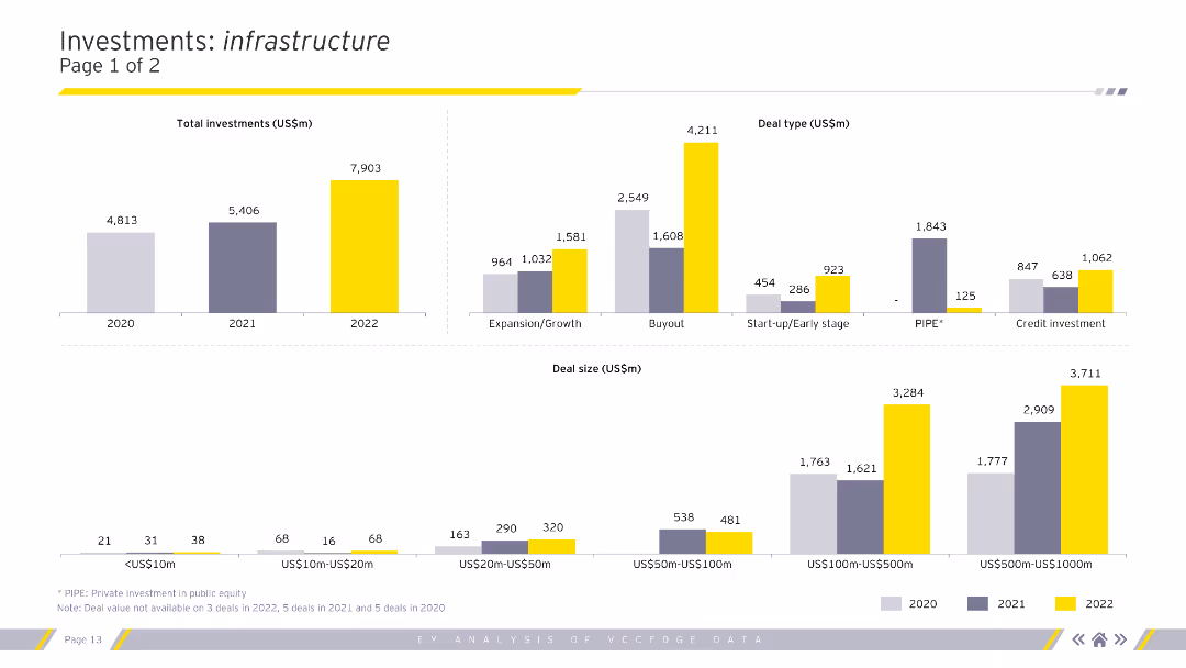
Column charts showing total investments, deal types, and deal sizes in the infrastructure sector for 2020-2022.
Market Analysis and Trends
Real Estate & Construction
Analysis of investment types, sizes, and segments within the infrastructure sector.
infrastructure, investments, deal types, deal sizes, analysis
Multiple Chart
EY
Saved
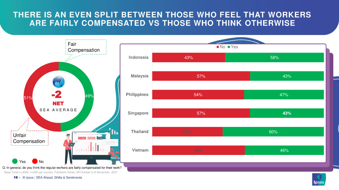
Circle chart and bar charts depicting perceptions of worker compensation fairness in SEA countries.
Market Analysis and Trends
Financial Services
The slide indicates a split perception among respondents regarding the fairness of worker compensation in SEA countries.
worker compensation, fairness, SEA, bar chart, perceptions
Multiple Chart
IPSOS
Saved
This slide features an abstract design with bright lines connecting various aircraft, reflecting a network or system. The image occupies the entire slide, with a red title bar at the top for contrast.
Strategic Planning
Government & Public Sector
The visual suggests strategic connections within the defense network, suitable for presentations focusing on strategic planning within the defense sector or for illustrating integrated defense systems.
Strategy, Defense, Aircraft, System, Network, Integration
Text Only
PwC/Strategy&
Saved
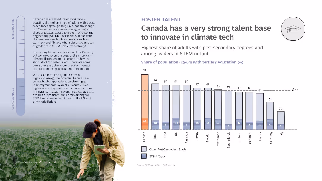
The slide features a column chart comparing tertiary education levels in various countries. It includes a photo of a person in a field, a strengths and challenges bar, and detailed text discussing Canada's educational strengths.
Human Resources and Talent Management
Education & Training
Discusses Canada's strong educational base for climate tech innovation, highlighting high post-secondary education rates and STEM graduates. Includes challenges in immigration rates and talent retention.
Talent, Innovation, Climate tech, Education, Canada
Mixed Chart
BCG
Saved
Charts showing the maturity level distribution across various industries.
Technology and Digital Transformation
Media & Entertainment
Analyzes the distribution of maturity levels within industries like retail, consumer goods, and telco.
industry, maturity, distribution, retail, CPG, telco
Multiple Chart
BCG
Saved
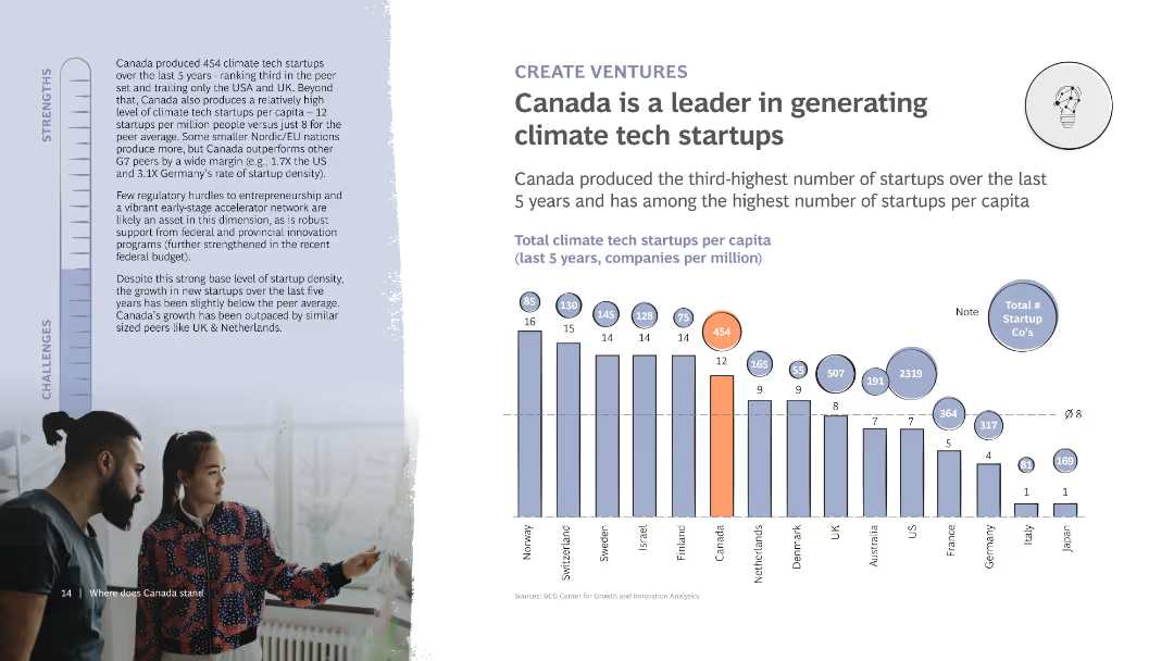
The slide includes a column chart showing the number of climate tech startups per capita in various countries. It also features detailed text discussing Canada’s startup ecosystem and its strengths and challenges, with a photo of two people collaborating.
Market Analysis and Trends
Technology & Software
Highlights Canada's leadership in generating climate tech startups, showing it ranks high in startups per capita. Discusses the supportive ecosystem and challenges in maintaining growth and innovation in the sector.
Startups, Climate tech, Canada, Innovation, Ecosystem
Mixed Chart
BCG
Saved
The slide features bar charts showing risks and opportunities percentages. Text boxes detail risks and opportunities, and a summary box highlights key takeaways.
Market Analysis and Trends
Industrial & Manufacturing
It shows survey results indicating a lower perceived need for repositioning in industrial services and IT functions due to digitalization, focusing on R&D and innovation.
Digitalization, industrial services, IT, risks, opportunities, R&D, innovation
Multiple Chart
Roland Berger
Saved
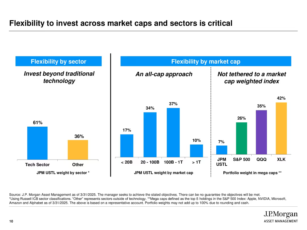
Slide is split into three vertical bar chart sections with labeled headings and blue dividers. Colors differentiate sectors and index groups (blue, orange, purple, green). Includes labels and percentages above each bar. Source notes and disclaimers appear at the bottom.
Strategic Planning
Financial Services
The slide illustrates J.P. Morgan’s diversified investment approach by showcasing flexibility in sector and market cap allocations. It emphasizes not being limited to traditional tech sectors or market-cap-weighted indices. The three sections show allocation by sector (tech vs. others), by market cap, and comparison of mega cap weightings across indices.
diversification, market cap, tech sector, investment strategy, J.P. Morgan, flexibility, portfolio allocation, index comparison, mega caps, strategic planning
Multiple Chart
JP Morgan
Saved
The slide includes a diagram of the Canadian grain supply chain, detailing the stages from harvest to port, along with key statistics and logistical information.
Operational Efficiency
Transportation & Logistics
The slide provides a detailed overview of Canada's grain supply chain, highlighting the long transport distances and the efficiency of its port infrastructure.
Supply chain, logistics, Canada, transport distances, port infrastructure, grain export, harvest, storage, transportation, efficiency
Graphic
LEK
Saved
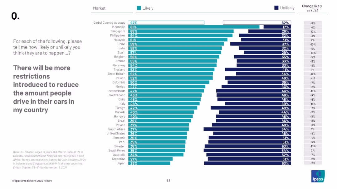
Bar chart with countries listed on the Y-axis; Likely (green) and Unlikely (blue) horizontal bars; change vs. 2023 shown on right. Clean, minimalist layout with sans-serif font.
Market Analysis and Trends
Environmental Services & Sustainability
The slide compares public perceptions across countries on the likelihood of more car-use restrictions being introduced. Indonesia leads with the highest belief in restrictions, while Japan and Argentina show the lowest. The slide tracks shifts from 2023 to 2024.
restrictions, car usage, sustainability, global comparison, public opinion, climate, 2025 forecast, transport policy, Ipsos, perception shift
Mixed Chart
IPSOS
Saved
Similar to the previous slide, this one presents data for Great Britain, showing the mean estimate of CO2 emissions from a beef burger and the percentage of respondents who couldn't estimate the distance.
Market Analysis and Trends
Environmental Services & Sustainability
This slide focuses on the British respondents' awareness of the carbon footprint of beef burgers, highlighting that 83% couldn't estimate the distance, with an average estimate of 24 miles.
Carbon footprint, beef burger, emissions, Great Britain, public perception
Mixed Chart
IPSOS
Saved
The slide shows a column chart under the title "Family law application breakdown, ('000) 2016-17". It contains a legend explaining the colors representing different types of applications for FCC and FCoA. At the bottom, the source is referenced as PwC with the date of April 2018.
Regulatory and Compliance
Government & Public Sector
The slide analyzes different types of family law applications and their distribution between FCC and FCoA, with emphasis on the caseload and order types processed by each court. The column chart illustrates the predominance of divorce applications in the FCC and consent orders in the FCoA.
family law, caseload, applications, orders, FCC, FCoA, column chart, PwC, analysis
Mixed Chart
PwC/Strategy&
Saved
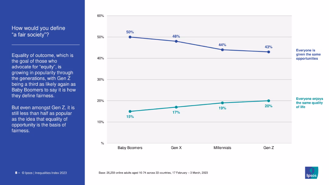
Dual-line chart comparing definitions: “same opportunity” vs. “same quality of life.” Left-aligned narrative and title.
Market Analysis and Trends
Government & Public Sector
The slide contrasts generational views on fairness. While most still define fairness as equal opportunity, support for equal outcome is rising, especially among Gen Z, who show the highest support for equity.
fairness, equity, opportunity, Gen Z, definitions, values
Mixed Chart
IPSOS
Saved
This slide features two column layout with labels "Top 5" and "Top 3" and text blocks explaining targets for 2025 and 2030 in terms of GW. A map of Chile highlights northern and southern hydrogen valleys.
Industry Overview
Energy & Utilities
The slide outlines Chile's aspirations to be among the top global producers and exporters of green hydrogen by 2025 and 2030, with specific GW capacity targets. Also indicates geographic areas of development.
Chile, hydrogen, exporters, 2025, 2030
Graphic
McKinsey
Saved
Features a horizontal bar graph in purple shades, analyzing the impact of technology on various underwriting activities.
Technology and Digital Transformation
Financial Services
Assesses how technological changes have impacted underwriting performance across several dimensions.
technology, underwriting, performance, impact, analysis
Single Chart
Accenture
Saved
Previous
Next
If nothing, comes up, please save your slides first
Create a FREE account to continue browsing
Receive Instant Access to 1,000+ slides from companies like McKinsey, Google, and Goldman Sachs
First Name
Last Name
Email
Password
I agree to all
Terms & Privacy Policy
Thank you! Your submission has been received!
Oops! Something went wrong while submitting the form.
Have an account?
Sign in
Column Chart
Heatmap
Chevron
Org Chart
Infographic
Callouts
Timeline
List
Graphic
Picture
Process Flow
Diagram
Paragraph
Map
Table
Framework
Subtitle
Takeaway Box
Icon
Other Chart
Radar Chart
Waterfall Chart
Mekko Chart
Pie Chart
Scatter Plot
Line Chart
Bar chart
Bullet points