Create a FREE Account
Instant access to 1,000+ real slides from top companies like McKinsey, BCG, Goldman Sachs, Google and many more!
First Name
Last Name
Email
Password
I agree to all
Terms & Privacy Policy
Thank you! Your submission has been received!
Oops! Something went wrong while submitting the form.
Have an account?
Sign in
Library
Templates
Courses
Pricing
My Account
My Slides
My Templates
✦ AI
AI Prompt Library
AI Search
Sign in
Start Here
Logout
My Saved Slides
Bar chart ranking countries by LTC workers per 100 people aged 65+; side text outlines causes for variation and key challenges in care employment.
Human Resources and Talent Management
Healthcare & Pharmaceuticals
This slide highlights the low number of LTC workers relative to aging populations in most countries, with wide variations. It points to systemic employment challenges, including low pay, high turnover, and insufficient professional training.
LTC workforce shortage, care worker density, aging population, eldercare employment, international comparison, labor market
Mixed Chart
Roland Berger
Saved
This slide features a line chart showing the historical Brent prices and future estimates with a sunset backdrop of oil tankers at sea. The visual complexity is moderate, with clear graph lines and color contrasts for readability.
Market Analysis and Trends
Energy & Utilities
The slide discusses the short-term increase in Brent futures due to COVID-19 vaccination programs and OPEC+ actions. It highlights the ongoing scrutiny on vaccine distribution, mobility patterns, and OPEC+ actions affecting oil demand.
Brent futures, OPEC+, COVID-19, oil demand, vaccine
Mixed Chart
EY
Saved
The slide contains column chart, tables, and a bullet-pointed textual analysis. It uses shades of green for the bars and a mix of bold and standard text for emphasis.
Regulatory and Compliance
Financial Services
Displaying the escalating costs of compliance, the slide breaks down expenditures into regulatory project and routine compliance costs, alongside an analysis of historical spending trends.
Compliance, Regulatory, Cost, Analysis, Trend
Mixed Chart
Morgan Stanley
Saved
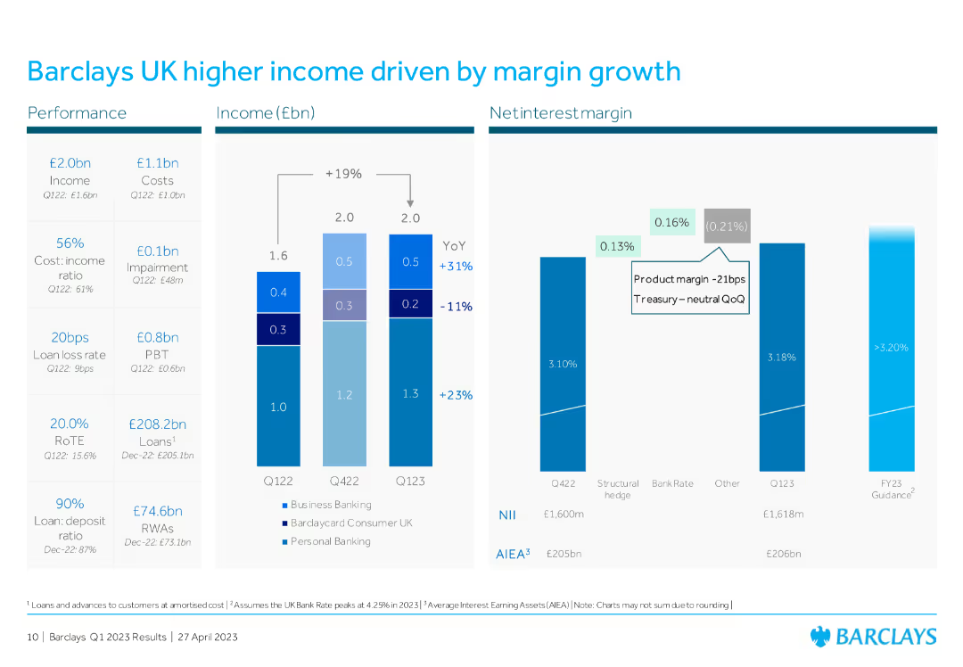
Two vertical bar charts with supporting bullet points and line charts on delinquencies and arrears
Risk Assessment and Management
Financial Services
Demonstrates disciplined credit card portfolio growth in the UK and US, with stable delinquency rates, strong FICO score distribution, and clear risk metrics like stage 2 coverage and net loans & advances.
credit cards, delinquencies, risk, UK, US, FICO
Multiple Chart
Barclays
Saved
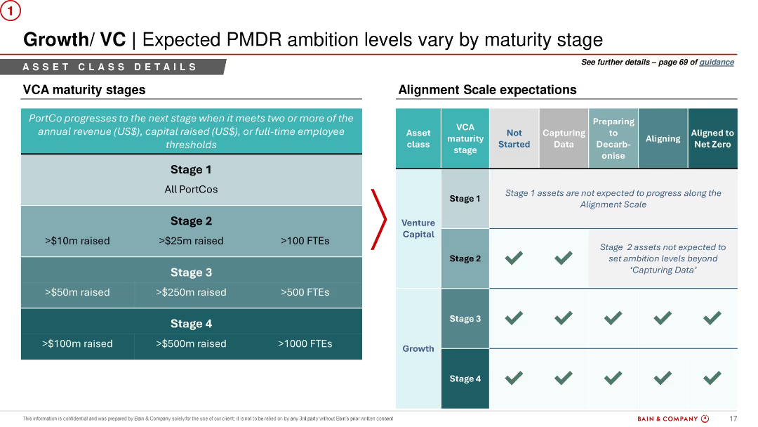
Four vertical columns with dark blue circular icons and titles. Bullet points in each section. White background with light blue headings. Visual separation between segments.
Risk Assessment and Management
Financial Services
This slide summarizes the key findings from the 2023 EBA stress test. It outlines capital depletion impacts, banks’ resilience, country-specific insights, and upcoming stress test initiatives like cyber and climate stress. Emphasis is placed on capital flexibility and potential for dividends and buybacks.
EBA, stress test, CET1, capital depletion, resilience, country impact, ECB, 2023 results
Pillar
Alvarez & Marsal
Saved
Dual bar chart layout with top section showing annual median values (2009–2024), and bottom comparing 2024 vs 10-year medians across infrastructure and transport sectors.
Investment Analysis
Transportation & Logistics
The slide analyzes historical and current value/sales multiples in transport and logistics sectors, with 2024 showing peaks in airport and road infrastructure. It highlights sector-level variations in valuation trends over time, emphasizing notable outliers and medians.
valuation, multiples, infrastructure, logistics, trucking, air, rail, shipping, median, PwC
Multiple Chart
PwC/Strategy&
Saved
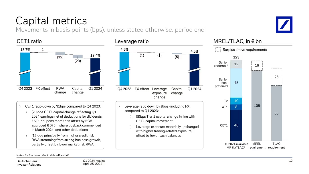
Comprising pie charts and column charts showing movements in asset and liability balances, this slide is organized to facilitate easy comprehension of complex financial data.
Financial Performance
Financial Services
Provides insights into Level 3 assets and liabilities, indicating the valuation and risk associated with unobservable assets, crucial for financial risk assessment and investment decision-making.
financial assets, liabilities, risk assessment, valuation
Multiple Chart
Deutsche Bank
Saved
The slide features a column chart showing the likelihood of avoiding products with a lot of packaging across various markets. It uses two colors to indicate "Likely" and "Unlikely." The text includes a question and survey details.
Market Analysis and Trends
Environmental Services & Sustainability
The slide presents survey data on the likelihood of avoiding products with excessive packaging, comparing responses across different global markets.
packaging, avoidance, likelihood, survey, environmental impact
Multiple Chart
IPSOS
Saved
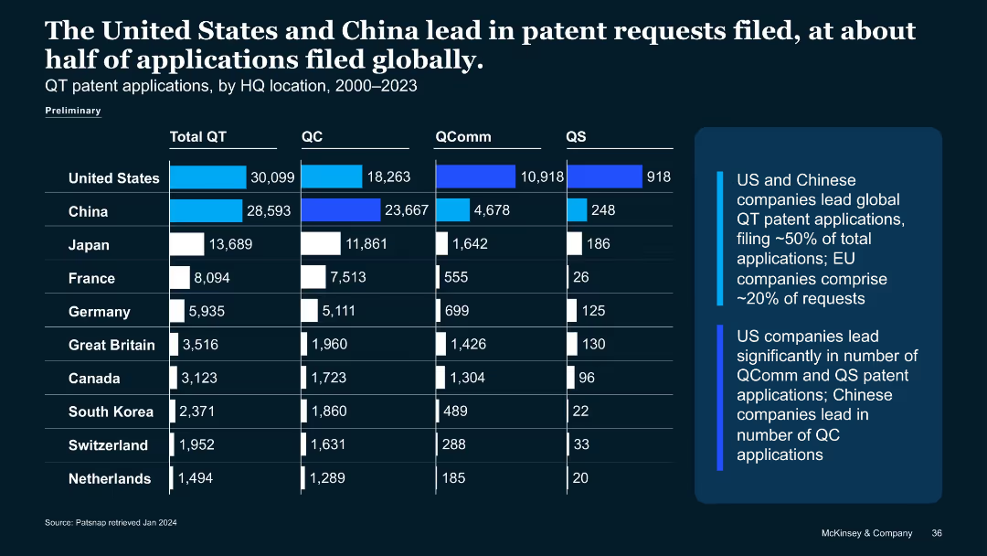
Tabular format with rankings by deal size, country, tech, and funding type
Financial Performance
Artificial Intelligence
Lists top ten QT VC/PE deals in 2023. Only five exceeded $50M. Includes information on country, segment, and deal type. Highlights QT investment concentration in QC hardware and software across France, UK, Australia, and Germany.
VC funding, QT deals, top startups, 2023 investments, hardware focus
Table
McKinsey
Saved
The slide presents a column chart showing the difficulty levels marketers face with various audience data elements like data access and GDPR compliance.
Market Analysis and Trends
Professional Services
This slide details the challenges marketers encounter with audience data, such as data access and GDPR compliance, highlighting areas that need improvement.
audience data, challenges, marketers, data access, GDPR compliance
Mixed Chart
Nielsen
Saved
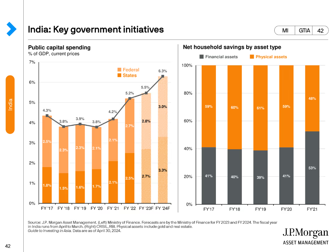
A stacked bar chart showing the percentage of total merchandise exports by type for various countries, and a column chart showing commodity exports by type in USD billions.
Market Analysis and Trends
Financial Services
The slide categorizes merchandise exports by type across different countries and details the value of commodity exports by type.
merchandise exports, export types, commodities, countries, economic analysis, trade, financial insights, export values, financial trends, development
Multiple Chart
JP Morgan
Saved
Includes stacked column charts and a table detailing credit losses and loan stages across different banking sectors.
Risk Assessment and Management
Financial Services
The slide focuses on credit loss provisions and the categorization of loans in different stages for various banking sectors, providing essential information for risk assessment and financial stability analysis. It is especially useful for credit analysts and financial risk managers looking at credit quality, risk exposure, and the effectiveness of credit management strategies within the banking industry.
Credit Risk, Loan Stages, Banking Sectors, Risk Management, Financial Stability
Multiple Chart
Deutsche Bank
Saved
A world map marked with various investment locations, accompanied by logos representing different sectors such as private equity and real estate.
Investment Analysis
Financial Services
Elucidates on the diversity and scope of the company's alternative investment platform, indicating different sectors and regions involved in the investment strategy.
Alternative investments, private equity, real estate, global
Graphic
Goldman Sachs
Saved
Two maps of Malaysia show the digital participation levels across regions in green shades for demand and blue shades for supply. There is no graph or chart, just color-coded regional data.
Competitive Landscape
Technology & Software
It contrasts digital e-commerce demand and supply in Malaysia, with Kuala Lumpur leading in participation. The slide could be used to identify market gaps and areas of potential growth, valuable for regional market analysis and strategic planning.
E-commerce, Malaysia, Digital Participation, Kuala Lumpur, Demand, Supply
Multiple Chart
Bain
Saved
A bar chart showing potential reach of the TV screen by source for different age groups, with a focus on AVOD reach and its incremental gain.
Market Analysis and Trends
Media & Entertainment
The slide highlights that AVOD content has the greatest reach potential among younger viewers, showing significant incremental gains in audience reach.
AVOD, reach, potential, younger viewers, incremental gain
Multiple Chart
Nielsen
Saved
The slide contains a column chart showing the average time required from incorporation to market for various deep tech categories. Each category is represented with different colored columns indicating the stages from incorporation to prototype to market.
Technology and Digital Transformation
Technology & Software
This slide presents data on the time needed for different deep tech categories to go from incorporation to market. Categories include Biotech, Advanced Material, Photonics & Electronics, AI, Drones & Robotics, and Blockchain.
Deep Tech, Time to Market, Biotech, AI, Robotics, Blockchain
Single Chart
BCG
Saved
This slide features a flow diagram depicting the distribution between tax revenue and non-tax revenue, and different types of tax revenues (customs & excise, VAT, individual income tax, corporate income tax, other taxes). Uses contrasting colors for clarity. The layout is straightforward, taking central focus surrounded by explanatory text.
Financial Performance
Government & Public Sector
The slide provides an overview of Namibia's tax revenue sources for the fiscal year 2021/22, highlighting the proportion of tax vs. non-tax revenue and the breakdown of different tax types. This visualization aids in understanding the government's main revenue sources and their proportions, which is essential for stakeholders analyzing fiscal policies or the economic situation of the region.
budget, tax revenue, fiscal policy, Namibia, VAT
Vertical Flow
PwC/Strategy&
Saved
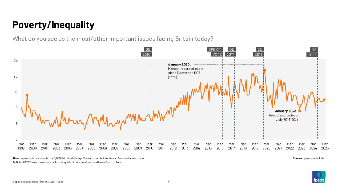
Bar chart comparing percentage of people in 29 countries describing the economy as "Good" vs "Bad", with annotations.
Market Analysis and Trends
Financial Services
This slide visualizes global public sentiment about the current economic situation, showing a 36% global average rating of "good". Singapore, India, and Indonesia lead in optimism, while Japan and Argentina have the lowest. Commentary highlights regional trends and month-over-month changes.
economic sentiment, global comparison, Ipsos, economic perception, survey, bar chart, economic optimism, Asia-Pacific, country ranking, economic trends
Mixed Chart
IPSOS
Saved
This slide includes a title, column charts contrasting the number of cases finalised per FTE in FCoA and FCC, and a sidebar explaining differences in judicial output.
Regulatory and Compliance
Government & Public Sector
The slide details the differences in case finalisation per FTE between FCoA and FCC, with a focus on the lower finalisation rate in FCoA despite its higher number of non-judicial staff, pointing to differences in case complexity.
judicial efficiency, FCoA, FCC, finalisation rate, full-time equivalent, case complexity
Multiple Chart
PwC/Strategy&
Saved
Line graph of raw material prices (2017–2022); change percentages annotated
Pricing Strategies
Energy & Utilities
Raw material prices for batteries surged post-COVID, with lithium carbonate and hydroxide increasing over 500%. The slide emphasizes price volatility due to delayed capacity expansion and recovery-driven demand.
battery materials, lithium prices, COVID impact, cobalt, nickel, price spike
Mixed Chart
Roland Berger
Saved
Bar chart displaying three responses: "Should increase", "Should keep at current level", and "Should lower", alongside change from previous year.
Strategic Planning
Government & Public Sector
The slide surveys public opinion on whether governments should increase infrastructure spending. A clear majority globally support increased investment (63% avg), with especially high support in Peru and South Africa. A few countries (e.g., Switzerland) show less enthusiasm for increases.
infrastructure, public investment, roads, broadband, electricity, planning, government, survey
Mixed Chart
IPSOS
Saved
A comparative chart illustrates sector shares between venture capital investing and equity market capitalisation. The visual elements highlight the disproportionate share attracted by the technology sector.
Investment Analysis
Technology & Software
This slide offers a comparative analysis between the venture investing and equity market capitalization across various sectors from 2013 to 2017. It underscores the technology sector's ability to attract a larger share of venture investments relative to its market capitalization, suggesting a higher investment activity within the sector.
venture capital, technology sector, market share, investment, equity capitalization
Mixed Chart
Oliver Wyman
Saved
The slide showcases column charts and percentages reflecting diversity within the company. The design includes a clean layout with blue tones, and strategic use of white space that aids in focusing on the data presented.
Human Resources and Talent Management
Financial Services
The content emphasizes the strategic importance of diversity within the company, presenting data on gender and ethnic diversity and trends over time. It is likely used to communicate the company's commitment to inclusive practices.
diversity, inclusion, gender, ethnicity, trends, bar graphs, strategic importance
Multiple Chart
Goldman Sachs
Saved
Features a detailed process flow diagram of the H₂ value chain, highlighting upstream, midstream, and downstream opportunities for carbon fiber vessels.
Strategic Planning
Industrial & Manufacturing
The slide identifies strategic opportunities for carbon fiber vessels within the H₂ value chain, covering storage, transportation, and end-use markets.
H₂, Carbon Fiber Vessels, Value Chain, Opportunities, Storage
Linear Flow
Roland Berger
Saved
This slide includes pie charts for 2019, 2020, and 2021 showing the distribution of podcast ad revenue by pricing model, particularly focusing on CPM (Cost per Thousand).
Financial Performance
Media & Entertainment
Analyzes the trend towards CPM pricing models in podcasting, aligning it with other digital media practices.
Podcast, CPM, Pricing, Trends
Multiple Chart
PwC/Strategy&
Saved
Previous
Next
If nothing, comes up, please save your slides first
Create a FREE account to continue browsing
Receive Instant Access to 1,000+ slides from companies like McKinsey, Google, and Goldman Sachs
First Name
Last Name
Email
Password
I agree to all
Terms & Privacy Policy
Thank you! Your submission has been received!
Oops! Something went wrong while submitting the form.
Have an account?
Sign in
Column Chart
Heatmap
Chevron
Org Chart
Infographic
Callouts
Timeline
List
Graphic
Picture
Process Flow
Diagram
Paragraph
Map
Table
Framework
Subtitle
Takeaway Box
Icon
Other Chart
Radar Chart
Waterfall Chart
Mekko Chart
Pie Chart
Scatter Plot
Line Chart
Bar chart
Bullet points