Create a FREE Account
Instant access to 1,000+ real slides from top companies like McKinsey, BCG, Goldman Sachs, Google and many more!
First Name
Last Name
Email
Password
I agree to all
Terms & Privacy Policy
Thank you! Your submission has been received!
Oops! Something went wrong while submitting the form.
Have an account?
Sign in
Library
Templates
Courses
Pricing
My Account
My Slides
My Templates
✦ AI
AI Prompt Library
AI Search
Sign in
Start Here
Logout
My Saved Slides
Detailed with column chart and table explanations, the slide offers a comparison of banking and market revenues. Colored columns represent different financial segments, providing a visual breakup of data for clear analysis.
Market Analysis and Trends
Financial Services
The slide analyzes global banking and market revenues, providing insights into areas like investment banking and equities. It’s used to discuss performance drivers and strategic business decisions with stakeholders familiar with financial markets.
global banking, market revenues, investment banking, equities, financial analysis
Mixed Chart
Goldman Sachs
Saved
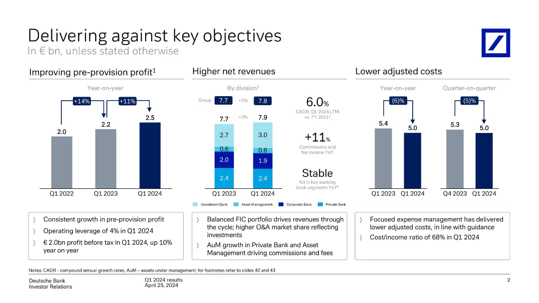
Three-part layout: bar charts for pre-provision profit, net revenue by division, and adjusted costs. Color-coded by segment with highlights below.
Performance Metrics and KPIs
Financial Services
Shows year-on-year improvement in pre-provision profit (+11%), stable revenue (+1%), and decreased costs (-6%). Emphasizes operating leverage, cost/income ratio, and revenue growth from balanced business model.
revenue, costs, profit, KPIs, business units, growth
Multiple Chart
Deutsche Bank
Saved
Features a column chart displaying coastal shipping volumes for clinker and cement, along with a map highlighting major shipping routes in Australia.
Market Analysis and Trends
Transportation & Logistics
Analyzes the growth of coastal shipping for cement and clinker in Australia. Discusses the impact of cabotage costs and identifies key shipping routes and distribution centers.
Coastal shipping, cement, clinker, cabotage, Australia
Mixed Chart
LEK
Saved
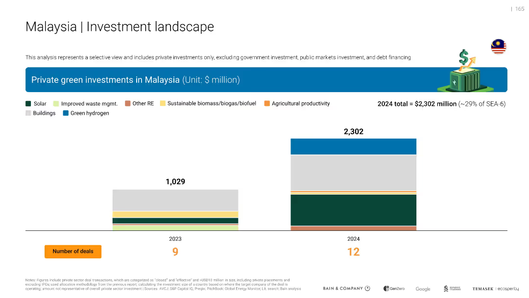
Stacked bar charts (2023 vs 2024) of green investment types with legend and total values
Financial Performance
Environmental Services & Sustainability
Malaysia saw green investment more than double, reaching $2.3B in 2024. Major contributions from solar, building efficiency, and green hydrogen. Deal count also rose from 9 to 12.
solar, efficiency
Single Chart
Bain
Saved
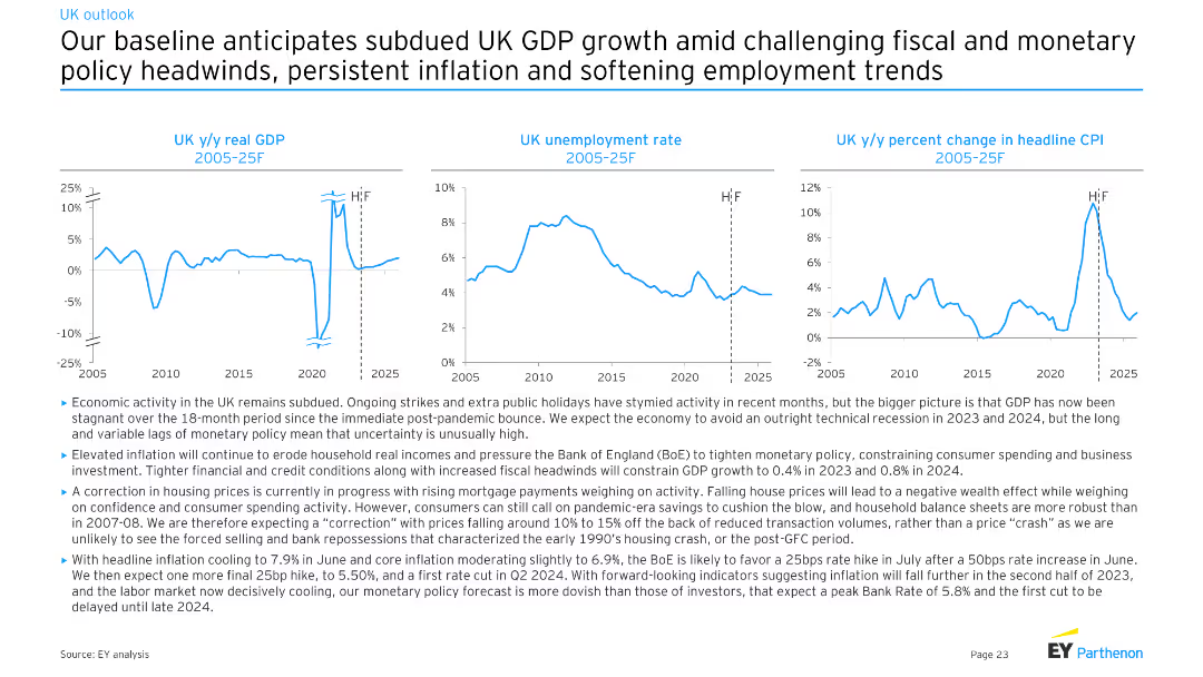
Three line charts depicting UK y/y real GDP, UK unemployment rate, and UK y/y percent change in headline CPI from 2005-25F. Moderate complexity with clear visual representations for economic trends analysis.
Market Analysis and Trends
Financial Services
The slide provides an economic forecast for the UK, projecting subdued GDP growth, persistent inflation, and softening employment trends. It discusses the effects of fiscal and monetary policies, as well as ongoing strikes and public holidays on economic activity.
UK, GDP, unemployment, CPI, forecast
Multiple Chart
EY
Saved
This slide showcases comparative data through multiple donut charts, illustrating disparities in digital product ownership and service subscriptions between higher and lower income households.
Market Analysis and Trends
Technology & Software
Examines the digital divide by comparing access to technology and subscription services in different income brackets. Useful in discussions on socio-economic disparities and digital inclusion.
digital divide, income disparity, technology access, subscription services, socio-economic status, market analysis, consumer behavior, digital inclusion, accessibility, demographics
Multiple Chart
Deloitte
Saved
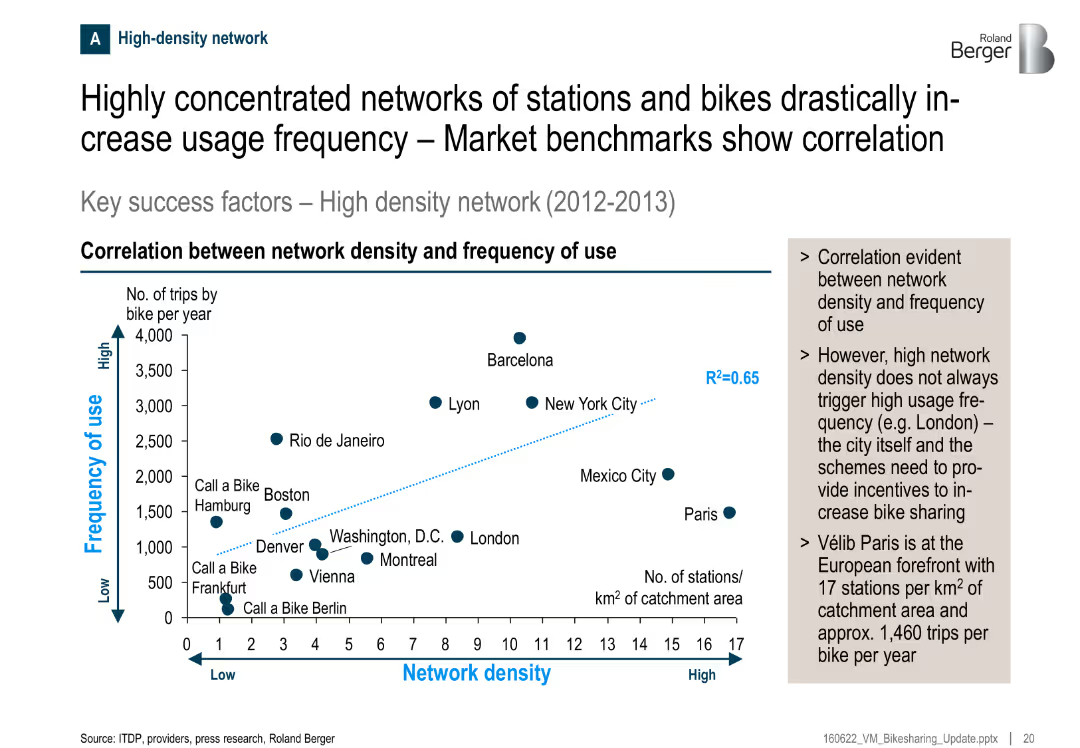
Scatter plot showing correlation between station density and usage frequency; key observations summarized in side box
Performance Metrics and KPIs
Transportation & Logistics
There’s a clear correlation between the density of bike stations and the frequency of use. Cities like Barcelona and New York show high use with dense networks. Paris, despite high density, shows moderate usage, suggesting incentives matter too.
bike sharing, usage frequency, network density, correlation, transportation, Paris, KPIs, stations
Mixed Chart
Roland Berger
Saved
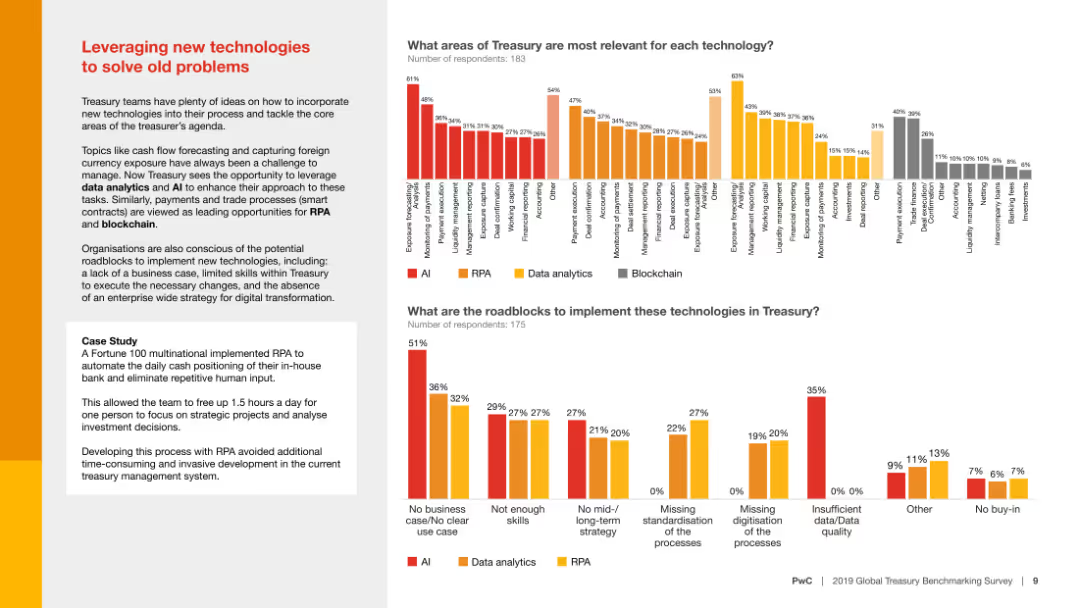
Column charts comparing areas of treasury relevance and roadblocks for implementing technologies like AI, RPA, and data analytics, with a case study example included.
Technology and Digital Transformation
Financial Services
The slide analyzes how new technologies can solve traditional treasury problems, highlighting the relevance of different technologies and potential implementation roadblocks.
New technologies, treasury, AI, RPA, data analytics
Multiple Chart
PwC/Strategy&
Saved
This slide features a dual bar chart comparing consumer priorities over the last twelve months, focusing on product quality, service, and price, among others. The layout is well-organized with labels, percentage values, and a color differentiation for easier comparison. The side panel includes additional insights that contextualize the data presented.
Product and Service Analysis
Professional Services
Analyzing consumer priorities, this slide shows a shift towards product quality over other aspects like service or price. It highlights the changing consumer behavior post-pandemic, with data segmented from a recent survey. Useful for marketing teams to strategize product development and customer service improvements, adapting to consumer trends.
consumer behavior, product quality, service, price, priorities
Mixed Chart
Deloitte
Saved
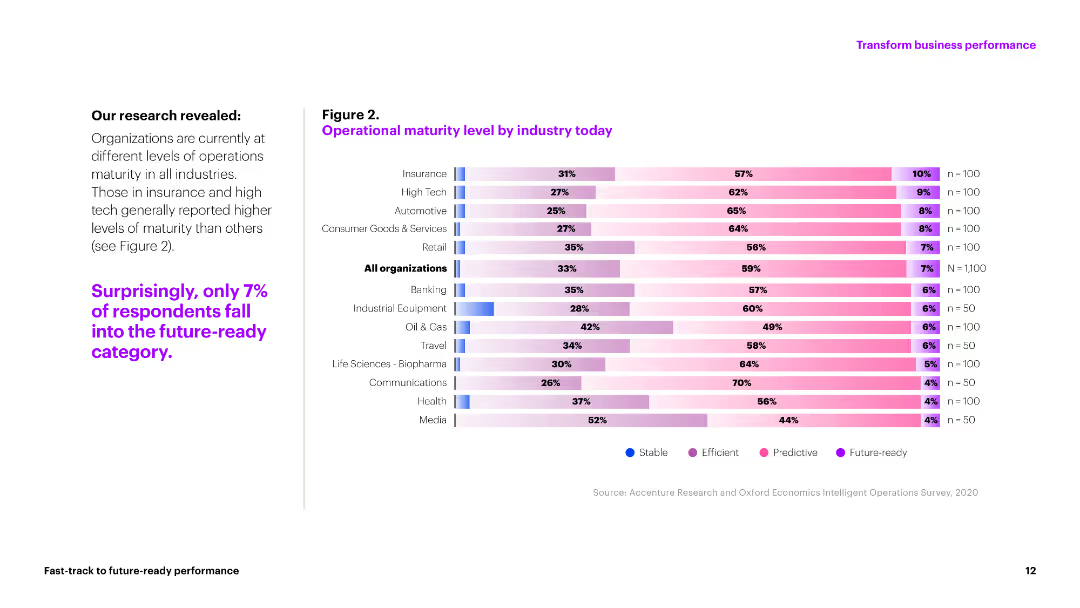
A column chart showing operational maturity levels across various industries, with detailed text explanations.
Market Analysis and Trends
Technology & Software
This slide presents data on the operational maturity levels of different industries, indicating areas of stability, efficiency, and readiness.
operational maturity, industry analysis, stability, efficiency, future-ready
Mixed Chart
Accenture
Saved
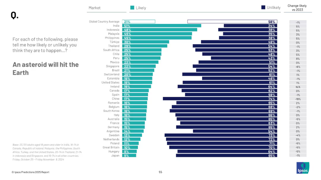
Bar chart by country; uses teal and navy bars to represent likely/unlikely; legend and changes from 2023 on right
Risk Assessment and Management
Environmental Services & Sustainability
This slide highlights global beliefs about the chance of an asteroid impact on Earth. It compares perceived likelihood across countries, with average trends and year-over-year changes.
asteroid impact, global fears, natural disaster, public sentiment, 2025, survey, likelihood, Ipsos
Mixed Chart
IPSOS
Saved
The slide displays a large column chart for net profit contribution over time and a donut chart for net operating income composition. It is clean and well-organized, with a white background and the Macquarie logo at the bottom left.
Financial Performance
Financial Services
Providing a financial performance review, this slide depicts the net profit contribution and net operating income sources for the commodities and global markets division. The visual data demonstrates the division's financial trajectory and income distribution across different areas.
net profit contribution, operating income, commodities, global markets, financial review, chart
Multiple Chart
Morgan Stanley
Saved
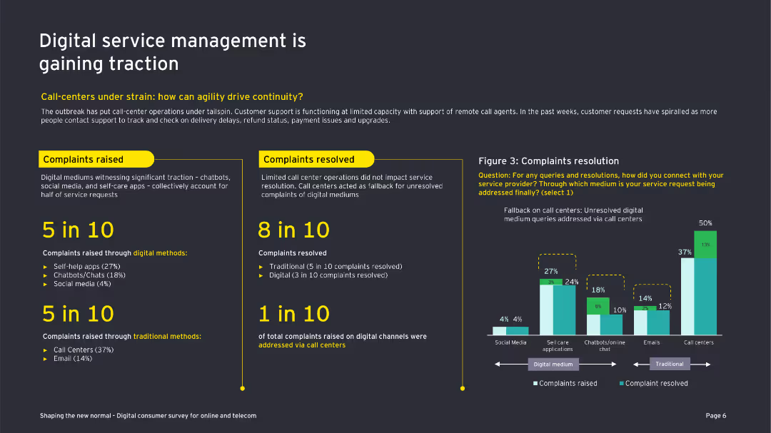
This slide features a combination of text and a column chart showing complaint resolution data. The design is detailed with clear segmentation.
Market Analysis and Trends
Telecommunications
The slide discusses the increasing importance of digital service management in the telecom sector, focusing on customer complaints and resolutions.
digital service, customer support, complaints, resolutions, telecom, COVID-19, call centers, digital channels, self-care applications
Mixed Chart
EY
Saved
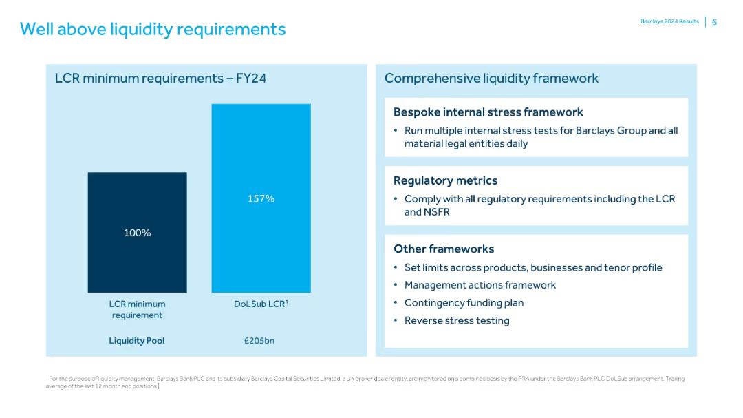
Bar chart comparing LCR requirement to Barclays’ actual liquidity coverage ratio; text box outlines liquidity frameworks and practices.
Regulatory and Compliance
Financial Services
Demonstrates that Barclays maintains a 157% LCR, significantly above the 100% minimum. Accompanied by a breakdown of liquidity management practices including stress testing, regulatory compliance, and contingency planning.
LCR, liquidity, stress testing, Barclays, compliance, NSFR, funding
Mixed Chart
Barclays
Saved
A line graph correlating TCE increases with EBITDA gains, alongside a column chart of yearly EBITDA, illustrating financial leverage across a fleet.
Operational Efficiency
Transportation & Logistics
Demonstrates how adjustments in freight charge rates substantially affect annual earnings, providing insights into strategic financial management.
operating leverage, EBITDA, financial management, freight rates, strategic planning
Multiple Chart
Deutsche Bank
Saved
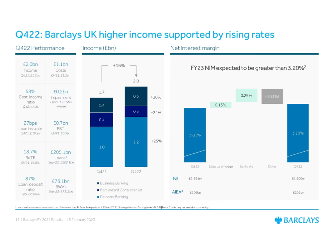
Three-section layout: Left shows Q422 performance metrics, center has a bar chart comparing Q421 and Q422 income by segment, and right displays a net interest margin (NIM) bridge.
Financial Performance
Financial Services
Demonstrates income growth in Barclays UK driven by interest rate rises, showing improved NIM and income across segments (Personal, Business, Barclaycard). Also includes NII and AIEA figures to reinforce NIM expectations for FY23.
Barclays UK, NIM, income growth, interest rates, Q422, personal banking, business banking, RoTE
Multiple Chart
Barclays
Saved
Horizontal bar chart showing various perceptions of societal change across different countries with percentages.
Market Analysis and Trends
Government & Public Sector
The slide analyzes global perceptions of societal changes, highlighting variations in attitudes and values across countries.
societal change, global trends, perceptions, attitudes, values
Mixed Chart
IPSOS
Saved
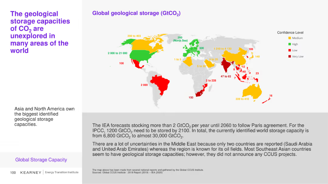
This slide includes a map and a bar chart illustrating the global geological storage capacities of CO2 with varying confidence levels across different regions. Color coding (green, yellow, red) indicates confidence levels.
Market Analysis and Trends
Environmental Services & Sustainability
The slide explores the identified geological storage capacities for CO2 globally, emphasizing areas with the highest potential and the uncertainties in certain regions like the Middle East.
CO2 storage, geological capacity, global map, confidence levels
Graphic
Kearney
Saved
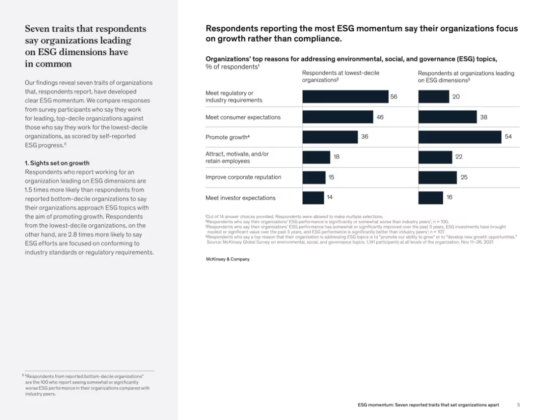
Two-column layout with narrative on the left and bar chart on the right comparing ESG motivations between top- and bottom-performing organizations.
Organizational Structure and Change
Professional Services
The slide reveals that organizations with strong ESG performance prioritize growth, unlike weaker performers who focus on compliance. A comparison chart illustrates differences in motivations—such as promoting growth, attracting talent, and improving reputation—between top and bottom ESG performers.
ESG leadership, strategic traits, growth vs. compliance, stakeholder engagement, sustainability traits, organizational performance
Mixed Chart
McKinsey
Saved
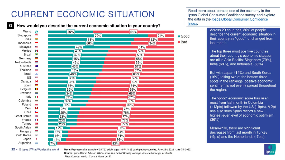
Bar chart comparing percentage of people in 29 countries describing the economy as "Good" vs "Bad", with annotations.
Market Analysis and Trends
Financial Services
This slide visualizes global public sentiment about the current economic situation, showing a 36% global average rating of "good". Singapore, India, and Indonesia lead in optimism, while Japan and Argentina have the lowest. Commentary highlights regional trends and month-over-month changes.
economic sentiment, global comparison, Ipsos, economic perception, survey, bar chart, economic optimism, Asia-Pacific, country ranking, economic trends
Mixed Chart
IPSOS
Saved
The slide features sections on description, pros, cons, an overview of technology, and key feature estimates. It includes a simple diagram of the Haber-Bosch process and a box listing the conversion and reconversion costs and efficiencies of ammonia.
Product and Service Analysis
Energy & Utilities
This slide provides detailed information on the conversion of ammonia through the Haber-Bosch process. It highlights the advantages and disadvantages of using ammonia for hydrogen conversion, supported by key feature estimates.
Ammonia, Conversion, Hydrogen, Process, Analysis
Diagram
Kearney
Saved
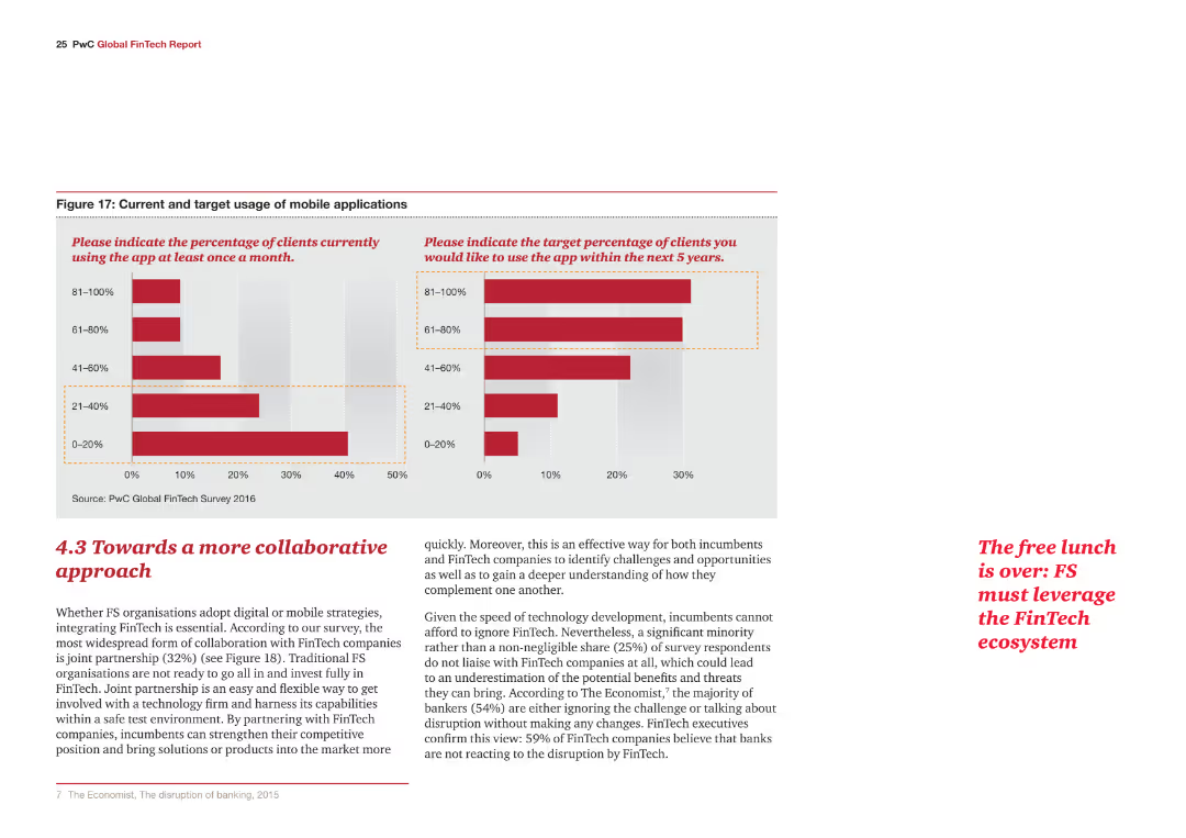
The slide includes two column charts comparing current and target usage of mobile applications, with red bars indicating usage percentages. Below the charts, a paragraph of text discusses the approach towards collaboration in FinTech.
Strategic Planning
Financial Services
The slide presents data on current and target usage of mobile applications and discusses the necessity for a collaborative approach in integrating FinTech for traditional financial service organizations.
FinTech, mobile applications, collaboration, strategy, integration
Multiple Chart
PwC/Strategy&
Saved
This slide features a line graph displaying global per capita food consumption with a forecast till 2030. It's accompanied by text boxes highlighting key investment opportunities.
Market Analysis and Trends
Agriculture & Food Production
It outlines the relationship between population growth and agricultural technology improvements, proposing investment opportunities.
food consumption, population growth, agriculture, technology, investment opportunities
Single Chart
EY
Saved
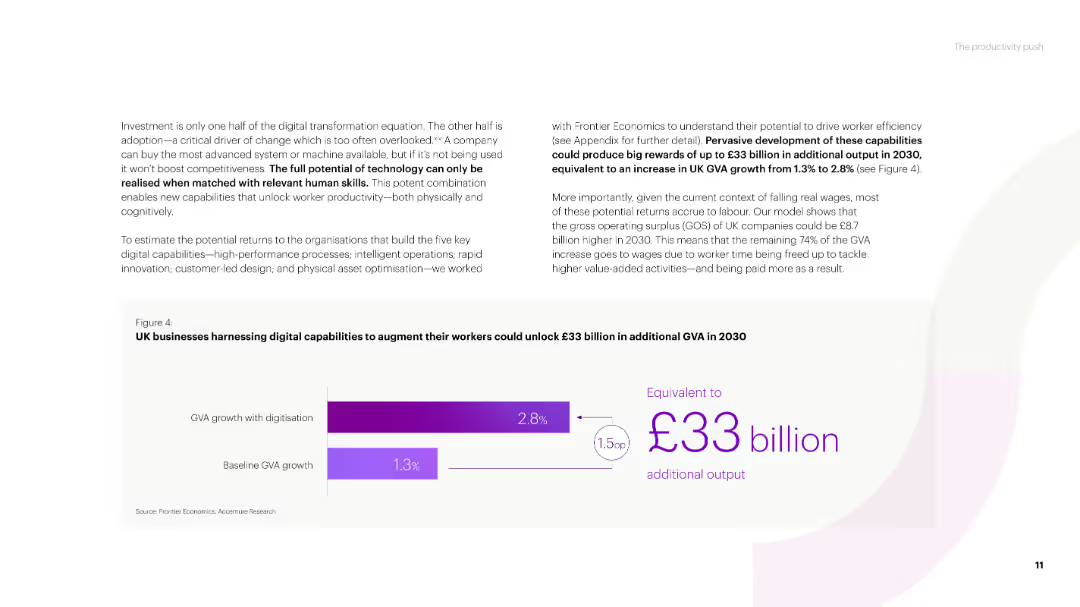
A text-heavy slide with a title and several paragraphs discussing the potential of technology for business growth. Includes a column chart showing GVA growth with digitization versus baseline GVA growth in the UK.
Strategic Planning
Technology & Software
The slide emphasizes the importance of digital capabilities for business productivity, projecting significant additional GVA growth for UK businesses by 2030 through the adoption of technology.
technology potential, digital capabilities, GVA growth, UK businesses, productivity
Mixed Chart
Accenture
Saved
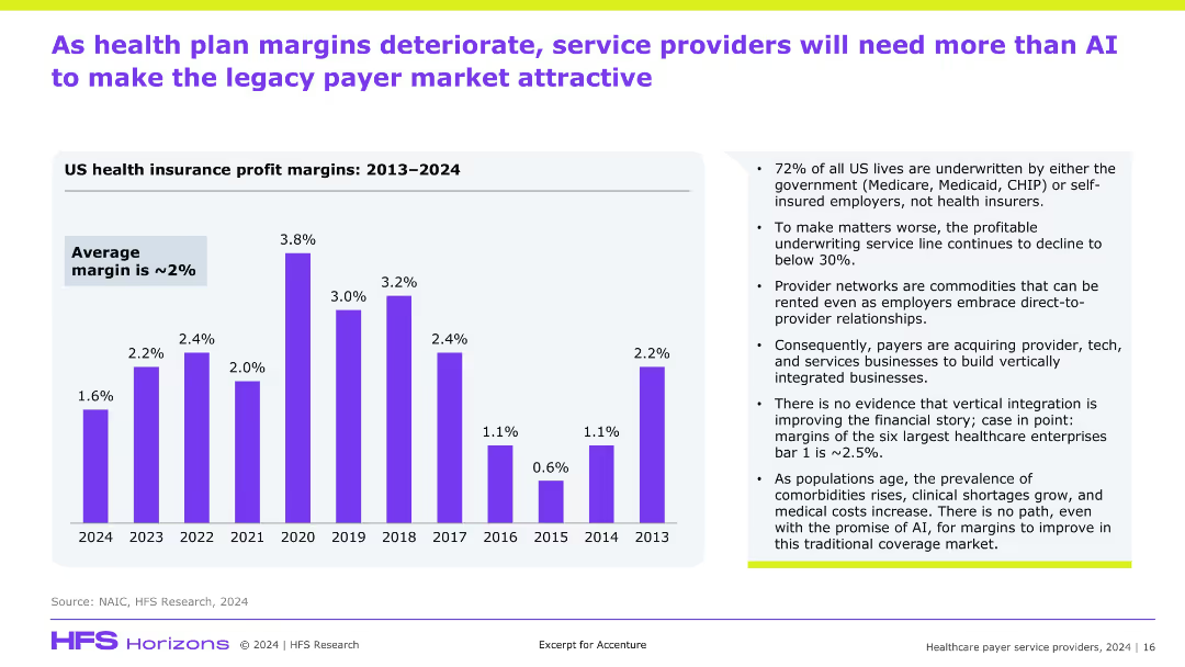
Left-aligned title, left bar graph showing profit margins 2013–2024, right bullet points with insights; clean corporate design with purple theme and emphasis on data and interpretation.
Financial Performance
Healthcare & Pharmaceuticals
This slide discusses the declining profit margins in US health insurance, highlighting a ~2% average margin. It outlines the challenges facing payers including shrinking underwriting margins, commoditization of provider networks, and limitations of vertical integration. It suggests that AI alone won’t solve systemic issues in the legacy payer market.
health insurance, profit margins, underwriting, vertical integration, AI, payer, provider
Mixed Chart
Accenture
Saved
Previous
Next
If nothing, comes up, please save your slides first
Create a FREE account to continue browsing
Receive Instant Access to 1,000+ slides from companies like McKinsey, Google, and Goldman Sachs
First Name
Last Name
Email
Password
I agree to all
Terms & Privacy Policy
Thank you! Your submission has been received!
Oops! Something went wrong while submitting the form.
Have an account?
Sign in
Column Chart
Heatmap
Chevron
Org Chart
Infographic
Callouts
Timeline
List
Graphic
Picture
Process Flow
Diagram
Paragraph
Map
Table
Framework
Subtitle
Takeaway Box
Icon
Other Chart
Radar Chart
Waterfall Chart
Mekko Chart
Pie Chart
Scatter Plot
Line Chart
Bar chart
Bullet points