Create a FREE Account
Instant access to 1,000+ real slides from top companies like McKinsey, BCG, Goldman Sachs, Google and many more!
First Name
Last Name
Email
Password
I agree to all
Terms & Privacy Policy
Thank you! Your submission has been received!
Oops! Something went wrong while submitting the form.
Have an account?
Sign in
Library
Templates
Courses
Pricing
My Account
My Slides
My Templates
✦ AI
AI Prompt Library
AI Search
Sign in
Start Here
Logout
My Saved Slides
The slide includes bullet points discussing the adoption of agile practices in IT and business, along with a bar chart showing the percentage of teams adopting agile methods.
Strategic Planning
Professional Services
The slide discusses the adoption of business agility across different sectors, highlighting the percentage of IT and business teams using agile methods, and the industries most advanced in this practice.
business agility, agile adoption, IT, business, industries
Mixed Chart
Deloitte
Saved
Two charts: left bar graph showing earnings cycles by fiscal year group, right table comparing average RoE across regions (India, Asia, World, EM). Clean design with blue highlights.
Strategic Planning
Financial Services
Shows that Indian corporations have entered a strong earnings growth cycle expected to continue to FY25. Also compares India's superior return on equity (RoE) to other global regions, positioning it as one of the most profitable investment destinations.
earnings cycle, RoE, India corporates, profitability, global comparison, FY25, earnings visibility
Mixed Chart
Goldman Sachs
Saved
Bubble chart with axes showing impact as % of industry revenue vs. NOK value; bubble size represents overall impact.
Investment Analysis
Artificial Intelligence
This slide visually compares the expected GenAI impact across sectors. The energy sector offers the highest value (in NOK), while high tech is most disrupted (highest % revenue impact). Bubble sizes represent the magnitude of economic value potential.
Sector Impact, GenAI Disruption, Energy, High Tech, Value Potential, Bubble Chart, Revenue Impact, Industry Analysis
Single Chart
McKinsey
Saved
The slide includes a vertical column chart showing the number of apprentices organizations typically host per year, segmented into five categories. A separate horizontal bar chart shows the types of support services apprentices receive, with four categories.
Human Resources and Talent Management
Professional Services
The slide highlights that organizations leveraging apprenticeships typically host between 11 and 30 apprentices per year. It also shows the support services provided to apprentices, such as mentorship, employability training, career counseling, and mental health services.
apprenticeships, support services, mentorship, training, career counseling, mental health
Multiple Chart
Accenture
Saved
This slide contains a pie chart detailing portfolio by industry and a line graph illustrating net charge-off performance, accompanied by text boxes.
Risk Assessment and Management
Financial Services
The slide presents a portfolio summary, market commentary, and performance metrics for commercial and industrial (C&I) lending, discussing risk management and credit performance.
Risk Discipline, C&I Lending, Portfolio, Market Commentary, Performance, Credit Quality
Multiple Chart
JP Morgan
Saved
The slide presents a mixed layout with arrows, lines and a table of data. It features a color scheme of blues and greens, with icons illustrating various growth strategies.
Financial Performance
Financial Services
The slide details the growth in merchant services, compares volume growth to revenue, and outlines strategies for continued margin expansion.
Merchant services, growth, revenue, strategies, margin expansion, financial analysis, comparison, APIs, international expansion
Mixed Chart
JP Morgan
Saved
Grid of 15 charts showing relative performance of various industry groups with top 3 stocks highlighted in each panel
Market Analysis and Trends
Financial Services
Breaks down performance of specific industry groups, comparing them to the S&P 500 and identifying the three dominant companies by weight. Useful for granular sector-level insight.
industry groups, sector analysis, top holdings, stock weights, relative return
Multiple Chart
Goldman Sachs
Saved
Side-by-side bar charts. Left shows historical GDP growth decomposition. Right shows future productivity gains under GenAI scenarios (global & Norway).
Performance Metrics and KPIs
Artificial Intelligence
This slide highlights the role of productivity in driving GDP growth, noting its recent slowdown and forecasting its rebound due to GenAI. It compares historical trends and future projections under GenAI.
GDP growth, productivity, GenAI, Norway, economic performance, automation, scenario analysis
Multiple Chart
McKinsey
Saved
Column chart with labeled segments showing changes in Assets Under Management (AUM) over time.
Financial Performance
Financial Services
The slide shows the AUM movement within Macquarie Asset Management, detailing the effects of various business activities and market conditions. This visual aids in the analysis of asset growth and investment strategies, suitable for investor updates and strategic planning discussions.
AUM, investment, growth, assets, management
Single Chart
Morgan Stanley
Saved
The slide features a title at the top, followed by a bar chart showing the percentage of U.S. marketers using different technologies like DMPs and CDPs. The chart bars are horizontal.
Technology and Digital Transformation
Technology & Software
The slide discusses the adoption rates of various privacy-preserving technologies among U.S. marketers, highlighting the usage of DMPs and CDPs.
privacy, technology, DMPs, CDPs, adoption
Mixed Chart
IPSOS
Saved
Column chart detailing quarterly profit before tax (PBT) changes with various contributing factors and a breakdown of 4Q23 results versus previous quarters.
Financial Performance
Financial Services
Analyzes UBS's quarterly profit before tax for 4Q23, highlighting underlying versus reported figures and factors affecting results.
PBT, Financial Performance, UBS, 4Q23, Analysis
Mixed Chart
UBS
Saved
The slide features a line chart showing the exchange rate trends and oil price over time. It is visually complex, designed to provide a clear comparative analysis of key financial metrics.
Market Analysis and Trends
Financial Services
The slide discusses the dynamics of the exchange rate environment, highlighting challenges due to limited foreign exchange inflows and the impact of oil production and other factors.
FX, Exchange Rate, Oil Price, Trends, Dynamics
Mixed Chart
PwC/Strategy&
Saved
This slide features a puzzle-shaped triangle diagram segmented into three parts, each labeled with a key component of an attractive rewards and compensation structure.
Human Resources and Talent Management
Professional Services
The slide is designed to discuss the three core components that constitute an attractive rewards and compensation system in an organization, likely used as part of a detailed HR presentation on employee remuneration and benefits.
Compensation, Employee Benefits, Rewards Structure, HR Strategy
Framework
Kearney
Saved
Features a column chart projecting revenue growth targets from FY 2022 to FY 2025, with notable franchise achievements driving revenue momentum listed on the side.
Strategic Planning
Financial Services
Outlines the revenue growth targets for upcoming fiscal years, highlighting strategies and franchise achievements that contribute to this growth.
revenue growth, targets, strategic planning, franchise achievements, fiscal years, growth strategies
Mixed Chart
Deutsche Bank
Saved
Country-wise trust ranking chart in social media; consistent visual theme with green/red bars.
Market Analysis and Trends
Media & Entertainment
The chart details the global public's low trust in social media firms, especially in Western countries. China and India lead in trust levels.
social media, trustworthiness, global survey, Ipsos, perception, internet platforms, countries, public trust, ranking
Mixed Chart
IPSOS
Saved
The slide displays a detailed table with the number of companies across various industries, divided into three performance categories: top performers, median, and bottom performers. Icons representing industries are shown at the bottom of the table, with performance metrics displayed above.
Market Analysis and Trends
Industrial & Manufacturing
This slide provides a comprehensive overview of the number of companies in different industries and their performance metrics. The table categorizes companies into top performers, median, and bottom performers, offering a detailed analysis of market trends and industry standings.
Company performance, industry analysis, top performers, median, bottom performers, market trends, data table
Multiple Chart
PwC/Strategy&
Saved
The slide includes a scatter plot comparing cost efficiency and capital efficiency among banks. Text boxes explain the efficiency and profitability of UBS's personal and corporate banking.
Operational Efficiency
Financial Services
This slide showcases UBS's cost and capital efficiency, comparing it to Swiss and European peers, and highlights its superior profitability.
Cost Efficiency, Capital Efficiency, UBS, Banking, Profitability
Mixed Chart
UBS
Saved
The slide features four circular diagrams, each representing one of the RICE priorities: Responsible, Intelligent, Customized, and Expandable. The design is clean and uses a consistent color scheme to enhance readability.
Strategic Planning
Professional Services
The slide outlines the RICE priorities for business success: Responsible (positive impact), Intelligent (innovation), Customized (human experiences), and Expandable (new business creation). It serves as a strategic planning guide for organizations.
RICE, Priorities, Strategy, Business, Planning
Framework
Accenture
Saved
Bar chart showing coronavirus concern levels by country, including global score and trend shifts from prior months and year.
Risk Assessment and Management
Healthcare & Pharmaceuticals
The pandemic now registers only 2% global concern, a dramatic drop. Malaysia and India are relatively higher. The chart reveals a steep global decline in COVID-19 as a pressing issue, signaling a post-pandemic sentiment shift.
COVID-19, pandemic, public health, global recovery, Ipsos, declining concern
Single Chart
IPSOS
Saved
The slide uses dark green shades in a vertical bar graph format to depict the transfer rates of community college students to four-year institutions, including text annotations.
Human Resources and Talent Management
Education & Training
This slide outlines the transfer rates and graduation rates for community college students, highlighting the disparity in transfer success based on income levels.
education, transfer, community college, graduation, statistics
Mixed Chart
BCG
Saved
Two-column format: left side text-heavy with insights; right side features a vertical bar chart of AI budget allocation by sector and maturity.
Investment Analysis
Financial Services
Describes expanding use of AI in businesses and increasing investment. Charts AI budget share by sector and maturity level. Highlights governance, strategic alignment, and the EU AI Act's anticipated impact.
AI investment, IT budget, digital maturity, sector comparison, governance, compliance
Mixed Chart
KPMG
Saved
The slide displays a column chart side by side, one showing a decrease in 'cost to serve per CCB household' and another with icons and text highlighting efficiency examples.
Operational Efficiency
Financial Services
Focuses on JP Morgan's reduction in customer service costs and enhancements in operational efficiency, marked by self-service and workforce transformation. It targets an audience interested in operational improvements and cost management.
Self-Service, Operational Efficiency, Cost Reduction, Workforce Transformation
Mixed Chart
JP Morgan
Saved
Vertical bar chart layout comparing outperformers and others across five cloud adoption success factors. Left-aligned narrative explanation.
Strategic Planning
Technology & Software
This slide identifies the traits of cloud migration outperformers, including executive sponsorship, comprehensive planning, and talent investment. Companies that commit to upfront investments and structured strategy are significantly more successful.
cloud adoption, best practices, CEO involvement, security, strategy, digital leadership, early investment, outperformers, migration success
Mixed Chart
McKinsey
Saved
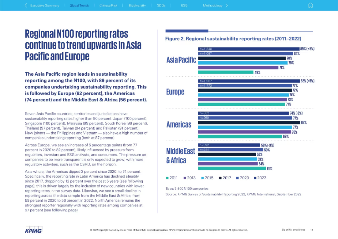
Two charts: a bar chart showing global corporate debt maturities by year and a line chart tracking corporate bankruptcy trends alongside non-investment grade corporate yields, emphasizing financial stress from high-interest rates.
Financial Performance
Financial Services
The slide predicts amplified financial stress and bankruptcy pressures for corporations due to the likelihood of sustained high-interest rates, with significant refinancing needs emerging in 2024 and beyond.
Bankruptcy, Interest Rates, Corporate Debt, Financial Stress, Refinancing
Multiple Chart
Accenture
Saved
A line graph showing total shareholder return over time, comparing tech-forward companies to others. Text analyzes financial performance trends before, during, and after the pandemic.
Performance Metrics and KPIs
Technology & Software
The slide compares the total shareholder return of tech-forward companies with other companies, using a line graph to illustrate performance over different periods.
Shareholder Return, Financial Performance, Pandemic, Tech-Forward, Comparison
Mixed Chart
Accenture
Saved
Previous
Next
If nothing, comes up, please save your slides first
Create a FREE account to continue browsing
Receive Instant Access to 1,000+ slides from companies like McKinsey, Google, and Goldman Sachs
First Name
Last Name
Email
Password
I agree to all
Terms & Privacy Policy
Thank you! Your submission has been received!
Oops! Something went wrong while submitting the form.
Have an account?
Sign in
Column Chart
Heatmap
Chevron
Org Chart
Infographic
Callouts
Timeline
List
Graphic
Picture
Process Flow
Diagram
Paragraph
Map
Table
Framework
Subtitle
Takeaway Box
Icon
Other Chart
Radar Chart
Waterfall Chart
Mekko Chart
Pie Chart
Scatter Plot
Line Chart
Bar chart
Bullet points