Create a FREE Account
Instant access to 1,000+ real slides from top companies like McKinsey, BCG, Goldman Sachs, Google and many more!
First Name
Last Name
Email
Password
I agree to all
Terms & Privacy Policy
Thank you! Your submission has been received!
Oops! Something went wrong while submitting the form.
Have an account?
Sign in
Library
Templates
Courses
Pricing
My Account
My Slides
My Templates
✦ AI
AI Prompt Library
AI Search
Sign in
Start Here
Logout
My Saved Slides
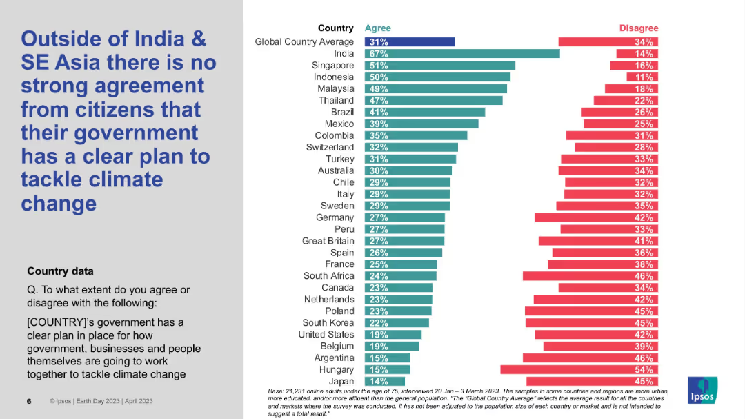
Bar chart on right showing country-level agreement/disagreement; large bold title on left; grey and white background split.
Market Analysis and Trends
Environmental Services & Sustainability
This slide highlights global perceptions regarding whether governments have a clear plan to address climate change. India and several SE Asian countries show stronger agreement, while many Western nations fall below the global average of 31%. The chart visually contrasts country sentiments.
Climate change, Government policy, Regional comparison, Ipsos, Global sentiment, SE Asia
Mixed Chart
IPSOS
Saved
Displays a column chart indicating the median CO2 capture capacities of projects (in Mtpa) by region and status (in development, operational, completed, cancelled).
Strategic Planning
Energy & Utilities
Projects significant growth in the size of CCUS projects globally. Provides insights into the future capacities and development of various regions' CCUS initiatives.
CCUS, project size, growth, future development, CO2 capture, regional analysis, strategic planning, trends
Mixed Chart
Kearney
Saved
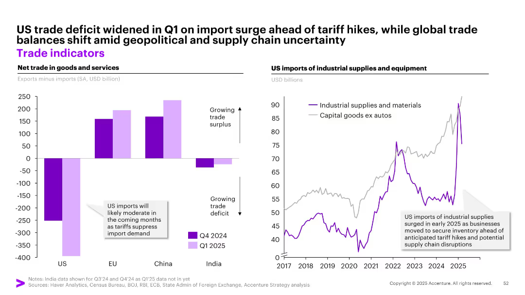
Dual-panel chart: left = net trade by region (bar chart), right = US imports of industrial supplies (line chart)
Market Analysis and Trends
Transportation & Logistics
This slide shows the widening US trade deficit in early 2025 due to an import surge ahead of tariff hikes, while other regions like China and EU maintain trade surpluses. It also depicts a rise in US industrial supply imports, driven by businesses stockpiling before anticipated tariff impacts.
trade deficit, US imports, industrial supplies, tariffs, supply chain, global trade
Multiple Chart
Accenture
Saved
Line graphs showing search trends for video streaming services, by country, with annotations indicating multipliers compared to baseline levels.
Market Analysis and Trends
Technology & Software
Highlights the growing consumer interest in video streaming services across different countries. Essential for media companies to track changes in market interest and strategize for content delivery and platform engagement.
Video streaming, Search trends, Consumer interest, Market analysis, Technology
Multiple Chart
Bain
Saved
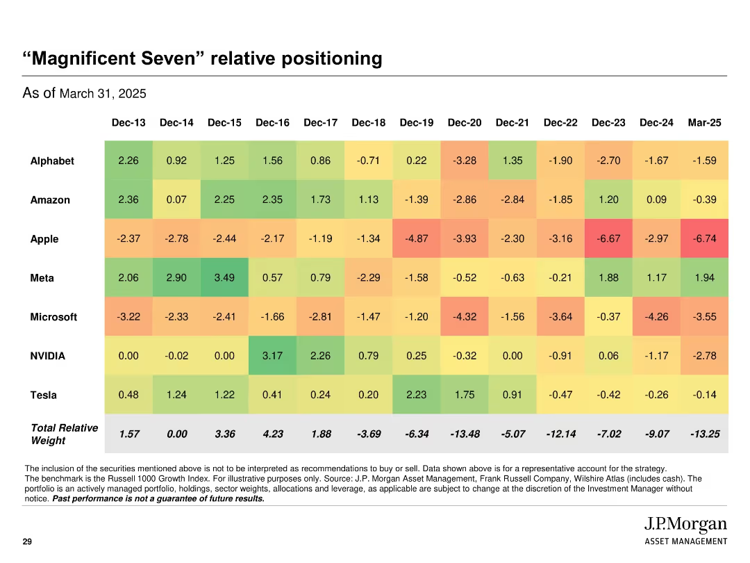
Heatmap table format showing relative stock weightings across years; color-coded cells from green (overweight) to red (underweight)
Product and Service Analysis
Financial Services
Displays the strategy's relative positioning in key large-cap tech names ("Magnificent Seven") over time, from 2013 to 2025. The chart tracks year-by-year portfolio weight differences versus benchmark, providing insights into historical and current exposure trends.
magnificent seven, tech stocks, relative weight, heatmap, positioning, strategy, J.P. Morgan
Single Chart
JP Morgan
Saved
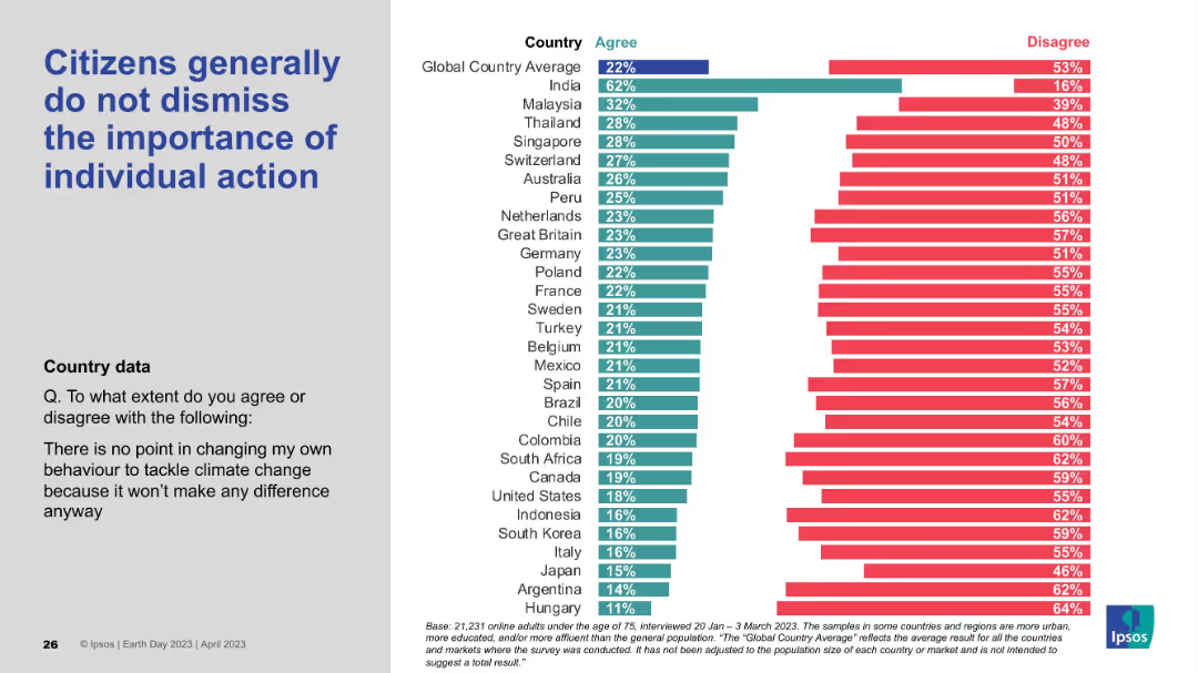
Left-hand statement in large blue font; right side includes a horizontal agreement/disagreement bar chart with minimal agreement levels shown.
Customer and Market Segmentation
Environmental Services & Sustainability
This slide indicates that while a small percentage agree that individual actions are meaningless, the majority disagree. It underscores the global recognition of individual impact, even if levels of strong belief vary across countries.
individual action, behavior change, climate impact, personal responsibility, public opinion, Ipsos, Earth Day
Mixed Chart
IPSOS
Saved
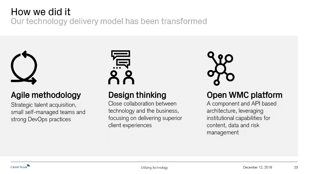
Features icons and text to describe the transformation of the technology delivery model through agile methodology, design thinking, and an open WMC platform.
Technology and Digital Transformation
Technology & Software
This slide explains the transformation of the technology delivery model, highlighting key methodologies and platforms used, such as agile practices and design thinking.
technology delivery, agile methodology, design thinking, open WMC platform, transformation, technology model, collaboration, client experience
Pillar
Credit Suisse
Saved
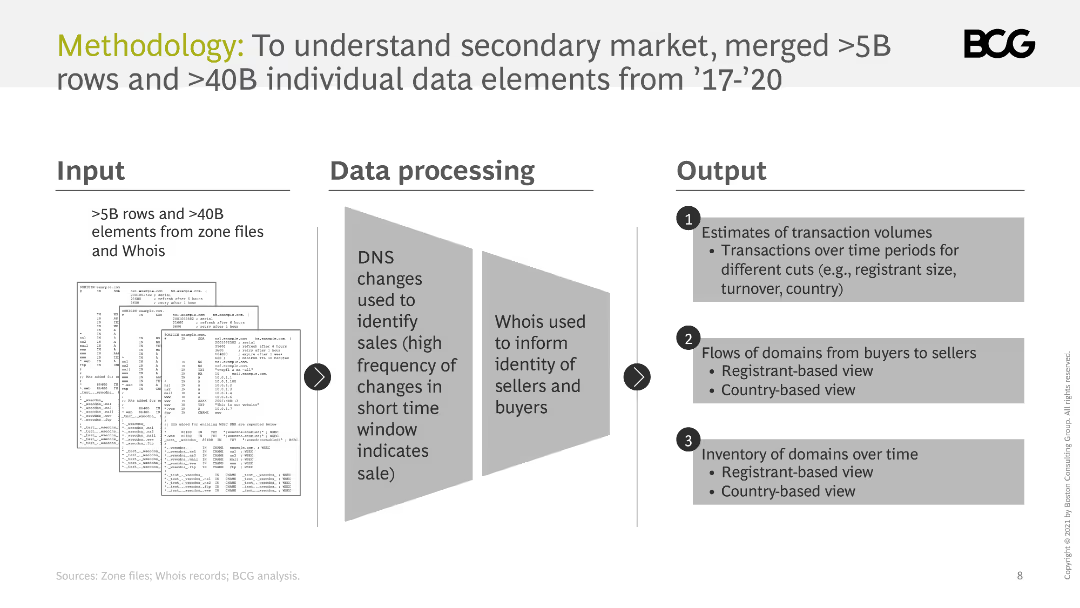
The slide outlines the methodology for understanding the secondary market, including inputs, data processing, and outputs. It uses diagrams to illustrate the process.
Technology and Digital Transformation
Professional Services
It describes the methodology used to analyze the secondary market, including data sources, processing techniques, and the types of outputs generated.
methodology, data processing, secondary market, analysis, inputs, outputs
Linear Flow
BCG
Saved
The slide features a timeline highlighting key milestones in the development of biomass processing technologies from the late 18th century to the 20th century. Key events are marked along the timeline with brief descriptions.
Technology and Digital Transformation
Energy & Utilities
This slide provides a historical overview of the development of biomass processing technologies, highlighting significant discoveries and commercial developments over time.
biomass processing, history, timeline, technology development, discoveries, commercial development, milestones
Linear Flow
Kearney
Saved
This slide combines a comprehensive text description with a flowing graphic depicting a wave, which symbolizes growth and profitability. The design employs shades of blue and white, conveying a sense of clarity and forward movement.
Market Analysis and Trends
Technology & Software
Offering a detailed analysis of e-commerce trends, this slide argues for persistent growth in SEA despite a shift back to offline shopping, with a focus on profitability. It’s insightful for discussions on market dynamics, particularly for strategizing around customer retention, value-add services, and adapting to evolving consumer preferences.
e-commerce, SEA, growth trends, offline shopping, profitability, market analysis, consumer behavior
Single Chart
Bain
Saved
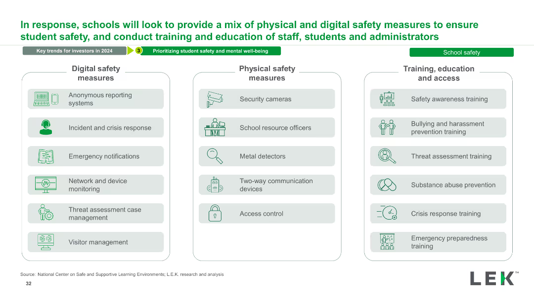
The slide has three columns listing digital safety measures, physical safety measures, and training/education/access measures. Each column includes multiple bullet points and icons representing each measure.
Strategic Planning
Education & Training
This slide outlines a comprehensive mix of safety measures for schools, covering digital and physical safety, as well as training and education for staff and students.
Safety, Measures, Training, Education, Digital, Physical, School, Security, Prevention, Strategy
Table
LEK
Saved
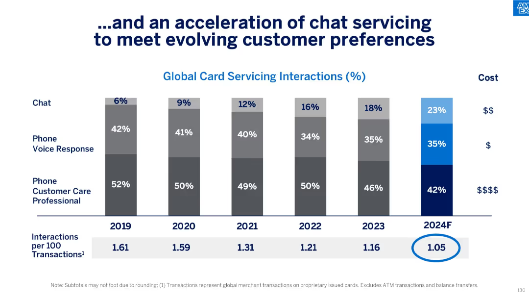
Vertical bar chart showing % breakdown of global card servicing interactions by channel (Chat, Phone Voice Response, Customer Care Professional) from 2019–2024F, along with associated costs and interaction per transaction metric.
Operational Efficiency
Financial Services
The slide highlights a shift in customer service preferences toward chat interactions, increasing from 6% in 2019 to a forecasted 23% in 2024. It also correlates interaction types with costs and shows a steady decline in interactions per 100 transactions, implying greater servicing efficiency.
customer service, chat, servicing, digital shift, cost efficiency, forecasting, interactions, voice response, professional care, card services
Single Chart
McKinsey
Saved
Presents a blue column chart with amounts of cash returned to shareholders over four fiscal years, highlighting a significant share repurchase initiative.
Financial Performance
Consumer Goods
Reviews the substantial amounts returned to shareholders through dividends and share repurchases, underscoring the company's commitment to shareholder returns.
shareholder return, dividends, share repurchase, fiscal years, investment
Single Chart
Barclays
Saved
Contains a mixed chart with columns and a line graph illustrating Namibia's national debt from 2017/18 to 2024/25. Columns represent domestic and foreign debt in two shades of red, while the line graph shows total debt as a percentage of GDP. Includes minimal textual annotations.
Financial Performance
Government & Public Sector
Provides an overview of Namibia's national debt trends, highlighting increases in domestic and foreign debt over time. Useful for understanding fiscal health and governmental financial strategies.
National Debt, Fiscal Health, Namibia, Government Finance, Debt Trends
Single Chart
PwC/Strategy&
Saved
The slide includes a list of bullet points and two side-by-side data tables comparing financial statistics from two different periods. It's well-structured with a focus on financial data presentation.
Financial Performance
Financial Services
This slide's content offers a detailed view of the company's financial position, showcasing improvements and dividends. It's used for discussing financial health and strategies with stakeholders.
balance sheet, financials, dividends, net cash, assets, liabilities, mining
Table
Morgan Stanley
Saved
This slide presents a column chart showing growth in Indonesia's internet economy GMV from 2015 to 2025 with projected CAGR. It uses a simple layout with a clear color distinction for different years.
Market Analysis and Trends
Technology & Software
The slide illustrates the growth of Indonesia's internet economy reaching US $44B despite economic challenges, with a focus on past and projected GMV values.
Indonesia, Internet economy, GMV, Growth, Projections, CAGR, Economic challenges, 2015, 2020, 2025
Single Chart
Bain
Saved
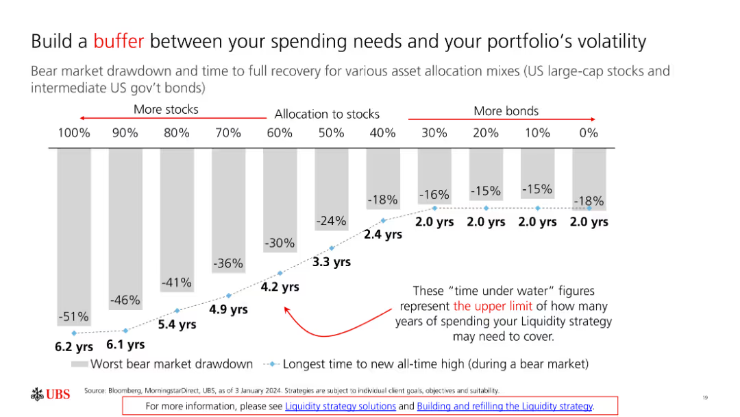
The slide includes a bar chart showing bear market drawdowns and recovery times for different asset allocation mixes, from 100% stocks to 100% bonds.
Risk Assessment and Management
Financial Services
The slide discusses strategies to mitigate portfolio volatility by adjusting asset allocation, highlighting the importance of having a financial buffer.
Portfolio, Volatility, Buffer, Asset Allocation, Risk
Single Chart
UBS
Saved
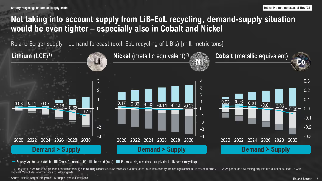
Bar chart layout comparing lithium, nickel, and cobalt supply-demand gaps over time (2020–2030); dark background, labeled vertical axes, colored bars and annotations for deficits
Risk Assessment and Management
Energy & Utilities
This slide illustrates projected shortfalls in lithium, nickel, and cobalt supply versus demand, excluding End-of-Life (EoL) recycling. It highlights a worsening deficit, particularly for lithium, emphasizing the importance of integrating recycling into future supply models.
Lithium, Nickel, Cobalt, Supply Gap, Forecast, Battery Materials, 2030, Mining, Recycling, Shortfall
Multiple Chart
Roland Berger
Saved
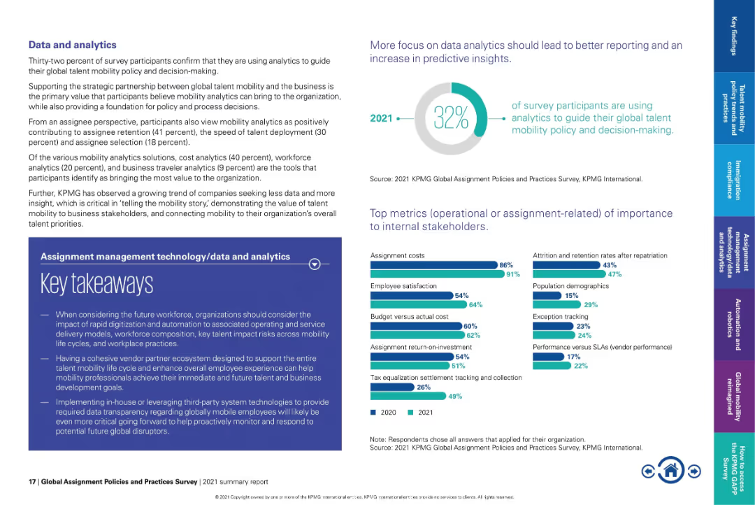
Text-heavy layout with pie chart on top right and bar graphs at bottom.
Performance Metrics and KPIs
Technology & Software
Emphasizes how only 32% of organizations currently use analytics in mobility decision-making. Lists top metrics such as assignment costs and employee satisfaction. Underscores the need for better data transparency and strategic alignment with business goals.
analytics, mobility KPIs, assignment cost, employee satisfaction, talent insights, strategic mobility
Multiple Chart
KPMG
Saved
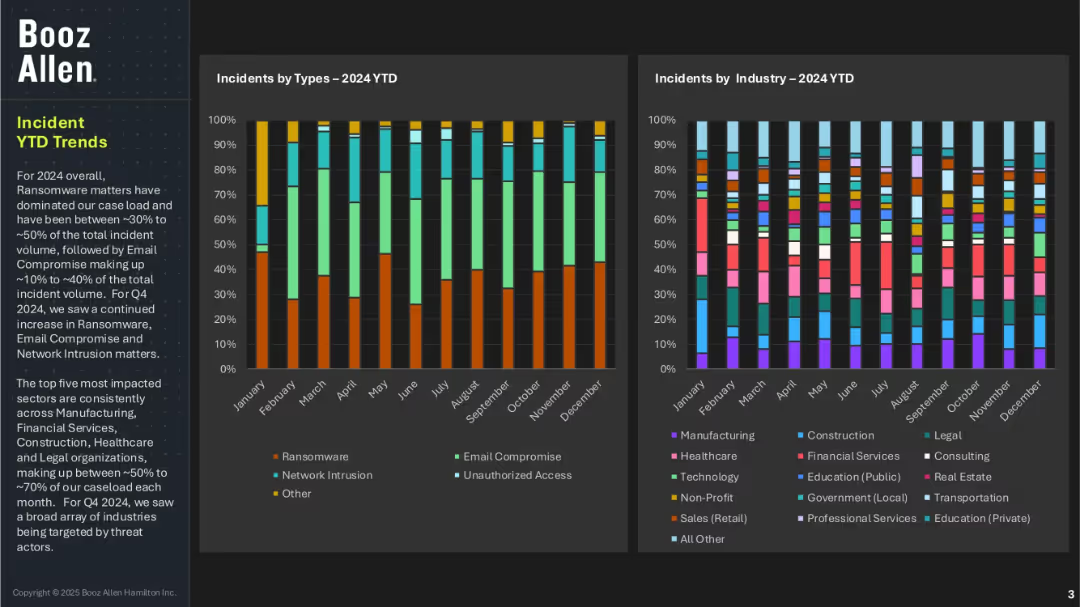
Two vertical stacked bar charts tracking incident types and industry impacts across months in 2024; left section includes narrative summary; dark background with vivid color blocks.
Risk Assessment and Management
Technology & Software
This slide presents year-to-date trends for cybersecurity incidents, showing that ransomware has consistently been the most common threat, followed by email compromise and network intrusion. The most affected sectors are manufacturing, financial services, healthcare, construction, and legal. Q4 saw a broad expansion of targeted industries.
ransomware, incident trends, cyber threats, industry impact, Booz Allen, monthly analysis, YTD data, email compromise, network intrusion
Multiple Chart
Booz Allen Hamilton
Saved
Bar chart showing the changes in the number of jobs due to one additional robot in the manufacturing sector, by income level of country.
Market Analysis and Trends
Technology & Software
The slide examines the impact of automation and robotics on employment, focusing on the manufacturing sector. It shows how each additional robot affects job numbers in high-income, average, and low-income countries, highlighting the greater substitutive effect in low-income countries.
Automation, Robotics, Manufacturing, Job Loss
Mixed Chart
Roland Berger
Saved
Displays a column chart detailing the impact of COVID-19 on job satisfaction among deskless workers in France versus a general overview, using shades of green, grey, and red.
Operational Efficiency
Professional Services
Examines the impact of COVID-19 on job satisfaction levels among deskless workers, providing insights into the pandemic’s effects on employee morale.
COVID-19, job satisfaction, impact, deskless workers, column chart
Multiple Chart
BCG
Saved
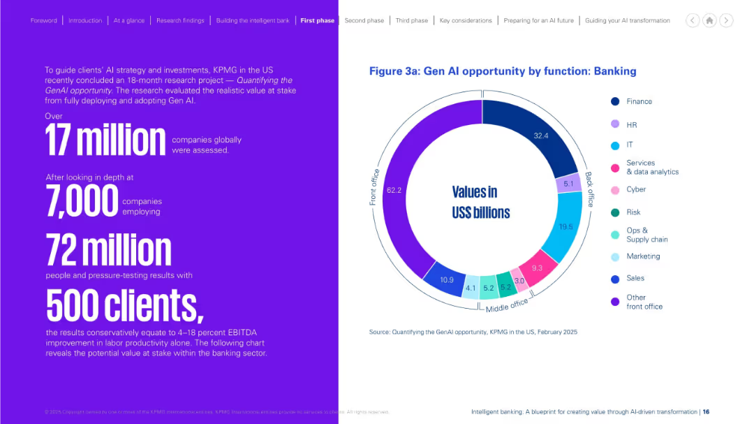
Left side presents research stats in large purple text. Right side includes a colorful circular chart showing value breakdown by banking functions. Neat bifurcation, vibrant colors.
Investment Analysis
Financial Services
This slide quantifies the opportunity of Gen AI in banking, based on KPMG research. It highlights potential value by function, with front-office roles offering the largest gains. The stats support significant productivity and financial impact, derived from analyzing over 17 million companies and thousands of clients globally.
Gen AI, opportunity, banking, productivity, front office, research, KPMG
Mixed Chart
KPMG
Saved
Left side has a ranked and icon-supported list of top 10 macro trends for 2025; right side offers concise explanatory bullets. Simple and highly readable layout with a lavender-accented color theme.
Market Analysis and Trends
Professional Services
This executive summary highlights the top 10 macro trends for 2025, including rising geopolitical risks, inflation, tariff battles, China and India’s diverging roles, and energy transition strategies. It provides a high-level overview of major global forces likely to impact businesses this year.
Trends 2025, Geopolitics, Inflation, Tariffs, Consumer Pressure, Gen AI, India Growth, China Export, Strategy, CAPEX
Table
Accenture
Saved
Features a complex layout with multiple bar charts showing the percentage of companies using strategies to promote acceptance of climate-related changes.
Strategic Planning
Environmental Services & Sustainability
Details the percentage of companies implementing strategies to enhance acceptance of their climate change efforts, segmented by company size and revenue.
climate strategies, business strategy, customer engagement, environmental initiatives
Multiple Chart
Deloitte
Saved
Previous
Next
If nothing, comes up, please save your slides first
Create a FREE account to continue browsing
Receive Instant Access to 1,000+ slides from companies like McKinsey, Google, and Goldman Sachs
First Name
Last Name
Email
Password
I agree to all
Terms & Privacy Policy
Thank you! Your submission has been received!
Oops! Something went wrong while submitting the form.
Have an account?
Sign in
Column Chart
Heatmap
Chevron
Org Chart
Infographic
Callouts
Timeline
List
Graphic
Picture
Process Flow
Diagram
Paragraph
Map
Table
Framework
Subtitle
Takeaway Box
Icon
Other Chart
Radar Chart
Waterfall Chart
Mekko Chart
Pie Chart
Scatter Plot
Line Chart
Bar chart
Bullet points