Create a FREE Account
Instant access to 1,000+ real slides from top companies like McKinsey, BCG, Goldman Sachs, Google and many more!
First Name
Last Name
Email
Password
I agree to all
Terms & Privacy Policy
Thank you! Your submission has been received!
Oops! Something went wrong while submitting the form.
Have an account?
Sign in
Library
Templates
Courses
Pricing
My Account
My Slides
My Templates
✦ AI
AI Prompt Library
AI Search
Sign in
Start Here
Logout
My Saved Slides
Combination of line chart showing unemployment rate forecasts, column chart for loan growth, and bar chart for card services NCO rate. Uses blue and gray tones to differentiate data sets.
Risk Assessment and Management
Financial Services
Discusses JP Morgan's preparedness for economic conditions, including expected peak unemployment, loan growth driving reserve builds, and projected card services NCO rate for 2024.
Reserve, Unemployment, Loan, Growth, Card, Economic, Forecast
Multiple Chart
JP Morgan
Saved
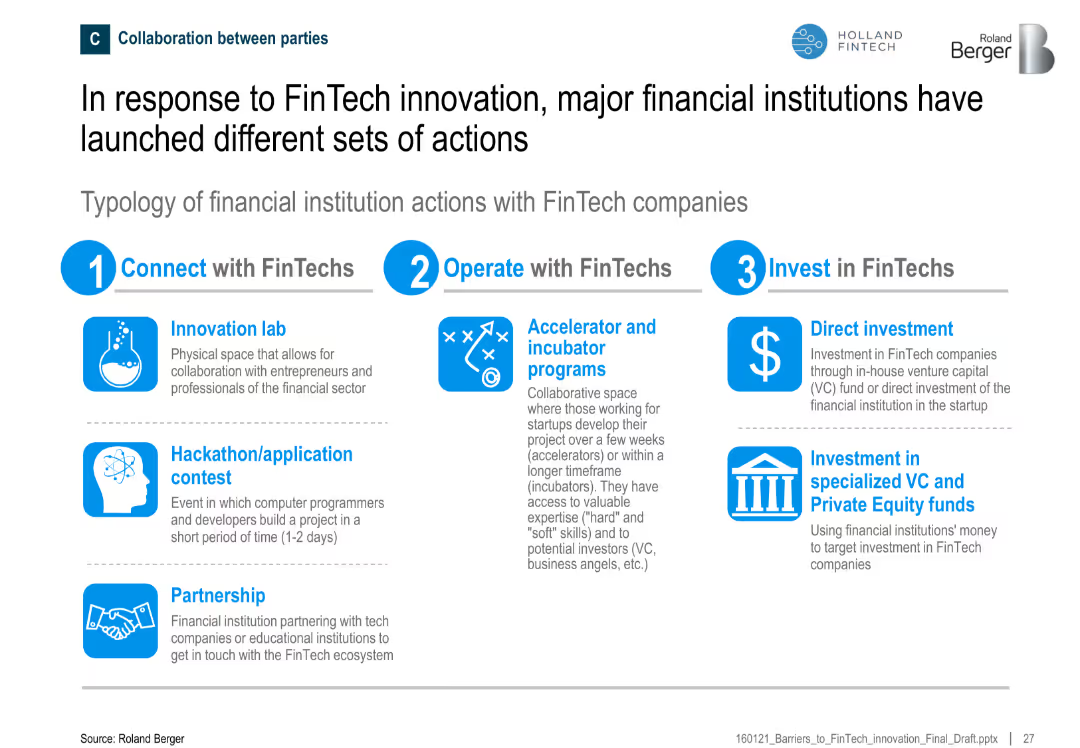
Circular diagram highlighting the fragmentation of health data ecosystems and a list of the four dimensions of big data in healthcare (Volume, Veracity, Variety, Velocity).
Market Analysis and Trends
Healthcare & Pharmaceuticals
The slide highlights the importance of big data in the healthcare sector, emphasizing the need to analyze the increasing volumes of data. It discusses the fragmentation of health data ecosystems and outlines the four key dimensions of big data that are crucial for deriving actionable insights in healthcare.
Big Data, Healthcare, Data Analysis, Ecosystems
Diagram
Roland Berger
Saved
The slide includes imagery, a large figure highlight, and a side column for detailed text explanation, with a moderate visual complexity.
Investment Analysis
Education & Training
It details the apprenticeship opportunities the Tempest programme will offer, highlighting the importance of skill development and its impact on the UK economy.
apprenticeships, skill development, Tempest programme, BAE Systems, MBDA, STEM education, UK economy, training
Boxed
PwC/Strategy&
Saved
The slide features a chart mapping France's position on various criteria such as labor cost and tax system, with areas for improvement highlighted.
Regulatory and Compliance
Government & Public Sector
This slide outlines the key areas for improvement in France to enhance its attractiveness, focusing on labor cost and administrative procedures.
Improvement priorities, Labor cost, Tax system, Administrative procedures, Government
Mixed Chart
Bain
Saved
Column chart comparing the proportion of prominent and practical green consumers in different regions: APAC, LATAM, MEA.
Customer and Market Segmentation
Consumer Goods
The slide presents data on the prevalence of prominent versus practical green consumers across various regions, suggesting market strategies.
green consumers, APAC, LATAM, MEA, market strategy, segmentation, consumer behavior
Mixed Chart
Accenture
Saved
Column chart showing the impact of a 1% rise or fall in interest rates on total returns across various fixed income categories.
Market Analysis and Trends
Financial Services
Examines sensitivity of different fixed income categories to interest rate changes, showing potential returns and losses.
interest rates, sensitivity, fixed income, returns, impact
Single Chart
JP Morgan
Saved
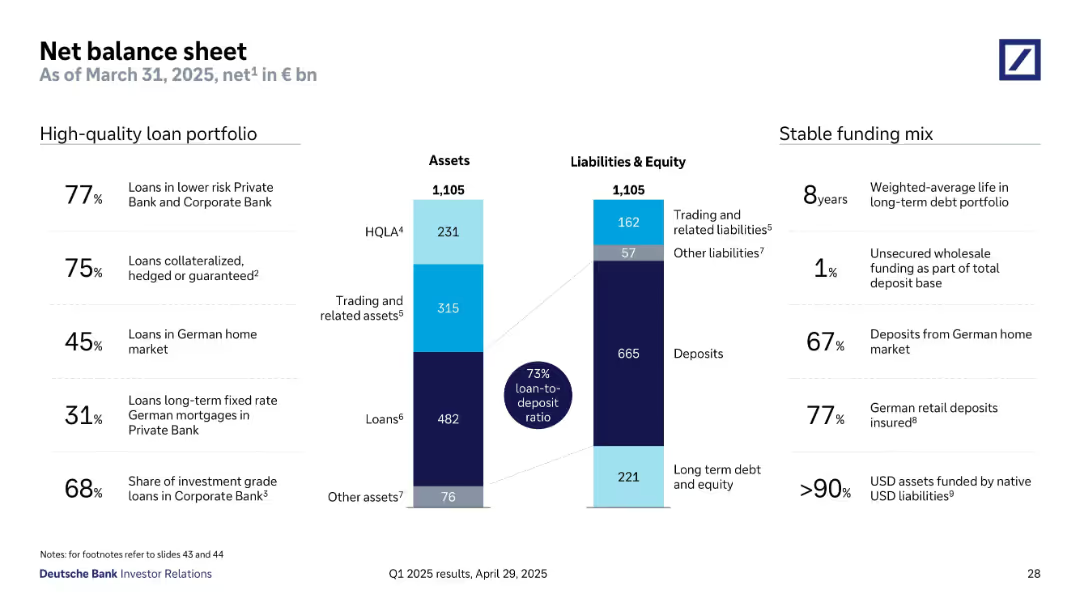
This slide has a column chart showing divisional revenues and a table with financial results for Q1 2024, with key highlights on the right.
Financial Performance
Financial Services
The slide summarizes Q1 2024 financial results, including revenues, profit, balance sheet metrics, and divisional revenues, with key insights.
financial, Q1 2024, highlights, revenue, profit, divisional, results, analysis, metrics, Deutsche Bank
Mixed Chart
Deutsche Bank
Saved
Standard Ipsos layout with ranked horizontal bars; shows 30-country perception of Canada's influence on world affairs over the next decade.
Strategic Planning
Government & Public Sector
This slide ranks global perceptions of Canada’s potential positive influence in world affairs over the next decade. Canada ranks high, with comparison to the 30-country average and change from previous year shown.
global influence, Canada, public opinion, world affairs, strategic perception, international relations, Ipsos ranking, soft power
Mixed Chart
IPSOS
Saved
The slide has a title at the top, text in the middle, and a column chart at the bottom showing trust levels in neighborhoods.
Risk Assessment and Management
Government & Public Sector
Presents data on neighborhood trust levels, with 81% of respondents agreeing they trust people in their neighborhood. The data compares trust levels from May and December 2020.
Neighborhood, Trust, Survey, Community, Data
Single Chart
IPSOS
Saved
Line chart showing central bank key policy rates for various countries. Another chart shows expected policy rate changes over the next year.
Market Analysis and Trends
Financial Services
Tracks central bank policy rates globally, showing historical trends and expectations for future policy changes.
central bank, policy rates, key rates, changes, expectations
Multiple Chart
JP Morgan
Saved
This slide features a vertical bar chart illustrating support levels for Universal Basic Income (UBI) among the surveyed population. The chart is simple, with three distinct bars showing "In favour," "Oppose," and "Not sure" categories.
Market Analysis and Trends
Financial Services
The slide shows that 66% are in favor of UBI, 16% oppose it, and 18% are unsure. It highlights the growing support for UBI, which can be utilized to discuss policy changes, economic reforms, and public sentiment towards income security.
universal basic income, survey results, public opinion, income security, economic reform
Single Chart
IPSOS
Saved
Dual bar charts showing revenue and expenditure performance (2021–2024) by source and cost type
Financial Performance
Government & Public Sector
The slide shows that non-oil revenue outperformed other sources from 2021 to 2024, but debt servicing costs consistently increased, undermining gains. Expenditure data shows underperformance in capital spending. The insights highlight debt as a growing fiscal concern despite revenue growth.
revenue, oil, non-oil, debt servicing, capital expenditure, Nigeria, budget performance
Mixed Chart
PwC/Strategy&
Saved
The slide has horizontal bar charts with percentages showing the top four complaints about digital partners and vendors.
Customer and Market Segmentation
Professional Services
The slide lists and quantifies the top complaints about digital partners, including coordination and inadequate training.
digital partners, complaints, vendors, coordination, training
Mixed Chart
BCG
Saved
Matrix of four scenarios (A–D) with visual indicators of vaccine efficacy and coverage; accompanied by descriptive text.
Strategic Planning
Healthcare & Pharmaceuticals
Illustrates four vaccine rollout scenarios ranging from pessimistic to optimistic, based on varying levels of efficacy and population coverage. Assumptions include 6-month ramp-up and 2-year immunity. Highlights implications for controlling the pandemic.
vaccine scenarios, efficacy, coverage, epidemic control, modeling
Mixed Chart
McKinsey
Saved
The slide displays a complex bar chart categorizing employment by job role across different countries, accompanied by a text block for detailed explanation.
Market Analysis and Trends
Technology & Software
This slide analyzes job roles distribution by role cluster, using statistical analysis to predict the impact of intelligent technologies in various industries. It is useful for strategic workforce planning and analysis.
Employment, Job Roles, Intelligent Technologies, Workforce Planning, Analysis
Single Chart
Accenture
Saved
Displays a combination of line charts and column chart detailing interest rate hedges over time, using smooth curves and shaded areas for visual distinction.
Financial Performance
Financial Services
Provides an overview of interest rate hedging strategies and their financial impact from 2021 to projected 2025.
interest rates, hedging strategies, financial planning, 2025 forecast, risk management
Mixed Chart
Deutsche Bank
Saved
The slide shows a bar chart with text, discussing how Canadians would manage a $5,000 unexpected expense with key methods.
Risk Assessment and Management
Financial Services
It outlines various methods Canadians would use to handle an unexpected $5,000 expense, based on survey responses.
Preparedness, Unexpected Expenses, Management, Canadians, $5,000, Bar Chart, Financial, Risk, Assessment, Methods
Mixed Chart
IPSOS
Saved
Three-panel design using large circular charts and callouts. Visual emphasis on AXP travel performance vs. industry.
Product and Service Analysis
Financial Services
Demonstrates AXP’s strength in travel services, with higher percentages of premium air sales and luxury hotel bookings, significantly outperforming industry benchmarks.
travel bookings, premium travel, luxury hotels, industry benchmark, travel innovation, Amex travel
Mixed Chart
McKinsey
Saved
Featuring two bar charts comparing the decline in market cap for tech and non-tech segments in the S&P500 and the equity capital distribution in global buyout deals, categorized by industry sectors with a significant red section representing technology, specifically software and hardware.
Market Analysis and Trends
Financial Services
This slide highlights the discrepancy in tech sector representation between public markets and private equity portfolios, pertinent to strategic discussions on portfolio composition and market exposure.
Market Cap, Tech Sector, Non-Tech, Private Equity, Public Markets, Portfolio Composition
Multiple Chart
Bain
Saved
Bar charts showing survey respondents' reports of cost savings and revenue growth from data analytics investments, alongside projections of future spending increases.
Financial Performance
Technology & Software
The slide presents data on the financial impact of data analytics investments, including cost savings and revenue growth, and expectations for future spending. Useful for assessing the return on investment in data analytics.
data analytics, cost savings, revenue growth, investment
Multiple Chart
Deloitte
Saved
Slide contains three vertical bar charts comparing the focus on outsourcing, automation, and workforce experience among leaders, middle group, and laggards.
Operational Efficiency
Retail & E-commerce
Leaders are shown to prioritize automation and enhancing workforce experience over outsourcing, reflecting a shift towards more sustainable internal improvements in business operations.
automation, outsourcing, workforce, leaders, laggards, business operations, prioritize, sustainable
Single Chart
Deloitte
Saved
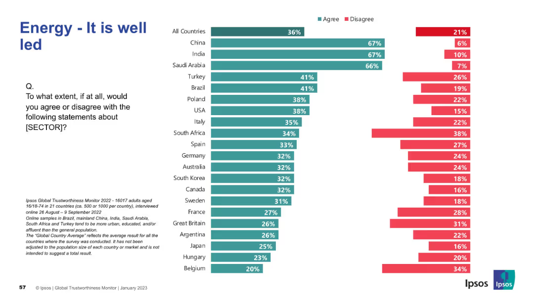
Similar format as previous: left-side large text and right-side horizontal bar chart showing country agreement/disagreement.
Market Analysis and Trends
Environmental Services & Sustainability
This slide explores public perception of whether developed countries are currently leading efforts in combating climate change. Results vary widely, with global agreement lower than on other climate topics, suggesting a more skeptical view of current leadership.
climate leadership, developed countries, perception, global view, public opinion, Ipsos, environmental action, Earth Day
Mixed Chart
IPSOS
Saved
Features a comparative layout with two graphical representations of asset valuations at different times. The first part shows asset values as of December 2021, and the second part shows them for December 2022. Below, a line graph comparing net initial yield by asset class over several years is shown, correlating with German 5Y Bonds for reference. There is an explanatory note and references to valuation reports.
Financial Performance
Real Estate & Construction
Compares portfolio valuations at different time points to demonstrate resilience, especially considering economic factors such as interest rate increases.
Portfolio Valuation, Asset Management, Yield Analysis, Economic Resilience, Real Estate, Financial Assessment, Interest Rate Impact
Multiple Chart
Morgan Stanley
Saved
The slide contains a mix of column charts and text segments detailing Singapore's emission profile, government commitments, and a "2030 Trajectory" map with recommended actions.
Regulatory and Compliance
Environmental Services & Sustainability
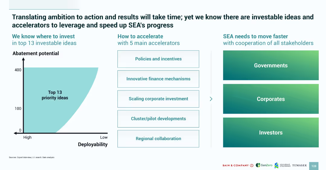
Discusses Singapore's approach to green transitions, highlighting government commitments to the environment by 2030, and the challenges and enabling factors for these policies.
Singapore, emissions, green buildings, carbon tax, 2030
Header Horizontal
Bain
Saved
Line chart with a curve representing relative probability over time; annotated with influencing factors; timeline spans Q4 2020 to Q1 2023.
Strategic Planning
Healthcare & Pharmaceuticals
Estimates peak probability for functional end of the pandemic in Q3–Q4 2021, influenced by vaccine efficacy, speed of distribution, and therapeutic developments. Scenarios for faster or slower progress are annotated.
COVID-19, pandemic end, vaccine, immunity, timeline, probability
Mixed Chart
McKinsey
Saved
Previous
Next
If nothing, comes up, please save your slides first
Create a FREE account to continue browsing
Receive Instant Access to 1,000+ slides from companies like McKinsey, Google, and Goldman Sachs
First Name
Last Name
Email
Password
I agree to all
Terms & Privacy Policy
Thank you! Your submission has been received!
Oops! Something went wrong while submitting the form.
Have an account?
Sign in
Column Chart
Heatmap
Chevron
Org Chart
Infographic
Callouts
Timeline
List
Graphic
Picture
Process Flow
Diagram
Paragraph
Map
Table
Framework
Subtitle
Takeaway Box
Icon
Other Chart
Radar Chart
Waterfall Chart
Mekko Chart
Pie Chart
Scatter Plot
Line Chart
Bar chart
Bullet points