Create a FREE Account
Instant access to 1,000+ real slides from top companies like McKinsey, BCG, Goldman Sachs, Google and many more!
First Name
Last Name
Email
Password
I agree to all
Terms & Privacy Policy
Thank you! Your submission has been received!
Oops! Something went wrong while submitting the form.
Have an account?
Sign in
Library
Templates
Courses
Pricing
My Account
My Slides
My Templates
✦ AI
AI Prompt Library
AI Search
Sign in
Start Here
Logout
My Saved Slides
The slide includes a column chart and a photo. The chart shows the percentage of family offices offering various services like administrative support, investment advice, and tax advice.
Product and Service Analysis
Financial Services
This slide outlines the various services offered by APAC family offices, highlighting the most common services provided, such as administrative support and investment advice.
services, family offices, APAC, administrative support, investment advice
Mixed Chart
EY
Saved
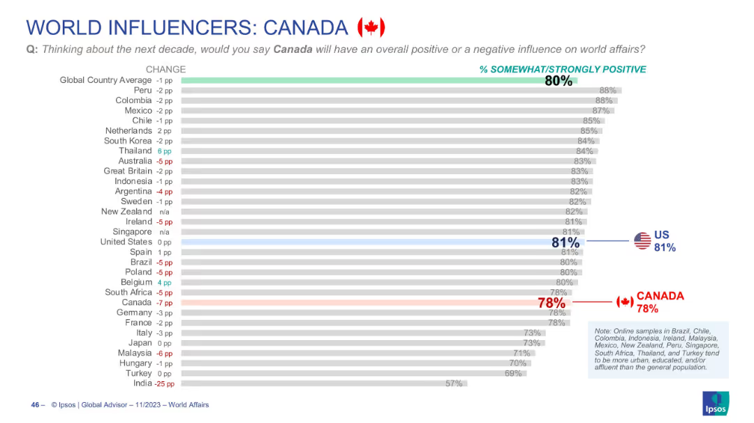
Horizontal bar chart with grey bars showing % positive views of Canada globally; country flags/icons and arrows
Market Analysis and Trends
Government & Public Sector
Shows global perceptions of Canada's influence on world affairs over the next decade. Canada scores 78% positive, slightly below the global average (80%) and U.S. (81%). Includes year-over-year change indicators.
Canada, world influence, perception, Ipsos, global views, public opinion, bar chart, positive rating, global affairs, trend
Single Chart
IPSOS
Saved
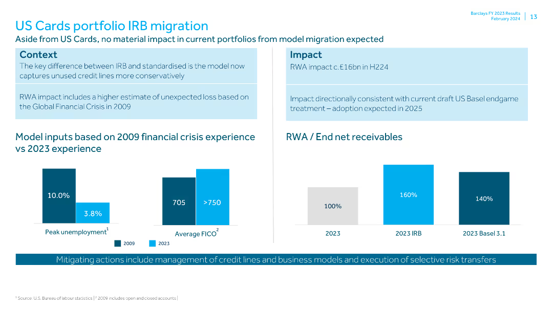
Contains bar charts comparing model inputs from 2009 financial crisis vs 2023, and data on RWA and end net receivables. Context and impact boxes are included.
Risk Assessment and Management
Financial Services
Discusses the impact of IRB migration on the US Cards portfolio, comparing past and current financial conditions. It details the RWA impact and mitigating actions.
IRB migration, US Cards, financial crisis, RWA, receivables, peak unemployment, FICO, liquidity pool, credit lines, risk transfer
Multiple Chart
Barclays
Saved
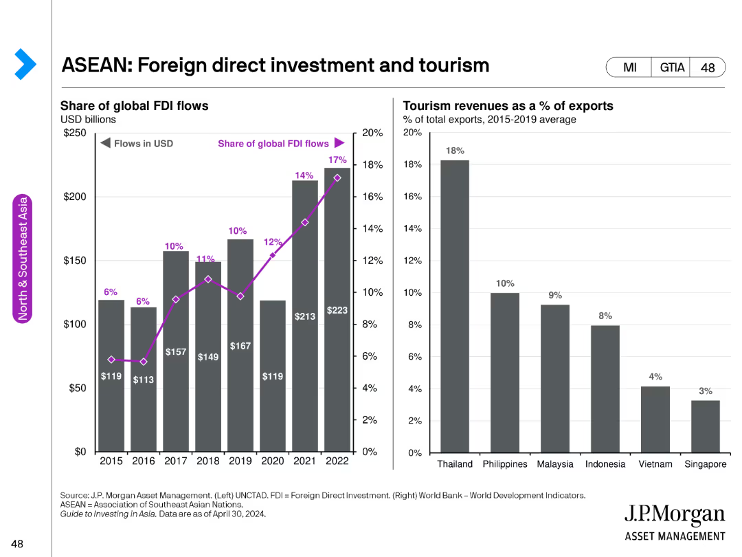
The left side of the slide features a bar chart showing the share of global FDI flows from 2015 to 2022. The right side has a bar chart depicting tourism revenues as a percentage of total exports for ASEAN countries.
Investment Analysis
Financial Services
This slide analyzes foreign direct investment trends and tourism revenues in ASEAN countries, providing insights into economic inflows and their impact on regional economies.
ASEAN, foreign direct investment, tourism, economic analysis, regional inflows
Multiple Chart
JP Morgan
Saved
This slide presents a column chart detailing expenditure trends over a decade and a dotted line illustrating expenditure as a percentage of GDP, along with a sidebar on wage containment measures.
Regulatory and Compliance
Government & Public Sector
Discusses strategic measures to manage and consolidate government expenditure, including wage bill controls.
Fiscal consolidation, expenditure trends, wage control, budget
Mixed Chart
PwC/Strategy&
Saved
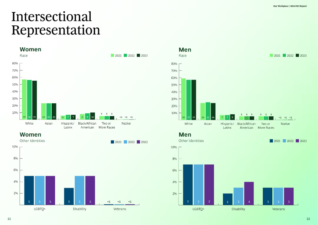
This slide uses column charts to show intersectional representation of different races and identities among men and women over three years.
Customer and Market Segmentation
Professional Services
The slide provides data on intersectional representation in terms of race and other identities among men and women in the years 2021, 2022, and 2023.
intersectional, representation, race, gender, identity
Multiple Chart
BCG
Saved
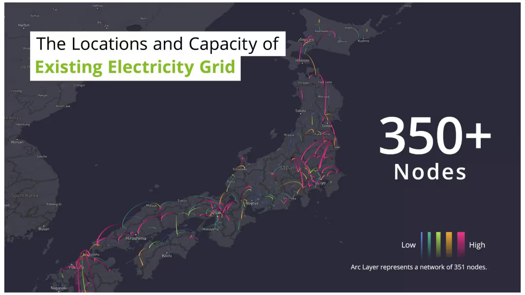
The slide features a dark map of Japan with arc lines connecting various points, indicating the locations and capacities of the electricity grid nodes. The arcs are color-coded from low to high capacity. There is also a legend.
Technology and Digital Transformation
Energy & Utilities
The slide provides an overview of the existing electricity grid in Japan, highlighting over 350 nodes with varying capacities. It's useful for understanding current infrastructure and planning upgrades.
Electricity grid, nodes, capacity, Japan, map
Graphic
Deloitte
Saved
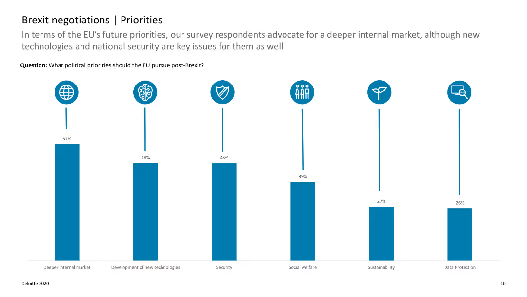
The slide features a column chart with data on the top political priorities for the EU post-Brexit, such as internal market and new technologies.
Strategic Planning
Government & Public Sector
This slide highlights the key political priorities for the EU after Brexit, showing the importance of internal market and technology development. It helps in understanding EU strategic focuses.
Brexit, EU priorities, political priorities, internal market, technology
Single Chart
Deloitte
Saved
Slide displays two column charts comparing cost/income ratios for 2022 and a 2025 target, alongside a breakdown of efficiency measures.
Operational Efficiency
Financial Services
Details strategies to reduce Deutsche Bank's cost-income ratio through operational efficiencies and technological improvements.
Cost-income ratio, operational efficiency, Deutsche Bank, reduction, strategy, technology
Multiple Chart
Deutsche Bank
Saved
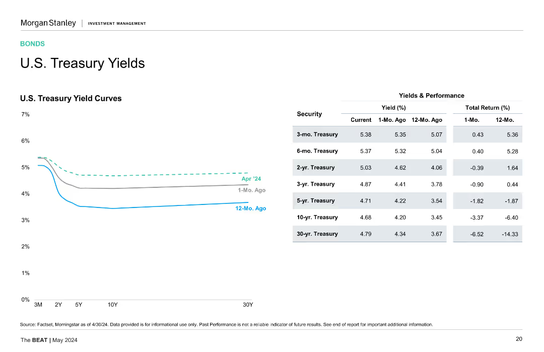
Contains a line chart on the left showing the U.S. Treasury yield curves for April 2024, one month ago, and twelve months ago, and a table on the right comparing yields and total returns for various Treasury securities over the same periods.
Market Analysis and Trends
Financial Services
The slide analyzes the changes in U.S. Treasury yields over the past year, providing insights into yield curves and total returns for different Treasury maturities.
U.S. Treasury, Yields, Yield Curve, Total Return, Financial Analysis, Treasury Securities
Mixed Chart
Morgan Stanley
Saved
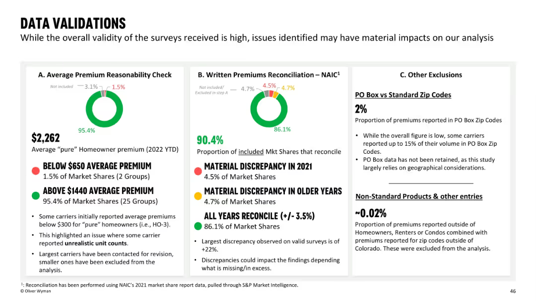
Slide is divided into three labeled sections (A–C) with circular data visuals, percentage figures, and explanations. Clear separation of content with red/green/yellow traffic light indicators.
Regulatory and Compliance
Financial Services
This slide assesses the validity of insurance data used in the analysis, focusing on average premium reasonableness, written premium reconciliation, and exclusions like PO boxes. The slide highlights a few discrepancies but confirms high overall validity of data collected from insurers. Key issues like outliers and unrealistic unit counts are addressed.
data validation, premiums, reconciliation, insurance, survey quality, PO box, exclusions, market share
Multiple Chart
Oliver Wyman
Saved
Line graph showing real consumer spending trends for different major economies
Market Analysis and Trends
Financial Services
The slide presents trends in real consumer spending, comparing major economies, with a focus on the impact of reopening in China.
consumer spending, trends, major economies, China, reopening
Single Chart
Accenture
Saved
Features a data table with revenue, client numbers, deposits, and income figures, as well as diagrams depicting business segments and LOBs.
Financial Performance
Financial Services
Provides a snapshot of the firm’s performance in the payments sector, showing revenue, clients, and income data.
Payments, Revenue, Clients, Deposits, Income, Corporate Banking, Treasury Services
Header Horizontal
JP Morgan
Saved
Text with images showing groups of employees in discussion and meeting environments, emphasizing trust and people experience in the workplace.
Human Resources and Talent Management
Professional Services
The slide emphasizes the importance of building trust and creating a sustainable people experience in the workplace, highlighting statistics on trust and employee support.
Trust, people experience, workplace, employee support, sustainability
Multiple Chart
EY
Saved
A simple agenda slide with a two-column bulleted list detailing the topics to be covered in the presentation, with a focus on industry dynamics and profitability drivers.
Strategic Planning
Financial Services
Sets the agenda for a discussion on distribution industry dynamics, profitability drivers, and an overview of EY-Parthenon's experience.
agenda, distribution industry, profitability drivers, EY-Parthenon, presentation, organization
Agenda
EY
Saved
Slide features bar graphs comparing three survey years across various tech issues impacting underwriters' workload. Purple theme, vertical bars.
Market Analysis and Trends
Financial Services
Analyzes the impact of technological challenges on underwriters' workload over time, highlighting areas such as process integration and data issues.
technology, underwriting, workload, integration, survey, data, performance, training
Mixed Chart
Accenture
Saved
The slide features a column chart showing percentages of investments bought during the pandemic, with text describing the data. Clean white background.
Market Analysis and Trends
Financial Services
This slide presents data on the percentage of investments bought by Canadian investors during the pandemic, showing that a significant number of investors were buying rather than selling.
investments bought, pandemic, Canadian investors, data analysis, COVID-19
Mixed Chart
IPSOS
Saved
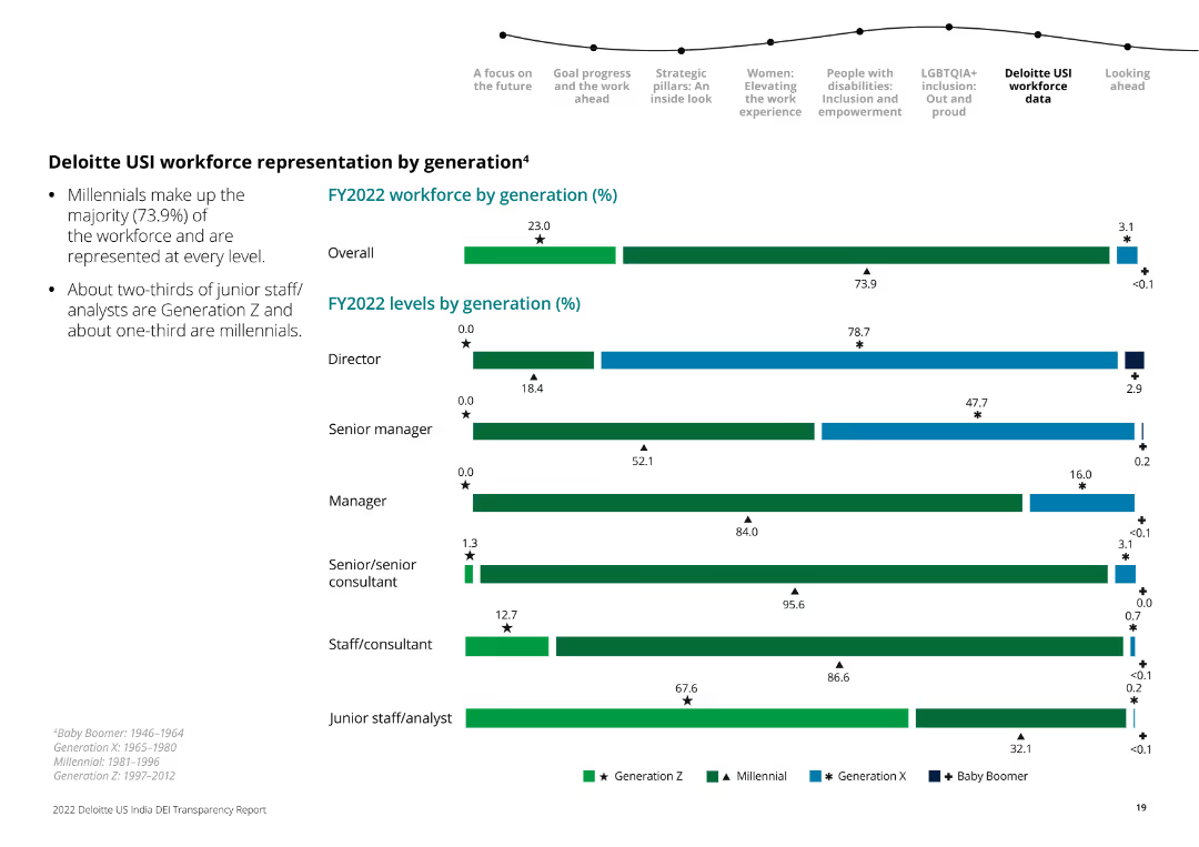
The slide presents horizontal bar charts depicting workforce distribution across generations (Gen Z, Millennials, Gen X, Baby Boomers) in FY2022.
Human Resources and Talent Management
Professional Services
The slide details the generational composition of Deloitte USI's workforce at various organizational levels in FY2022.
workforce, generation, Deloitte, distribution, FY2022, generational analysis, bar chart
Multiple Chart
Deloitte
Saved
Column chart with a projected growth annotation, showing the percentage use of AI and machine learning in marketing efforts from the current to future expectations.
Technology and Digital Transformation
Technology & Software
Highlights the current and expected future usage of AI and machine learning in marketing, noting a 166% growth projection.
AI, machine learning, marketing, growth projection, automation
Single Chart
Deloitte
Saved
This slide shows a column chart with a dark background, representing banking and markets revenues against prior years with annotations.
Market Analysis and Trends
Financial Services
Examines market share and financing gains in the Global Banking & Markets revenues over a period, indicating growth and trends.
market share, revenue, growth, banking, trends
Single Chart
Goldman Sachs
Saved
Features two line charts: 'AAA Muni-to-Treasury Yield Ratios' and 'Credit Quality Spreads vs. AAA'. Both charts include timelines from 2014 to 2024, color differentiation for clarity, and a data table for current and historical metrics in a clean and organized manner.
Market Analysis and Trends
Financial Services
This slide offers an update on the municipal bond market, focusing on yield ratios and credit quality spreads. Aimed at investors or analysts, it provides a clear visual representation of the market's condition, comparing municipal bonds to treasury yields and assessing credit quality differences, crucial for strategic financial planning or market forecasting.
Yield Ratios, Credit Spreads, Municipal Bonds, Treasury, AAA
Multiple Chart
Morgan Stanley
Saved
This slide presents a column chart visualizing the 'Efficiency Ratio' trend, along with a comprehensive table detailing various expense categories and their respective changes compared to prior periods.
Financial Performance
Financial Services
Offers a detailed view of the company's expenses, showcasing factors contributing to the efficiency ratio and providing context for the financial data, such as increased non-compensation expenses and changes in the effective tax rate.
Efficiency Ratio, Operational Expenses, Compensation, Depreciation, Technology, Professional Fees, Tax Rate, Financial Health
Mixed Chart
Goldman Sachs
Saved
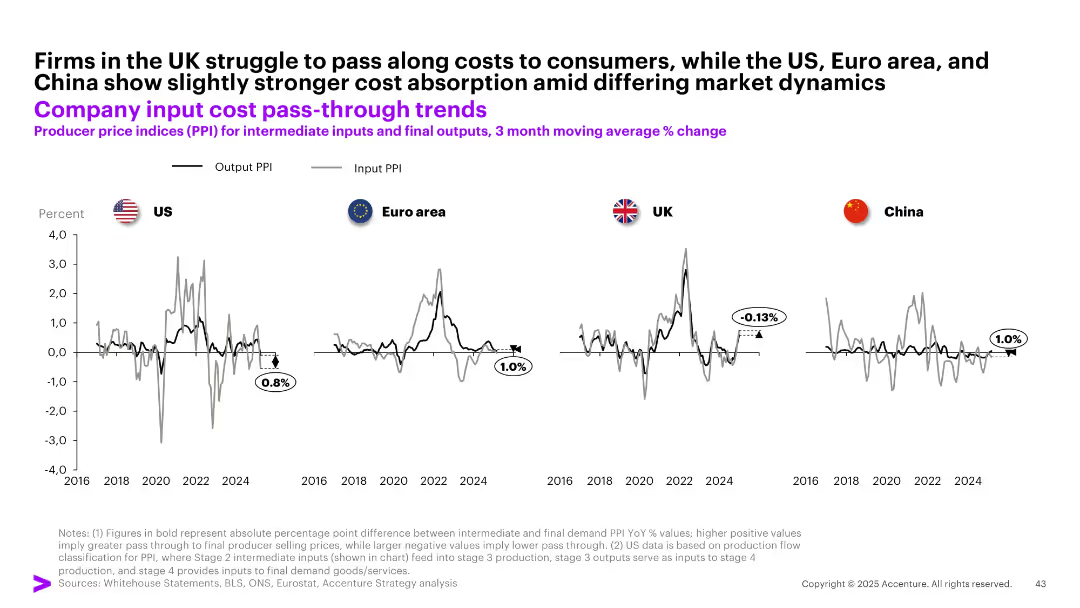
Four-panel line chart comparing Output PPI vs Input PPI across US, UK, Euro area, and China; subtle grid; black and gray lines
Performance Metrics and KPIs
Financial Services
The slide analyzes the extent to which companies in different regions can pass input costs to final prices. The UK shows weak pass-through (-0.13%), whereas the US, Euro area, and China demonstrate better absorption of input cost increases with positive output-input PPI spreads.
PPI, input cost, output prices, pass-through, UK, China, US, Euro area, producer prices
Multiple Chart
Accenture
Saved
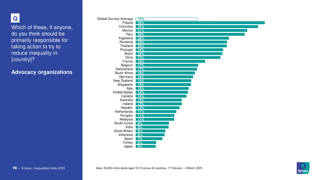
Horizontal bar chart by country comparing support for advocacy organizations’ role in addressing inequality; clean white background.
Market Analysis and Trends
Government & Public Sector
This slide shows how people in various countries perceive advocacy organizations as responsible actors in fighting inequality, with Poland and Colombia ranking highest.
advocacy, NGOs, inequality, country-level views, global opinion, public responsibility
Mixed Chart
IPSOS
Saved
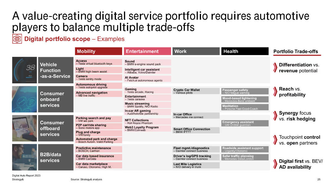
A detailed table showing digital service portfolios across mobility, entertainment, work, and health, highlighting trade-offs.
Technology and Digital Transformation
Transportation & Logistics
Explains the balance automotive players must achieve in creating digital service portfolios, addressing differentiation, reach, and control.
digital services, portfolio, trade-offs, automotive, mobility
Table
PwC/Strategy&
Saved
Previous
Next
If nothing, comes up, please save your slides first
Create a FREE account to continue browsing
Receive Instant Access to 1,000+ slides from companies like McKinsey, Google, and Goldman Sachs
First Name
Last Name
Email
Password
I agree to all
Terms & Privacy Policy
Thank you! Your submission has been received!
Oops! Something went wrong while submitting the form.
Have an account?
Sign in
Column Chart
Heatmap
Chevron
Org Chart
Infographic
Callouts
Timeline
List
Graphic
Picture
Process Flow
Diagram
Paragraph
Map
Table
Framework
Subtitle
Takeaway Box
Icon
Other Chart
Radar Chart
Waterfall Chart
Mekko Chart
Pie Chart
Scatter Plot
Line Chart
Bar chart
Bullet points