Create a FREE Account
Instant access to 1,000+ real slides from top companies like McKinsey, BCG, Goldman Sachs, Google and many more!
First Name
Last Name
Email
Password
I agree to all
Terms & Privacy Policy
Thank you! Your submission has been received!
Oops! Something went wrong while submitting the form.
Have an account?
Sign in
Library
Templates
Courses
Pricing
My Account
My Slides
My Templates
✦ AI
AI Prompt Library
AI Search
Sign in
Start Here
Logout
My Saved Slides
A line chart displaying trends in GDP per capita from 2011 to 2016 for several US metro areas, each represented by a different colored line, with highlighted points for areas like San Francisco and Washington DC.
Financial Performance
Transportation & Logistics
Analyzes economic growth in U.S. metropolitan areas through GDP per capita over time, highlighting regions with significant changes. Useful for economic planning and assessment.
GDP, economic growth, metro areas, US, trends, financial analysis
Single Chart
BCG
Saved
The slide contains a bubble chart and various company logos with financial data. It is divided into two main sections, showing local execution platform and cooperation details.
Market Analysis and Trends
Financial Services
The slide highlights Credit Suisse's position in Investment Banking in Switzerland, showing execution platform details and cooperation with other divisions.
Investment Banking, Switzerland, market analysis, execution platform, cooperation
Mixed Chart
Credit Suisse
Saved
The slide presents a matrix chart categorizing online channels into brand owned, cooperate, aggregators, and luxury verticals, with various metrics such as price level and number of brands with/without cosmetics.
Market Analysis and Trends
Retail & E-commerce
This slide categorizes the different types of online channels in the luxury market, explaining their price levels and brand control, highlighting the role of cosmetics in each category.
Online channels, luxury market, brand control, cosmetics, price level, domestic market
Table
Bain
Saved
Contains a dual-layer diagram comparing traditional consulting with A&M's approach, focusing on Performance Improvement, with clear visual distinction.
Investment Analysis
Professional Services
This slide contrasts traditional consulting with A&M’s unique performance improvement approach, emphasizing the integration of hands-on interim management.
Performance, Improvement, Consulting, A&M, Strategy
Diagram
Alvarez & Marsal
Saved
A pie chart indicates client coverage across sectors and a parallel comparative table shows global league table rankings from 2010 to 2019. It's visually clean with a light blue theme and organized layout.
Market Analysis and Trends
Financial Services
This slide highlights Goldman Sachs' market leadership and consistent performance over time, contrasting rankings in various financing activities, aimed at market analysts or potential clients to demonstrate the firm's competitive positioning.
Market leadership, client coverage, financial rankings, performance, Goldman Sachs
Framework
Goldman Sachs
Saved
Split layout: two-column format, left slide (Insight 3) with a bar chart and paragraph text; right slide (Insight 4) also with a bar chart and multiple paragraph blocks. Bold headers and red highlights used.
Market Analysis and Trends
Retail & E-commerce
Insight 3 highlights increased visits to physical stores such as supermarkets, malls, and discounters in 2024. Insight 4 emphasizes that promotions, hygiene, and loyalty benefits are strong incentives for in-store shopping. Regional variations in preferences are also discussed.
Physical stores, supermarkets, promotions, consumer trends, hygiene, membership, retail incentives, discount stores, shopper behavior
Multiple Chart
Roland Berger
Saved
Contains lists and bullet points detailing levers and strategies for optimizing demand management processes.
Strategic Planning
Professional Services
Provides strategies for reducing unnecessary work and aligning organizational processes with market demands.
demand management, strategies, optimization, alignment
Table
Deloitte
Saved
A line chart showing historical CO2 concentrations, highlighting significant increases over millennia and recent years.
Regulatory and Compliance
Environmental Services & Sustainability
Offers historical context for current CO2 levels, underscoring the urgency in addressing climate change for policy makers and environmental planners.
CO2 levels, climate change, environmental policy, historical data, sustainability
Single Chart
BCG
Saved
Images depicting industry applications of immersive tech, with short text descriptions underneath.
Technology and Digital Transformation
Technology & Software
Insights on how immersive reality could change operations within various industries, focusing on specific applications like AR for operational safety.
Immersive reality, industry operations, AR, VR, applications
Pillar
McKinsey
Saved
Bar charts by gender and generation; each group has four bars showing top healthcare issues (staff, access, cost, bureaucracy).
Market Analysis and Trends
Healthcare & Pharmaceuticals
The slide visualizes top challenges people identify in their country’s healthcare system—“Not enough staff” and “Access to treatment” are dominant across genders and generations. Data presented globally.
healthcare issues, staff shortage, access, cost, bureaucracy, global average, gender, age cohort, concerns
Mixed Chart
IPSOS
Saved
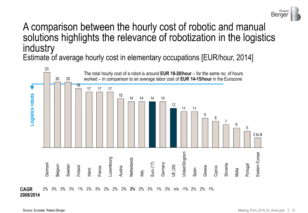
Line graph depicting road transport tonnage from 2012 to 2021 by region, with CAGR stats on the side. Clear separation between historical and forecast data.
Market Analysis and Trends
Transportation & Logistics
This slide analyzes road transport volume (in billion ton-km), indicating a steady global increase with China leading in growth. It links increased road transport to greater demand for fleets and vehicle production.
['road transport', 'fleet utilization', 'China', 'market growth', 'CAGR', 'logistics', 'forecast', 'tonnage']
Single Chart
Roland Berger
Saved
A data-driven slide with key economic indicators for Hong Kong, including GDP, population, and sector contributions.
Financial Performance
Financial Services
The slide presents Hong Kong’s macroeconomic determinants, highlighting the potential economic impact of the metaverse by 2035.
Hong Kong, GDP, economic impact, metaverse, financial indicators
Mixed Chart
Deloitte
Saved
A pie chart showing the percentage distribution between tax revenue and non-tax revenue for the fiscal year 2019/20. The chart is colored in shades of gray, with a clear distinction between the two categories.
Financial Performance
Government & Public Sector
This slide presents a clear visual representation of the revenue sources for a government, highlighting the overwhelming dependence on tax revenue compared to non-tax sources. It provides a foundational understanding for discussions on fiscal policy and revenue management strategies.
tax revenue, non-tax revenue, fiscal policy, government finance, budget
Single Chart
PwC/Strategy&
Saved
The slide uses a combination of bar charts and text to present the impact of disrupted Russian and Ukrainian exports of wheat, corn, and sunflower on global agribusiness markets.
Market Analysis and Trends
Agriculture & Food Production
The slide discusses the significant impact of disrupted grain and sunflower supply from Russia and Ukraine on global agribusiness. It highlights export percentages, top customers, and potential industry impacts, including food shortages and price increases.
agribusiness, supply disruption, wheat, corn, sunflower, exports
Multiple Chart
BCG
Saved
The slide features a flow diagram illustrating multiple chemical pathways from CO2, showcasing the conversion of CO2 into various chemical products like hydrocarbons, methanol, formic acid, and more.
Technology and Digital Transformation
Energy & Utilities
The slide presents opportunities for the chemical industry to utilize CO2 through various pathways, highlighting the potential to reduce fossil fuel dependence and valorize emitted CO2.
CO2 pathways, chemical conversion, industry opportunities, fossil fuel reduction
Diagram
Kearney
Saved
The slide shows ranked lists and pie charts discussing reasons for employees leaving current firms. The background is split between blue and white, with icons symbolizing each reason.
Human Resources and Talent Management
Professional Services
Examines the primary reasons employees consider leaving, with a focus on misalignment with company vision and compensation issues. Ideal for employee retention strategy development.
employee retention, company vision, compensation, job change reasons, retention strategies, pie charts
Header Horizontal
Kearney
Saved
Displays a column chart comparing infrastructure work in New Zealand from FY07 to FY25, with actuals until FY12 and future scenarios. It includes a clear title, annotations, and distinct scenario markers.
Market Analysis and Trends
Real Estate & Construction
This slide discusses the expected trends in infrastructure projects in New Zealand, comparing past data with future projections under various economic conditions, essential for strategic planning.
infrastructure, trends, New Zealand, projections, strategic planning
Mixed Chart
Deloitte
Saved
The slide includes a column chart showing the difficulty in recruiting various skills such as creativity (77%), leadership (75%), and emotional intelligence (64%). It also shows the importance of these skills.
Human Resources and Talent Management
Professional Services
This slide addresses the challenges CEOs face in recruiting skills that cannot be automated. It lists creativity, leadership, and emotional intelligence as the most difficult to find, alongside their importance to organizations.
Recruitment, skills, automation, creativity, leadership, emotional intelligence, CEOs, HR challenges
Mixed Chart
PwC/Strategy&
Saved
The slide includes a bar chart showing various use cases for DCRs like data anonymization, privacy compliance, data cleaning, and transformation, with percentages for each.
Technology and Digital Transformation
Technology & Software
The slide explains the main use cases for data clean rooms (DCRs) among current users, emphasizing their role in addressing privacy concerns and audience activation.
DCR use cases, privacy, data anonymization, compliance
Single Chart
IPSOS
Saved
The slide has a table on the left and a pie chart on the right. The table lists the top 10 tenant-customers with associated percentages of total headline rent. The pie chart shows the distribution of industries contributing to the total leases. Both charts are color-coded for clarity. There's also a summary statement at the top, highlighting the income security backed by government and MNC tenants.
Financial Performance
Real Estate & Construction
Analyzes the stability of rental income by showcasing the share contributed by top tenant-customers and the diversification across industries.
Income Security, Tenant Analysis, Government Tenants, MNC, Lease Distribution, Industry Diversification, Financial Stability
Mixed Chart
Morgan Stanley
Saved
Chart plotting vaccine efficacy vs. coverage, overlaid with contour lines representing natural immunity needed; insights listed on the side.
Strategic Planning
Healthcare & Pharmaceuticals
Presents a sensitivity analysis showing how much natural immunity is required to achieve herd immunity under different vaccine efficacy and coverage combinations. Only optimistic scenarios succeed without needing substantial pre-existing immunity.
vaccine coverage, herd immunity, natural immunity, modeling, thresholds
Mixed Chart
McKinsey
Saved
Features a line chart depicting the declining revenue trend for traditional TV and the rising trend for OTT video in Hong Kong from 2016 to 2025. The slide also includes a column chart showing the number of households in Hong Kong subscribing to various TV services over the same period, highlighting the shift in consumer behavior towards digital streaming platforms.
Market Analysis and Trends
Media & Entertainment
Analyzes the shifting dynamics between traditional television and over-the-top (OTT) video services in Hong Kong, projecting that OTT will surpass traditional TV revenues by 2024. This slide is useful for understanding the impact of digital transformation on media consumption and the increasing preference for streaming services over traditional broadcast formats.
OTT, traditional TV, Hong Kong, revenue trends, line chart, bar chart, consumer behavior
Multiple Chart
PwC/Strategy&
Saved
Features a comparative column chart showing direct sales ROI by media channel, emphasizing the misleading nature of traditional MMM findings without considering the halo effect.
Market Analysis and Trends
Media & Entertainment
Explains the misinterpretation of media spending ROI across various channels when ignoring the halo effect, using direct sales ROI data.
halo effect, MMM findings, media channels, ROI, misleading
Single Chart
Accenture
Saved
Bar chart on the left comparing anticipated cross-industry acquisition percentages globally, in the Middle East, and the GCC; right side features an image of industrial machinery and thematic visual accents.
Mergers and Acquisitions
Professional Services
The slide compares the anticipated share of cross-industry M&A deals over the next three years, with the GCC leading (74%), followed by the Middle East (72%) and Global (60%). It emphasizes a regional trend toward cross-industry diversification and innovation-driven acquisitions, especially in healthcare, logistics, and consumer markets.
M&A, cross-industry, diversification, GCC, Middle East, deal value, strategic pivot, innovation, new markets, acquisition planning
Mixed Chart
PwC/Strategy&
Saved
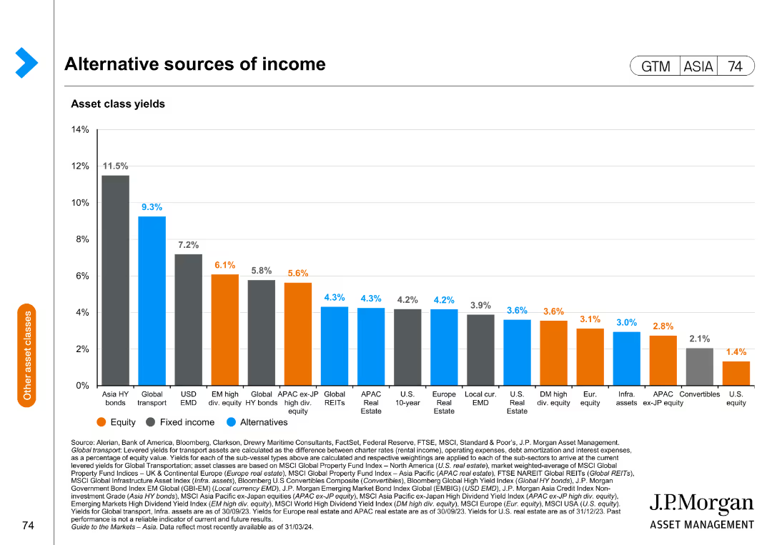
The slide features a table and a column chart presenting 2022 performance data against targets set at the 2022 Investor Day, with future outlooks. Color differentiation is used to distinguish between various types of data and forecasts, with textual annotations for clarification.
Financial Performance
Financial Services
Provides a comprehensive review of a financial firm's performance relative to its targets, showing areas of growth and projections for future earnings. It could serve to evaluate business performance, communicate financial results to stakeholders, or strategize for upcoming fiscal periods.
financial performance, targets, investor day, revenue growth
Single Chart
JP Morgan
Saved
Previous
Next
If nothing, comes up, please save your slides first
Create a FREE account to continue browsing
Receive Instant Access to 1,000+ slides from companies like McKinsey, Google, and Goldman Sachs
First Name
Last Name
Email
Password
I agree to all
Terms & Privacy Policy
Thank you! Your submission has been received!
Oops! Something went wrong while submitting the form.
Have an account?
Sign in
Column Chart
Heatmap
Chevron
Org Chart
Infographic
Callouts
Timeline
List
Graphic
Picture
Process Flow
Diagram
Paragraph
Map
Table
Framework
Subtitle
Takeaway Box
Icon
Other Chart
Radar Chart
Waterfall Chart
Mekko Chart
Pie Chart
Scatter Plot
Line Chart
Bar chart
Bullet points