Create a FREE Account
Instant access to 1,000+ real slides from top companies like McKinsey, BCG, Goldman Sachs, Google and many more!
First Name
Last Name
Email
Password
I agree to all
Terms & Privacy Policy
Thank you! Your submission has been received!
Oops! Something went wrong while submitting the form.
Have an account?
Sign in
Library
Templates
Courses
Pricing
My Account
My Slides
My Templates
✦ AI
AI Prompt Library
AI Search
Sign in
Start Here
Logout
My Saved Slides
This slide contains a gauge chart displaying an average score of 2.71 for SDG reporting quality, with a breakdown of qualitative and quantitative measures.
Regulatory and Compliance
Professional Services
It discusses the average score for reporting quality of companies prioritizing SDGs, highlighting improvements from the previous year and the importance of setting qualitative and quantitative KPIs.
SDG reporting, quality score, qualitative, quantitative, professional services, gauge chart, improvements, compliance
Mixed Chart
PwC/Strategy&
Saved
Consists of two column charts, one depicting the change in growth territory rankings by China CEOs and the other showing a global perspective. The slide uses a monochromatic color scheme to differentiate the years for each territory.
Market Analysis and Trends
Financial Services
This slide illustrates the shifting focus of China CEOs from the US to alternative growth territories like Australia, based on surveyed rankings. It's valuable for discussions on global market dynamics and strategic growth territory identification.
CEO preferences, Growth territories, Market trends, US, Australia, Global ranking
Multiple Chart
PwC/Strategy&
Saved
The slide combines column charts with an image to show representation by groups within BCG X + other specialty business units, comparing race and gender for the years 2021, 2022, and 2023.
Customer and Market Segmentation
Professional Services
The slide provides a detailed look at the representation of different races and genders within BCG X and other specialty business units over three years.
representation, BCG X, specialty units, race, gender
Multiple Chart
BCG
Saved
Includes line and column charts tracking the ROE and capital across various business divisions from 2017 to 2021.
Financial Performance
Financial Services
This slide provides a comprehensive overview of JP Morgan's business performance over several years, focusing on returns above the firm-wide cost of capital. It shows improvements in ROE and capital allocations across their banking divisions, reflecting strategic financial management.
ROE, capital, business, performance
Multiple Chart
JP Morgan
Saved
Left-aligned text block with bold statistics; right side features dual vertical bar charts comparing N100 and G250 (2017–2022)
Performance Metrics and KPIs
Professional Services
This slide focuses on the inclusion of sustainability data in annual financial reports. It contrasts N100 and G250 trends, showing a plateau for N100 and a decline for G250. The Asia Pacific region is highlighted as dominant in data presentation.
annual reporting, N100, G250, sustainability data, Asia Pacific, transparency, trend analysis
Mixed Chart
KPMG
Saved
The slide showcases the digital transformation in the T&T sector with a diagram illustrating five pillars: Data Hub, Digital ID, Smart Destination, Smart Business, and Digital Skills. There are descriptions of each pillar and related initiatives.
Technology and Digital Transformation
Hospitality & Tourism
Highlights the acceleration of digital transformation in the Greek T&T sector, focusing on initiatives like Data Hub, Digital ID, and smart applications to improve profitability and reduce environmental impact. Details strategic goals and actions.
Digital transformation, Technology, T&T sector, Smart applications, Digital skills
Mixed Chart
EY
Saved
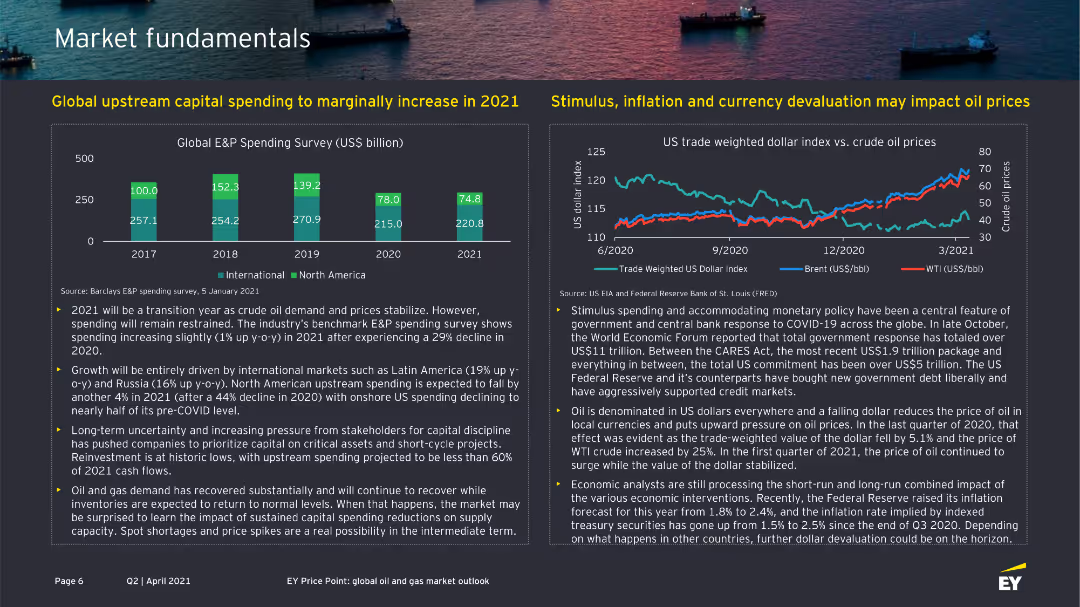
This slide has a column chart detailing profit before tax, including elements like income, costs, and impairment impacts over time.
Financial Performance
Financial Services
The slide highlights the Group RoTE and profit before tax, excluding specific impacts, and provides performance metrics for Q223.
RoTE, profit, tax, performance, financial, metrics, column chart, vertical bar, Q223, income
Mixed Chart
Barclays
Saved
The slide has a white background with blue circles and lines outlining three triggers for regime changes: new solvency framework, new regulatory intervention level, and significant revisions to the existing framework. Each trigger is described with a brief explanation in blue text.
Regulatory and Compliance
Financial Services
This slide outlines the triggers for regime changes in the financial sector, including new solvency frameworks, regulatory intervention levels, and revisions to existing frameworks, providing a structured approach to understanding these changes.
regime change, triggers, solvency, regulatory, compliance
Framework
Oliver Wyman
Saved
Dual-column text-heavy layout on left; performance line chart (GDP vs WiW Index) on right; orange and yellow palette used for segmentation.
Investment Analysis
Government & Public Sector
This slide sets up the productivity analysis section, connecting gender equality progress to economic output across OECD and G7 nations. It introduces the methodology and aims to correlate women’s workforce participation with GDP per hour worked. UK’s lagging productivity is noted, setting context for subsequent findings.
productivity analysis, GDP, gender equality, WiW Index, OECD, G7, UK economy, economic growth, female participation, workplace equity
Mixed Chart
PwC/Strategy&
Saved
Right side features a dual-line chart (goods vs. services spending), while left side includes a narrative discussing inflation-adjusted trends.
Market Analysis and Trends
Consumer Goods
Despite inflation, consumer spending has remained high, particularly on services. However, inflation-adjusted growth is slowing for goods. This slide outlines the divergent post-pandemic spending trends between goods and services.
consumer spending, inflation, goods vs. services, economic trends, real terms growth, post-pandemic
Mixed Chart
McKinsey
Saved
Column chart showing the percentage of time profit margins expanded when S&P 500 sales grew over different periods.
Market Analysis and Trends
Financial Services
Analyzes the correlation between economic growth, profit margin recovery, and high-single-digit earnings growth forecast for the S&P 500 in 2024, based on historical data.
economic growth, profit margins, earnings growth, S&P 500
Mixed Chart
Goldman Sachs
Saved
Vertical column chart showing the most influential roles in purchasing implantable medical devices and consumables across public and private hospitals in SEA.
Market Analysis and Trends
Healthcare & Pharmaceuticals
Highlights that clinical department heads are key influencers for medical consumables in public hospitals, while the procurement department is crucial in private hospitals.
implantable medical devices, medical consumables, purchasing decisions, clinical department heads, SEA
Multiple Chart
LEK
Saved
Features column charts indicating the vaccine wastage rates at various healthcare centers before and after adopting solar power.
Regulatory and Compliance
Healthcare & Pharmaceuticals
Explores the reduction in vaccine wastage through improved power supplies via solar energy adoption, showing significant decreases in wastage rates post-implementation in Nigerian healthcare facilities.
vaccine wastage, solar power, healthcare centers, Nigeria, power supply, energy solutions
Single Chart
BCG
Saved
Contains lists, a block of text defining GPT, and a highlight on the Internet as a GPT. Purple accents are used throughout the slide.
Industry Overview
Technology & Software
Explores the concept of General Purpose Technologies (GPTs) and positions the internet as a critical GPT, highlighting its broad economic impacts.
GPT, internet, technology, economic impact, innovation, broadband, 21st century, utility
Header Vertical
Accenture
Saved
Three-part layout with pie charts for WE 5+5, China, and USA; flags and national data; red-pink-black hybrid color scheme with category breakout
Market Analysis and Trends
Industrial & Manufacturing
This slide compares electric vehicle registrations in FY2024 across Western Europe, China, and the USA. Each region’s total and EV sales are provided, with breakdowns into BEVs, PHEVs, and Hybrids. China leads in absolute numbers, while Western Europe shows the highest EV share percentage. The visualization highlights regional market penetration and composition.
EV registrations, BEV, PHEV, hybrid market, regional comparison, 2024 sales, WE5+5, China, USA
Single Chart
PwC/Strategy&
Saved
A grey-scale donut chart shows the percentage of GDP generated by sectors with varying degrees of exposure to the net-zero transition. Blue accents highlight key sections. Additional text provides context and analysis.
Risk Assessment and Management
Environmental Services & Sustainability
Addresses the uneven impact of the net-zero transition across the economy, specifying which sectors are most exposed in terms of GDP contribution. Offers insights into potential risk areas within the economic shift.
Net-Zero, Economic Exposure, GDP, Sectors, Transition, Risk Management
Single Chart
McKinsey
Saved
Presents a column chart tracking investor priorities for financially healthy companies over time, shown in a green gradient, highlighting shifts in investor focus during the COVID-19 pandemic.
Investment Analysis
Financial Services
Details the changing investment priorities among investors, particularly the balance between long-term growth and short-term performance expectations in response to global economic shifts.
investment priorities, COVID-19, long-term growth, short-term performance
Multiple Chart
BCG
Saved
Clean infographic with male/female icons and horizontal bar charts. Covers quality perception, top health concerns, and care equality
Customer and Market Segmentation
Healthcare & Pharmaceuticals
Gender-specific breakdown of healthcare perception and concerns. Women more frequently cite mental health as a top concern; equality in care is also shown to be lower for women.
gender differences, healthcare quality, mental health, health priorities, care equity, Ipsos health data, public perception
Multiple Chart
IPSOS
Saved
Vertical bar chart comparing 2023 vs. 2024 responses across generational groups (Gen Z to Baby Boomers).
Risk Assessment and Management
Artificial Intelligence
This slide tracks the year-over-year change in belief that AI will replace current jobs. Gen Z maintains the highest level of concern, while Baby Boomers show the least concern. Overall, responses have remained relatively stable between 2023 and 2024.
AI job risk, generational perception, technology anxiety, automation, workplace displacement, year-on-year trend, AI adoption
Mixed Chart
IPSOS
Saved
Includes a line chart on the left showing macro hedge fund relative performance and volatility, and a column chart on the right comparing hedge fund style returns during bear markets.
Risk Assessment and Management
Financial Services
This slide analyzes volatility in alternative investments, focusing on macro hedge fund performance and comparing different hedge fund styles during bear markets.
volatility, hedge funds, performance, alternative investments, bear markets
Multiple Chart
JP Morgan
Saved
This slide contains a scatter plot comparing S&P 500 valuations to interest rates and a column chart showing the market cap share of top S&P 500 firms.
Investment Analysis
Financial Services
The slide analyzes the high valuations of equity markets driven by a few ultra-mega-cap firms, represented as the "Magnificent 7." It discusses the impact of these firms on the S&P 500 and the overall market dynamics. This slide can be used for investment strategy discussions and market valuation analysis.
S&P 500, valuations, market cap, Magnificent 7, equities
Multiple Chart
JP Morgan
Saved
The slide has a white background with black text. It includes three numbered points and a large image of rolled steel on the right side.
Strategic Planning
Industrial & Manufacturing
The slide outlines three main strategies for ASEAN steel players: optimizing supply chain, combining traditional and digital transformation, and co-developing low-CO2 technology.
ASEAN, steel, supply chain, digital transformation, CO2 technology
Vertical Flow
McKinsey
Saved
This slide features two vertical column charts. The left chart shows UBS Group AG capital development from 2023-2026, with different capital components.
Financial Performance
Financial Services
Discusses UBS Group AG's strong capital position, future CET1 ratios, funding cost savings, and expected capital ratios post-Credit Suisse merger.
UBS, capital, CET1, funding, Credit Suisse, ratios, development, financial, performance, bank
Multiple Chart
UBS
Saved
Three-column layout with quantitative comparisons and a bar graph showing revenue mix between AXP and peers.
Financial Performance
Financial Services
Emphasizes AXP's unique revenue structure, showing significantly higher card fees and spending per card compared to peers, resulting in a greater share of revenue from spend and fees.
revenue mix, diversified income, card fees, spending behavior, subscription revenue, peer comparison, financial structure
Mixed Chart
McKinsey
Saved
The slide features text sections on cybersecurity threats, a bar chart of cyberattack statistics, and a policy draft description. The layout is information-heavy with a clear distinction between visual and textual elements.
Technology and Digital Transformation
Telecommunications
It discusses the importance of good governance in digitalization, focusing on cybersecurity threats and the legislative response in Indonesia. The slide provides data on cyberattacks and highlights efforts to improve digital security.
Digitalisation, Cybersecurity, Governance, Indonesia, Threats
Multiple Chart
PwC/Strategy&
Saved
Previous
Next
If nothing, comes up, please save your slides first
Create a FREE account to continue browsing
Receive Instant Access to 1,000+ slides from companies like McKinsey, Google, and Goldman Sachs
First Name
Last Name
Email
Password
I agree to all
Terms & Privacy Policy
Thank you! Your submission has been received!
Oops! Something went wrong while submitting the form.
Have an account?
Sign in
Column Chart
Heatmap
Chevron
Org Chart
Infographic
Callouts
Timeline
List
Graphic
Picture
Process Flow
Diagram
Paragraph
Map
Table
Framework
Subtitle
Takeaway Box
Icon
Other Chart
Radar Chart
Waterfall Chart
Mekko Chart
Pie Chart
Scatter Plot
Line Chart
Bar chart
Bullet points