Create a FREE Account
Instant access to 1,000+ real slides from top companies like McKinsey, BCG, Goldman Sachs, Google and many more!
First Name
Last Name
Email
Password
I agree to all
Terms & Privacy Policy
Thank you! Your submission has been received!
Oops! Something went wrong while submitting the form.
Have an account?
Sign in
Library
Templates
Courses
Pricing
My Account
My Slides
My Templates
✦ AI
AI Prompt Library
AI Search
Sign in
Start Here
Logout
My Saved Slides
The slide features a column chart comparing CEOs' predictions from 1998 and 2017 about the impact of technology on competition, with categories like "significant impact" and "no impact."
Market Analysis and Trends
Technology & Software
This slide illustrates how CEOs' predictions about the impact of technology on competition have changed from 1998 to 2017. It shows that while many expected significant changes, the actual impact has been more moderate than anticipated.
Technology, impact, competition, predictions, CEOs, market analysis, trends
Mixed Chart
PwC/Strategy&
Saved
Line graphs comparing daily traffic index, coal consumption, and property transactions in China before and during COVID-19, marked with key dates.
Strategic Planning
Financial Services
Tracks the early signs of economic recovery in China, analyzing daily activities, energy consumption, and property transactions as of April 2020.
COVID-19, China, economic recovery, traffic, coal consumption, property transactions, analysis, recovery tracking
Multiple Chart
BCG
Saved
Slide features two column charts comparing equity value changes and return sensitivities for various investments in Seadrill. Left chart shows equity returns based on asset values, right chart shows return sensitivity based on company names.
Investment Analysis
Financial Services
Analyzes potential returns in a market recovery scenario using asset value increases and sensitivity analysis across different companies, serving as a strategic tool for investors.
Equity, Returns, Investment, Sensitivity, Market Recovery
Multiple Chart
Barclays
Saved
Column chart showing labor force participation pre and during pandemic; line chart displaying US mid-career labor force participation trends.
Market Analysis and Trends
Financial Services
Discusses the decline in global labor force participation during the pandemic and the continuous lower participation of mid-career workers in the US.
labor force participation, pandemic impact, US labor trends, mid-career workers, childcare requirement, virus fears, unemployment stimulus
Multiple Chart
BCG
Saved
Includes pie charts and bar charts visually representing employment trends and sentiments.
Human Resources and Talent Management
Professional Services
Analyzes employment trends highlighting increasing job switches and wage pressures, useful for HR and organizational planning.
Employment Trends, Job Market, Wage Pressure, HR Planning, Organizational Strategy
Multiple Chart
PwC/Strategy&
Saved
A heatmap displaying economic momentum across various metrics (services, manufacturing, consumer spending, employment, CPI inflation) for different countries, indicating an overall slump in global manufacturing.
Market Analysis and Trends
Professional Services
The slide highlights a continued downturn in global manufacturing, with varied momentum in services and consumer spending, and moderation in inflation and labor markets.
Manufacturing, Economic Momentum, Global, Services, Inflation
Table
Accenture
Saved
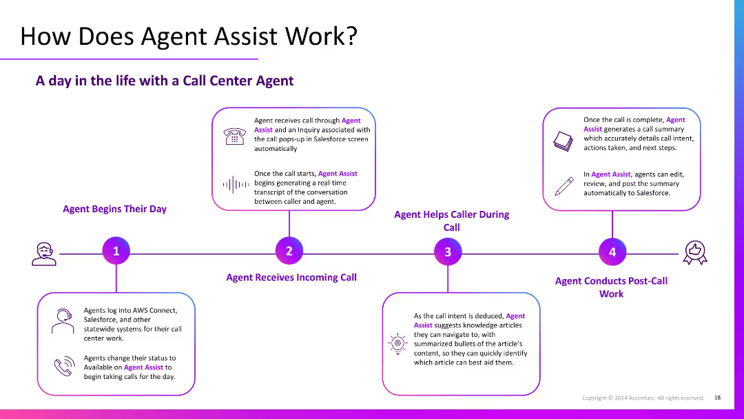
The slide uses flowchart to compare the terminology used in different approaches to social impact measurement. It features lists and connecting lines to match related terms.
Industry Overview
Telecommunications
This slide compares various methodologies for measuring social impact, emphasizing the commonality despite different terminologies used. It breaks down the process into seven steps.
social impact, measurement, terminology, methodology, comparison, steps
Linear Flow
Accenture
Saved
The slide contains a column chart on the right showing the proportion of companies setting renewable energy targets by region.
Strategic Planning
Environmental Services & Sustainability
The slide discusses the adoption of renewable energy targets by companies as part of their broader net zero strategies, with regional breakdowns.
renewable energy, targets, net zero, overall sample, Europe, North America, rest of world, public targets
Mixed Chart
Accenture
Saved
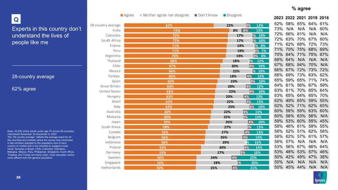
Left column contains the title and question, with a right-aligned bar chart for country responses.
Risk Assessment and Management
Technology & Software
The slide analyzes how populations in different countries perceive technology companies in terms of responsible behavior, based on survey agreement levels.
responsible behavior, tech sector, Ipsos, survey results, global trust, ethics, corporate responsibility, public sentiment, accountability
Mixed Chart
IPSOS
Saved
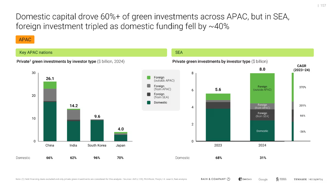
Dual-panel bar chart comparing 4W and 2W EV penetration across SEA and global markets; green color theme for EV types
Market Analysis and Trends
Transportation & Logistics
Shows that internal combustion engine (ICE) vehicles still dominate in SEA-6 countries, with low adoption of battery electric vehicles (BEVs), especially in 2-wheelers. Highlights lag in EV transition compared to global markets.
EV adoption, ICE dominance, BEV, SEA-6, 2W EV, penetration, vehicle market
Multiple Chart
Bain
Saved
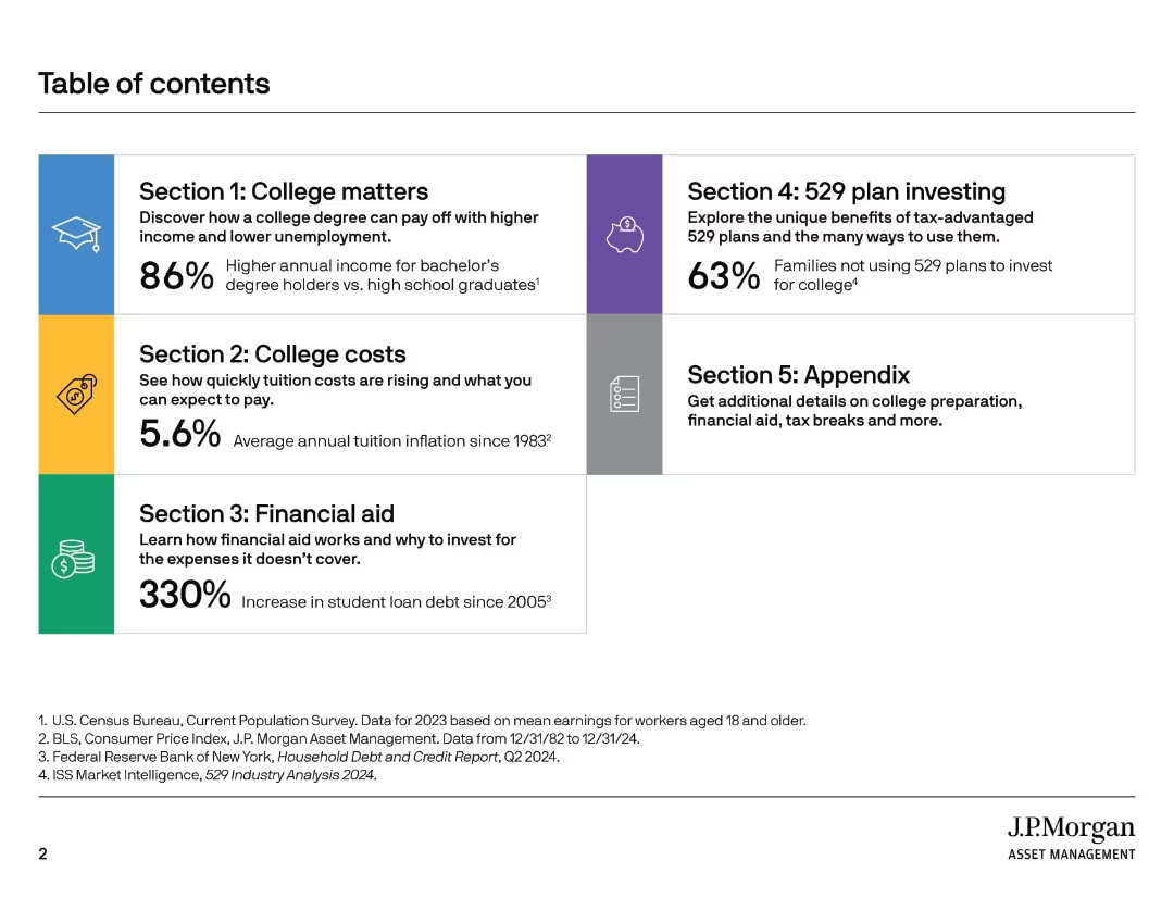
Circular infographics and bar charts showing AUM distribution by asset class and client type; ranking list on the right
Industry Overview
Financial Services
Highlights the scale and diversification of JPMorgan Asset Management, emphasizing its $3.3T AUM and strong global rankings in various asset classes. Shows distribution by client segments, asset classes, and regional revenue breakdown, reinforcing JPMAM’s breadth and reach.
AUM, asset classes, global rankings, client segment, JPMorgan, diversification, industry leader
Multiple Chart
JP Morgan
Saved
Column chart comparing the total shareholder return (TSR) of oil and gas with other sectors over five years, shown in different shades of green with performance markers.
Competitive Landscape
Energy & Utilities
Evaluates the attractiveness of the oil and gas sector by comparing its performance against other industries, emphasizing its place within the competitive landscape of various sectors over the past five years.
oil, gas, sectors, performance, competitiveness
Single Chart
BCG
Saved
Two data tables, line graph on rate assumptions; left-to-right timeline progression; clean, blue-white layout
Risk Assessment and Management
Financial Services
This slide models Barclays’ sensitivity to a -25bps rate change over three years, projecting Group income impact. It compares February 2024 and 2025 plans and includes swap and base rate projections. The assumption includes stable balance sheet reinvestment over time.
interest rate risk, swap rates, base rates, income sensitivity, macroeconomic trends
Multiple Chart
Barclays
Saved
The slide is divided into two segments with a central title. On the left, bullet points outline key assumptions. On the right, a line graph depicts the unemployment rate with two scenarios. There's a table below the graph summarizing potential losses.
Risk Assessment and Management
Financial Services
This slide performs a stress scenario analysis for the credit card division, with assumptions based on unemployment rates and potential credit losses. It provides projections and comparative scenarios to assist in strategic planning and risk preparedness.
Stress test, Credit card, Unemployment rate, Loss projections, Risk analysis, Scenario planning
Single Chart
JP Morgan
Saved
Bar chart showing planned technology investments by family offices, with accompanying text on significance.
Technology and Digital Transformation
Financial Services
Highlights the technology investment plans of APAC family offices, emphasizing cybersecurity and IT hardware.
technology investments, APAC, family offices, cybersecurity, IT hardware
Mixed Chart
EY
Saved
The slide presents text explanations and line graphs showing the variability of renewable production and the response time of PEM electrolyzers. It also includes a business case opportunity section.
Operational Efficiency
Energy & Utilities
This slide discusses how electrolyzers can support grid stability by integrating renewable energy, managing variability, and improving LCOH. It highlights the quick response time of PEM electrolyzers and potential business opportunities.
electrolyzer, grid services, renewable integration, LCOH, PEM
Multiple Chart
Kearney
Saved
The slide has a clear, structured format with two main sections, each containing checkmark lists. The design uses a simple blue and white color scheme.
Operational Efficiency
Financial Services
This slide details strategic measures for resource management across different risk areas, with a focus on people strategy and liquidity. It is typically used for corporate strategy presentations.
resource management, risk dimensions, strategy, liquidity, capital, people management, Goldman Sachs, COVID-19, private equity, investment
Table
Goldman Sachs
Saved
Column and line chart showing VC deal volume and value (2020–2024), labeled bars for volume and yellow trend line for value.
Investment Analysis
Technology & Software
This slide outlines venture capital (VC) deal trends, showing a steady increase in volume with a peak in 2024, while deal values peaked in 2022 and declined after. High tech and industrial sectors accounted for most of the activity, with AI-related deals playing a key role in early-stage fundraising momentum.
Venture capital, deal volume, deal value, AI, early-stage, high tech, fundraising
Single Chart
PwC/Strategy&
Saved
Contains column chart and bullet points demonstrating revenue trajectories and growth drivers for upcoming years. Emphasizes areas like Corporate Bank and Investment Bank, with annotations for projected growth.
Financial Performance
Financial Services
Details the bank's strategic positioning and expected revenue growth, focusing on specific financial services sectors and strategies for diversification and resilience in market positioning.
financial planning, revenue growth, strategic positioning, diversification, banking
Mixed Chart
Deutsche Bank
Saved
This slide contains column charts and bullet points. Charts illustrate the growth in security data processed, application vulnerability scanning, and devices secured from 2019 to 2022. The color scheme is teal and dark blue, with each point accompanied by a relevant icon.
Financial Performance
Financial Services
Details the bank's cybersecurity measures and investments, underscoring consistent efforts despite increased demand and evolving threats.
Cybersecurity, Risk Management, Technology, Data Protection, Financial Services, Investment, Device Security
Multiple Chart
JP Morgan
Saved
Double bar chart comparing current and future investment allocation across AADA pillars. AI shows the highest projected increase.
Investment Analysis
Artificial Intelligence
The slide compares current and expected investment distribution across AADA pillars, showing AI as the largest growth area. It illustrates a shift in strategic focus toward AI over the next two years.
AADA investment, AI, analytics, automation, data platforms, future spend, strategic focus
Multiple Chart
KPMG
Saved
Line chart showing number of start-ups and investment volume over time (2000–2020), emphasizing surge since 2015
Investment Analysis
Artificial Intelligence
The chart demonstrates exponential growth in quantum computing start-up founding and venture capital activity in recent years. Despite this, <10% of investment goes outside hardware, showing a concentrated funding focus.
funding trends, VC, hardware investment, start-up growth, quantum computing, venture capital
Single Chart
McKinsey
Saved
Three-panel graph layout with emission trends, GDP vs. energy, and energy vs. CO₂; green-blue branding with minimal text.
Risk Assessment and Management
Environmental Services & Sustainability
Shows SEA’s increasing greenhouse emissions linked to growing energy consumption and economic activity. Warns that emissions will rise significantly unless curve is bent by 2050. Serves as a call to action for emission intensity reduction.
SEA, emissions, CO₂, energy consumption, GDP, risk, sustainability
Multiple Chart
Bain
Saved
Bar chart comparing projected demand and supply; $40T gap highlighted
Strategic Planning
Real Estate & Construction
The slide forecasts a $40 trillion construction shortfall by 2040 if productivity and workforce trends do not improve. Demand for net-zero and infrastructure exceeds supply by ~20%, creating major output gaps.
construction gap, net-zero, demand vs. supply, productivity, output gap
Mixed Chart
McKinsey
Saved
A column chart showing enrollment share of private K-12 education in major markets, segmented by region.
Market Analysis and Trends
Education & Training
Discusses the trend of privatization in K-12 education across major markets and its growth between 2015 and 2019.
privatization, K-12, education, enrollment, markets
Single Chart
LEK
Saved
Previous
Next
If nothing, comes up, please save your slides first
Create a FREE account to continue browsing
Receive Instant Access to 1,000+ slides from companies like McKinsey, Google, and Goldman Sachs
First Name
Last Name
Email
Password
I agree to all
Terms & Privacy Policy
Thank you! Your submission has been received!
Oops! Something went wrong while submitting the form.
Have an account?
Sign in
Column Chart
Heatmap
Chevron
Org Chart
Infographic
Callouts
Timeline
List
Graphic
Picture
Process Flow
Diagram
Paragraph
Map
Table
Framework
Subtitle
Takeaway Box
Icon
Other Chart
Radar Chart
Waterfall Chart
Mekko Chart
Pie Chart
Scatter Plot
Line Chart
Bar chart
Bullet points