My Account
My Slides
Search by Category
Companies
Slide Type
Use Case
Industry
Pricing
Templates
View All Templates
Download Template Slides
✦ AI Search
Feedback
Login
Logout
Get Started
Browse all Slides
Browse all Slides
Create a FREE Account
Instant access to 1,000+ real slides from top companies like McKinsey, BCG, Goldman Sachs, Google and many more!
First Name
Last Name
Email
Password
I agree to all
Terms & Privacy Policy
Thank you! Your submission has been received!
Oops! Something went wrong while submitting the form.
Have an account?
Sign in
Saved Slides
This slide has a three-column format with headings 'Business issues', 'Approach', and 'Impact'. Each column has bullet points and icons in a distinct color. There's a pie chart, two informal group images, and a line graph labeled 'WORKFORCE MIX'. The design is professional with a clear structure.
Strategic Planning
Financial Services
The slide details Deloitte's collaboration with a financial institution to define their workforce strategy. It includes business issues such as mandated FTE reduction, the approach including methodology and assessment, and the impact like understanding disruption and workforce strategy over the next few years.
workforce, strategy, Deloitte, financial, FTE, performance, future success
Header Horizontal
Deloitte
Saved
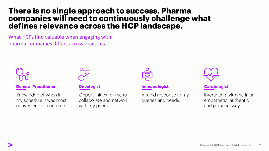
The slide features text with four icons representing different healthcare practitioners and their preferred engagement methods with pharma companies.
Strategic Planning
Healthcare & Pharmaceuticals
The slide emphasizes that engagement strategies with healthcare professionals (HCPs) need to be tailored to their specific practice areas, highlighting varied preferences.
engagement, HCPs, strategies, pharma, preferences
Pillar
Accenture
Saved
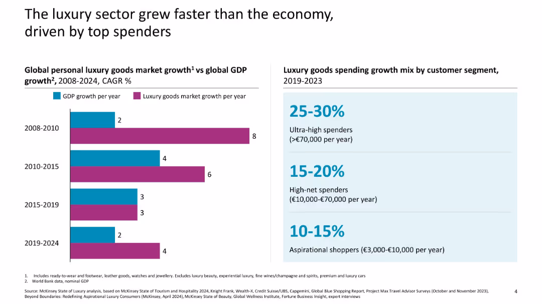
Split layout: left side bar chart compares GDP and luxury goods market growth; right side highlights luxury spending growth by consumer segment
Market Analysis and Trends
Consumer Goods
This slide illustrates how the luxury goods sector has consistently outpaced global GDP growth across various periods and highlights the key drivers of growth—primarily ultra-high and high-net-worth individuals.
luxury market, GDP, consumer segments, growth rate, spending, high-net-worth, CAGR, economy comparison
Mixed Chart
McKinsey
Saved
The slide contains multiple horizontal bar charts comparing the performance of various talent management aspects within an organization. It uses color gradients to represent different performance ratings from superior to deficient, labeled for easy interpretation.
Human Resources and Talent Management
Financial Services
Examines the performance of different talent management practices like recruitment, training, and succession planning in underwriting. Highlights areas needing improvement and those performing well, essential for HR strategy development in financial services.
talent management, underwriting, performance, HR, recruitment, training, succession planning
Single Chart
Accenture
Saved
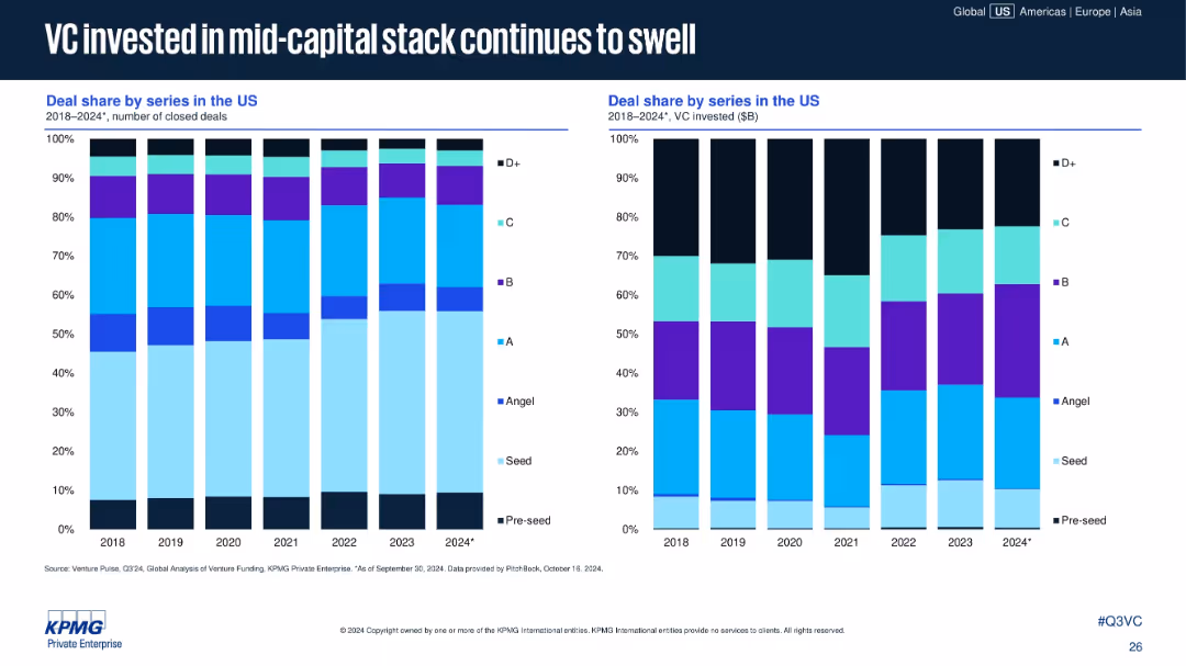
Two stacked bar charts: left shows number of deals by series; right shows VC invested ($B). Color-coded by funding stage.
Strategic Planning
Financial Services
The slide shows a shift in VC deal distribution, with Series B and C stages seeing increased deal share and capital investment. Early-stage deals are declining in share, highlighting a shift toward mid-capital stack funding.
deal share, Series B, Series C, VC investment, funding stage, mid-cap stack, capital allocation, startup funding
Multiple Chart
KPMG
Saved
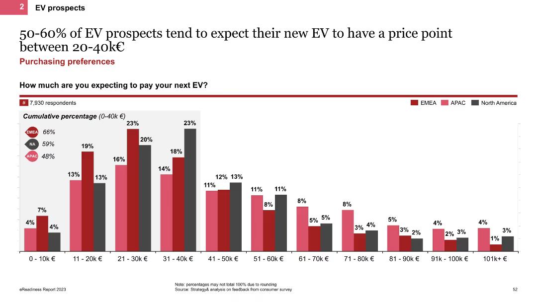
The slide features a column chart displaying the expected price range for new EVs among prospects. It shows cumulative percentages for different price points, with regional comparisons indicated by colored bars for EMEA, APAC, and North America.
Market Analysis and Trends
Transportation & Logistics
This slide presents the expected price range for new EVs among prospects, highlighting that 50-60% expect to pay between 20-40k€. It includes regional comparisons to show variations in price expectations across different markets.
EV price range, column chart, price expectations, regional comparison
Single Chart
PwC/Strategy&
Saved
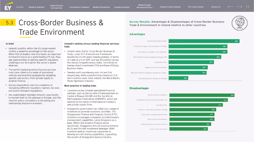
Left-aligned textual brief and narrative with right-side bar chart visualization for advantages and disadvantages. Neutral tones and thematic icons frame the content.
Market Analysis and Trends
Financial Services
Highlights Ireland’s strategic EU positioning and global trade ranking. The slide provides a comparative view of Ireland’s cross-border appeal, citing regulatory and tax frameworks. Singapore and Luxembourg are given as benchmarks. Survey bars emphasize market access and regulatory concerns.
trade, EU market, regulation, FDI, tax policy, global business
Multiple Chart
EY
Saved
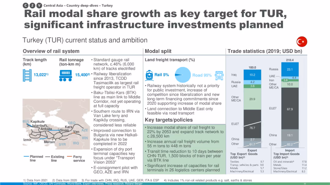
Similar to others: includes trade stats, modal split, and map; highlights investment plans to increase rail freight share.
Strategic Planning
Transportation & Logistics
Turkey’s rail network status and future ambitions are described, with plans to increase modal share of rail freight, expand the network, and improve logistics centers. The slide also touches on liberalization and international connectivity with surrounding countries.
Turkey, rail share, investment, modal split, BTK line, logistics, transport planning
Multiple Chart
Roland Berger
Saved
The slide contains multiple column charts depicting the number of SPAC IPOs, proceeds, merger announcements, and completed mergers from 2018 to YTD 2022.
Market Analysis and Trends
Financial Services
The slide discusses the decline in SPAC IPOs and mergers in the US, highlighting market performance, regulatory uncertainty, and increased redemptions.
SPAC, IPO, mergers, market performance, regulatory uncertainty
Multiple Chart
EY
Saved
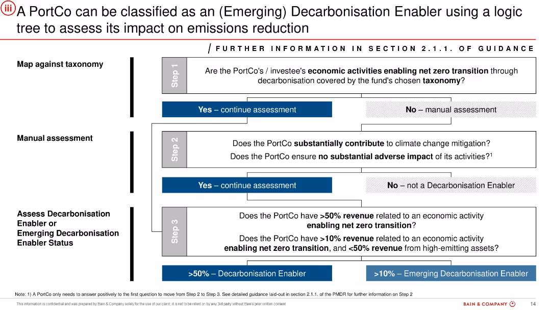
Vertical logic tree layout in grayscale and blue, progressing through 3 assessment steps. Boxes contain decision questions and flow to "Yes"/"No" outcomes. Blue highlights indicate enabling status.
Customer and Market Segmentation
Financial Services
Provides a decision framework to classify PortCos as Decarbonisation Enablers based on taxonomy alignment, climate contribution, and revenue thresholds. This structured logic is used to guide investment decisions or categorize assets according to their role in supporting the net-zero transition.
decarbonisation enabler, emissions, climate, taxonomy, classification, PortCo, investment criteria
Uncategorized
Bain
Saved
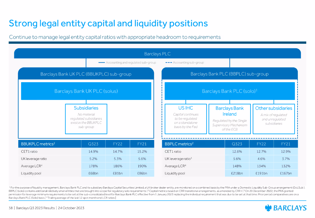
The slide is structured with a hierarchical diagram showing Barclays PLC's organizational structure. Below it are key financial metrics in tabular format.
Regulatory and Compliance
Financial Services
Provides an overview of Barclays' organizational structure and key capital and liquidity metrics for different legal entities within the group, ensuring regulatory compliance.
legal entity, capital, liquidity, Barclays, structure, compliance, regulatory, metrics, financial
Diagram
Barclays
Saved
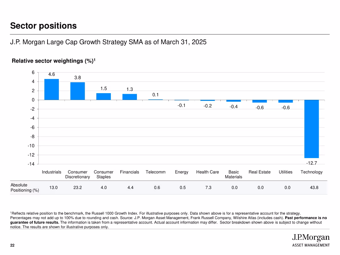
Bar chart with horizontal axis for sectors and vertical bars showing relative sector weightings
Investment Analysis
Financial Services
Shows the sector positioning of the strategy relative to the Russell 1000 Growth Index as of March 31, 2025. Technology is notably underweighted while Industrials and Consumer Discretionary are overweighted. Includes absolute positioning percentages below the chart.
sector positions, weighting, strategy, benchmark, relative position, J.P. Morgan, allocation, equity sectors
Single Chart
JP Morgan
Saved
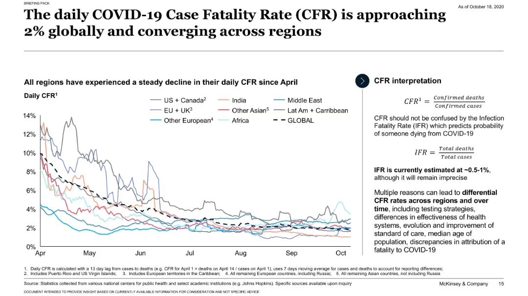
Line chart tracking daily CFR trends globally and by region since April; CFR definitions provided.
Performance Metrics and KPIs
Healthcare & Pharmaceuticals
Shows that the global daily COVID-19 CFR has declined and converged around 2% across regions. Introduces the distinction between CFR and IFR and discusses why CFR may vary.
CFR, global trends, IFR, regional comparison, COVID-19
Mixed Chart
McKinsey
Saved
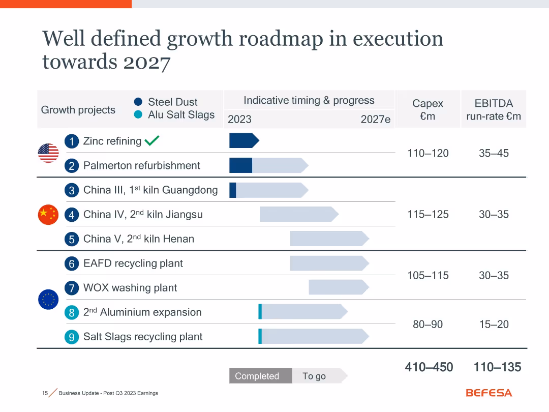
Timeline chart with horizontal bars indicating project progress, icons for flags and materials, and summary columns for Capex and EBITDA estimates.
Strategic Planning
Industrial & Manufacturing
This slide outlines nine growth projects (steel dust and aluminum salt slags) scheduled up to 2027, including timelines, Capex, and EBITDA estimates. It visually distinguishes between completed and pending milestones, helping assess strategic progress and financial expectations.
growth roadmap, Capex, EBITDA, recycling, 2027, zinc, aluminum, projects
Single Chart
Goldman Sachs
Saved
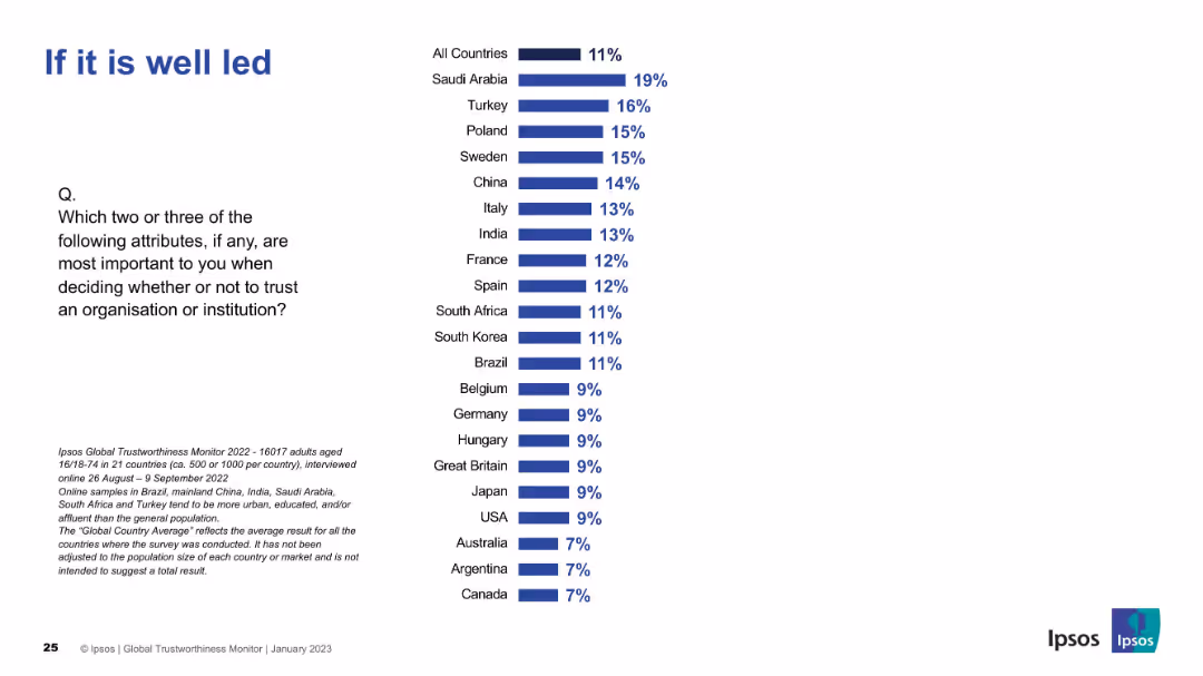
Country comparison bar chart with "All Countries" at top. Standard layout used across slides, emphasizing leadership perception.
Market Analysis and Trends
Professional Services
Reflects global perceptions of leadership's impact on organizational trust. Leadership is least important globally (11%), but higher in Saudi Arabia and Turkey.
leadership, trustworthiness, perception, Ipsos survey, global data, country ranking
Mixed Chart
IPSOS
Saved
A table with rows for different financial services and columns showing rankings in EMEA, Asia Pacific, and Latin America.
Market Analysis and Trends
Financial Services
Highlights Goldman Sachs' rankings across various financial services sectors globally, emphasizing its leading market position.
Goldman Sachs, Investment Banking, Global Markets, EMEA, Asia Pacific, Latin America, Market Position
Table
Goldman Sachs
Saved
Slide depicts individuals in various activities, signifying diverse employment models. Includes circular statistics and is colored in warm red and orange tones.
Strategic Planning
Professional Services
Discusses the shift towards flexible employment models and the readiness of businesses to lead an inclusive workforce.
workforce ecosystem, employment models, business readiness, workforce inclusivity, leadership
Multiple Chart
Deloitte
Saved
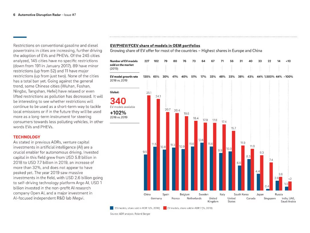
Bar chart showing the share of EV models in OEM portfolios across different countries in 2019, highlighting growth rates and number of models available globally.
Product and Service Analysis
Transportation & Logistics
Analyzes the growing share of EV models in OEM portfolios, with highest shares observed in Europe and China, and a global growth rate of 102% from 2016 to 2019.
EV models, OEM portfolios, growth rates, global, 2019
Mixed Chart
Roland Berger
Saved
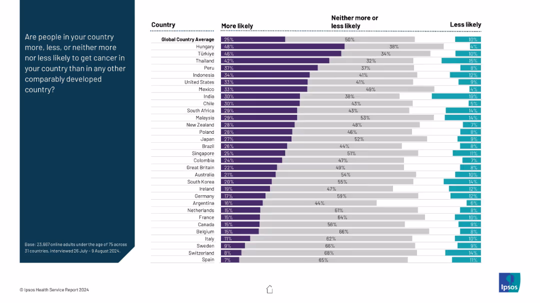
Horizontal stacked bar chart per country; segmented by perception (more/less/neither); left panel shows question prompt.
Risk Assessment and Management
Healthcare & Pharmaceuticals
This slide presents survey data on public perception of cancer risk across countries. It shows what proportion of respondents believe cancer risk is higher in their country compared to others, with a global average benchmark.
cancer perception, public belief, health risk, international ranking, comparative analysis, survey data
Mixed Chart
IPSOS
Saved
The slide includes two column charts. The left chart shows average annual global infrastructure need by type, and the right chart displays regional investment needs.
Investment Analysis
Real Estate & Construction
It assesses global infrastructure investment needs by type and region from 2016-2040, highlighting major investment areas like roads and rail.
infrastructure, investment, global, needs, roads, rail, telecom, ports, airports, power
Multiple Chart
JP Morgan
Saved
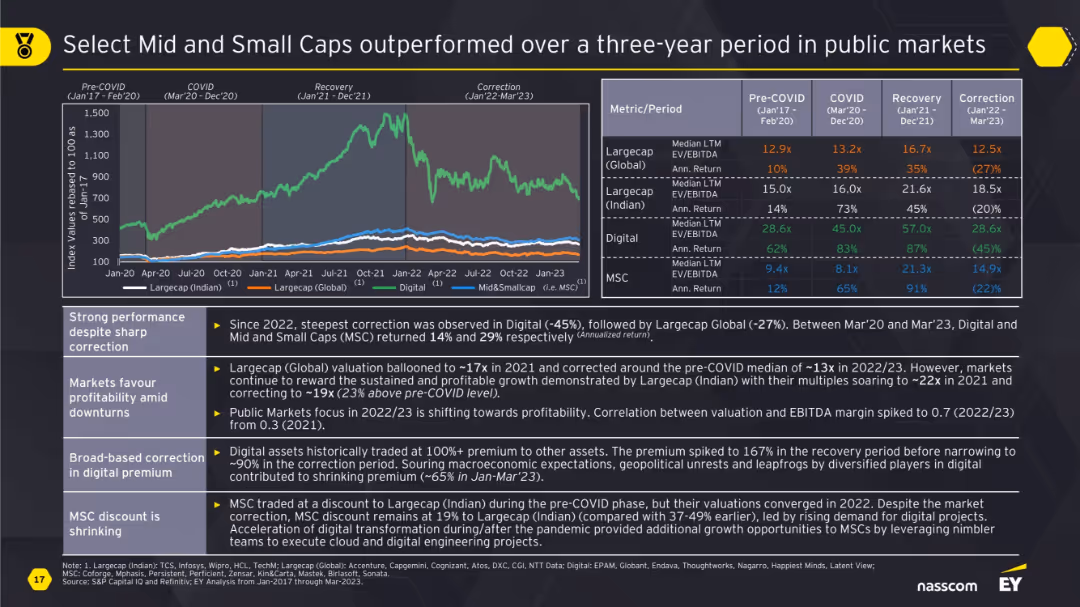
Line chart segmented by phases (Pre-COVID to Correction) with a performance comparison, side metric table, and bullet points on the left. Background is dark-themed.
Financial Performance
Financial Services
This slide compares the performance of Indian and Global large caps, digital assets, and mid & small caps across different market phases. It highlights how MSCs and Digital outperformed other segments post-COVID, even amid corrections. It also explains valuation trends, profitability focus, and shifts in investor sentiment.
midcap, smallcap, valuation, EV/EBITDA, digital, profitability, correction, return, public markets
Mixed Chart
EY
Saved
Features a combination of gray and red column charts comparing revenue and expenditures over multiple years, highlighting deficits with a separate indicator.
Regulatory and Compliance
Government & Public Sector
This slide compares governmental revenue and expenditures across different fiscal years to assist in budget management and fiscal analysis, with details on deficits.
revenue, expenditure, comparison, budget management, fiscal analysis, government, finance, deficit, years
Single Chart
PwC/Strategy&
Saved
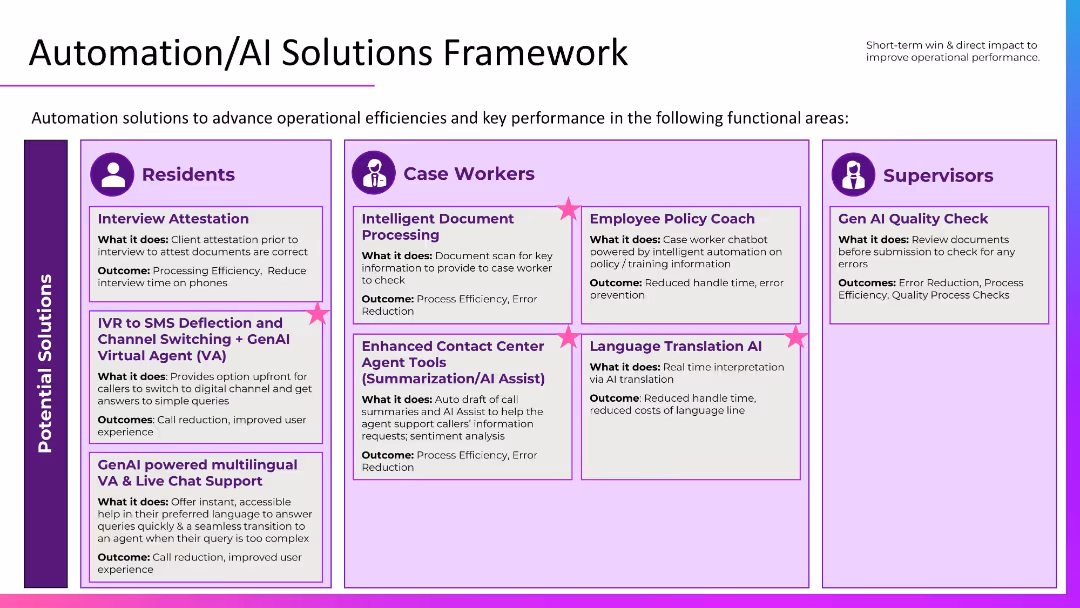
Grid layout segmented by audience: Residents, Case Workers, Supervisors. Uses icons and callouts with bolded titles and outcomes in purple boxes.
Operational Efficiency
Government & Public Sector
Outlines AI-based automation solutions targeted at residents, case workers, and supervisors. Use cases include virtual agents, document processing, policy coaching, and translation AI, each aiming to improve efficiency, reduce errors, and enhance the user experience.
automation, AI framework, GenAI tools, public services, efficiency
Table
Accenture
Saved
Includes a complex layout with a column chart, text annotations, icons indicating outlook, and a detailed breakdown of governmental commitments and recommended actions.
Regulatory and Compliance
Energy & Utilities
Examines Vietnam's climate goals and strategies, discussing emissions profiles, government commitments, and suggested actions for clearer energy policies.
Vietnam, renewable energy, government, emissions, climate policy
Mixed Chart
Bain
Saved
The slide includes three pie charts comparing operating profit distribution between investments, employees, shareholders, and taxes for 2017, 2021, and 2025.
Strategic Planning
Professional Services
It shows the distribution of value creation between stakeholders for the years 2017, 2021, and projected for 2025, highlighting changes over time.
value creation, stakeholders, profit, Ipsos, planning
Multiple Chart
IPSOS
Saved
Previous
Next
If nothing, comes up, please save your slides first
Create a FREE account to continue browsing
Receive Instant Access to 1,000+ slides from companies like McKinsey, Google, and Goldman Sachs
First Name
Last Name
Email
Password
I agree to all
Terms & Privacy Policy
Thank you! Your submission has been received!
Oops! Something went wrong while submitting the form.
Have an account?
Sign in
Column Chart
Heatmap
Chevron
Org Chart
Infographic
Callouts
Timeline
List
Graphic
Picture
Process Flow
Diagram
Paragraph
Map
Table
Framework
Subtitle
Takeaway Box
Icon
Other Chart
Radar Chart
Waterfall Chart
Mekko Chart
Pie Chart
Scatter Plot
Line Chart
Bar chart
Bullet points