My Account
My Slides
Search by Category
Companies
Slide Type
Use Case
Industry
Pricing
Templates
View All Templates
Download Template Slides
✦ AI Search
Feedback
Login
Logout
Get Started
Browse all Slides
Browse all Slides
Create a FREE Account
Instant access to 1,000+ real slides from top companies like McKinsey, BCG, Goldman Sachs, Google and many more!
First Name
Last Name
Email
Password
I agree to all
Terms & Privacy Policy
Thank you! Your submission has been received!
Oops! Something went wrong while submitting the form.
Have an account?
Sign in
Saved Slides
This slide contains a column chart showing the number of elective procedures per month performed/expected each year across different regions from 2021 to 2023.
Market Analysis and Trends
Healthcare & Pharmaceuticals
This slide highlights the recovery in procedure volumes post-COVID-19, with a detailed analysis of elective procedures across various regions and years.
procedure volume, COVID-19 recovery, elective procedures, regional analysis, year comparison
Single Chart
LEK
Saved
The slide features a column chart comparing the median willingness to pay for connected car services among consumers in Germany, the US, and China, with detailed pricing points for maximum, optimal, and minimum prices.
Market Analysis and Trends
Consumer Goods
This slide explores the willingness of consumers in Germany, the US, and China to pay for connected car services, showing variations in median price points and consumer expectations in each country.
willingness to pay, connected services, consumer analysis, Germany, US, China, pricing, column chart
Mixed Chart
PwC/Strategy&
Saved
The slide features a column chart comparing road freight costs to port across various regions, with contextual annotations on factors influencing costs.
Operational Efficiency
Transportation & Logistics
The slide provides a comparative analysis of road freight costs in Australia and international competitors, highlighting the efficiency and cost advantages of Australia's road freight network.
Road freight, Australia, cost comparison, transportation, logistics, modal share, efficiency, freight network, operational efficiency
Mixed Chart
LEK
Saved
The slide includes both text and visual elements such as icons and a cartoon character, detailing various tax proposals and policy changes.
Regulatory and Compliance
Government & Public Sector
Outlines proposed tax changes and reforms, focusing on fiscal policy adjustments aimed at improving tax collection and economic recovery.
tax proposals, fiscal policy, government reform
Table
PwC/Strategy&
Saved
The slide features a Venn diagram showing the relationship between Private Banking, APAC IBCM, and ATS, emphasizing global connectivity.
Strategic Planning
Professional Services
This slide outlines the collaborative approach central to the company's strategy, highlighting the synergy between Private Banking, APAC IBCM, and ATS, along with the emphasis on global connectivity.
Collaboration, Private Banking, APAC IBCM, ATS, Global Connectivity
Framework
Credit Suisse
Saved
Features a world map with export impacts and column charts detailing grain trade forecasts, focusing on geographic and quarterly variations.
Market Analysis and Trends
Transportation & Logistics
Discusses global grain trade dynamics influenced by geopolitical and environmental factors, with detailed forecasts and regional analysis.
grain trade, global market, export forecasts, geopolitical impact, environmental factors
Multiple Chart
Deutsche Bank
Saved
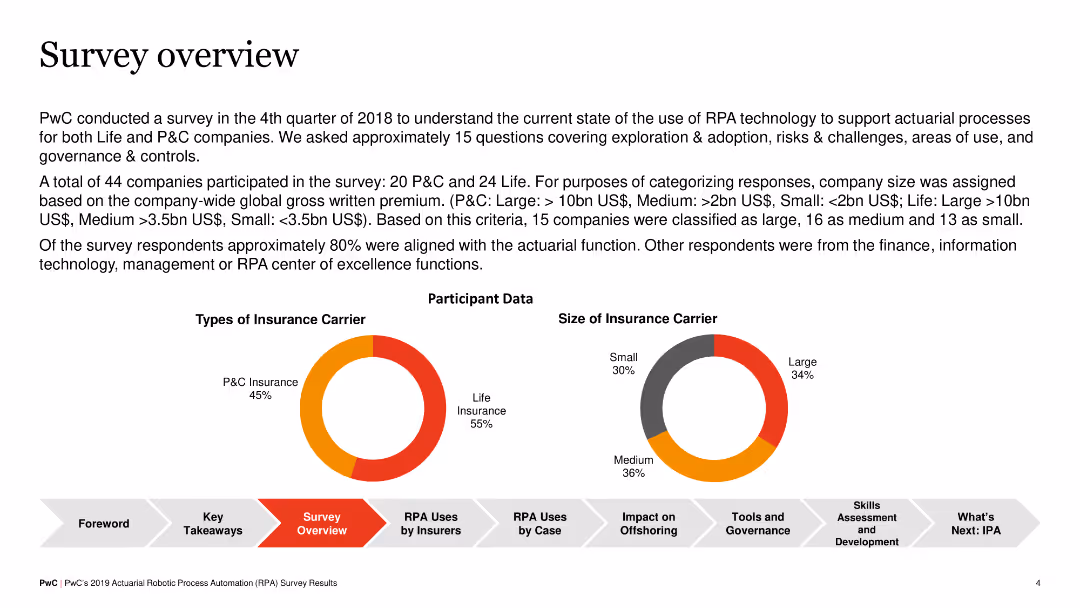
The slide summarizes the survey conducted by PwC on RPA adoption in insurance companies, including participant data on types of insurance carriers and the size of insurance carriers. It features pie charts and key data points.
Market Analysis and Trends
Financial Services
The slide provides an overview of a survey on RPA adoption, detailing the types and sizes of participating insurance carriers. It indicates that a majority of participants were from the actuarial function, with a split between P&C and life insurers.
RPA, survey, insurance, pie chart, overview
Multiple Chart
PwC/Strategy&
Saved
Features a quote from Namibia's Minister of Finance, an image of a person at a desk, and three highlighted goals represented by vertical bars of varying colors (yellow, grey, red), each with a brief label. The design is clean, utilizing ample whitespace and balanced text placement.
Strategic Planning
Government & Public Sector
Outlines the strategic goals of Namibia's national budget for 2024/25, focusing on stimulating domestic demand, investing in infrastructure, and fiscal prudence. Aims to communicate governmental fiscal priorities and public sector planning.
National Budget, Fiscal Planning, Namibia, Public Sector, Economic Strategy
Pillar
PwC/Strategy&
Saved
A column chart showing funding composition from 2020 to 2023 with labels for shareholder equity, debt, and customer deposits. To the right, data boxes highlight specific figures for 4Q23. The chart uses neutral colors for clarity and emphasis.
Financial Performance
Financial Services
The slide provides an overview of the group's funding over several years, focusing on the breakdown of shareholder equity, debt, and customer deposits. It includes a detailed view of the 4Q23 figures, highlighting changes and components of funding.
funding, equity, debt, deposits, financial report
Multiple Chart
UBS
Saved
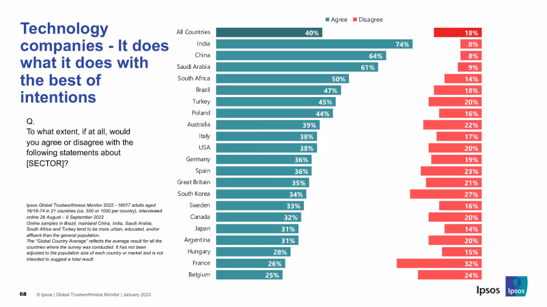
Simple bar graph on the right; large text title and survey question on the left.
Strategic Planning
Technology & Software
This slide assesses public perceptions of the intentions behind tech companies' actions, reflecting whether they are seen as operating with good intentions across countries.
intentions, technology, ethics, survey, public perception, Ipsos, global trust, corporate responsibility, transparency, sentiment
Mixed Chart
IPSOS
Saved
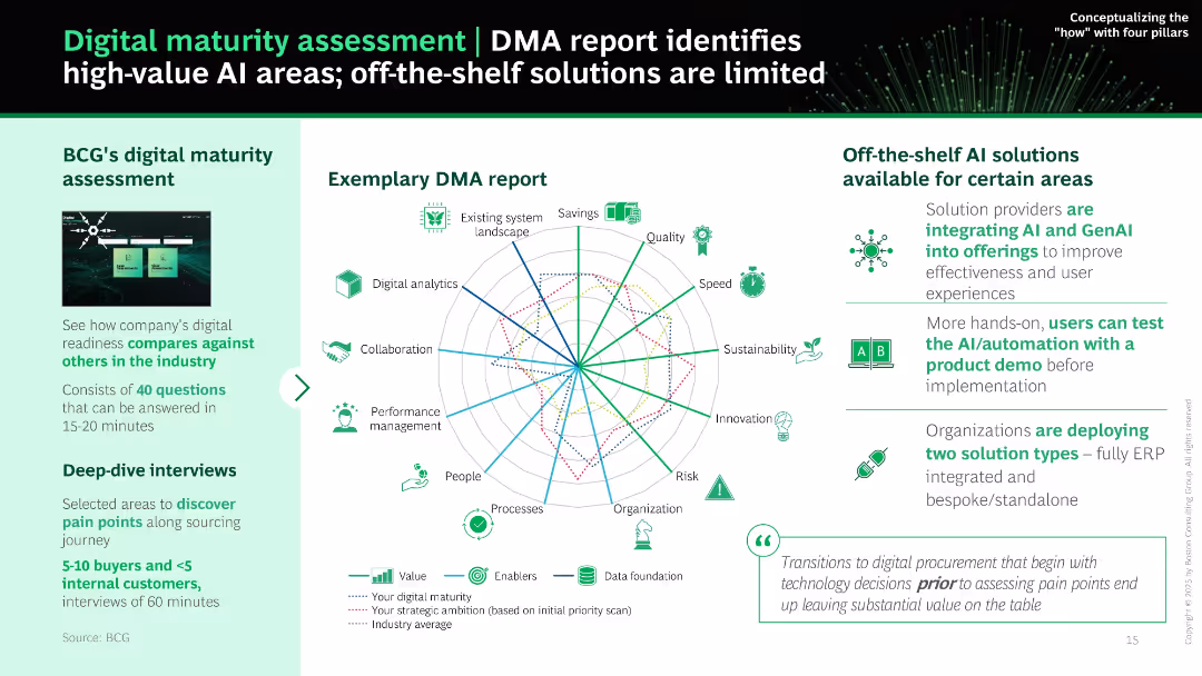
Radar chart at center with multiple axes and legend. Sidebars explain DMA assessment approach and available solutions. Balanced layout using green color palette.
Performance Metrics and KPIs
Technology & Software
Explains how BCG’s DMA report benchmarks an organization's digital maturity across procurement functions. Visual radar chart compares maturity with ambition and industry averages. Also discusses off-the-shelf AI tools and implementation insights.
digital maturity, DMA, assessment, AI, analytics, sourcing, procurement, benchmarking
Mixed Chart
BCG
Saved
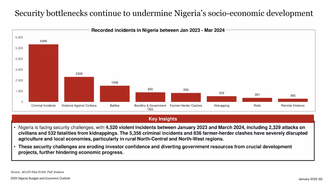
Bar chart with red bars representing different types of recorded incidents; header and insights in text box
Risk Assessment and Management
Government & Public Sector
The slide presents a bar chart showing the number of security incidents in Nigeria from Jan 2023 to Mar 2024. Criminal incidents dominate, followed by violence against civilians and battles. Key insights highlight the negative impacts on rural economies, agriculture, and investor confidence, urging attention to worsening insecurity trends.
Nigeria, security, incidents, criminal, rural, agriculture, investor confidence, development
Mixed Chart
PwC/Strategy&
Saved
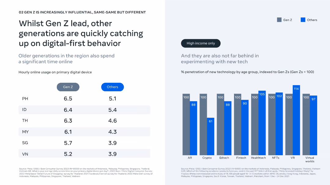
Dual-column layout showing device usage and tech adoption; clean bar and comparison chart visuals.
Technology and Digital Transformation
Technology & Software
The slide shows Gen Z leads in online engagement and tech adoption, but older generations are rapidly catching up, especially in high-income segments. Charts show hourly device usage and penetration of new tech by generation.
digital behavior, online usage, Gen Z, technology adoption, fintech, AR, VR, generational comparison, screen time, innovation trends
Mixed Chart
Bain
Saved
A world map highlighting regions with varying colors, pie charts detailing product types sold, and textual information about sales, margins, and operations.
Industry Overview
Consumer Goods
Outlines the sales distribution and product focus within the Asia, Oceania, and Africa regions, providing insights into market segmentation and operational scale. Helpful for regional strategic planning and resource allocation.
regional sales, market segmentation, operational scale, strategic planning, Nestlé
Multiple Chart
Deutsche Bank
Saved
The slide contains text and a bar chart comparing the share of winners across different pharma segments, highlighting blood plasma and CMO/CDMO.
Competitive Landscape
Healthcare & Pharmaceuticals
This slide presents data on the segments of the pharma industry with the highest share of top-performing companies, focusing on blood plasma and CDMO.
pharma segments, share of winners, blood plasma, CMO/CDMO, top-performing companies
Multiple Chart
Roland Berger
Saved
Vertical bar chart comparing countries by agreement/disagreement on climate action by businesses. Text block on left; chart dominates right.
Strategic Planning
Environmental Services & Sustainability
This slide visualizes international public opinion on whether businesses should take immediate climate action or risk failing employees and customers. The chart ranks agreement by country, showing variation in expectations and urgency.
climate action, businesses, employees, customers, international comparison, Ipsos, public opinion, sustainability, responsibility, Earth Day
Mixed Chart
IPSOS
Saved
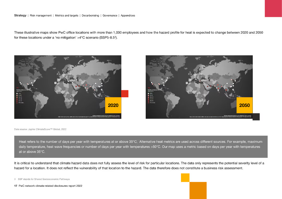
World maps illustrating the hazard profile for heat across PwC office locations in 2020 and projected changes by 2050, with a focus on climate-related risks.
Risk Assessment and Management
Professional Services
Displays maps of PwC office locations and their hazard profiles for heat, highlighting projected changes under a high-temperature scenario and the potential risks.
risk management, climate change, PwC, hazard profile, heat, projections, 2020, 2050, locations, temperature
Graphic
PwC/Strategy&
Saved
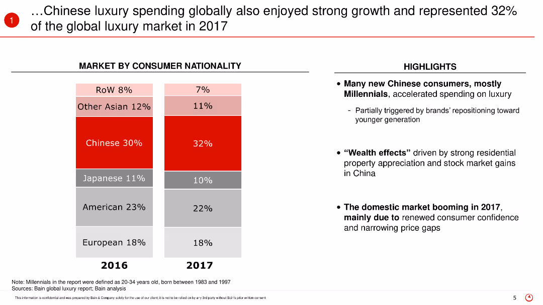
This slide features a stacked bar chart comparing the market share of luxury spending by consumer nationality between 2016 and 2017. The chart is accompanied by text highlighting the key insights and the factors contributing to the growth in Chinese luxury spending.
Market Analysis and Trends
Retail & E-commerce
The slide discusses the global luxury market in 2017, focusing on the significant contribution of Chinese consumers who represented 32% of the market. It highlights the increase in spending among Chinese Millennials and the factors driving this trend, such as the wealth effect and increased consumer confidence.
Luxury spending, Chinese consumers, global market, 2017, Millennials, market share, spending trends, consumer confidence, wealth effect
Mixed Chart
Bain
Saved
Features a line chart on the left comparing WTI crude oil price and US rig count, and a line chart on the right showing crude oil production by country.
Market Analysis and Trends
Energy & Utilities
This slide provides insights into the oil market, comparing WTI crude oil prices with US rig counts and analyzing oil production trends across different countries.
oil prices, WTI crude, rig count, production, countries
Multiple Chart
JP Morgan
Saved
Column chart showing changes in Aircastle's debt structure over time, emphasizing shifts to unsecured debt.
Financial Performance
Transportation & Logistics
Analyzes changes in financial structure, focusing on debt types and shareholder equity to assess financial health.
capital, debt, equity, financial health, unsecured, structure
Mixed Chart
Deutsche Bank
Saved
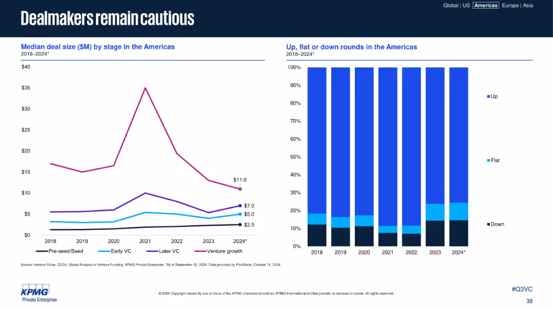
Dual-panel chart; left shows median deal size by stage; right shows deal outcome distribution (up/down).
Risk Assessment and Management
Financial Services
The slide shows a decline in median deal sizes across VC stages in the Americas from 2018–2024, with a concurrent increase in flat and down rounds. This reflects ongoing investor caution and reduced valuations amid persistent macroeconomic uncertainty.
deal size, VC stages, risk, down rounds, investor sentiment, flat rounds, caution, Americas, funding trends
Multiple Chart
KPMG
Saved
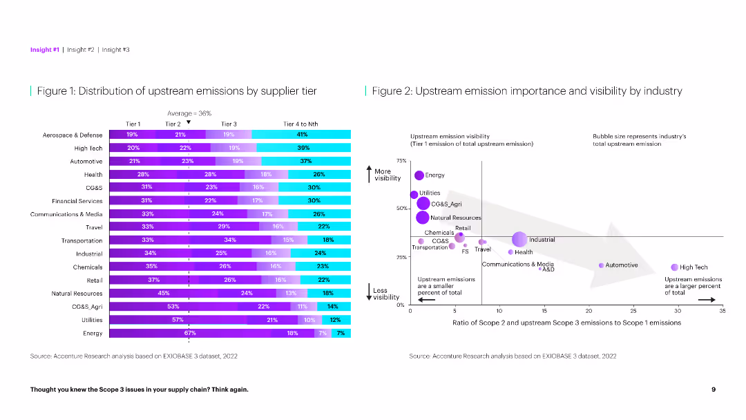
The slide features a horizontal bar chart on the left showing emission distribution by tier and a scatter plot on the right comparing emission importance.
Market Analysis and Trends
Environmental Services & Sustainability
This slide provides a detailed analysis of upstream emissions across different supplier tiers and their visibility by industry, highlighting key emission sources.
Emissions, supplier tier, distribution, visibility, industry, analysis, environmental impact, upstream, importance, sustainability
Multiple Chart
Accenture
Saved
Similar in layout to slide 11, uses icons and lists to illustrate the strategic initiatives and their benefits in terms of market and client metrics.
Strategic Planning
Financial Services
Reiterates the details of JPMorgan’s focused strategic investments, particularly in client coverage, showcasing the targeted benefits like market share and client satisfaction.
Strategy, Client Coverage, Banking, Market Share, Client Satisfaction, Investments
Linear Flow
JP Morgan
Saved
The slide features a hierarchical chart with two main columns differentiated by color. On the left, a blue column lists the supervisory board's structure, and on the right, a darker blue column outlines the general partners' responsibilities.
Organizational Structure and Change
Industrial & Manufacturing
This slide illustrates the governance structure of Michelin, detailing the roles and relationships between the supervisory board and general partners. It can be used to explain company management and oversight practices.
Governance, Structure, Roles, Oversight, Partners, Liability, Management
Diagram
Morgan Stanley
Saved
The slide has two line charts showing EU natural gas reserves as a percentage of storage capacity and gas prices, with annotations explaining key events and a commentary section.
Market Analysis and Trends
Energy & Utilities
The slide analyzes EU natural gas reserves and price trends, highlighting the impact of high storage levels and slowing economic demand on prices.
natural gas, EU, reserves, prices, trends
Multiple Chart
Accenture
Saved
Previous
Next
If nothing, comes up, please save your slides first
Create a FREE account to continue browsing
Receive Instant Access to 1,000+ slides from companies like McKinsey, Google, and Goldman Sachs
First Name
Last Name
Email
Password
I agree to all
Terms & Privacy Policy
Thank you! Your submission has been received!
Oops! Something went wrong while submitting the form.
Have an account?
Sign in
Column Chart
Heatmap
Chevron
Org Chart
Infographic
Callouts
Timeline
List
Graphic
Picture
Process Flow
Diagram
Paragraph
Map
Table
Framework
Subtitle
Takeaway Box
Icon
Other Chart
Radar Chart
Waterfall Chart
Mekko Chart
Pie Chart
Scatter Plot
Line Chart
Bar chart
Bullet points


![If businesses in [COUNTRY] do not act now…](https://cdn.prod.website-files.com/654e70fb59937215cac87b19/6899c5d0c55e7f59a3dd62ed_DaEYf9O11SEaHqTZvCcD4hy1W5NGXof3c0J8463Z5sU.avif)