Create a FREE Account
Instant access to 1,000+ real slides from top companies like McKinsey, BCG, Goldman Sachs, Google and many more!
First Name
Last Name
Email
Password
I agree to all
Terms & Privacy Policy
Thank you! Your submission has been received!
Oops! Something went wrong while submitting the form.
Have an account?
Sign in
Library
Templates
Courses
Pricing
My Account
My Slides
My Templates
✦ AI
AI Prompt Library
AI Search
Sign in
Start Here
Logout
My Saved Slides
Stacked bar chart shows FGA internal R&D spending versus technology venture investing, with annotations for key years and percentages.
Investment Analysis
Technology & Software
Analyzing the ratio of FGA internal R&D investments to the overall technology venture investing market, this slide is valuable for discussions on internal vs. external investment strategies.
FGA, R&D, Investment, Technology, Market Analysis
Mixed Chart
Oliver Wyman
Saved
The slide compares two markets using photographs of cityscapes (Los Angeles and Chicago), side-by-side column charts, and key data points annotated around the images. The use of visuals and text is balanced, with emphasis on growth rates and market opportunities in both new and legacy markets.
Market Analysis and Trends
Financial Services
This comparative slide examines the performance and market opportunities in two distinct markets, Los Angeles (new) and Chicago (legacy). It highlights key statistics such as client numbers and CAGR, using column charts to contrast the revenue and loan growth in both cities. The visual representation aids in understanding the market dynamics and potential for expansion in each location.
new markets, Los Angeles, Chicago, market opportunity, revenue growth, loans, clients, prospects, CAGR
Multiple Chart
JP Morgan
Saved
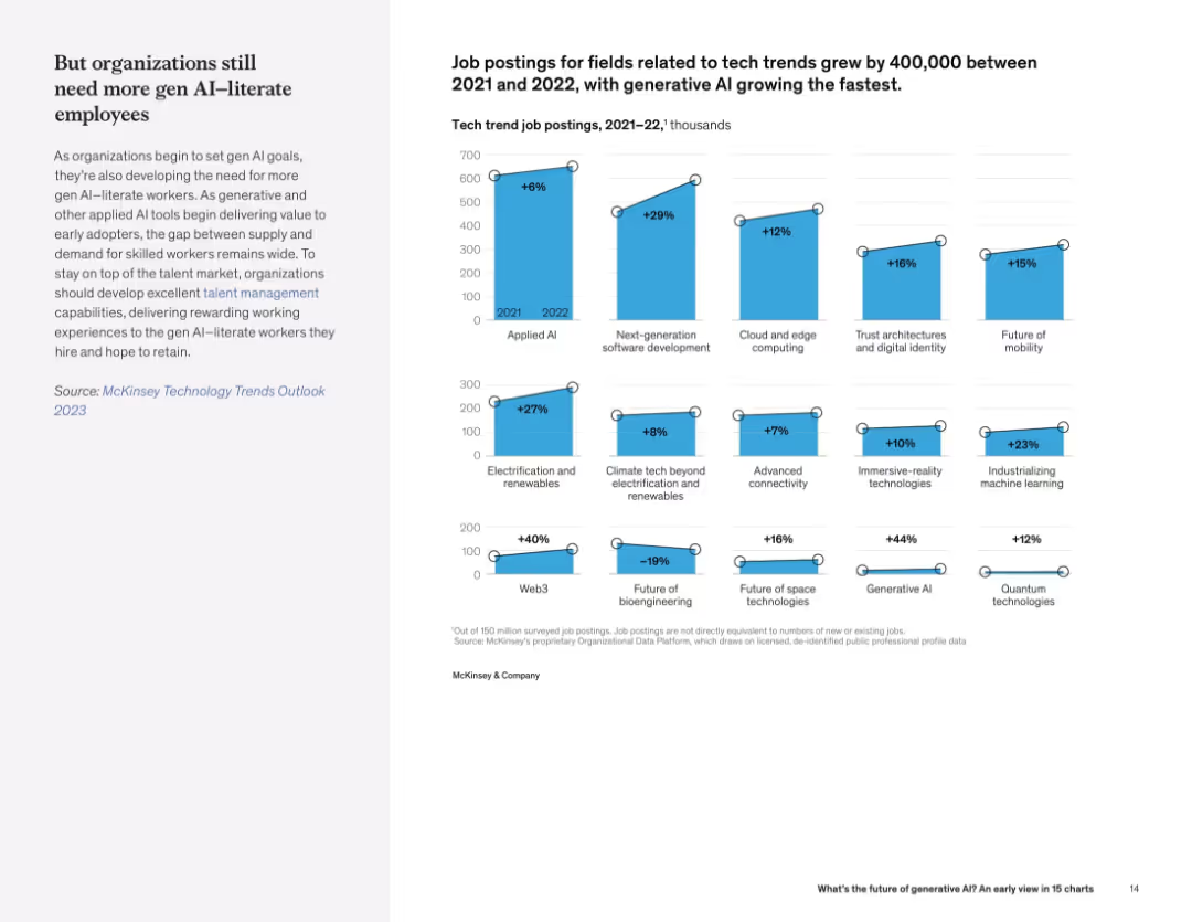
Left-aligned text with a grid of vertical bar charts on the right showing % growth in job postings across various tech fields.
Human Resources and Talent Management
Artificial Intelligence
This slide shows sharp increases in job postings in tech domains, especially for generative AI and Web3. The trend highlights growing demand for AI-literate employees.
tech hiring trends, job growth, generative AI, Web3, talent demand, AI workforce
Mixed Chart
McKinsey
Saved
Visual timeline from 2020 to 2022 with icons and images representing key corporate milestones.
Organizational Structure and Change
Financial Services
Details significant organizational changes and strategic decisions impacting company growth and market position from 2020 to 2022.
Milestones, Organizational Change, Growth
Linear Flow
Barclays
Saved
Four bar chart comparisons on left, with accompanying explanatory text on right in dark-themed box. Charts cover processing time, accuracy, context relevancy, and scalability.
Performance Metrics and KPIs
Financial Services
Compares Elastic RAG to a Naive RAG method across various metrics (accuracy, processing time, relevancy, scalability) for ESG data extraction. The analysis shows that Elastic RAG consistently outperforms in extracting relevant data with better accuracy and speed. Highlights its robustness, scalability, and potential to improve ESG data handling in a scalable AI-driven platform.
ESG metrics, Elastic RAG, performance comparison, context relevancy, AI, scalability
Multiple Chart
EY
Saved
The slide features a column chart showing the energy demand for advanced biofuels from 2000 to 2017, with segments for different biofuels like bio jet kerosene, renewable municipal waste, biogases, biodiesel, and bioethanol.
Market Analysis and Trends
Energy & Utilities
This slide examines the energy demand for advanced biofuels from 2000 to 2017, highlighting technical, economic, and sociopolitical drivers affecting the growth and adoption of these biofuels.
advanced biofuels, energy demand, 2000-2017, bio jet kerosene, renewable waste, biogases, biodiesel, bioethanol
Mixed Chart
Kearney
Saved
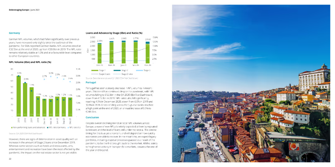
The slide displays column charts depicting NPL volumes and NPL ratios for German banks and loans by stage for Portugal. An image of a waterfront cityscape complements the data.
Financial Performance
Financial Services
This slide focuses on the NPL volumes and ratios for German banks and the distribution of loans by stage in Portugal. It highlights the effects of the pandemic on these metrics.
NPL volumes, NPL ratios, Germany, Portugal, loans
Multiple Chart
Deloitte
Saved
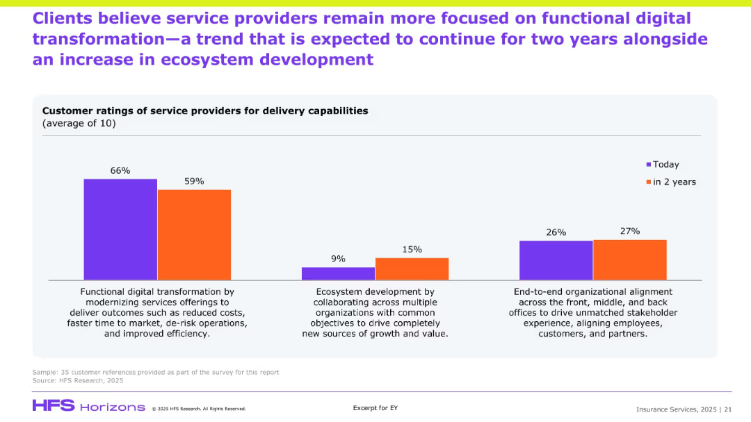
Bar graph comparing “Today” vs “In 2 Years” sentiment; three focus areas; explanatory text at bottom.
Customer and Market Segmentation
Financial Services
The slide presents survey data on clients’ current and expected focus areas for service providers. The data shows a shift from heavy focus on functional digital transformation to increased attention on ecosystem development and organizational alignment. It captures client sentiment on the delivery capabilities expected over the next two years.
Client ratings, delivery, transformation, ecosystem, efficiency, stakeholder alignment
Single Chart
EY
Saved
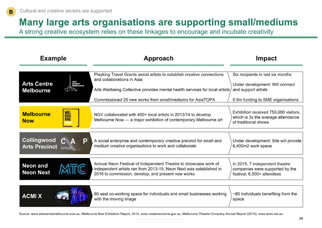
Comparative layout with examples of large arts organizations and their support initiatives
Client Case Studies
Media & Entertainment
Describes how large arts organizations in Melbourne support small and medium creative businesses, detailing specific programs and impacts.
Support initiatives, large organizations, small/medium businesses, Melbourne, arts support
Table
BCG
Saved
Features images of a digital banking interface, application components, and text descriptions on the side.
Technology and Digital Transformation
Technology & Software
Details J.P.Morgan's new product development for embedded banking, emphasizing speed and user experience.
Embedded Banking, Product Development, User Experience, J.P.Morgan, Digital Onboarding
Header Horizontal
JP Morgan
Saved
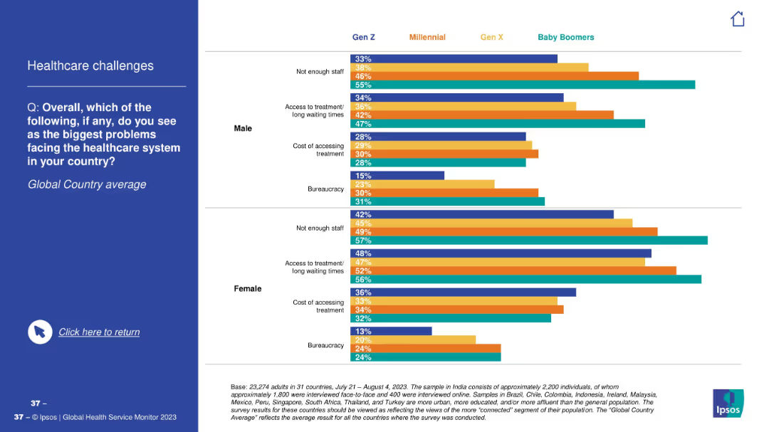
Bar charts by gender and generation; each group has four bars showing top healthcare issues (staff, access, cost, bureaucracy).
Market Analysis and Trends
Healthcare & Pharmaceuticals
The slide visualizes top challenges people identify in their country’s healthcare system—“Not enough staff” and “Access to treatment” are dominant across genders and generations. Data presented globally.
healthcare issues, staff shortage, access, cost, bureaucracy, global average, gender, age cohort, concerns
Mixed Chart
IPSOS
Saved
This slide features a line chart comparing sales and new listings for January over several years. The lines represent sales (blue) and new listings (gray) with clear data points and trend lines.
Market Analysis and Trends
Real Estate & Construction
The slide shows historical data on sales and new listings for January, providing insights into market trends and performance over time.
January 2021, sales, new listings, line chart, market trends
Single Chart
IPSOS
Saved
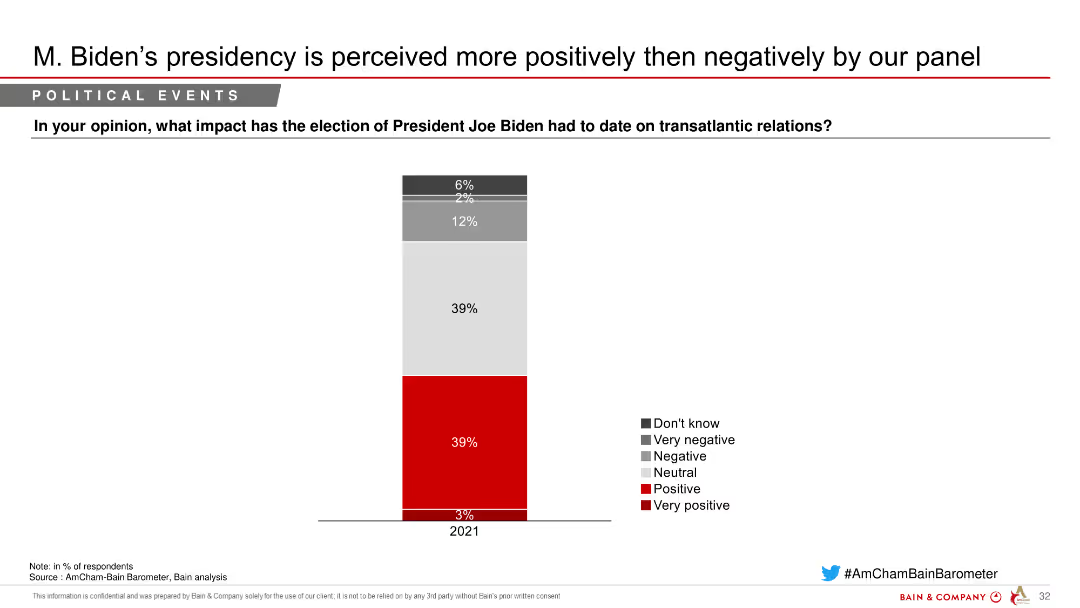
Column chart depicting perceptions of President Joe Biden's impact on transatlantic relations, with segmented responses indicating varying degrees of positivity and negativity.
Market Analysis and Trends
Government & Public Sector
Shows the impact of President Joe Biden's election on transatlantic relations, with a majority seeing it positively, as indicated by a survey of respondents.
Biden, transatlantic, relations, perceptions, survey
Single Chart
Bain
Saved
Features line graphs comparing the GDP trajectories of major economies under different COVID-19 scenarios, annotated with specific percentage changes and recovery timelines.
Financial Performance
Financial Services
Analyzes the economic impact of the COVID-19 pandemic across major global economies, offering scenario-based projections for GDP growth and recovery.
GDP, economic impact, COVID-19, recovery, scenario analysis
Single Chart
McKinsey
Saved
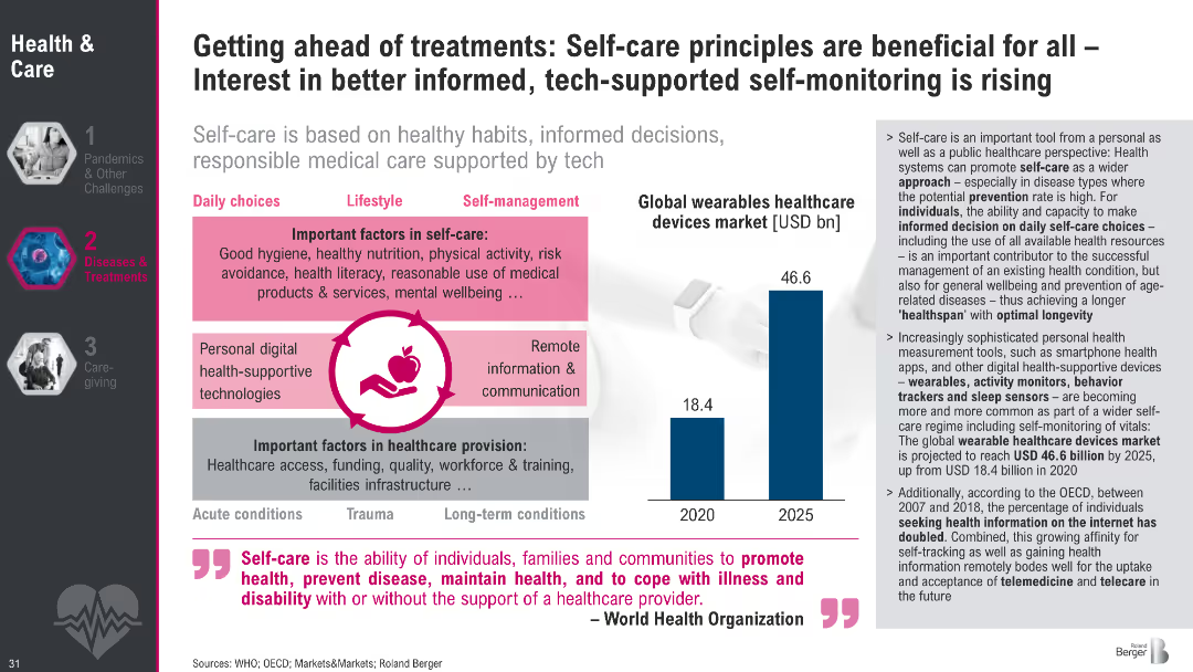
Dual-panel layout showing self-care factors and wearable device market growth; iconography and charts used
Technology and Digital Transformation
Healthcare & Pharmaceuticals
The slide advocates self-care as a strategy to prevent and manage diseases, supported by digital tools like wearables. It notes a growing market for health tech and increasing consumer responsibility in health decisions.
self-care, health tech, wearables, prevention, WHO, lifestyle, market trends, health monitoring, telehealth
Mixed Chart
Roland Berger
Saved
Bubble chart showing CARG and growth for various IT segments from 2020-2025. Segments like Supply Chain Management, IaaS, and Business Intelligence Platforms are plotted with bubbles varying in size to represent different scales of impact.
Strategic Planning
Technology & Software
The slide analyzes the shift from purchasing solutions to building them in-house across various IT segments, with a focus on growth and CARG predictions.
CARG, growth, IT segments, bubble chart, strategy
Single Chart
Gartner
Saved
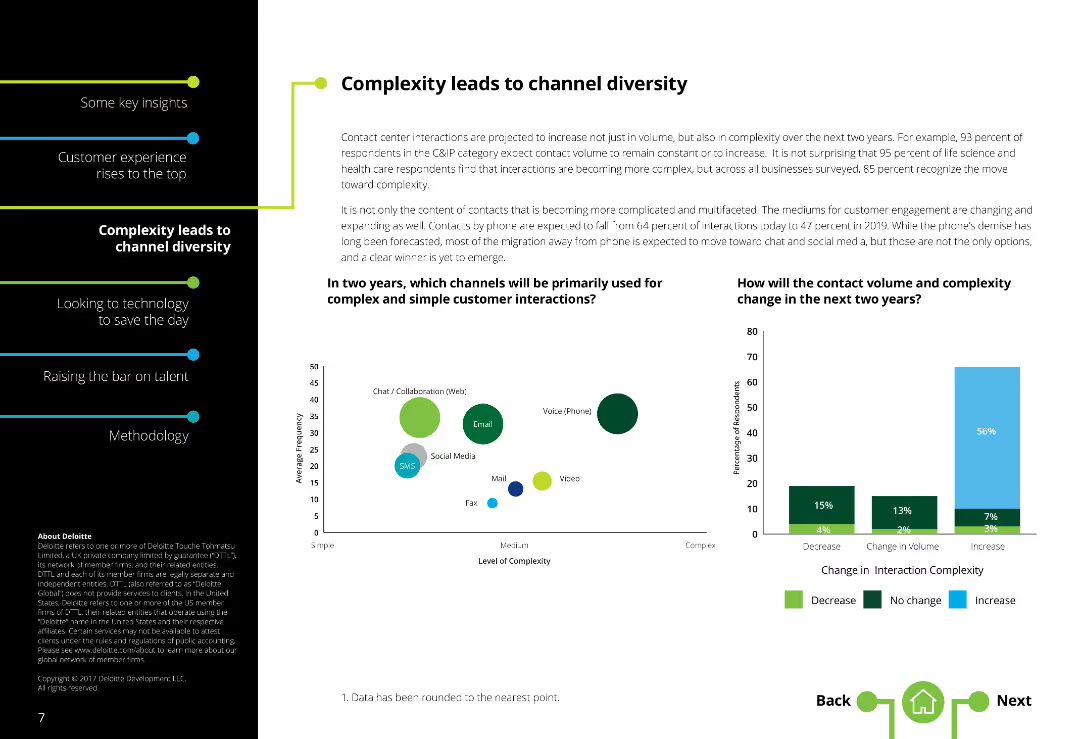
The slide features a two-column layout with text on the left and two column charts on the right. There is a moderate amount of text.
Market Analysis and Trends
Telecommunications
It addresses the increasing complexity in customer interactions and how contact channels are diversifying, with future projections for channel usage.
Channel diversity, Contact centers, Complexity, Communication channels, Customer interaction, Future projections
Multiple Chart
Deloitte
Saved
Presents a series of column charts displaying growth in active accounts, sales volume, EOP outstandings, and revenue from 2014 to 2018. Several side notes elaborate on growth drivers.
Financial Performance
Financial Services
Highlights the financial growth of JP Morgan Chase in terms of active accounts, sales volume, and revenue, emphasizing the drivers behind the growth such as investment in rewards programs and digital engagement.
financial growth, sales volume, revenue, active accounts, digital engagement
Multiple Chart
JP Morgan
Saved
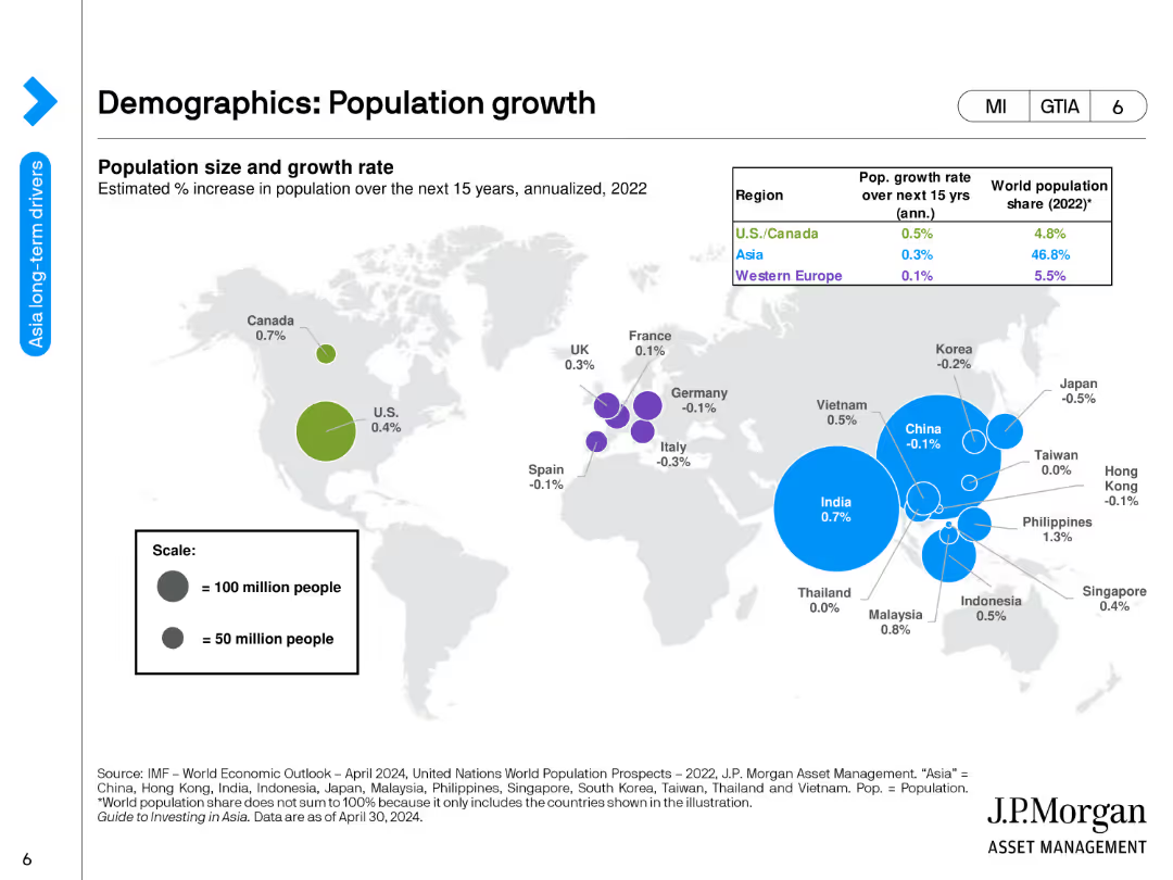
The slide includes a world map showing population size and growth rates by region for the next 15 years, along with a table listing population growth rates and world population shares.
Market Analysis and Trends
Financial Services
This slide examines global population growth trends, identifying key regions of growth and their implications for future economic development. It provides a visual and tabular representation of demographic changes.
Population Growth, Demographics, World Regions, Economic Development, Trends
Single Chart
JP Morgan
Saved
This slide features a line chart showing TRREB sales and new listings forecast from 1988 to 2021 (F). Sales are in blue, and new listings are in gray, with future forecasts marked.
Market Analysis and Trends
Real Estate & Construction
The slide forecasts TRREB MLS® system sales and new listings, providing insights into future market conditions and trends based on historical data.
TRREB, MLS, sales forecast, new listings, market outlook
Single Chart
IPSOS
Saved
The slide features a bar chart representing investment values across sectors with a key data point highlighted in green. It maintains visual simplicity while conveying quantitative information.
Investment Analysis
Financial Services
An analysis of Q1 2020 investments into emerging internet and tech firms, beneficial for financial and investment strategy discussions, especially within the tech industry.
investments, financial strategy, tech industry, Q1 2020, emerging firms
Single Chart
Bain
Saved
The slide shows a bar chart for each country representing Manufacturing PMI data before and after COVID-19.
Strategic Planning
Industrial & Manufacturing
Examines the recovery of manufacturing sectors across various countries using PMI data, indicating economic health and recovery rates.
manufacturing, PMI, recovery, analysis
Multiple Chart
BCG
Saved
The slide contrasts policy measures between countries using icons and bullet points, and presents two case studies in side panels.
Strategic Planning
Government & Public Sector
Discusses curated policy measures Australia could implement to attract major players in the industry, drawing parallels with successful international examples.
policy measures, industry tenants, Australia, investment incentives, supply chain security, case studies, Tesla, Hungary
Vertical Flow
Accenture
Saved
The slide includes a pie chart and a list of areas of expertise in market and opinion research.
Strategic Planning
Professional Services
The slide highlights Ipsos' comprehensive offerings in market and opinion research across different sectors.
expertise, market research, opinion research, Ipsos, sectors, services
Single Chart
IPSOS
Saved
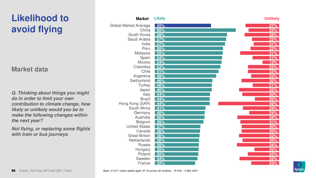
A bar chart (horizontal) comparing the likelihood of avoiding flights across various countries. Different colors are used to distinguish likely and unlikely responses.
Market Analysis and Trends
Transportation & Logistics
This slide analyzes the likelihood of consumers avoiding flights to reduce their carbon footprint. It presents comparative data across different countries, offering insights into changing travel behaviors due to environmental concerns.
air travel, sustainability, consumer behavior, environmental impact, comparative data
Multiple Chart
IPSOS
Saved
Previous
Next
If nothing, comes up, please save your slides first
Create a FREE account to continue browsing
Receive Instant Access to 1,000+ slides from companies like McKinsey, Google, and Goldman Sachs
First Name
Last Name
Email
Password
I agree to all
Terms & Privacy Policy
Thank you! Your submission has been received!
Oops! Something went wrong while submitting the form.
Have an account?
Sign in
Column Chart
Heatmap
Chevron
Org Chart
Infographic
Callouts
Timeline
List
Graphic
Picture
Process Flow
Diagram
Paragraph
Map
Table
Framework
Subtitle
Takeaway Box
Icon
Other Chart
Radar Chart
Waterfall Chart
Mekko Chart
Pie Chart
Scatter Plot
Line Chart
Bar chart
Bullet points