Create a FREE Account
Instant access to 1,000+ real slides from top companies like McKinsey, BCG, Goldman Sachs, Google and many more!
First Name
Last Name
Email
Password
I agree to all
Terms & Privacy Policy
Thank you! Your submission has been received!
Oops! Something went wrong while submitting the form.
Have an account?
Sign in
Library
Templates
Courses
Pricing
My Account
My Slides
My Templates
✦ AI
AI Prompt Library
AI Search
Sign in
Start Here
Logout
My Saved Slides
Contains a table and textual information arranged in a balanced format. Visual elements are used to represent data effectively, with contrasting colors for different categories and detailed annotations for clarity.
Investment Analysis
Environmental Services & Sustainability
Details the investment opportunities in project development for carbon credit trading in Indonesia and Malaysia, discussing the market size, potential profits, and strategic development opportunities in the forestry sector.
carbon credits, Indonesia, Malaysia, forestry, investment opportunities
Header Horizontal
Bain
Saved
The slide features a column chart showing total environment-focused PE/VC investments from 2018 to 2023 and a series of bar charts for deal types in different sectors.
Investment Analysis
Environmental Services & Sustainability
This slide highlights trends in environment-focused PE/VC investments, showing total investments over recent years and breaking down investment types by sectors such as waste management and renewable energy.
Environment-focused, PE/VC, Investments, Trends, Sectors, Column Chart, Bar Charts
Multiple Chart
EY
Saved
The slide features multiple column charts on a dark background, focusing on technology-enhanced healthcare preferences, with white and yellow text.
Technology and Digital Transformation
Healthcare & Pharmaceuticals
It highlights consumer readiness for personalized medicine, genetic testing, and wearable technology in healthcare.
technology, personalized care, genetic testing, survey, Germany
Mixed Chart
EY
Saved
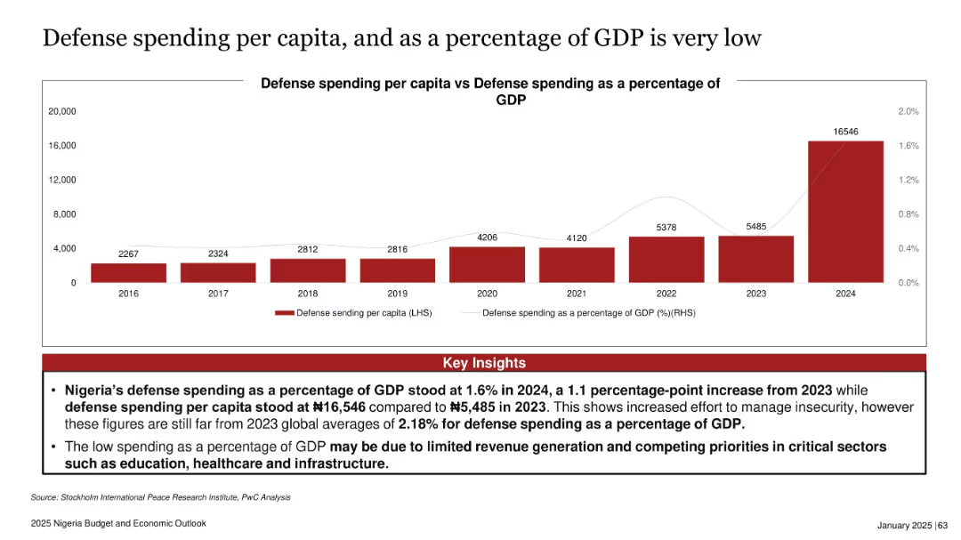
Dual-axis bar and line chart with red bars for per capita spending and a thin grey line for % of GDP
Financial Performance
Government & Public Sector
This slide compares Nigeria’s defense spending per capita with its GDP percentage from 2016 to 2024. While there’s a sharp increase in per capita spending in 2024, it still remains below global averages. Insights explain that low spending relative to GDP is due to revenue challenges and competing sectoral priorities like education and infrastructure.
defense, Nigeria, GDP, budget, security, spending, inflation, infrastructure, public finance
Mixed Chart
PwC/Strategy&
Saved
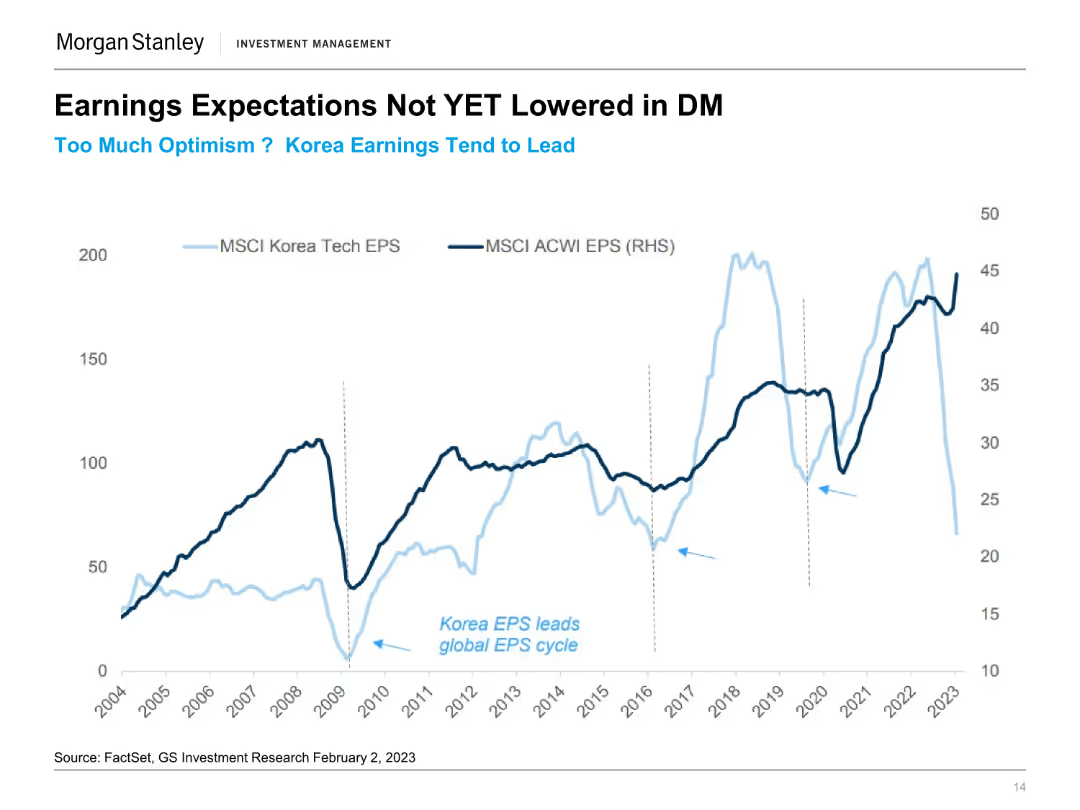
The slide features a line chart comparing MSCI Korea Tech EPS and MSCI ACWI EPS from 2004 to 2023. Two lines represent the earnings per share for each index over time.
Financial Performance
Financial Services
This slide discusses the earnings expectations in developed markets, highlighting Korea's earnings trends compared to global averages and noting optimism in projections.
Earnings Expectations, Korea EPS, MSCI, Developed Markets, Financial Performance, Market Trends, Tech Sector, EPS Comparison
Single Chart
Morgan Stanley
Saved
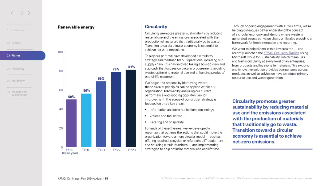
Split layout: left side with vertical bar chart (FY19–FY23), right side with text blocks and a bold quote.
Technology and Digital Transformation
Professional Services
Highlights progress in renewable energy usage across fiscal years and details a circularity strategy aimed at sustainability. The text explains how the organization is adopting circular economy principles by reducing material use, managing waste, and promoting sustainable procurement across various operations. It also mentions a tool (Circularity Tracker) that aids in tracking these efforts.
Renewable energy, sustainability, circularity, emissions, supply chain, procurement, technology, KPMG, net-zero, operations
Mixed Chart
KPMG
Saved
The slide features comparative column charts detailing the fleet size and average age of Seadrill and its competitors. It uses a dual-axis format to display numbers of rigs and fleet age, making direct comparisons straightforward. The color palette is consistent with Seadrill's branding, and each graph is clearly labeled to ensure viewer understanding. The overall design is sleek and professional, emphasizing key data points through effective visual contrast.
Competitive Landscape
Energy & Utilities
The slide compares Seadrill's fleet size and age with those of its competitors, highlighting its position in the market. It serves as a competitive analysis tool in investor briefings or strategic meetings, arguing Seadrill's advantages in terms of a newer, more technologically advanced fleet. The presentation of this data aims to convey Seadrill's industry standing and readiness for future market demands, supporting arguments for investment or strategic shifts based on fleet composition and age.
competitive analysis, fleet size, age, Seadrill, bar graphs, market position, strategic meetings, technology, investment, industry standing
Multiple Chart
Barclays
Saved
The slide contains text on the left side and two doughnut charts on the right. The text discusses effective targeting strategies, and the charts compare 'All Entrants' and 'All Winners' with respect to having a primary target.
Strategic Planning
Media & Entertainment
This slide explains the effectiveness of mass and targeted strategies in driving brand growth, comparing the presence of a primary target between all entrants and winners.
targeting strategies, mass, targeted, primary target, brand growth
Multiple Chart
IPSOS
Saved
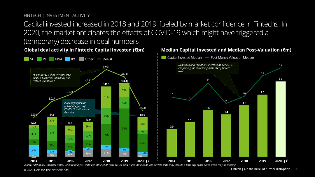
Dual-column charts showing global deal activity in fintech, with capital invested and median capital invested/post-valuation from 2014 to 2020 Q3. Various colors indicate deal types.
Investment Analysis
Financial Services
Analyzes global deal activity in fintech, highlighting increased investments in 2018-2019, and the potential decrease in 2020 due to COVID-19, with a breakdown by deal types.
fintech, capital investment, market confidence, COVID-19, deal activity, valuation, global analysis, venture capital, private equity, M&A
Multiple Chart
Deloitte
Saved
The slide presents online market growth for luxury goods in 2017, with detailed segment analysis including hard luxury, beauty, apparel, and accessories. It uses a mix of a column chart and texts in a dynamic layout, employing red to highlight growth areas and gray for the background.
Market Analysis and Trends
Consumer Goods
Discusses the significant growth of the online luxury goods market, breaking down the performance by product category and business model. Highlights how strategic partnerships and a focus on specific segments like e-tailers and brand websites have driven substantial growth.
online market, luxury goods, growth analysis, digital strategy
Single Chart
Bain
Saved
Features column charts comparing the proportion of women in managerial positions across various regions and time periods, presented with clear labels and contrasting colors for easy comparison.
Market Analysis and Trends
Professional Services
Highlights the slow progress and continuing challenges in achieving gender parity in managerial roles globally, providing a basis for discussions on gender equity in professional settings.
gender equality, managerial roles, global, trends, workplace, diversity, equity, data, analysis
Mixed Chart
Roland Berger
Saved
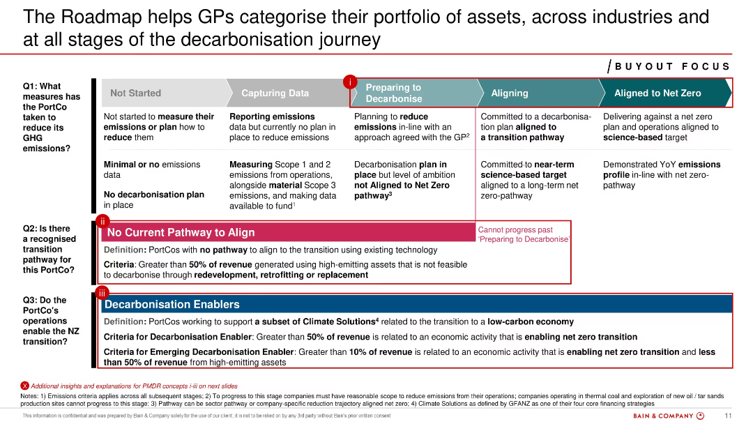
Detailed process flow diagram with multi-stage progression bar and three guiding questions. Extensive use of text and color-coded segments for stages.
Organizational Structure and Change
Financial Services
Categorizes PortCos across five decarbonization stages and addresses readiness, pathways, and enablers. Helps GPs assess portfolio alignment with net-zero goals using qualitative criteria and investment readiness.
decarbonisation stages, PortCos, roadmap, net zero, alignment, GP tools
Linear Flow
Bain
Saved
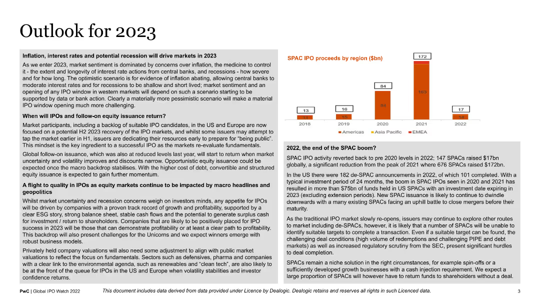
The slide contains a detailed text analysis on market expectations for 2023, accompanied by a small bar chart showing SPAC IPO proceeds by region from 2018 to 2022. It is text-heavy, with key points highlighted in bullet form for readability.
Strategic Planning
Financial Services
This slide outlines predictions for 2023 market trends, focusing on potential impacts of inflation, interest rates, and recession fears. It is aimed at market analysts and financial strategists planning for the upcoming year.
2023 outlook, market trends, SPAC IPOs, inflation, recession
Mixed Chart
PwC/Strategy&
Saved
This slide is text-heavy with a split layout. The left side displays a column chart titled 'Liquidity Ratio Components', and the right side features a column chart comparing 'Average Liquidity Coverage Ratio Trend' across different quarters. Text content explains the liquidity risk management strategy.
Risk Assessment and Management
Financial Services
Focuses on liquidity risk, showcasing components and trends in coverage ratios, and is ideal for financial managers or analysts looking at liquidity risk preparedness and regulatory compliance.
liquidity risk, risk management, bar chart, financial stability, coverage ratio, regulatory compliance, risk assessment, asset management, stress scenario, financial oversight
Multiple Chart
Goldman Sachs
Saved
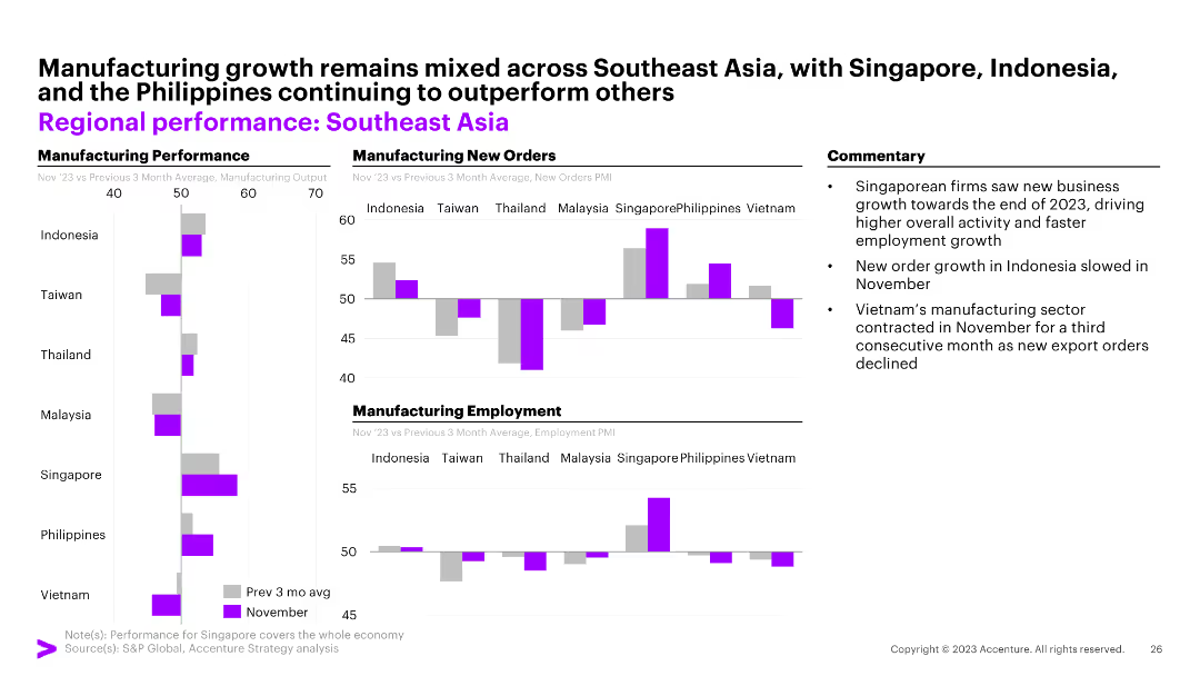
The slide features three column charts illustrating manufacturing performance, manufacturing new orders, and manufacturing employment across Southeast Asian countries. Commentary on the right.
Market Analysis and Trends
Financial Services
The slide highlights mixed manufacturing growth in Southeast Asia with Singapore, Indonesia, and the Philippines outperforming others.
Southeast Asia, manufacturing, new orders, employment, Indonesia, Singapore, Philippines, Taiwan, Thailand, Malaysia, Vietnam
Multiple Chart
Accenture
Saved
A column chart showing the number of foreign investment projects and jobs created from 2010 to 2022, with an accompanying text box providing context.
Market Analysis and Trends
Financial Services
The slide presents the trends in foreign direct investment projects and jobs in Europe over a period of time and discusses the factors influencing these trends.
FDI, trends, Europe, investment, jobs
Mixed Chart
EY
Saved
Line charts showing "Global Default Rates and Distress Ratios" with separate lines for "Default Rate," "HY Distress Ratio," and "Loan Distress Ratio" over time from 1998-2023.
Risk Assessment and Management
Financial Services
This slide indicates rising default rates even as signs of financial distress are declining, useful for risk management and credit analysis.
default rates, distress ratios, financial risk
Single Chart
Morgan Stanley
Saved
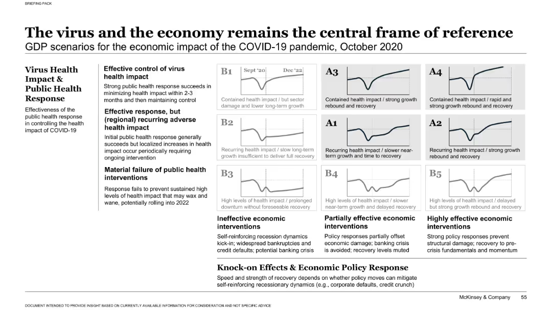
Matrix-style layout with 3x3 grid of small charts representing GDP scenarios, grouped by effectiveness of virus response and economic policy response. Left-hand text box explains scenario categories. Neutral color palette.
Strategic Planning
Professional Services
Presents a framework of nine GDP recovery scenarios based on public health response and economic interventions. It highlights three tiers of virus control (effective, recurring, and failure) and three levels of economic response (ineffective to highly effective), leading to different economic trajectories.
COVID-19, GDP scenarios, economic impact, virus response, policy impact, strategic framework, recovery models, public health, recession risk, intervention outcomes
Single Chart
McKinsey
Saved
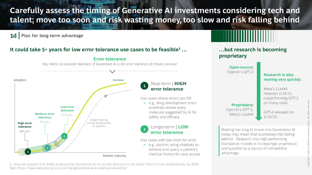
A column chart with error tolerance categories, a textual explanation on the right, and a descriptive flow chart at the bottom depicting AI adoption stages.
Strategic Planning
Technology & Software
The slide explains the error tolerance levels for generative AI use cases, emphasizing the timing for investments. It provides an analysis of short-term and long-term AI adoption strategies.
Generative AI, investment, error tolerance, AI adoption, strategic planning
Mixed Chart
BCG
Saved
Features a line chart showing investment projections over 20 years under low and high growth scenarios, with key projects listed. Visuals include icons and highlighted text boxes.
Investment Analysis
Energy & Utilities
Examines potential economic impacts of proposed oil and gas investments, detailing low and high growth scenarios and listing key projects in development.
Investment, Growth Scenarios, Economic Impact, Oil and Gas, Western Australia, Key Projects, Future Capacity
Mixed Chart
EY
Saved
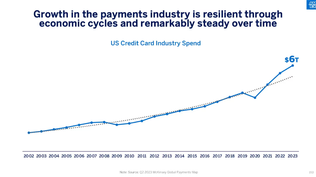
Line graph showing historical growth in US credit card industry spend from 2002 to 2023, reaching $6T in 2023.
Market Analysis and Trends
Financial Services
This slide emphasizes the resilience and consistent growth of the U.S. credit card industry despite economic cycles. With spend rising from under $1T in 2002 to $6T in 2023, it underlines the industry's long-term momentum and consumer reliance on credit-based transactions.
payments industry, growth trend, credit card spend, economic cycles, resilience, US market, long-term trends
Single Chart
McKinsey
Saved
A column chart compares the levelized cost of hydrogen as a feedstock for different grid utilizations (wind, solar, grid wind, grid solar) over different capacities (1 MW, 10 MW, 100 MW) by 2030.
Market Analysis and Trends
Energy & Utilities
The slide discusses the potential competitiveness of green hydrogen as a feedstock, noting the current higher cost compared to brown sources but highlighting future cost reductions.
green hydrogen, feedstock, levelized cost, grid, wind, solar, competitiveness, future cost, hydrogen production
Multiple Chart
Kearney
Saved
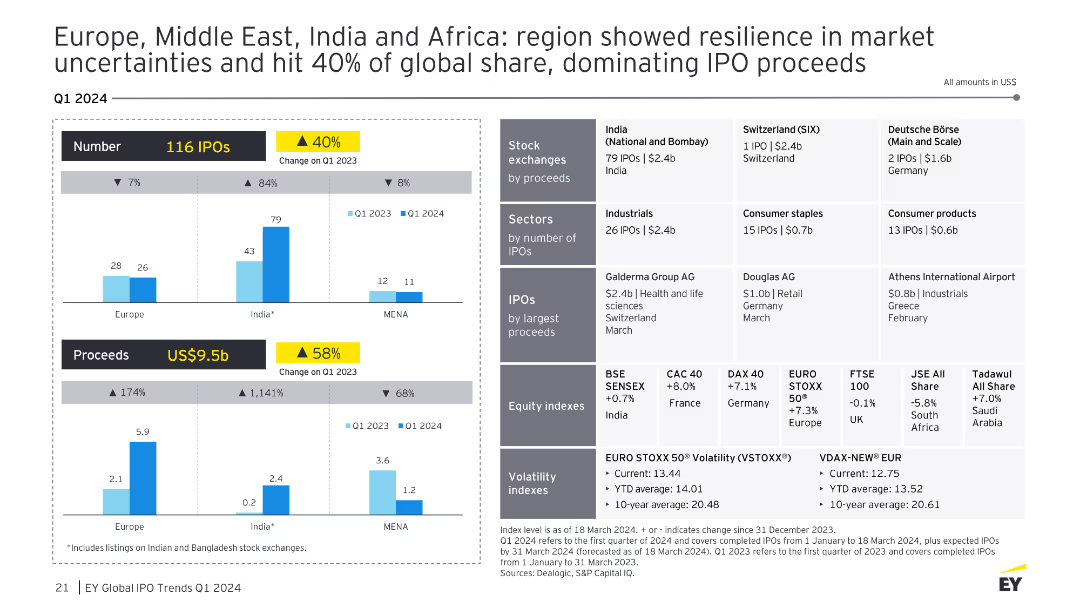
A slide with multiple charts showing the number and proceeds of IPOs in Europe, Middle East, India, and Africa, with detailed exchange and sector breakdowns. The visual complexity is advanced, with comprehensive data.
Market Analysis and Trends
Financial Services
The slide highlights the resilience of the Europe, Middle East, India, and Africa regions in market uncertainties, capturing 40% of the global IPO proceeds. It provides detailed data on the number of IPOs and proceeds by region, along with sector-specific performances and notable IPOs in each region.
IPO, Europe, Middle East, India, Africa, Resilience
Multiple Chart
EY
Saved
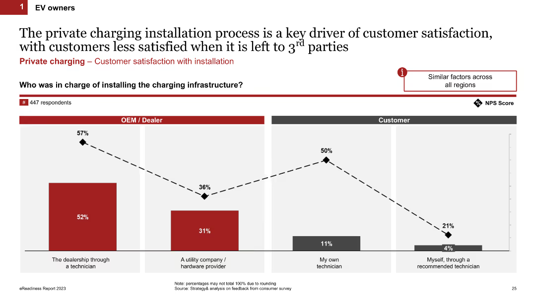
Column chart comparing satisfaction levels based on who installed the charging infrastructure (OEM/Dealer, Utility company, own technician, or self-installation). The chart uses percentages and a Net Promoter Score (NPS) line graph to show satisfaction.
Customer and Market Segmentation
Transportation & Logistics
This slide compares customer satisfaction levels with the charging installation process, showing higher satisfaction when the customer installs it themselves or through a recommended technician compared to other methods.
installation process, customer satisfaction, charging infrastructure, NPS, EV owners
Single Chart
PwC/Strategy&
Saved
Features a Venn diagram illustrating the crossover between fashion and sportswear, supplemented by a pyramid graph showing market segments.
Strategic Planning
Consumer Goods
Discusses the blending of fashion and sportswear into a singular lifestyle market, exploring the dynamics of cross-segment competition.
market convergence, fashion, sportswear, lifestyle trends, competitive analysis
Mixed Chart
Bain
Saved
Previous
Next
If nothing, comes up, please save your slides first
Create a FREE account to continue browsing
Receive Instant Access to 1,000+ slides from companies like McKinsey, Google, and Goldman Sachs
First Name
Last Name
Email
Password
I agree to all
Terms & Privacy Policy
Thank you! Your submission has been received!
Oops! Something went wrong while submitting the form.
Have an account?
Sign in
Column Chart
Heatmap
Chevron
Org Chart
Infographic
Callouts
Timeline
List
Graphic
Picture
Process Flow
Diagram
Paragraph
Map
Table
Framework
Subtitle
Takeaway Box
Icon
Other Chart
Radar Chart
Waterfall Chart
Mekko Chart
Pie Chart
Scatter Plot
Line Chart
Bar chart
Bullet points