Create a FREE Account
Instant access to 1,000+ real slides from top companies like McKinsey, BCG, Goldman Sachs, Google and many more!
First Name
Last Name
Email
Password
I agree to all
Terms & Privacy Policy
Thank you! Your submission has been received!
Oops! Something went wrong while submitting the form.
Have an account?
Sign in
Library
Templates
Courses
Pricing
My Account
My Slides
My Templates
✦ AI
AI Prompt Library
AI Search
Sign in
Start Here
Logout
My Saved Slides
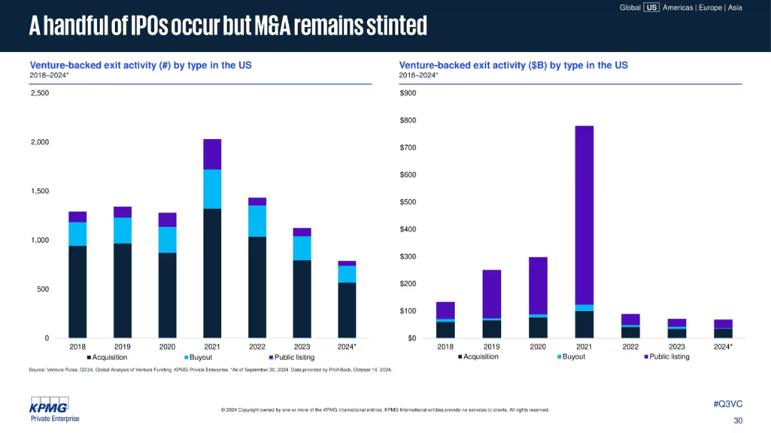
Two vertical bar charts: left shows number of exits by type; right shows exit value ($B) by type. Color-coded by acquisition, buyout, and public listing.
Mergers and Acquisitions
Financial Services
Public listings have dropped significantly since 2021, with M&A dominating exit types. Total exit values are down across the board, showing limited liquidity events and a slowdown in large-scale buyouts and IPOs.
IPOs, M&A, buyouts, exit activity, venture exits, liquidity events, public listing decline, 2024 exits
Multiple Chart
KPMG
Saved
Features a column chart depicting various uses of crypto assets by Canadians, including conversion to cash and payments.
Market Analysis and Trends
Financial Services
This slide details the ways Canadians use crypto assets, with top uses being conversion to cash, exchanging for other assets, and making payments. It shows demographic differences in the usage patterns of crypto assets.
Crypto assets, usage, Canadians
Mixed Chart
IPSOS
Saved
This slide juxtaposes two sets of data: a bar chart comparing market share changes between 2014-2018 and 2017-2018, and two circular graphs showing the number of businesses where the company ranks in the market from 2014 to 2018.
Market Analysis and Trends
Financial Services
Suited for business analysts and investors, the slide provides a competitive analysis of market share gains in the Corporate Investment Banking sector, underlining the company's improving market position relative to its peers over time.
market share, CIB, leadership, competitive analysis, 2014, 2018, business ranking
Multiple Chart
JP Morgan
Saved
The slide contains a column chart comparing the length of technology use (2 years or less vs. 3+ years) for different technologies including DCRs, identity solutions, CMPs, etc.
Technology and Digital Transformation
Technology & Software
This slide shows the acceleration of DCR adoption in the past two years compared to other technologies, highlighting the increase in usage over a shorter period.
DCR adoption, technology, acceleration, privacy
Mixed Chart
IPSOS
Saved
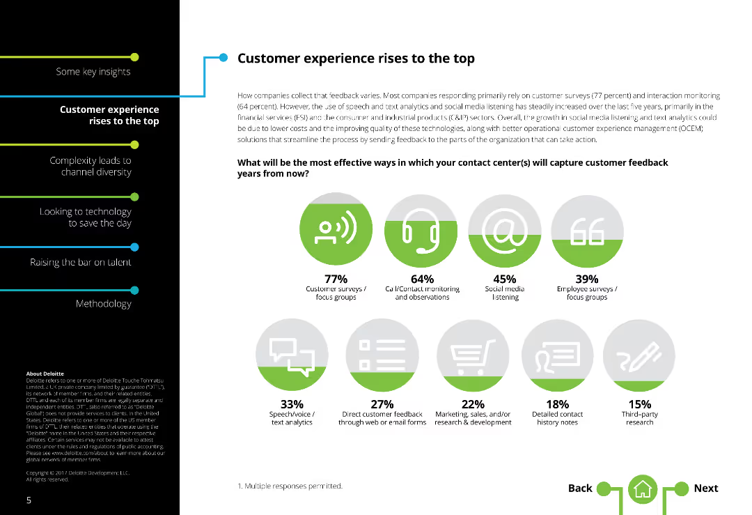
This slide features various icons and column charts displaying effective methods for capturing customer feedback in contact centers, with percentage data for each method.
Market Analysis and Trends
Professional Services
The slide outlines the most effective ways for contact centers to capture customer feedback. It includes survey data showing the prevalence of different methods such as customer surveys, call/contact monitoring, social media listening, and employee focus groups, presented with corresponding icons and column charts.
Customer feedback, contact centers, survey methods, column charts, engagement
Single Chart
Deloitte
Saved
Column chart showing semiconductor investment projects and a pie chart of low-carbon mobility projects by country.
Market Analysis and Trends
Technology & Software
Highlights investments in semiconductors and low-carbon mobility in Europe, focusing on leading countries.
semiconductors, low-carbon, mobility, investment, Europe
Multiple Chart
EY
Saved
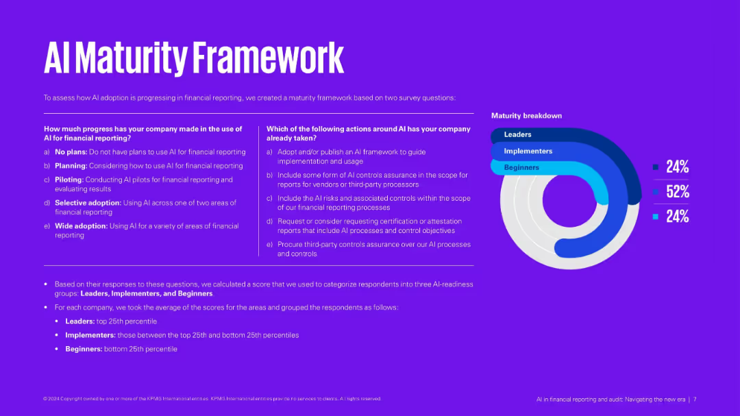
Purple background with side-by-side matrices and a donut chart breakdown of maturity levels: Leaders, Implementers, Beginners.
Technology and Digital Transformation
Financial Services
Defines an AI maturity model based on usage and actions taken. Categorizes companies into three groups based on their AI implementation readiness. Provides criteria and scoring method for classification.
AI maturity, financial reporting, implementation stages, digital transformation, assessment
Mixed Chart
KPMG
Saved
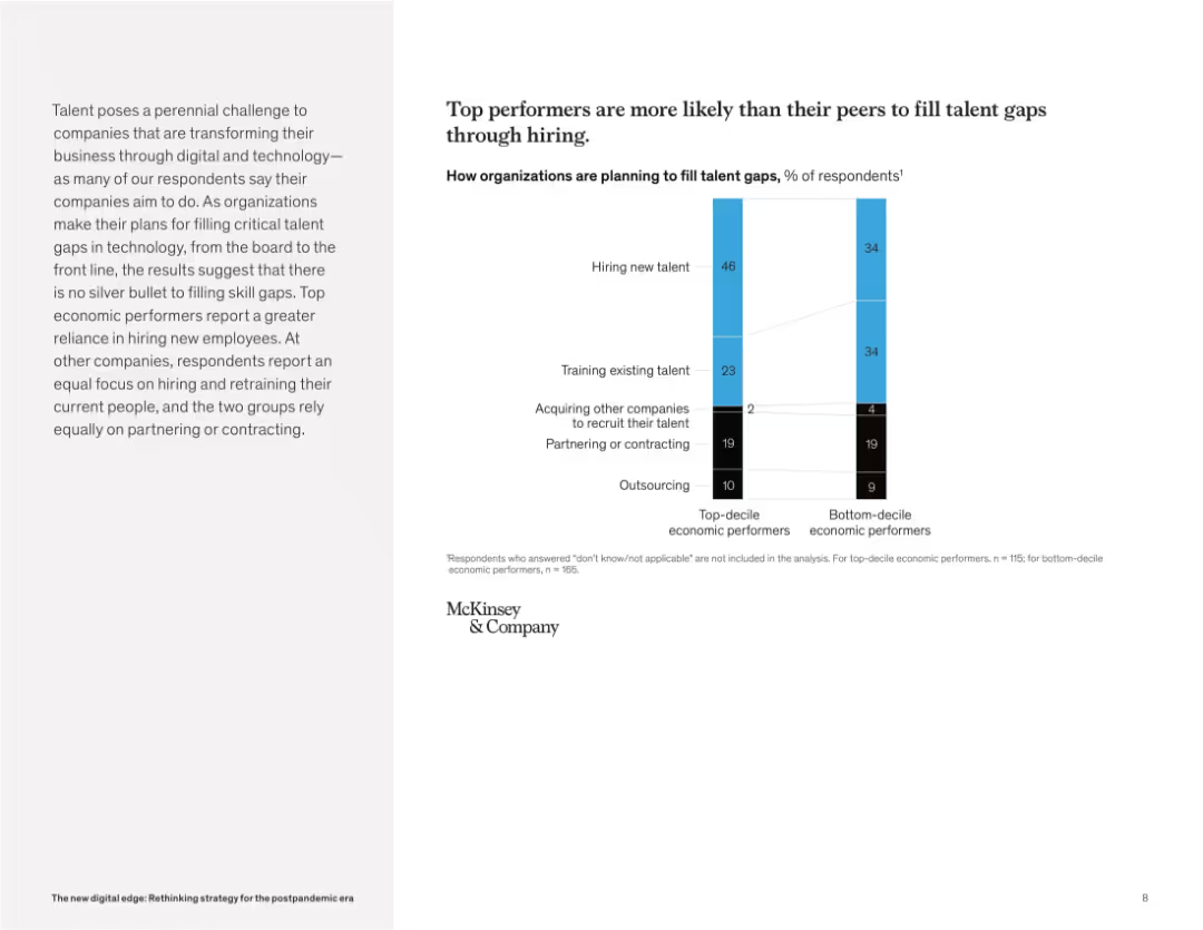
Split-page layout: left side features a paragraph in light gray background, right side shows a vertical stacked bar chart with labels and legend. Simple, clean design.
Human Resources and Talent Management
Technology & Software
The slide compares how top-decile vs. bottom-decile economic performers plan to address talent gaps. It reveals that top performers rely more heavily on hiring new talent, while others focus more on retraining or maintaining existing talent. Both groups use similar levels of partnering and outsourcing.
talent strategy, hiring, retraining, outsourcing, partnering, skill gaps, economic performers, workforce planning, McKinsey, tech skills
Mixed Chart
McKinsey
Saved
This slide includes a column chart comparing port costs in Australia, the US, and France, with bullet points discussing various factors affecting port costs and their implications for supply chains.
Market Analysis and Trends
Transportation & Logistics
It evaluates the direct port costs in Australia compared to the US and France, highlighting factors that influence these costs and the competitive position of Australian ports within the global market.
port costs, Australia, US, France, supply chain, comparison
Mixed Chart
LEK
Saved
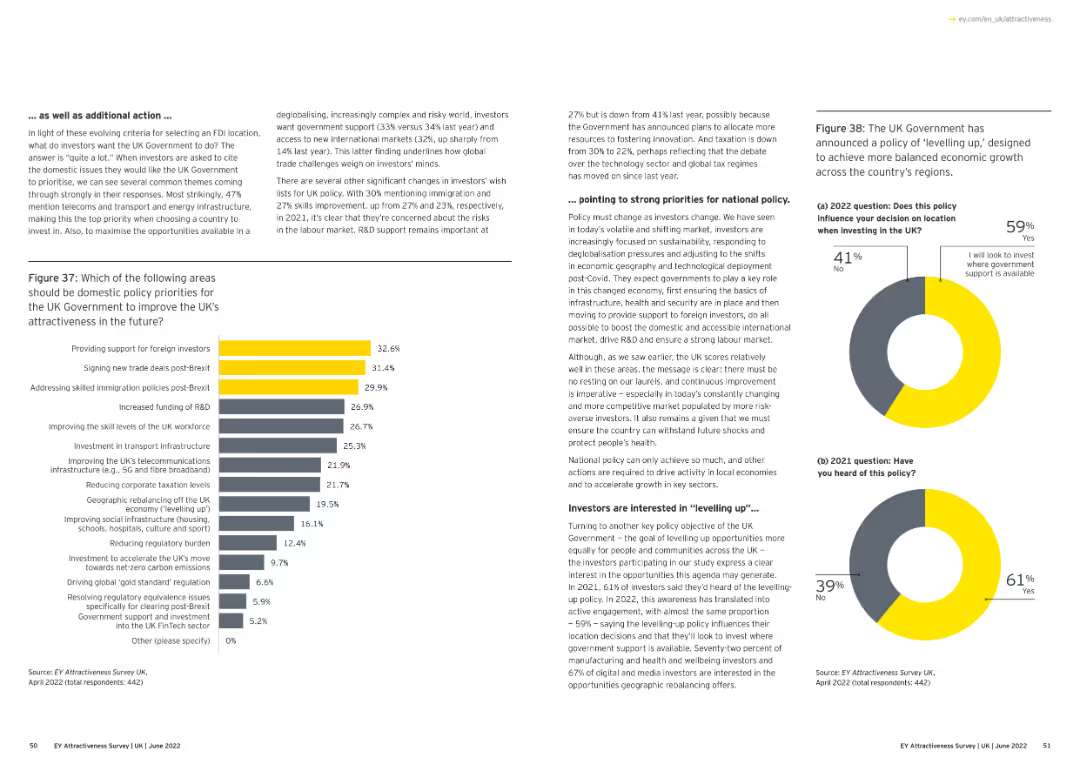
Text and a bar chart. The chart lists policy priorities for the UK government to improve attractiveness post-Brexit.
Regulatory and Compliance
Financial Services
The slide outlines policy priorities for the UK government to enhance attractiveness, focusing on foreign investment and trade deals.
policy priorities, UK government, post-Brexit, foreign investment, column chart
Multiple Chart
EY
Saved
Line chart showing 10-year Treasury yield and fed funds rate. Another chart shows the breakdown of nominal yield into breakeven and real yield.
Market Analysis and Trends
Financial Services
Analyzes U.S. real yields by breaking down Treasury yields and comparing them with the fed funds rate, providing insights into real vs. nominal returns.
U.S., real yields, Treasury, nominal, breakeven
Multiple Chart
JP Morgan
Saved
Similar design to others; shows global average and detailed country-by-country percentage comparisons
Risk Assessment and Management
Government & Public Sector
Focusing on a single reason for inaction—feeling that no action would make a difference—this slide presents country-level data and gender-based breakdowns to highlight where this sentiment is most prevalent.
pessimism, gender equality, action barriers, Ipsos, survey data, global comparison
Mixed Chart
IPSOS
Saved
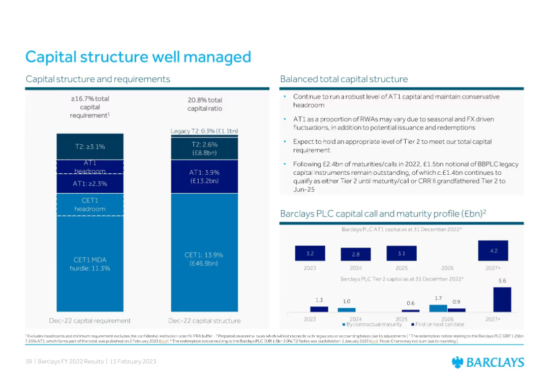
Three-part layout: a stacked bar chart for regulatory capital requirement, a current capital structure bar, and a capital maturity profile showing AT1 and Tier 2 maturity timelines.
Corporate Finance and Valuation
Financial Services
Barclays outlines its well-managed capital structure, breaking down its CET1, AT1, and Tier 2 capital layers and maturity profiles. It highlights regulatory requirements, headroom levels, and future capital instrument call/maturity expectations through 2027+.
capital structure, AT1, Tier 2, maturity profile, Barclays
Multiple Chart
Barclays
Saved
The slide displays a split circular diagram divided into four segments, each with icons representing different tax amendments for 2018. The design uses bold colors like orange and red to denote different areas like Charitable activities and Foreign income taxation.
Regulatory and Compliance
Government & Public Sector
This slide presents proposed tax amendments for Namibia in 2018, detailing changes in taxation for dividends, trusts, foreign income, and charitable activities, aimed at discussing potential revenue impacts and legislative changes in a budget review.
tax, amendments, revenue, Namibia, 2018, dividend, trust, foreign, income, charitable
Framework
PwC/Strategy&
Saved
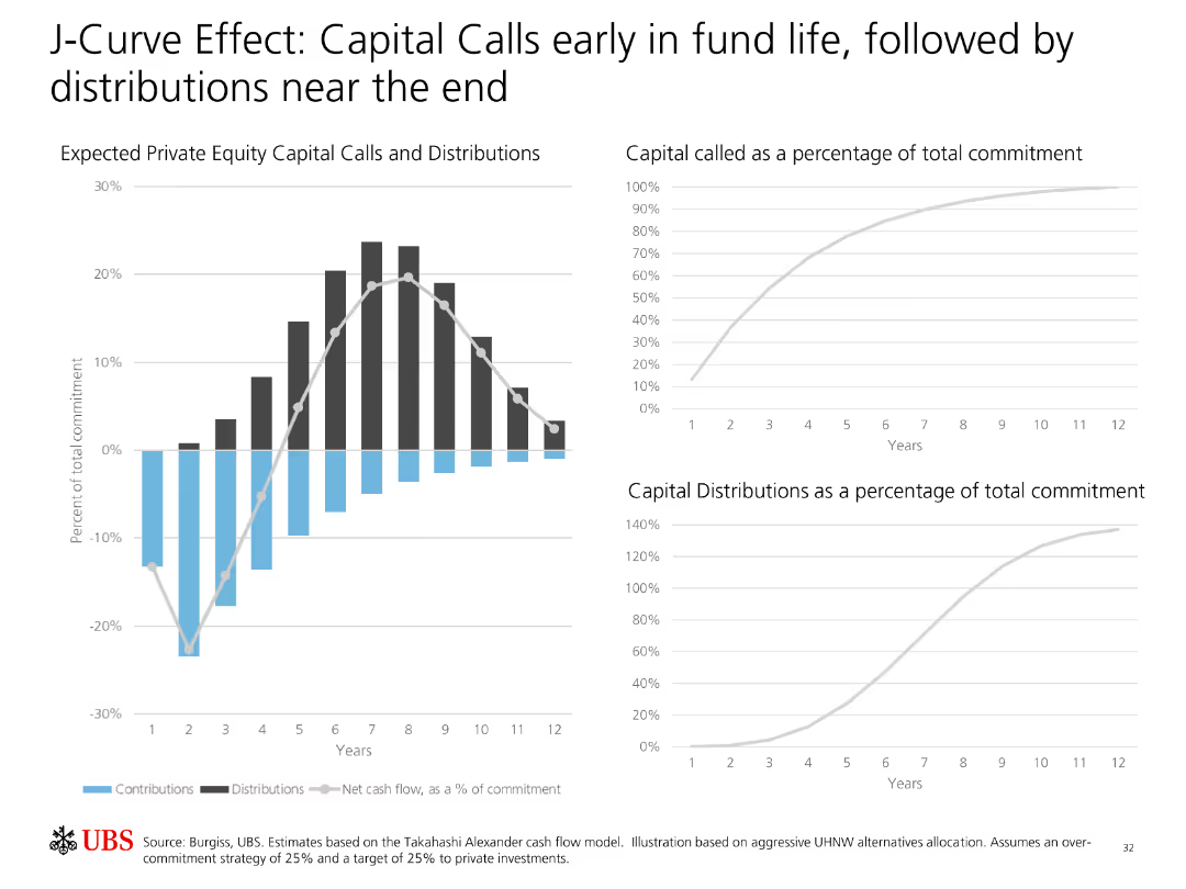
Contains two line charts and one bar chart illustrating expected private equity capital calls and distributions over the fund's lifecycle.
Financial Performance
Financial Services
Explains the J-Curve effect in private equity, showing how capital calls are concentrated early in the fund's life while distributions increase later.
J-Curve, Private Equity, Capital Calls, Distributions, Fund Lifecycle, Investment, Analysis, Cash Flow, Strategy
Multiple Chart
UBS
Saved
This slide showcases a breakdown of revenue growth factors with accompanying column charts and annotations, including a projection for net interest income.
Financial Performance
Financial Services
Analyzes the drivers of revenue growth within the business, including deposit and loan expansion. Ideal for financial strategy and planning meetings.
revenue growth, business development, financial strategy, net interest income, deposit growth, loan expansion, strategic planning
Single Chart
JP Morgan
Saved
Displays a pie chart comparing 2020 market share in HEV plastic fuel tanks among competitors, with annotations about technology and market strategy. The chart uses various colors to represent different competitors.
Product and Service Analysis
Industrial & Manufacturing
The slide examines TI Fluid Systems' market share in the HEV plastic fuel tanks sector, highlighting their second position and strategic initiatives like the PACE awarded TAPT process to enhance market share.
HEV, market share, 2020, pie chart, fuel tanks
Mixed Chart
Deutsche Bank
Saved
The slide has a header and two sections: a text block on the left and two sets of column charts on the right. The first column chart shows the frequency of doctor visits among different ethnic groups, while the second shows the frequency of visits to other health professionals, using different colors for each ethnic group.
Market Analysis and Trends
Healthcare & Pharmaceuticals
Analyzes the frequency of primary care doctor visits and consultations with other health professionals among different ethnic groups in the U.S. The column charts compare annual and less frequent visits, highlighting disparities in healthcare access and usage among these groups.
Healthcare, doctor visits, ethnic groups, survey, frequency
Multiple Chart
IPSOS
Saved
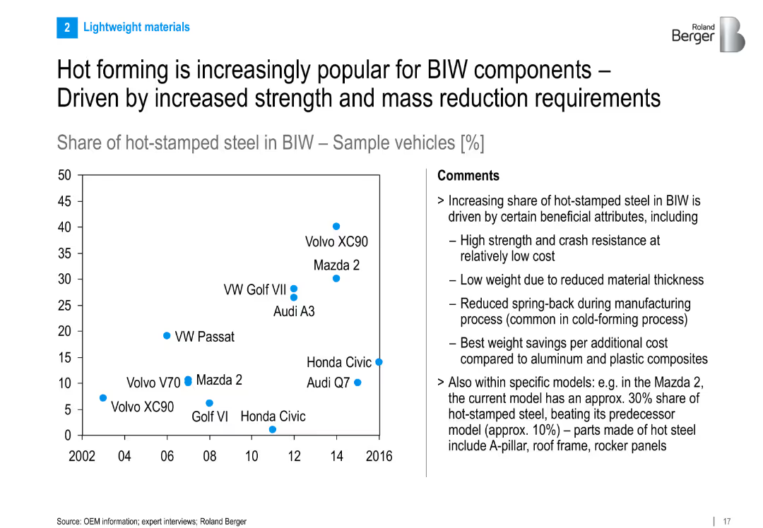
Left side: scatter plot showing hot-stamped steel share in BIW across vehicles and years; right side: comments explaining benefits; clean layout with a focus on data
Market Analysis and Trends
Industrial & Manufacturing
Shows the rising adoption of hot-stamped steel in Body-in-White (BIW) components. Benefits include strength, reduced weight, and low cost. Includes example models like Mazda 2 and Audi Q7 with increasing hot-stamp usage.
hot forming, BIW, hot-stamped steel, vehicle weight, OEMs, trend, body structure, strength, mass reduction
Mixed Chart
Roland Berger
Saved
Includes a line graph and summary text.
Performance Metrics and KPIs
Technology & Software
Reviews the perceived impact of marketing analytics on company performance, with a focus on improvements over time and future potential.
Marketing, Analytics, Performance, Improvement, Impact, Company, Future Potential, Line Graph, Perceived Impact
Mixed Chart
Deloitte
Saved
The slide shows a stacked column chart illustrating the impact of netting and collateral on IFRS derivative trading assets, alongside bullet points for additional context. The design is minimalistic yet effective in conveying complex financial concepts.
Financial Performance
Financial Services
Reviews the net positions of derivative trading assets after adjustments for netting and collateral, serving as an analysis tool for understanding financial risk and asset management in banking.
derivatives, financial risk, banking, assets management
Mixed Chart
Deutsche Bank
Saved
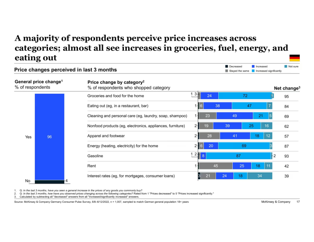
Two-part horizontal bar chart showing Germany's perceived price changes by category. Right chart breaks down responses into "Decreased," "Stayed the same," "Increased," and "Increased significantly." Left bar shows overall % perceiving general price increase.
Market Analysis and Trends
Financial Services
Most German respondents noticed price increases across multiple spending categories. Particularly high increases were reported in groceries, gasoline, and home energy. This breakdown helps identify where consumers feel inflation most directly across their recent purchases.
Germany, price changes, inflation perception, groceries, fuel, energy, spending categories, consumer insight
Multiple Chart
McKinsey
Saved
Contains column chart in dark and light blue shades, depicting TLTRO transactions over time.
Financial Performance
Financial Services
Reviews TLTRO metrics and future projections, highlighting impacts on liquidity and financial stability.
TLTRO, financial forecast, liquidity, NSFR, LCR, banking, financial stability, projections
Single Chart
Deutsche Bank
Saved
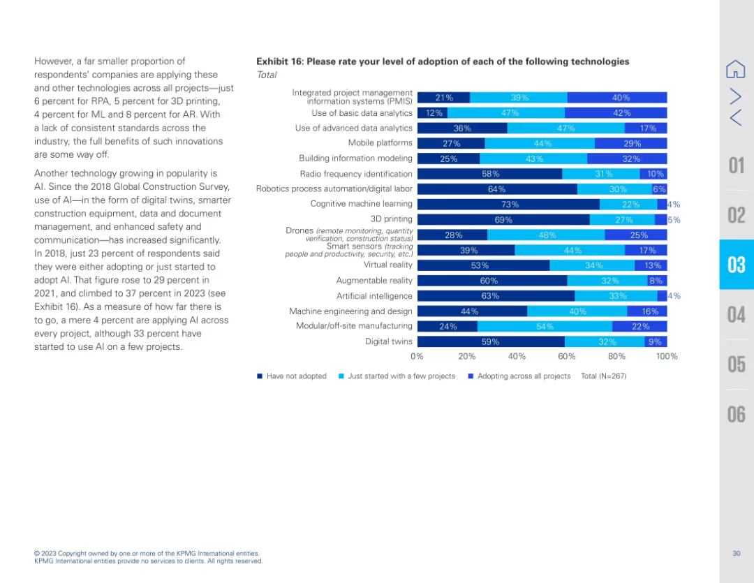
Two-column layout with a bar chart on the right and text explanation on the left. The bar chart uses horizontal stacked bars in different shades of blue to show adoption stages of various technologies.
Technology and Digital Transformation
Real Estate & Construction
Presents a survey of how different digital and emerging technologies are being adopted in capital projects. AI, RPA, AR, ML, digital twins, and PMIS are highlighted. Adoption rates remain low for most technologies, showing potential for growth.
technology adoption, AI, PMIS, construction, survey, analytics, digital twins, robotics, ML, AR, VR
Mixed Chart
KPMG
Saved
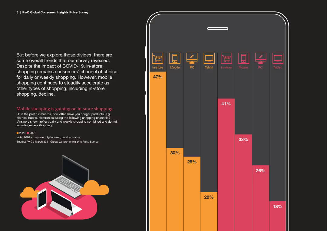
Column chart within a mobile phone outline, comparing in-store and mobile shopping trends between 2020 and 2021.
Market Analysis and Trends
Retail & E-commerce
This slide examines the shift towards mobile shopping compared to in-store shopping during the COVID-19 pandemic.
mobile shopping, in-store, trends, 2020, 2021, COVID-19, comparison
Mixed Chart
PwC/Strategy&
Saved
Previous
Next
If nothing, comes up, please save your slides first
Create a FREE account to continue browsing
Receive Instant Access to 1,000+ slides from companies like McKinsey, Google, and Goldman Sachs
First Name
Last Name
Email
Password
I agree to all
Terms & Privacy Policy
Thank you! Your submission has been received!
Oops! Something went wrong while submitting the form.
Have an account?
Sign in
Column Chart
Heatmap
Chevron
Org Chart
Infographic
Callouts
Timeline
List
Graphic
Picture
Process Flow
Diagram
Paragraph
Map
Table
Framework
Subtitle
Takeaway Box
Icon
Other Chart
Radar Chart
Waterfall Chart
Mekko Chart
Pie Chart
Scatter Plot
Line Chart
Bar chart
Bullet points