Create a FREE Account
Instant access to 1,000+ real slides from top companies like McKinsey, BCG, Goldman Sachs, Google and many more!
First Name
Last Name
Email
Password
I agree to all
Terms & Privacy Policy
Thank you! Your submission has been received!
Oops! Something went wrong while submitting the form.
Have an account?
Sign in
Library
Templates
Courses
Pricing
My Account
My Slides
My Templates
✦ AI
AI Prompt Library
AI Search
Sign in
Start Here
Logout
My Saved Slides
The slide has a text area with a header and two line graphs comparing the perspectives of millennials and Gen Z on businesses' societal impact from 2016 to 2021. The design is straightforward with a mix of green and yellow lines against a white backdrop.
Organizational Structure and Change
Technology & Software
This slide reflects the shifting perspectives of millennials and Gen Z regarding the role of businesses in society. It discusses a trend where fewer individuals view businesses as a force for good, with line graphs showing the percentage of those who agree with this sentiment from 2016 to 2021. The information is vital for understanding corporate reputation and social responsibility practices.
Business Impact, Society, Millennials, Gen Z, Line Graph, Corporate Responsibility, Trends, Sentiment Analysis
Mixed Chart
Deloitte
Saved
Agreement/disagreement by country with emphasis on sustainability claims; color-coded bars.
Market Analysis and Trends
Retail & E-commerce
Evaluates perceptions of the retail sector’s environmental responsibility. China, Saudi Arabia, and India show highest agreement; many Western nations are skeptical.
sustainability, environment, perception, Ipsos, retail, countries, green practices
Mixed Chart
IPSOS
Saved
A detailed table presenting ESG KPI targets for 2023, including Net Promoter Score, Audit & Inspection Score, Inpatient Quality Indicator, and Employee Engagement Index.
Operational Efficiency
Environmental Services & Sustainability
The slide outlines Fresenius's 2023 targets for ESG KPIs, aligned with management board compensation, covering patient quality, inspection scores, and employee engagement.
ESG, KPIs, targets, governance, quality, engagement
Pillar
Goldman Sachs
Saved
Circular diagram showing factors interconnected with business model innovation and column charts projecting global retail e-commerce sales and its share of total retail sales from 2015 to 2024.
Technology and Digital Transformation
Technology & Software
This slide explores the dynamics of business model innovation within Industry 4.0, highlighting factors such as digital communications and emerging markets. It projects significant growth in global retail e-commerce sales and its increasing share of total retail sales, indicating a shift towards online business models.
Business Model Innovation, E-commerce, Industry 4.0
Mixed Chart
Roland Berger
Saved
The slide features a combination of column charts, pie charts, and text boxes with a balanced layout. Visual elements highlight domestic and international tourism growth, sector contributions to GDP, and public funding distribution.
Strategic Planning
Hospitality & Tourism
The slide discusses the potential long-term opportunities in sustainable tourism and infrastructure in Indonesia. It presents data on tourism growth, contributions to GDP, and infrastructure-related FDI. The slide also covers Indonesia's commitment to sustainable tourism development, infrastructure-related sector performance, and future investment strategies.
Sustainable tourism, infrastructure, GDP contribution, FDI, development strategy
Multiple Chart
PwC/Strategy&
Saved
Graphical representation of investor sentiment over different timeframes regarding the economy and stock market.
Investment Analysis
Financial Services
Visualizes survey data on investor perspectives about the US economy and stock market, showing a trend towards bearish sentiment.
sentiment, investors, bull vs bear, economy, stock market, forecast
Text Only
BCG
Saved
Slide with a column chart comparing the percentage share of podcast ad revenue by ad type (announcer-read/pre-produced, host-read, etc.) from 2019 to 2021.
Operational Efficiency
Media & Entertainment
Evaluates the shift towards announcer-read ads in podcasts, reflecting on its efficiency in ad creation and deployment.
Podcast, Ads, Announcer-Read, Efficiency
Single Chart
PwC/Strategy&
Saved
This slide uses a dark background with white and blue text. It includes a list of technologies under categories like ACES and adjacent tech. Visuals include stylized icons representing each technology category.
Technology and Digital Transformation
Transportation & Logistics
It outlines innovative technologies in the mobility sector, such as autonomy and electrification, with descriptions of each. Additional adjacent technologies like lightweight materials are also presented.
autonomy, connectivity, electrification, smart mobility, lightweight technologies, decarbonization
Header Horizontal
McKinsey
Saved
The slide features a line chart for inflation targeting and accumulated change, another line chart breaking down inflation into goods and services, and a line chart showing target policy rate and expectations.
Market Analysis and Trends
Financial Services
The slide discusses Brazil's inflation trends, monetary policy targets, and the breakdown of inflation between goods and services.
Brazil, inflation, monetary policy, target rate, economic trends
Multiple Chart
JP Morgan
Saved
A sequence of five circular icons connected by arrows, each representing a different phase: Awareness raising, Prioritisation, Strategy and implementation, Measurement, Reporting.
Strategic Planning
Professional Services
The slide outlines the approach for embedding SDGs in businesses, highlighting steps from awareness raising to reporting with corresponding actions and tools.
SDGs, Strategy, Implementation, Reporting, Measurement, Tools, Awareness, Business, Value, Specialists
Mixed Chart
PwC/Strategy&
Saved
The left side features a text box setting a target for combined lost time injury frequency (LTIF), with a contrasting red backdrop. Adjacent to this is a grey-scale line graph with trends over the years and a target level indicated by a dashed line. On the right, a large image shows a smiling worker wearing a safety helmet. This personal touch adds a human element to the data-driven slide. The bottom contains a logo and footer text indicating the source and event.
Operational Efficiency
Government & Public Sector
Focuses on the importance of occupational safety, setting a specific LTIF target and using a graph to track performance, suitable for discussions on safety protocols and performance metrics.
occupational safety, supply chain, LTIF, performance tracking, industrial safety, worker well-being, safety protocols, safety metrics
Mixed Chart
Goldman Sachs
Saved
Multiple overlaid line charts showing projected changes in oil and gas production over time, based on data from IOC and IEA with a growth indicator.
Investment Analysis
Financial Services
Discusses oil and gas production forecasts, comparing different sources and highlighting growth expectations in the sector, suggesting ongoing investment viability despite broader market shifts.
oil, gas, production, forecasts, investment
Single Chart
BCG
Saved
The slide summarizes strategic focus areas through four segments with icons and brief descriptions: delivering products, software development capabilities, data power, and customer protection. It employs a clear layout with each segment distinctly color-coded for emphasis.
Strategic Planning
Financial Services
Summarizes the bank's strengths in delivering products, enhancing software development, leveraging data, and protecting customers with a focus on technology.
Strategic Planning, Product Differentiation, Financial Services, Technology, Data Utilization, Cybersecurity, Customer Protection
Pillar
JP Morgan
Saved
Line chart with multiple colored lines; long-term trend of asset classes' value growth
Strategic Planning
Financial Services
Compares inflation-adjusted growth of $10,000 in various asset classes (large cap stocks, small caps, bonds, cash) from 1995–2024. Highlights compounding benefits over time.
compounding, inflation, purchasing power, long-term investing, asset classes, small cap, large cap, bonds, cash, total return
Single Chart
JP Morgan
Saved
A line chart comparing the market cap of Apple and Google over time, with annotations highlighting key points in their competition.
Competitive Landscape
Technology & Software
Highlights Apple's dominance in market capitalization over Google, emphasizing key periods where Apple pulled ahead. Includes insights on Apple's shareholder returns and dividends.
Apple, Google, market cap, competition, line chart, shareholder returns, dividends, market trends
Multiple Chart
PwC/Strategy&
Saved
Slide presents icons and column charts detailing GDP growth, inflation trends, and policy rates, supplemented with financial performance indicators of major institutions.
Market Analysis and Trends
Financial Services
Analyzes Mexico's economic conditions and stability, emphasizing factors like GDP growth, inflation control, and policy adjustments beneficial for investment decisions.
Mexico, economy, inflation, GDP, investment
Multiple Chart
Barclays
Saved
This slide includes text blocks and icons to describe government and brand efforts in improving luxury domestic sales in China. It also features a column chart and text highlighting the impact of these efforts on luxury consumption.
Regulatory and Compliance
Retail & E-commerce
The slide reviews the 2015 expectations for improvement in China's luxury domestic sales due to government policies and brand strategies. It discusses various measures taken to localize consumption and reduce price differences, ultimately contributing to an increase in luxury purchases.
Luxury sales, government efforts, brand strategies, China, 2015 report, luxury market, regulatory impact, consumption trends
Mixed Chart
Bain
Saved
Dual-axis bar and line chart showing EBIT value and margin % from H1/19 to H1/24; commentary on the right side in a light blue box.
Financial Performance
Healthcare & Pharmaceuticals
Details the adjusted EBIT and margin trend over five years, with margin improving to 8.2% in H1/2024. Drivers include efficiency measures, revenue mix favoring consumables, and currency effects. Notes scale challenges and improvement potential in systems business.
EBIT, margin, financials, diagnostics, cost efficiency, revenue mix, STRATEC, service parts
Mixed Chart
Goldman Sachs
Saved
World map with bar graphs showing LTC recipients (home vs. institutions) across countries in 2005 vs. 2017; explanatory sidebar discusses trends.
Strategic Planning
Healthcare & Pharmaceuticals
This slide presents the global trend toward de-institutionalization of elderly care, with most countries increasing the share of LTC recipients being cared for at home. It shows a shift in policy focus to improve quality of life and reduce institutional costs.
LTC trends, deinstitutionalization, eldercare, home care, policy shift, international comparison, aging population
Multiple Chart
Roland Berger
Saved
Pie chart with 82% research, 9% consulting, 9% conferences; text-heavy right section explains each revenue segment.
Organizational Structure and Change
Technology & Software
The slide emphasizes that Gartner's revenue is primarily driven by research services. It also explains the contributions of its conference and consulting segments, showcasing their complementary role to the research business.
revenue split, research, consulting, conferences, Gartner, business mix
Mixed Chart
Gartner
Saved
Includes a table with bullet points and textual analysis detailing Australia's presence in global mining for key battery materials like lithium, cobalt, and nickel.
Competitive Landscape
Energy & Utilities
Discusses Australia's leading role and capabilities in mining essential battery materials, highlighting global market shares and reserves, and outlining upcoming projects.
Australia, mining, lithium, cobalt, nickel, market share, reserves
Table
Accenture
Saved
The slide presents a series of circular charts indicating the current share of total retail banking revenue for main banks in various countries. Each country is represented by a different colored circle.
Financial Performance
Financial Services
This slide displays the current market share of retail banking revenue by main banks in several countries, showing significant variation. It serves as a comparative analysis of market penetration.
retail banking, revenue share, market comparison, financial services, main banks
Single Chart
Accenture
Saved
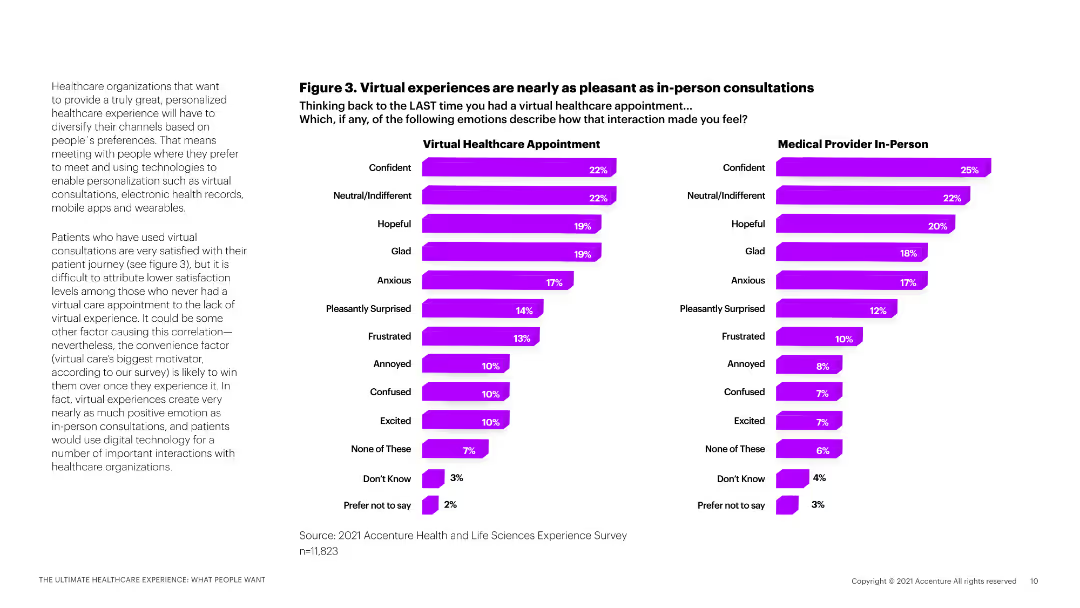
Horizontal bar chart comparing countries by percent rating healthcare as “Very good/Good” or “Poor”
Market Analysis and Trends
Healthcare & Pharmaceuticals
The chart compares how people in 28 countries rate the quality of healthcare. Malaysia, Australia, and Singapore top the list positively. Hungary, Peru, and Poland have the lowest satisfaction levels with highest “poor” ratings.
Healthcare quality, international comparison, satisfaction, global survey, medical care, Ipsos
Mixed Chart
IPSOS
Saved
This slide features a pie chart and a column chart detailing the segmentation of EO optical high-resolution market by industry. The layout is structured, containing explanatory texts and data labels.
Market Analysis and Trends
Environmental Services & Sustainability
The slide presents a detailed analysis of the EO downstream market shift towards higher resolution data and its implications on various industries. It’s useful for understanding market segmentation and potential data service opportunities.
high-resolution data, market shift, industry segmentation, data services, open data
Multiple Chart
PwC/Strategy&
Saved
Contains two overlapping line graphs tracking the rate changes over time, complemented by a column chart for annual data. The layout is clean with a clear title.
Market Analysis and Trends
Financial Services
Evaluates insurance rate trends over an extended period, highlighting shifts in the market, with a focus on the direct Energy sector. Provides historical data to assess market conditions.
historical data, insurance rates, market analysis, energy sector, trends
Mixed Chart
PwC/Strategy&
Saved
Previous
Next
If nothing, comes up, please save your slides first
Create a FREE account to continue browsing
Receive Instant Access to 1,000+ slides from companies like McKinsey, Google, and Goldman Sachs
First Name
Last Name
Email
Password
I agree to all
Terms & Privacy Policy
Thank you! Your submission has been received!
Oops! Something went wrong while submitting the form.
Have an account?
Sign in
Column Chart
Heatmap
Chevron
Org Chart
Infographic
Callouts
Timeline
List
Graphic
Picture
Process Flow
Diagram
Paragraph
Map
Table
Framework
Subtitle
Takeaway Box
Icon
Other Chart
Radar Chart
Waterfall Chart
Mekko Chart
Pie Chart
Scatter Plot
Line Chart
Bar chart
Bullet points