My Account
My Slides
Search by Category
Companies
Slide Type
Use Case
Industry
Pricing
Templates
View All Templates
Download Template Slides
✦ AI
AI Prompt Library
AI Search
Feedback
Login
Logout
Get Started
Browse all Slides
Browse all Slides
Create a FREE Account
Instant access to 1,000+ real slides from top companies like McKinsey, BCG, Goldman Sachs, Google and many more!
First Name
Last Name
Email
Password
I agree to all
Terms & Privacy Policy
Thank you! Your submission has been received!
Oops! Something went wrong while submitting the form.
Have an account?
Sign in
Saved Slides
This slide contains two graphical elements: a bar chart showing Eurozone GDP quarter growth and a line chart depicting the Eurocoin index. The design includes textual elements on a white background, with the charts situated centrally for focus.
Financial Performance
Financial Services
The slide provides a comparative analysis of Eurozone GDP growth and the Eurocoin index, highlighting economic performance by country. It's useful for discussions about economic policy or investment strategy in the region.
Eurozone, GDP Growth, Economic Performance, France, Spain, Germany, Italy, Comparative Analysis, Eurocoin Index
Multiple Chart
McKinsey
Saved
This is a cover slide with a creative design depicting a world map made of plant leaves on a deep blue background, representing the concept of a 'green' or eco-friendly world. The title is prominently displayed at the top.
Industry Overview
Environmental Services & Sustainability
As the introductory slide, it sets the theme for the presentation, signaling a focus on the costs and benefits of the net-zero transition within the global energy sector.
Net-Zero, Transition, Global Energy, Sustainability, Eco-Friendly, Introduction, McKinsey, 2022, Cover Slide
Title
McKinsey
Saved
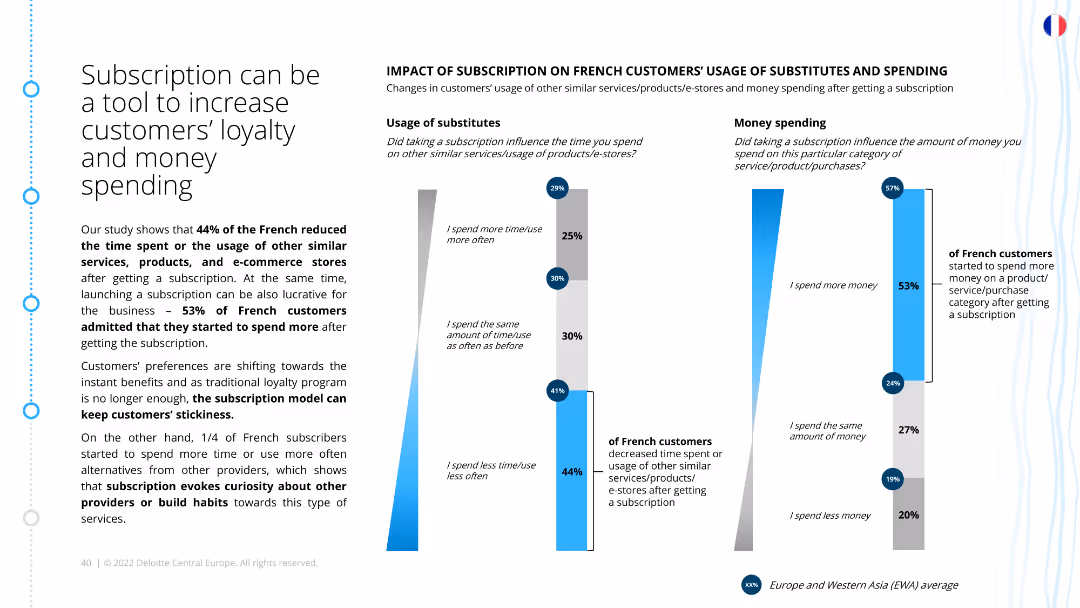
The slide features a bar chart and a column chart. The bar chart shows changes in the usage of substitutes after getting a subscription, and the column chart illustrates changes in spending habits among French customers after subscribing to services or products.
Strategic Planning
Consumer Goods
The slide presents findings on how subscriptions can enhance customer loyalty and spending. It shows that a significant portion of French customers reduced their use of substitutes and increased their spending after subscribing, indicating the effectiveness of subscription models.
Customer loyalty, spending habits, subscription impact, substitutes usage, French market, customer retention, spending increase, loyalty strategy
Multiple Chart
Deloitte
Saved
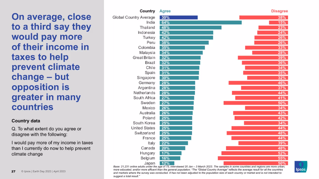
Layout follows the same pattern: left-side statement, right-side country-wise bar chart indicating willingness to pay more taxes for climate initiatives.
Pricing Strategies
Environmental Services & Sustainability
This slide reflects public willingness to contribute financially through taxes for climate change mitigation. Around one-third agree globally, but there's a high level of opposition in most countries, suggesting tax-based measures could face strong resistance in policy adoption.
climate tax, willingness to pay, income contribution, public funding, opposition, climate finance, Ipsos data
Mixed Chart
IPSOS
Saved
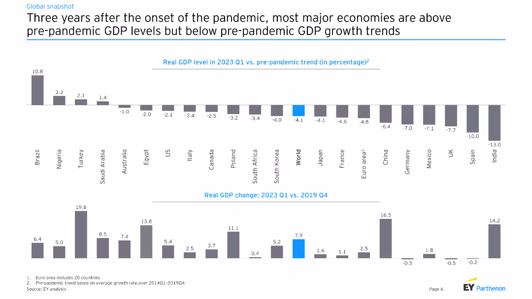
This slide features two charts: one showing the real GDP level in 2023 Q1 versus pre-pandemic trends for various countries, and another showing real GDP change from 2023 Q1 versus 2019 Q4.
Market Analysis and Trends
Financial Services
The slide compares real GDP levels and changes post-pandemic, analyzing how different economies have recovered relative to pre-pandemic trends, providing insights into economic resilience and recovery rates.
GDP, pre-pandemic, trend, recovery, economy, global
Multiple Chart
EY
Saved
Moderate visual complexity, this slide uses iconography to represent the drivers behind the development and adoption of Emissions Management Systems (EMS). It is text-light but the icons are accompanied by concise bullet points that explain each driver in detail.
Technology and Digital Transformation
Industrial & Manufacturing
The slide focuses on the drivers stimulating the development of sophisticated Emissions Management Systems in process industries. It points out the significant contributions of these industries to greenhouse gas emissions and the resultant demand for EMS to reduce environmental impacts while ensuring compliance with stringent governmental regulations.
Emissions Management, Environmental sustainability, Regulatory compliance, EMS drivers
Pillar
LEK
Saved
The slide includes bulleted points on collaboration initiatives and a column chart on asset management net new assets from private bank channels. It features a clean layout with blue and grey tones.
Strategic Planning
Financial Services
This slide details the initiatives to strengthen partnerships with PB through collaboration and distribution enhancement. It shows cumulative NNA growth and thematic equity fund launches.
Partnership, Collaboration, Asset Management, NNA Growth, Thematic Equity Funds
Mixed Chart
Credit Suisse
Saved
A world map marked with various investment locations, accompanied by logos representing different sectors such as private equity and real estate.
Investment Analysis
Financial Services
Elucidates on the diversity and scope of the company's alternative investment platform, indicating different sectors and regions involved in the investment strategy.
Alternative investments, private equity, real estate, global
Graphic
Goldman Sachs
Saved
A horizontal five-step roadmap diagram with circular nodes and accompanying text. The design is clear with a simple color scheme directing focus to each step of the process.
Technology and Digital Transformation
Professional Services
Details a strategic roadmap for crafting employee experience, from organizational review to governance and continuous improvement.
employee experience, organizational strategy, governance, continuous improvement, roadmap
Linear Flow
Deloitte
Saved
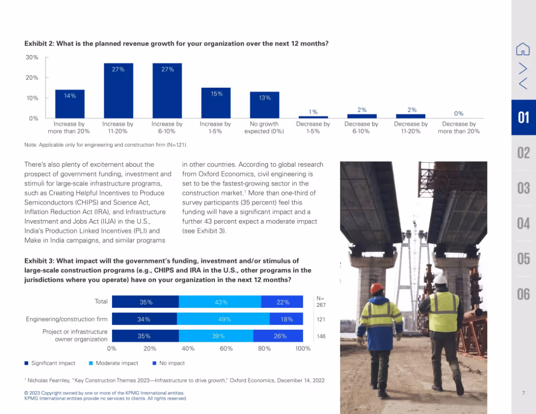
Dual-chart slide with bar graphs and image of construction workers; text explains implications of stimulus programs
Investment Analysis
Real Estate & Construction
Details planned revenue growth and anticipated impact of government infrastructure programs like CHIPS and IRA. Bar charts show varying growth expectations and perceived impact by firm type.
revenue forecast, stimulus impact, infrastructure funding, CHIPS Act, IRA, construction growth, investment outlook
Multiple Chart
KPMG
Saved
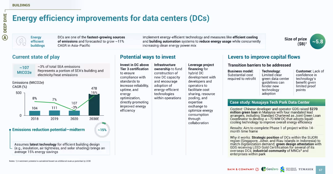
Follows the energy slide design with sections for emissions, investment, challenges, and a green-shaded case study. Focus on energy-efficient buildings.
Investment Analysis
Technology & Software
Focuses on energy consumption by data centers, one of SEA’s fastest-growing sources of emissions. Shows 15% midterm reduction potential with efficient cooling, automation, and green design. Investment opportunities include infrastructure ownership and Tier 3+ certification. Case study highlights GDS’s $270M green loan to develop a Malaysia-based DC using liquid cooling and green certification strategies.
data centers, energy efficiency, emissions, GDS, Malaysia, DCs, cooling, green loans
Multiple Chart
Bain
Saved
Features a detailed process flow diagram of the H₂ value chain, highlighting upstream, midstream, and downstream opportunities for carbon fiber vessels.
Strategic Planning
Industrial & Manufacturing
The slide identifies strategic opportunities for carbon fiber vessels within the H₂ value chain, covering storage, transportation, and end-use markets.
H₂, Carbon Fiber Vessels, Value Chain, Opportunities, Storage
Linear Flow
Roland Berger
Saved
Features two column charts: Left chart shows firmwide AUS in trillions from 2019 to Q1 2022. Right chart illustrates firmwide management and other fees in billions from 2019 to 2024 targets. An arrow indicates a CAGR of +12%.
Financial Performance
Financial Services
This slide analyzes the growth in assets under supervision (AUS) and associated fees over time, projecting a continuous upward trend. It presents past performance and future targets, positioning the firm's growth within the financial services industry.
AUS growth, fee analysis, financial performance, CAGR, projections, column chart
Multiple Chart
Goldman Sachs
Saved
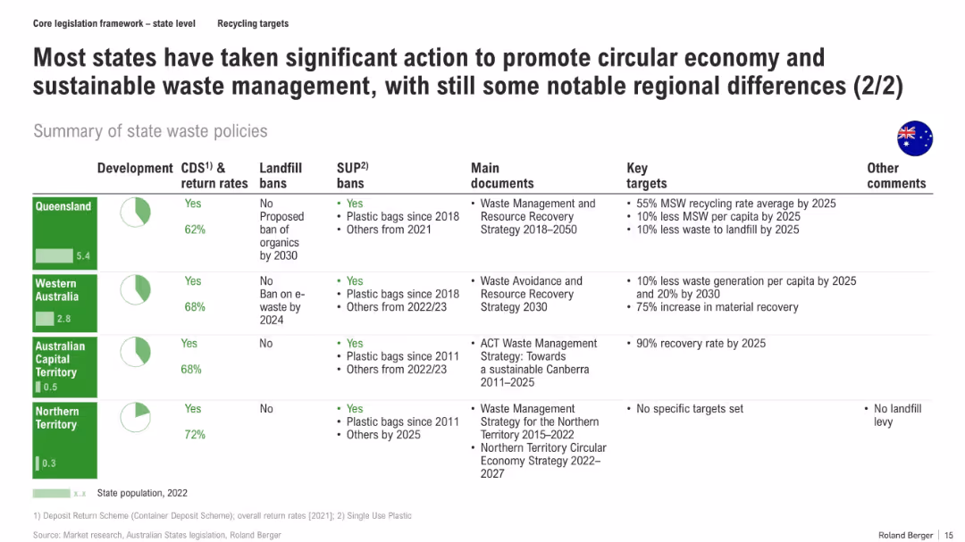
Continuation of the previous slide, using the same tabular format to cover the remaining Australian states and territories
Regulatory and Compliance
Environmental Services & Sustainability
The slide continues coverage of state waste policies, detailing Queensland, Western Australia, ACT, and Northern Territory. It compares CDS return rates, bans, and strategic targets, identifying gaps in NT and strong recovery goals in others.
state policies, CDS, plastic bans, landfill strategy, recovery targets, circular economy, recycling, Australia
Mixed Chart
Roland Berger
Saved
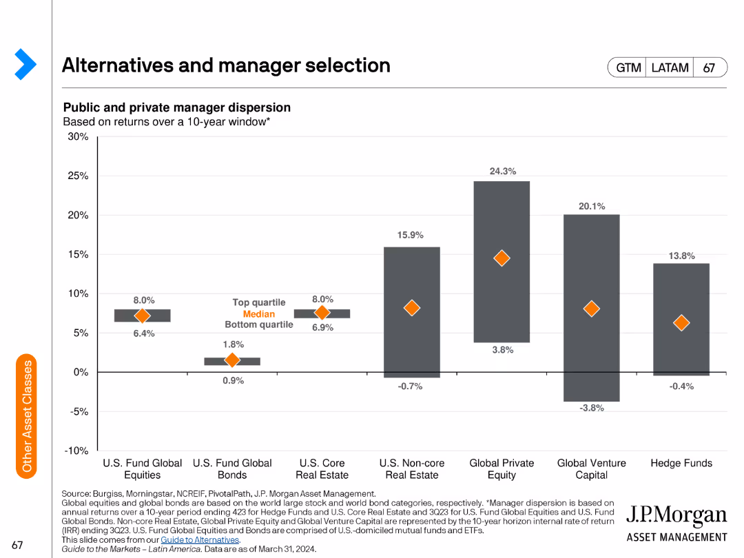
The slide displays a column chart illustrating the dispersion of public and private managers' performance over a 10-year window.
Performance Metrics and KPIs
Financial Services
The slide highlights the performance dispersion among public and private managers, providing insights into manager selection for investment portfolios.
manager selection, performance dispersion, public managers, private managers, investment strategies, performance analysis, financial metrics
Single Chart
JP Morgan
Saved
A column chart showing revenue progression from 2022 to 2026 with specific comments on various influencing factors like productivity and capability enhancements.
Financial Performance
Financial Services
This slide illustrates the revenue enhancement plan up to 2026, highlighting the productivity and capability improvements driving the revenue forecast.
revenue, productivity, capabilities, forecast, enhancement
Single Chart
UBS
Saved
Shows growth trends in corporate decarbonization commitments alongside charts on the forecasted supply of key resources.
Strategic Planning
Environmental Services & Sustainability
Discusses the importance of early adoption in sustainability practices, correlating corporate commitments with resource scarcity forecasts. Useful for strategic and sustainability planning.
sustainability, corporate commitments, resource scarcity, strategic planning, decarbonization, early adoption
Mixed Chart
BCG
Saved
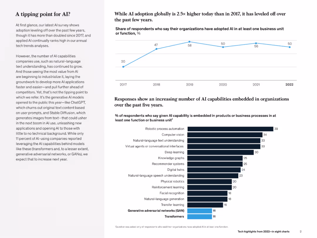
Line chart (top) and bar chart (bottom). Left-aligned text explains key insight. Minimalist black-and-blue theme.
Technology and Digital Transformation
Artificial Intelligence
The slide evaluates AI adoption trends (flatlining at ~50% post-2018) and shows growing diversity in AI use cases (e.g., robotic process automation, NLP). Emphasis is placed on emerging generative AI models like GANs and transformers.
AI adoption, transformers, GANs, NLP, robotic automation, McKinsey, business unit, survey
Multiple Chart
McKinsey
Saved
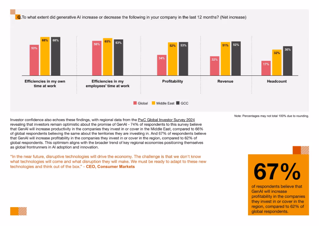
Five-category bar chart comparing impacts of GenAI on efficiency, profitability, revenue, and headcount by region
Performance Metrics and KPIs
Artificial Intelligence
This slide tracks measurable outcomes of GenAI adoption, including improved work efficiencies, profitability, and revenue. GCC firms report the highest gains in headcount, reflecting strong AI integration.
Efficiency, GenAI Impact, Headcount, Productivity, KPIs, AI Metrics, Regional Comparison
Mixed Chart
PwC/Strategy&
Saved
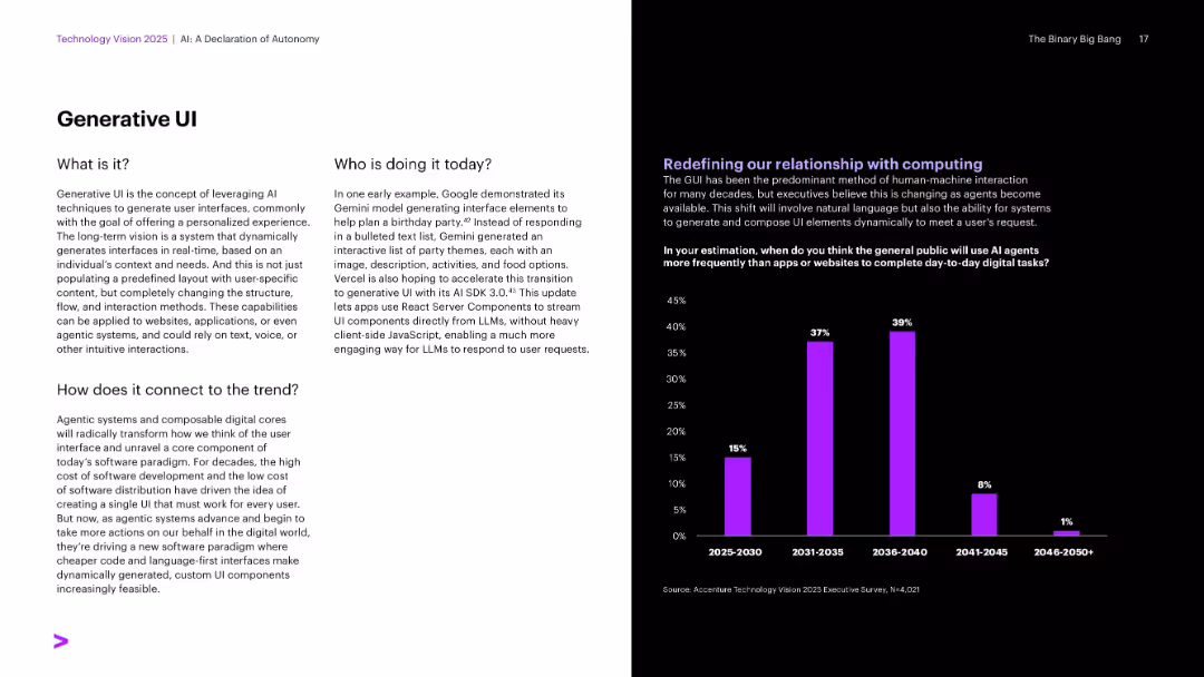
Split layout with concept explanation and examples on left; bar chart on right forecasting public adoption timeline.
Product and Service Analysis
Artificial Intelligence
Discusses generative UIs that dynamically build personalized interfaces in real-time using LLMs. Provides a future outlook on when the general public will predominantly use AI agents over traditional apps.
Generative UI, AI Agents, User Experience, Gemini, React Server, Personalized Interfaces
Multiple Chart
Accenture
Saved
The slide uses vertical bar charts to compare top five motivators for respondents to buy an EV across three different years (2021, 2022, 2023). Each year's motivators are color-coded.
Market Analysis and Trends
Transportation & Logistics
This slide highlights the key motivators for potential EV buyers, showing how priorities like environmental concerns, high fuel prices, and penalties on ICE vehicles have shifted over time.
EV motivators, fuel prices, environmental concerns, ICE penalties, buyer priorities
Multiple Chart
EY
Saved
Bar chart showing the changes in the number of jobs due to one additional robot in the manufacturing sector, by income level of country.
Market Analysis and Trends
Technology & Software
The slide examines the impact of automation and robotics on employment, focusing on the manufacturing sector. It shows how each additional robot affects job numbers in high-income, average, and low-income countries, highlighting the greater substitutive effect in low-income countries.
Automation, Robotics, Manufacturing, Job Loss
Mixed Chart
Roland Berger
Saved
Features column charts and textual analysis comparing customer use of online and offline channels for different types of purchases, focusing on percentages of usage across various industries.
Market Analysis and Trends
Retail & E-commerce
Analyzes the shift in consumer behavior towards online platforms and digital channels, noting significant trends in how different sectors are adapting to the digital age.
digital age, consumer behavior, online shopping, channel usage, retail
Multiple Chart
Bain
Saved
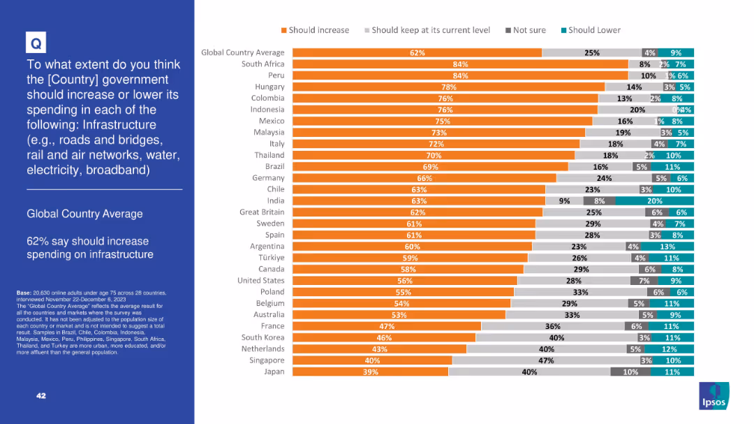
Orange-heavy bar chart indicating public support for increasing infrastructure spending; response categories include keep same, not sure, lower
Strategic Planning
Government & Public Sector
A clear global majority (62%) supports increasing infrastructure spending. South Africa, Peru, and Hungary show highest support. The slide suggests strong public backing for investment in roads, bridges, transport, and broadband.
infrastructure, investment, public services, government spending, broadband, roads, development, Ipsos, public support
Mixed Chart
IPSOS
Saved
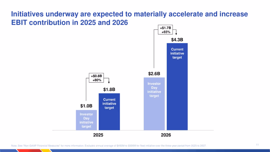
Column chart showing revised EBIT targets for 2025 and 2026; comparison of original and updated projections with labels for increase.
Strategic Planning
Transportation & Logistics
Communicates expected EBIT growth due to ongoing initiatives. The chart shows a material increase in EBIT targets for 2025 and 2026, emphasizing strategy execution effectiveness and operational uplift.
EBIT growth, initiatives, strategic plan, transportation, projections, acceleration, financial targets, operational improvement
Single Chart
JP Morgan
Saved
Previous
Next
If nothing, comes up, please save your slides first
Create a FREE account to continue browsing
Receive Instant Access to 1,000+ slides from companies like McKinsey, Google, and Goldman Sachs
First Name
Last Name
Email
Password
I agree to all
Terms & Privacy Policy
Thank you! Your submission has been received!
Oops! Something went wrong while submitting the form.
Have an account?
Sign in
Column Chart
Heatmap
Chevron
Org Chart
Infographic
Callouts
Timeline
List
Graphic
Picture
Process Flow
Diagram
Paragraph
Map
Table
Framework
Subtitle
Takeaway Box
Icon
Other Chart
Radar Chart
Waterfall Chart
Mekko Chart
Pie Chart
Scatter Plot
Line Chart
Bar chart
Bullet points