My Account
My Slides
Search by Category
Companies
Slide Type
Use Case
Industry
Pricing
Templates
View All Templates
Download Template Slides
✦ AI
AI Prompt Library
AI Search
Feedback
Login
Logout
Get Started
Browse all Slides
Browse all Slides
Create a FREE Account
Instant access to 1,000+ real slides from top companies like McKinsey, BCG, Goldman Sachs, Google and many more!
First Name
Last Name
Email
Password
I agree to all
Terms & Privacy Policy
Thank you! Your submission has been received!
Oops! Something went wrong while submitting the form.
Have an account?
Sign in
Saved Slides
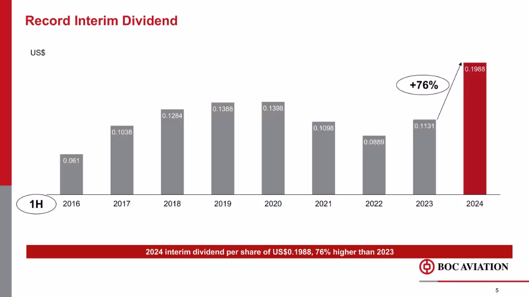
Vertical bar chart showing interim dividend growth over years 2016–2024, with a +76% increase in 2024 highlighted in red.
Financial Performance
Transportation & Logistics
This slide highlights a record interim dividend of $0.1988 per share in 1H 2024, representing a 76% increase over 2023. It shows historical dividend trends and underscores BOC Aviation’s financial strength and shareholder returns.
dividends, interim payout, historical trend, shareholder value, BOC Aviation, financial returns, growth
Single Chart
Goldman Sachs
Saved
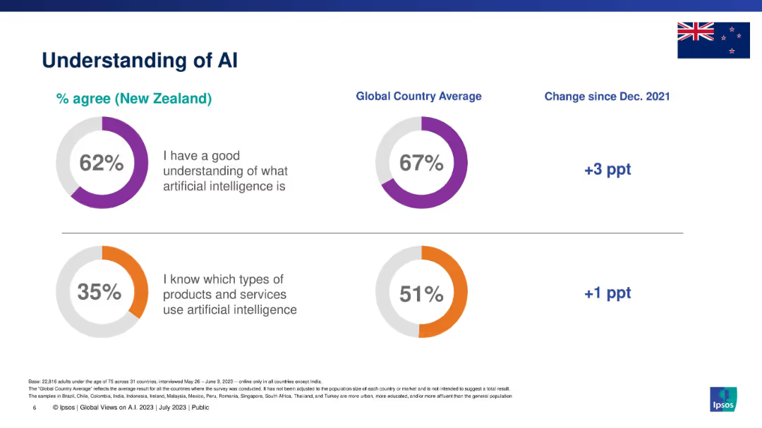
Split section layout with two circular graphs: one on AI understanding, the other on product awareness.
Industry Overview
Artificial Intelligence
This slide presents New Zealanders' understanding of AI in comparison with global averages. It measures agreement with two statements: understanding AI conceptually and knowing which products/services use AI. It also includes percentage changes since 2021.
AI, understanding, awareness, Ipsos, New Zealand, global comparison, knowledge levels
Single Chart
IPSOS
Saved
This slide includes two column charts. The first chart shows the contribution of the largest seven 'tech' stocks to the S&P 500. The second chart displays the contribution of the 'magnificent 7' stocks to S&P 500 return.
Competitive Landscape
Financial Services
The slide provides insights into the market concentration and impact of major tech stocks on the S&P 500, aiding in competitive landscape analysis.
equity, market concentration, tech stocks, S&P 500, market impact, analysis
Multiple Chart
JP Morgan
Saved
The slide features text describing advancements in technology, accompanied by a graphic on renewable power generation costs and a statistic on consumer behavior.
Technology and Digital Transformation
Technology & Software
The slide discusses the rapid advancement in technology, focusing on affordable clean energy solutions and their impact on power generation costs. It also highlights consumer interest in electric vehicles.
technology advancements, clean energy, power generation, renewable energy, consumer trends
Multiple Chart
EY
Saved
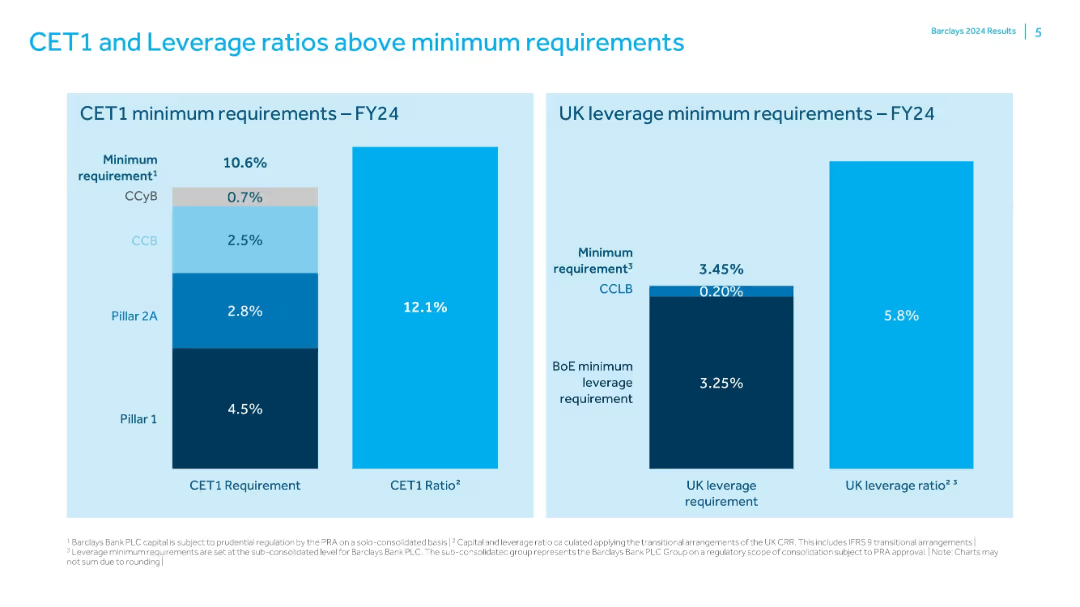
Two bar charts comparing Barclays' capital ratios to regulatory minimums; simple labeled format.
Risk Assessment and Management
Financial Services
Shows that Barclays exceeds FY24 minimum CET1 (10.6%) and UK leverage (3.45%) requirements with actual ratios of 12.1% and 5.8% respectively. Charts break down the components of regulatory minimums and the capital buffers in place.
CET1, leverage, regulatory capital, Barclays, risk management, capital ratio
Single Chart
Barclays
Saved
Showcases a pie chart for the CRE portfolio by asset class and a line chart for CRE net charge-offs, along with textual commentary on market trends and risk management.
Risk Assessment and Management
Financial Services
Assesses the CRE loan portfolio's risk approach, emphasizing credit performance, loan quality, and focused asset class strategy, considering market trends and interest rate effects.
CRE, loan portfolio, risk discipline, JPMC, credit performance, loan quality, asset class strategy, market trends
Multiple Chart
JP Morgan
Saved
Includes column charts depicting financial performance metrics for 9M 2022 and 9M 2023 with comparative analysis and descriptive annotations.
Financial Performance
Financial Services
Analyzes the bank's financial performance showing a trend in pre-provision profit and other key financial metrics over nine months, highlighting operational efficiencies and strategic financial management.
Financial Performance, Resilience, Profit, Trends, Metrics, 2023
Mixed Chart
Deutsche Bank
Saved
Contains multiple text boxes connected by arrows depicting industry trends, responses, and opportunities.
Market Analysis and Trends
Transportation & Logistics
Outlines significant automotive industry trends, like digital retail and service innovations, and their implications for Experian's business strategies, emphasizing long-term industry evolution.
automotive trends, digital innovation, long-term strategy, industry analysis, Experian opportunities
Linear Flow
Barclays
Saved
Features vibrant purple boxes detailing assets and solutions across multiple market segments. Layout is structured and visually appealing.
Operational Efficiency
Technology & Software
Discusses the unique assets of the company and how they cater to different market needs, particularly in healthcare data management and provider solutions. Ideal for business strategy meetings or pitches to potential partners in tech solutions.
data assets, market solutions, healthcare, technology integration
Linear Flow
Barclays
Saved
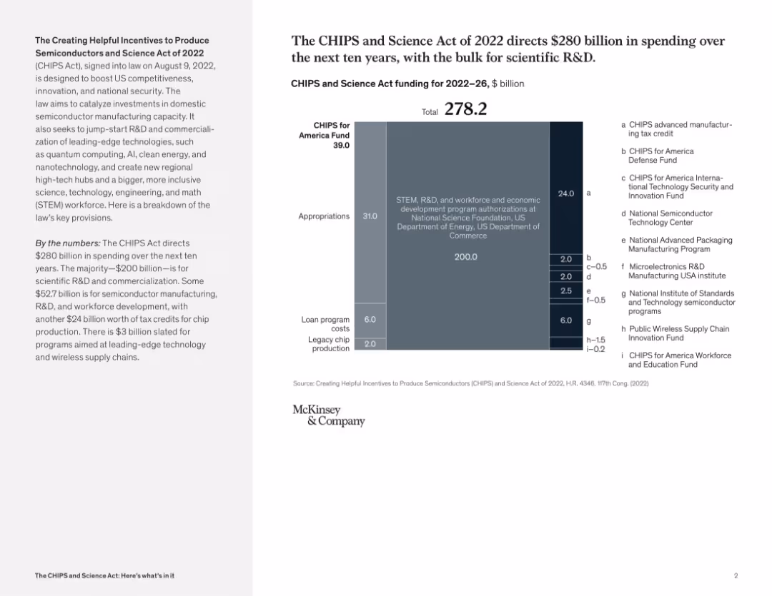
Split layout with summary and vertical funding bar graph showing $278.2B allocations; various shaded blocks and categories
Regulatory and Compliance
Government & Public Sector
This slide presents a breakdown of CHIPS Act spending from 2022–2026. It categorizes appropriations for R&D, loan programs, tax credits, and specific funds for semiconductor development and innovation. It communicates strategic investment priorities for boosting U.S. technology leadership.
CHIPS Act, semiconductor funding, R&D, government investment, science policy, U.S. competitiveness, federal spending
Mixed Chart
McKinsey
Saved
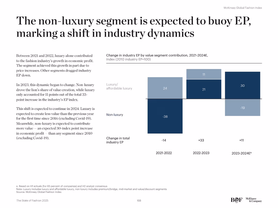
Split bar chart showing EP contribution by luxury and non-luxury segments from 2021 to 2024E. Left-side text explains the shift.
Market Analysis and Trends
Retail & E-commerce
This slide highlights a shift in value creation from luxury to non-luxury segments. From 2023 onward, non-luxury drives the majority of industry EP growth, reversing previous trends where luxury was dominant.
Non-luxury, luxury, EP contribution, market trends, fashion dynamics, economic profit, segment growth, value creation, retail, affordability
Mixed Chart
McKinsey
Saved
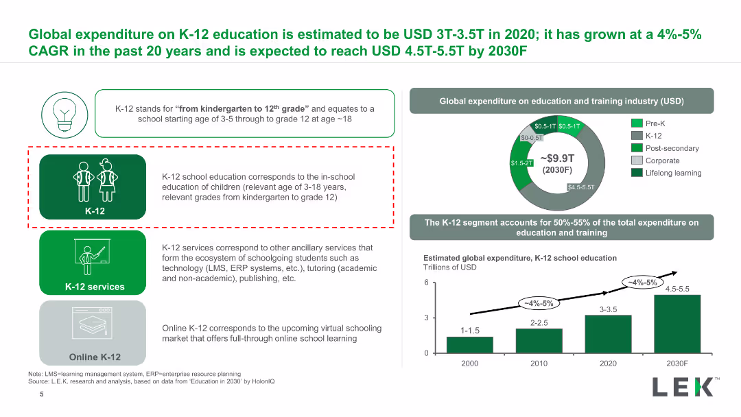
The slide features a column chart, pie chart, and text boxes. It is moderately dense with visual elements and data.
Market Analysis and Trends
Education & Training
Describes the global expenditure on K-12 education, its growth rate, and future projections.
K-12, expenditure, education, CAGR, global, services
Multiple Chart
LEK
Saved
This slide displays the 17 Sustainable Development Goals (SDGs) set by the UN, each represented by an icon and a brief description. The slide provides a comprehensive overview of these goals, which include ending poverty, ensuring education for all, and combating climate change, among others.
Regulatory and Compliance
Government & Public Sector
Provides an overview of the United Nations' Sustainable Development Goals, highlighting their role as a global framework for addressing key challenges like poverty, education, and climate change. The slide serves as a valuable educational tool for discussing global priorities and the collaborative efforts needed to achieve sustainable development across various sectors.
SDGs, global challenges, sustainability, education, poverty
Table
McKinsey
Saved
Presents column charts with revenue and EBIT margin data across different product focuses (Tires, Electronics/Infotainment, Powertrain, etc.). Also includes a comparison of EBIT margins between traditional and new vehicle domains.
Financial Performance
Transportation & Logistics
Analyzes the deterioration of margins across different automotive domains. Highlights the performance of new vehicle domains like battery and semiconductor suppliers compared to traditional suppliers.
Margins, Performance, Automotive, Revenue, EBIT
Multiple Chart
Roland Berger
Saved
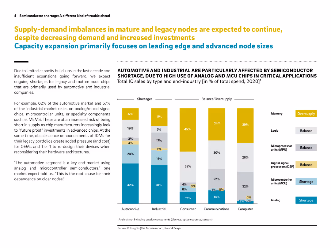
Clean, data-driven layout with stacked bar chart and bullet points. Color-coded legend and vertical segmentation by end-industry.
Market Analysis and Trends
Technology & Software
This slide illustrates ongoing supply shortages for mature semiconductor nodes, particularly affecting automotive and industrial sectors. It shows the imbalance between demand and supply by end-industry and chip type, indicating oversupply in memory but shortages in analog and MCU chips.
semiconductor, supply-demand, mature nodes, automotive, industrial, chip shortage, analog chips, MCU, MEMS, IC market
Mixed Chart
Roland Berger
Saved
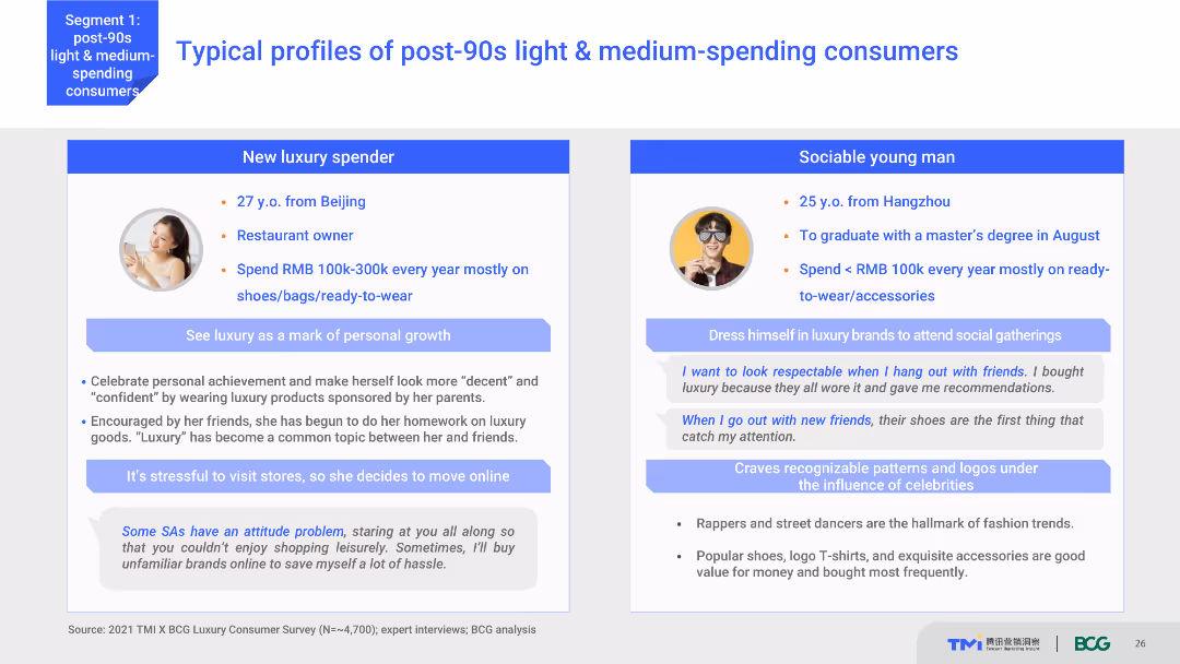
The slide features two detailed consumer profiles with personal information, spending habits, and preferences. It uses a content layout with text and images, providing a vivid portrayal of typical post-90s light & medium-spending consumers. The visual complexity is moderate, with clear, organized sections.
Customer and Market Segmentation
Consumer Goods
This slide presents detailed profiles of two typical post-90s light and medium-spending consumers, including their background, spending behavior, and luxury consumption habits. It aims to humanize market data through relatable examples.
consumer profiles, post-90s, spending habits, luxury market, consumer behavior
Boxed
BCG
Saved
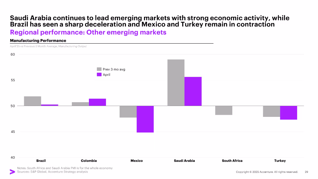
Bar chart with side-by-side bars (gray for past 3-month avg and purple for April) showing manufacturing output in 6 emerging markets.
Performance Metrics and KPIs
Industrial & Manufacturing
The slide highlights varying manufacturing momentum across emerging markets. Saudi Arabia leads with high output, while Brazil shows deceleration, and Mexico and Turkey remain in contraction.
emerging markets, manufacturing, Saudi Arabia, Brazil, contraction, April, comparison, economic activity
Single Chart
Accenture
Saved
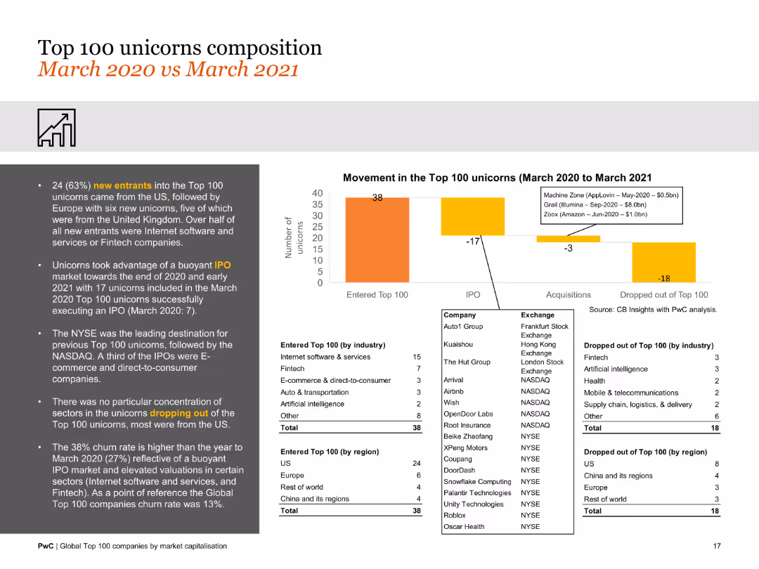
Features a column chart and data lists comparing the composition of the top 100 unicorns over a year. The design is moderately detailed with focus on changes in composition.
Market Analysis and Trends
Financial Services
This slide analyzes the composition of the top 100 unicorns from March 2020 to March 2021, noting new entrants, exits, and changes in valuation and sector distribution.
unicorns, composition, market changes, new entrants, exits, valuation, sector distribution
Mixed Chart
PwC/Strategy&
Saved
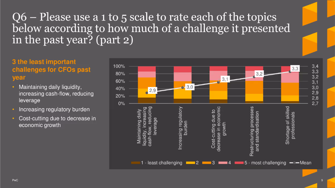
The slide features a column chart rating less significant challenges, such as maintaining liquidity and increasing regulatory burden.
Market Analysis and Trends
Financial Services
This slide highlights the least important challenges for CFOs: daily liquidity, regulatory burden, and cost-cutting, rated on a 1 to 5 scale.
Challenges, CFOs, Column Chart, PwC, Survey, 2022, Liquidity
Mixed Chart
PwC/Strategy&
Saved
Multiple data presentations including bullet points and column charts on financial metrics like RoTE, CIR, and CET1 ratio.
Operational Efficiency
Financial Services
Discusses financial outcomes for H1 2023, showing growth in revenue and operational efficiency with strong capital and resilience.
financial, H1 2023, momentum, efficiency, growth, capital, bar graph, column chart, RoTE, CET1 ratio
Multiple Chart
Deutsche Bank
Saved
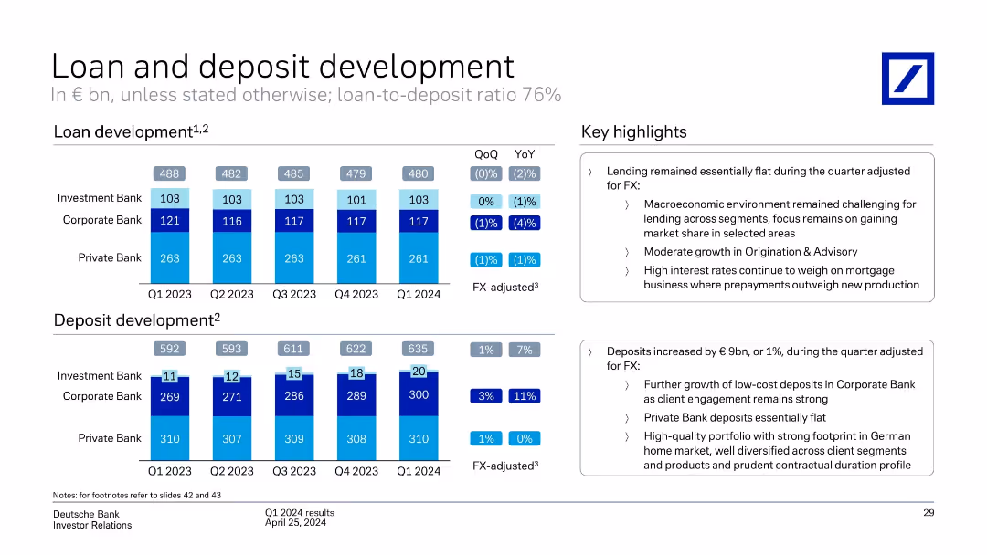
Two grouped bar charts show loan and deposit volumes by bank unit across five quarters; highlights are provided in a text box on the right.
Performance Metrics and KPIs
Financial Services
This slide details loan and deposit trends across business units (Investment, Corporate, Private Bank) from Q1 2023 to Q1 2024. Lending remained flat while deposits rose, mainly driven by the Corporate Bank. Key macroeconomic conditions and interest rate challenges are noted alongside business unit performance.
loans, deposits, Deutsche Bank, Q1 2024, corporate banking, private bank, investment bank, macroeconomic environment
Multiple Chart
Deutsche Bank
Saved
Features a prominent image of a person using VR equipment, with the report's title and release date.
Technology and Digital Transformation
Technology & Software
Serves as the introductory slide for McKinsey's Technology Trends Outlook 2022, with a focus on immersive-reality technologies.
technology trends, outlook, immersive reality, virtual reality, McKinsey & Company
Title
McKinsey
Saved
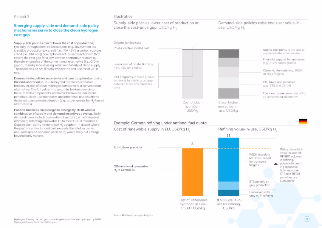
Left text explains policies; right side includes two diagrams: a bar visual of cost reductions and a Germany-focused comparison of hydrogen costs and value-in-use.
Regulatory and Compliance
Energy & Utilities
Explains supply- and demand-side policy mechanisms to narrow hydrogen cost gaps. Uses visual examples to illustrate how incentives can make clean hydrogen financially viable in sectors like German refining.
hydrogen policy, cost gap, value-in-use, subsidies, clean energy incentives, EU energy, Germany, REDIII, CFd, 2030 projections
Multiple Chart
McKinsey
Saved
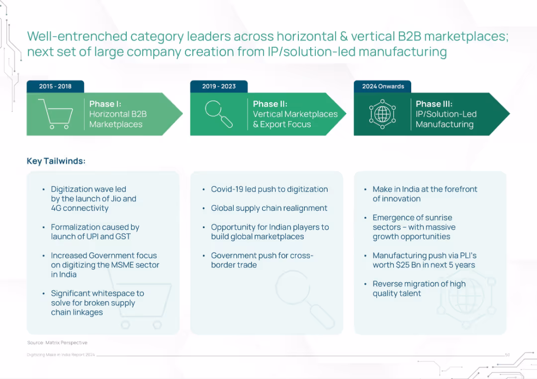
Horizontal timeline across three phases (2015–2024 onwards) with bullet points on key tailwinds underneath
Strategic Planning
Technology & Software
The slide presents a phased evolution of India’s B2B marketplace development, moving from horizontal platforms to IP-driven manufacturing. It identifies key enabling factors like digitization, GST/UPI formalization, Covid-related shifts, and emerging innovation-led sectors. Tailwinds are categorized by era and strategic influence.
B2B, marketplaces, India, digitization, UPI, IP-led, MSME, government policy, manufacturing evolution
Pillar
BCG
Saved
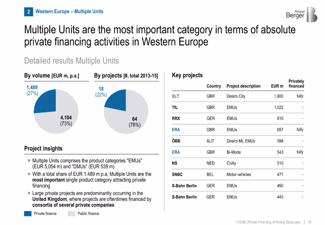
Pie charts for volume/projects, list of key projects, project insights section
Financial Performance
Transportation & Logistics
Multiple Units (EMU/DMU) are the leading category in private rail financing in Western Europe, especially in the UK. Several fully private projects were executed, often via consortia.
EMUs, DMUs, private investment, UK, consortia, rail, multiple units, GBR, financing structure
Mixed Chart
Roland Berger
Saved
Previous
Next
If nothing, comes up, please save your slides first
Create a FREE account to continue browsing
Receive Instant Access to 1,000+ slides from companies like McKinsey, Google, and Goldman Sachs
First Name
Last Name
Email
Password
I agree to all
Terms & Privacy Policy
Thank you! Your submission has been received!
Oops! Something went wrong while submitting the form.
Have an account?
Sign in
Column Chart
Heatmap
Chevron
Org Chart
Infographic
Callouts
Timeline
List
Graphic
Picture
Process Flow
Diagram
Paragraph
Map
Table
Framework
Subtitle
Takeaway Box
Icon
Other Chart
Radar Chart
Waterfall Chart
Mekko Chart
Pie Chart
Scatter Plot
Line Chart
Bar chart
Bullet points


![The margin deterioration is visible across all domains, with tires and electronics/infotainment being the most stable Key supplier performance indicators by product focus [%]](https://cdn.prod.website-files.com/654e70fb59937215cac87b19/680b5328121d10e37464cdd2_oSwk6Mev3dD8Aq_2CtvtPs6DwAZrSOSCbdkel5D86PI.avif)