Create a FREE Account
Instant access to 1,000+ real slides from top companies like McKinsey, BCG, Goldman Sachs, Google and many more!
First Name
Last Name
Email
Password
I agree to all
Terms & Privacy Policy
Thank you! Your submission has been received!
Oops! Something went wrong while submitting the form.
Have an account?
Sign in
Library
Templates
Courses
Pricing
My Account
My Slides
My Templates
✦ AI
AI Prompt Library
AI Search
Sign in
Start Here
Logout
My Saved Slides
The slide has four column charts, comparing financial metrics with competitors. The colors and data points are clearly marked.
Financial Performance
Financial Services
Showcases the year-on-year growth in revenue, net income, ROTCE, and overhead ratios compared to competitors.
Revenue growth, net income, ROTCE, overhead ratio, financial comparison
Multiple Chart
JP Morgan
Saved
The slide features flowcharts with different stages of a customer journey in car buying. It integrates text blocks with directional arrows.
Industry Overview
Technology & Software
This slide visualizes the customer journey in car buying, highlighting market understanding, customer acquisition, risk management, and relationship enhancement as key stages, aimed at optimizing customer experience.
customer journey, car buying, market understanding, risk management, relationship building
Linear Flow
Barclays
Saved
Features diagrams and bar graphs displaying the number of Tier 1 suppliers across different industries and major companies.
Operational Efficiency
Industrial & Manufacturing
Details the extent of reliance on Tier 1 suppliers in large companies, highlighting the vast networks involved and the industries most dependent on these suppliers for operations.
Suppliers, Industries, Supply Chain, Tier 1, Companies
Multiple Chart
McKinsey
Saved
The slide features a column chart showing the primary demand for renewable energies from 2000 to 2017, detailing the contributions of wind, solar, geothermal, hydro, advanced biofuels, and primary solid biofuels, with CAGR percentages.
Market Analysis and Trends
Energy & Utilities
This slide tracks the growth and changing composition of renewable energy demand from 2000 to 2017, emphasizing the shift towards wind and solar energies while noting the decreasing share of bioenergy.
renewable energies, primary demand, 2000-2017, wind, solar, geothermal, hydro, biofuels
Single Chart
Kearney
Saved
Slide includes a clear title, three sets of bullet lists under "Traditional approaches" and "Additional approaches", icons, and a clickable white paper download link.
Industry Overview
Technology & Software
This slide presents different digital business models that companies can adopt, such as "Build", "Buy", "Partner", "Invest", and "Incubate/Accelerate". It describes when each approach is most appropriate.
digital business models, build, buy, partner, invest, incubate
Header Vertical
Accenture
Saved
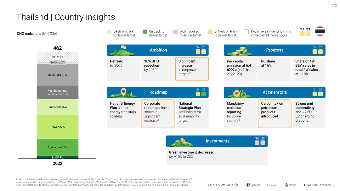
Vertical emissions bar and structured layout of “Ambition”, “Progress”, “Roadmap”, and “Accelerators” sections. Color-coded performance markers and icons.
Strategic Planning
Government & Public Sector
Shows Thailand’s 2023 emissions by sector and outlines policy actions, targets, and performance in green initiatives. Highlights mixed progress toward targets and mentions a 10% green investment decrease in 2024.
Thailand, net zero, roadmap, emission reporting, investment drop
Mixed Chart
Bain
Saved
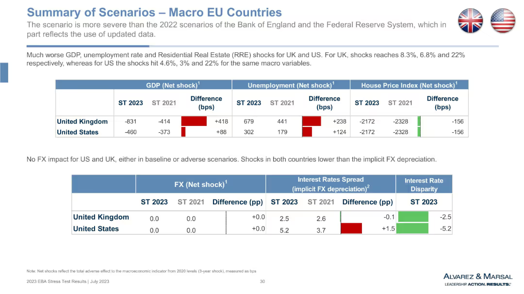
Continuation of macro table for UK and US, with added FX and interest rate spread metrics. Mix of bar graphs and tabular comparisons.
Market Analysis and Trends
Government & Public Sector
This slide presents a comparative macro stress scenario for the UK and US. It shows increased GDP and unemployment shocks in 2023 vs 2021, along with decreased house prices. Additional rows examine FX and interest rate spread impacts, providing a broader view of financial environment changes. Notably, the UK sees worse deterioration than the US under this stress test scenario.
GDP shock, FX spread, UK economy, US economy, macroeconomic comparison, unemployment, house price, interest rates, EBA stress test
Single Chart
Alvarez & Marsal
Saved
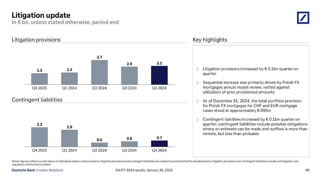
Two bar charts tracking litigation provisions and contingent liabilities over time; highlight box explains recent changes
Regulatory and Compliance
Financial Services
Reports a quarterly increase in litigation provisions and contingent liabilities, mainly due to FX mortgage cases in Poland. Describes the legal status, valuation impacts, and trends in civil and regulatory matters, highlighting exposure to uncertain but possible financial obligations.
litigation, provisions, contingent liabilities, FX mortgages, legal risk
Mixed Chart
Deutsche Bank
Saved
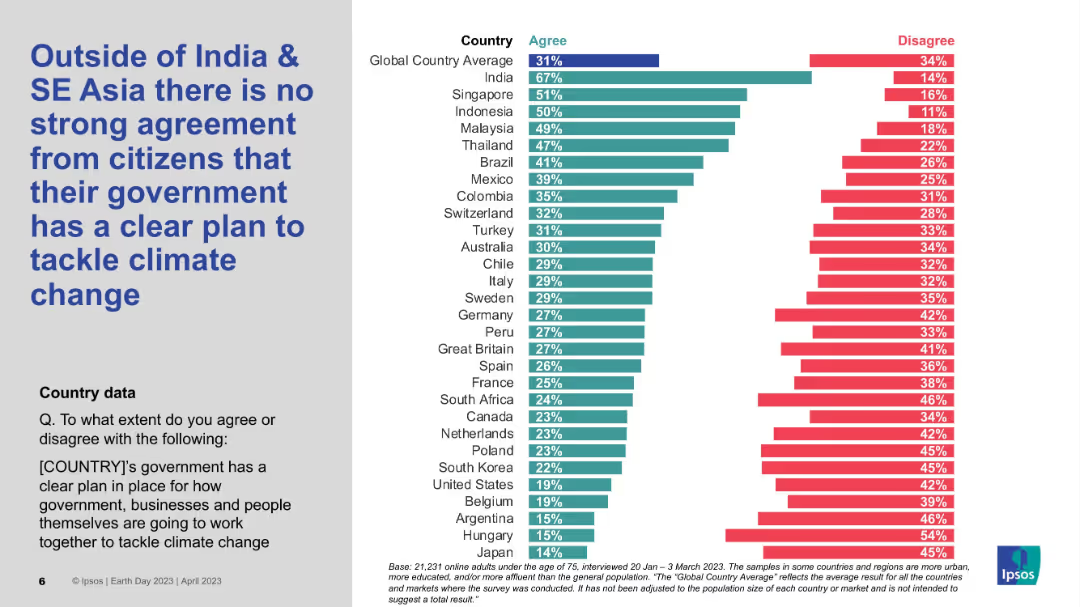
Bar chart on right showing country-level agreement/disagreement; large bold title on left; grey and white background split.
Market Analysis and Trends
Environmental Services & Sustainability
This slide highlights global perceptions regarding whether governments have a clear plan to address climate change. India and several SE Asian countries show stronger agreement, while many Western nations fall below the global average of 31%. The chart visually contrasts country sentiments.
Climate change, Government policy, Regional comparison, Ipsos, Global sentiment, SE Asia
Mixed Chart
IPSOS
Saved
A visually dense slide featuring tables, a variety of column chart, and sections for textual highlights. The color scheme is blue, gray, and white.
Investment Analysis
Financial Services
Details asset management performance, highlighting net revenues and investment areas. It's used for evaluating asset management strategies and performance.
Asset, Management, Performance, Investment, Net, Revenues, Strategies, Evaluation, Pie Chart, Table
Mixed Chart
Goldman Sachs
Saved
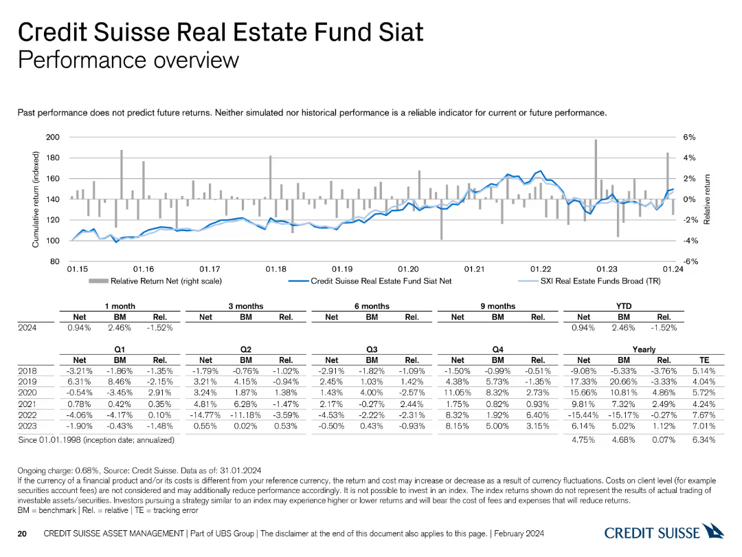
This slide presents a line chart and a table detailing the performance of the Credit Suisse Real Estate Fund Siat.
Financial Performance
Financial Services
It reviews the performance of the Siat fund, comparing it with benchmarks and historical data, offering insights into its financial health and trends.
performance, Credit Suisse, Real Estate Fund, benchmarks, historical data
Mixed Chart
Credit Suisse
Saved
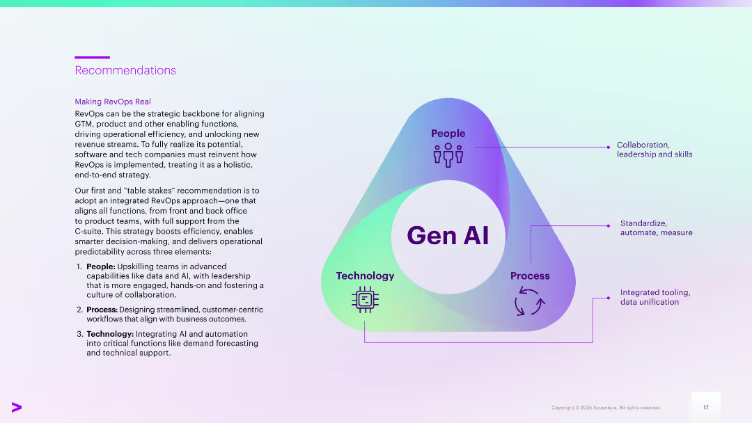
Left-aligned text next to a triangular infographic labeled “Gen AI” at the center, connecting People, Process, and Technology. Each point includes a brief description. Gradient background with purple and teal.
Strategic Planning
Technology & Software
Recommends a holistic, end-to-end RevOps approach leveraging Gen AI. Emphasizes integrating people (skills and leadership), process (workflow design), and technology (AI for automation and forecasting). Aims to enhance decision-making, efficiency, and alignment across business functions.
Gen AI, RevOps, strategic planning, collaboration, automation, upskilling
Framework
Accenture
Saved
Split layout with definitions side by side, green accent
Technology and Digital Transformation
Technology & Software
Defines Generative AI and LLMs and their applications
Generative AI, LLM, AI definition
Header Horizontal
Deloitte
Saved
A bar graph with a percentage breakout showing the prioritization of personalized product offerings by executives.
Market Analysis and Trends
Professional Services
Evaluates the importance placed on personalized products in business strategy, as seen by different company sizes and executive roles.
Personalization, Executive Priorities, Bar Graph, Product Strategy
Single Chart
Kearney
Saved
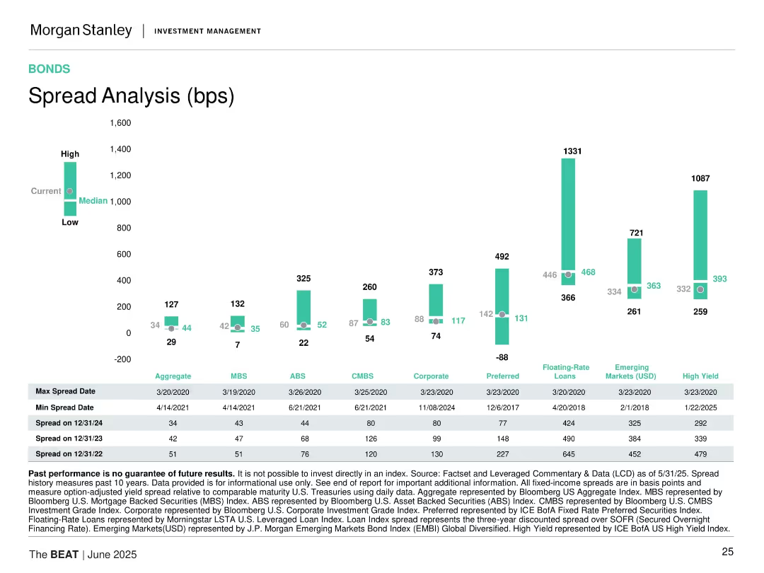
Bar chart comparing spread ranges (low, median, high) for various bond categories, with data tables at the bottom.
Risk Assessment and Management
Financial Services
Compares current bond spreads across sectors such as ABS, MBS, Corporate, High Yield, and EM. Includes historical spread extremes and recent data trends.
bond spreads, credit risk, ABS, MBS, high yield, floating rate, emerging markets, historical data, fixed income
Mixed Chart
Morgan Stanley
Saved
This slide presents multiple data visualizations, including bar charts and line graphs, tracking COVID-19's impact on various factors like mobility, economic forecasts, and consumer activity from August to November. Each section uses a different color to denote the type of data being represented, like green for mobility and red for GDP.
Strategic Planning
Financial Services
Summarizes key metrics affected by COVID-19, such as global epidemic progression, mobility trends, GDP forecasts, and stock market performance. It provides a comprehensive overview of how different sectors and regions are recovering from the pandemic impacts.
COVID-19, economic impact, healthcare, GDP, mobility, stock markets
Mixed Chart
BCG
Saved
The slide has a list format with color-coded sections, each providing key points about the investment thesis, and a company logo in the top right corner.
Strategic Planning
Financial Services
The slide articulates a financial institution's investment thesis, highlighting the pillars of earnings, risk management, and capital allocation. It's useful for communicating the company's strategic positioning and investment potential to stakeholders or potential investors.
Investment Thesis, Earnings, Risk Management, Capital Allocation, Strategic Position, Financial Institution
Table
Morgan Stanley
Saved
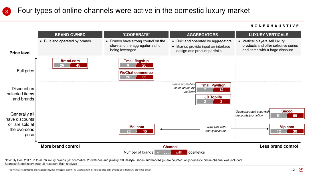
The slide presents a matrix chart categorizing online channels into brand owned, cooperate, aggregators, and luxury verticals, with various metrics such as price level and number of brands with/without cosmetics.
Market Analysis and Trends
Retail & E-commerce
This slide categorizes the different types of online channels in the luxury market, explaining their price levels and brand control, highlighting the role of cosmetics in each category.
Online channels, luxury market, brand control, cosmetics, price level, domestic market
Table
Bain
Saved
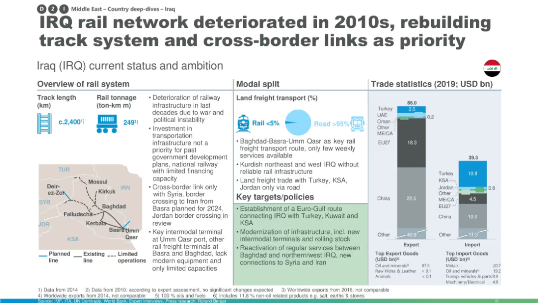
Layout with overview stats, modal split graphic, trade bar charts, and a small Iraq map showing rail routes; includes policy targets.
Strategic Planning
Transportation & Logistics
This slide presents Iraq’s rail system status, showing a small modal share for rail in freight transport and deteriorated infrastructure. It highlights key policies for modernization, expansion, and intermodal development, supported by trade data and network maps.
Iraq rail, infrastructure deterioration, modal split, trade statistics, policy targets, track rebuilding, intermodal terminals, cross-border links
Multiple Chart
Roland Berger
Saved
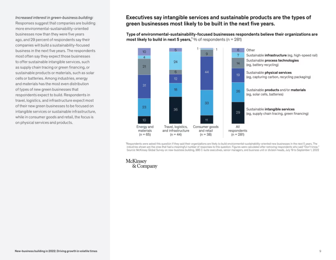
Vertical stacked bar chart of green-business types by industry, with explanatory sidebar; straightforward visual structure.
Market Analysis and Trends
Environmental Services & Sustainability
This slide focuses on expected green-business types in the next five years. Intangible services like green financing and sustainable products such as batteries are most likely to be built. It shows distinct preferences across industries.
green business, sustainability, new-business, renewable products, services, industry focus, environment
Mixed Chart
McKinsey
Saved
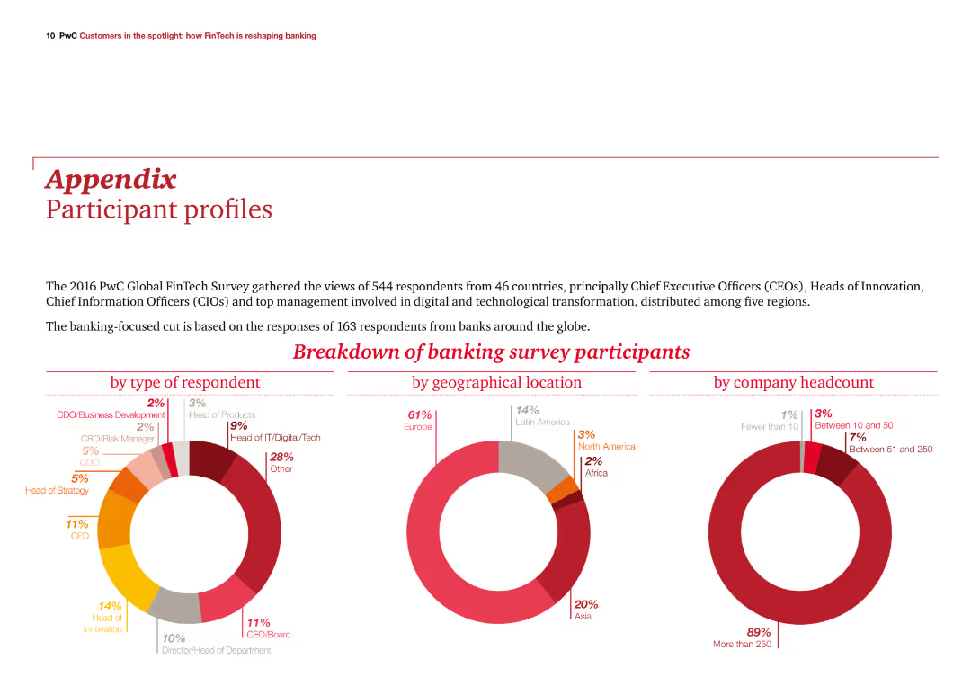
The slide features three column charts showing participant breakdowns by type, geographical location, and company headcount. It is visually balanced with text and visuals in harmony.
Client Case Studies
Financial Services
The slide provides an overview of the 2016 PwC Global FinTech Survey participants, focusing on those from the banking sector, with detailed participant demographics.
demographics, survey, banking, participants, PwC
Multiple Chart
PwC/Strategy&
Saved
This slide has a colorful and dynamic layout with pie charts, icons, and significant percentages displayed, highlighting year-over-year growth in YouTube watch time, with a particular emphasis on mobile device usage.
Market Analysis and Trends
Technology & Software
The slide details the three main factors contributing to the increase in YouTube watch time: non-English content, local language searches, and mobile-first content. It showcases the impact of these forces with the aid of visual data representations.
YouTube, growth, mobile, local language, watch time
Linear Flow
BCG
Saved
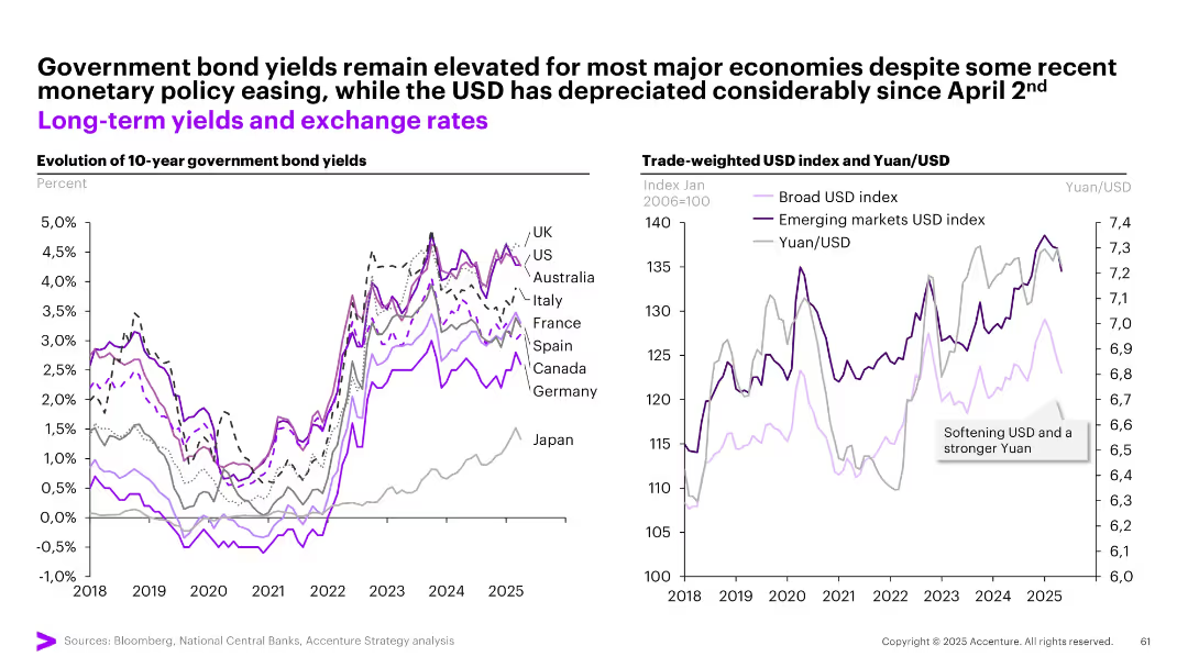
Two graphs: one for 10-year bond yields across countries, another for trade-weighted USD and Yuan/USD.
Investment Analysis
Financial Services
Examines bond yields and currency movements post-policy easing. Yields remain high despite easing, while the USD has weakened notably since April 2. A stronger Yuan and emerging markets USD index are emphasized.
bond yields, USD, Yuan, exchange rates, inflation, interest rates, investment, sovereign debt, currency trends
Multiple Chart
Accenture
Saved
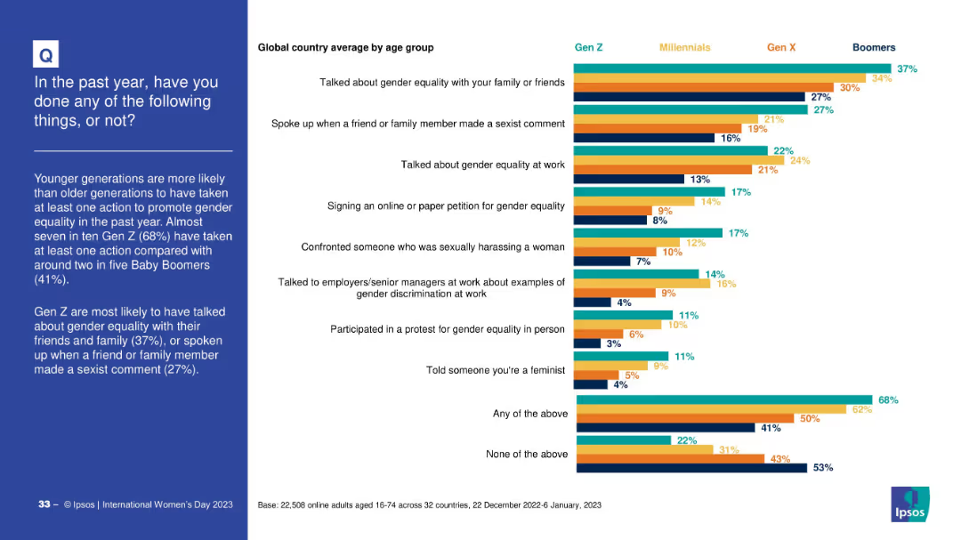
Stacked bar chart by generation showing participation in different actions. Categories include discussing gender equality, confronting harassment, or joining protests.
Strategic Planning
Government & Public Sector
This slide shows generational trends in actions supporting gender equality. Gen Z leads across most categories, especially in discussions and confronting sexism. Boomers report the lowest participation.
activism, generational divide, equality actions, civic behavior, public awareness
Mixed Chart
IPSOS
Saved
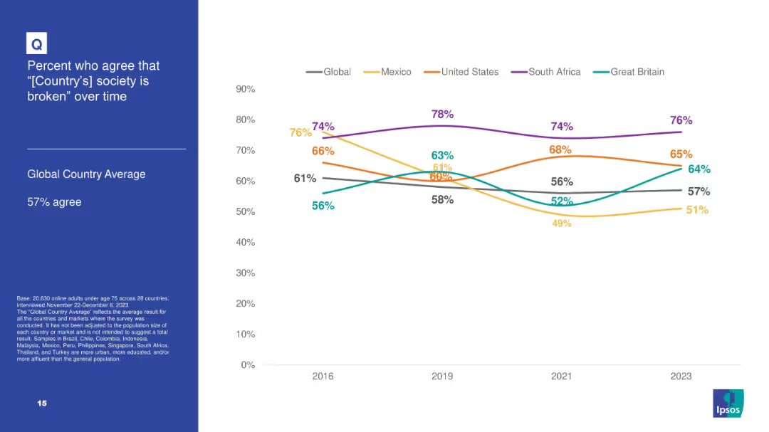
White background with line chart tracking agreement over time that “[Country]'s society is broken” for 5 countries plus global average; blue info box on left.
Market Analysis and Trends
Government & Public Sector
Tracks longitudinal data from 2016–2023 on societal dissatisfaction in select countries, noting highest levels in South Africa and consistent upward trend in Great Britain.
broken society, dissatisfaction, Ipsos, trend analysis, longitudinal data, South Africa, perception
Mixed Chart
IPSOS
Saved
Previous
Next
If nothing, comes up, please save your slides first
Create a FREE account to continue browsing
Receive Instant Access to 1,000+ slides from companies like McKinsey, Google, and Goldman Sachs
First Name
Last Name
Email
Password
I agree to all
Terms & Privacy Policy
Thank you! Your submission has been received!
Oops! Something went wrong while submitting the form.
Have an account?
Sign in
Column Chart
Heatmap
Chevron
Org Chart
Infographic
Callouts
Timeline
List
Graphic
Picture
Process Flow
Diagram
Paragraph
Map
Table
Framework
Subtitle
Takeaway Box
Icon
Other Chart
Radar Chart
Waterfall Chart
Mekko Chart
Pie Chart
Scatter Plot
Line Chart
Bar chart
Bullet points