Create a FREE Account
Instant access to 1,000+ real slides from top companies like McKinsey, BCG, Goldman Sachs, Google and many more!
First Name
Last Name
Email
Password
I agree to all
Terms & Privacy Policy
Thank you! Your submission has been received!
Oops! Something went wrong while submitting the form.
Have an account?
Sign in
Library
Templates
Courses
Pricing
My Account
My Slides
My Templates
✦ AI
AI Prompt Library
AI Search
Sign in
Start Here
Logout
My Saved Slides
Features bar and column charts comparing vaccine trial candidates against other diseases and various vaccine technologies.
Regulatory and Compliance
Healthcare & Pharmaceuticals
Reviews the global response to COVID-19 through vaccine development efforts, comparing it to other diseases and detailing technological approaches.
vaccine, R&D, COVID-19, technology, trials
Mixed Chart
BCG
Saved
Four-column layout showing pillars: digital maturity, best-suiting tech, upskilling, and supplier value. Each pillar is supported with icons, example tools, and brief descriptions.
Strategic Planning
Technology & Software
Outlines the four pillars necessary for successful AI transformation in procurement: assessing digital maturity, selecting appropriate tools, upskilling teams, and capturing value from suppliers. Emphasizes internal and external approaches and integration of various AI tools.
AI transformation, maturity, tools, upskilling, procurement, suppliers, enablement, digital strategy
Mixed Chart
BCG
Saved
The slide presents bar graphs with deal values and numbers, using shades of blue for differentiation and clarity in data presentation.
Investment Analysis
Financial Services
The slide compares the deal values and number of deals in Thailand, suggesting a trend towards another record year in 2021.
Deals, Thailand, 2021, Record, Values, Investments, Analysis, Financial
Single Chart
Bain
Saved
The slide includes a mix of text, column charts, and data tables. It uses color coding to differentiate data across different regions and time periods.
Market Analysis and Trends
Financial Services
Summarizes the 2021 IPO market performance in the Americas, highlighting key statistics and trends across major stock exchanges, sectors, and IPO activity levels.
IPO, Americas, financial performance, trends, sectors, stock exchanges, proceeds, 2021 activity, market highlights, outlook
Multiple Chart
EY
Saved
Left side shows multi-year bar chart of NII development by segment; right side lists highlights driving growth expectations.
Strategic Planning
Financial Services
The slide forecasts continued NII growth into 2025 due to drivers like structural hedge portfolios, deposit and loan growth, and long-term hedges. Historical and projected NII are visualized, while key growth factors are detailed in bullet form.
NII growth, 2025 outlook, deposits, hedges, loan growth, Deutsche Bank
Mixed Chart
Deutsche Bank
Saved
Bar chart showing Cost of Risk (net of reversals) across banks, with change indicators. Summary insights on the left. Improved, stable, and worsened performance marked with colored arrows.
Risk Assessment and Management
Financial Services
Highlights bank-level contributions to the rising cost of risk. SAB saw the largest increase in impairment allowance; ALINMA and BALB saw the most improvement. Visual comparison across banks shows variance in net risk performance.
cost of risk, reversals, SAB, impairment allowance, ALINMA, BALB, net impact
Mixed Chart
Alvarez & Marsal
Saved
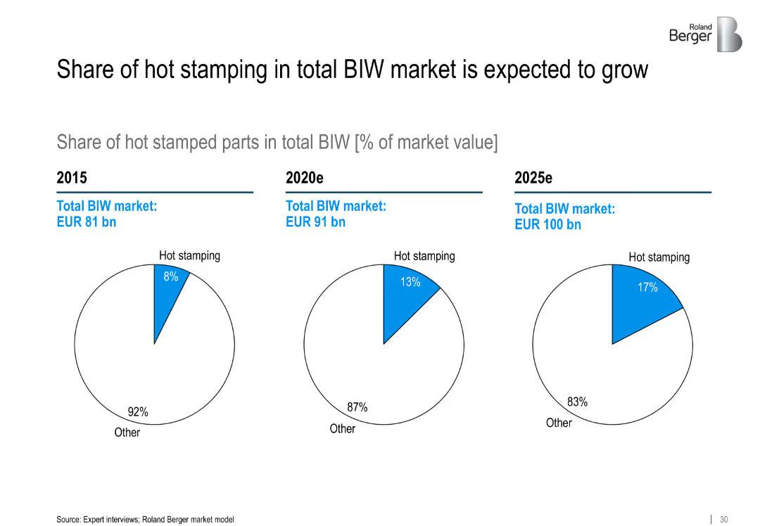
Comparative pie charts (2017, 2022, Post SGGP) showing capacity and regional distribution; includes volumes, utilisation, and material categories
Strategic Planning
Industrial & Manufacturing
Tracks Befesa's regional diversification and capacity evolution from 2017 IPO to post-SGGP. Highlights growth in steel dust and aluminium slag capacities, utilization trends, and volume expansion.
diversification, global footprint, capacity, utilisation, slag, steel dust, SGGP, regional growth
Single Chart
Goldman Sachs
Saved
Ranked bar chart by country showing likelihood of rising unemployment
Risk Assessment and Management
Professional Services
The slide analyzes how likely people in different countries believe unemployment will rise in 2024. It shows global and country-level averages, plus comparisons with 2022 data for trend analysis.
unemployment, labor market, risk, economic sentiment, global survey
Mixed Chart
IPSOS
Saved
Features multiple bubble charts overlaid on a light blue background. Each bubble represents a different challenge or inefficiency in AI implementation, with varying sizes indicating prevalence. The layout is uncluttered, focusing on the visual data representation.
Technology and Digital Transformation
Technology & Software
This slide highlights the various challenges and inefficiencies faced by organizations in scaling AI initiatives. It is useful for understanding barriers to technology adoption and strategizing on overcoming these challenges.
AI challenges, inefficiencies, technology adoption, scaling AI, barriers, strategic planning, technology implementation
Multiple Chart
Deloitte
Saved
The slide features a table listing CCUS hubs in Europe with project names, countries, CO2 capacity, and year.
Market Analysis and Trends
Energy & Utilities
The table provides an overview of various CCUS projects in Europe, including their capacities and industries.
CCUS, Europe, hubs, projects, CO2 capacity
Table
Kearney
Saved
Includes line and scatter plots comparing earnings/coupon yield on a 60/40 portfolio and subsequent 10-year annualized returns.
Financial Performance
Financial Services
Analyzes the relationship between earnings/coupon yield on a 60/40 portfolio and future annualized returns over a period from 1985 to 2014.
earnings, coupon yield, portfolio, returns, annualized
Multiple Chart
JP Morgan
Saved
Column chart displaying annual sales growth by GTA region, with bars representing different regions such as Toronto, Peel, Halton, York, and Durham.
Market Analysis and Trends
Real Estate & Construction
The slide compares the annual sales growth percentages for different regions within the GTA between 2020 and 2019. Toronto shows a decline, while other regions show positive growth.
GTA, sales growth, annual comparison, regions, 2020 vs 2019, Toronto, Peel, Halton, York, Durham
Single Chart
IPSOS
Saved
The slide features a pie chart and several smaller charts detailing the investment focus on cloud security, cyber resilience, and related initiatives.
Risk Assessment and Management
Technology & Software
The slide discusses the increasing investment in cybersecurity, highlighting cloud security and cyber resilience as top priorities for organizations.
cybersecurity, cloud security, resilience, data privacy, cyber initiatives
Multiple Chart
EY
Saved
Horizontal bar chart showing public belief in environmental sustainability of oil & gas. Dark green = agree; red = disagree.
Market Analysis and Trends
Energy & Utilities
This slide examines how environmentally sustainable the public perceives the oil & gas sector to be. China, India, and Saudi Arabia report high agreement, while European countries overwhelmingly disagree with the claim.
Environmental Sustainability, Oil & Gas, Climate Impact, Public Sentiment, Energy Sector, Ipsos, Green Practices, Survey Data
Mixed Chart
IPSOS
Saved
Includes a comprehensive list of tokenization companies along with key business focus points. The layout integrates logos and brief descriptions, providing a visual and textual overview of the industry landscape. Uses minimal colors to maintain a professional appearance.
Technology and Digital Transformation
Technology & Software
Provides an overview of key U.S.-based tokenization companies and their business focuses, including areas like digital assets, blockchain infrastructure, and decentralized finance. Highlights the industry's growth and the strategic importance of tokenization services.
tokenization, United States, companies, blockchain, digital assets, ecosystem
Table
PwC/Strategy&
Saved
Two column charts: one showing employment percentage in creative industries, and the other showing GVA share of Victoria's industry over time.
Market Analysis and Trends
Media & Entertainment
This slide highlights the growing importance of creative industries in Victoria, showcasing employment trends and the GVA share over time to demonstrate economic impact.
creative industries, employment, GVA, Victoria, economy, trends, growth, market analysis, industry
Multiple Chart
BCG
Saved
Layout mirrors other regional slides; commentary on the left, bar/line chart in center-right, expert quote far right. Emphasis on Sweden.
Investment Analysis
Financial Services
The Nordic region, led by Sweden, achieved record VC investment levels in H1 2021 due to major deals including Klarna and Itiviti. The slide emphasizes Sweden’s leadership in fintech and its role as a testing ground for innovation.
Nordics, Sweden, Klarna, VC Investment, Fintech, H1 2021, Innovation, Itiviti
Mixed Chart
KPMG
Saved
Horizontal bar chart showing country-level agreement with the statement, ranked by agreement level, with % change vs 2022.
Market Analysis and Trends
Professional Services
This slide provides a country-level breakdown of the percentage of people agreeing that 2023 was a bad year for their country. Argentina ranks highest at 88%, and Japan lowest at 30%.
global opinion, country ranking, 2023, bad year, Ipsos, sentiment, international comparison, bar chart
Mixed Chart
IPSOS
Saved
Inverted sentiment slide—agreement here indicates distrust; green bar for agree dominates
Risk Assessment and Management
Government & Public Sector
The slide shows distrust toward government, measuring belief that governments would exploit people if possible. Agreement is highest globally in this negative sentiment.
distrust, exploitation, government behavior, public perception, Ipsos, skepticism, sentiment, international
Mixed Chart
IPSOS
Saved
Gantt chart layout with horizontal bars, milestones, and color coding per stakeholder. Uses a calendar grid from 2020 to 2024. Bottom section includes a legend and bullet-pointed assumptions. Corporate branding along the bottom.
Strategic Planning
Financial Services
The slide provides a high-level timeline showing the restructuring process of Zambia's sovereign debt under a coordinated framework. It compares sequential vs. parallel negotiation phases involving multiple stakeholders like IMF, bondholders, and official creditors. The aim is to demonstrate potential time savings of 12–18 months.
Zambia, sovereign debt, restructuring, IMF, bondholders, coordinated framework, timeline, milestones, assumptions
Table
Alvarez & Marsal
Saved
Text-heavy slide with bullet points outlining the demographics, financial literacy, and behavior of crypto asset owners, along with a doughnut chart.
Customer and Market Segmentation
Financial Services
Detailed profile of crypto asset owners, discussing demographics, investment behaviors, financial literacy, and the influence of advertising on ownership decisions.
crypto owners, demographics, financial literacy, investment behavior, advertising influence
Mixed Chart
IPSOS
Saved
The slide includes column charts showing CET1 ratio, liquidity coverage ratio, and Tier 1 leverage ratio comparisons among peers.
Financial Performance
Financial Services
This slide highlights Credit Suisse's strong capital and liquidity position with comparisons to peers, indicating robust financial health.
capital position, liquidity, CET1 ratio, Tier 1 leverage, financial health
Multiple Chart
Credit Suisse
Saved
Mixed bar chart with four response categories (very likely to not likely at all) across countries. Bars are color-coded by intensity of likelihood.
Technology and Digital Transformation
Artificial Intelligence
This slide shows perceived likelihood across countries that AI will change how people perform their current jobs in the next five years. Asian countries like Indonesia and Thailand show the highest perceived likelihood, while Western European countries show more skepticism.
AI jobs, workplace transformation, future of work, employment outlook, country breakdown, likelihood perception, digital tools, survey
Mixed Chart
IPSOS
Saved
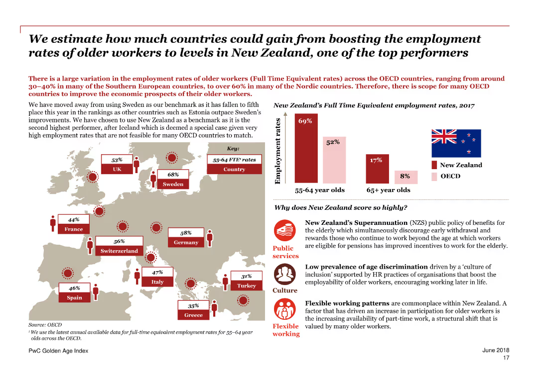
Combination of narrative text, line chart of participation rates, and photo insert; focus on gender participation trends across OECD and UK.
Performance Metrics and KPIs
Government & Public Sector
This slide highlights the narrowing gender participation rate gap in the UK, which fell from 4.1 to 2.1 points between 2011 and 2023. It contrasts UK and OECD participation trends, emphasizing the UK’s relatively strong female participation and recent declines in overall rates post-2020.
participation gap, female workforce, UK vs OECD, gender trends, employment rates, PwC, labor force, policy insight, gender dynamics, labor participation
Mixed Chart
PwC/Strategy&
Saved
Two distinct graphs are shown. The first graph plots daily growth rates of total cases with a log scale of confirmed cases, categorizing countries by their cases doubling rate. The second graph displays cumulative number of confirmed cases for selected countries with a curve that shows the progression over days.
Market Analysis and Trends
Healthcare & Pharmaceuticals
This slide visualizes the COVID-19 case growth trends and containment efforts across different countries, useful for analyzing epidemic progression and virus monitoring.
COVID-19, epidemic progression, virus monitoring, case growth, containment efforts, daily growth rate, cumulative cases, log scale
Multiple Chart
BCG
Saved
Previous
Next
If nothing, comes up, please save your slides first
Create a FREE account to continue browsing
Receive Instant Access to 1,000+ slides from companies like McKinsey, Google, and Goldman Sachs
First Name
Last Name
Email
Password
I agree to all
Terms & Privacy Policy
Thank you! Your submission has been received!
Oops! Something went wrong while submitting the form.
Have an account?
Sign in
Column Chart
Heatmap
Chevron
Org Chart
Infographic
Callouts
Timeline
List
Graphic
Picture
Process Flow
Diagram
Paragraph
Map
Table
Framework
Subtitle
Takeaway Box
Icon
Other Chart
Radar Chart
Waterfall Chart
Mekko Chart
Pie Chart
Scatter Plot
Line Chart
Bar chart
Bullet points