Create a FREE Account
Instant access to 1,000+ real slides from top companies like McKinsey, BCG, Goldman Sachs, Google and many more!
First Name
Last Name
Email
Password
I agree to all
Terms & Privacy Policy
Thank you! Your submission has been received!
Oops! Something went wrong while submitting the form.
Have an account?
Sign in
Library
Templates
Courses
Pricing
My Account
My Slides
My Templates
✦ AI
AI Prompt Library
AI Search
Sign in
Start Here
Logout
My Saved Slides
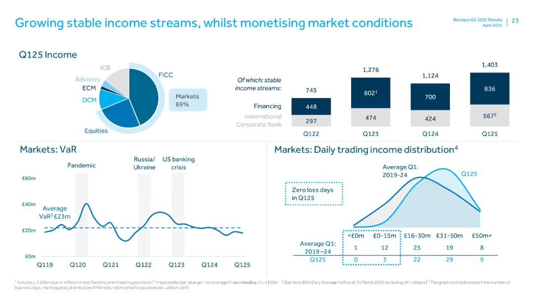
Pie chart and bar charts showing Q125 income mix, VaR, and trading income distribution metrics.
Performance Metrics and KPIs
Financial Services
Focuses on stable income from core sources, with charts on Q125 income split, market risk (VaR), and daily trading income. Notes high portion of stable income and zero loss days in Q125.
Income Streams, VaR, Trading Income, FICC, Markets, Q125, Stable Revenue, ICB
Multiple Chart
Barclays
Saved
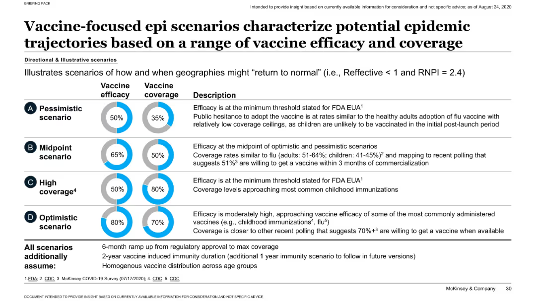
Matrix of four scenarios (A–D) with visual indicators of vaccine efficacy and coverage; accompanied by descriptive text.
Strategic Planning
Healthcare & Pharmaceuticals
Illustrates four vaccine rollout scenarios ranging from pessimistic to optimistic, based on varying levels of efficacy and population coverage. Assumptions include 6-month ramp-up and 2-year immunity. Highlights implications for controlling the pandemic.
vaccine scenarios, efficacy, coverage, epidemic control, modeling
Mixed Chart
McKinsey
Saved
Bar chart showing the number of years until 25% of the US population adopted various technologies, from electricity to tablets. Text discusses the increasing speed of technology adoption over time.
Technology and Digital Transformation
Technology & Software
The slide presents the accelerating pace of technology adoption in the US, comparing different technologies' adoption rates from the late 19th century to the present. It emphasizes how the faster adoption of new technologies is crucial for driving economic growth and adapting to rapid changes in the tech landscape.
Technology Adoption, US, Speed, Economic Growth
Mixed Chart
Roland Berger
Saved
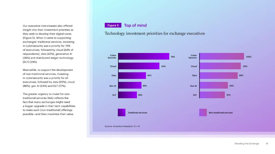
Dual horizontal bar charts comparing tech priorities for traditional vs. non-traditional services. Text explanation on the left. Purple-themed color coding.
Strategic Planning
Technology & Software
This slide summarizes executive priorities for technology investments in exchanges. Cybersecurity is top across both traditional and non-traditional services, with a stronger push in non-traditional areas for data, cloud, and AI adoption.
Cybersecurity, Investment, Exchange, Cloud, AI, Data, Tech Priorities, Traditional, Strategic Planning
Mixed Chart
Accenture
Saved
This slide presents two column charts comparing the usage of brand safety and suitability solutions among podcast publishers. The charts are color-coded to distinguish between active usage and planning stages.
Risk Assessment and Management
Media & Entertainment
Discusses the low adoption rates of brand safety and suitability solutions in podcast advertising and anticipates future growth as AI-driven tools become more prevalent. This slide points towards a necessary evolution in the industry to manage ad content adjacency and maintain brand integrity in a dynamic digital environment.
brand safety, podcast, advertising, AI, 2021
Mixed Chart
PwC/Strategy&
Saved
Column chart comparing the top ten countries where physical health is prioritized over mental health, along with text comparing mental and physical health priorities in selected countries.
Customer and Market Segmentation
Healthcare & Pharmaceuticals
This slide compares the emphasis on physical versus mental health across various countries, identifying those where physical health is given more priority, with specific data from Kenya, Panama, etc.
physical health, mental health, priority, comparison, survey
Mixed Chart
IPSOS
Saved
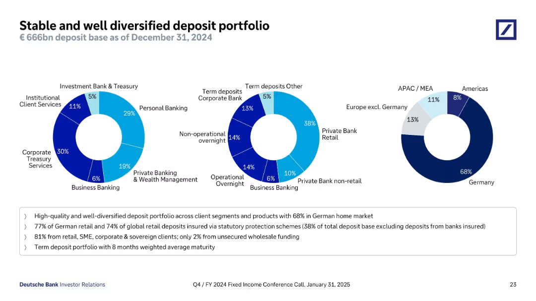
Three donut charts show deposit distribution by client type, deposit type, and geography. The visuals are clean and colored to separate categories. A text box below summarizes key figures and metrics.
Customer and Market Segmentation
Financial Services
This slide details Deutsche Bank’s €666bn deposit base as of December 2024. It shows client type diversification (e.g., retail, corporate), deposit types (term, overnight), and geographic spread (68% in Germany). It emphasizes a high-quality, insured, and well-diversified deposit base, primarily from stable retail and corporate sources.
deposits, retail, corporate, Germany, diversification, deposit insurance, stability, Deutsche Bank
Mixed Chart
Deutsche Bank
Saved
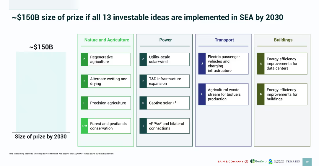
Grid-style layout categorizing 13 priority ideas by sector: Nature & Agriculture, Power, Transport, Buildings; left side shows potential value.
Strategic Planning
Environmental Services & Sustainability
The slide estimates a ~$150B opportunity if 13 prioritized green investments are implemented across SEA by 2030. It categorizes each idea under sectors like agriculture and power, listing initiatives such as solar, biofuels, and energy-efficient buildings. A visual grid aids clarity and sector association.
SEA 2030 strategy, investment opportunity, decarbonization, priority ideas, emissions reduction, value projection
Mixed Chart
Bain
Saved
This slide includes a column chart comparing the expected changes in the proportion of acute beds over the next five years by country and hospital type.
Strategic Planning
Healthcare & Pharmaceuticals
This slide predicts an increase in the demand for acute beds in hospitals over the next five years, with detailed analysis by country and hospital type.
acute beds, demand surge, hospital planning, future trends, regional analysis
Multiple Chart
LEK
Saved
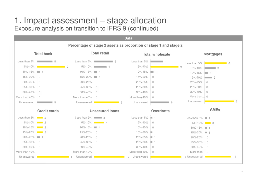
This slide contains multiple sets of horizontal bar charts, showing the percentage of stage 2 assets as a proportion of stage 1 and stage 2 across various categories including Total bank, Retail, Wholesale, Mortgages, and SMEs.
Risk Assessment and Management
Financial Services
It continues the analysis from the previous slide, breaking down the percentage of stage 2 assets for different financial products and segments, providing deeper insights into the IFRS 9 transition impacts.
stage 2 assets, percentage, IFRS 9, financial products, mortgages, SMEs
Multiple Chart
EY
Saved
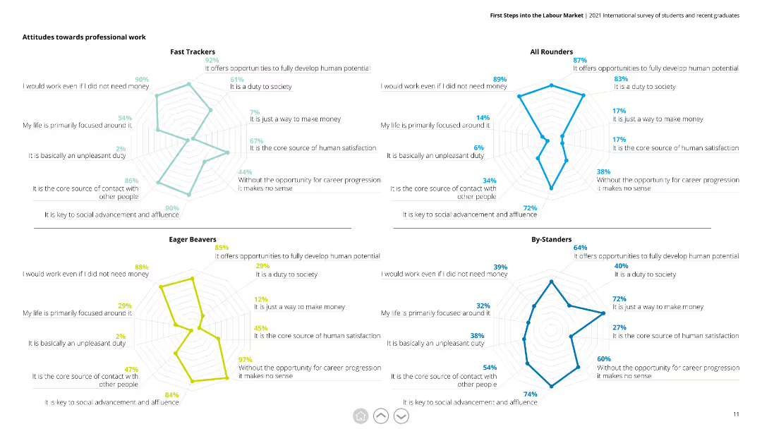
This slide contains four radar charts, each representing a different respondent group (Fast Trackers, All Rounders, Eager Beavers, By-Standers). Each chart evaluates attitudes towards professional work based on various statements.
Market Analysis and Trends
Education & Training
The slide illustrates how different groups perceive professional work, with metrics like duty to society, core satisfaction source, and need for money. It is useful for understanding diverse attitudes and tailoring career advice or programs.
professional work, radar chart, attitudes, respondents, Fast Trackers, All Rounders, Eager Beavers, By-Standers
Multiple Chart
Deloitte
Saved
The slide uses a combination of text and icons in a multi-column layout. It features four main areas with icons representing prevent, detect, respond, and recover, with supporting text in each section. There is also a sidebar discussing the importance of cybersecurity.
Risk Assessment and Management
Technology & Software
The slide emphasizes the importance of integrating cybersecurity into business strategy by focusing on prevention, detection, response, and recovery. It highlights the steps companies should take to bolster their cybersecurity programs, mentioning specific actions and benefits.
cybersecurity, prevention, detection, response, recover
Linear Flow
BCG
Saved
The slide contains a mix of column charts and textual information. It's color-coded and has headers like 'Active Accounts' and 'Sales Volume'. The layout is dense with data points and percentages highlighted.
Financial Performance
Financial Services
The slide presents data on the card franchise's performance, such as sales volume and customer retention rates. It may be used for financial reviews or shareholder presentations.
credit card, sales volume, industry leader, customer retention, net revenue
Multiple Chart
JP Morgan
Saved
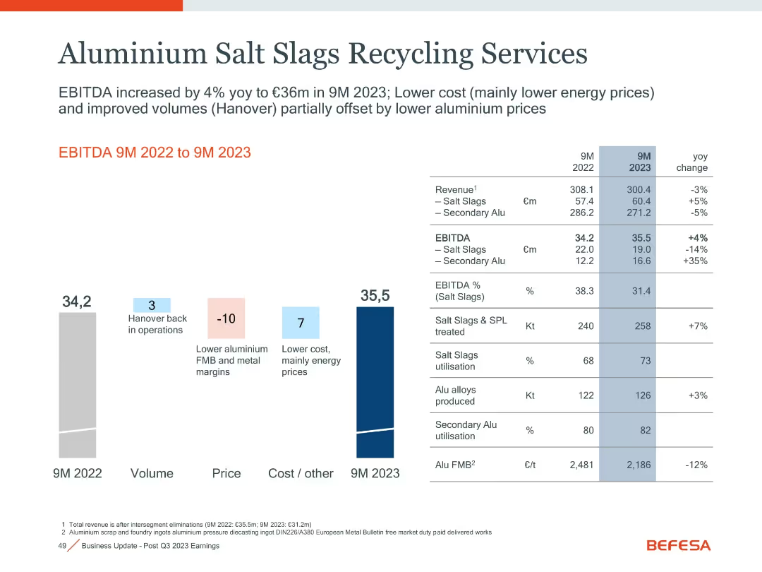
Bar and waterfall chart left, detailed comparison table right with volume, margin, and utilization metrics.
Performance Metrics and KPIs
Industrial & Manufacturing
Displays a 4% YoY rise in EBITDA to €35.5m in 9M 2023 driven by cost improvements (mainly energy), despite lower aluminum prices and margins. Hanover’s return to operations also supported volume gains.
aluminum, EBITDA, salt slags, utilization, margins, energy cost
Mixed Chart
Goldman Sachs
Saved
Features two donut charts and a gauge chart. Each donut chart is segmented with various responses about employee awareness of career paths, colored distinctly for clarity. The gauge chart highlights a percentage.
Human Resources and Talent Management
Professional Services
Analyzes the level of employee awareness regarding career progression within the company, illustrated through clear visual charts. Suitable for internal reviews or strategic HR planning.
career paths, employee awareness, HR, charts
Multiple Chart
PwC/Strategy&
Saved
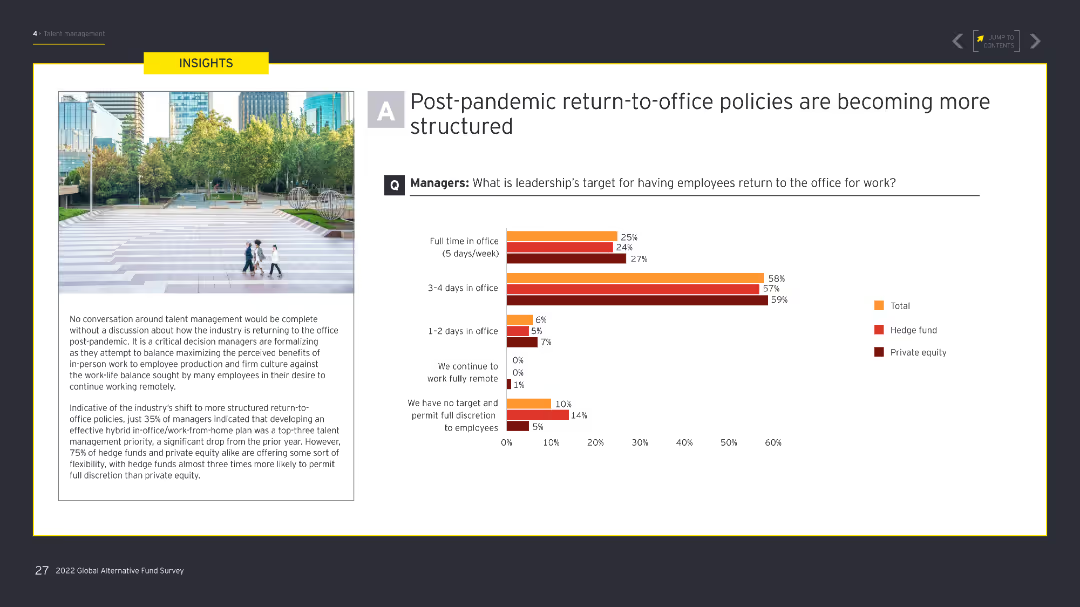
The slide features a column chart illustrating leadership's targets for employees returning to the office post-pandemic. An image on the left shows an outdoor urban setting with people walking. The chart uses shades of orange and red.
Human Resources and Talent Management
Financial Services
The slide outlines how leadership is targeting different levels of in-office presence post-pandemic, with a significant focus on structured return-to-office policies to balance remote work and office work.
Return-to-office, post-pandemic, remote work, office policies, leadership targets
Mixed Chart
EY
Saved
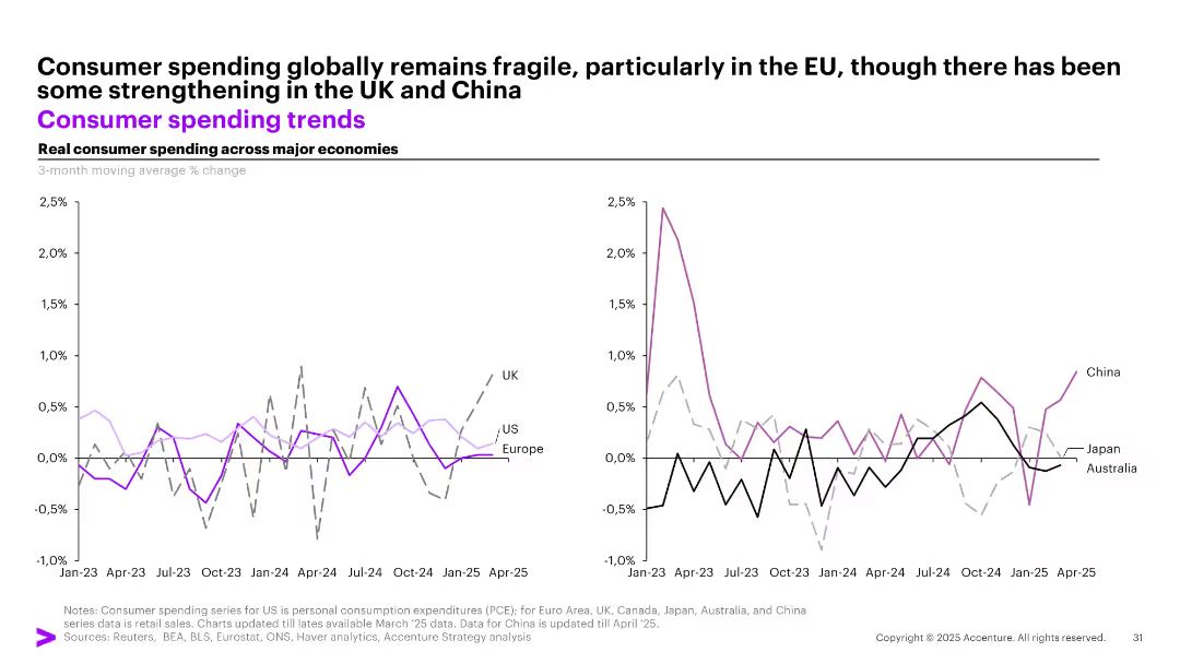
Dual line graphs showing real consumer spending trends for major economies, segmented into Western (left) and APAC (right) regions.
Market Analysis and Trends
Consumer Goods
Real consumer spending trends show fragility in the EU and US, with some rebound in the UK and China. The graphs track 3-month moving average % changes across countries like UK, US, China, and others from Jan 2023 to Apr 2025.
consumer spending, global trends, UK, China, US, retail, APAC, EU, fragility, economic activity
Multiple Chart
Accenture
Saved
This slide presents a combined graph and textual information. On the left, a column chart shows 'GS Group Vanilla and Preferred Stock Issuance vs. Maturities' over several years. On the right, a pie chart details '1Q20 GS Group Vanilla Issuance by Currency'. Additionally, there are bullet points summarizing key funding details.
Financial Performance
Financial Services
Offers a look into the company's funding strategy through various debt instruments and preferred stocks, useful for investors or financial analysts interested in funding diversification and debt maturity profiles.
vanilla funding, preferred stock, issuance, debt maturities, bar chart, pie chart, currency distribution, investment analysis, financial diversification, funding strategy
Multiple Chart
Goldman Sachs
Saved
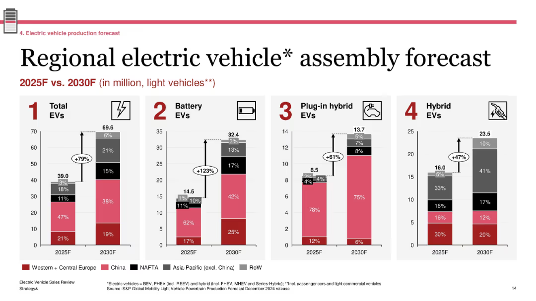
Four grouped bar charts showing production forecasts by region; labeled segments with growth percentages; standard red-gray-black color palette
Technology and Digital Transformation
Industrial & Manufacturing
The slide forecasts EV assembly volumes across major global regions between 2025 and 2030. It projects a 79% increase in total EVs, with battery EVs seeing the most significant growth (+123%). Regional shares are shown for each EV type (BEV, PHEV, Hybrid), emphasizing China and Western Europe as leading contributors.
EV forecast, regional production, BEV growth, 2030 outlook, light vehicles, automotive transformation
Single Chart
PwC/Strategy&
Saved
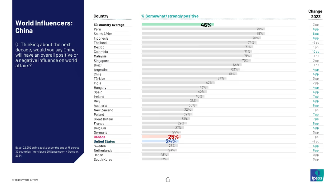
Left-hand context section and right-side horizontal bar chart comparing nations' views.
Market Analysis and Trends
Government & Public Sector
The slide summarizes global attitudes toward China’s future role in world affairs. The data show a polarized view, with some countries more favorable than others, and general sentiment still low.
China, influence perception, global opinion, Ipsos, international relations, approval ratings, sentiment data, 2024 survey, comparison chart
Mixed Chart
IPSOS
Saved
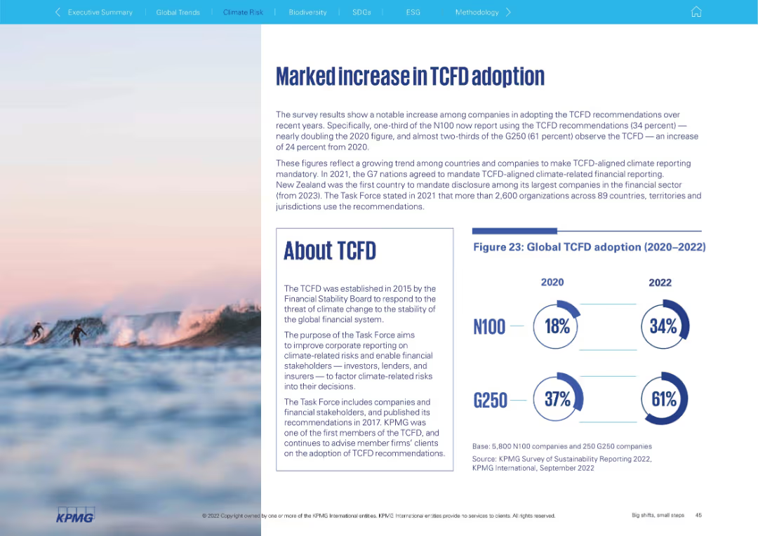
Left: narrative text and About TCFD box; Right: donut chart shows increase in TCFD adoption (2020–2022) for N100 and G250. Surf-themed background adds visual interest.
Regulatory and Compliance
Environmental Services & Sustainability
The slide shows rising corporate adoption of TCFD recommendations between 2020 and 2022. It underscores global efforts to make climate-related disclosures mandatory and presents key facts about TCFD's mission and purpose, with nearly two-thirds of G250 firms now aligned.
TCFD, climate disclosure, ESG, adoption, reporting, G250, N100
Mixed Chart
KPMG
Saved
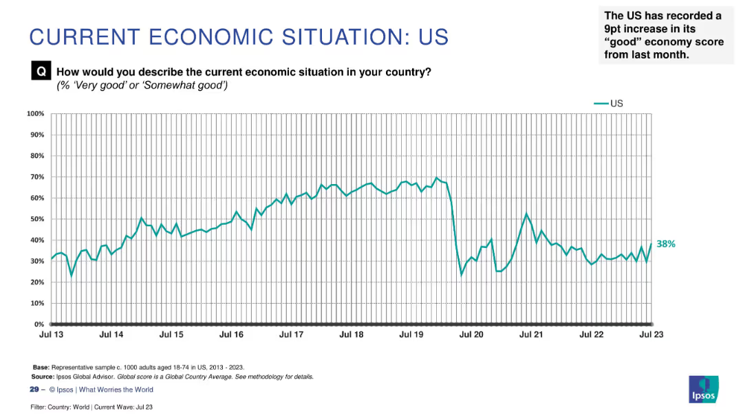
Line chart tracking sentiment from 2013–2023 with a recent increase to 38% highlighted as a 9-point monthly gain.
Market Analysis and Trends
Financial Services
Economic optimism in the US has risen by 9 percentage points to 38%, indicating a notable improvement in public sentiment. The chart shows historical trends and fluctuations in perception.
US economy, public sentiment, recent rise, Ipsos, economic perception, monthly change, economic trends, survey analysis
Single Chart
IPSOS
Saved
This Diagram Slide showcases 'Watèa by Michelin' with diagrams and icons, highlighting the transition to electric light commercial vehicles (LCVs). It presents the stakes of this transition, fleet pain points, and Michelin's value proposition. The use of diagrams, pictograms, and a central circular graphic visually conveys the information effectively, with clear labels and a coherent color scheme.
Technology and Digital Transformation
Transportation & Logistics
This slide introduces 'Watèa by Michelin', a solution for decarbonizing urban LCV fleets, addressing the transition to EVs, operational challenges, and financing issues. It emphasizes Michelin’s comprehensive approach, leveraging group assets and partnerships, including a collaboration with Credit Agricole for vehicle financing, to offer a sustainable and operationally efficient fleet management service.
decarbonization, LCV, electric vehicles, urban, fleet management, sustainability, partnership, financing, Michelin
Framework
Morgan Stanley
Saved
Displays growth percentages in luxury goods shopping among tourists in Europe with column charts. Bars are colored differently to represent various countries like France and Italy.
Market Analysis and Trends
Retail & E-commerce
Provides an overview of the impact of the strong Euro on tourist shopping in Europe, showing changes in tax-free shopping growth rates for luxury goods between 2017 and 2018 in major European markets.
Tourism, Shopping Trends, Europe, Luxury Goods, Currency
Single Chart
Bain
Saved
Light background with blue text, a bar chart displaying different objectives organizations have for security investments, such as improving operational efficiency and compliance.
Risk Assessment and Management
Technology & Software
The slide presents survey data on the objectives organizations aim to achieve with security investments, highlighting the focus on improving operational efficiency and productivity.
Security investments, objectives, operational efficiency, compliance, survey
Mixed Chart
Oliver Wyman
Saved
Previous
Next
If nothing, comes up, please save your slides first
Create a FREE account to continue browsing
Receive Instant Access to 1,000+ slides from companies like McKinsey, Google, and Goldman Sachs
First Name
Last Name
Email
Password
I agree to all
Terms & Privacy Policy
Thank you! Your submission has been received!
Oops! Something went wrong while submitting the form.
Have an account?
Sign in
Column Chart
Heatmap
Chevron
Org Chart
Infographic
Callouts
Timeline
List
Graphic
Picture
Process Flow
Diagram
Paragraph
Map
Table
Framework
Subtitle
Takeaway Box
Icon
Other Chart
Radar Chart
Waterfall Chart
Mekko Chart
Pie Chart
Scatter Plot
Line Chart
Bar chart
Bullet points