My Account
My Slides
Search by Category
Companies
Slide Type
Use Case
Industry
Pricing
Templates
View All Templates
Download Template Slides
✦ AI
AI Prompt Library
AI Search
Feedback
Login
Logout
Get Started
Browse all Slides
Browse all Slides
Create a FREE Account
Instant access to 1,000+ real slides from top companies like McKinsey, BCG, Goldman Sachs, Google and many more!
First Name
Last Name
Email
Password
I agree to all
Terms & Privacy Policy
Thank you! Your submission has been received!
Oops! Something went wrong while submitting the form.
Have an account?
Sign in
Saved Slides
Lists key competencies in bullet points with contrasting headers for core competences and rapidly accelerating competences. Clear layout and text hierarchy.
Organizational Structure and Change
Technology & Software
Details Faurecia's core and emerging competencies aimed at enhancing its technological footprint in automotive cockpit innovations, with a focus on AI and data analytics enhancements.
competencies, innovation, automotive, AI, data analytics, technology
Boxed
Deutsche Bank
Saved
This slide includes a column chart showing the number of Norwegians owning cryptocurrency from 2018 to 2022. It emphasizes the growth in crypto ownership, with an increase of 120,000 owners from the previous year, totaling 420,000 in 2022.
Market Analysis and Trends
Financial Services
Shows the significant increase in cryptocurrency ownership among Norwegians, doubling since 2018 to 420,000 in 2022. Highlights the annual growth and demographic changes, focusing on the increase from the previous year.
Cryptocurrency, Norway, Growth, Ownership, Trends
Multiple Chart
EY
Saved
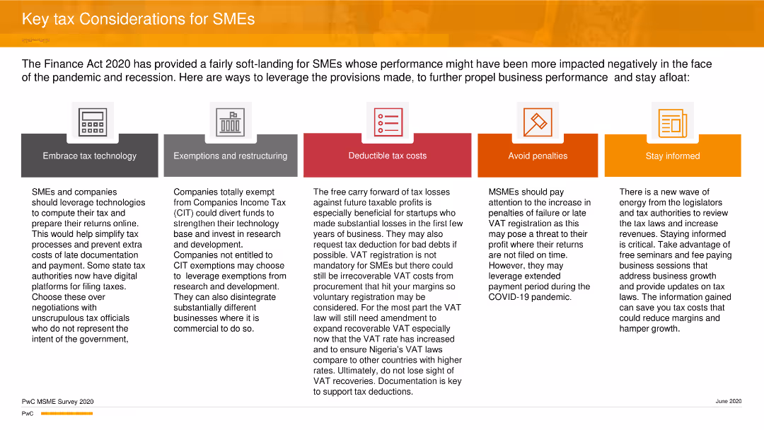
The slide features five icons representing key tax considerations: technology, exemptions, deductible costs, penalties, and staying informed.
Strategic Planning
Financial Services
The slide offers strategic tax considerations for SMEs, focusing on leveraging technology, understanding exemptions, managing deductible costs, avoiding penalties, and staying informed about tax laws to improve business performance during the pandemic and recession.
Tax, SMEs, Strategy, Planning, Business, PwC
Pillar
PwC/Strategy&
Saved
The slide contains multiple pie charts showing the division of advertising revenues between digital and non-digital formats for Asia Pacific (excluding Mainland China), Mainland China, and Hong Kong from 2016 and projecting to 2025. It includes percentages and a color-coded system to distinguish between digital and non-digital revenues, alongside text boxes summarizing key insights.
Market Analysis and Trends
Media & Entertainment
Analyzes the transition in advertising revenue streams from non-digital to digital formats in Hong Kong versus other regions. It highlights that despite the shift towards digital, non-digital advertising still dominates Hong Kong's market, contrary to the faster digital adoption seen in Mainland China and the broader Asia Pacific region. The slide discusses factors influencing these trends, such as technological adoption and market maturity.
digital, non-digital, advertising, Hong Kong, Asia Pacific, 2025, revenue shares
Multiple Chart
PwC/Strategy&
Saved
The slide features a large image of a network globe with text on the right and a trend assessment.
Technology and Digital Transformation
Technology & Software
Covers the significance of data and AI in creating personalized consumer experiences and improving supply chain automation.
Data, AI, Personalization, Consumer Experience, Supply Chain, Automation, Blockchain
Multiple Chart
Deloitte
Saved
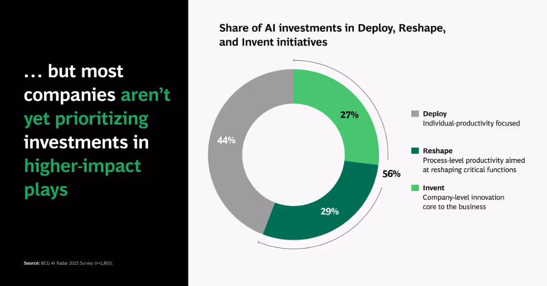
Similar donut chart to previous slide but showing global averages; left panel inverts the headline to highlight underperformance.
Operational Efficiency
Artificial Intelligence
Indicates that most companies still invest heavily in basic deployment rather than higher-impact innovation, revealing a gap in strategic prioritization.
underinvestment, AI deploy, reshape, innovation, donut chart, gap, strategic focus, transformation
Single Chart
BCG
Saved
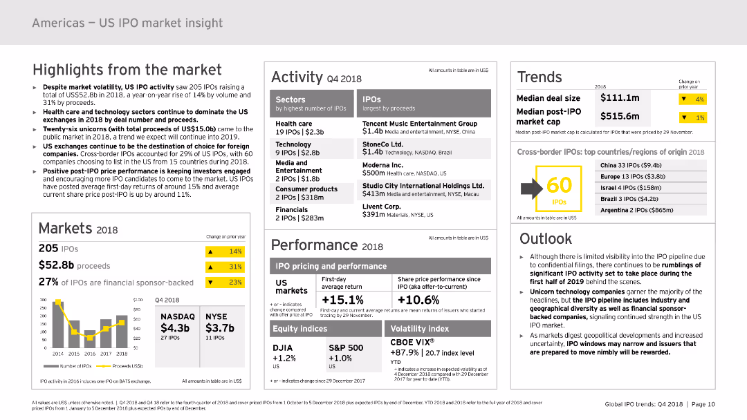
The slide contains multiple sections with various charts and graphs, including column charts, data tables, and infographic elements. Key areas include highlights, markets, activity, performance, trends, and outlook. The layout is dense, presenting a comprehensive overview of the US IPO market in 2018.
Market Analysis and Trends
Financial Services
Provides an in-depth analysis of the US IPO market in 2018, highlighting market volatility, activity, performance, and trends. It includes detailed statistics and predictions for future trends, making it suitable for financial analysis and strategic planning.
IPO, US market, trends, performance, 2018, financial analysis
Mixed Chart
EY
Saved
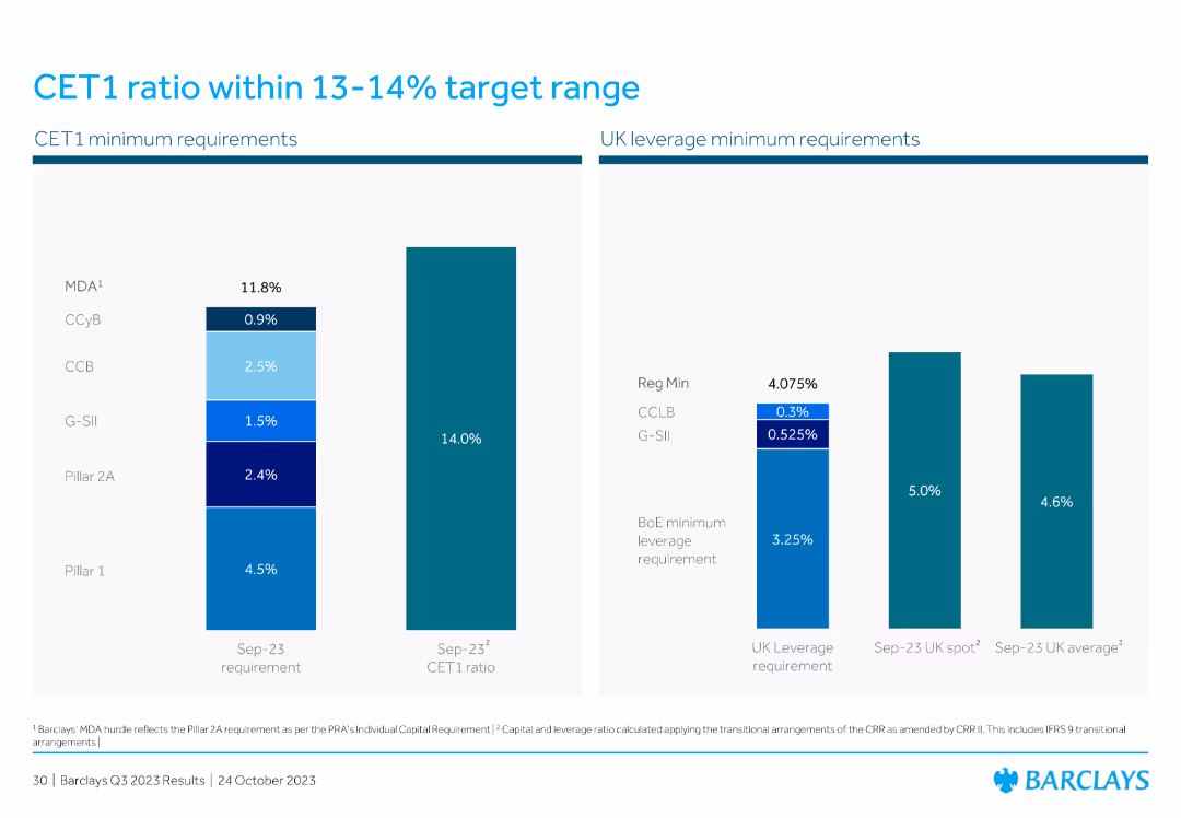
Contains a vertical bar chart showing CET1 minimum requirements and a comparison chart for UK leverage minimum requirements. The design is clean and data-oriented.
Financial Performance
Financial Services
This slide discusses the CET1 ratio within the target range and compares UK leverage requirements, emphasizing regulatory compliance and financial stability.
CET1 ratio, target range, UK leverage, minimum requirements, financial stability, regulatory compliance
Multiple Chart
Barclays
Saved
Contains five images with captions related to digital advertising, retail partnerships, consumer value, and economic factors like currency headwinds. Each image is connected by arrows, indicating a flow of strategy.
Operational Efficiency
Consumer Goods
Discusses Clorox's strategic adaptations in the consumer packaged goods sector, focusing on digital marketing, retail growth, consumer value, and operational efficiency against economic challenges. Useful for strategy review meetings.
digital marketing, retail growth, consumer value, strategy, Clorox
Pillar
Barclays
Saved
Features a central triangle with each vertex labeled with a question about work, worker, or workplace. It shows the contrast between future and current work options through a graphical element representing a spectrum.
Strategic Planning
Technology & Software
Examines the disruptors in the future of work, focusing on who can do the work, where, and how. This slide is beneficial for strategic planning regarding workforce evolution.
Disruptors, Future of Work, Strategy, Workforce
Diagram
Deloitte
Saved
A column chart showing the 2018 to 2019 outlook with changes in expenses broken down by type, such as tech investments and FDIC/other, with a title above and footnotes below.
Financial Performance
Financial Services
Demonstrates the company's financial planning, highlighting changes in expenses and investments year over year, useful for financial analysis and performance discussions.
Expenses, Outlook, Financial Planning, Investments, FDIC
Single Chart
JP Morgan
Saved
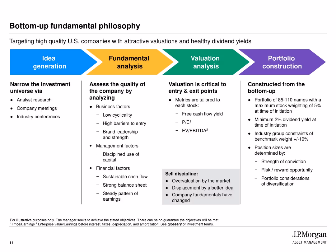
Horizontal multi-section layout with colored blocks representing process steps from idea generation to portfolio construction.
Strategic Planning
Financial Services
Outlines the step-by-step bottom-up investment process at JPMorgan. Focuses on narrowing the investment universe, analyzing company fundamentals, conducting valuations, and finalizing portfolio construction based on risk, conviction, and diversification.
investment strategy, valuation, bottom-up, stock selection, due diligence, portfolio construction, analysis
Linear Flow
JP Morgan
Saved
Slide with a bold title, line graphs tracking search volume for sustainable clothing terms, and labels for significant points.
Market Analysis and Trends
Retail & E-commerce
Illustrates the growing interest in sustainable and ethical clothing through search trends, suggesting a shift in consumer values.
sustainability, ethical clothing, search trends, consumer interest, data analysis, green fashion
Single Chart
Accenture
Saved
A gauge diagram in a gradient from orange to yellow, indicating a balance between operational and strategic focuses, with a pointer set at 'Balanced'.
Market Analysis and Trends
Professional Services
Analyzes the focus of organizations on operational versus strategic approaches, providing insights into how companies balance daily operations with long-term strategic planning.
operational, strategic, focus, planning, balance, organizations, approaches
Single Chart
PwC/Strategy&
Saved
The slide showcases a dashboard with multiple data visualizations, including line and bar charts, detailing customer debt, active debt, and highest debt customers.
Financial Performance
Energy & Utilities
This slide details customer debt metrics, including total debt amount, active debt, and highest debt customers, presented through various graphical elements for clear understanding.
customer debt, active debt, highest debt, utilities, metrics
Multiple Chart
EY
Saved
List format with icons, descriptive text, and benefits. Blue and white color scheme.
Product and Service Analysis
Healthcare & Pharmaceuticals
Details recent technological advances in bioengineering and their practical applications.
Bioengineering, Technology, Advancements, Healthcare
Header Vertical
McKinsey
Saved
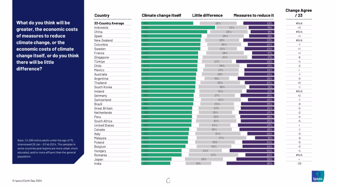
Horizontal stacked bar chart comparing beliefs on whether climate change itself or the measures to reduce it will cost more. Countries listed on the left with agreement levels for each opinion.
Strategic Planning
Environmental Services & Sustainability
The slide presents perceptions across various countries regarding whether the economic cost of addressing climate change outweighs the cost of climate change itself. Most respondents believe climate change is the more costly threat, though views vary by country.
economic costs, climate change, mitigation measures, global perception, Ipsos, cost analysis, country comparison, sustainability policy
Mixed Chart
IPSOS
Saved
Displays column charts breaking down export potentials and timelines for ammonia and hydrogen from Chile to various regions.
Market Analysis and Trends
Energy & Utilities
Analyzes export potentials for Chile in hydrogen and ammonia, forecasting growth and identifying key markets.
hydrogen, ammonia, exports, Chile, market size, LATAM, Europe, Asia
Multiple Chart
McKinsey
Saved
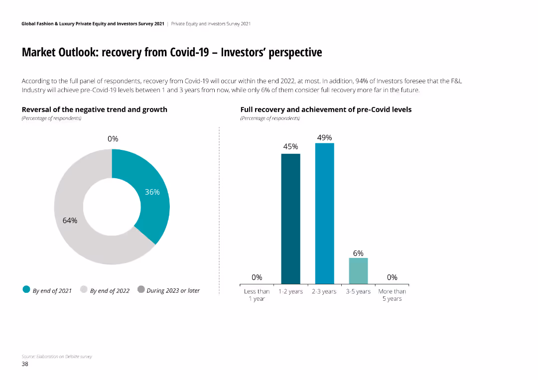
Pie chart and column chart showing timeline for recovery from Covid-19, with full recovery expected between 1 to 3 years by most investors.
Strategic Planning
Financial Services
Recovery from Covid-19 expected by end of 2022 for most investors. 94% foresee F&L industry reaching pre-Covid levels within 3 years, full recovery expected within 1-3 years.
Covid-19 recovery, F&L industry, investor perspective, recovery timeline, pre-Covid levels
Multiple Chart
Deloitte
Saved
Slide contains three vertical bar charts comparing the focus on outsourcing, automation, and workforce experience among leaders, middle group, and laggards.
Operational Efficiency
Retail & E-commerce
Leaders are shown to prioritize automation and enhancing workforce experience over outsourcing, reflecting a shift towards more sustainable internal improvements in business operations.
automation, outsourcing, workforce, leaders, laggards, business operations, prioritize, sustainable
Single Chart
Deloitte
Saved
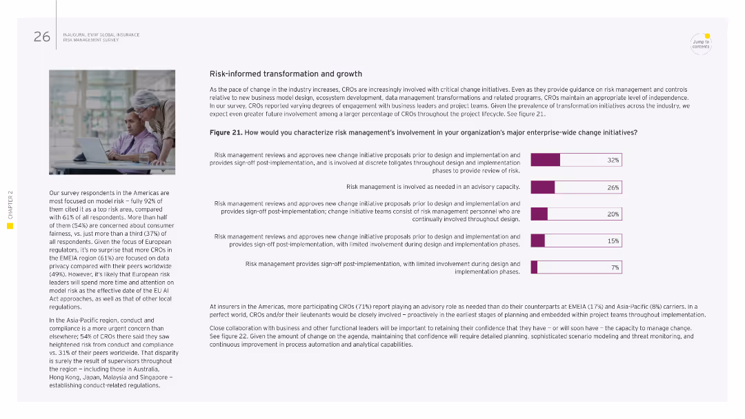
Image of two people working together. Column chart showing risk management involvement in major enterprise-wide change initiatives.
Strategic Planning
Financial Services
This slide examines the role of risk management in enterprise-wide change initiatives, detailing the different levels of involvement from advisory roles to active participation. It emphasizes the need for risk management to provide sign-off and oversight throughout the implementation phases of change initiatives.
risk management, transformation, change initiatives, enterprise-wide, oversight
Mixed Chart
EY
Saved
Two bar charts showing average annual capital and total factor productivity contributions to real potential GDP growth from 2020-25 and 2025-33, highlighting scenarios of trend, baseline, and optimistic growth.
Market Analysis and Trends
Financial Services
The slide highlights the potential boost to global economic growth from stronger investment and productivity growth driven by GenAI, with significant contributions expected across major economies.
GenAI, investment growth, productivity, GDP growth, economic forecast, 2025-33
Multiple Chart
EY
Saved
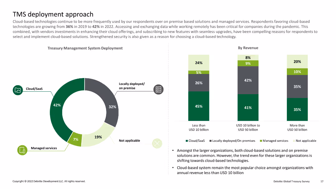
Pie chart showing percentages of cloud/SaaS, locally deployed, and managed services; bar charts detailing deployment by revenue
Technology and Digital Transformation
Financial Services
Discusses the shift towards cloud-based treasury management systems and their deployment among organizations of varying revenue sizes.
Cloud, SaaS, deployment, revenue, treasury
Multiple Chart
Deloitte
Saved
The slide includes a timeline from 1994 to 2017 with labeled phases such as "Sortie du Temple," "Crisis," "Chinese Bulimia," and "New Normal." It features a column chart and icons representing market growth, price effects, and volume effects, using red and gray to differentiate the periods and impacts.
Market Analysis and Trends
Consumer Goods
Focuses on the luxury leather goods market, detailing volume and price effects over different periods. Highlights how market dynamics like consumer base expansion and pricing policies have driven changes in the market structure, especially post-crisis and during the "Chinese Bulimia" period.
luxury goods, market trends, crisis, volume growth, price effects
Single Chart
Bain
Saved
This slide is divided into four sections with a combination of column charts and bullet points. It utilizes a blue, white, and red color scheme and includes award logos and a circular diagram to represent the different business sectors discussed.
Strategic Planning
Technology & Software
Showcasing strategic business advancements in banking, highlighting key innovations, market leadership, and technology integration across several sectors.
innovation, fintech, market leadership, digital platform, banking, treasury management
Table
Goldman Sachs
Saved
Previous
Next
If nothing, comes up, please save your slides first
Create a FREE account to continue browsing
Receive Instant Access to 1,000+ slides from companies like McKinsey, Google, and Goldman Sachs
First Name
Last Name
Email
Password
I agree to all
Terms & Privacy Policy
Thank you! Your submission has been received!
Oops! Something went wrong while submitting the form.
Have an account?
Sign in
Column Chart
Heatmap
Chevron
Org Chart
Infographic
Callouts
Timeline
List
Graphic
Picture
Process Flow
Diagram
Paragraph
Map
Table
Framework
Subtitle
Takeaway Box
Icon
Other Chart
Radar Chart
Waterfall Chart
Mekko Chart
Pie Chart
Scatter Plot
Line Chart
Bar chart
Bullet points