Create a FREE Account
Instant access to 1,000+ real slides from top companies like McKinsey, BCG, Goldman Sachs, Google and many more!
First Name
Last Name
Email
Password
I agree to all
Terms & Privacy Policy
Thank you! Your submission has been received!
Oops! Something went wrong while submitting the form.
Have an account?
Sign in
Library
Templates
Courses
Pricing
My Account
My Slides
My Templates
✦ AI
AI Prompt Library
AI Search
Sign in
Start Here
Logout
My Saved Slides
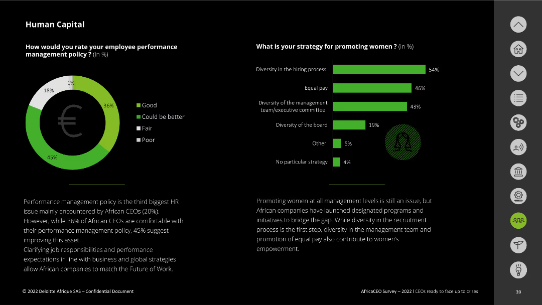
This slide has a donut chart and a vertical bar chart. The visuals represent ratings for employee management policy and strategies for promoting women. Text boxes add explanations.
Human Resources and Talent Management
Professional Services
It evaluates African CEOs' views on employee management policies and strategies to promote women within companies.
employee management, policy rating, promoting women, diversity, African CEOs
Multiple Chart
Deloitte
Saved
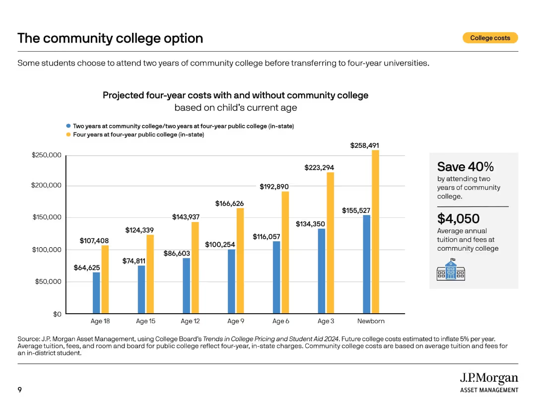
Bar chart comparing projected costs for two college pathways: community college then university vs four-year university.
Investment Analysis
Education & Training
This slide shows the cost-saving advantage of attending community college for two years before transferring to a four-year university. It emphasizes potential 40% savings and provides a cost breakdown across different child age groups.
community college, education savings, transfer strategy, tuition comparison, cost reduction, college path, public college, financial strategy, planning tips
Mixed Chart
JP Morgan
Saved
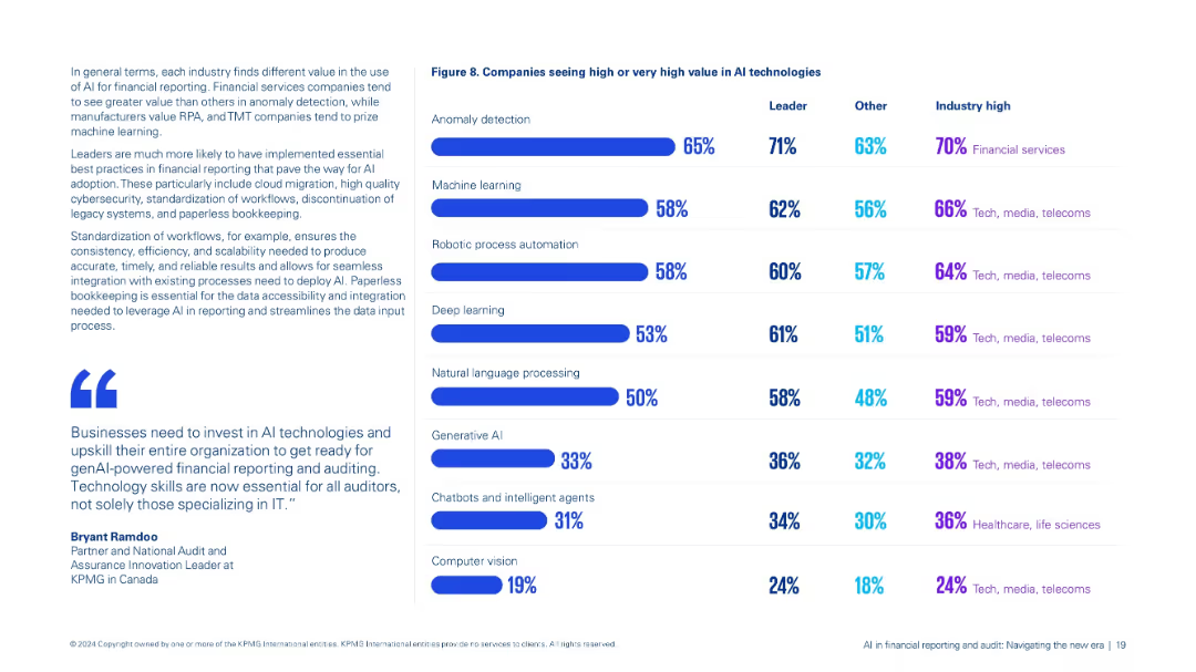
Dual-column layout: left contains contextual text and quotes; right features a bar chart comparison (Figure 8) of AI technology value perceptions.
Market Analysis and Trends
Financial Services
Compares perceived value across AI technologies like anomaly detection, machine learning, and genAI by leaders and others, highlighting industry-specific trends, especially in financial services and TMT sectors.
AI technologies, anomaly detection, machine learning, industry trends, value perception
Mixed Chart
KPMG
Saved
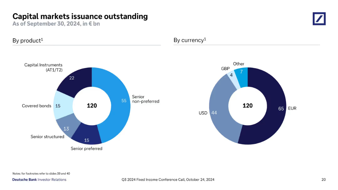
Two donut charts showing €120bn issuance breakdown by product and currency; product types include SNP, AT1/T2, and covered bonds.
Investment Analysis
Financial Services
This slide breaks down Deutsche Bank’s €120bn outstanding capital markets issuance as of Q3 2024. The product distribution is led by senior non-preferred (55), with the majority of currency exposure in EUR (65) and USD (44), indicating strong Euro and Dollar market activity.
capital markets, senior non-preferred, EUR, USD, issuance, bonds, Deutsche Bank
Single Chart
Deutsche Bank
Saved
The slide contains a column chart showing monthly trends in PE/VC fundraising, with total funds raised in green bars and the number of funds raised represented by an orange line.
Market Analysis and Trends
Financial Services
This slide tracks monthly trends in private equity and venture capital fundraising over a year. It shows the total amount of funds raised each month and the corresponding number of funds. The purpose is to analyze fundraising activity trends.
PE/VC, Fundraise, Monthly Trends, Funds Raised, Column Chart, Line Chart
Multiple Chart
EY
Saved
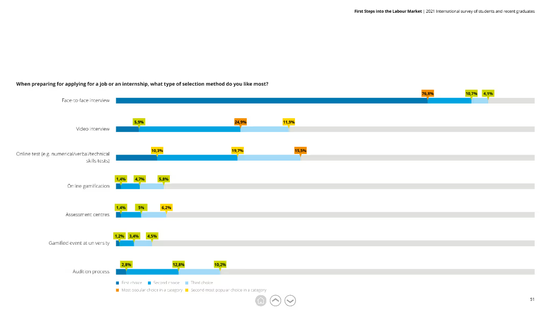
This slide features a horizontal bar chart with data on preferred job application selection methods, including face-to-face interviews and online tests.
Market Analysis and Trends
Professional Services
The slide details preferences for different job selection methods, showing face-to-face interviews as the most favored. It helps in understanding recruitment preferences.
Job applications, selection methods, survey, interviews, recruitment
Single Chart
Deloitte
Saved
Presents break-even inflation rates over time through a dual-line graph, accompanied by a clear, concise analysis.
Investment Analysis
Financial Services
Evaluates long-term investor expectations of inflation, likely used in financial services to inform investment strategies.
inflation expectations, US Treasury yields, investment analysis, economic forecast, inflationary pressures, market trends, financial planning
Single Chart
McKinsey
Saved
This slide presents a bar chart showing net interest income trends along with key financial metrics and expectations for future quarters. It uses a combination of graphical and textual data.
Financial Performance
Financial Services
It analyzes the net interest income trends, detailing the drivers behind the changes and providing expectations for future financial performance.
net interest income, financial trends, metrics, future expectations, 3Q22
Mixed Chart
UBS
Saved
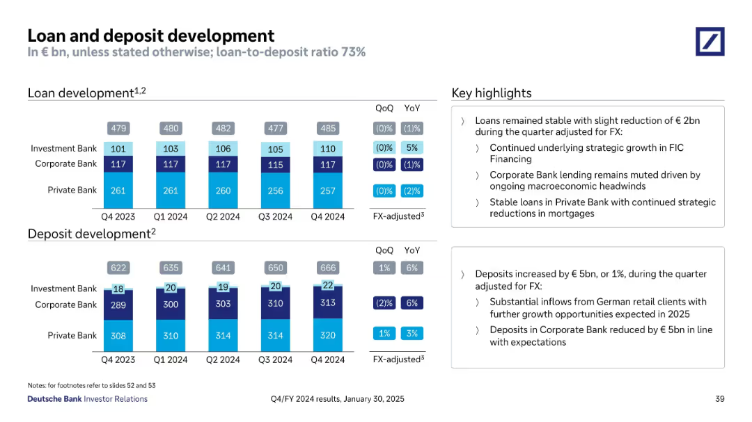
Two bar charts showing loan and deposit development across quarters; right side includes key highlights in boxed text format
Financial Performance
Financial Services
This slide shows quarterly loan and deposit figures broken down by banking divisions. Loans remained stable while deposits rose slightly. Strategic growth occurred in investment banking, while private bank loans were strategically reduced. Key factors include macroeconomic headwinds and FX adjustments.
loans, deposits, quarterly trend, FX-adjusted, banking divisions, stable
Multiple Chart
Deutsche Bank
Saved
Two maps of Vietnam, one highlighting e-commerce demand and the other supply density, with green and blue shading. Each map points to Hanoi, Danang, and HCM City. Source information includes Google and Bain Analysis.
Market Analysis and Trends
Technology & Software
Analyzes digital participation across Vietnam's top metro cities, showing demand and supply dynamics in e-commerce, beneficial for regional market strategies and investment considerations.
Vietnam, Digital Participation, E-Commerce Demand, Supply Density, Metro Cities, Market Analysis, Geographic Trends, Consumer Behavior, Investment Insights
Multiple Chart
Bain
Saved
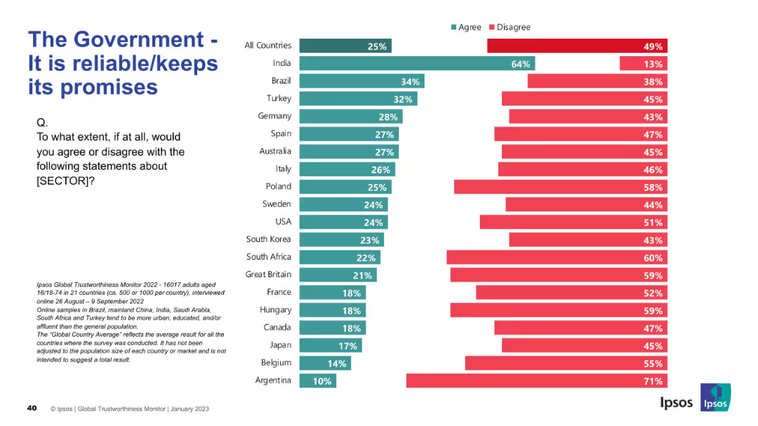
Country-wise bar chart showing perceptions of government reliability
Risk Assessment and Management
Government & Public Sector
The slide assesses public confidence in governments keeping promises. India stands out in agreement; most countries show high levels of skepticism.
promises, reliability, trust, governance, survey, Ipsos, international, skepticism, expectations
Mixed Chart
IPSOS
Saved
The slide shows column charts representing the adoption rates of physician support systems, such as medication management systems and clinical decision support tools, in hospitals across different APAC regions.
Technology and Digital Transformation
Healthcare & Pharmaceuticals
The slide focuses on the adoption of physician support systems like medication management systems, clinical workflow management systems, and clinical decision support tools across hospitals in APAC, noting lower adoption rates in Japan.
APAC, physician support, hospitals, adoption, digital tools
Multiple Chart
LEK
Saved
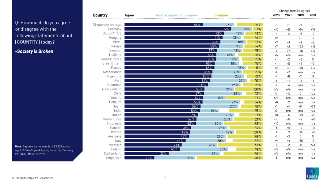
Bar chart showing agreement levels that society is broken across countries with historical comparison from 2016–2025.
Market Analysis and Trends
Government & Public Sector
This slide ranks countries by belief that society is broken, alongside data over time. Agreement is highest in Germany, South Africa, and Hungary. Trends show significant increases in perceived societal dysfunction across several countries.
societal breakdown, public opinion, social unrest, longitudinal trends
Mixed Chart
IPSOS
Saved
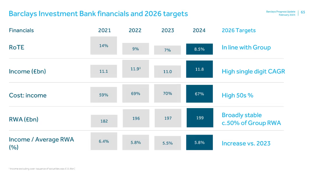
Table with 2021–2024 values and 2026 goals; clearly segmented rows with dark blue for latest values and target goals
Financial Performance
Financial Services
The Investment Bank’s financial overview includes RoTE, income, cost-income ratio, RWA, and income/RWA ratio. Targets for 2026 align with group averages and aim for stable risk-weighted assets and income growth. High 50s cost-income ratio and increased income efficiency are key goals.
Investment bank, RoTE, income, RWA, cost-income ratio, financial goals
Single Chart
Barclays
Saved
Column chart showing headwinds impacting recent performance and drivers to achieve 2024 RoRC ambition.
Strategic Planning
Financial Services
Analyzes recent performance challenges and outlines strategies to achieve growth and sustainable returns by 2024.
performance, growth, strategic planning, headwinds, returns
Mixed Chart
Credit Suisse
Saved
Two pie charts showing GDP and market capitalization percentages by country.
Market Analysis and Trends
Financial Services
Illustrates US dominance in global equity market allocations, useful for investment strategies.
Equity Allocation, GDP, Market Capitalization, US Dominance, Pie Charts, Morgan Stanley, Market Monitor
Multiple Chart
Morgan Stanley
Saved
Features bulleted lists, bar graphs, and a mobile app interface highlighting physical and mental health strategies. The slide uses a mix of green and dark tones for visual separation.
Human Resources and Talent Management
Healthcare & Pharmaceuticals
Focuses on workplace safety and mental health management. It covers strategies like stress management, hygiene standards, and mental health training benefits, with a service provider example showing impact on stress and burnout rates.
Employee safety, Mental health, Stress management, Burnout, Hygiene
Header Vertical
BCG
Saved
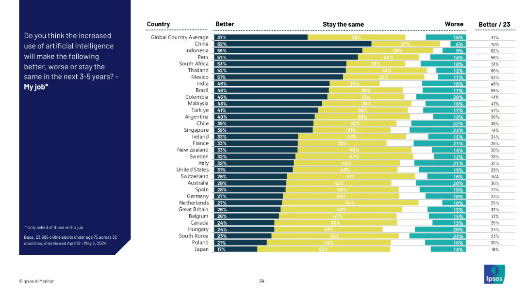
Stacked bar chart by country showing "Better," "Stay the same," and "Worse" views on AI’s job impact. Colors separate the three opinions.
Human Resources and Talent Management
Artificial Intelligence
This slide captures perceptions across countries about whether AI will improve, worsen, or not affect their job over the next 3–5 years. Optimism is highest in Asia and Latin America, while skepticism is more prevalent in Western Europe.
AI job impact, country analysis, workplace outlook, sentiment distribution, talent management, job improvement, technology shift
Mixed Chart
IPSOS
Saved
Features column charts and bullet points detailing marketing spend and performance metrics. It's well-structured with color-coding for easy distinction between categories.
Financial Performance
Financial Services
Details marketing spend and key performance metrics, which could be relevant in financial and marketing strategy sessions.
marketing, performance metrics, financial strategy, cash marketing spend
Multiple Chart
JP Morgan
Saved
A line chart comparing 'Goods' (in blue) and 'Services' (in orange) spending by US consumers is presented on this slide. The chart tracks the spending index from December 2019, showing a sharp decline followed by a recovery with fluctuating levels for both categories.
Financial Performance
Technology & Software
This slide shows the impact of the pandemic on US consumer spending, demonstrating changes in the level and composition of expenditures on goods and services. It could be used to analyze consumer behavior during economic shocks and guide business strategy adjustments.
Pandemic, Consumer Spending, US, Goods, Services, Economic Impact, Spending Behavior
Single Chart
JP Morgan
Saved
Two sections feature a ranking table and a line graph, showing the firm's market positioning and share growth with blue and grey shades.
Market Analysis and Trends
Financial Services
The slide compares the firm's current market position with growth potential, indicating areas for client base expansion and ranking improvements.
client base, market position, equities, FICC, market share, growth potential, competitive ranking, Goldman Sachs
Multiple Chart
Goldman Sachs
Saved
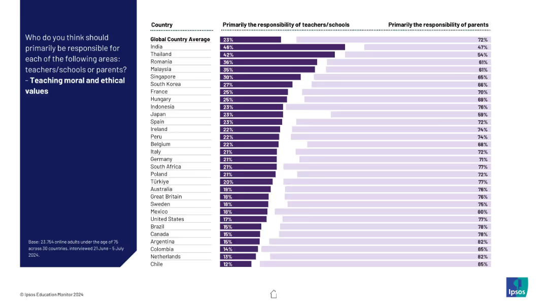
Visual ranking of countries on responsibility for instilling ethics; clear majority favor parents over schools.
Regulatory and Compliance
Education & Training
The slide illustrates global consensus that moral and ethical education should primarily fall to parents, though some variation exists.
ethics, values, morality, parenting, education, schools, culture, children, responsibility, global perspective
Mixed Chart
IPSOS
Saved
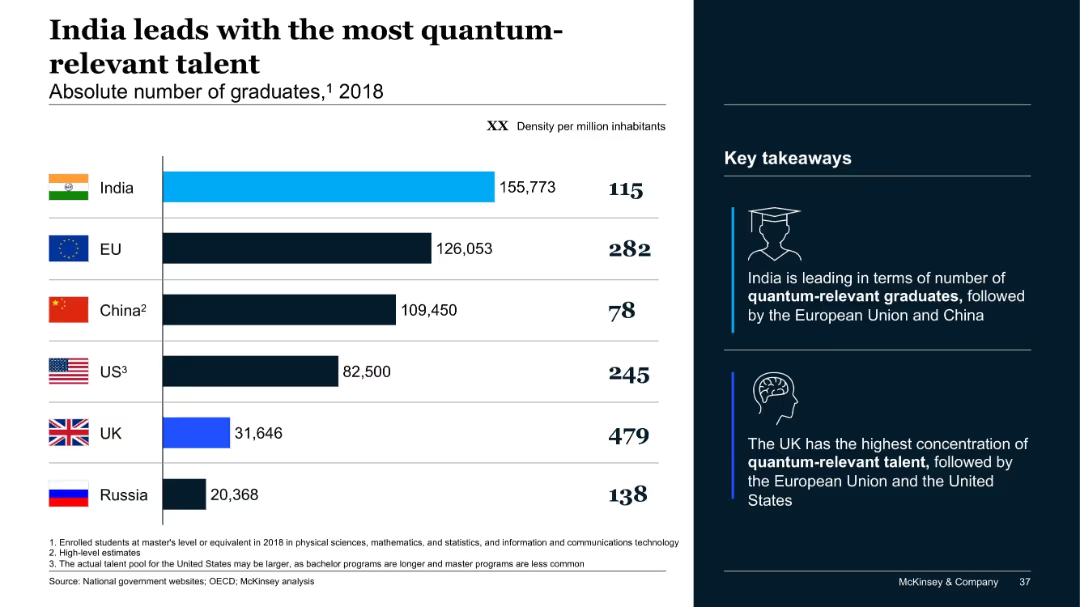
Bar chart showing graduate counts and population density; key takeaways highlighted with icons; bold headers; minimalist styling.
Human Resources and Talent Management
Artificial Intelligence
This slide reveals India's lead in quantum-relevant graduates by absolute numbers, with the EU and China following. The UK has the highest concentration per capita. It reflects both volume and density of emerging talent across key nations.
quantum talent, graduates, India, EU, China, UK, education, McKinsey, density
Mixed Chart
McKinsey
Saved
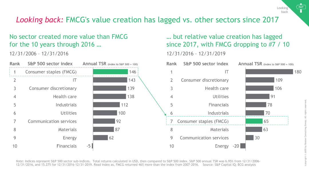
The slide uses two comparative column charts to show TSR rankings over two different periods. It has a clean design with green highlights.
Financial Performance
Consumer Goods
It compares the total shareholder return (TSR) of FMCG against other sectors from 2006-2016 and 2016-2019, showing FMCG's declining performance.
FMCG, Value Creation, TSR, Comparison, Sectors
Multiple Chart
BCG
Saved
Featuring a text description of development finance objectives and a column chart on the left that illustrates the geographical distribution of investments, the slide also includes an image of a corporate initiative in Africa on the right.
Financial Performance
Financial Services
This slide details JPMorgan Chase's strategy for development finance, focusing on geographical investment distributions to foster global economic growth. The image supports the narrative by showcasing a corporate initiative, possibly indicating the firm's on-ground impact. It's likely used in discussions about international investment strategies and their outcomes.
development finance, investment, global, economic growth, geographic distribution, JPMorgan Chase
Mixed Chart
JP Morgan
Saved
Previous
Next
If nothing, comes up, please save your slides first
Create a FREE account to continue browsing
Receive Instant Access to 1,000+ slides from companies like McKinsey, Google, and Goldman Sachs
First Name
Last Name
Email
Password
I agree to all
Terms & Privacy Policy
Thank you! Your submission has been received!
Oops! Something went wrong while submitting the form.
Have an account?
Sign in
Column Chart
Heatmap
Chevron
Org Chart
Infographic
Callouts
Timeline
List
Graphic
Picture
Process Flow
Diagram
Paragraph
Map
Table
Framework
Subtitle
Takeaway Box
Icon
Other Chart
Radar Chart
Waterfall Chart
Mekko Chart
Pie Chart
Scatter Plot
Line Chart
Bar chart
Bullet points