Create a FREE Account
Instant access to 1,000+ real slides from top companies like McKinsey, BCG, Goldman Sachs, Google and many more!
First Name
Last Name
Email
Password
I agree to all
Terms & Privacy Policy
Thank you! Your submission has been received!
Oops! Something went wrong while submitting the form.
Have an account?
Sign in
Library
Templates
Courses
Pricing
My Account
My Slides
My Templates
✦ AI
AI Prompt Library
AI Search
Sign in
Start Here
Logout
My Saved Slides
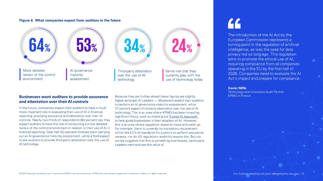
The slide features a column chart showing the percentage of people providing various types of help to others. Text boxes highlight key activities and their respective percentages.
Customer and Market Segmentation
Government & Public Sector
This slide highlights the types of help people are providing to others, showing the percentage of people engaging in various helping activities, based on survey data.
providing help, survey, types, activities, column chart, public opinion, percentage, healthcare, helping
Mixed Chart
IPSOS
Saved
Four grouped bar comparisons between 2021 and 2023 across industry verticals: e-commerce, tourist attractions, transport, and lodging.
Competitive Landscape
Financial Services
This slide presents improvement in Amex acceptance across key verticals, showing growth in top e-commerce sites, tourist attractions, transport, and lodging between 2021 and 2023, reinforcing strategic focus areas.
Key Verticals, Industry Acceptance, E-commerce, Lodging, Tourist Attractions, Transport, Growth
Single Chart
McKinsey
Saved
The slide shows a process flow diagram with icons representing various stages of returns handling in the fashion industry, including sorting, refunding, and recycling.
Operational Efficiency
Retail & E-commerce
This slide explains the flow of returns within the fashion ecosystem, highlighting the key stages and actions involved in managing returns efficiently and sustainably.
Returns, Recycling, Sorting, Process flow, Fashion industry
Diagram
Roland Berger
Saved
This slide features a line chart depicting the Global economic policy uncertainty index from 1997 to 2022, and a column chart showing year-over-year percent change in real GDP from 2019 to 2024 for various regions and countries. It uses a blue and white color scheme with clear labels and legends.
Market Analysis and Trends
Financial Services
The slide analyzes persistent inflation and elevated interest rates, showcasing global economic policy uncertainty and projected real GDP changes for different regions and countries, suggesting these as continued characteristics of the economic slowdown.
inflation, interest rates, economic slowdown, GDP, policy uncertainty
Multiple Chart
EY
Saved
The slide features a column chart comparing the average spend and purchase penetration of various product categories by city tier. The bars are color-coded and labeled for clarity.
Market Analysis and Trends
Consumer Goods
This slide presents data from a 2018 study, showing the average spend and purchase penetration of ready-to-wear, watches/jewelry, handbags, accessories, and shoes by city tier.
consumer spend, purchase penetration, city tier, average spend, luxury market
Multiple Chart
BCG
Saved
Several bar charts, well-organized text sections, uses shades of blue and green.
Customer and Market Segmentation
Telecommunications
Examines the effectiveness of various performance metrics in enhancing customer satisfaction.
performance metrics, customer satisfaction, assessment
Multiple Chart
Deloitte
Saved
Contains a column chart showing the Return on Equity (ROE) in 2017 and 2018 with contributing factors like revenue, rates, and expenses indicated by arrows and percentages along the bars.
Financial Performance
Financial Services
This slide is meant for financial professionals, focusing on the factors contributing to the increase in Return on Equity (ROE) from 2017 to 2018, which is crucial for assessing company performance and making investment decisions.
ROE, financial analysis, 2017, 2018, revenue, rates, expenses, investment decision
Single Chart
JP Morgan
Saved
The slide showcases multiple column charts with financial metrics such as invested assets, deposits, loans, and revenues across different business units. It features clear numerical data and graphical elements.
Strategic Planning
Financial Services
It highlights the commercial momentum by presenting key financial metrics, emphasizing growth in invested assets, net new money, and other financial indicators.
commercial momentum, financial metrics, assets, deposits, loans
Multiple Chart
UBS
Saved
The slide contains two column charts. The left chart shows the contribution to UK real GDP growth by different sectors. The right chart displays UK Purchasing Managers' Indices (PMI) over time. The charts are detailed and use various colors to distinguish data categories.
Market Analysis and Trends
Financial Services
The slide analyzes the UK's GDP growth and business activity through sector contributions and PMI trends, essential for economic analysis and business strategy.
UK GDP, business surveys, PMI, sector growth, economic analysis
Multiple Chart
JP Morgan
Saved
The slide features a column chart displaying the key reasons driving EV purchases, such as cost, convenience, and environmental impact. It also includes regional comparisons with colored bars representing APAC, EMEA, and North America.
Market Analysis and Trends
Transportation & Logistics
This slide analyzes the main drivers behind EV purchases, focusing on cost, convenience, and environmental impact. It provides a regional breakdown to show variations in purchasing motivations across different areas.
EV drivers, column chart, cost, convenience, environment
Single Chart
PwC/Strategy&
Saved
The slide includes a bar chart for real GDP year-over-year change, a line chart for consumption and investment, and a combined line/bar chart for trade balance and exchange rate.
Market Analysis and Trends
Financial Services
The slide provides an economic overview of Mexico, detailing GDP changes, consumption, investment trends, and trade balance with exchange rate metrics.
Mexico, economic snapshot, GDP, trade balance, investment
Multiple Chart
JP Morgan
Saved
Waterfall chart showing breakdown of changes from Q1 2024 to Q1 2025 with annotations; summary highlights in a side box
Operational Efficiency
Financial Services
A waterfall analysis of cost changes from Q1 2024 to Q1 2025. The chart shows a modest increase in adjusted costs mainly due to compensation, while bank levies and other costs remain stable.
adjusted costs, Q1 2025, cost discipline, Deutsche Bank, compensation, waterfall
Mixed Chart
Deutsche Bank
Saved
Similar to the previous slide, this one includes line charts showing emissions by region under high carbon price scenarios. The charts provide detailed comparisons of emissions trajectories for different regions over time.
Risk Assessment and Management
Environmental Services & Sustainability
This slide focuses on the impact of high carbon pricing on emissions across various regions, aiding in evaluating the effectiveness of carbon pricing policies in reducing emissions and managing environmental risks.
High carbon price, emissions, regions, environmental policies, carbon pricing
Multiple Chart
Deloitte
Saved
A visually balanced slide with text sections and a central infographic illustrating the organization's strategy. The graphic is divided into three main areas, each with concise bullet points.
Strategic Planning
Government & Public Sector
The slide presents a strategic framework focusing on environmental, social, and governance aspects. It could be utilized to communicate a firm’s comprehensive strategy for sustainable and inclusive growth.
ESG, Environmental, Social, Governance, Strategy, Sustainable Growth
Framework
McKinsey
Saved
Four-panel bar and line chart visualizing year-on-year % CPI changes in US, UK, Euro Area, and Korea, with colored bar segments for different goods and services categories.
Market Analysis and Trends
Financial Services
This slide analyzes the persistence of inflation across the US, UK, Euro area, and Korea. It highlights contributions of various sectors like energy, food, housing, and services to inflation and notes regional differences in inflation momentum, especially South Korea’s services-led uptick.
CPI, inflation, US, UK, Euro area, Korea, services inflation, housing, food, energy
Single Chart
Accenture
Saved
A column chart comparing revenue performance across segments, a table of financial results, and key highlights. The slide is moderately dense with a balanced mix of text and visual elements.
Financial Performance
Financial Services
This slide provides an overview of the Corporate Bank's Q1 2024 financial results, including revenue, profit, and other key metrics, comparing them across different business segments.
Corporate Bank, revenue performance, financial results, Q1 2024, business segments
Mixed Chart
Deutsche Bank
Saved
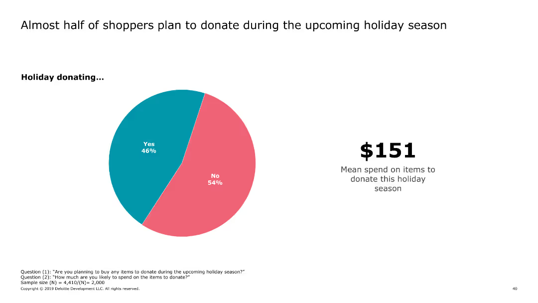
Pie chart showing the current and planned usage of third-party APIs, alongside a word cloud highlighting popular API providers such as Salesforce, Oracle, and Microsoft.
Market Analysis and Trends
Technology & Software
The slide identifies the most commonly used third-party APIs and the intent to use them, supported by a word cloud of specific providers, emphasizing Salesforce as the leading provider.
third-party APIs, Salesforce, Oracle, providers
Mixed Chart
Gartner
Saved
This slide uses a dual-column chart to compare the past and projected revenue against expenditures over several fiscal years, displayed in a clear, linear format with red for expenses and grey for revenues. Each year is labeled at the base, and the values are shown at the top of each column, providing a quick visual assessment of fiscal balance.
Financial Performance
Government & Public Sector
This slide compares historical and projected government revenue and expenditures, illustrating fiscal trends and budgetary balances over time. It is typically used in budget presentations to policymakers or the public to discuss financial management and planning, showcasing how revenue covers or falls short of expenses.
government budget, fiscal trends, revenue, expenditure, projections
Single Chart
PwC/Strategy&
Saved
Utilizes a stacked area chart to depict the distribution of new COVID-19 cases across US regions from April to July 2020, colored by region.
Market Analysis and Trends
Healthcare & Pharmaceuticals
Presents the regional distribution of new COVID-19 cases in the US, showing how the case load has shifted from the Northeast to the Southern and Western states, providing insights into the dynamics of the pandemic’s domestic spread.
COVID-19, US, cases, regional, 2020
Single Chart
McKinsey
Saved
A timeline with logos of companies and key events, accompanied by bullet points and a side section with impacts
Competitive Landscape
Healthcare & Pharmaceuticals
Discusses the impact of the expiration of Intuitive's patents on global competition, technological advancements, and cost reduction
patents, competition, innovation, cost, healthcare
Header Horizontal
LEK
Saved
Three-column comparative layout; icons and bold headings distinguish disruptor archetypes; bullet points within shaded boxes for consistent structure.
Competitive Landscape
Consumer Goods
This slide classifies three types of insurgent disruptors in Southeast Asia—Localized Traditional, High-End Digital First, and Low-Cost Champions—by outlining their pricing, consumers, distribution, and financial traits. It demonstrates how these disruptors meet evolving consumer demands unmet by incumbents.
insurgent disruptors, localization, premium pricing, low-cost, Southeast Asia
Table
Bain
Saved
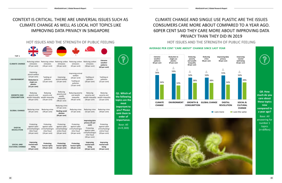
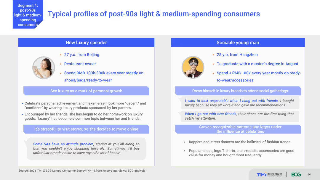
Contains multiple pie charts showing consumer behavior by city tier, icons depicting shopping behaviors, and text annotations.
Market Analysis and Trends
Retail & E-commerce
Analyzes consumer purchase behaviors in different city tiers, focusing on online and offline preferences, useful for understanding market dynamics and tailoring regional marketing strategies.
consumer behavior, city tiers, online shopping, retail strategies, market analysis, digital conversion, ROPO, tiered marketing, consumer journey
Multiple Chart
BCG
Saved
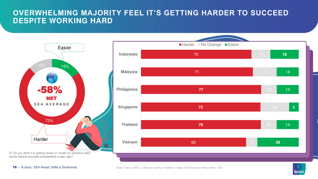
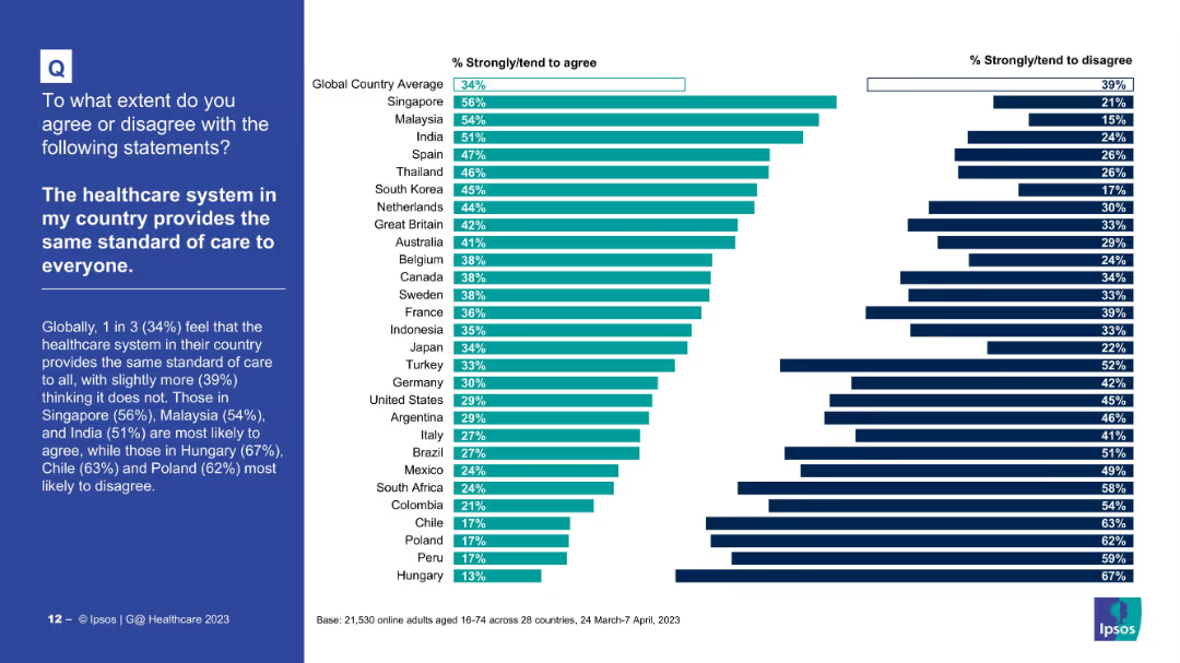
A column chart showing the percentage of people who trust business leaders to tell the truth across various countries, with global averages highlighted.
Market Analysis and Trends
Government & Public Sector
The slide presents data on trust in business leaders globally, showing higher trust in emerging markets compared to developed ones.
business leaders, trust, emerging markets, developed markets, column chart, percentages
Multiple Chart
IPSOS
Saved
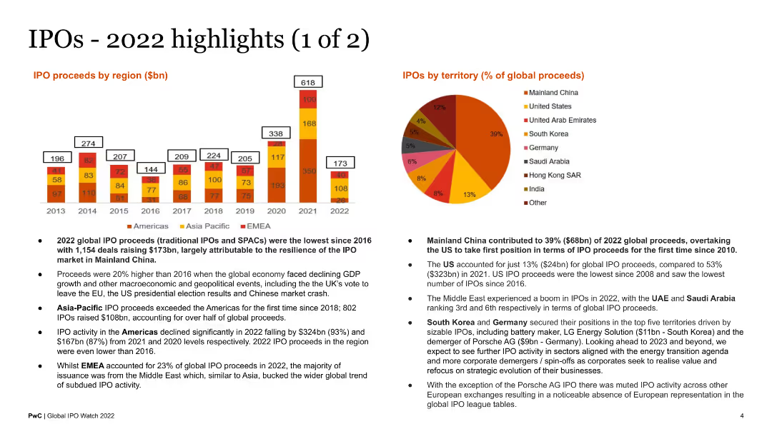
A slide with two column charts comparing after-market performance by region and sectors. The visual complexity is moderate, focusing on column charts with comparative data.
Market Analysis and Trends
Financial Services
The slide discusses the shift in valuation expectations in the IPO landscape, with improved confidence among issuers and investors. It highlights the after-market performance of IPOs in different regions and sectors, showing significant improvements in specific areas.
IPO, Valuation, Buyers, Sellers, Performance, Market
Multiple Chart
EY
Saved
The slide includes a pie chart showing the split of organizational expenses and a column chart listing top business priorities for leagues and event organizers. It also contains text discussing profitability and growth priorities.
Market Analysis and Trends
Media & Entertainment
This slide focuses on the cost structure and business priorities of European esports leagues and event organizers. It highlights the emphasis on growing business, achieving revenue growth, and attracting new sponsors.
esports, expenses, business priorities, growth, sponsors
Multiple Chart
Deloitte
Saved
Previous
Next
If nothing, comes up, please save your slides first
Create a FREE account to continue browsing
Receive Instant Access to 1,000+ slides from companies like McKinsey, Google, and Goldman Sachs
First Name
Last Name
Email
Password
I agree to all
Terms & Privacy Policy
Thank you! Your submission has been received!
Oops! Something went wrong while submitting the form.
Have an account?
Sign in
Column Chart
Heatmap
Chevron
Org Chart
Infographic
Callouts
Timeline
List
Graphic
Picture
Process Flow
Diagram
Paragraph
Map
Table
Framework
Subtitle
Takeaway Box
Icon
Other Chart
Radar Chart
Waterfall Chart
Mekko Chart
Pie Chart
Scatter Plot
Line Chart
Bar chart
Bullet points